Related Plugins and Tags

QGIS Planet

Speeding up your PyQGIS scripts

I’ve recently spent some time optimising the performance of various QGIS plugins and algorithms, and I’ve noticed that there’s a few common performance traps which developers fall into when fetching features from a vector layer. In this post I’m going to explore these traps, what makes them slow, and how to avoid them.

As a bit of background, features are fetched from a vector layer in QGIS using a QgsFeatureRequest object. Common use is something like this:

request = QgsFeatureRequest()
for feature in vector_layer.getFeatures(request):
    # do something

This code would iterate over all the features in layer. Filtering the features is done by tweaking the QgsFeatureRequest, such as:

request = QgsFeatureRequest().setFilterFid(1001)
feature_1001 = next(vector_layer.getFeatures(request))

In this case calling getFeatures(request) just returns the single feature with an ID of 1001 (which is why we shortcut and use next(…) here instead of iterating over the results).

Now, here’s the trap: calling getFeatures is expensive. If you call it on a vector layer, QGIS will be required to setup an new connection to the data store (the layer provider), create some query to return data, and parse each result as it is returned from the provider. This can be slow, especially if you’re working with some type of remote layer, such as a PostGIS table over a VPN connection. This brings us to our first trap:

Trap #1: Minimise the calls to getFeatures()

A common task in PyQGIS code is to take a list of feature IDs and then request those features from the layer. A see a lot of older code which does this using something like:

for id in some_list_of_feature_ids:
    request = QgsFeatureRequest().setFilterFid(id)
    feature = next(vector_layer.getFeatures(request))
    # do something with the feature

Why is this a bad idea? Well, remember that every time you call getFeatures() QGIS needs to do a whole bunch of things before it can start giving you the matching features. In this case, the code is calling getFeatures() once for every feature ID in the list. So if the list had 100 features, that means QGIS is having to create a connection to the data source, set up and prepare a query to match a single feature, wait for the provider to process that, and then finally parse the single feature result. That’s a lot of wasted processing!

If the code is rewritten to take the call to getFeatures() outside of the loop, then the result is:

request = QgsFeatureRequest().setFilterFids(some_list_of_feature_ids)
for feature in vector_layer.getFeatures(request):
    # do something with the feature

Now there’s just a single call to getFeatures() here. QGIS optimises this request by using a single connection to the data source, preparing the query just once, and fetching the results in appropriately sized batches. The difference is huge, especially if you’re dealing with a large number of features.

Trap #2: Use QgsFeatureRequest filters appropriately

Here’s another common mistake I see in PyQGIS code. I often see this one when an author is trying to do something with all the selected features in a layer:

for feature in vector_layer.getFeatures():
    if not feature.id() in vector_layer.selectedFeaturesIds():
        continue

    # do something with the feature

What’s happening here is that the code is iterating over all the features in the layer, and then skipping over any which aren’t in the list of selected features. See the problem here? This code iterates over EVERY feature in the layer. If you’re layer has 10 million features, we are fetching every one of these from the data source, going through all the work of parsing it into a QGIS feature, and then promptly discarding it if it’s not in our list of selected features. It’s very inefficient, especially if fetching features is slow (such as when connecting to a remote database source).

Instead, this code should use the setFilterFids() method for QgsFeatureRequest:

request = QgsFeatureRequest().setFilterFids(vector_layer.selectedFeaturesIds())
for feature in vector_layer.getFeatures(request):
    # do something with the feature

Now, QGIS will only fetch features from the provider with matching feature IDs from the list. Instead of fetching and processing every feature in the layer, only the actual selected features will be fetched. It’s not uncommon to see operations which previously took many minutes (or hours!) drop down to a few seconds after applying this fix.

Another variant of this trap uses expressions to test the returned features:

filter_expression = QgsExpression('my_field > 20')
for feature in vector_layer.getFeatures():
    if not filter_expression.evaluate(feature):
        continue

    # do something with the feature

Again, this code is fetching every single feature from the layer and then discarding it if it doesn’t match the “my_field > 20” filter expression. By rewriting this to:

request = QgsFeatureRequest().setFilterExpression('my_field > 20')
for feature in vector_layer.getFeatures(request):
    # do something with the feature

we hand over the bulk of the filtering to the data source itself. Recent QGIS versions intelligently translate the filter into a format which can be applied directly at the provider, meaning that any relevant indexes and other optimisations can be applied by the provider itself. In this case the rewritten code means that ONLY the features matching the ‘my_field > 20’ criteria are fetched from the provider – there’s no time wasted messing around with features we don’t need.


Trap #3: Only request values you need

The last trap I often see is that more values are requested from the layer then are actually required. Let’s take the code:

my_sum = 0
for feature in vector_layer.getFeatures(request):
    my_sum += feature['value']

In this case there’s no way we can optimise the filters applied, since we need to process every feature in the layer. But – this code is still inefficient. By default QGIS will fetch all the details for a feature from the provider. This includes all attribute values and the feature’s geometry. That’s a lot of processing – QGIS needs to transform the values from their original format into a format usable by QGIS, and the feature’s geometry needs to be parsed from it’s original type and rebuilt as a QgsGeometry object. In our sample code above we aren’t doing anything with the geometry, and we are only using a single attribute from the layer. By calling setFlags( QgsFeatureRequest.NoGeometry ) and setSubsetOfAttributes() we can tell QGIS that we don’t need the geometry, and we only require a single attribute’s value:

my_sum = 0
request = QgsFeatureRequest().setFlags(QgsFeatureRequest.NoGeometry).setSubsetOfAttributes(['value'], vector_layer.fields() )
for feature in vector_layer.getFeatures(request):
    my_sum += feature['value']

None of the unnecessary geometry parsing will occur, and only the ‘value’ attribute will be fetched and populated in the features. This cuts down both on the processing required AND the amount of data transfer between the layer’s provider and QGIS. It’s a significant improvement if you’re dealing with larger layers.

Conclusion

Optimising your feature requests is one of the easiest ways to speed up your PyQGIS script! It’s worth spending some time looking over all your uses of getFeatures() to see whether you can cut down on what you’re requesting – the results can often be mind blowing!

QGIS Atlas Tutorial – Material Design

This is a guest post by Mickael HOARAU @Oneil974

For people who are working on QGIS Atlas feature, I worked on an Atlas version of the last tutorial I have made. The difficulty level is a little bit more consequente then last tutorial but there are features that you could appreciate. So I’m happy to share with you and I hope this would be helpful.

Click to view slideshow.

You can download tutorial here:

Material Design – QGIS Atlas Tutorial

And sources here:

https://drive.google.com/file/d/0B37RnaYSMWAZUUJ2NUxhZC1TNmM/view?usp=sharing


PS : I’m looking for job offers, feel free to contact me on twitter @Oneil974


Movement data in GIS #2: visualization

In the first part of the Movement Data in GIS series, I discussed some of the common issues of modeling movement data in GIS, followed by a recommendation to model trajectories as LinestringM features in PostGIS to simplify analyses and improve query performance.

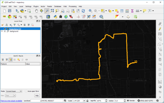
Of course, we don’t only want to analyse movement data within the database. We also want to visualize it to gain a better understanding of the data or communicate analysis results. For example, take one trajectory:

(data credits: GeoLife project)

Visualizing movement direction is easy: just slap an arrow head on the end of the line and done. What about movement speed? Sure! Mean speed, max speed, which should it  be?

Speed along the trajectory, a value for each segment between consecutive positions.

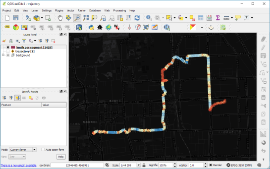
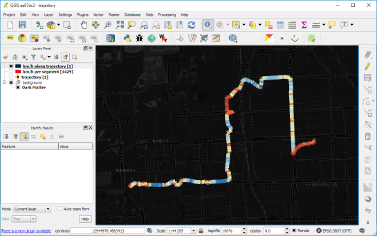
With the usual GIS data model, we are back to square one. A line usually has one color and width. Of course we can create doted and dashed lines but that’s not getting us anywhere here. To visualize speed variations along the trajectory, we therefore split the original trajectory into its segments, 1429 in this case. Then we can calculate speed for each segment and use a graduated or data defined renderer to show the results:

trajectory_segment_features

Speed along trajectory: red = slow to blue = fast

Very unsatisfactory! We had to increase the number of features 1429 times just to show speed variations along the trajectory, even though the original single trajectory feature already contained all the necessary information and QGIS does support geometries with measurement values.

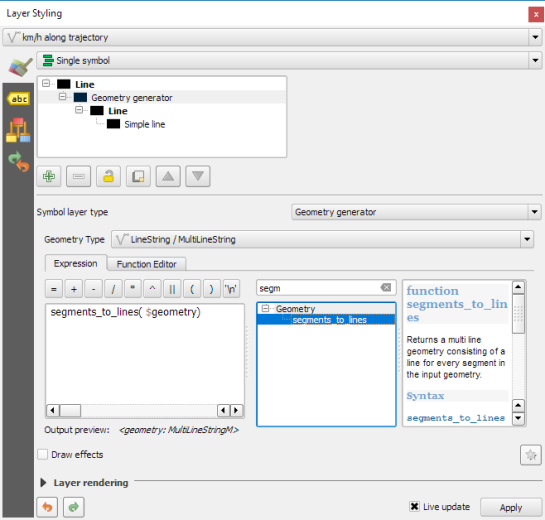
Starting from QGIS 2.14, we have an alternative way to deal with this issue. We can stick to the original single trajectory feature and render it using the new geometry generator symbol layer. (This functionality is also used under the hood of the 2.5D renderer.) Using the segments_to_lines() function, the geometry generator basically creates individual segment lines on the fly:

geomgenerator

Segments_to_lines( $geometry) returns a multi line geometry consisting of a line for every segment in the input geometry

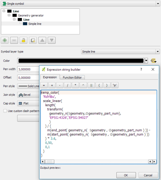
Once this is set up, we can style the segments with a data-defined expression that determines the speed on the segment and returns the respective color along a color ramp:

segment_speed_color

Speed is calculated using the length of the segment and the time between segment start and end point. Then speed values from 0 to 50 km/h are mapped to the red-yellow-blue color ramp:

ramp_color(
  'RdYlBu',
  scale_linear(
    length( 
      transform(
	    geometry_n($geometry,@geometry_part_num),
		'EPSG:4326','EPSG:54027'
		)
    ) / (
      m(end_point(  geometry_n($geometry,@geometry_part_num))) -
      m(start_point(geometry_n($geometry,@geometry_part_num)))
    ) * 3.6,
    0,50,
    0,1
  )
)

Thanks a lot to @nyalldawson for all the help figuring out the details!

While the following map might look just like the previous one in the end, note that we now only deal with the original single line feature:

trajectory_geomgenerator

Similar approaches can be used to label segments or positions along the trajectory without having to break the original feature. Thanks to the geometry generator functionality, we can make direct use of the LinestringM data model for trajectory visualization.


Winning QGIS Grant Proposals for 2016

We are extremely pleased to announce the winning proposals for our 2016 QGIS.ORG grant programme. Funding for the programme was sourced by you, our project donors and sponsorsNote: For more context surrounding our grant programme, please see:

Our intent with the QGIS.ORG Grant Programme is to support work from community that would typically not be funded by client/contractor agreements, and that contributes to the broadest possible swathe of our community by providing cross-cutting, foundational improvements to the QGIS Project.

Voting to select the successful projects was carried out by our QGIS Voting Membership. Each voting member was allowed to select up to 6 of the 18 submitted proposals by means of a ranked selection form. The full list of votes are available here (on the first sheet). The second sheet contains the calculations used to determine the winner (for full transparency). The table below summarizes the voting tallies for those proposals that received one or more votes, along with brief notes on the methodology used:

screen-shot-2016-10-04-at-11-02-38-pm

A couple of extra notes about the voting process:

  • Voting was carried out based on the technical merits of the proposals and the competency of the applicants to execute on these proposals.
  • No restrictions were in place in terms of how many proposals could be submitted per person / organization, or how many proposals could be awarded to each proposing person / organization.
  • Although the budget for the grant programme was €20,000.00, the total amount for the three winning proposals is €20,500.00 – an additional €500.00 was made available by the PSC towards the grant programme to accommodate this.
  • Voting was ‘blind’ (voters could not see the existing votes that had been placed).

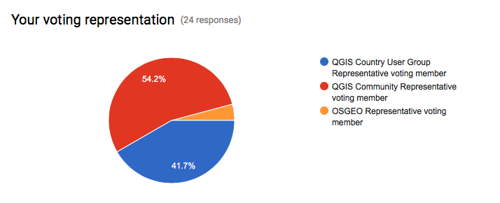
As mentioned in our previous blog post about this selection process, this is the first time that we have asked our newly formed group of QGIS Voting Members to vote. It is extremely gratifying to see such enthusiastic participation in the voting process. Of the 27 voting members, 24 registered their votes. There was one late submission that unfortunately had to be excluded, and 2 non-votes.

screen-shot-2016-10-03-at-2-58-20-pm
On behalf of the QGIS.ORG project, I would really like to thank everyone who submitted proposals for this call. There were many interesting proposals that I believe would be of great benefit to QGIS and I hope others perusing the proposals list will use their initiative and funding interesting proposals independently if they can.

Below you can find the detailed proposals of the successful applications – we look forward to seeing the results of their work land in the code base soon!


Details of the approved grant proposals


Implement a flexible properties framework in QGIS (Nyall Dawson) – €10,000


Details: I am applying for a QGIS grant to cover the implementation of a flexible “properties framework” for QGIS. I honestly believe that implementation of this framework will unlock cartographic power in QGIS well beyond anything that is currently possible in any of the desktop or web based mapping applications.

I propose to implement a system of managing and evaluating properties for generic objects within QGIS. Properties include all settings relating to symbology, such as a line marker’s width, color, or offset, label settings (eg font size, color, shadow opacity, etc), diagram properties (colors, size, etc) and composer item settings (position, rotation, frame size and color, etc). While currently many of the properties can be set to use “data defined overrides”, the properties framework will extend these capabilities by making them both more flexible and easier to use.

This proposal is being driven by a number of factors:

1. To avoid the current multiple duplicate code paths involving storage, retrieval and evaluation of data defined properties and to make it easier to add data defined support to more things (eg diagrams) without incurring even more duplicate code. Currently labeling, symbology and composer all have their own methods for handling data defined properties, which makes maintenance of data defined code very difficult.

2. To allow creation of other property types besides the current “data defined” (ie bound to field value or expression result) property, eg time based properties for a future in-built animation framework.

3. To avoid the complexity of requiring users to write their own expressions to map values to colors, sizes, etc and apply scaling functions to these, and instead expose these to users in an interactive, flexible way. Think Mapbox studio’s approach to zoom level styling (https://cloud.githubusercontent.com/assets/1829991/17850412/6a0f285e-68a0-11e6-8719-cdf74afd061d.jpg), but available for all property types. Eg data defined values can be set to preset ease in/ease out curves, or manually edited curves through an interactive GUI.

4. Enable the possibility of having live project wide colors. Ie a color palette could be created in the project properties, and color based properties “bound” to these colors. Altering the color would then automatically update every property which was bound to this preset color. This also brings the possibility of “color themes” for maps, eg binding properties to a predefined color types such as “highlights”, “background features”, etc, and then interactively changing all these color bound properties by applying a color theme to the project.

5. To allow a system of inherited and overridden properties. Eg QGIS default label font overridden by a project default font and finally overridden by label font setting. The proposed composer rewrite (layouts work) would use this property inheritance to bind layout item properties to a dynamic template. Changes in the template would be reflected in all linked layouts, but individual items could overwrite the inherited properties as required. Layout item properties could then be set globally (eg, font size), per project (eg font family), via a “master template” and finally individually per layout item.

6. The labelling engine has a need for predefined label styles. Label properties could be set globally, per project, via a predefined style, or overridden for a particular layer.

Technical details regarding this proposal are available in QEP 22 (https://github.com/qgis/QGIS-Enhancement-Proposals/issues/38).

I am seeking funding to:

1. Implement the core functionality for the properties framework
2. Port symbology, labeling and diagrams to the framework, and enable data definable control of all appropriate diagram settings (currently diagrams have a very limited data defined control available)
3. Implement the GUI for the property framework, including:
– a widget for controlling property behaviour
– interactive widgets for size and color properties (which have been designed to work inside 2.16’s live layer styling dock)
– interactive widgets for setting the “easing” for properties, with choices of preset ease in/out methods + an interactive curve editor for manual control

If funds are remaining following these items, I will undertake (in order of priority):

4. Bound project colors
5. Begin work on labeling styles

History: Because I believe so firmly that this framework is required within QGIS, I have been building toward this work through numerous hours of development over the previous 2 years of QGIS releases. There were a number of prerequisite changes required first, such as the implementation of expression contexts. An initial PR (https://github.com/qgis/QGIS/pull/2857) for the properties framework was filed in May 2016, which includes some of the core parts of this proposal. Changes were required based on feedback from that PR , however to date all work on this has been on a volunteer, unsponsored basis and unfortunately I am no longer able to complete such large scale changes as are required by this proposal without funding. Aside from the changes required from the initial PR, significant work remains in implementing GUI, unit tests, and porting symbology and labeling to the new framework.

Qualifications: I have an extensive history of large-scale contributions to QGIS since 2013 and a proven track record for writing polished UI with extensive unit testing. I’m passionate about QGIS, being a daily GIS user and strongly believe that this framework is required to take QGIS to the next level of cartographic abilities.

Implementation Plan: Due to the extensive refactoring and API changes which are required for implementing the properties framework, this work MUST be done in the QGIS 3.0 timeline. If it is not completed during the 3.0 API break period, the amount of work and cost required would substantially increase, and numerous methods across the symbology, labeling and diagrams API would be deprecated. Accordingly this work will be conducted during the QGIS 3.0 timeline, and for greatest testing I would aim to complete the work ASAP (likely complete by late October). Due to the changes required this work would NOT be suitable to backporting to the >= 2.18 branch and will be targeted at QGIS 3.0 only.

Proposal Link:  A QEP detailing technical implemention is available at: https://github.com/qgis/QGIS-Enhancement-Proposals/issues/38, and an initial PR available at https://github.com/qgis/QGIS/pull/2857


Introduce everything necessary for QGIS3 to OSGeo4W (Jürgen Fischer)- €6,000


Details: For QGIS3 we need packages of Qt5, PyQt5 and Python 3 (including many extensions currently available for Python 2).   The goal of this proposal is to introduce all required dependencies to OSGeo4W (32&64bit) that are necessary to build and package QGIS3. The requested amount will cover 60h of work on this.

History: I also did the packaging of Qt4, PyQt4 and QGIS.  I’ve also already started to build and package Qt 5.7 using Visual C++ 2015.

Qualifications: See previous point (or well known history)

Implementation Plan: I plan on doing it this in Q4 this year to have it available for the release and I don’t expect significant extra effort to support Windows (ie. if the issues are solved on a platform that already has Qt5 and friends available it should also work on Windows).

Implement an inbuilt Task Manager in QGIS for background long running tasks (Nyall Dawson) – €4,500

Details: QGIS requires a centralised, in built task manager to handle background threading of long running analysis tasks. Currently these long running tasks are either conducted while blocking the UI (such as when a snapping index is built for a layer) leading users to conclude that QGIS has frozen, via blocking progress dialogs which prevent interaction with QGIS while the operation proceeds, or via custom threaded implementations. By building a standard framework for handling these long running tasks, we will benefit by:


1. Avoiding UI blocking tasks, allowing users to continue working while the task is completed.
2. Simplify background task threading for plugin, processing algorithm (and core) developers by exposing a simple API for creating and scheduling long running tasks.
3. Benefit from the stabler code which comes as a result of having a single, well tested implementation of background threading rather than multiple custom implementations of this code.
4. We “catch up” to our commercial competitors (ie ArcGIS and MapInfo Professional), who currently have inbuilt background threading of long running tasks already available in their software.

This work was begun in https://github.com/qgis/QGIS/pull/3004, however significant changes are still required before the task manager can be merged into QGIS. It is vital that the task manager implementation is rock solid and with a future proof API which addresses our needs for the 3.x release cycle.

Accordingly, this grant proposal covers:

1. Building off the work started in the pull request, first addressing the feedback received from GitHub and from direct conversations with interested stakeholders and stabilising the API.
2. Completion of the unit tests to cover all parts of the framework.
3. Polish the GUI for interacting with running and completed tasks.
4. Writing documentation for the Python cookbook demonstrating how the task manager should be used from Python code.

(Please note that this proposal does not cover porting any existing code (such as processing) across to the new framework.)

History: An initial prototype of the work was begun in https://github.com/qgis/QGIS/pull/3004  

Qualifications: I have an extensive history of complex changes to QGIS code, and am currently one of the most active QGIS core developers. I have a track record of implementing stable, heavily unit tested code and supporting code I write for extended periods. I am also a daily user of QGIS as a GIS software application, so am invested in making the software as powerful, stable and easy to use as possible!

Implementation Plan: This work would be completed ASAP to allow for lengthy testing prior to the QGIS 3.0 release, and to allow the maximum time possible for developers to adapt their code and plugins to the new task manager interface.

Proposal Link: An initial prototype of the work was begun in https://github.com/qgis/QGIS/pull/3004, and a video demonstration is available at https://www.youtube.com/watch?v=7pXBZtWYFJc   


Notes from the QGIS-UK South West user group

Yesterday Dartmoor National Park was host to the third QGIS user group for the South West region. We a great range of talks from the worlds of academia, offshore exploration and local government to name but a few. The slides from these are below.

Teaching in QGIS

Using PostGIS within our Geospatial Workflows at Lloyd’s Register

The Adoption of QGIS at Plymouth Community Homes

Integrating QGIS functionality into a data workflow through both automated processing and a plugin

PopChange: An Academic Open Source Project

Building a Mixed GIS Environment at the Met Office

We are looking at having another meet up in the spring and are thinking of running some workshops on form designing and plugin building. Keep an eye on the main QGIS user group page on Google+ for any news.

Thanks again to everyone who attending and presented.  We also need to give a special thanks to Clear Mapping Company for sponsoring the event.

Cheers

Matt

6th QGIS UK user group meeting in Edinburgh

The 6th QGIS UK user group meeting in Scotland is happening on the 3rd November 2016.  It is being hosted by the EDINA University of Edinburgh at the Informatics Forum and is sponsored by thinkWhere, Ordnance Survey, Angus Council and Cawdor Forestry.  Tickets are available through Eventbrite.

The almost final programme of presentations and lightning talks is as follows:

  • Phil Taylor (CEH) – How deep is your loch?
  • Fiona Hemsley-Flint – QGIS server
  • University of Edinburgh – packaging and deploying QGIS
  • Anouk Lang – Mapping narrative: QGIS in the humanities classroom
  • Art Lembo (Salisbury University, MD) – terrain analysis with massively parallel processing techniques (embarrasingly so)
  • Neil Benny (thinkWhere) – finding the heart of Scotland / viewshed analysis
  • Tom Chadwin – qgis2web and coding a QGIS plugin
  • Pete Wells (Lutra) – WMTS previews and XYZ support
  • Stephen Bathgate – decision support system in Forestry
  • Tim Manners (Ordnance Survey) – Creating an indoor routable network with QGIS and pgRouting
  • Andrew Whitelee – QGIS in forestry/ecology
  • Ross McDonald (Angus Council) – Them thar hills: shaded, textured and blended
  • Michal Michalski (The Origins of Doha and Qatar Project) – DOHA: Doha Online Historical Atlas
  • eeGeo – Using QGIS to create 3D indoor maps

Doors open from 9:00. Registration shortly thereafter. Start and welcome at 9:45 and a planned finish at 16:30. Geobeers to follow.

Update on the QGIS Grant Programme

At the beginning of August this year, we put out a call for applications in our newly launched grant programme. The intent of the programme is to leverage donor and sponsor funding in order to support community members with great ideas to improve the underlying infrastructure of the QGIS project and code base.

We have had a really great response to the call for applications (detailed list of applications is here for your reading pleasure – 233KB download). There has also been some good discussion on the QGIS Developer mailing list about the evaluation process.

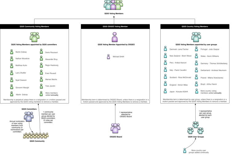
Given that we have 18 proposals and only 20,000 Euros to disburse, the QGIS voting members will need to make some tough, pragmatic choices. Its also noteworthy that this is the first time since establishing our community of QGIS Voting Members that we have asked them to vote on an issue. Our intent with the voting member system is to have a streamlined process for deciding on important issues whilst ensuring good representation of all members of the community. In case you are wondering who the QGIS Voting members are, I have prepared this little infographic below which lists the members and shows how they are elected  etc.

qgisoperationalstructure-votingmembersonlyThe voting for the grant proposals ends at the end of the September 2016, and we plan to announce the successful candidates soon after that – probably on the 4th of October. The PSC will arbitrate in the case of a dead heat or the proposal amounts of the top voted proposals not adding up to our funding target.

This round of grant proposals is special not only because it is the first time we are doing this, but also because the grant programme precedes the upcoming release of QGIS 3.0. Providing grants to facilitate this work will help to assure that QGIS 3.0 gets all the love and attention it needs in order to make it a success. That said, there is a huge amount of work to do, and it is mostly being done by a handful of very dedicated and generous (with their time) individuals. If you have the wherewithal to further support some of the grant proposals that did not make the cut, or the QGIS 3.0 effort in general, please get into contact with our treasurer, Andreas Neumann (finance [at] qgis.org) or head over to our sponsorship or donations page to support their work!

Lastly, I appeal to those QGIS Voting Members who have not yet cast their votes to check your email and head over to the voting form to cast your vote!


How to visualize bird migration data with QGIS TimeManager

A common use case of the QGIS TimeManager plugin is visualizing tracking data such as animal migration data. This post illustrates the steps necessary to create an animation from bird migration data. I’m using a dataset published on Movebank:

Fraser KC, Shave A, Savage A, Ritchie A, Bell K, Siegrist J, Ray JD, Applegate K, Pearman M (2016) Data from: Determining fine-scale migratory connectivity and habitat selection for a migratory songbird by using new GPS technology. Movebank Data Repository. doi:10.5441/001/1.5q5gn84d.

It’s a CSV file which can be loaded into QGIS using the Add delimited text layer tool. Once loaded, we can get started:

1. Identify time and ID columns

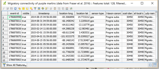
Especially if you are new to the dataset, have a look at the attribute table and identify the attributes containing timestamps and ID of the moving object. In our sample dataset, time is stored in the aptly named timestamp attribute and uses ISO standard formatting %Y-%m-%d %H:%M:%S.%f. This format is ideal for TimeManager and we can use it without any changes. The object ID attribute is titled individual-local-identifier.

movebank_data

The dataset contains 128 positions of 14 different birds. This means that there are rather long gaps between consecutive observations. In our animation, we’ll want to fill these gaps with interpolated positions to get uninterrupted movement traces.

2. Configuring TimeManager

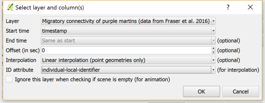
To set up the animation, go to the TimeManager panel and click Settings | Add Layer. In the following dialog we can specify the time and ID attributes which we identified in the previous step. We also enable linear interpolation. The interpolation option will create an additional point layer in the QGIS project, which contains the interpolated positions.

timemanager_settings

When using the interpolation option, please note that it currently only works if the point layer is styled with a Single symbol renderer. If a different renderer is configured, it will fail to create the interpolation layer.

Once the layer is configured, the minimum and maximum timestamps will be displayed in the TimeManager dock right bellow the time slider. For this dataset, it makes sense to set the Time frame size, that is the time between animation frames, to one day, so we will see one frame per day:

timemanager_dock

Now you can test the animation by pressing the TimeManager’s play button. Feel free to add more data, such as background maps or other layers, to your project. Besides exploring the animated data in QGIS, you can also create a video to share your results.

3. Creating a video

To export the animation, click the Export video button. If you are using Linux, you can export videos directly from QGIS. On Windows, you first need to export the animation frames as individual pictures, which you can then convert to a video (for example using the free Windows Movie Maker application).

These are the basic steps to set up an animation for migration data. There are many potential extensions to this animation, including adding permanent traces of past movements. While this approach serves us well for visualizing bird migration routes, it is easy to imagine that other movement data would require different interpolation approaches. Vehicle data, for example, would profit from network-constrained interpolation between observed positions.

If you find the TimeManager plugin useful, please consider supporting its development or getting involved. Many features, such as interpolation, are weekend projects that are still in a proof-of-concept stage. In addition, we have the huge upcoming challenge of migrating the plugin to Python 3 and Qt5 to support QGIS3 ahead of us. Happy QGISing!


How to fix a broken Processing model with AttributeError: ‘NoneType’ object has no attribute ‘getCopy’

Broken Processing models are nasty and this error is particularly unpleasant:

...
File "/home/agraser/.qgis2/python/plugins/processing/modeler/
ModelerAlgorithm.py", line 110, in algorithm
self._algInstance = ModelerUtils.getAlgorithm(self.consoleName).getCopy()
AttributeError: 'NoneType' object has no attribute 'getCopy'

It shows up if you are trying to open a model in the model editor that contains an algorithm which Processing cannot find.

For example, when I upgraded to Ubuntu 16.04, installing a fresh QGIS version did not automatically install SAGA. Therefore, any model with a dependency on SAGA was broken with the above error message. Installing SAGA and restarting QGIS solves the issue.


Movement data in GIS: issues & ideas

Since I’ve started working, transport and movement data have been at the core of many of my projects. The spatial nature of movement data makes it interesting for GIScience but typical GIS tools are not a particularly good match.

Dealing with the temporal dynamics of geographic processes is one of the grand challenges for Geographic Information Science. Geographic Information Systems (GIS) and related spatial analysis methods are quite adept at handling spatial dimensions of patterns and processes, but the temporal and coupled space-time attributes of phenomena are difficult to represent and examine with contemporary GIS. (Dr. Paul M. Torrens, Center for Urban Science + Progress, New York University)

It’s still a hot topic right now, as the variety of related publications and events illustrates. For example, just this month, there is an Animove two-week professional training course (18–30 September 2016, Max-Planck Institute for Ornithology, Lake Konstanz) as well as the GIScience 2016 Workshop on Analysis of Movement Data (27 September 2016, Montreal, Canada).

Space-time cubes and animations are classics when it comes to visualizing movement data in GIS. They can be used for some visual analysis but have their limitations, particularly when it comes to working with and trying to understand lots of data. Visualization and analysis of spatio-temporal data in GIS is further complicated by the fact that the temporal information is not standardized in most GIS data formats. (Some notable exceptions of formats that do support time by design are GPX and NetCDF but those aren’t really first-class citizens in current desktop GIS.)

Most commonly, movement data is modeled as points (x,y, and optionally z) with a timestamp, object or tracker id, and potential additional info, such as speed, status, heading, and so on. With this data model, even simple questions like “Find all tracks that start in area A and end in area B” can become a real pain in “vanilla” desktop GIS. Even if the points come with a sequence number, which makes it easy to identify the start point, getting the end point is tricky without some custom code or queries. That’s why I have been storing the points in databases in order to at least have the powers of SQL to deal with the data. Even so, most queries were still painfully complex and performance unsatisfactory.

So I reached out to the Twitterverse asking for pointers towards moving objects database extensions for PostGIS and @bitnerd, @pwramsey, @hruske, and others replied. Amongst other useful tips, they pointed me towards the new temporal support, which ships with PostGIS 2.2. It includes the following neat functions:

  • ST_IsValidTrajectory — Returns true if the geometry is a valid trajectory.
  • ST_ClosestPointOfApproach — Returns the measure at which points interpolated along two lines are closest.
  • ST_DistanceCPA — Returns the distance between closest points of approach in two trajectories.
  • ST_CPAWithin — Returns true if the trajectories’ closest points of approach are within the specified distance.

Instead of  points, these functions expect trajectories that are stored as LinestringM (or LinestringZM) where M is the time dimension. This approach makes many analyses considerably easier to handle. For example, clustering trajectory start and end locations and identifying the most common connections:

animation_clusters

(data credits: GeoLife project)

Overall, it’s an interesting and promising approach but there are still some open questions I’ll have to look into, such as: Is there an efficient way to store additional info for each location along the trajectory (e.g. instantaneous speed or other status)? How well do desktop GIS play with LinestringM data and what’s the overhead of dealing with it?


How to use Print Composer templates

In the previous post, Mickael shared a great map design. The download includes a print composer template, that you can use to recreate the design in a few simple steps:

1. Create a new composition based on a template

Open the Composer manager and configure it to use a specific template. Then you can select the .qpt template file and press the Add button to create a new composition based on the template.

2. Update image item paths

If the template uses images, the paths to the images most likely need to be fixed since the .qpt file stores absolute file paths instead of relative ones.

update_image_paths

With these steps, you’re now ready to use the design for your own maps. Happy QGISing!


Material design map tutorial for QGIS Composer

This is a guest post by Mickael HOARAU @Oneil974

For those wishing to get a stylized map on QGIS composer, I’ve been working on a tutorial to share with you a project I’m working on. Fan of web design and GIS user since few years, I wanted to merge Material Design Style with Map composer. Here is a tutorial to show you how to make simply a Material Design Map style on QGIS.

Click to view slideshow.

You can download tutorial here:

Tutorial Material Design Map

And sources here:

Sources Material Design Map

An Atlas Powered version is coming soon!


The EuroLST seamless and gap-free daily European maps of land surface temperatures

The EuroLST dataset is seamless and gap-free with a temporal resolution of four records per day and enhanced spatial resolution of 250 m. This newly developed reconstruction method (Metz et al, 2014) has been applied to Europe and neighbouring countries, resulting in complete daily coverage from 2001 onwards. To our knowledge, this new reconstructed LST time series exceeds the level of detail of comparable reconstructed LST datasets by several orders of magnitude. Studies on emerging diseases, parasite risk assessment and temperature anomalies can now be performed on the continental scale, maintaining high spatial and temporal detail. In their paper, the authors provide examples for implications and applications of the new LST dataset, such as disease risk assessment, epidemiology, environmental monitoring, and temperature anomalies.

Reconstructed MODIS Land Surface Temperature Dataset, at 250m pixel resolution (click figure to enlarge):
MODIS lst time series reconstructed

Section 1. Article and data citation:

EuroLST has been produced by the former PGIS group at Fondazione Edmund Mach, DBEM based on daily MODIS LST (Product of NASA) maps.

Metz, M.; Rocchini, D.; Neteler, M. 2014: Surface temperatures at the continental scale: Tracking changes with remote sensing at unprecedented detail. Remote Sensing. 2014, 6(5): 3822-3840 (DOI | HTML | PDF)

Section 2. Used software

Open Source commands used in processing (GRASS GIS 7):
links to the related manual pages involved in the data preparation

  • i.pca: Principal Components Analysis (PCA) for image processing.
  • r.regression.multi: it calculates multiple linear regression from raster maps
  • v.surf.bspline: it performs bicubic or bilinear spline interpolation with Tykhonov regularization.

Furthermore:

  • r.bioclim: calculates various bioclimatic indices from monthly temperature and optional precipitation time series (install in GRASS GIS 7 with “g.extention r.bioclim”)
  • pyModis: Free and Open Source Python based library to work with MODIS data

Section 3. Metadata

Map projection: EPSG 3035, prj file
PROJCS["Lambert Azimuthal Equal Area",
    GEOGCS["grs80",
        DATUM["European_Terrestrial_Reference_System_1989",
            SPHEROID["Geodetic_Reference_System_1980",6378137,298.257222101]],
        PRIMEM["Greenwich",0],
        UNIT["degree",0.0174532925199433]],
    PROJECTION["Lambert_Azimuthal_Equal_Area"],
    PARAMETER["latitude_of_center",52],
    PARAMETER["longitude_of_center",10],
    PARAMETER["false_easting",4321000],
    PARAMETER["false_northing",3210000],
    UNIT["Meter",1]]

1. Selected open data derived from EuroLST

Section 1. BIOCLIM derived from reconstructed MODIS LST at 250m pixel resolution

BIO1: Annual mean temperature (°C*10) BIO2: Mean diurnal range (Mean monthly (max - min tem)) BIO3: Isothermality ((bio2/bio7)*100) BIO4: Temperature seasonality (standard deviation * 100) BIO5: Maximum temperature of the warmest month (°C*10) BIO6: Minimum temperature of the coldest month (°C*10) BIO7: Temperature annual range (bio5 - bio6) (°C*10) BIO10: Mean temperature of the warmest quarter (°C*10) BIO11: Mean temperature of the coldest quarter (°C*10)

BIOCLIM-like European LST maps following the “Bioclim” definition (Hutchinson et al., 2009) – derived from 10 years of reconstructed MODIS LST (download to be completed) as GeoTIFF files, 250m pixel resolution, in EU LAEA projection:

Each ZIP file contains the respective GeoTIFF file (for cell value units, see below), the color table as separate ASCII file and a README.txt with details.

Section 2. WMS/WCS Server

Using this URL, you can read the EuroLST BIOCLIM data directly via OGC WMS and WCS protocol:

http://geodati.fmach.it/production/ows_europe_lst

Section 3. OpenData License

The data published in this page are open data and released under the ODbL (Open Database License).

The full EuroLST dataset is not released online as open data (size: 18TB), please ask Luca Delucchi or Roberto Zorer for more info


2. Acknowledgments

The MOD11A1.005, MYD11A1.005 were retrieved from the online web site, courtesy of the NASA EOSDIS Land Processes Distributed Active Archive Center (LP DAAC), USGS/Earth Resources Observation and Science (EROS) Center, Sioux Falls, South Dakota, http://e4ftl01.cr.usgs.gov/

The post The EuroLST seamless and gap-free daily European maps of land surface temperatures appeared first on GFOSS Blog | GRASS GIS Courses.

Point cluster renderer crowdfunding – successful!

Great news! Thanks in part to some generous last minute pledges, our QGIS Point Cluster Renderer campaign has successfully reached its target. This means that QGIS 3.0 will now include a full feature and flexible cluster renderer.

In the meantime, we’d like to extend our warmest thanks to the following generous contributors, whose pledges have made this work possible:

  • Andreas Neumann
  • Qtibia Engineering (Tudor Barascu)
  • Karl-Magnus Jönsson
  • Geonesia (Nicolas Ponzo)

Plus numerous additional anonymous backers whose generous contributions are also highly valued. If you run into any of these funders at a QGIS user group or conference, make sure you treat them like the GIS rock-stars they are!

Keep an eye out on our social media accounts as we’ll be posting more video demonstrations of this work as it lands in the QGIS codebase.

BOTH

Editing raster cell values in QGIS using Serval plugin

Users can directly edit raster cell values using Serval plugin in QGIS.

How to use Serval

Serval is available from QGIS plugin repository. Note that you will need to restart QGIS if you upgrade Serval from an earlier version.

Once installed, Serval functions and settings will be available from the toolbar.

Serval Toolbar in QGIS

Serval supports Undo/Redo for editing values of raster. But it is recommended to make a copy of your raster.

Currently, the following functionalities are available:

  • Probe mode Displays raster bands values in boxes.
  • Draw mode Draw/Edit mode: bands values can be modified in the boxes and written to the current raster cell by hitting the Enter key. In this mode the values will be also assigned to any other raster cell clicked by user.
  • Write nodata To replace a cell value with the NODATA value.
  • Define nodata To define or replace the NODATA value.
  • Color picker To pick a color using QGIS color picker (3-bands rasters only).
  • Undo Redo To Undo/Redo the cell edit. Edits history is saved separately for each raster, that is, undo/redo is always done for current raster layer.
Future developments

We’d like to add support to edit values using spatial and expression selection tools.

For any problems or feedback, please consider to file a ticket here.

You may also like...

Mergin Maps, a field data collection app based on QGIS. Mergin Maps makes field work easy with its simple interface and cloud-based sync. Available on Android, iOS and Windows. Screenshots of the Mergin Maps mobile app for Field Data Collection
Get it on Google Play Get it on Apple store

Reporting back from Bonn & Oslo

Over the last two weeks, I had the pleasure to attend both the international FOSS4G conference in Bonn, Germany, as well as the regional FOSS4G-NOR in Oslo, Norway. Both events were superbly organized and provided tons of possibilities to share experiences and find new inspiration.

Talks at both conferences have been recorded and can be watched online: Bonn / Oslo

I enjoyed having the opportunity to give two very different talks. In Bonn, I presented work on pedestrian routing and navigation, which was developed within the PERRON project:

It was particularly nice that we had plenty of time for Q&A after this presentation since only two talks were scheduled for this session rather than the usual three. I’d also like to thank everyone for the great feedback – both in person and on Twitter!

In Oslo, I had the honor to give the opening keynote on OpenSource in general and the QGIS project in particular:

2 – Anita Graser – QGIS – A Community-powered GIS Project from krokskogstrollet on Vimeo.

Both conferences were packed with great sessions and talks. If I had to pick favorites from last week’s presentations, I would have to opt for Iván Sánchez presenting his latest projects, including what3fucks and geohaiku:

6 – Iván Sánchez Ortega, Mazemap – Addressing NSFW Geodesic Grids from krokskogstrollet on Vimeo.

Followed closely by the impressive project presentations of the student organizers of FOSS4G-NOR:

10 – Program Committee – What are the results when students use Open Source? from krokskogstrollet on Vimeo.

All three projects: OPPTUR, GISTYLE, and the flexible traffic web viewer were great demos of what can be achieved with open source tools. Mathilde’s GISTYLE project is also available on Github.

An inspiring GISummer comes to an end, but with so many videos to watch and workshop materials to explore, I’m convinced that the autumn will be no less exciting.


GRASS GIS PSC election 2016 results

The new GRASS GIS Project Steering Committee (PSC) is composed of the following nine members (ranking, name, votes):

1 Markus Neteler 62
2 Helena Mitasova 53
3 Martin Landa 52
4 Anna Petrasova 45
5 Moritz Lennert 41
6 Margherita Di Leo 39
7 Michael Barton 35
8 Peter Löwe 33
9 Vaclav Petras 31

More details in earlier announcement sent to the “grass-psc” mailing list:
https://lists.osgeo.org/pipermail/grass-psc/2016-August/001571.html.

For completeness, all relevant candidacy communications, as well as details about the voting process, are published at
https://trac.osgeo.org/grass/wiki/PSC/Election2016

Cited from the original announcement email:
https://lists.osgeo.org/pipermail/grass-announce/2016-September/000119.html

The post GRASS GIS PSC election 2016 results appeared first on GFOSS Blog | GRASS GIS Courses.

Point cluster renderer crowdfunding – the final countdown!

At North Road we are currently running a crowdfunding campaign to sponsor work on a new “Point Cluster Renderer” for QGIS. This is a really exciting new feature which would help make possible some neat styling effects which just aren’t possible in QGIS at the moment. The campaign is now in its final hours and we’ve still got some way to go to reach the campaign goals. If you’re interested in seeing this feature happen, now’s the time to jump onboard and contribute to the campaign!

Before time runs out we’d like to share some more details on how the cluster renderer can be enhanced through the use of data defined symbol overrides. Data defined overrides are where a huge part of QGIS’ symbology power resides. If you’re not familiar with them, we’d suggest grabbing a copy of Anita Graser and Gretchen Peterson’s reference “QGIS Map Design” (seriously – buy this book. You won’t regret it!). Basically, data defined properties allow you to set rules in place which control exactly how each individual feature in a layer is rendered. So, for instance, you can create an override which makes just a single feature render in a different color, or with a larger label, or so that all features with a value over 100 render with a bold label.

We’ve designed the point cluster renderer to take full advantage of QGIS data defined symbology. What this means is that the cluster symbol (ie, the marker which is rendered when 2 or more points are sufficiently close together) will respect any data defined overrides you set for this symbol, and each individual cluster symbol can have a different appearance as a result.

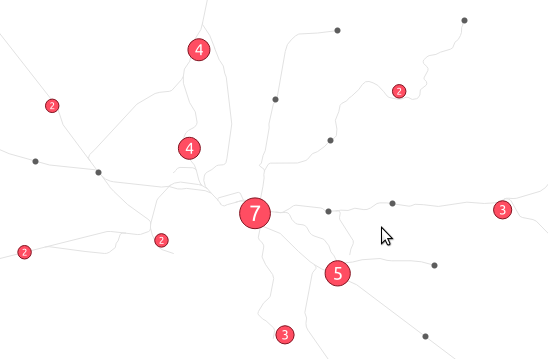
To make this even more flexible, the clusterer will also provide two additional new variables which can be used in data defined overrides for the symbol. The first of these, @cluster_size, will be preset to equal the number of features which have been clustered together at that point. Eg, if the cluster consists of 4 individual neighbouring features, then @cluster_size will be 4 when the cluster symbol is rendered. This can be used to alter the appearance of the cluster symbol based on the number of associated points. The mockup below shows how this could be used to scale the cluster symbol size so that clusters with more points are rendered larger than clusters with less points:

symbol_sizeIn this mockup we’ve also used a font marker symbol layer to render the actual cluster size inside the symbol too. Of course, because almost every property of symbols in QGIS can be data defined there’s almost no limit how @cluster_size could be used – you could use it to change the symbol color by pairing it with QGIS’ ramp_color function, or alter the symbol opacity, or the outline width… basically anything!

The second new expression variable which would be introduced with the cluster renderer is @cluster_color. This variable allows you to access the color of the points contained within each cluster. Since the cluster renderer is built “on top” of an existing renderer, any point which is NOT contained within a cluster is rendered using the specified renderer. For example, if you use a categorized symbol renderer then all points which aren’t in clusters will be drawn using these categorized classes. In this case isolated points will be drawn using different colors to match the predefined classes.

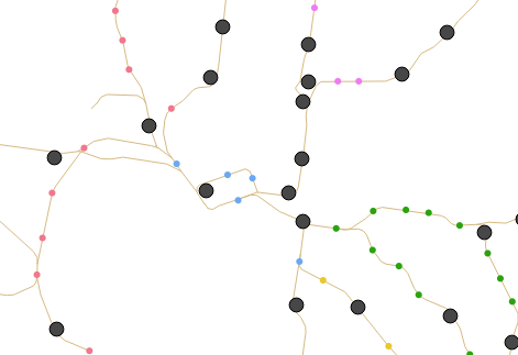
When multiple points are clustered together, @cluster_color will be set to match the color of any contained points. The points must all have the same color, if they differ then @cluster_color will be null. It’s easiest to illustrate this concept! In the below mockup, we’ve used a categorized render to shade points by an attribute (in this case rail line segment name), and used an uninspiring dark grey circle for the cluster markers:

clusters_categorized

Using @cluster_color together with a data defined color override, we can force these cluster markers to retain the colors from the points within each cluster:

clusters_categorized2

Much nicer! You’ll note that a single dark grey point remains, which is where the cluster consists of stations from multiple different line segments. In this case @cluster_color is null, so the data defined override is not applied and the marker falls back to the dark grey color.

Of course, both @cluster_size and @cluster_color can be combined to create some very nice results:

BOTH

So there we have it – using data defined overrides with the cluster marker renderer allows for extremely flexible, powerful cartography!

Now’s the time to get involved… if you’re wanting to see this feature in QGIS, head over to the crowd funding page to find out how YOU can contribute!


OSGeo Code Sprint in Bonn

It’s been a great week in Bonn! I joined the other members of the QGIS project at the pre-FOSS4G code sprint at the Basecamp, the weirdest location we’ve had for a developer meeting so far. We used this opportunity to have a face-to-face meeting of the QGIS PSC  with special guests Matthias Kuhn (on QGIS 3.0 and bug tracker discussions) and Lene Fischer (on community team issues)  – notes here.

picture by Tim Sutton

QGIS PSC meeting in action (from left to right: Otto Dassau, Paolo Cavallini, Anita Graser, Andreas Neumann, Jürgen E. Fischer), picture by Tim Sutton

I also finally took the time to compile a blog post on the results of the QGIS user survey 2015.

The code sprint was also a great opportunity to present the results of Akbar Gumbira’s Google Summer of Code project: the QGIS Resource Sharing plugin. This plugin makes it possible to easily share resources (such as SVG icons, symbol definitions, QGIS styles, and Processing scripts) with other QGIS users through an interface that closely resembles the well-known QGIS Plugin Manager. Akbar has also prepared great presentation with background info and screencasts showcasing his project.

QGIS Resource Sharing presentation, picture by @foss4g

QGIS Resource Sharing presentation, picture by @foss4g

The plugin is now available in the Plugin Repository and we have created the official QGIS Resources repository on Github. If you have symbols or styles that you want to share with the community, please create a resource collection and send us a pull request to add it to the official list.

Thanks to all the organizers who worked hard to make this one of the most well-organized and enjoyable code sprints I’ve ever been to. You are awesome!


What are trusted plugins?

The core team of QGIS strives hard to provide the most advanced and user friendly GIS for free use by everyone. In the core QGIS project, every line of code that gets committed is subject to peer review when contributed by a non core developer. This gives us an opportunity to identify and correct inadvertent (or intentional) security issues that a developer may introduce into the code base. By contrast, all of the plugins that are published via the QGIS plugin repository are reviewed by the plugin developers themselves and we don’t have good insight into how much due diligence is applied to plugin code management.

The vast majority of our plugins (listed in http://plugins.qgis.org/ and inside your copy of QGIS) are developed by third parties, either individuals, companies, and institutions. As such, they are outside our direct control and the developers often relatively unknown to the QGIS community. We view this as a potential security risk. We are convinced the risk is small, because of many factors including the “many eyes” principle (the code is visible to everybody, and in use by thousands of people), but cannot exclude the possibility that someone tries to inject malicious code into a plugin.

In order to address this situation, we looked into the opportunity of implementing automatic tools to scan plugins, before their publication, and spot potential problems. Our research indicated that this approach would be difficult and costly, and easy to circumvent.

We (the PSC) therefore decided to implement a simple yet robust approach to security, based on the ‘web of trust’ principle: we trust people we know well in the community. You will see on the http://plugins.qgis.org web site that there is a ‘Trusted Author’ tag has been applied to plugins created by those members of the community that we know and trust.

The criteria for ‘Trusted Authors’ includes those community members that regularly meet at our QGIS developer meetings, and and those that are in almost daily contact with the core team via our developer mailing lists or background project discussions. The remaining plugins (and there are wonderful, reliable, robust, and useful plugins in the list) have not been given the ‘trusted’ label.

We would be delighted if a side effect of this choice would be to stimulate more active and direct involvement of plugin developers in the QGIS community. All plugin developers are therefore invited to join us at one of the next developer meetings (AKA HackFest), or otherwise become a recognized, active member of the community, so they can be integrated as ‘trusted’ plugin developers.


  • <<
  • Page 57 of 141 ( 2820 posts )
  • >>

Back to Top

Sustaining Members