Related Plugins and Tags

QGIS Planet

Flow maps in QGIS – no plugins needed!

If you’ve been following my posts, you’ll no doubt have seen quite a few flow maps on this blog. This tutorial brings together many different elements to show you exactly how to create a flow map from scratch. It’s the result of a collaboration with Hans-Jörg Stark from Switzerland who collected the data.

The flow data

The data presented in this post stems from a survey conducted among public transport users, especially commuters (available online at: https://de.surveymonkey.com/r/57D33V6). Among other questions, the questionnair asks where the commuters start their journey and where they are heading.

The answers had to be cleaned up to correct for different spellings, spelling errors, and multiple locations in one field. This cleaning and the following geocoding step were implemented in Python. Afterwards, the flow information was aggregated to count the number of nominations of each connection between different places. Finally, these connections (edges that contain start id, destination id and number of nominations) were stored in a text file. In addition, the locations were stored in a second text file containing id, location name, and co-ordinates.

Why was this data collected?

Besides travel demand, Hans-Jörg’s survey also asks participants about their coffee consumption during train rides. Here’s how he tells the story behind the data:

As a nearly daily commuter I like to enjoy a hot coffee on my train rides. But what has bugged me for a long time is the fact the coffee or hot beverages in general are almost always served in a non-reusable, “one-use-only-and-then-throw-away” cup. So I ended up buying one of these mostly ugly and space-consuming reusable cups. Neither system seem to satisfy me as customer: the paper-cup produces a lot of waste, though it is convenient because I carry it only when I need it. With the re-usable cup I carry it all day even though most of the time it is empty and it is clumsy and consumes the limited space in bag.

So I have been looking for a system that gets rid of the disadvantages or rather provides the advantages of both approaches and I came up with the following idea: Installing a system that provides a re-usable cup that I only have with me when I need it.

In order to evaluate the potential for such a system – which would not only imply a material change of the cups in terms of hardware but also introduce some software solution with the convenience of getting back the necessary deposit that I pay as a customer and some software-solution in the back-end that handles all the cleaning, distribution to the different coffee-shops and managing a balanced stocking in the stations – I conducted a survey

The next step was the geographic visualization of the flow data and this is where QGIS comes into play.

The flow map

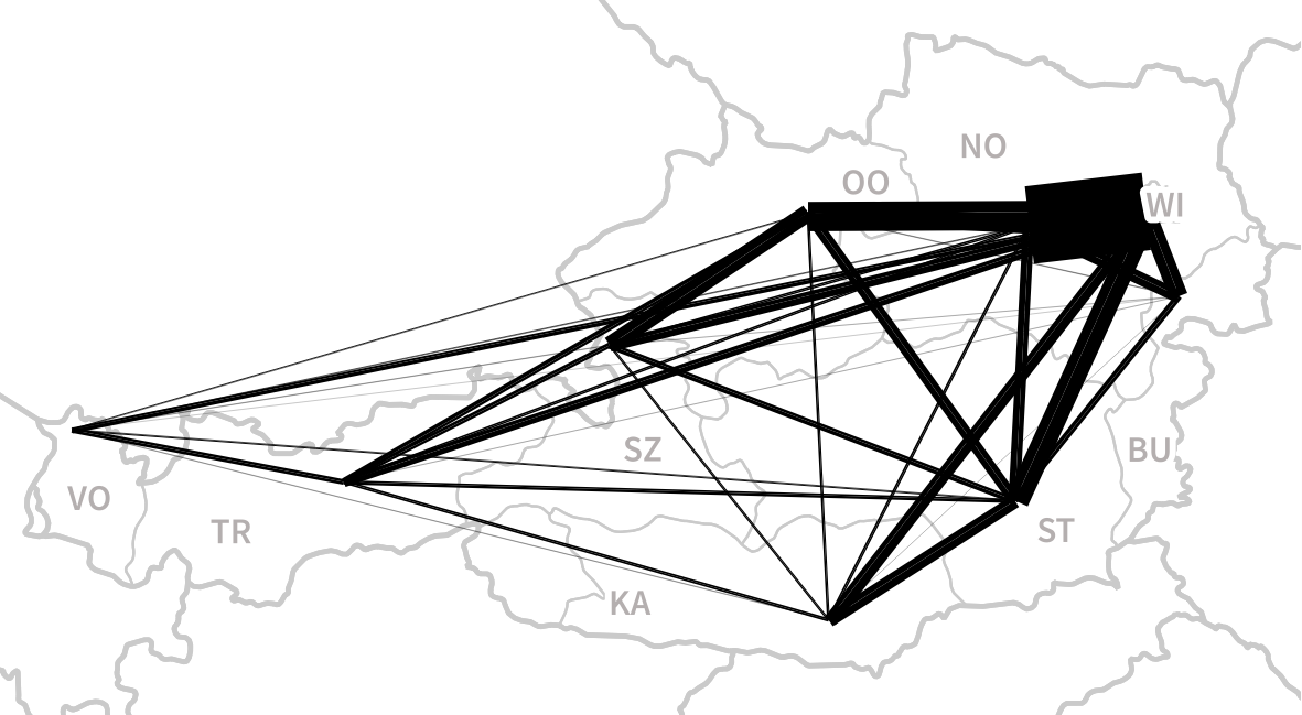
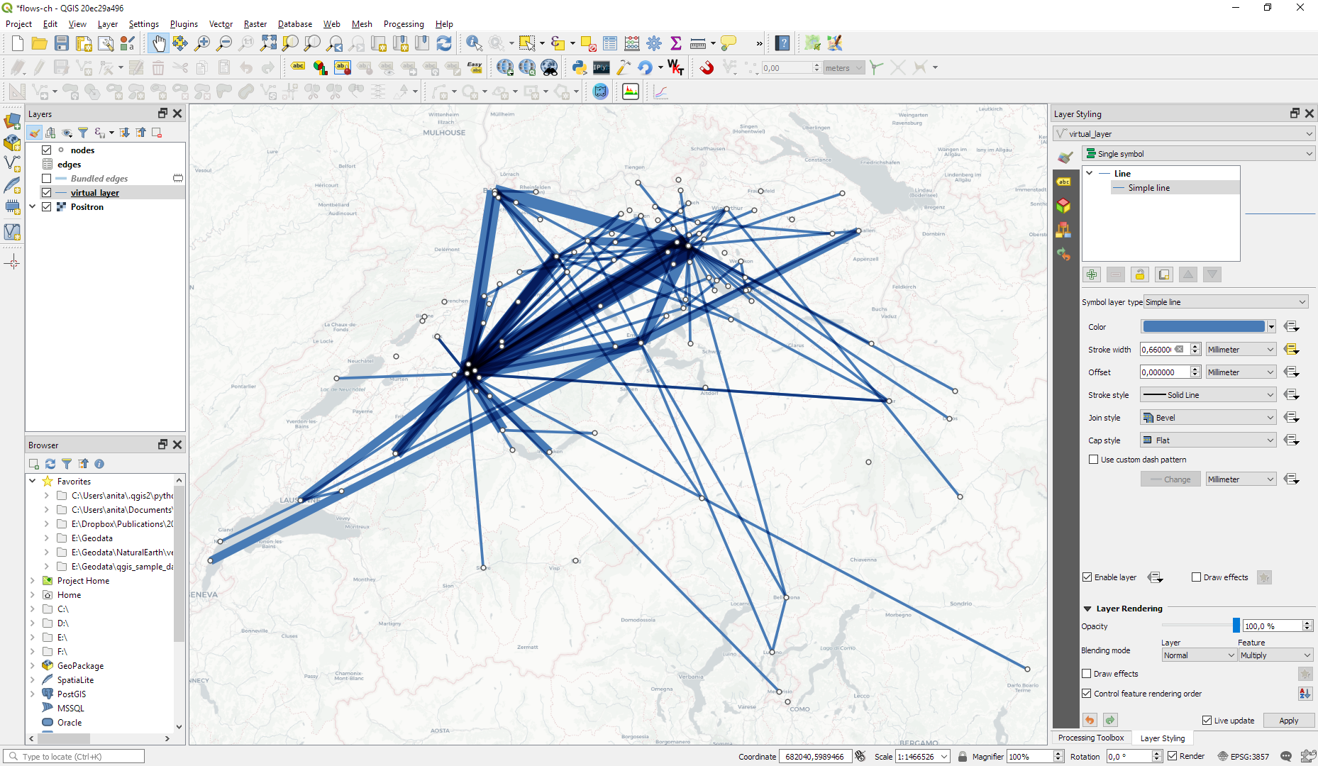
Survey data like the one described above is a common input for flow maps. There’s usually a point layer (here: “nodes”) that provides geographic information and a non-spatial layer (here: “edges”) that contains the information about the strength or weight of a flow between two specific nodes:

The first step therefore is to create the flow line features from the nodes and edges layers. To achieve our goal, we need to join both layers. Sounds like a job for SQL!

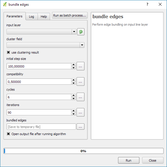
More specifically, this is a job for Virtual Layers: Layer | Add Layer | Add/Edit Virtual Layer

SELECT StartID, DestID, Weight, 
       make_line(a.geometry, b.geometry)
FROM edges
JOIN nodes a ON edges.StartID = a.ID
JOIN nodes b ON edges.DestID = b.ID
WHERE a.ID != b.ID 

This SQL query joins the geographic information from the nodes table to the flow weights in the edges table based on the node IDs. In the last line, there is a check that start and end node ID should be different in order to avoid zero-length lines.

By styling the resulting flow lines using data-driven line width and adding in some feature blending, it’s possible to create some half decent maps:

However, we can definitely do better. Let’s throw in some curved arrows!

The arrow symbol layer type automatically creates curved arrows if the underlying line feature has three nodes that are not aligned on a straight line.

Therefore, to turn our straight lines into curved arrows, we need to add a third point to the line feature and it has to have an offset. This can be achieved using a geometry generator and the offset_curve() function:

make_line(
   start_point($geometry),
   centroid(
      offset_curve(
         $geometry, 
         length($geometry)/-5.0
      )
   ),
   end_point($geometry)
)

Additionally, to achieve the effect described in New style: flow map arrows, we extend the geometry generator to crop the lines at the beginning and end:

difference(
   difference(
      make_line(
         start_point($geometry),
         centroid(
            offset_curve(
               $geometry, 
               length($geometry)/-5.0
            )
         ),
	 end_point($geometry)
      ),
      buffer(start_point($geometry), 0.01)
   ),
   buffer(end_point( $geometry), 0.01)
)

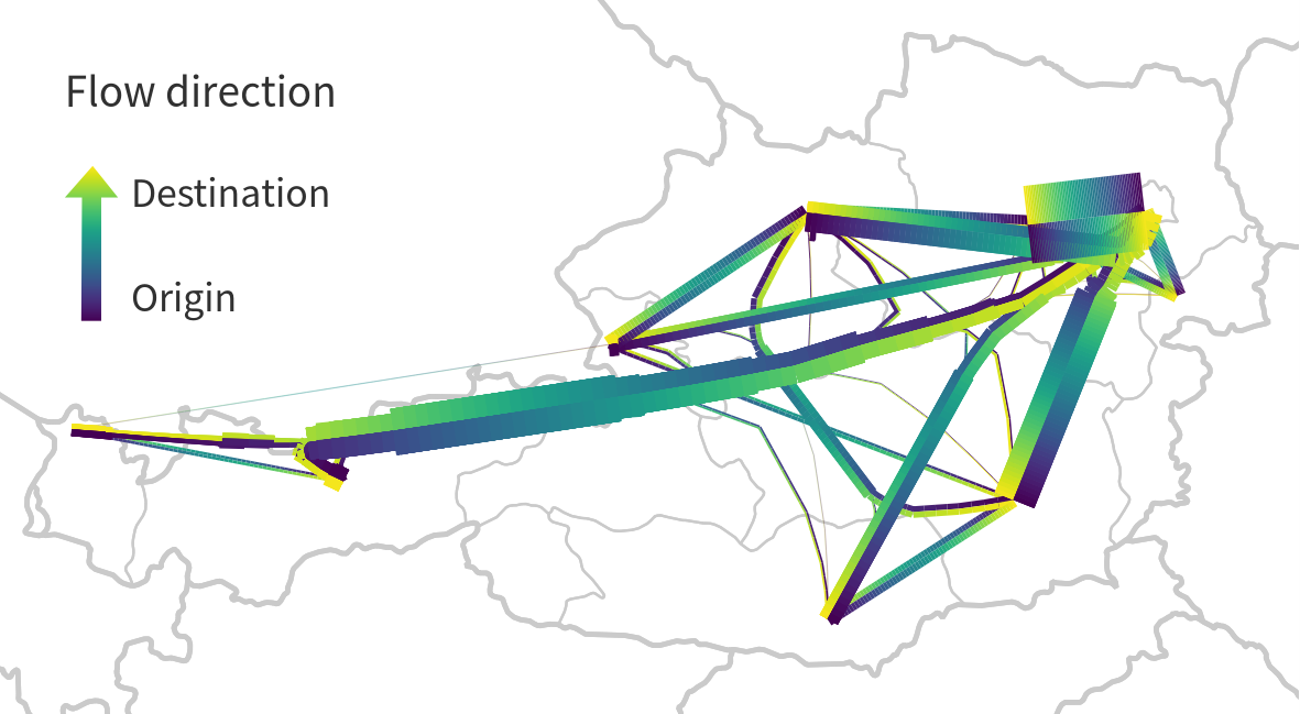
By applying data-driven arrow and arrow head sizes, we can transform the plain flow map above into a much more appealing map:

The two different arrow colors are another way to emphasize flow direction. In this case, orange arrows mark flows to the west, while blue flows point east.

CASE WHEN
 x(start_point($geometry)) - x(end_point($geometry)) < 0
THEN
 '#1f78b4'
ELSE
 '#ff7f00'
END

Conclusion

As you can see, virtual layers and geometry generators are a powerful combination. If you encounter performance problems with the virtual layer, it’s always possible to make it permanent by exporting it to a file. This will speed up any further visualization or analysis steps.

Movement data in GIS #8: edge bundling for flow maps

If you follow this blog, you’ll probably remember that I published a QGIS style for flow maps a while ago. The example showed domestic migration between the nine Austrian states, a rather small dataset. Even so, it required some manual tweaking to make the flow map readable. Even with only 72 edges, the map quickly gets messy:

Raw migration flows between Austrian states, line width scaled by flow strength

One popular approach in the data viz community to deal with this problem is edge bundling. The idea is to reduce visual clutter by generate bundles of similar edges. 

Surprisingly, edge bundling is not available in desktop GIS. Existing implementations in the visual analytics field often run on GPUs because edge bundling is computationally expensive. Nonetheless, we have set out to implement force-directed edge bundling for the QGIS Processing toolbox [0]. The resulting scripts are available at https://github.com/dts-ait/qgis-edge-bundling.

The main procedure consists of two tools: bundle edges and summarize. Bundle edges takes the raw straight lines, and incrementally adds intermediate nodes (called control points) and shifts them according to computed spring and electrostatic forces. If the input are 72 lines, the output again are 72 lines but each line geometry has been bent so that similar lines overlap and form a bundle.

After this edge bundling step, most common implementations compute a line heatmap, that is, for each map pixel, determine the number of lines passing through the pixel. But QGIS does not support line heatmaps and this approach also has issues distinguishing lines that run in opposite directions. We have therefore implemented a summarize tool that computes the local strength of the generated bundles.

Continuing our previous example, if the input are 72 lines, summarize breaks each line into its individual segments and determines the number of segments from other lines that are part of the same bundle. If a weight field is specified, each line is not just counted once but according to its weight value. The resulting bundle strength can be used to create a line layer style with data-defined line width:

Bundled migration flows

To avoid overlaps of flows in opposing directions, we define a line offset. Finally, summarize also adds a sequence number to the line segments. This sequence number is used to assign a line color on the gradient that indicates flow direction.

I already mentioned that edge bundling is computationally expensive. One reason is that we need to perform pairwise comparison of edges to determine if they are similar and should be bundled. This comparison results in a compatibility matrix and depending on the defined compatibility threshold, different bundles can be generated.

The following U.S. dataset contains around 4000 lines and bundling it takes a considerable amount of time.

One approach to speed up computations is to first use a quick clustering algorithm and then perform edge bundling on each cluster individually. If done correctly, clustering significantly reduces the size of each compatibility matrix.

In this example, we divided the edges into six clusters before bundling them. If you compare this result to the visualization at the top of this post (which did not use clustering), you’ll see some differences here and there but, overall, the results are quite similar:

Looking at these examples, you’ll probably spot a couple of issues. There are many additional ideas for potential improvements from existing literature which we have not implemented yet. If you are interested in improving these tools, please go ahead! The code and more examples are available on Github.

For more details, leave your email in a comment below and I’ll gladly send you the pre-print of our paper.

[0] Graser, A., Schmidt, J., Roth, F., & Brändle, N. (2017 online) Untangling Origin-Destination Flows in Geographic Information Systems. Information Visualization – Special Issue on Visual Movement Analytics.


Read more:

Small multiples for OD flow maps using virtual layers

In my previous posts, I discussed classic flow maps that use arrows of different width to encode flows between regions. This post presents an alternative take on visualizing flows, without any arrows. This style is inspired by Go with the Flow by Robert Radburn and Visualisation of origins, destinations and flows with OD maps by J. Wood et al.

The starting point of this visualization is a classic OD matrix.

migration_raw_data

For my previous flow maps, I already converted this data into a more GIS-friendly format: a Geopackage with lines and information about the origin, destination and strength of the flow:

migration_attribute_table

In addition, I grabbed state polygons from Natural Earth Data.

At this point, we have 72 flow features and 9 state polygon features. An ordinary join in the layer properties won’t do the trick. We’d still be stuck with only 9 polygons.

Virtual layers to the rescue!

The QGIS virtual layers feature (Layer menu | Add Layer | Add/Edit Virtual Layer) provides database capabilities without us having to actually set up a database … *win!*

Using a classic SQL query, we can join state polygons and migration flows into a new virtual layer:

virtual_layer

The resulting virtual layer contains 72 polygon features. There are 8 copies of each state.

Now that the data is ready, we can start designing the visualization in the Print Composer.

This is probably the most manual step in this whole process: We need 9 map items, one for each mini map in the small multiples visualization. Create one and configure it to your liking, then copy and paste to create 8 more copies.

I’ve decided to arrange the map items in a way that resembles the actual geographic location of the state that is represented by the respective map, from the state of Vorarlberg (a proud QGIS sponsor by the way) in the south-west to Lower Austria in the north-east.

To configure which map item will represent the flows from which origin state, we set the map item ID to the corresponding state ID. As you can see, the map items are numbered from 1 to 9:

small_multiples_print_composer_init

Once all map items are set up, we can use the map item IDs to filter the features in each map. This can be implemented using a rule based renderer:

small_multiples_style_rules

The first rule will ensure that the each map only shows flows originating from a specific state and the second rule will select the state itself.

We configure the symbol of the first rule to visualize the flow strength. The color represents the number number of people moving to the respective district. I’ve decided to use a smooth gradient instead of predefined classes for the polygon fill colors. The following expression maps the feature’s weight value to a shade on the Viridis color ramp:

ramp_color( 'Viridis',
  scale_linear("weight",0,2000,0,1)
)

You can use any color ramp you like. If you want to use the Viridis color ramp, save the following code into an .xml file and import it using the Style Manager. (This color ramp has been provided by Richard Styron on rocksandwater.net.)

<!DOCTYPE qgis_style>
<qgis_style version="0">
  <symbols/>
    <colorramp type="gradient" name="Viridis">
      <prop k="color1" v="68,1,84,255"/>
      <prop k="color2" v="253,231,36,255"/>
      <prop k="stops" v="0.04;71,15,98,255:0.08;72,29,111,255:0.12;71,42,121,255:0.16;69,54,129,255:0.20;65,66,134,255:0.23;60,77,138,255:0.27;55,88,140,255:0.31;50,98,141,255:0.35;46,108,142,255:0.39;42,118,142,255:0.43;38,127,142,255:0.47;35,137,141,255:0.51;31,146,140,255:0.55;30,155,137,255:0.59;32,165,133,255:0.62;40,174,127,255:0.66;53,183,120,255:0.70;69,191,111,255:0.74;89,199,100,255:0.78;112,206,86,255:0.82;136,213,71,255:0.86;162,218,55,255:0.90;189,222,38,255:0.94;215,226,25,255:0.98;241,229,28,255"/>
    </colorramp>
  </colorramps>
</qgis_style>

If we go back to the Print Composer and update the map item previews, we see it all come together:

small_multiples_print_composer

Finally, we set title, legend, explanatory texts, and background color:

migration

I think it is amazing that we are able to design a visualization like this without having to create any intermediate files or having to write custom code. Whenever a value is edited in the original migration dataset, the change is immediately reflected in the small multiples.


  • Page 1 of 1 ( 3 posts )
  • flows

Back to Top

Sustaining Members