Related Plugins and Tags

QGIS Planet

And now… colour preview modes in QGIS’ map canvas

As a quick follow-up to my last post on colour preview modes for the print composer in QGIS 2.4, this feature has also been added to the main map canvas window! Now it’s even easier to adjust your symbol colours and immediately see how they’d appear under a range of different circumstances:

Colour previews modes for the map canvas

Colour previews modes for the map canvas


Colour blindness and grayscale previews in QGIS 2.4

Since QGIS 2.4 is nearing feature freeze it seems like a good time to start exploring some of the great new features in this release. So, let’s get started with my most recent addition to QGIS’ print composer… preview modes!

As every first year cartography text book will tell you, it’s important to know your target media and audience when creating a usable map. Some important considerations are whether or not your map will be photocopied or printed in black and white, and whether you need to consider colour blind map readers in your audience. In the past, designing maps with these considerations has been a time consuming, tedious process. You’d have to export your map, open it in another graphics editing program, apply some colour transform, work out what issues there are, flip back to QGIS, make your changes and repeat. If you’re working with a tight deadline it can be difficult to justify the time this all takes.

QGIS 2.4 will help to make this whole process a lot simpler. In the print composer there’s now an option to enable a number of different live “preview modes“. These include grayscale, monochrome, and two colour blindness simulations (Protanope and Deuteranope).

Composer preview modes in QGIS 2.4

Composer preview modes in QGIS 2.4

These preview modes are live, so you can continue to edit and tweak the colours in your composition while a preview mode is active! For a quick demonstration, let’s start with this creatively coloured thematic map:

bad_colored_map

While it might not be the most aesthetically pleasing map, at least the thematic colours can be easily matched to their corresponding values in the legend. Let’s see what would happen if we photocopied this map. This is as easy as activating the “Simulate photocopy (grayscale)” preview mode:

greyscalepreview

Hmm… not so usable now. The five thematic colours have been reduced to just three discernible colours. Oh well, at least we haven’t had to export our map to find this out, and it’s nice and easy to adjust the colours and composition to work for photocopies without having to leave QGIS to test the results!

Let’s see how this map would look to someone with colour blindness, by activating the “Simulate colour blindness (Protanope)” mode:

color_blindness

In this case, our map isn’t too bad. The different classes are still discernible and the map can be interpreted by someone with protanopia.

So there we have it – now it’s easy to determine how our map outputs will look under different circumstances and adjust them to suit! Composer preview modes will be a part of the upcoming 2.4 release of QGIS, which is due out at the end of June 2014.

Update:

This feature has also been added to the main map canvas.

Coming soon in QGIS Part 2 – Color control for raster layers

Continuing on from part 1, another feature I’ve recently pushed to QGIS is the ability to control the hue, saturation and colour of a raster layer. This builds off the excellent work done by Alexander Bruy (who added brightness and contrast controls for raster layers), and it’s another step in my ongoing quest to cut down the amount of map design tweaking required outside of QGIS. Let’s step through these new features and see what will be available when version 2.0 is released in June…

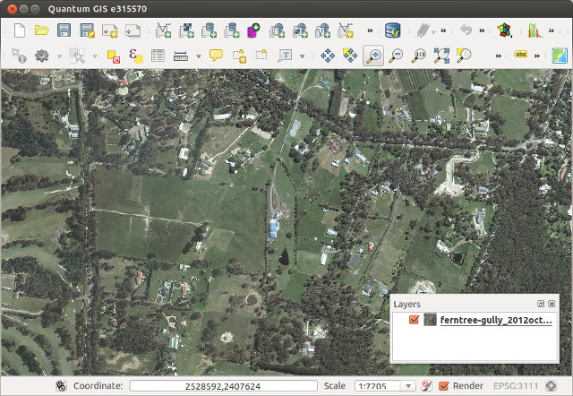
First up is the ability to tweak the saturation of a layer. Saturation basically refers to the intensity of a colour, with low saturation resulting in a more washed out, greyer image, and high saturation resulting in more vibrant and colourful images. Here’s a WMS layer showing an aerial view of Victoria at its driest, least appealing and most bushfire ready state:

Original layer

Raster layer before saturation controls…

Let’s tweak the saturation a bit to see if we can make it more appealing. In the Style tab under raster layer properties, you’ll see a new “Saturation and hue” section. For this layer I’ll bump the saturation up from its default value of zero:
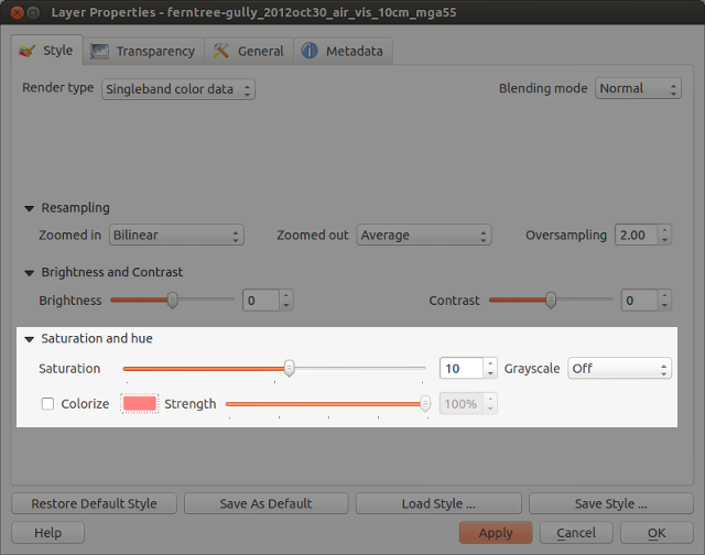
Saturation settings

Saturation settings

Which results in something like this:

Resultant layer!

… and after increasing the saturation!

Ah, much better. This actually looks like somewhere I’d like to live. A bit over-the-top perhaps, but it IS handy to make quick adjustments to raster colours in this way without the need for any external programs.

How about turning an image grayscale? I regularly have to do this with street directory basemaps, and until now couldn’t find a satisfactory way of doing this in QGIS. Previously I’ve tried using various command line utilities, but never found one which could turn an image grayscale without losing embedded georeferencing tags. (I did manage to achieve it once in QGIS using a convoluted approach involving the raster calculator and some other steps I’ve thankfully forgotten.)

But now, you can forget about all that frustration and quickly turn a raster grayscale by using a control right inside the layer properties! You even get a choice of desaturation methods, including lightness, luminosity or average. Best part about this is you can then right click on the layer to save the altered version out to a full-resolution georeferenced image.

grayscale

Street map in grayscale… woohoo!

Lastly, there’s the colourise option. As expected, this behaves in a similar fashion to the colourise tools in GIMP and Photoshop. It allows you to tint a layer to a specified colour. Let’s take a WMS layer of Melbourne, tweak the brightness and contrast, and colourise it blue…

colorize_settings

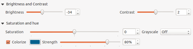
Tweaking the colourize settings

… and the end result wouldn’t be out of place in Ingress or some mid 90′s conspiracy flick!

colorized

Colorized WMS layer

These changes are just a tiny, tiny part of what QGIS 2.0 has to offer. It’s looking to be a sensational release and I can’t wait for final version in June!

  • Page 1 of 1 ( 3 posts )
  • grayscale

Back to Top

Sustaining Members