


Coming soon in QGIS 2.0 – blend modes for layers
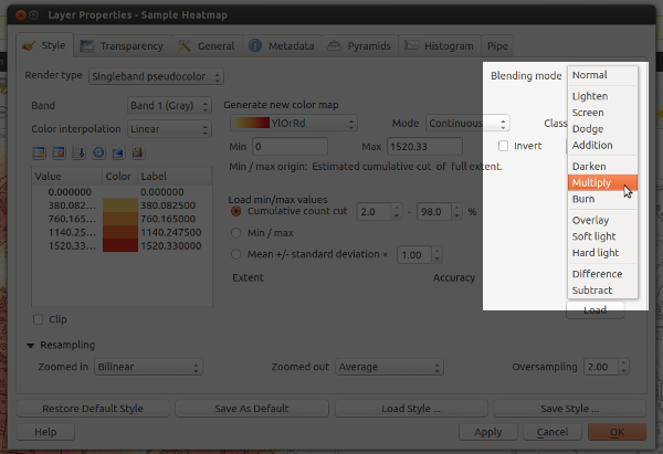
I’ve just pushed my first major contribution to QGIS — the ability to set the compositing mode for a layer. Compositing is a technique widely used by cartographers and graphic artists to fine tune how layers are blended together, and it allows for some spectacular results! Until now, the only way to get these effects would be to export a map to a separate editor like Photoshop or GIMP and playing with the layer modes there. But with QGIS 2.0, blending can be controlled via a simple drop down menu for both raster and vector layers:
Woohoo… blending modes in QGIS!
So what makes this so great? Well, in previous versions the only option for compositing layers in QGIS was by setting a layer’s opacity. This approach has some limitations. Let’s say you want to overlay two raster layers – a basemap layer and a heatmap. You could place the heatmap layer over the basemap and set its transparency at 50% so that the basemap shows through, but then both the basemap and heatmap layers will be partially faded out:

Overlaying layers by altering transparency – see how both the heatmap and basemap are partially faded
With QGIS 2.0, you’ll be able to use the “multiply” blend mode to overlay these layers. This means both the heatmap and underlying basemap will be shown with full intensity:

Overlaying rasters with “multiply” blend mode – both layers are shown in their full intensity!
Ok… perhaps that’s not the prettiest example, but it is something I have to do a lot in my job. Until now it’s only been possible by exporting the map to GIMP or Photoshop/Illustrator and setting the blend modes there. That’s always fiddly, time consuming and generally frustrating all round. Much easier to just change it with a dropdown within QGIS itself.
Let’s move on to some more impressive example. First, here’s a terrain map using a combination of a landcover thematic with ‘overlay’ blending and a hillshade set to ‘multiply‘ blending. The graticule lines are also set to overlay – note how they aren’t visible over the lighter water areas and brighter hillshade regions.

Hill shading with advanced compositing… Hal Shelton would be proud!
Ok, that’s nice, but let’s try something a little different. Using a combination of darken, screen, hard light and overlay:

Live Stamen-style watercolors within QGIS – sweet!
These a just some rough examples — I’m keen to see what results others get using this feature (feel free to post links to your work in the comments).
One final note: I’m really appreciative of the efforts of the QGIS dev team, who’ve been really supportive and helpful while I find my way around the QGIS codebase. A big thank you has to go to Nathan Woodrow for taking the time to review this commit and answering all the questions I’ve had!
