Last week, I had the pleasure to meet some of the people behind the OGC Moving Features Standard Working group at the IEEE Mobile Data Management Conference (MDM2024). While chatting about the Moving Features (MF) support in MovingPandas, I realized that, after the MF-JSON update & tutorial with official sample post, we never published a complete tutorial on working with MF-JSON encoded data in MovingPandas.
The current MovingPandas development version (to be release as version 0.19) supports:
Reading MF-JSON MovingPoint (single trajectory features and trajectory collections)
Writing MovingPandas Trajectories and TrajectoryCollections to MF-JSON MovingPoint
This means that we can now go full circle: reading — writing — reading.
Reading MF-JSON
Both MF-JSON MovingPoint encoding and Trajectory encoding can be read using the MovingPandas function read_mf_json(). The complete Jupyter notebook for this tutorial is available in the project repo.
import json
with open('mf5.json', 'w') as json_file:
    json.dump(mf_json, json_file, indent=4)
tc = mpd.read_mf_json('mf5.json', traj_id_property='trajectory_id' )
Conclusion
The implemented MF-JSON support covers the basic usage of the encodings. There are some fine details in the standard, such as the distinction of time-varying attribute with linear versus step-wise interpolation, which MovingPandas currently does not support.
If you are working with movement data, I would appreciate if you can give the improved MF-JSON support a spin and report back with your experiences.
With the release of GeoPandas 1.0 this month, we’ve been finally able to close a long-standing issue in MovingPandas by adding support for the explore function which provides interactive maps using Folium and Leaflet.
Explore() will be available in the upcoming MovingPandas 0.19 release if your Python environment includes GeoPandas >= 1.0 and Folium. Of course, if you are curious, you can already test this new functionality using the current development version.
This enables users to access interactive trajectory plots even in environments where it is not possible to install geoviews / hvplot (the previously only option for interactive plots in MovingPandas).
I really like the legend for the speed color gradient, but unfortunately, the legend labels are not readable on the dark background map since they lack the semi-transparent white background that has been applied to the scale bar and credits label.
Speaking of reading / interpreting the plots …
You’ve probably seen the claims that AI will help make tools more accessible. Clearly AI can interpret and describe photos, but can it also interpret MovingPandas plots?
ChatGPT 4o interpretations of MovingPandas plots
Not bad.
And what happens if we ask it to interpret the animated GIF from the beginning of the blog post?
So it looks like ChatGPT extracts 12 frames and analyzes them to answer our question:
Its guesses are not completely off but it made up the facts such as that the view shows “how traffic speeds vary over time”.
The problem remains that models such as ChatGPT rather make up interpretations than concede when they do not have enough information to make a reliable statement.
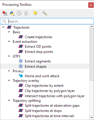
Today marks the 2.1 release of Trajectools for QGIS. This release adds multiple new algorithms and improvements. Since some improvements involve upstream MovingPandas functionality, I recommend to also update MovingPandas while you’re at it.
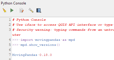
If you have installed QGIS and MovingPandas via conda / mamba, you can simply:
Afterwards, you can check that the library was correctly installed using:
import movingpandas as mpd
mpd.show_versions()
Trajectools 2.1
The new Trajectools algorithms are:
Trajectory overlay — Intersect trajectories with polygon layer
Privacy — Home work attack (requires scikit-mobility)
This algorithm determines how easy it is to identify an individual in a dataset. In a home and work attack the adversary knows the coordinates of the two locations most frequently visited by an individual.
Furthermore, we have fixed issue with previously ignored minimum trajectory length settings.
Scikit-mobility and gtfs_functions are optional dependencies. You do not need to install them, if you do not want to use the corresponding algorithms. In any case, they can be installed using mamba and pip:
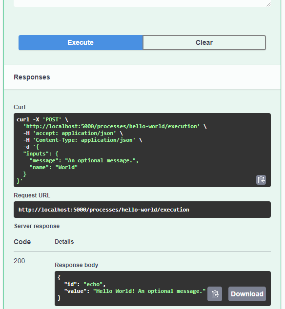
Today’s post is a quick introduction to pygeoapi, a Python server implementation of the OGC API suite of standards. OGC API provides many different standards but I’m particularly interested in OGC API – Processes which standardizes geospatial data processing functionality. pygeoapi implements this standard by providing a plugin architecture, thereby allowing developers to implement custom processing workflows in Python.
I’ll provide instructions for setting up and running pygeoapi on Windows using Powershell. The official docs show how to do this on Linux systems. The pygeoapi homepage prominently features instructions for installing the dev version. For first experiments, however, I’d recommend using a release version instead. So that’s what we’ll do here.
As a first step, lets install the latest release (0.16.1 at the time of writing) from conda-forge:
Next, we’ll clone the GitHub repo to get the example config and datasets:
cd C:\Users\anita\Documents\GitHub\
git clone https://github.com/geopython/pygeoapi.git
cd pygeoapi\
To finish the setup, we need some configurations:
cp pygeoapi-config.yml example-config.yml # There is a known issue in pygeoapi 0.16.1: https://github.com/geopython/pygeoapi/issues/1597 # To fix it, edit the example-config.yml: uncomment the TinyDB option in the server settings (lines 51-54)
As you can see, writing JSON content for curl is a pain. Luckily, pyopenapi comes with a nice web GUI, including Swagger UI for playing with all the functionality, including the hello-world process:
It’s not really a geospatial hello-world example, but it’s a first step.
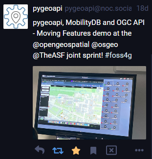
Finally, I wan’t to leave you with a teaser since there are more interesting things going on in this space, including work on OGC API – Moving Features as shared by the pygeoapi team recently:
In this post, Jakub Nowosad introduces our book “Geocomputation with Python”, also known as geocompy. It is an open-source book on geographic data analysis with Python, written by Michael Dorman, Jakub Nowosad, Robin Lovelace, and me with contributions from others. You can find it online at https://py.geocompx.org/
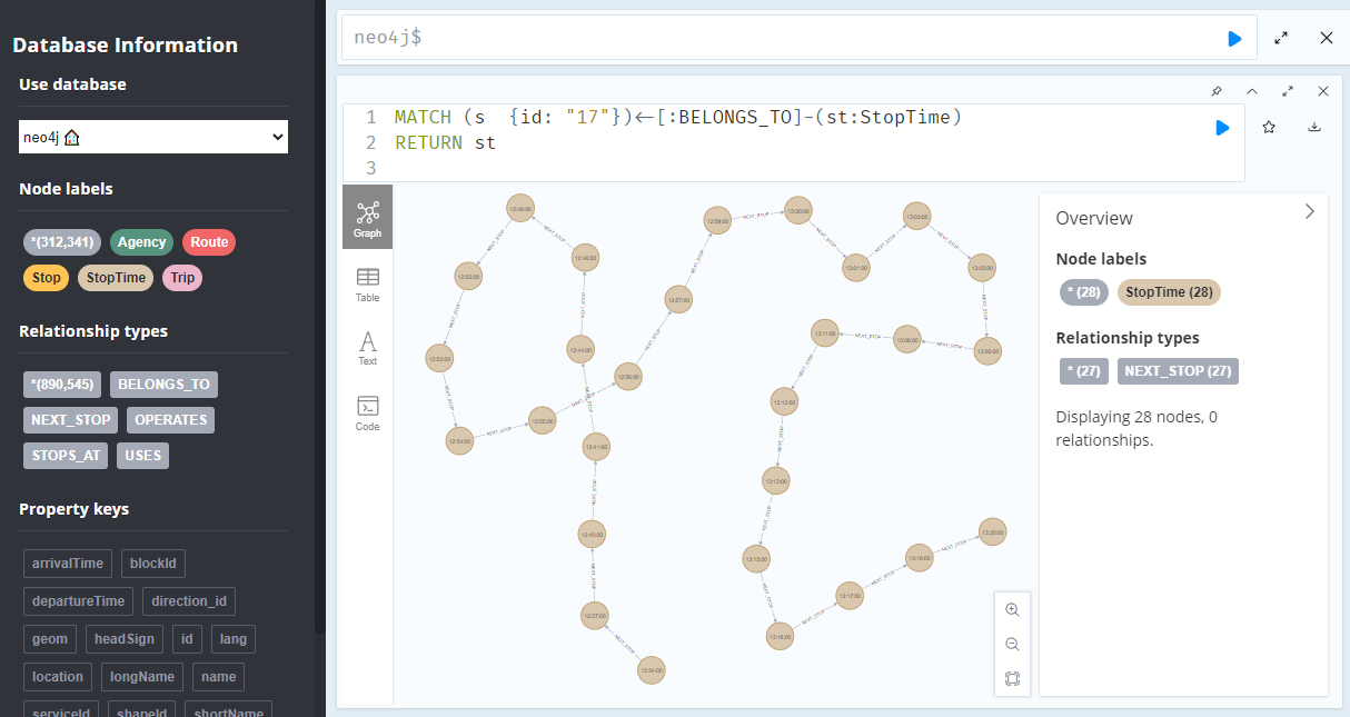
A prime example, are the relationships between GTFS StopTime and Trip nodes. For example, this is the Cypher query to get all StopTime nodes of Trip 17:
MATCH
    (t:Trip  {id: "17"})
    <-[:BELONGS_TO]-
    (st:StopTime)
RETURN st
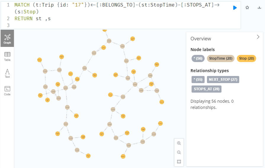
To get the stop locations, we also need to get the stop nodes:
MATCH
    (t:Trip {id: "17"})
    <-[:BELONGS_TO]-
    (st:StopTime)
    -[:STOPS_AT]->
    (s:Stop)
RETURN st ,s
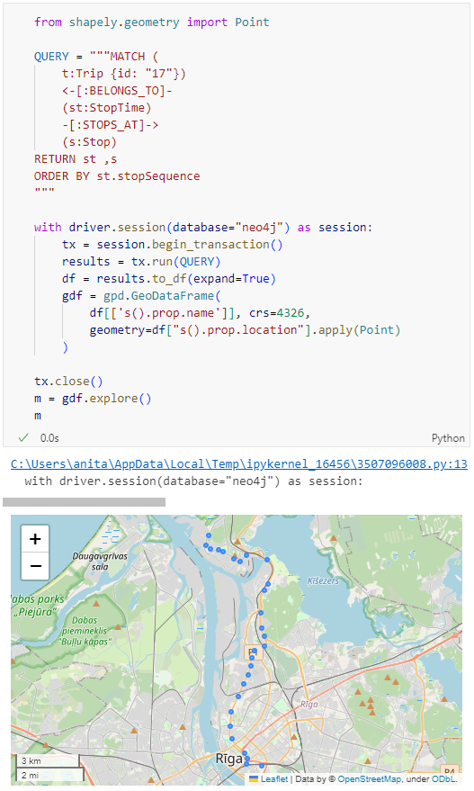
Adapting our code from the previous post, we can plot the stops:
from shapely.geometry import Point

QUERY = """MATCH (
    t:Trip {id: "17"})
    <-[:BELONGS_TO]-
    (st:StopTime)
    -[:STOPS_AT]->
    (s:Stop)
RETURN st ,s
ORDER BY st.stopSequence
"""

with driver.session(database="neo4j") as session:
    tx = session.begin_transaction()
    results = tx.run(QUERY)
    df = results.to_df(expand=True)
    gdf = gpd.GeoDataFrame(
        df[['s().prop.name']], crs=4326,
        geometry=df["s().prop.location"].apply(Point)
    )

tx.close()
m = gdf.explore()
m
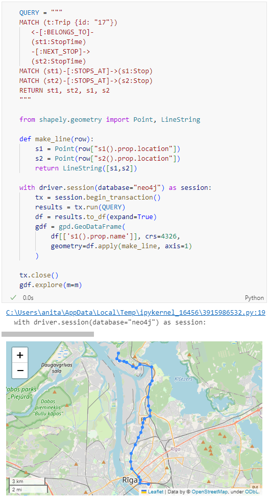
Ordering by stop sequence is actually completely optional. Technically, we could use the sorted GeoDataFrame, and aggregate all the points into a linestring to plot the route. But I want to try something different: we’ll use the NEXT_STOP relationships to get a DataFrame of the start and end stops for each segment:
QUERY = """
MATCH (t:Trip {id: "17"})
   <-[:BELONGS_TO]-
   (st1:StopTime)
   -[:NEXT_STOP]->
   (st2:StopTime)
MATCH (st1)-[:STOPS_AT]->(s1:Stop)
MATCH (st2)-[:STOPS_AT]->(s2:Stop)
RETURN st1, st2, s1, s2
"""

from shapely.geometry import Point, LineString

def make_line(row):
    s1 = Point(row["s1().prop.location"])
    s2 = Point(row["s2().prop.location"])
    return LineString([s1,s2])

with driver.session(database="neo4j") as session:
    tx = session.begin_transaction()
    results = tx.run(QUERY)
    df = results.to_df(expand=True)
    gdf = gpd.GeoDataFrame(
        df[['s1().prop.name']], crs=4326,
        geometry=df.apply(make_line, axis=1)
    )

tx.close()
gdf.explore(m=m)
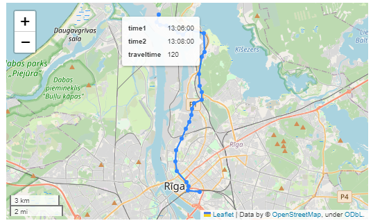
Finally, we can also use Cypher to calculate the travel time between two stops:
MATCH (t:Trip {id: "17"})
   <-[:BELONGS_TO]-
   (st1:StopTime)
   -[:NEXT_STOP]->
   (st2:StopTime)
MATCH (st1)-[:STOPS_AT]->(s1:Stop)
MATCH (st2)-[:STOPS_AT]->(s2:Stop)
RETURN st1.departureTime AS time1,
   st2.arrivalTime AS time2,
   s1.location AS geom1,
   s2.location AS geom2,
   duration.inSeconds(
      time(st1.departureTime),
      time(st2.arrivalTime)
   ).seconds AS traveltime
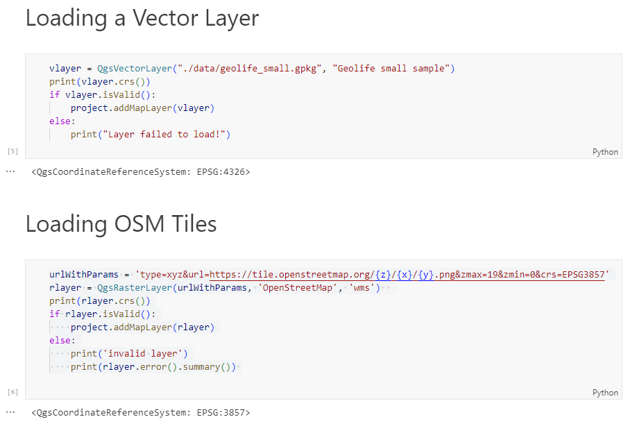
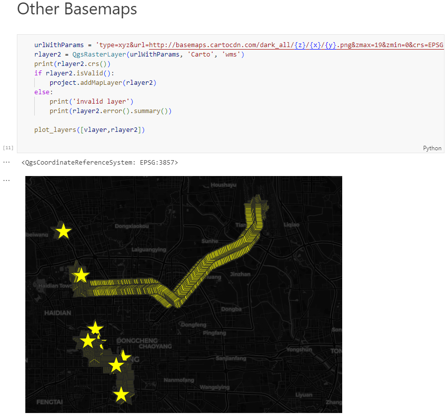
Today, we’ll take the next step and add basemaps to our maps. This is trickier than I would have expected. In particular, I was fighting with “invalid” OSM tile layers until I realized that my QGIS application instance somehow lacked the “WMS” provider.
In addition, getting basemaps to work also means that we have to take care of layer and project CRSes and on-the-fly reprojections. So let’s get to work:
from IPython.display import Image
from PyQt5.QtGui import QColor
from PyQt5.QtWidgets import QApplication
from qgis.core import QgsApplication, QgsVectorLayer, QgsProject, QgsRasterLayer, \
    QgsCoordinateReferenceSystem, QgsProviderRegistry, QgsSimpleMarkerSymbolLayerBase
from qgis.gui import QgsMapCanvas
app = QApplication([])
qgs = QgsApplication([], False)
qgs.setPrefixPath(r"C:\temp", True)  # setting a prefix path should enable the WMS provider
qgs.initQgis()
canvas = QgsMapCanvas()
project = QgsProject.instance()
map_crs = QgsCoordinateReferenceSystem('EPSG:3857')
canvas.setDestinationCrs(map_crs)
print("providers: ", QgsProviderRegistry.instance().providerList())
To add an OSM basemap, we use the xyz tiles option of the WMS provider:
This summer, I had the honor to — once again — speak at the OpenGeoHub Summer School. This time, I wanted to challenge the students and myself by not just doing MovingPandas but by introducing both MovingPandas and DVC for Mobility Data Science.
I’ve previously written about DVC and how it may be used to track geoprocessing workflows with QGIS & DVC. In my summer school session, we go into details on how to use DVC to keep track of MovingPandas movement data analytics workflow.
written together with my fellow “Geocomputation with Python” co-authors Robin Lovelace, Michael Dorman, and Jakub Nowosad.
In this blog post, we talk about our experience teaching R and Python for geocomputation. The context of this blog post is the OpenGeoHub Summer School 2023 which has courses on R, Python and Julia. The focus of the blog post is on geographic vector data, meaning points, lines, polygons (and their ‘multi’ variants) and the attributes associated with them. We plan to cover raster data in a future post.
Das QGIS swiss locator Plugin erleichtert in der Schweiz vielen Anwendern das Leben dadurch, dass es die umfangreichen Geodaten von swisstopo und opendata.swiss zugänglich macht. Darunter ein breites Angebot an GIS Layern, aber auch Objektinformationen und eine Ortsnamensuche.
Dank eines Förderprojektes der Anwendergruppe Schweiz durfte OPENGIS.ch ihr Plugin um eine zusätzliche Funktionalität erweitern. Dieses Mal mit der Integration von WMTS als Datenquelle, eine ziemlich coole Sache. Doch was ist eigentlich der Unterschied zwischen WMS und WMTS?
WMS vs. WMTS
Zuerst zu den Gemeinsamkeiten: Beide Protokolle – WMS und WMTS – sind dazu geeignet, Kartenbilder von einem Server zu einem Client zu übertragen. Dabei werden Rasterdaten, also Pixel, übertragen. Ausserdem werden dabei gerenderte Bilder übertragen, also keine Rohdaten. Diese sind dadurch für die Präsentation geeignet, im Browser, im Desktop GIS oder für einen PDF Export.
Der Unterschied liegt im T. Das T steht für “Tiled”, oder auf Deutsch “gekachelt”. Bei einem WMS (ohne Kachelung) können beliebige Bildausschnitte angefragt werden. Bei einem WMTS werden die Daten in einem genau vordefinierten Gitternetz — als Kacheln — ausgeliefert.
Der Hauptvorteil von WMTS liegt in dieser Standardisierung auf einem Gitternetz. Dadurch können diese Kacheln zwischengespeichert (also gecached) werden. Dies kann auf dem Server geschehen, der bereits alle Kacheln vorberechnen kann und bei einer Anfrage direkt eine Datei zurückschicken kann, ohne ein Bild neu berechnen zu müssen. Es erlaubt aber auch ein clientseitiges Caching, das heisst der Browser – oder im Fall von Swiss Locator QGIS – kann jede Kachel einfach wiederverwenden, ganz ohne den Server nochmals zu kontaktieren. Dadurch kann die Reaktionszeit enorm gesteigert werden und flott mit Applikationen gearbeitet werden.
Warum also noch WMS verwenden?
Auch das hat natürlich seine Vorteile. Der WMS kann optimierte Bilder ausliefern für genau eine Abfrage. Er kann Beispielsweise alle Beschriftungen optimal platzieren, so dass diese nicht am Kartenrand abgeschnitten sind, bei Kacheln mit den vielen Rändern ist das schwieriger. Ein WMS kann auch verschiedene abgefragte Layer mit Effekten kombinieren, Blending-Modi sind eine mächtige Möglichkeit, um visuell ansprechende Karten zu erzeugen. Weiter kann ein WMS auch in beliebigen Auflösungen arbeiten (DPI), was dazu führt, dass Schriften und Symbole auf jedem Display in einer angenehmen Grösse angezeigt werden, währenddem das Kartenbild selber scharf bleibt. Dasselbe gilt natürlich auch für einen PDF Export.
Ein WMS hat zudem auch die Eigenschaft, dass im Normalfall kein Caching geschieht. Bei einer dahinterliegenden Datenbank wird immer der aktuelle Datenstand ausgeliefert. Das kann auch gewünscht sein, zum Beispiel soll nicht zufälligerweise noch der AV-Datensatz von gestern ausgeliefert werden.
Dies bedingt jedoch immer, dass der Server das auch entsprechend umsetzt. Bei den von swisstopo via map.geo.admin.ch publizierten Karten ist die Schriftgrösse auch bei WMS fix ins Kartenbild integriert und kann nicht vom Server noch angepasst werden.
Im Falle von QGIS Swiss Locator geht es oft darum, Hintergrundkarten zu laden, z.B. Orthofotos oder Landeskarten zur Orientierung. Daneben natürlich oft auch auch weitere Daten, von eher statischer Natur. In diesem Szenario kommen die Vorteile von WMTS bestmöglich zum tragen. Und deshalb möchten wir der QGIS Anwendergruppe Schweiz im Namen von allen Schweizer QGIS Anwender dafür danken, diese Umsetzung ermöglicht zu haben!
Der QGIS Swiss Locator ist das schweizer Taschenmesser von QGIS. Fehlt dir ein Werkzeug, das du gerne integrieren würdest? Schreib uns einen Kommentar!
Kaggle’s “Taxi Trajectory Data from ECML/PKDD 15: Taxi Trip Time Prediction (II) Competition” is one of the most used mobility / vehicle trajectory datasets in computer science. However, in contrast to other similar datasets, Kaggle’s taxi trajectories are provided in a format that is not readily usable in MovingPandas since the spatiotemporal information is provided as:
TIMESTAMP: (integer) Unix Timestamp (in seconds). It identifies the trip’s start;
POLYLINE: (String): It contains a list of GPS coordinates (i.e. WGS84 format) mapped as a string. The beginning and the end of the string are identified with brackets (i.e. [ and ], respectively). Each pair of coordinates is also identified by the same brackets as [LONGITUDE, LATITUDE]. This list contains one pair of coordinates for each 15 seconds of trip. The last list item corresponds to the trip’s destination while the first one represents its start;
Therefore, we need to create a DataFrame with one point + timestamp per row before we can use MovingPandas to create Trajectories and analyze them.
But first things first. Let’s download the dataset:
import datetime
import pandas as pd
import geopandas as gpd
import movingpandas as mpd
import opendatasets as od
from os.path import exists
from shapely.geometry import Point

input_file_path = 'taxi-trajectory/train.csv'

def get_porto_taxi_from_kaggle():
    if not exists(input_file_path):
        od.download("https://www.kaggle.com/datasets/crailtap/taxi-trajectory")

get_porto_taxi_from_kaggle()
df = pd.read_csv(input_file_path, nrows=10, usecols=['TRIP_ID', 'TAXI_ID', 'TIMESTAMP', 'MISSING_DATA', 'POLYLINE'])
df.POLYLINE = df.POLYLINE.apply(eval)  # string to list
df
And now for the remodelling:
def unixtime_to_datetime(unix_time):
    return datetime.datetime.fromtimestamp(unix_time)

def compute_datetime(row):
    unix_time = row['TIMESTAMP']
    offset = row['running_number'] * datetime.timedelta(seconds=15)
    return unixtime_to_datetime(unix_time) + offset

def create_point(xy):
    try:
        return Point(xy)
    except TypeError:  # when there are nan values in the input data
        return None

new_df = df.explode('POLYLINE')
new_df['geometry'] = new_df['POLYLINE'].apply(create_point)
new_df['running_number'] = new_df.groupby('TRIP_ID').cumcount()
new_df['datetime'] = new_df.apply(compute_datetime, axis=1)
new_df.drop(columns=['POLYLINE', 'TIMESTAMP', 'running_number'], inplace=True)
new_df
And that’s it. Now we can create the trajectories:
That’s it. Now our MovingPandas.TrajectoryCollection is ready for further analysis.
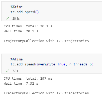
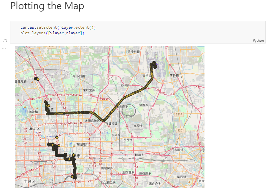
By the way, the plot above illustrates a new feature in the recent MovingPandas 0.16 release which, among other features, introduced plots with arrow markers that show the movement direction. Other new features include a completely new custom distance, speed, and acceleration unit support. This means that, for example, instead of always getting speed in meters per second, you can now specify your desired output units, including km/h, mph, or nm/h (knots).
Similarly, we’ve seen posts on using PyQGIS in Jupyter notebooks. However, I find the setup with *.bat files rather tricky.
This post presents a way to set up a conda environment with QGIS that is ready to be used in Jupyter notebooks.
The first steps are to create a new environment and install QGIS. I use mamba for the installation step because it is faster than conda but you can use conda as well:
If we now try to import the qgis module in Python, we get an error:
(qgis) PS C:\Users\anita> python
Python 3.9.15 | packaged by conda-forge | (main, Nov 22 2022, 08:41:22) [MSC v.1929 64 bit (AMD64)] on win32
Type "help", "copyright", "credits" or "license" for more information.
>>> import qgis
Traceback (most recent call last):
  File "<stdin>", line 1, in <module>
ModuleNotFoundError: No module named 'qgis'
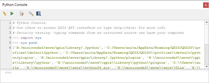
To fix this error, we need to get the paths from the Python console inside QGIS:
Amongst all the processing algorithms already available in QGIS, sometimes the one thing you need is missing.
This happened not a long time ago, when we were asked to find a way to continuously visualise traffic on the Swiss motorway network (polylines) using frequently measured traffic volumes from discrete measurement stations (points) alongside the motorways. In order to keep working with the existing polylines, and be able to attribute more than one value of traffic to each feature, we chose to work with the M-values. M-values are a per-vertex attribute like X, Y or Z coordinates. They contain a measure value, which typically represents time or distance. But they can hold any numeric value.
In our example, traffic measurement values are provided on a separate point layer and should be attributed to the M-value of the nearest vertex of the motorway polylines. Of course, the motorway features should be of type LineStringM in order to hold an M-value. We then should interpolate the M-values for each feature over all vertices in order to get continuous values along the line (i.e. a value on every vertex). This last part is not yet existing as a processing algorithm in QGIS.
This article describes how to write a feature-based processing algorithm based on the example of M-value interpolation along LineStrings.
Feature-based processing algorithm
The pyqgis class QgsProcessingFeatureBasedAlgorithmis described as follows: “An abstract QgsProcessingAlgorithm base class for processing algorithms which operates “feature-by-feature”.
Feature based algorithms are algorithms which operate on individual features in isolation. These are algorithms where one feature is output for each input feature, and the output feature result for each input feature is not dependent on any other features present in the source. […]
Using QgsProcessingFeatureBasedAlgorithm as the base class for feature based algorithms allows shortcutting much of the common algorithm code for handling iterating over sources and pushing features to output sinks. It also allows the algorithm execution to be optimised in future (for instance allowing automatic multi-thread processing of the algorithm, or use of the algorithm in “chains”, avoiding the need for temporary outputs in multi-step models).”
In other words, when connecting several processing algorithms one after the other – e.g. with the graphical modeller – these feature-based processing algorithms can easily be used to fill in the missing bits.
Compared to the standard QgsProcessingAlgorithm the feature-based class implicitly iterates over each feature when executing and avoids writing wordy loops explicitly fetching and applying the algorithm to each feature.
Just like for the QgsProcessingAlgorithm (a template can be found in the Processing Toolbar > Scripts > Create New Script from Template), there is quite some boilerplate code in the QgsProcessingFeatureBasedAlgorithm. The first part is identical to any QgsProcessingAlgorithm.
After the description of the algorithm (name, group, short help, etc.), the algorithm is initialised with def initAlgorithm, defining input and output.
While in a regular processing algorithm now follows def processAlgorithm(self, parameters, context, feedback), in a feature-based algorithm we use def processFeature(self, feature, context, feedback). This implies applying the code in this block to each feature of the input layer.
! Do not use def processAlgorithm in the same script, otherwise your feature-based processing algorithm will not work !
Interpolating M-values
This actual processing part can be copied and added almost 1:1 from any other independent python script, there is little specific syntax to make it a processing algorithm. Only the first line below really.
In our M-value example:
    def processFeature(self, feature, context, feedback):

        try:
            geom = feature.geometry()
            line = geom.constGet()
            vertex_iterator = QgsVertexIterator(line)
            vertex_m = []

            # Iterate over all vertices of the feature and extract M-value

            while vertex_iterator.hasNext():
                vertex = vertex_iterator.next()
                vertex_m.append(vertex.m())

            # Extract length of segments between vertices

            vertices_indices = range(len(vertex_m))
            length_segments = [sqrt(QgsPointXY(line[i]).sqrDist(QgsPointXY(line[j])))
                for i,j in itertools.combinations(vertices_indices, 2)
                if (j - i) == 1]

            # Get all non-zero M-value indices as an array, where interpolations
              have to start

            vertex_si = np.nonzero(vertex_m)[0]

            m_interpolated = np.copy(vertex_m)

            # Interpolate between all non-zero M-values - take segment lengths between
              vertices into account

            for i in range(len(vertex_si)-1):
                first_nonzero = vertex_m[vertex_si[i]]
                next_nonzero = vertex_m[vertex_si[i+1]]
                accum_dist = itertools.accumulate(length_segments[vertex_si[i]
                                                                  :vertex_si[i+1]])
                sum_seg = sum(length_segments[vertex_si[i]:vertex_si[i+1]])
                interp_m = [round(((dist/sum_seg)*(next_nonzero-first_nonzero)) +
                            first_nonzero,0) for dist in accum_dist]
                m_interpolated[vertex_si[i]:vertex_si[i+1]] = interp_m

            # Copy feature geometry and set interpolated M-values,
              attribute new geometry to feature

            geom_new = QgsLineString(geom.constGet())

            for j in range(len(m_interpolated)):
                geom_new.setMAt(j,m_interpolated[j])

            attrs = feature.attributes()

            feat_new = QgsFeature()
            feat_new.setAttributes(attrs)
            feat_new.setGeometry(geom_new)

        except Exception:
            s = traceback.format_exc()
            feedback.pushInfo(s)
            self.num_bad += 1
            return []

        return [feat_new]
In our example, we get the feature’s geometry, iterate over all its vertices (using the QgsVertexIterator) and extract the M-values as an array. This allows us to assign interpolated values where we don’t have M-values available. Such missing values are initially set to a value of 0 (zero).
We also extract the length of the segments between the vertices. By gathering the indices of the non-zero M-values of the array, we can then interpolate between all non-zero M-values, considering the length that separates the zero-value vertex from the first and the next non-zero vertex.
For the iterations over the vertices to extract the length of the segments between them as well as for the actual interpolation between all non-zero M-value vertices we use the library itertools. This library provides different iterator building blocks that come in quite handy for our use case.
Finally, we create a new geometry by copying the one which is being processed and setting the M-values to the newly interpolated ones.
And that’s all there is really!
Alternatively, the interpolation can be made using the interp function of the numpy library. Some parts where our manual method gave no values, interp.numpy seemed more capable of interpolating. It remains to be judged which version has the more realistic results.
Styling the result via M-values
The last step is styling our output layer in QGIS, based on the M-values (our traffic M-values are categorised from 1 [a lot of traffic -> dark red] to 6 [no traffic -> light green]). This can be achieved by using a Single Symbol symbology with a Marker Line type “on every vertex”. As a marker type, we use a simple round point. Stroke style is “no pen” and Stroke fill is based on an expression:
with_variable(

'm_value', m(point_n($geometry, @geometry_point_num)),

	CASE WHEN @m_value = 6
		THEN color_rgb(140, 255, 159)

		WHEN @m_value = 5
			THEN color_rgb(244, 252, 0)

		WHEN @m_value = 4
			THEN color_rgb(252, 176, 0)

		WHEN @m_value = 3
			THEN color_rgb(252, 134, 0)

		WHEN @m_value = 2
			THEN color_rgb(252, 29, 0)

		WHEN @m_value = 1
			THEN color_rgb(140, 255, 159)

		ELSE
			color_hsla(0,100,100,0)

	END
)
And voilà! Wherever we have enough measurements on one line feature, we get our motorway network continuously coloured according to the measured traffic volume.
Motorway network – the different lanes are regrouped for each direction. M-values of the vertices closest to measurement points are attributed the measured traffic volume. The vertices are coloured accordingly.Trafic on motorway network after “manual” M-value interpolation. Trafic on motorway network after M-value interpolation using numpy.
One disclaimer at the end: We get this seemingly continuous styling only because of the combination of our “complex” polylines (containing many vertices) and the zoomed-out view of the motorway network. Because really, we’re styling many points and not directly the line itself. But in our case, this is working very well.
If you’d like to make your custom processing algorithm available through the processing toolbox in your QGIS, just put your script in the folder containing the files related to your user profile:
profiles > default > processing > scripts
You can directly access this folder by clicking on Settings > User Profiles > Open Active Profile Folder in the QGIS menu.
That way, it’s also available for integration in the graphical modeller.
Extract of the GraphicalModeler sequence. “Interpolate M-values neg” refers to the custom feature-based processing algorithm described above.
You can download the above-mentioned processing scripts (with numpy and without numpy) here.
New functions to add a timedelta column and get the trajectory sampling interval #233
As always, all tutorials are available from the movingpandas-examples repository and on MyBinder:
The new distance measures are covered in tutorial #11:
Computing distances between trajectories, as illustrated in tutorial #11Computing distances between a trajectory and other geometry objects, as illustrated in tutorial #11
But don’t miss the great features covered by the other notebooks, such as outlier cleaning and smoothing:
Trajectory cleaning and smoothing, as illustrated in tutorial #10
If you have questions about using MovingPandas or just want to discuss new ideas, you’re welcome to join our discussion forum.
Speed and direction column names can now be customized
If you have questions about using MovingPandas or just want to discuss new ideas, you’re welcome to join our recently opened discussion forum.
As always, all tutorials are available from the movingpandas-examples repository and on MyBinder:
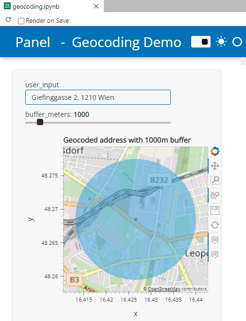
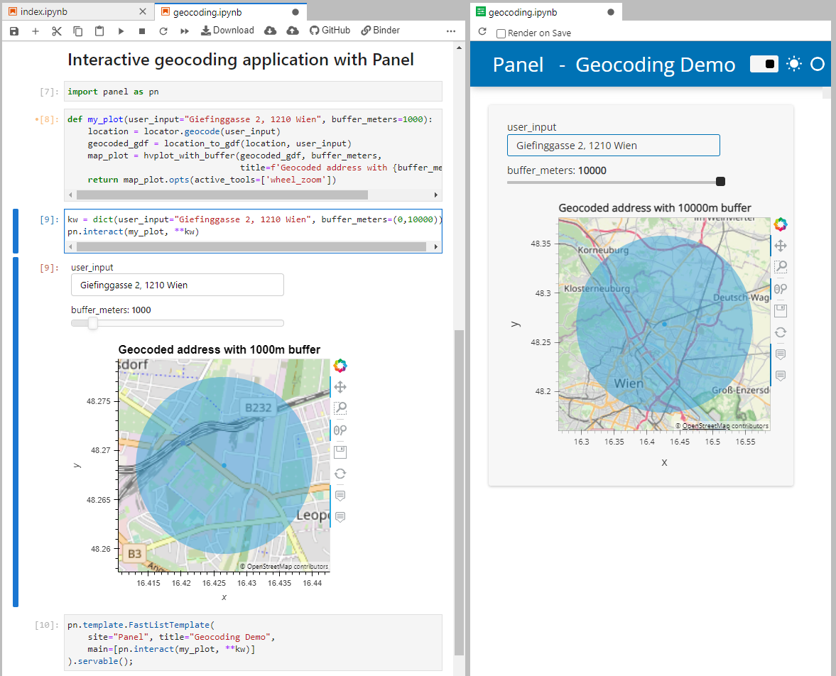
Besides others examples, the movingpandas-examples repo contains the following tech demo: an interactive app built with Panel that demonstrates different MovingPandas stop detection parameters
To start the app, open the stopdetection-app.ipynb notebook and press the green Panel button in the Jupyter Lab toolbar:
Here’s a quick preview of the resulting app in action:
To create this app, I defined a single function called my_plot which takes the address and desired buffer size as input parameters. Using Panel’s interact and servable methods, I’m then turning this function into the interactive app you’ve seen above:
To open the Panel preview, press the green Panel button in the Jupyter Lab toolbar:
I really enjoy building spatial data exploration apps this way, because I can start off with a Jupyter notebook and – once I’m happy with the functionality – turn it into a pretty app that provides a user-friendly exterior and hides the underlying complexity that might scare away stakeholders.
Give it a try and share your own adventures. I’d love to see what you come up with.
Many of you certainly have already heard of and/or even used Leafmap by Qiusheng Wu.
Leafmap is a Python package for interactive spatial analysis with minimal coding in Jupyter environments. It provides interactive maps based on folium and ipyleaflet, spatial analysis functions using WhiteboxTools and whiteboxgui, and additional GUI elements based on ipywidgets.
This way, Leafmap achieves a look and feel that is reminiscent of a desktop GIS:
Recently, Qiusheng has started an additional project: the geospatial meta package which brings together a variety of different Python packages for geospatial analysis. As such, the main goals of geospatial are to make it easier to discover and use the diverse packages that make up the spatial Python ecosystem.
Besides the usual suspects, such as GeoPandas and of course Leafmap, one of the packages included in geospatial is MovingPandas. Thanks, Qiusheng!
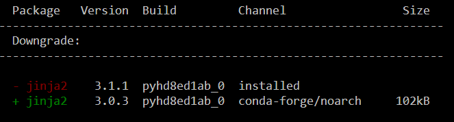
I’ve tested the mamba install today and am very happy with how this worked out. There is just one small hiccup currently, which is related to an upstream jinja2 issue. After installing geospatial, I therefore downgraded jinja:
Of course, I had to try Leafmap and MovingPandas in action together. Therefore, I fired up one of the MovingPandas example notebook (here the example on clipping trajectories using polygons). As you can see, the integration is pretty smooth since Leafmap already support drawing GeoPandas GeoDataFrames and MovingPandas can convert trajectories to GeoDataFrames (both lines and points):
Clipped trajectory segments as linestrings in LeafmapLeafmap includes an attribute table view that can be activated on user request to show, e.g. trajectory informationAnd, of course, we can also map the original trajectory points
Geospatial also includes the new dask-geopandas library which I’m very much looking forward to trying out next.
MovingPandas 0.9rc3 has just been released, including important fixes for local coordinate support. Sports analytics is just one example of movement data analysis that uses local rather than geographic coordinates.
Many movement data sources – such as soccer players’ movements extracted from video footage – use local reference systems. This means that x and y represent positions within an arbitrary frame, such as a soccer field.
Since Geopandas and GeoViews support handling and plotting local coordinates just fine, there is nothing stopping us from applying all MovingPandas functionality to this data. For example, to visualize the movement speed of players:
Of course, we can also plot other trajectory attributes, such as the team affiliation.
But one particularly useful feature is the ability to use custom background images, for example, to show the soccer field layout:
The Kalman filter in action on the Geolife sample: smoother, less jiggly trajectories.Top-Down Time Ratio generalization aka trajectory compression in action: reduces the number of positions along the trajectory without altering the spatiotemporal properties, such as speed, too much.
Behind the scenes, Ray Bell took care of moving testing from Travis to Github Actions, and together we worked through the steps to ensure that the source code is now properly linted using flake8 and black.
Being able to work with so many awesome contributors has made this release really special for me. It’s great to see the project attracting more developer interest.
As always, all tutorials are available from the movingpandas-examples repository and on MyBinder: