Related Plugins and Tags

QGIS Planet

Composition styling in QGIS 2.2

Here’s a quick run-down on some new feature in QGIS 2.2 which I never got around to writing about before the release. I feel like I’ve got to give these features their due publicity before moving on to all the exciting new stuff which is being added for 2.4. So, without further ado, let’s take a dive into print composer shape and page styling in QGIS 2.2…

Shape styling

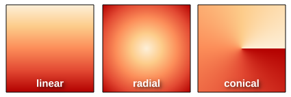
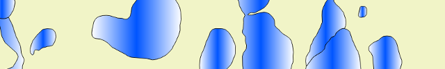
It’s no secret that QGIS has pretty impressive capabilities when it comes to cartographic styling of polygon features. Everything from line and point pattern fills, SVG image fills, gradients and even buffered gradients (new in 2.4 — more on that in a later post) can be used to shade polygons. That’s all in addition to the whole range of line styles which can be used to outline the edges of polygons. In QGIS 2.2 all these fill effects are now available for styling shapes in the print composer. What exactly does this mean?

Well, now you can draw a frame onto your print layout and style it with a gradient fill…

Gradient shape fill in composer

…or a line pattern fill….

Line pattern fill in composer

…or some crazy combination of everything…

Advanced fill in composer

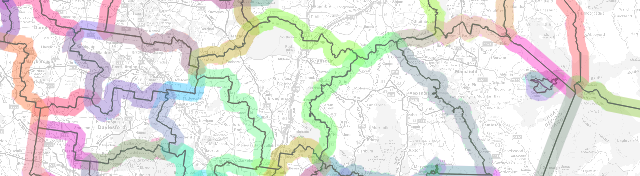
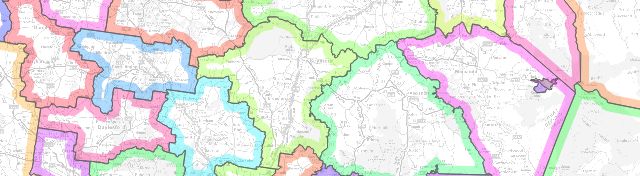
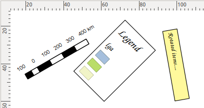
It’s totally up to you how far you take this! Here’s a nice example of a map created in QGIS 2.2’s print composer using these new styling options.

Page styling for compositions

Why is this cool? Well, for a start, if we take a quick look at the QGIS map showcase on Flickr very few of the maps shown there have a white background. In previous versions of QGIS achieving a non-white background would require drawing a giant coloured rectangle over your whole composition, banishing it to the back of the stack, and then continually being annoyed by it getting in the way while you tried to work on the rest of the composition. Now, just like the shape styling described above, you can style the page background using any of the available options in QGIS for polygon fills!

Creating a composition with a black page background

Creating a composition with a black page background

It doesn’t end there though. Since the page background can now be styled like this, it’s also possible to have transparent or semi-transparent page backgrounds. I’ll show the result opened here in GIMP so that you can see the full transparency effect over GIMP’s checkerboard background pattern:

A composition exported with a transparent background

A QGIS 2.2 composition exported with a transparent background

Using a transparent composition background like this also allows for transparency effects in map layers to show through – so, for instance, if your map layer is set to 50% transparent then the resultant export from the composer will also be 50% transparent.

And now for the final stinger…

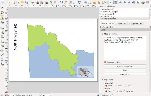
Have I mentioned yet that you can also use data defined symbology for both shape and page styling? No? Well, this was actually my main motivator in adding styling support to these elements. For a long time I’ve been wanting to create atlases which vary the page background based on attributes in the atlas coverage layer. Think flip-book style maps, where the page border is colour-coded to highlight areas that need attention. For example, areas with high rates showing with red borders, average rates with yellow, and low rates with green borders. Using a combination of page and shape styling, data defined symbology, and QGIS’ atlas features, this is now possible!

…And that (belatedly) wraps up my exploration of new features in QGIS 2.2. Next up I’ll start showcasing all the sweet new features which have landed for 2.4…

Atlas previews in QGIS 2.2

QGIS 2.2 includes some great additions to the map composer’s “Atlas” feature. If you’re not familiar with atlas prints they are QGIS’ equivalent of ArcGIS’s “data driven pages”, or something like a map based version of Microsoft Word’s “mail merge”. In an atlas composition you can select one of your map layers to use as a “coverage layer“, and QGIS will automatically generate multiple pages from the composition with each page highlighting a different feature from this coverage layer.

Atlas Previews

Thanks to funding from SIGE, I’ve added some useful new features to QGIS’ atlas abilities for 2.2. The first of these is the ability to preview atlas compositions before printing them. In QGIS 2.0, atlas generation took a bit of guess work. You’d set up the parameters for the atlas, then export the whole atlas in one shot and just hope you’d got the settings right. If not, you’d have to tweak the settings and export the whole lot again to see the result. But not any more! Now, in QGIS 2.2, you can switch on a live atlas preview mode by clicking “Preview Atlas” in the new atlas preview toolbar:

The new atlas preview toolbar

The new atlas preview toolbar

The composer window will switch to showing you a preview of exactly how the atlas will look when exported. You can tweak the appearance of any layout item, adjust the atlas and map parameters, or experiment with the new options for atlas feature styling to see instantly what the final export will look like.

The composer window in atlas preview mode

The composer window in atlas preview mode (complete with gratuitous use of label rotation and rounded rectangles…) 

When this Atlas Preview mode is enabled, you navigate through all the features in the coverage layer by clicking any of the navigation buttons in the atlas preview toolbar:

Navigating the atlas preview

Navigating the atlas preview

While previewing you can export individual pages from the atlas. So, if just one or two pages in your atlas need to be individually tweaked you can do that as you step through the features. A neat thing with this is that you can make temporary tweaks to the extent and scale of the map items as you go, without affecting how the rest of the atlas maps look.

(Oh, by the way, I should mention that as an added bonus QGIS 2.2 lets you control more than one map with an atlas print!)

Selecting the current atlas feature

The second part of the work funded by SIGE was creation of shortcut actions for selecting the current atlas feature. If your atlas coverage layer has many records it may not be practical to step through the atlas previews one at a time until you find a specific feature. That’s where these new shortcut actions come in handy!

There’s a few ways of jumping directly to a specific atlas feature. The first is to open a browser window for your coverage layer, then right click a row and choose “Set as atlas feature for …“:

Setting the atlas feature from the browser window

Setting the atlas feature from the browser window

Selecting this menu item will cause the composer to immediately jump to the matching atlas row. Another way of selecting the current atlas feature is to use the “Set as atlas feature” map action. You activate this by first selecting your coverage layer in the layers panel, then clicking the “Run Feature Action” tool button and selecting “Set as atlas feature…“:

The set atlas feature map action

The set atlas feature map action

The mouse cursor will change to a cross-hair, and clicking any matching feature in the map window will cause the composer atlas preview to jump straight to that feature. Lastly, you can also activate the “Set as atlas feature” action directly from the identify results window.

That’s just a small taste of some of the new atlas creation features which will be available in QGIS 2.2, coming your way by the end of February 2014!

(One last note – as mentioned, this work was kindly sponsored by SIGE. If there’s a specific composer based feature or bug you’d like me to work on, I’m available for further sponsored work. Just contact me directly for details.)

QGIS – Two neat features in 2.2

Here’s a quick run-down on two nice new styling options which I’ve recently added to QGIS 2.2.

Map styling for compositions

This little feature was suggested by Mathieu Pellerin, who is always pushing the boundaries of QGIS’ cartographic tools and coming up with great ideas for new styling features (you can check out some of his work via Flickr). Mathieu’s idea was for a new ‘$map‘ variable for the expression builder. This variable holds the id of the map item which is drawing the map, and allows for some nice tweaking of maps in the composer.

The $map variable is most useful when you have more than one map in your composition. The example below shows $map being used to change the styling of a single layer from the main map to the smaller inset map:

Using $map to style two maps with different colours

Using $map to style a single layer in two maps with different colours

In this example the composition has two maps, the larger has an id of “main_map” and the smaller has “inset_map“. The boundary layer has been styled using the rule based renderer, with one rule for $map=’main_map’ and one for $map=’inset_map’, as shown below:

Rule based rendering using the $map variable

Rule based rendering using the $map variable

The end result is that the layer will be rendered using the two different styles depending on which composer map item it is being drawn into. This trick can also be used to tweak labelling rules between the maps. In the example above I’ve restricted the labelling to only show in the main map. This is achieved by setting an expression for the data defined “Show label” property. I’ve used the expression “$map=’main_map’” so that labels are only shown in the main map and not the smaller inset map.

Tweaking label settings using the $map variable

Tweaking label settings using the $map variable

This small addition to QGIS 2.2 allows for some rather powerful improvements to multi-map compositions!

Drawing polygon borders only inside the polygon

The second new feature I wanted to highlight is a new option for polygon outlines which causes the outline to be drawn only on the inside of a polygon feature. The usual behaviour is for outlines to be drawn directly over the centre of the feature boundary, so that half of the outline is drawn inside the feature and half on the outside.

Simple Line Fill before

This means that the outline in a simple line symbol layer overlaps into the neighbouring polygons, and the result is that outlines from these features blend together:

Shaded borders pre QGIS 2.2

Shaded borders pre QGIS 2.2 – see how the colours bleed into the neighbouring features and overlap

This looks like a big muddy mess. A feature I’ve wanted for a long time is the ability to restrict these outlines so that they are only drawn inside the feature. This effect is commonly seen in world atlases and National Geographic maps, where each neighbouring country is shaded with it’s own unique outline colour. Now it’s possible to do this in QGIS just by ticking a single box!

The new "Draw line only inside polygon" option

The new “Draw line only inside polygon” option

As you can see in the above image, the simple line outline style has a new checkbox, “Draw line only inside polygon“. Ticking this box will clip the outline so that only the portion of it which falls inside the feature is rendered. Here’s the result:

Shaded borders with "Draw line only inside polygon" checked

Shaded borders with “Draw line only inside polygon” checked

So much nicer then the earlier output – now none of the borders overlap into their neighbouring regions! Ok, so it is possible to achieve a similar result by creating a specially crafted layer consisting of negatively buffered polygons subtracted from the original polygons, but this takes a lot of fiddling around. It also has the major disadvantage in that the result is scale dependant, and zooming in or out of the map will alter the size of the polygon outlines. But using this wonderful new checkbox in QGIS, we get proper scale-independent borders, and zooming in or out of the map keeps a consistent border width!

Zooming in keeps a consistent border width...

Zooming in keeps a consistent border width…

So there we go – two small new features added in QGIS 2.2 which have huge potential for your cartographic outputs! As per usual, if you come up with some fancy way of utilising these, don’t forget to add your maps to the QGIS Showcase on Flickr.

Waiting for QGIS 2.2 – Composer Improvements (part 3)

Following on from parts 1 and 2, here’s some more composer changes which are coming in QGIS 2.2

  • Rotation support for all composer item types. Now anything you draw in a composer can be rotated, including scale bars, legends, attribute tables and html frames! Rotation of text labels has also been improved by making the border and background of labels respect the rotation of the label.
Every composer item can now be rotated...

Every composer item can now be rotated…

  • Resizing of rotated items has been improved. Now it’s possible to easily resize rotated items while keeping their correct shape. (There’s still one missing ingredient for complete support here – shear/perspective transforms. Unfortunately this will probably have to wait till 2.4).
Better resizing of rotated items

Better resizing of rotated items

  • Rulers can be shown or hidden in compositions
  • The ruler appearance has been tweaked, adding smaller divisions and better text placement
The ruler appearance has been tweaked

New tweaked appearance for rulers

  • A zoom to actual size button and short cut (Ctrl + 1) have been added
Zoom to 100%

New Zom to 100% button

  • Lastly, the status bar has a new zoom combo box, which shows the current zoom level and allows for quick zoom to several predefined levels. You can also enter an exact zoom level in the box for precise control.
New zoom levels combo box in the status bar

New zoom levels combo box in the status bar

As you can see, the print composer in QGIS 2.2 just keeps getting better! There’s a few other really exciting new additions which have landed recently too, but they deserve their own blog posts. Stay tuned…

Waiting for QGIS 2.2 – Gradient Fills

One of the big features I worked on for QGIS 2.2 is gradient fill symbols for polygons. In my view QGIS’ symbol support is one of its biggest strengths — the versatility of its symbol layers coupled with the powerful data defined properties support allows for so many effects which just aren’t possible in other GIS packages. Gradient fill support is a nice addition to these features and should help make QGIS even more attractive to cartographers. In this post I’m going to give a quick run through of how gradient fills work in QGIS, and some of the options available for tweaking them.

Gradient fills are enabled through the Style tab in the properties for a vector layer. The default fill for a polygon in QGIS is “Simple fill”, so to switch a layer to a gradient fill you first need to select the “Simple fill” layer, then change the “Symbol layer type” dropdown  to “Gradient fill”:

Gradient Fill type

As you can see, there’s a lot of options in QGIS which can be tweaked for gradient fills. I’ll run through each of them now and explain a little bit about how each one can be used.

Colour modes

QGIS supports two different types of colour modes for gradient fills. The first is a simple “Two color” gradient, where the colour smoothly blends from the first colour to the second. The second mode, “Color ramp” allows you to use any of the standard or user-defined QGIS colour ramps, which can consist of multiple colour stops:

Colour options in gradient fills

Colour options in gradient fills

So, when would you use these options? Well, any time you need more than two colours or need to tweak the position of any of the colours in the gradient you’ll have to use a colour ramp.  If instead you’re just wanting a quick-and-easy gradient then the two colour option might be more suitable.

One last important distinction is that the colours in a two colour gradient can be set using a data defined expression:

Data defined gradient colours

Data defined gradient colours. Please try to use them more tastefully then this!

Gradient types

The next option for gradient fills is rather self-explanatory: gradient types. QGIS supports linear, radial and conical gradients:

Gradient types

Coordinate modes

The coordinate mode option is a little trickier to explain. The default setting, “Object“, will cause the gradient to be drawn entirely within each separate feature. You can see in the example below that every lake feature is coloured with a gradient which starts with light blue in the top left and darkens to a deeper blue in the bottom right. This gradient fill is repeated for all the lake features:

Gradient object coordinate mode

The “Object” coordinate mode for gradient fills

In contrast, the “Viewport” coordinate mode causes the gradient to be drawn across the entire current view of the map. So only the lakes in the top left of the map are drawn with the light blue colour, and the lakes in the bottom right with the deeper blue:

Gradient "viewport" coordinate mode

The “Viewport” coordinate mode for gradient fills

The choice of coordinate mode will depend entirely on your cartographic desires for your map!

Reference points

QGIS gradient fills allow the setting of two “reference points“. These points control where the gradient fill begins and ends. It’s easiest to visualise how these work by imagining a square defined by the points (0, 0) in the top left and (1, 1) in the bottom right. The two reference points fall somewhere within this square. So, the default reference points of (0.5, 0) and (0.5, 1.0) represent points mid way along the top edge and and the bottom edge, respectively.

Now imagine that this square forms the bounding box for the feature being drawn (or the current map window, if in “viewport” coordinate mode). The default reference points mean that the gradient will be drawn from the middle of the top edge to middle of the bottom edge of the feature. Reference points of (0, 0) and (1, 1) would mean the gradient is drawn from the top-left to the bottom-right. Similarly, reference points of (0.5, 0.5) to (1.0, 1.0) would draw a gradient from the middle of the feature to the bottom right (good for radial gradients).

Example gradient reference points

There’s also the option to set either of the reference points as the feature centroid, which again can come in handy for radial or conical gradient types.

Gradient spread

If you’ve got your head around the reference points concept, then the next setting for gradient fills affects how the gradients spread. This takes effect whenever a gradient starts or ends before the bounds of the feature. The default setting of “pad” means that the gradient will simple “pad” out any extra space with the start or end gradient colour:

Gradient "pad" spread

“Pad” spread – notice how the darker blue is stretched across the right side of each feature

Repeat” mode will tile the gradient across the feature:

Gradient "repeat" spread

“Repeat” spread

Finally, “reflect” mode will draw a reflected version of the gradient to fill up any extra space:

"Reflect" spread

“Reflect” spread

Angle

Last of all, there’s a simple “angle” parameter, which allows you to rotate the entire gradient fill. This option is included mostly for use with data defined symbols, since a similar effect can be achieved by changing the gradient reference points. Amongst other effects, this is useful for achieving a “sun glint” on water, where each gradient is drawn in a random direction (more on this in a later blog post):

Data defined gradient angles

Random data defined gradient angles

This leads me into my final note… all of these properties can be data defined! So you could have a column in your data controlling whether each feature is drawn with a radial or linear gradient, or whether the gradient in a given feature should be drawn at a specific angle, or that the gradient in a feature should start at the centroid and end at the top right of the feature!

I’m excited to see what the QGIS user community is able to create using this new gradient fill feature when 2.2 is released. If you’ve already had a chance to play with the dev version of 2.2 and have something to show off, make sure you submit your map to the Flickr QGIS Map Showcase!

Waiting for QGIS 2.2 – Composer Improvements (part 2)

Following on from Part 1, here’s some more recent usability improvements which have been made to QGIS’ map composer:

  • Multiple items can now be selected by drawing a box around them. Holding Shift while drawing a box adds to the current selection, holding Ctrl will subtract from the current selection. In addition, holding Alt while drawing the selection box changes from an “intersects” style selection mode to a “within” selection mode. This was my major frustration with the composer in earlier versions of QGIS, and combined with the earlier fixes for multi-item drag and resize it substantially improves the design workflow.
Selecting multiple items with a mouse drag

Selecting multiple items with a mouse drag

  • Grid lines are always drawn on top of compositions
  • There’s new menu options for showing the grid and snapping to grid, and for showing/snapping/smart guides. All these have convenient keyboard shortcuts so you can quickly switch on or off display of the guides and grid or temporarily switch on or off snapping while you work. There’s also a new menu item for clearing all guides from a composition.
Grid and guide controls in the view menu

Grid and guide controls in the view menu

  • The composer window now has a status bar which shows the exact cursor position and details about resizing/moving items
The new composer status bar

The new composer status bar

  • A new mouse-based zoom tool has been added to the composer, which allows you to click and drag to specify an area to zoom to. You can also switch to this new tool at any time by holding Ctrl and space. Holding Shift while using the zoom tool switches to zooming out.

That’s it for now, but there’s loads more to come for 2.2!

Waiting for QGIS 2.2 – Composer Improvements (part 1)

In the spirit of depesz’s “Waiting for Postgresql 9.#” series (and BostonGIS’ follow up Waiting for PostGIS 2.#), here’s the first in a new series of “Waiting for QGIS 2.2″ posts…

As I mentioned in my last post, one of my major goals for QGIS 2.2 is to make the print composer behave more like a professional DTP package. A big part of this is making sure QGIS respects all the expected standard behaviour for graphic design programs. While the print composer made huge advances toward this goal in version 2.0, there’s still further we can go.

So, let’s start with a list of all the new usability features the print composer has already gained for QGIS 2.2:

  • Selections of multiple items can all be moved and resized together (previously only one item in the selection would be altered)
  • Mouse handles are always drawn on the top of the composition – in earlier versions mouse handles could be hidden by items sitting higher in the composition
  • Holding shift while resizing items locks their aspect ratio
  • Holding control while resizing items causes them to resize from their centre
  • Holding shift while moving items locks the movement to the horizontal or vertical
  • Holding control while moving items temporarily disables any grid or guide-based snapping
  • Items can be removed from a selection by shift-clicking them
  • Control-clicking an item causes the next item below it to be selected – this allows you to select items which are hidden behind other items
  • Holding shift while moving items using the cursor keys results in a large item movement
  • There’s a new “Edit” menu in the composer, with options like
    • Select All/Select None and Invert Selection
    • Select Next Item Above and Select Next Item Below
    • Lock Selected Items and Unlock All
The new composer "Edit" menu

The new composer “Edit” menu

Additionally, there’s a bunch of pull requests which haven’t yet been merged to master, but are ready to go, including:

  • Adding a dedicated “pan” tool for dragging around compositions
  • Compositions can be panned at any time by holding the space key or middle mouse button
  • Compositions can be zoomed by using the mouse wheel
Composer pan tool

Composer pan tool

Some of these are simple little changes which don’t sound like much, but it’s not until you’re forced to work without something like shift-resizing to lock the aspect ratio that you realise how often you use it and rely on it!

Sneak Peak

While it’s really exciting that the release of QGIS 2.0 is just around the corner, I’m finding it just as exciting that work is already under way on version 2.1! Some great new features have already landed and I can’t wait to see what else is planned. Personally, I’ve got plans for a raft of improvements relating to print composers with the goal of making the print composer behave as much like a full-blown DTP package as possible. In the meantime, here’s a quick teaser of a feature I’ve been working on that will hopefully be landing in master soon:

A sneak peak...

  • Page 1 of 1 ( 8 posts )
  • 2.2

Back to Top

Sustaining Members