Related Plugins and Tags

QGIS Planet

QGIS Add to Felt Plugin – Phase 2

We have been continuing our work with the Flagship sponsor of QGISFelt to develop their QGIS Plugin – Add to Felt  that makes it even easier to share your maps and data on the web.

What is the ‘Add to Felt’ QGIS Plugin?

The ‘Add to Felt’ QGIS Plugin is a powerful tool that empowers users to export their QGIS projects and layers directly to a Felt web map. This update introduces two fantastic features:

  1. Single Layer Sharing: You can now share a single layer from your QGIS project to a Felt map. This means you have greater control over which specific data layers to share, allowing you to tailor your map precisely to your audience’s needs.
  2. Map Selection: With the updated plugin, you can choose which map on Felt to add your layer to – a new map, or an ongoing project. This flexibility simplifies your workflow and ensures that your data ends up in the right place.

Businesses that rely on QGIS love how these new features provide a seamless way to view and share results, ultimately allowing them to move more quickly and stay in sync:

“Felt helps us keep each other updated on what we’ve done, what we’ve modeled, how things are progressing.” – ICON Engineering

Why is this Update Important?

Web maps are invaluable tools for sharing data with a wider audience, be it colleagues, clients, or the public. They provide creators with the ability to control data visibility, display options, and audience access, all within an easily shareable digital format. However, creating web maps can be an arduous and complex task.

Here’s where the ‘Add to Felt’ QGIS Plugin update comes to the rescue:

1. Streamlining the Process: Creating web maps traditionally involves website development, data hosting, and map application development—tasks that require a diverse skill set. This complexity can be a significant barrier, especially for smaller operations with limited resources or budget constraints.

2. Felt Simplifies Web Mapping: Felt makes it effortless to create web maps, and share them as easily as you would a Google Doc or Sheet. Simply drag and drop your data, customize the symbology to your liking, and share the map with a link or by inviting collaborators. No need to send large data files or answer questions about the map’s data sources.

3. Integration with QGIS: Now, the ‘Add to Felt’ QGIS Plugin bridges the gap between QGIS and Felt. It seamlessly imports your QGIS data into Felt, eliminating the need for manual data transfers and reducing the complexity of web map creation.

In essence, the ‘Add to Felt’ QGIS Plugin update simplifies the process of sharing and collaborating on web maps. It empowers users to harness the full potential of web-based mapping, making it accessible to everyone, regardless of their technical expertise. The update makes it even easier to share progress updates or model re-run outputs without creating a new map, or sharing a new map link.

So, if you’re a QGIS user looking to enhance your map-sharing capabilities and streamline your workflow, make sure to take advantage of this fantastic update. Say goodbye to the complexities of web map creation and hello to effortless, data-rich web maps with Felt and the ‘Add to Felt’ QGIS Plugin.

How to install and upgrade

  • Open QGIS on your computer. You must have version 3.22 or later installed.
  • In the plugins tab, select Manage and Install Plugins.
  • Search for the ‘Add to Felt’ plugin, select and click Install Plugin.
  • Close the Plugins dialog. The Felt plugin toolbar will appear in your toolbar for use.
  • Sign into Felt and begin sharing your maps to the web.

If you want more features in this plugin, let us know or you’re interested in exploring how a QGIS plugin can make your service easily accessible to the millions of daily QGIS users, contact us to discuss how we can help!

‘Add to Felt’ QGIS Plugin

The gift economy of Open Source is community driven and filled by folks with ideas that just go for it!

We at North Road are blessed that we get to join these creatives on their journey in order to get their products to you. Recently, the first QGIS flagship sponsor, Felt, engaged us to further strengthen their support for the up to 600,000 daily QGIS users to integrate their workflows between QGIS and Felt.

The result is the “Add to Felt” QGIS Plugin, which makes it super-simple to publish your QGIS maps to the Felt platform.

To get started, install the Add to Felt Plugin from the QGIS Plugin manager.

If you don’t have a free Felt account, you’ll need to sign up for one online (or from the Add to Felt plugin itself once you have installed it).

Within QGIS, users can easily publish their maps and layers to Felt. You can either:

  • Publish a single layer by right-clicking the layer and selecting “Share Layer to Felt” from the Export sub-menu
  • Publish your whole QGIS project/map by selecting the Project Menu, Export, “Add to Felt” action

Whilst Felt is loading up your map, you can continue working and it will let you know once your map is ready to open on Felt and share with others.

We are happy to let you know that the collaboration does not stop there! As with our SLYR tool, there is ongoing development as the requirements of the community and technology grow.  So install the Add to Felt Plugin via the QGIS Plugin manager, and let us know where you want it to go via the Add to Felt GitHub page.

Read more about it here:

QGIS 3.28 improvements for working with ESRI formats and services

The QGIS 3.28 release is an extremely exciting release for all users who work in mixed software workplaces, or who need to work alongside users of ESRI software. In this post we’ll be giving an overview of all the new tools and features introduced in 3.28 which together result in a dramatic improvement in the workflows and capabilities in working with ESRI based formats and services. Read on for the full details…!

Before we begin, we’d like to credit the following organisations for helping fund these developments in QGIS 3.28:

  • Naturstyrelsen, Denmark
  • Provincie Gelderland, Netherlands
  • Uppsala Universitet, Department of Archaeology and Ancient History
  • Gemeente Amsterdam
  • Provincie Zuid-Holland, Netherlands

FileGeodatabase (GDB) related improvements

The headline item here is that QGIS 3.28 introduces support for editing, managing and creating ESRI FileGeodatabases out of the box! While older QGIS releases offered some limited support for editing FileGeodatabase layers, this required the manual installation of a closed source ESRI SDK driver… which unfortunately resulted in other regressions in working with FileGeodatabases (such as poor layer loading speed and random crashes). Now, thanks to an incredible reverse engineering effort by the GDAL team, the open-source driver for FileGeodatabases offers full support for editing these datasets! This means all QGIS users have out-of-the-box access to a fully functional, high-performance read AND write GDB driver, no further action or trade-offs required.

Operations supported by the GDAL open source driver include:

  • Editing existing features, with full support for editing attributes and curved, 3D and measure-value geometries
  • Creating new features
  • Deleting features
  • Creating, adding and modifying attributes in an existing layer
  • Full support for reading and updating spatial indexes
  • Creating new indexes on attributes
  • “Repacking” layers, to reduce their size and improve performance
  • Creating new layers in an existing FileGeodatabase
  • Removing layers from FileGeodatabases
  • Creating completely new, empty FileGeodatabases
  • Creating and managing field domains

On the QGIS side, the improvements to the GDAL driver meant that we could easily expose feature editing support for FileGeodatabase layers for all QGIS users. While this is a huge step forward, especially for users in mixed software workplaces, we weren’t happy to rest there when we  had the opportunity to further improve GDB support within QGIS!

So in QGIS 3.28 we also introduced the following new functionality when working with FileGeodatabases:

FileGeodatabase management tools

QGIS 3.28 introduces a whole range of GUI based tools for managing FileGeodatabases. To create a brand new FileGeodatabase, you can now right click on a directory from the QGIS Browser panel and select New – ESRI FileGeodatabase:

After creating your new database, a right click on its entry will show a bunch of available options for managing the database. These include options for creating new tables, running arbitrary SQL commands, and database-level operations such as compacting the database:

You’re also able to directly import existing data into a FileGeodatabase by simply dragging and dropping layers onto the database!

Expanding out the GDB item will show a list of layers present in the database, and present options for managing the fields in those layers. Alongside field creation, you can also remove and rename existing fields.

Field domain handling

QGIS 3.28 also introduces a range of GUI tools for working with field domains inside FileGeodatabases. (GeoPackage users also share in the love here — these same tools are all available for working with field domains inside this standard format too!) Just right click on an existing FileGeodatabase (or GeoPackage) and select the “New Field Domain” option. Depending on the database format, you’ll be presented with a list of matching field domain types:

Once again, you’ll be guided through a user-friendly dialog allowing you to create your desired field domain!

After field domains have been created, they can be assigned to fields in the database by right-clicking on the field name and selecting “Set Field Domain”:

Field domains can also be viewed and managed by expanding out the “Field domains” option for each database.

Relationship discovery

Another exciting addition in QGIS 3.28 (and the underlying GDAL 3.6 release) is support for discovering database relationships in FileGeodatabases! (Once again, GeoPackage users also benefit from this, as we’ve implemented full support for GeoPackage relationships via the “Related Tables Extension“).

Expanding out a database containing any relationships will show a list of all discovered relationships:

(You can view the full description and details for any of these relationships by opening the QGIS Browser “Properties” panel).

Whenever QGIS 3.28 discovers relationships in the database, these related tables will automatically be added to your project whenever any of the layers which participate in the relationship are opened. This means that users get the full experience as designed for these databases without any manual configuration, and the relationships will “just work”!

Dataset Grouping

Lastly, we’ve improved the way layers from FileGeodatabases are shown in QGIS, so that layers are now grouped according to their original dataset groupings from the database structure:

Edit ArcGIS Online / Feature Service layers

While QGIS has had read-only support for viewing and working with the data in ArcGIS Online (AGOL) vector layers and ArcGIS Server “feature service” layers for many years, we’ve added support for editing these layers in QGIS 3.28. This allows you to take advantage of all of QGIS’ easy to use, powerful editing tools and directly edit the content in these layers from within your QGIS projects! You can freely create new features, delete features, and modify the shape and attributes of existing features (assuming that your user account on the ArcGIS service has these edit permissions granted, of course). This is an exciting addition for anyone who has to work often with content in ArcGIS services, and would prefer to directly manipulate these layers from within QGIS instead of the limited editing tools available on the AGOL/Portal platforms themselves.

This new functionality will be available immediately to users upon upgrading to QGIS 3.28 — any users who have been granted edit capabilities for the layers will see that the QGIS edit tools are all enabled and ready for use without any further configuration on the QGIS client side.

Filtering Feature Service layers

We’ve also had the opportunity to introduce filter/query support for Feature Service layers in QGIS 3.28. This is a huge performance improvement for users who need to work with a subset of a features from a large Feature Service layer. Unfortunately, due to the nature of the Feature Service protocol, these layers can often be slow to load and navigate on a client side. By setting a SQL filter to limit the features retrieved from the service the performance can be dramatically increased, as only matching features will ever be requested from the backend server. You can use any SQL query which conforms to the subset of SQL understood by ArcGIS servers (see the Feature Service documentation for examples of supported SQL queries).


What’s next?

While QGIS 3.28 is an extremely exciting release for any users who need to work alongside ESRI software, we aren’t content to rest here! The exciting news is that in QGIS 3.30 we’ll be introducing a GUI driven approach allowing users to create new relationships in their FileGeodatabase (and GeoPackage!) databases.

At North Road we’re always continuing to improve the cross-vendor experience for both ESRI and open-source users through our continued work on the QGIS desktop application and our SLYR conversion suite. If you’d like to chat to us about how we can help your workplace transition from a fully ESRI stack to a mixed or fully open-source stack, just contact us to discuss your needs.

Line Label Placement: Our gift to the QGIS community!

If you’re a follower of North Road’s social media accounts, it probably comes as no surprise to hear that we love sharing regular tips and useful suggestions about working with spatial data on these channels. Recently, we realised we were close to a new milestone of 4k followers of our Twitter stream. This milestone gave us the perfect excuse to give something back to all these followers! So we ran a little promo, where we promised that if we hit 4k followers we’d implement a new feature in QGIS, as determined by a popular vote:

Given we’ve now reached the target milestone, it was our turn to deliver! So we’re proud to introduce a new feature coming in QGIS 3.16: the ability to control exactly where labels are positioned along line feature! Let’s take a look!…

In previous QGIS releases, whenever labels are enabled for a line layer these labels will automatically gravitate towards the center of the line features:

In certain situations, it’s desirable for these labels to be positioned in specific positions along these line features (e.g. at the start of lines, or at the end of lines). With this new feature gift to the community, QGIS users have to option to precisely control the label placement for these lines:


There’s new options for placing the labels at the start of lines, end of lines, or at a custom offset along the line.

This option can be super-handy when combined with Rule Based Labelling, as it allows you to have different labels at the start versus end of lines:

So there we go! Another great QGIS cartography enhancement, heading your way in QGIS 3.16, and just a little thank you back to the community for all your support of North Road.

And if you’re not following us on social media yet, it’s a great to start… because who knows when our next little giveaway will be?!


QGIS Processing, Model Designer and ETL Campaign crowdfund launched!

QGIS Processing offers a rich and expandable set of algorithms which can operate on spatial data, along with a powerful Model Designer which allows users to string together these algorithms to create custom workflows.

Since its introduction in QGIS 2, the Processing framework has seen an intensive amount of development and optimisation efforts. In recent QGIS releases it offers a very user-friendly way of performing complex spatial data processing tasks, all without requiring ANY expensive third-party tools or software licenses!

At North Road we are passionate about the QGIS Processing framework, and have invested considerable effort in this framework over the past 5 years. We’re proud to announce that our latest crowd-funding campaign is focused on further expanding the capabilities and flexibility of Processing and the Processing Model Designer!

Unlike a typical crowdfunding campaign, where a specific funding target and deadline is set, we’re running this campaign a little differently. Instead, this campaign is taking the form of a “à la carte” menu of Processing enhancements. These range from small “paper-cut” style fixes, through to larger architectural improvements, and are each individually priced accordingly. We are asking backers to pick individual enhancements from this “menu of enhancements” and fund that enhancement’s development in full. In order to make this campaign affordable for a wide range of backers, we’ve included a huge range of enhancements which vary in price from smaller amounts to larger amounts.

You can read the full details of the campaign and browse the list of proposed enhancements at the campaign page.

QGIS Print Layouts Graphs and Charts Campaign – Complete!

Last week saw the exciting release of version 3 of the QGIS DataPlotly plugin, which incorporates all the work done as a result of our Print Layouts Graphs and Charts crowdfunding campaign crowd funding campaign. Now, beautiful charts and graphs are available directly within QGIS print layouts, and all it takes is the easy installation of the “DataPlotly” plugin from your QGIS install!

In this post we’ll showcase the functionality which has been added during this campaign, and which is available today in the plugin.

UI modernisation and tweaks

First up, during our work on this plugin we’ve invested some time in refreshing the plugin’s UI to ensure it follows all the widget conventions used elsewhere in QGIS. Now, the plugin blends seamlessly into your QGIS window, and all the chart setting widgets behave in just the way you’re used to. We’ve also used this opportunity to fix a number of issues the plugin had when running on hi-dpi displays (such as Apple retina displays)!


Dynamic charting of selected and visible features

If you’ve used earlier versions of the DataPlotly plugin, you’ll likely notice that there’s many new options shown in the screenshot above. Possibly the most exciting of these is the new “Use only selected features” and “Use only visible features” checkboxes. When either of these options are enabled, then your chart will immediately respond to changes in layer selections or changes to the visible map canvas extent respectively. Previously, interactivity in the plugin only went one way (from the chart to the canvas) – but now the charts are truly interactive, and respond dynamically to changes in the canvas too!


Improved handling of “data defined” settings

During the plugin refactoring, we reworked how “data defined” settings are handled within charts. If you’re not familiar with these, “data defined” settings are QGIS’ approach for exposing per-feature control over the map rendering process. In DataPlotly charts, we expose this functionality to allow per-feature control over the chart appearance (e.g., showing different scatter plot dot colors based on feature attributes). The new code uses the same code model as QGIS itself, so data-defined settings in your charts now have full access to the whole suite of QGIS expression functions and variables that you’re used to! Additionally, QGIS data-defined assistants are fully supported in the charts too. Ultimately, this enables some very advanced styling options, such as charts which dynamically change color and appearance on every page of your print atlas…

Charts in print layouts

We’ve previously covered this feature in depth, but the DataPlotly v3 release brings print-layout based charts to the masses! When a chart is inserted into a print layout, some additional options are available for controlling the plot behavior:

These new options allow you to link the chart to a map item within the layout, which lets you filter the content of the chart to only include features visible within the map. If your print layout is setup as an atlas export, you can also filter out included features to only show those which are geographically located inside the current atlas feature.

Our partners from Faunalia demonstrate this in the screencast below:


Saving plot configuration

An often-requested functionality previous missing from the plugin was the ability to save and restore plot configuration. Now, plot configuration is automatically saved within your QGIS project and restored when you reopen the project. You no longer have to re-create all your charts from scratch at every session (ouch!). We also added the ability to export chart configuration to XML files, allowing you to share and reuse chart configuration across projects.

Behind the scenes work

Aside from all the wonderful new features added to the plugin, we’ve extensively refactored most of the plugin backend. Unit tests and CI infrastructure have been added, which will ensure the plugin remains stable and regression-free in future releases. The code cleanup and simplification has drastically lowered the barrier of contribution to the project, and we’ve already seen new contributors adding more new features to the plugin as a result of this! (Kudos to Simon Gröchenig, who added the new “Feature subset” expression option you can see in the above screenshots!).

Project sponsors

All this work is thanks to the backers of our crowdfunding campaign. Without their contributions this work would not have been possible! In no particular order, our thanks go out to:

  • Federico Gianoli
  • Papercraft Mountains
  • Liam McCrae
  • Henry Walshaw
  • Raúl Sangonzalo
  • Ferdinando Urbano
  • pitsch-ing.ch
  • Carbon-X
  • Gabriel Diosan
  • Rene Giovanni Borella
  • Enrico Bertonati
  • Guido Ingwer
  • David Addy
  • Gerd Jünger
  • Andreas Neumann
  • Stefano Campus
  • Michael Jabot
  • Korto
  • Enrico Ferreguti
  • Carlo A. Nicolini
  • Salvatore Fiandaca
  • Alberto Grava
  • Hans van der Kwast
  • Ben Hur Pintor
  • Silvio Grosso
  • Nobusuke Iwasaki
  • Alasdair Rae
  • Manori Senanayake
  • Canton de Neuchâtel
  • Matthias Daues
  • Alteri Seculo
  • SunGIS Ltd.
  • Stu Smith
  • Keolis Rennes
  • Gabriel Diosan
  • Aiden Price
  • Giacomo Ponticelli
  • Diane Fritz
  • Gemio Bissolati
  • Claire Birnie
  • Nicolas Roelandt
  • Rocco Pispico
  • Gabriel Bengtsson
  • Birds Eye View
  • Barend Köbben
  • Roberto Marzocchi (GTER)
  • Yoichi Kayama
  • Alessandro Sarretta
  • Luca Angeli
  • Luca Bellani
  • giswelt
  • Stefan Giese
  • Ben Harding
  • Joao Gaspar
  • Romain Lacroix
  • Ryan Cooper
  • Daniele Bonaposta
  • QGIS Swedish User Group
  • Nino Formica
  • Michael Gieding
  • Amedeo Fadini
  • Andrew Hannell
  • Stefano
  • Phil Wyatt
  • Brett Edmond Carlock
  • Transitec

Keep an eye out on the North Road blog for future crowd-funding initiatives. Coming soon: a QGIS Processing grab-bag of ETL modelling improvements!

SLYR ESRI to QGIS compatibility suite – October 2019 update

Recently, staff at North Road have been hard at work on our SLYR “ESRI to QGIS compatiblity suite“, and we thought it’s time to share some of the latest exciting updates with you.

While SLYR begun life as a simple “LYR to QGIS conversion tool”, it quickly matured into a full ArcGIS compatibility suite for QGIS. Aside from its original task of converting ESRI LYR files, SLYR now extends the QGIS interface and adds seamless support for working with all kinds of ArcGIS projects and data files. It’s rapidly becoming a must-have tool for any organisation which uses a mix of ESRI and open source tools, or for any organisation exploring a transition away from ArcGIS to QGIS.

Accordingly, we thought it’s well past time we posted an update detailing the latest functionality and support we’ve added to SLYR over the past couple of months! Let’s dive in…

  • Full support for raster LYR file conversion, including unique value renderers, color map renderers, classified renderers, RGB renderers and stretched color ramp renderers:

    From ArcMap…

    …to QGIS!
  • Support for conversion of fill symbol outlines with complex offsets, decorations and dashed line templates
  • Conversion of 3D marker and simple 3D lines to their 2d equivalent, matching ArcMap’s 2D rendering of these symbol types
  • Beta support for converting map annotations and drawings, including custom text labels and reference scale support
  • Label and annotation callout support*
  • Support for converting bookmarks stored in MXD documents*
  • Support for converting ESRI bookmark “.dat” files via drag and drop to QGIS*
  • Correct conversion of OpenStreetMap and bing maps basemap layers
  • SLYR now presents users with a friendly summary of warnings generated during the LYR or MXD conversion process (e.g. due to settings which can’t be matched in QGIS)
  • Added support for MXD documents generated in very early ArcMap versions
  • We’ve added QGIS Processing algorithms allowing for bulk LYR to QLR and MXD to QGS conversion. Now you can run a batch conversion process of ALL MXD/LYR files held at your organisation in one go!
  • Greatly improved matching of converted symbols to their original ArcGIS appearance, including more support for undocumented ArcGIS symbol rendering behavior
  • Support for conversion of text symbols and label settings stored in .style databases*
  • Directly drag and drop layers and layer groups from ArcMap to QGIS to add them to the current QGIS project (maintaining their ArcGIS symbology and layer settings!)*
  • Directly drag and drop layers from ArcCatalog to QGIS windows to open in QGIS*
  • Support for ESRI MapServer layers

(*requires QGIS 3.10 or later)

Over the remainder of 2019, we’ll be hard at work further improving SLYR’s support for MXD document conversion, and adding support for automatic conversion of ArcMap print layouts to QGIS print layouts.

While SLYR is not currently an open-source tool, we believe strongly in the power of open source software, and accordingly we’ve been using a significant portion of the funds generated from SLYR sales to extend the core QGIS application itself. This has directly resulted in many exciting improvements to QGIS, which will become widely available in the upcoming QGIS 3.10 release. Some of the features directly funded by SLYR sales include:

  • A “Segment Center” placement mode for marker line symbols
  • Reworked bookmark handling in QGIS, with a greatly enhanced workflow and usability, and a stable API for 3rd party plugins and scripts to hook into
  • Improved handling of layer symbology for layers with broken paths
  • Auto repair of all other broken layers with a matching data source whenever a single layer path is fixed in a project
  • Support for managing text formats and label settings in QGIS style libraries, allowing storage and management of label and text format presets
  • A new Processing algorithm “Combine Style Databases“, allowing multiple QGIS style databases to be merged to one
  • Adding a “Save layer styles into GeoPackage” option for the “Package Layers” algorithm
  • New expression functions which return file info, such as file paths and base file names
  • Adding new options to autofill the batch Processing dialog, including adding input files using recursive filter based file searches
  • Coming in QGIS 3.12: A new option to set the color to use when rendering nodata pixels in raster layers
  • Coming in QGIS 3.12: A new “random marker fill” symbol layer type, which fills polygons by placing point markers in random locations

You can read more about our SLYR ESRI to QGIS compatibility tool here, or email [email protected] to discuss licensing arrangements for your organisation! Alternatively, send us an email if you’d like to discuss your organisations approach to open-source GIS and for assistance in making this transition as painless as possible.

QGIS Print Layouts Graphs and Charts — Beta Out Now!

Thanks to the success of our recent QGIS Print Layouts Graphs and Charts crowdfunding campaign, staff at North Road and Faunalia have been busy updating and improving the QGIS “DataPlotly” plugin with the goal of allowing beautiful charts inside your print layouts.

We’re super-excited to announce that the beta release of this new functionality is now available! With this beta installed, you’ll see a new icon in your QGIS Print Layout designer window:

Clicking this button will allow you to draw a new plot onto your print layout, just like you would any other standard layout item (like legends, scalebars, etc). Any print layout chart can be customised by right-clicking the chart and selecting “Item Properties“. This will open a panel with settings like position, size, frame, and other standard options. All the magic happens when you click the “Setup Plot” button inside this panel:

This exposes the vast array of styling and charting options available for use. If you’re an existing user of the DataPlotly QGIS plugin, you’ll recognise that these are the same settings you have available when creating interactive plots alongside the main map canvas. Every setting is now available for use in print layouts!


To grab the beta, head over to https://github.com/ghtmtt/DataPlotly/releases/tag/v3.9-beta and download the DataPlotly.zip file. Then, inside QGIS, select the Manage and Install Plugins option from the Plugins menu. Click on the “Install from ZIP” section, and point the dialog at your downloaded DataPlotly.zip file. Click “Install Plugin“, and then restart QGIS for good measure. When QGIS restarts you should see the new chart icon inside the print layout designer.

Note that you’ll need a recent QGIS release for this to work correctly — either QGIS 3.8.3 or 3.4.12. (The print layout functionality may not be compatible with earlier releases, as we’ve had to fix several issues inside QGIS itself to get this feature working as designed!). 

We are actively seeking feedback and user testing on this beta release. If you encounter any issues, just head over to https://github.com/ghtmtt/DataPlotly/issues and let us know.

We’ll be further refining this functionality, with the goal of releasing the final non-beta version of the plugin to coincide with the upcoming QGIS 3.10 release.

Happy charting!

QGIS 3.10 Loves GeoPDF!

Recently, we’ve been working on an exciting development which is coming soon in QGIS 3.10… support for Geospatial PDF exports! This has been a long-desired feature for many QGIS users, and it was only made possible thanks to a group of financial backers (listed below). In this post, we’re going to explore these new features and how they improve your QGIS PDF outputs.

Geospatial PDFs can now be created either by exporting the main QGIS map canvas, or by creating and exporting a custom print layout. For instance, when you select the “Save Map as PDF” option from the main QGIS window, you’ll see a new group of Geospatial PDF related options:

At its most basic, Geospatial PDF is a standard extension to the PDF format which allows for vector spatial datasets to be embedded in PDF files. If the “Include vector feature information” checkbox is ticked when creating a Geospatial PDF output, then QGIS will automatically include all the geometry and attribute information from features visible within the page. So if we export a simple map to PDF, we’ll get an output file which looks just like any old regular PDF map output…

…but, we can also pull this PDF back into QGIS and treat it just like any other vector data source! In the screenshot below we’re using the Identify tool to query on of the polygons and see all the attribute information from the original source layer.

This ability adds a lot of value to PDF exports. Anyone who has ever been supplied a non-spatial PDF as a “spatial dataset” will attest to the frustrations these cause… but if you create proper Geospatial PDFs instead, then there’s no loss of the valuable underlying spatial information or feature attributes! Furthermore, if these PDFs are opened within Acrobat Reader, tools are enabled which allow users to query features interactively.

Another nice benefit which comes with Geospatial PDF output is that layers can be interactively toggled on or off in the PDF viewer. The screenshot below shows a Geospatial PDF file created from a simple QGIS map. On the left we have a list of the layers in the PDF, each of which can be turned on or off inside the PDF viewer!

The really nice thing here is that, thanks to the underlying smarts in the GDAL library which is responsible for the actual Geospatial PDF creation, the PDF renders identically to our original QGIS map. While labels turn on and off alongside their corresponding map layer, they are still correctly stacked in the exact same way as you see in the QGIS window. Furthermore, the created PDFs keep labels and vector features as vector artwork… so there’s absolutely no loss in quality when zooming in to the map! These files look GREAT!

On that same note… the sponsorship allowed us to tackle another related issue, which is that in previous QGIS versions PDF (or SVG) exports would always export every single vertex from any visible feature! Ouch! This meant that if you had a complex polygon boundary layer, you would potentially be creating a PDF with millions of vertices per feature, even though most of these would be overlapping and completely redundant at the exported map’s scale. Now, QGIS automatically simplifies vector features while exporting them (using an appropriate, effectively invisible, level of simplification). The dramatically reduces the created file sizes and speeds up opening them and navigating them in other applications (especially Inkscape). (There’s an option at export time to disable this simplification, if you have a specific reason to!).

Creating Geospatial PDFs from print layouts gives even more options. For a start, whenever a print layout is exported to Geospatial PDFs, we ensure that the created PDF correctly handles stacking of layers alongside any other print layout items you have. In the image below we see a custom print layout which includes interactive layer visibility controls. If a layer is toggled, it’s hidden only from the map item — all the other surrounding elements like the title, north arrow and scalebar remain visible:

That’s not all though! When exporting a print layout to Geospatial PDF, QGIS also hooks into any map themes you’ve setup in your project. If you select to include these themes in your output, then the result is magical! The screenshot below shows the export options for a project with a number of themes, and we’ve chosen to export these themes in the PDF:

Opening the resultant PDF shows that our layer control on the left now lists the map themes instead of individual layers. Viewers can switch between these themes, changing the visibility of layers and their styling to match the QGIS map theme from the project! Additionally, you can even expand out a theme and expose layer-by-layer visibility control. Wow! This means you could create a single PDF output file which includes an environmental, social, cadastral, transport, …. view of your map, all in the one file.

Lastly, there’s even control for fine-tuning the combination of layers which are exposed in the output PDF file and which ones should be toggled on and off together. In the screenshot below we’ve opted to group the “Aircraft” and “Roads” map layers into a single logical PDF group called “Transport”. 

The resultant PDF respects this, showing an entry in the interactive layer tree for “Transport” which toggles both the aircraft and roads layers together:

So there you go — the power of Geospatial PDF, coming your way in QGIS 3.10!

One semi-related benefit of this work is that it gave us an opportunity to rework how “layered” exports from print layouts are created. This has had a significant flow-on impact on the existing ability to create layered SVG outputs from QGIS. Previously, this was a rather fragile feature, which created SVGs with lots of issues – overlapping labels, incorrectly stacked layers, and last-but-not-least, non-descriptive layer names! Now, just like Geospatial PDF exports, the layered SVG exports correctly respect the exact look of your map, and have much more friendly, descriptive layer names:

This should significantly reduce the amount of housekeeping required when working on these layered SVG exports. 

This work was funded by:

  • Land Vorarlberg
  • Municipality of Vienna
  • Municipality of Dornbirn
  • Biodiversity Information Service for Powys and BBNP Local
  • Kanton Zug
  • Canton de Neuchâtel
  • Canton de Thurgovia

North Road are leading experts in extending the QGIS application to meet your needs. If you’d like to discuss how you can sponsor development of features or fixes which you want in QGIS, just contact us for further details!


QGIS Print Layouts Graphs and Charts — target reached!

We’ve just passed the extended deadline for our recent QGIS Print Layouts Graphs and Charts campaign, and the great news is that thanks to a large number of generous backers we’ve successfully hit the target for this campaign! This has only been possible thanks to the tireless work of the QGIS community and user groups in promoting this campaign and spreading the word.

The Print Layouts Graphs and Charts campaign is a joint effort with our friends at Faunalia, so we’ll soon be starting work together on all the wonderful new functionality heading to the QGIS DataPlotly plugin as a result. The work will be commencing late June, just after the QGIS 3.8.0 final release. Keep an eye out for further updates on the development from this time! You can read more about what’s coming in detail at the campaign page.

We’d like to take this opportunity to extend our heartfelt thanks to all the backers who have pledged to support this project:

  • Federico Gianoli
  • Papercraft Mountains
  • Liam McCrae
  • Henry Walshaw
  • Raúl Sangonzalo
  • Ferdinando Urbano
  • pitsch-ing.ch
  • Carbon-X
  • Gabriel Diosan
  • Rene Giovanni Borella
  • Enrico Bertonati
  • Guido Ingwer
  • David Addy
  • Gerd Jünger
  • Andreas Neumann
  • Stefano Campus
  • Michael Jabot
  • Korto
  • Enrico Ferreguti
  • Carlo A. Nicolini
  • Salvatore Fiandaca
  • Alberto Grava
  • Hans van der Kwast
  • Ben Hur Pintor
  • Silvio Grosso
  • Nobusuke Iwasaki
  • Alasdair Rae
  • Manori Senanayake
  • Canton de Neuchâtel
  • Matthias Daues
  • Alteri Seculo
  • SunGIS Ltd.
  • Stu Smith
  • Keolis Rennes
  • Gabriel Diosan
  • Aiden Price
  • Giacomo Ponticelli
  • Diane Fritz
  • Gemio Bissolati
  • Claire Birnie
  • Nicolas Roelandt
  • Rocco Pispico
  • Gabriel Bengtsson
  • Birds Eye View
  • Barend Köbben
  • Roberto Marzocchi (GTER)
  • Yoichi Kayama
  • Alessandro Sarretta
  • Luca Angeli
  • Luca Bellani
  • giswelt
  • Stefan Giese
  • Ben Harding
  • Joao Gaspar
  • Romain Lacroix
  • Ryan Cooper
  • Daniele Bonaposta
  • QGIS Swedish User Group
  • Nino Formica
  • Michael Gieding
  • Amedeo Fadini
  • Andrew Hannell
  • Stefano
  • Phil Wyatt
  • Brett Edmond Carlock
  • Transitec


QGIS Print Layouts Graphs and Charts – campaign deadline extended!

If you’re a regular reader of this blog, it won’t surprise you to hear that we’re very excited about adding rich charting and graph functionality to QGIS’ Print Layout designer! Alongside our friends at Faunalia, we’re currently running a crowd funding campaign to make this a reality.

So, while the required funds weren’t raised within our original April 30 deadline, we’ve decided to extend this campaign by an additional 30 days in the hopes that the users and organisations from the wider QGIS community will jump onboard and pledge the remaining required funds.

This missing feature is a large gap in QGIS printing capabilities, so we’re counting on you to show your support and spread the word to your local user groups, QGIS users, and any organisations you know of who rely on QGIS and would love to see its inbuilt reporting capabilities levelled up!

QGIS (and SLYR!), now with Hash Lines support

Thanks to an anonymous corporate sponsor, we’ve recently had the opportunity to add a new Hashed Line symbol type for QGIS 3.8. This allows for a repeating line segment to be drawn over the length of a feature, with a line-sub symbol used to render each individual segment.

There’s tons of options available for customising the appearance and placement of line hashes. We based the feature heavily off QGIS’ existing “Marker Line” support, so you can create hashed lines placed at set intervals, on line vertices, or at the start/end/middle of lines. There’s options to offset the lines, and tweak the rotation angle of individual hashes too. Added to QGIS’ rich support for “data defined” symbol properties, this allows for a huge range of new symbol effects.

E.g. using a data defined hash length which increases over the length of a feature gives us this effect:

Or, when using a complex line sub-symbol for rendering each hash, we can get something like this:

Or even go completely “meta” and use a hashed line sub symbol for the hash line itself!

With the right combination of symbol settings and QGIS draw effects you can even emulate a calligraphic pen effect:

Or a chunky green highlighter!

This same corporate sponsor also funded a change which results in a huge improvement to the appearance of both rotated hashed lines and marker lines. Previously, when marker or hash lines were rendered, the symbol angles were determined by taking the exact line orientation at the position of the symbol. This often leads to undesirable rendering effects, where little “bumps” or corners in lines which occur at the position of the symbol cause the marker or hash line to be oriented at a very different angle to what the eye expects to see.

With this improvement, the angle is instead calculated by averaging the line over a specified distance either side of the symbol. E.g. averaging the line angle over 4mm means we take the points along the line 2mm from either side of the symbol placement, and use these instead to calculate the line angle for that symbol. This has the effect of smoothing (or removing) any tiny local deviations from the overall line direction, resulting in much nicer visual orientation of marker or hash lines.

It’s easiest to show the difference visually. Here’s a before image, showing arrow markers following a line feature. Pay specific attention to the 3rd and last arrow, which seem completely random oriented due to the little shifts in line direction:

With new smoothing logic this is much improved:

The difference is even more noticeable for hashed lines. Here’s the before:

…and the after:

Suffice to say, cartographers will definitely appreciate the result!

Lastly, we’ve taken this new hash line feature as an opportunity to implement automatic conversion of ESRI hash line symbols within our SLYR ESRI to QGIS conversion tool. Read more about SLYR here, and how you can purchase this tool for .style, .lyr and .mxd document conversion.

QGIS Print Layouts Graphs and Charts crowdfund launched!

Ever wished QGIS had a way to insert dynamic, feature rich charts and graphs directly inside print layouts? If so, our latest crowdfunding campaign has you covered! This missing feature is a large gap in QGIS printing capabilities, so we’re planning on filling that gap by exposing the powerful QGIS “Data Plotly” plugin to allow these charts to be embedded inside your layouts, and allow them to be created and modified in a simple, interactive style.

If you’re not aware of the existing capabilities of the DataPlotly plugin, here’s a quick screencast which should get you excited about the possibilities here…

QGIS is already a reporting powerhouse, and we believe that linking DataPlotly with QGIS print layouts will boost the current functionality up an order of magnitude! To make it possible we need 8600€ pledged before 30 April 2019. North Road is collaborating on this campaign with our friends at Faunalia, and development work will be shared between the two consultancy firms.

You can help make this a reality by supporting the campaign or by sharing the page and increasing exposure to the campaign. Full details about the planned functionality and how to contribute are available at the campaign page.

Announcing our SLYR (MXD to QGIS) funding drive!

One product which North Road had the chance to develop last year, and which we are super-proud of, is our SLYR ESRI style to QGIS conversion tool. If you haven’t heard of it before, this tool allows automatic conversion of ESRI .style database files to their equivalent QGIS symbology equivalent. It works well for the most part, and now we’re keen to take this to the next stage.

The good news is that North Road have been conducting extensive research and development over the past 12 months, and we’re pleased to announce our plans for extending SLYR to support ESRI LYR and MXD documents. The LYR and MXD formats are proprietary ESRI-only formats, with no public specifications allowing their use. This is a huge issue for organisations who want to move from an ESRI environment to the open geospatial world, yet are held back by hundreds (or thousands!) of existing ESRI MXD map documents and layer styles which they currently cannot utilise outside of the ESRI software ecosystem. Furthermore, many providers of spatial data only include ESRI specific layer formatting files with their data supplies. This leaves users with no means of utilising these official, pre-defined styles in non-ESRI tools.

In order for us to continue development of the SLYR tool and unlock use of LYR and MXD formats outside of ESRI tools, we are conducting a funding campaign. Sponsors of the campaign will receive access to the tools as they are developed and gain access to official support channels covering their use. At the conclusion of this drive we’ll be releasing all the tools and specifications under a free, open-source license.

You can read the full details of the campaign here, including pricing to become a project sponsor and gain access to the tools as they develop. As a campaign launch promo, we’re offering the first 10 sponsors a super-special discounted rate (as a reward for jumping on the development early).

The mockup below shows what the end goal is: seamless, fully integrated, automatic conversion of MXD and LYR files directly within the QGIS desktop application!

Thoughts on “FOSS4G/SOTM Oceania 2018”, and the PyQGIS API improvements which it caused

Last week the first official “FOSS4G/SOTM Oceania” conference was held at Melbourne University. This was a fantastic event, and there’s simply no way I can extend sufficient thanks to all the organisers and volunteers who put this event together. They did a brilliant job, and their efforts are even more impressive considering it was the inaugural event!

Upfront — this is not a recap of the conference (I’m sure someone else is working on a much more detailed write up of the event!), just some musings I’ve had following my experiences assisting Nathan Woodrow deliver an introductory Python for QGIS workshop he put together for the conference. In short, we both found that delivering this workshop to a group of PyQGIS newcomers was a great way for us to identify “pain points” in the PyQGIS API and areas where we need to improve. The good news is that as a direct result of the experiences during this workshop the API has been improved and streamlined! Let’s explore how:

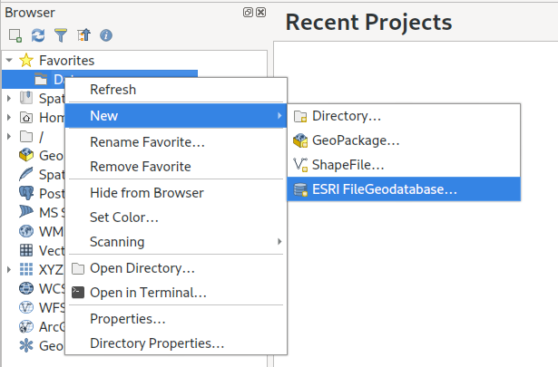
Part of Nathan’s workshop (notes are available here) focused on a hands-on example of creating a custom QGIS “Processing” script. I’ve found that preparing workshops is guaranteed to expose a bunch of rare and tricky software bugs, and this was no exception! Unfortunately the workshop was scheduled just before the QGIS 3.4.2 patch release which fixed these bugs, but at least they’re fixed now and we can move on…

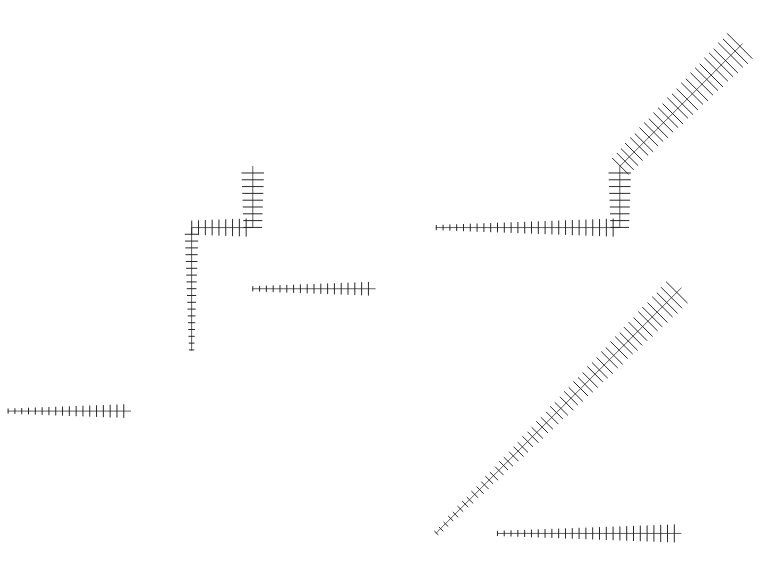
The bulk of Nathan’s example algorithm is contained within the following block (where “distance” is the length of line segments we want to chop our features up into):

for input_feature in enumerate(features):
    geom = feature.geometry().constGet()
    if isinstance(geom, QgsLineString):
        continue
    first_part = geom.geometryN(0)
    start = 0
    end = distance
    length = first_part.length()

    while start < length:
        new_geom = first_part.curveSubstring(start,end)

        output_feature = input_feature
        output_feature.setGeometry(QgsGeometry(new_geom))
        sink.addFeature(output_feature)

        start += distance
        end += distance

There’s a lot here, but really the guts of this algorithm breaks down to one line:

new_geom = first_part.curveSubstring(start,end)

Basically, a new geometry is created for each trimmed section in the output layer by calling the “curveSubstring” method on the input geometry and passing it a start and end distance along the input line. This returns the portion of that input LineString (or CircularString, or CompoundCurve) between those distances. The PyQGIS API nicely hides the details here – you can safely call this one method and be confident that regardless of the input geometry type the result will be correct.

Unfortunately, while calling the “curveSubstring” method is elegant, all the code surrounding this call is not so elegant. As a (mostly) full-time QGIS developer myself, I tend to look over oddities in the API. It’s easy to justify ugly API as just “how it’s always been”, and over time it’s natural to develop a type of blind spot to these issues.

Let’s start with the first ugly part of this code:

geom = input_feature.geometry().constGet()
if isinstance(geom, QgsLineString):
    continue
first_part = geom.geometryN(0)
# chop first_part into sections of desired length
...

This is rather… confusing… logic to follow. Here the script is fetching the geometry of the input feature, checking if it’s a LineString, and if it IS, then it skips that feature and continues to the next. Wait… what? It’s skipping features with LineString geometries?

Well, yes. The algorithm was written specifically for one workshop, which was using a MultiLineString layer as the demo layer. The script takes a huge shortcut here and says “if the input feature isn’t a MultiLineString, ignore it — we only know how to deal with multi-part geometries”. Immediately following this logic there’s a call to geometryN( 0 ), which returns just the first part of the MultiLineString geometry.

There’s two issues here — one is that the script just plain won’t work for LineString inputs, and the second is that it ignores everything BUT the first part in the geometry. While it would be possible to fix the script and add a check for the input geometry type, put in logic to loop over all the parts of a multi-part input, etc, that’s instantly going to add a LOT of complexity or duplicate code here.

Fortunately, this was the perfect excuse to improve the PyQGIS API itself so that this kind of operation is simpler in future! Nathan and I had a debrief/brainstorm after the workshop, and as a result a new “parts iterator” has been implemented and merged to QGIS master. It’ll be available from version 3.6 on. Using the new iterator, we can simplify the script:

geom = input_feature.geometry()
for part in geom.parts():
    # chop part into sections of desired length
    ...

Win! This is simultaneously more readable, more Pythonic, and automatically works for both LineString and MultiLineString inputs (and in the case of MultiLineStrings, we now correctly handle all parts).

Here’s another pain-point. Looking at the block:

new_geom = part.curveSubstring(start,end)
output_feature = input_feature
output_feature.setGeometry(QgsGeometry(new_geom))

At first glance this looks reasonable – we use curveSubstring to get the portion of the curve, then make a copy of the input_feature as output_feature (this ensures that the features output by the algorithm maintain all the attributes from the input features), and finally set the geometry of the output_feature to be the newly calculated curve portion. The ugliness here comes in this line:

output_feature.setGeometry(QgsGeometry(new_geom))

What’s that extra QgsGeometry(…) call doing here? Without getting too sidetracked into the QGIS geometry API internals, QgsFeature.setGeometry requires a QgsGeometry argument, not the QgsAbstractGeometry subclass which is returned by curveSubstring.

This is a prime example of a “paper-cut” style issue in the PyQGIS API. Experienced developers know and understand the reasons behind this, but for newcomers to PyQGIS, it’s an obscure complexity. Fortunately the solution here was simple — and after the workshop Nathan and I added a new overload to QgsFeature.setGeometry which accepts a QgsAbstractGeometry argument. So in QGIS 3.6 this line can be simplified to:

output_feature.setGeometry(new_geom)

Or, if you wanted to make things more concise, you could put the curveSubstring call directly in here:

output_feature = input_feature
output_feature.setGeometry(part.curveSubstring(start,end))

Let’s have a look at the simplified script for QGIS 3.6:

for input_feature in enumerate(features):
    geom = feature.geometry()
    for part in geom.parts():
        start = 0
        end = distance
        length = part.length()

        while start < length:
            output_feature = input_feature
            output_feature.setGeometry(part.curveSubstring(start,end))
            sink.addFeature(output_feature)

            start += distance
            end += distance

This is MUCH nicer, and will be much easier to explain in the next workshop! The good news is that Nathan has more niceness on the way which will further improve the process of writing QGIS Processing script algorithms. You can see some early prototypes of this work here:

So there we go. The process of writing and delivering a workshop helps to look past “API blind spots” and identify the ugly points and traps for those new to the API. As a direct result of this FOSS4G/SOTM Oceania 2018 Workshop, the QGIS 3.6 PyQGIS API will be easier to use, more readable, and less buggy! That’s a win all round!

Edit Features “In Place” crowdfund — made it to QGIS 3.4!

Well, thanks to the resounding success of our QGIS edit-in-place crowdfunding campaign, we’ve been frantically smashing away at our keyboards in an attempt to reward the QGIS community by sneaking this feature in a whole 4 months earlier than originally promised! And, we’re very proud to announce, that this exciting new feature has been implemented and will be included in the upcoming QGIS 3.4 release (due late October 2018). So go ahead — grab one of the nightly pre-release of QGIS 3.4 and checkout the results.

This wouldn’t have been possible without the rapid response to the campaign and the generosity of our wonderful backers:

(In addition to these backers, we’ve also received numerous anonymous donations to this feature from many other individuals — while we can’t list you all publicly, you’re also in our thanks!)


Keep an eye on this blog for other upcoming QGIS crowdfunding campaigns targeted at QGIS 3.6 and beyond… we’ve got lots more exciting work planned for these releases!


Edit Features “In Place” crowdfund — target reached!

Well, the final pledges have been tallied and we’re very proud to announce that our latest crowd funding campaign has been a roaring success!

We’ve been completely blown away by the response to this campaign. Thanks to some incredibly generous backers and donors, we’ve been able to hit the campaign target with plenty of time to spare. As a result, we’ll be pushing hard to reward the generosity of the community by trying to sneak this feature in for the upcoming QGIS 3.4 release (instead of the originally promised 3.6 release)! You can read more about what we’re adding at the campaign page.

We’d like to take this opportunity to extend our heartfelt thanks to all the backers who have pledged to support this project:

In addition to these backers, we’ve also received numerous anonymous donations to this feature from many other individuals — while we can’t list you all publicly, you’re also in our thanks!

Stay tuned for more updates to come as work proceeds on this feature…

Edit Features “In Place” Using QGIS Spatial Operations crowdfund launched!

We’ve just launched a new QGIS crowd funding campaign which we’re super-excited about! This time, we’re addressing what we see as the major shortcoming within QGIS vector layer editing tools, and bridging the gap between the vast power of QGIS’ Processing algorithms and easy-to-use operations which modify layer features “in place”. Here’s a quick sneak preview of what we have planned:


QGIS is already a vector editing powerhouse, and we believe that this improvement will boost the current functionality up an order of magnitude! To make it possible we need 6500€ pledged before 30 September 2018.

This is also our first crowdfunding campaign in which we’re running a “dual funding” approach, which we think should make things friendly and easy for both corporate backers and end user contributions alike. Read more about this at the full campaign page.

You can help make this a reality by supporting the campaign or by sharing the page and increasing exposure to the campaign. Updates to follow!


Drill down (cascading) forms in QGIS crowdfund – final stretch!

Update: donations are now closed, with the outcome of the campaign pending!

We’re nearing the final hours of our crowd funding campaign to implement a drill-down (cascading) field support within QGIS forms, and thanks to numerous generous backers we’re very close to hitting the funding goal! This is a really exciting new feature which would help add greater flexibility and power to QGIS feature forms, but in order to implement it for QGIS 3.2 we need to hit the funding target by 11 May 2018.

As a result, we’re dropping the minimum contribution amount and throwing open the campaign for payments of any amount. These smaller payment will be treated as direct donations to the campaign, so unlike the standard campaign backing these are payable up front. In the case that the campaign IS NOT successful, the donations will not be refunded and will instead be reinvested back into the QGIS (via bug fixing and maintenance efforts). Of course, if you’d prefer to pledge using the standard crowdfunding “no payment if campaign unsuccessful” model you’re more than welcome to! (Full details are available on the campaign page).

Donations closed – outcome pending!

Full details are available on the campaign page.

Drill-down (cascading) forms in QGIS crowdfund launched!

We’ve just launched a new crowd funding campaign to implement a drill-down (cascading) field support within QGIS forms. Full details are available on the campaign page.

This is a really exciting new feature which would help add greater flexibility and power to QGIS feature forms! To make it possible we need 3500€ pledged before 11 May 2018. You can help make this a reality by supporting the campaign or by sharing the page and increasing exposure to the campaign. Updates to follow!

  • Page 1 of 4 ( 67 posts )
  • >>
  • geospatial

Back to Top

Sustaining Members