Related Plugins and Tags

QGIS Planet

QGIS Print Layouts Graphs and Charts Campaign – Complete!

Last week saw the exciting release of version 3 of the QGIS DataPlotly plugin, which incorporates all the work done as a result of our Print Layouts Graphs and Charts crowdfunding campaign crowd funding campaign. Now, beautiful charts and graphs are available directly within QGIS print layouts, and all it takes is the easy installation of the “DataPlotly” plugin from your QGIS install!

In this post we’ll showcase the functionality which has been added during this campaign, and which is available today in the plugin.

UI modernisation and tweaks

First up, during our work on this plugin we’ve invested some time in refreshing the plugin’s UI to ensure it follows all the widget conventions used elsewhere in QGIS. Now, the plugin blends seamlessly into your QGIS window, and all the chart setting widgets behave in just the way you’re used to. We’ve also used this opportunity to fix a number of issues the plugin had when running on hi-dpi displays (such as Apple retina displays)!


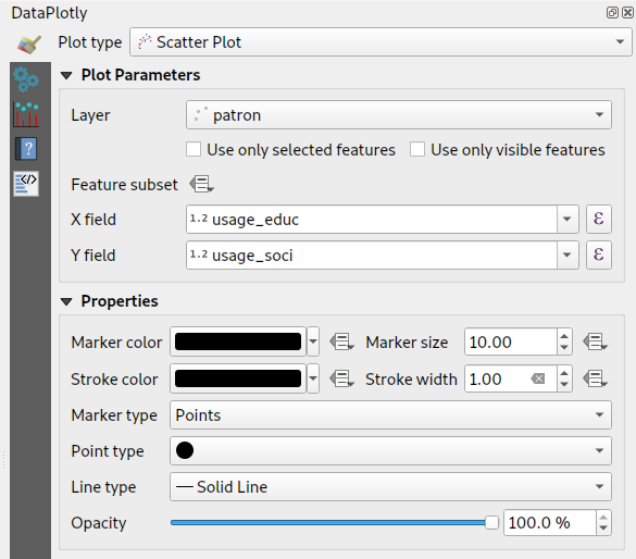
Dynamic charting of selected and visible features

If you’ve used earlier versions of the DataPlotly plugin, you’ll likely notice that there’s many new options shown in the screenshot above. Possibly the most exciting of these is the new “Use only selected features” and “Use only visible features” checkboxes. When either of these options are enabled, then your chart will immediately respond to changes in layer selections or changes to the visible map canvas extent respectively. Previously, interactivity in the plugin only went one way (from the chart to the canvas) – but now the charts are truly interactive, and respond dynamically to changes in the canvas too!


Improved handling of “data defined” settings

During the plugin refactoring, we reworked how “data defined” settings are handled within charts. If you’re not familiar with these, “data defined” settings are QGIS’ approach for exposing per-feature control over the map rendering process. In DataPlotly charts, we expose this functionality to allow per-feature control over the chart appearance (e.g., showing different scatter plot dot colors based on feature attributes). The new code uses the same code model as QGIS itself, so data-defined settings in your charts now have full access to the whole suite of QGIS expression functions and variables that you’re used to! Additionally, QGIS data-defined assistants are fully supported in the charts too. Ultimately, this enables some very advanced styling options, such as charts which dynamically change color and appearance on every page of your print atlas…

Charts in print layouts

We’ve previously covered this feature in depth, but the DataPlotly v3 release brings print-layout based charts to the masses! When a chart is inserted into a print layout, some additional options are available for controlling the plot behavior:

These new options allow you to link the chart to a map item within the layout, which lets you filter the content of the chart to only include features visible within the map. If your print layout is setup as an atlas export, you can also filter out included features to only show those which are geographically located inside the current atlas feature.

Our partners from Faunalia demonstrate this in the screencast below:


Saving plot configuration

An often-requested functionality previous missing from the plugin was the ability to save and restore plot configuration. Now, plot configuration is automatically saved within your QGIS project and restored when you reopen the project. You no longer have to re-create all your charts from scratch at every session (ouch!). We also added the ability to export chart configuration to XML files, allowing you to share and reuse chart configuration across projects.

Behind the scenes work

Aside from all the wonderful new features added to the plugin, we’ve extensively refactored most of the plugin backend. Unit tests and CI infrastructure have been added, which will ensure the plugin remains stable and regression-free in future releases. The code cleanup and simplification has drastically lowered the barrier of contribution to the project, and we’ve already seen new contributors adding more new features to the plugin as a result of this! (Kudos to Simon Gröchenig, who added the new “Feature subset” expression option you can see in the above screenshots!).

Project sponsors

All this work is thanks to the backers of our crowdfunding campaign. Without their contributions this work would not have been possible! In no particular order, our thanks go out to:

  • Federico Gianoli
  • Papercraft Mountains
  • Liam McCrae
  • Henry Walshaw
  • Raúl Sangonzalo
  • Ferdinando Urbano
  • pitsch-ing.ch
  • Carbon-X
  • Gabriel Diosan
  • Rene Giovanni Borella
  • Enrico Bertonati
  • Guido Ingwer
  • David Addy
  • Gerd Jünger
  • Andreas Neumann
  • Stefano Campus
  • Michael Jabot
  • Korto
  • Enrico Ferreguti
  • Carlo A. Nicolini
  • Salvatore Fiandaca
  • Alberto Grava
  • Hans van der Kwast
  • Ben Hur Pintor
  • Silvio Grosso
  • Nobusuke Iwasaki
  • Alasdair Rae
  • Manori Senanayake
  • Canton de Neuchâtel
  • Matthias Daues
  • Alteri Seculo
  • SunGIS Ltd.
  • Stu Smith
  • Keolis Rennes
  • Gabriel Diosan
  • Aiden Price
  • Giacomo Ponticelli
  • Diane Fritz
  • Gemio Bissolati
  • Claire Birnie
  • Nicolas Roelandt
  • Rocco Pispico
  • Gabriel Bengtsson
  • Birds Eye View
  • Barend Köbben
  • Roberto Marzocchi (GTER)
  • Yoichi Kayama
  • Alessandro Sarretta
  • Luca Angeli
  • Luca Bellani
  • giswelt
  • Stefan Giese
  • Ben Harding
  • Joao Gaspar
  • Romain Lacroix
  • Ryan Cooper
  • Daniele Bonaposta
  • QGIS Swedish User Group
  • Nino Formica
  • Michael Gieding
  • Amedeo Fadini
  • Andrew Hannell
  • Stefano
  • Phil Wyatt
  • Brett Edmond Carlock
  • Transitec

Keep an eye out on the North Road blog for future crowd-funding initiatives. Coming soon: a QGIS Processing grab-bag of ETL modelling improvements!

QGIS Print Layouts Graphs and Charts — Beta Out Now!

Thanks to the success of our recent QGIS Print Layouts Graphs and Charts crowdfunding campaign, staff at North Road and Faunalia have been busy updating and improving the QGIS “DataPlotly” plugin with the goal of allowing beautiful charts inside your print layouts.

We’re super-excited to announce that the beta release of this new functionality is now available! With this beta installed, you’ll see a new icon in your QGIS Print Layout designer window:

Clicking this button will allow you to draw a new plot onto your print layout, just like you would any other standard layout item (like legends, scalebars, etc). Any print layout chart can be customised by right-clicking the chart and selecting “Item Properties“. This will open a panel with settings like position, size, frame, and other standard options. All the magic happens when you click the “Setup Plot” button inside this panel:

This exposes the vast array of styling and charting options available for use. If you’re an existing user of the DataPlotly QGIS plugin, you’ll recognise that these are the same settings you have available when creating interactive plots alongside the main map canvas. Every setting is now available for use in print layouts!


To grab the beta, head over to https://github.com/ghtmtt/DataPlotly/releases/tag/v3.9-beta and download the DataPlotly.zip file. Then, inside QGIS, select the Manage and Install Plugins option from the Plugins menu. Click on the “Install from ZIP” section, and point the dialog at your downloaded DataPlotly.zip file. Click “Install Plugin“, and then restart QGIS for good measure. When QGIS restarts you should see the new chart icon inside the print layout designer.

Note that you’ll need a recent QGIS release for this to work correctly — either QGIS 3.8.3 or 3.4.12. (The print layout functionality may not be compatible with earlier releases, as we’ve had to fix several issues inside QGIS itself to get this feature working as designed!). 

We are actively seeking feedback and user testing on this beta release. If you encounter any issues, just head over to https://github.com/ghtmtt/DataPlotly/issues and let us know.

We’ll be further refining this functionality, with the goal of releasing the final non-beta version of the plugin to coincide with the upcoming QGIS 3.10 release.

Happy charting!

QGIS Print Layouts Graphs and Charts — target reached!

We’ve just passed the extended deadline for our recent QGIS Print Layouts Graphs and Charts campaign, and the great news is that thanks to a large number of generous backers we’ve successfully hit the target for this campaign! This has only been possible thanks to the tireless work of the QGIS community and user groups in promoting this campaign and spreading the word.

The Print Layouts Graphs and Charts campaign is a joint effort with our friends at Faunalia, so we’ll soon be starting work together on all the wonderful new functionality heading to the QGIS DataPlotly plugin as a result. The work will be commencing late June, just after the QGIS 3.8.0 final release. Keep an eye out for further updates on the development from this time! You can read more about what’s coming in detail at the campaign page.

We’d like to take this opportunity to extend our heartfelt thanks to all the backers who have pledged to support this project:

  • Federico Gianoli
  • Papercraft Mountains
  • Liam McCrae
  • Henry Walshaw
  • Raúl Sangonzalo
  • Ferdinando Urbano
  • pitsch-ing.ch
  • Carbon-X
  • Gabriel Diosan
  • Rene Giovanni Borella
  • Enrico Bertonati
  • Guido Ingwer
  • David Addy
  • Gerd Jünger
  • Andreas Neumann
  • Stefano Campus
  • Michael Jabot
  • Korto
  • Enrico Ferreguti
  • Carlo A. Nicolini
  • Salvatore Fiandaca
  • Alberto Grava
  • Hans van der Kwast
  • Ben Hur Pintor
  • Silvio Grosso
  • Nobusuke Iwasaki
  • Alasdair Rae
  • Manori Senanayake
  • Canton de Neuchâtel
  • Matthias Daues
  • Alteri Seculo
  • SunGIS Ltd.
  • Stu Smith
  • Keolis Rennes
  • Gabriel Diosan
  • Aiden Price
  • Giacomo Ponticelli
  • Diane Fritz
  • Gemio Bissolati
  • Claire Birnie
  • Nicolas Roelandt
  • Rocco Pispico
  • Gabriel Bengtsson
  • Birds Eye View
  • Barend Köbben
  • Roberto Marzocchi (GTER)
  • Yoichi Kayama
  • Alessandro Sarretta
  • Luca Angeli
  • Luca Bellani
  • giswelt
  • Stefan Giese
  • Ben Harding
  • Joao Gaspar
  • Romain Lacroix
  • Ryan Cooper
  • Daniele Bonaposta
  • QGIS Swedish User Group
  • Nino Formica
  • Michael Gieding
  • Amedeo Fadini
  • Andrew Hannell
  • Stefano
  • Phil Wyatt
  • Brett Edmond Carlock
  • Transitec


QGIS Print Layouts Graphs and Charts – campaign deadline extended!

If you’re a regular reader of this blog, it won’t surprise you to hear that we’re very excited about adding rich charting and graph functionality to QGIS’ Print Layout designer! Alongside our friends at Faunalia, we’re currently running a crowd funding campaign to make this a reality.

So, while the required funds weren’t raised within our original April 30 deadline, we’ve decided to extend this campaign by an additional 30 days in the hopes that the users and organisations from the wider QGIS community will jump onboard and pledge the remaining required funds.

This missing feature is a large gap in QGIS printing capabilities, so we’re counting on you to show your support and spread the word to your local user groups, QGIS users, and any organisations you know of who rely on QGIS and would love to see its inbuilt reporting capabilities levelled up!

QGIS Print Layouts Graphs and Charts – an Illustrated Showcase

If you’ve been following our latest updates, you’ll be well aware that North Road and Faunalia are running a crowd funding campaign to add rich charting and graph functionality to QGIS’ Print Layout designer. This missing feature is a large gap in QGIS printing capabilities, so we’re planning on filling that gap by exposing the powerful QGIS “Data Plotly” plugin to allow these charts to be embedded inside your layouts, and allow them to be created and modified in a simple, interactive style. And thanks to a large group of generous backers, the campaign is off to a fantastic start!

Accordingly, we’d like to take the opportunity to showcase some of the current plot styles available from the QGIS DataPlotly plugin, all of which will be possible to insert into your print layouts if the campaign is successful. Let’s start with the default chart option – a simple scatter plot:

In this screenshot we see a scatter plot of Educational Usage vs Distance from City for a network of railway stations. We’ve left most settings at their default in order to illustrate that even out-of-the-box, the charts look great! They’ll fit right alongside your map masterpieces in your print layouts and won’t look out of place. It’s also important to note that the above screenshot demonstrates the current interactive canvas mode for the DataPlotly plugin. If this campaign is successful, the chart designer shown above will be available directly inside the QGIS Print Layout designer window. Users will be able to drop new charts into their layouts, and then edit the properties of those charts in a interactive manner. Exciting stuff indeed!

So what other plot styles are currently available in DataPlotly? Here’s a quick showcase of what’s hopefully in the future for QGIS’ print layouts…

Box plots

Bar plot

Histograms

Pie Charts

2D Histogram

Polar Plots

Ternary Plots

Contour Plots

Violin Plots

These plots can already be created from your map canvas using the version of DataPlotly available from the standard QGIS plugin repository, so we encourage you to download the plugin and have a play, and start to get a feel for the flexibility and power having access to these charting options will bring to your print layouts!

You can help make this feature a reality by supporting the campaign or by sharing the page and increasing exposure to the campaign. Full details about the planned functionality and how to contribute are available at the campaign page.

QGIS Print Layouts Graphs and Charts crowdfund launched!

Ever wished QGIS had a way to insert dynamic, feature rich charts and graphs directly inside print layouts? If so, our latest crowdfunding campaign has you covered! This missing feature is a large gap in QGIS printing capabilities, so we’re planning on filling that gap by exposing the powerful QGIS “Data Plotly” plugin to allow these charts to be embedded inside your layouts, and allow them to be created and modified in a simple, interactive style.

If you’re not aware of the existing capabilities of the DataPlotly plugin, here’s a quick screencast which should get you excited about the possibilities here…

QGIS is already a reporting powerhouse, and we believe that linking DataPlotly with QGIS print layouts will boost the current functionality up an order of magnitude! To make it possible we need 8600€ pledged before 30 April 2019. North Road is collaborating on this campaign with our friends at Faunalia, and development work will be shared between the two consultancy firms.

You can help make this a reality by supporting the campaign or by sharing the page and increasing exposure to the campaign. Full details about the planned functionality and how to contribute are available at the campaign page.

Exploring Reports in QGIS 3.0 – the Ultimate Guide!

In 2017 North Road ran a crowd funding campaign for extending QGIS’ Print Composer and adding a brand new reporting framework to QGIS. Thanks to numerous generous backers, this campaign was a success. With the final QGIS 3.0 release just around the corner, we thought this was a great time to explore the new reporting engine and what it offers.

We’ll start with a relatively simple project, containing some administrative boundaries, populated places, ports and airports.

Using the “Project” – “New Report” command, we then create a new blank report. Initially, there’s not much to look at – the dialog which is displayed looks much like the QGIS 3.0 Layout Designer, except for the new “Report Organizer” panel shown on the left:

QGIS reports can consist of multiple, nested sections. In our new blank report we initially have only the main report section. The only options present for this report section is to include an optional header and footer for the report. If we enable these, the header will be included as the very first page (or pages… individual parts of reports can be multi-page if desired) in the report, and the footer would be the last page. Let’s go ahead and enable the header, and hit the “Edit” button next to it:

A few things happen as a result. Firstly, an edit pencil is now shown next to the “Report” section in the Report Organizer, indicating that the report section is currently being edited in the designer. We also see a new blank page shown in the designer itself, with the small “Report Header” title. In QGIS reports, every component of the report is made up of individual layouts. They can be created and modified using the exact same tools as are available for standard print layouts – so you can use any desired combination of labels, pictures, maps, tables, etc. Let’s add some items to our report header to demonstrate:

We’ll also create a simple footer for the report, by checking the “Include report footer” option and hitting “Edit“.

Before proceeding further, let’s export this report and see what we get. Exporting is done from the Report menu – in this case we select “Export Report as PDF” to render the whole report to a PDF file. Here’s the not-very-impressive result – a two page PDF consisting of our header and footer:

Let’s make things more interesting. By hitting the green “+” button in the Report Organizer, we’re given a choice of new sections to add to our report.

Currently there’s two options – a “Single section” and a “Field group“. Expect this list to grow in future QGIS releases, but for now we’ll add a Field Group to our report. At its most basic level, you can think of a Field Group as the equivalent of a print atlas. You select a layer to iterate over, and the report will insert a section for each feature found. Selecting the new Field Group section reveals a number of new related settings:

In this case we’ve setup our Field Group so that we iterate over all the states from the “Admin Level 1” layer, using the values from the “adm1name” field. The same options for header and footer are present, together with a new option to include a “body” for this section. We’ll do that, and edit the body:

We’ve setup this body with a map (set to follow the current report feature – just like how a map item in an atlas can follow the current atlas feature), and a label showing the state’s name. If we went ahead and exported our report now, we’d get something like this:

First, the report header, than a page for each state, and finally the report footer. So more or less an atlas, but with a header and footer page. Let’s make things more interesting by adding a subsection to our state group. We do this by first selecting the state field group in the organizer, then hitting the + button and adding a new Field Group:

When a field group is iterating over its features, it will automatically filter these features to match the feature attributes from its parent groups. In this case, the subsection we added will iterate over a “Populated Places” layer, including a body section for each place encountered. The magic here is that the Populated Places layer has an attribute named “adm1name“, tagging each place with the state it’s contained within (if you’re lucky your data will already be structured like this – if not, run the Processing “Join by Location” algorithm and create your own field). When we export this report, QGIS will grab the first state from the Admin Level 1 layer, and then iterate over all the Populated Places with a matching “adm1name” value. Here’s what we get:

(Here we created a basic body for the Populated Places group, including a map of the place and a table of some place attributes). So our report is now a report header, a page for each state followed by a page for every populated place within that state, and finally the report footer. If we were to add a header for the Populated Places group, it would be included just before listing the populated places for each state:

Similarly, a footer for the Populated Places group would be inserted after the final place for each state is included.

In addition to nested subsections, subsections in a report can also be included consecutively. If we add a second subsection to the Admin Level 1 group for Airports, then our report will first list ALL the populated places for each state, followed by all the airports within that state, before proceeding to the next state. In this case our report would be structured like this:

(The key point here is that our Airports group is a subsection of the Admin Level 1 group – not the Populated Places group). Here’s what our report could look like now:

Combining nested and consecutive sections, together with section headers and footers allows for tons of flexibility. For instance, in the below report we add another field group as a child of the main report for the Ports layer. Now, after listing the states together with their populated places and airports, we’ll get a summary list of all the ports in the region:

This results in the last part of our report exporting as:

As you can start to imagine, reports in QGIS are extremely powerful and flexible! We’re extremely thankful for all the backers of our crowd funding campaign, without whom this work would not have been possible.

Stay tuned for more reporting and layouts work we have planned for QGIS 3.2!


QGIS Composer Rewrite and Layout Engine crowdfund launched!

At North Road we believe that crowdfunding is a sustainable way to maintain and enhance open source software, like the QGIS open source GIS package. We’ve run a number of successful crowdfunding campaigns in the past, including support in QGIS for live layer effects, a point cluster renderer, and a unique value renderer for raster layers.

Now, we’re proud to announce our latest crowd funding endeavour, and our biggest to date, the QGIS Layout and Reporting Engine Campaign.

This campaign covers stage 1 of a large, ongoing project to modernise and expand on QGIS’ print composer and layout facilities. Over time QGIS’ composer functionality has grown extensively and now is capable of creating flexible, high quality cartographic outputs. However, we’ve now hit a limit where the current code architecture is prohibiting further improvements and important fixes. In order to add a reporting framework to QGIS, it is necessary for us to refactor and improve large sections of the composer code.

If this campaign is successful, we’ll be adding flexible report generation features to QGIS and cleaning up all the existing composer code. As part of these clean up, we’ll be taking the opportunity to tackle a number of current limitations which cannot be addressed in the current composition code:

  • Layouts will become unit aware, allowing for item placement and properties using millimetres, inches, pixels, centimetres, points, etc.
  • Layouts will have the ability to include mixed page sizes and orientations.
  • Plugins will be able to create custom composer item types (eg allow utilisation of 3rd party graphing and visualisation libraries!).
  • Individual layout items can be rasterised without affecting the rest of the layout. For instance, a map which requires rasterisation due to its use of blend modes will not require all other layout items (such as headings, legends, etc) to be rasterised. This will greatly benefit PDF outputs for complex map layouts.
  • The code refresh will allow more extensive use of data defined layout item properties.
  • A render caching system will be implemented for items, speeding up use of the layout designer and also paving the way for use of live paint effects on layout items (eg dynamic drop shadows).

Full details on what we have planned are available here: QGIS Layout and Reporting Engine Campaign.

To make it possible we need 30,000€ pledged before 31 May 2017. You can help make this a reality by supporting the campaign or by sharing the campaign page and increasing exposure to the campaign. Updates to follow!

  • Page 1 of 1 ( 8 posts )
  • layout

Back to Top

Sustaining Members