Related Plugins and Tags

QGIS Planet

Vintage map design using QGIS

This post describes the three simple steps necessary to create a vintage-looking map using the blending feature in QGIS 2.0′s print composer. This is what we are aiming for:
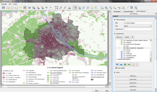
alaska_oldpaper

1. Prepare the map

Like any other map, this one starts in the QGIS main window. Try to stick with earthy colors which will go well with the old paper look. For labels, try fonts which look like handwriting.

alaska_oldschool_overview

Once you are happy with your map

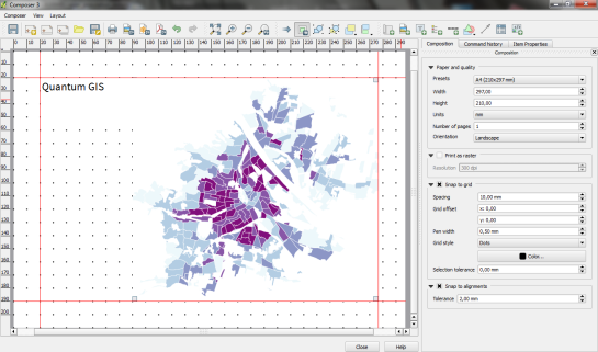
2. Prepare the composition background

To get that vintage feel, we need a background image with a great texture. You can find such textures on sites like lostandtaken.com. Download one you like and add it to an empty print composer. Make sure it covers the whole paper:

alaska_oldschool_bg

Lock the image by right-clicking it once – a small lock icon should appear in the upper left corner.

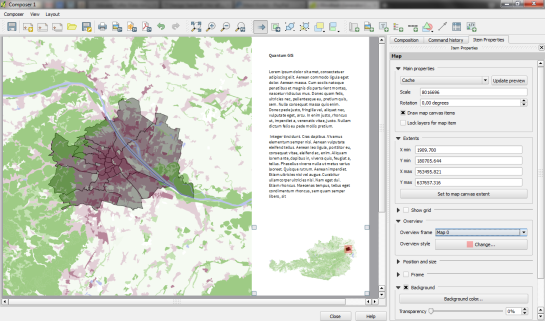
3. Finish the composition

The final step is to add the map on top of the background image. To make our nice background texture shine through, we enable the “multiply” blending mode in the map’s rendering options:

alaska_oldschool_print

Feel free to add north arrows or drawings of dragons as finishing touches.


Print Composer 2.0 – Take #7

Today’s post: More print composer overview magic!

Inverted Map Overviews

Thanks to the “Invert overview” option, we can now chose between highlighting the detail area (left example in the image) or blocking out the surrounding area (right example).

printcomposer_overviews

The “Lock layers for map item” option can come in very handy if you want to reduce the number of layers in the overview map while still keeping all layers of interest in the main map.


Print Composer 2.0 – Take #6

The latest version of Print composer features new

Rulers and guide lines or “alignments”

Rulers are a well-known feature in graphics programs such as Gimp and Photoshop. Now you can also find them in QGIS Print Composer. Click onto the ruler, hold the mouse key down and move the cursor to position guide lines for map feature alignment.

printcomposer_grid

Of course, there’s also the handy “Snap to grid” functionality.


Print Composer 2.0 – Take #5

This fifth part in my series on QGIS 2.0 Print Composer presents

Map grids

There are numerous different options for map grids in the new composer but a picture is worth a thousand words:

printcomposer_grids

The upper-left map features a zebra frame style and coordinate labels aligned horizontally and vertically.

The upper-right map shows a normal frame with labels written inside the frame instead of outside. This grid shows an additional offset.

The lower-left map has no frame but customized, colored and dashed grid lines.

Finally, the lower-right map shows a cross grid with default horizontal coordinate labels.


Print Composer 2.0 – Take #4

Today’s spotlight is on a feature which you’ll really love if you have to arrange a little more text on a print layout:

HTML labels

Regular labels are limited to one font, size and color. With the new “Render as HTML” option, you gain flexibility to use HTML tags to style your text by adding headers, lists and even images (note the QGIS logo I added by pointing to the image online):

printcomposer_html


Print Composer 2.0 – Take #3

After guide lines and multi-column legends, today’s focus is on

Overview maps

Small overview maps are used to help the reader get an idea of where the region displayed on the main map is located. In the new Print Composer, it’s simple to add such overviews: Add the main map as usual. Then add another map object to the composition an go to the “Overview” section. There, you can specify that the second map object should be an overview map for the first one: Just specify “Map 0″ in the dropdown list:

printcomposer_overview


Print Composer 2.0 – Take #2

After yesterday’s first post on guide lines & snapping for user-friendly map element arrangement, we’ll have a look at another great new addition:

Multi-column legends

In the panel on the right, there is a new section called “Columns”. Here we can create multi-column legend layouts by specifying the desired number of columns. Add some spacing too. It will make the result look more balanced.

By default, Print Composer tries to keep all classes of one layer in one column. You can override this behavior – as I did in this example – by ticking “Split Layers”:

printcomposer_columns

Another useful trick is to use text wrapping for long class labels. This option can be found in the legend’s “Main properties” right at the top of the side panel. In this example, I specified wrap on the pipe “|” symbol and inserted this symbol into the longer class names to force a line break:

printcomposer_wraplegendtext


Print Composer 2.0 – Take #1

This is the first post in a series dedicated solely to Print Composer in QGIS 2.0 which you can already admire in recent nightly builds.

Guide lines & snapping for user-friendly map element arrangement

Arranging map elements has never been easier: Elements can be moved as freely as before but now they will automatically try to align with other elements on the page or the page borders. Additional red guide lines help interpret the snapping behavior.

printcomposer_guides


Printing Web Maps with QGIS Mapserver

Great news: Sourcepole has extended QGIS server to offer printing functionality for web maps based on print composer.

Screenshot - Selecting a print extent

Selecting a print extent

You can test this functionality yourself on gis.uster.ch/webgis. The viewers are GeoExt-based. User can intuitively select a layout, extent, scale, rotation and resolution for printing. QGIS server will return a printable PDF.

If you want to learn more about what goes on behind the scenes, you find a good description on Sourcepole’s website.


  • Page 1 of 1 ( 9 posts )
  • printing

Back to Top

Sustaining Members