Related Plugins and Tags

QGIS Planet

Crowd funding alert: Point Clouds, Elevation Profiles and 3D Map view improvements!

Together with our partners at Lutra Consulting and Hobu, we have once again have collated your feature requests for even MORE point cloud and QGIS elevation improvements and are ready to start working on them!

Here’s a taster of what to expect if our latest crowd funding campaign is successful:

  • Point cloud data management, transformation and analysis via incorporation of PDAL within the QGIS “Processing” toolbox
  • Optimised handling of large datasets to speed up your 3D maps, including dynamic data loading for complex 3D scenes
  • Combine multiple LAS/LAZ point cloud files into a single “virtual” point cloud for easy data management and display
  • Elevation profile tool embedded into print layouts, totally customizable, more efficient and with the ability to export profile data to CSV and DXF
  • General improvements to QGIS 3D map views, including an enhanced 3D measuring tool, additional camera controls and improving the configuration dialog options and functionality.

To find out more, check out the ‘Detailed proposal and deliverables’ section on the main crowd funding page. You may want to get some popcorn ready, it really is exciting!

We need your help to make this work possible. If you’d like to see these enhancements, pledge to the crowdfunding campaign before October 24, 2022.

QGIS Processing, Model Designer and ETL Campaign crowdfund launched!

QGIS Processing offers a rich and expandable set of algorithms which can operate on spatial data, along with a powerful Model Designer which allows users to string together these algorithms to create custom workflows.

Since its introduction in QGIS 2, the Processing framework has seen an intensive amount of development and optimisation efforts. In recent QGIS releases it offers a very user-friendly way of performing complex spatial data processing tasks, all without requiring ANY expensive third-party tools or software licenses!

At North Road we are passionate about the QGIS Processing framework, and have invested considerable effort in this framework over the past 5 years. We’re proud to announce that our latest crowd-funding campaign is focused on further expanding the capabilities and flexibility of Processing and the Processing Model Designer!

Unlike a typical crowdfunding campaign, where a specific funding target and deadline is set, we’re running this campaign a little differently. Instead, this campaign is taking the form of a “à la carte” menu of Processing enhancements. These range from small “paper-cut” style fixes, through to larger architectural improvements, and are each individually priced accordingly. We are asking backers to pick individual enhancements from this “menu of enhancements” and fund that enhancement’s development in full. In order to make this campaign affordable for a wide range of backers, we’ve included a huge range of enhancements which vary in price from smaller amounts to larger amounts.

You can read the full details of the campaign and browse the list of proposed enhancements at the campaign page.

QGIS Print Layouts Graphs and Charts Campaign – Complete!

Last week saw the exciting release of version 3 of the QGIS DataPlotly plugin, which incorporates all the work done as a result of our Print Layouts Graphs and Charts crowdfunding campaign crowd funding campaign. Now, beautiful charts and graphs are available directly within QGIS print layouts, and all it takes is the easy installation of the “DataPlotly” plugin from your QGIS install!

In this post we’ll showcase the functionality which has been added during this campaign, and which is available today in the plugin.

UI modernisation and tweaks

First up, during our work on this plugin we’ve invested some time in refreshing the plugin’s UI to ensure it follows all the widget conventions used elsewhere in QGIS. Now, the plugin blends seamlessly into your QGIS window, and all the chart setting widgets behave in just the way you’re used to. We’ve also used this opportunity to fix a number of issues the plugin had when running on hi-dpi displays (such as Apple retina displays)!


Dynamic charting of selected and visible features

If you’ve used earlier versions of the DataPlotly plugin, you’ll likely notice that there’s many new options shown in the screenshot above. Possibly the most exciting of these is the new “Use only selected features” and “Use only visible features” checkboxes. When either of these options are enabled, then your chart will immediately respond to changes in layer selections or changes to the visible map canvas extent respectively. Previously, interactivity in the plugin only went one way (from the chart to the canvas) – but now the charts are truly interactive, and respond dynamically to changes in the canvas too!


Improved handling of “data defined” settings

During the plugin refactoring, we reworked how “data defined” settings are handled within charts. If you’re not familiar with these, “data defined” settings are QGIS’ approach for exposing per-feature control over the map rendering process. In DataPlotly charts, we expose this functionality to allow per-feature control over the chart appearance (e.g., showing different scatter plot dot colors based on feature attributes). The new code uses the same code model as QGIS itself, so data-defined settings in your charts now have full access to the whole suite of QGIS expression functions and variables that you’re used to! Additionally, QGIS data-defined assistants are fully supported in the charts too. Ultimately, this enables some very advanced styling options, such as charts which dynamically change color and appearance on every page of your print atlas…

Charts in print layouts

We’ve previously covered this feature in depth, but the DataPlotly v3 release brings print-layout based charts to the masses! When a chart is inserted into a print layout, some additional options are available for controlling the plot behavior:

These new options allow you to link the chart to a map item within the layout, which lets you filter the content of the chart to only include features visible within the map. If your print layout is setup as an atlas export, you can also filter out included features to only show those which are geographically located inside the current atlas feature.

Our partners from Faunalia demonstrate this in the screencast below:


Saving plot configuration

An often-requested functionality previous missing from the plugin was the ability to save and restore plot configuration. Now, plot configuration is automatically saved within your QGIS project and restored when you reopen the project. You no longer have to re-create all your charts from scratch at every session (ouch!). We also added the ability to export chart configuration to XML files, allowing you to share and reuse chart configuration across projects.

Behind the scenes work

Aside from all the wonderful new features added to the plugin, we’ve extensively refactored most of the plugin backend. Unit tests and CI infrastructure have been added, which will ensure the plugin remains stable and regression-free in future releases. The code cleanup and simplification has drastically lowered the barrier of contribution to the project, and we’ve already seen new contributors adding more new features to the plugin as a result of this! (Kudos to Simon Gröchenig, who added the new “Feature subset” expression option you can see in the above screenshots!).

Project sponsors

All this work is thanks to the backers of our crowdfunding campaign. Without their contributions this work would not have been possible! In no particular order, our thanks go out to:

  • Federico Gianoli
  • Papercraft Mountains
  • Liam McCrae
  • Henry Walshaw
  • Raúl Sangonzalo
  • Ferdinando Urbano
  • pitsch-ing.ch
  • Carbon-X
  • Gabriel Diosan
  • Rene Giovanni Borella
  • Enrico Bertonati
  • Guido Ingwer
  • David Addy
  • Gerd Jünger
  • Andreas Neumann
  • Stefano Campus
  • Michael Jabot
  • Korto
  • Enrico Ferreguti
  • Carlo A. Nicolini
  • Salvatore Fiandaca
  • Alberto Grava
  • Hans van der Kwast
  • Ben Hur Pintor
  • Silvio Grosso
  • Nobusuke Iwasaki
  • Alasdair Rae
  • Manori Senanayake
  • Canton de Neuchâtel
  • Matthias Daues
  • Alteri Seculo
  • SunGIS Ltd.
  • Stu Smith
  • Keolis Rennes
  • Gabriel Diosan
  • Aiden Price
  • Giacomo Ponticelli
  • Diane Fritz
  • Gemio Bissolati
  • Claire Birnie
  • Nicolas Roelandt
  • Rocco Pispico
  • Gabriel Bengtsson
  • Birds Eye View
  • Barend Köbben
  • Roberto Marzocchi (GTER)
  • Yoichi Kayama
  • Alessandro Sarretta
  • Luca Angeli
  • Luca Bellani
  • giswelt
  • Stefan Giese
  • Ben Harding
  • Joao Gaspar
  • Romain Lacroix
  • Ryan Cooper
  • Daniele Bonaposta
  • QGIS Swedish User Group
  • Nino Formica
  • Michael Gieding
  • Amedeo Fadini
  • Andrew Hannell
  • Stefano
  • Phil Wyatt
  • Brett Edmond Carlock
  • Transitec

Keep an eye out on the North Road blog for future crowd-funding initiatives. Coming soon: a QGIS Processing grab-bag of ETL modelling improvements!

QGIS Print Layouts Graphs and Charts — Beta Out Now!

Thanks to the success of our recent QGIS Print Layouts Graphs and Charts crowdfunding campaign, staff at North Road and Faunalia have been busy updating and improving the QGIS “DataPlotly” plugin with the goal of allowing beautiful charts inside your print layouts.

We’re super-excited to announce that the beta release of this new functionality is now available! With this beta installed, you’ll see a new icon in your QGIS Print Layout designer window:

Clicking this button will allow you to draw a new plot onto your print layout, just like you would any other standard layout item (like legends, scalebars, etc). Any print layout chart can be customised by right-clicking the chart and selecting “Item Properties“. This will open a panel with settings like position, size, frame, and other standard options. All the magic happens when you click the “Setup Plot” button inside this panel:

This exposes the vast array of styling and charting options available for use. If you’re an existing user of the DataPlotly QGIS plugin, you’ll recognise that these are the same settings you have available when creating interactive plots alongside the main map canvas. Every setting is now available for use in print layouts!


To grab the beta, head over to https://github.com/ghtmtt/DataPlotly/releases/tag/v3.9-beta and download the DataPlotly.zip file. Then, inside QGIS, select the Manage and Install Plugins option from the Plugins menu. Click on the “Install from ZIP” section, and point the dialog at your downloaded DataPlotly.zip file. Click “Install Plugin“, and then restart QGIS for good measure. When QGIS restarts you should see the new chart icon inside the print layout designer.

Note that you’ll need a recent QGIS release for this to work correctly — either QGIS 3.8.3 or 3.4.12. (The print layout functionality may not be compatible with earlier releases, as we’ve had to fix several issues inside QGIS itself to get this feature working as designed!). 

We are actively seeking feedback and user testing on this beta release. If you encounter any issues, just head over to https://github.com/ghtmtt/DataPlotly/issues and let us know.

We’ll be further refining this functionality, with the goal of releasing the final non-beta version of the plugin to coincide with the upcoming QGIS 3.10 release.

Happy charting!

QGIS Print Layouts Graphs and Charts — target reached!

We’ve just passed the extended deadline for our recent QGIS Print Layouts Graphs and Charts campaign, and the great news is that thanks to a large number of generous backers we’ve successfully hit the target for this campaign! This has only been possible thanks to the tireless work of the QGIS community and user groups in promoting this campaign and spreading the word.

The Print Layouts Graphs and Charts campaign is a joint effort with our friends at Faunalia, so we’ll soon be starting work together on all the wonderful new functionality heading to the QGIS DataPlotly plugin as a result. The work will be commencing late June, just after the QGIS 3.8.0 final release. Keep an eye out for further updates on the development from this time! You can read more about what’s coming in detail at the campaign page.

We’d like to take this opportunity to extend our heartfelt thanks to all the backers who have pledged to support this project:

  • Federico Gianoli
  • Papercraft Mountains
  • Liam McCrae
  • Henry Walshaw
  • Raúl Sangonzalo
  • Ferdinando Urbano
  • pitsch-ing.ch
  • Carbon-X
  • Gabriel Diosan
  • Rene Giovanni Borella
  • Enrico Bertonati
  • Guido Ingwer
  • David Addy
  • Gerd Jünger
  • Andreas Neumann
  • Stefano Campus
  • Michael Jabot
  • Korto
  • Enrico Ferreguti
  • Carlo A. Nicolini
  • Salvatore Fiandaca
  • Alberto Grava
  • Hans van der Kwast
  • Ben Hur Pintor
  • Silvio Grosso
  • Nobusuke Iwasaki
  • Alasdair Rae
  • Manori Senanayake
  • Canton de Neuchâtel
  • Matthias Daues
  • Alteri Seculo
  • SunGIS Ltd.
  • Stu Smith
  • Keolis Rennes
  • Gabriel Diosan
  • Aiden Price
  • Giacomo Ponticelli
  • Diane Fritz
  • Gemio Bissolati
  • Claire Birnie
  • Nicolas Roelandt
  • Rocco Pispico
  • Gabriel Bengtsson
  • Birds Eye View
  • Barend Köbben
  • Roberto Marzocchi (GTER)
  • Yoichi Kayama
  • Alessandro Sarretta
  • Luca Angeli
  • Luca Bellani
  • giswelt
  • Stefan Giese
  • Ben Harding
  • Joao Gaspar
  • Romain Lacroix
  • Ryan Cooper
  • Daniele Bonaposta
  • QGIS Swedish User Group
  • Nino Formica
  • Michael Gieding
  • Amedeo Fadini
  • Andrew Hannell
  • Stefano
  • Phil Wyatt
  • Brett Edmond Carlock
  • Transitec


QGIS Print Layouts Graphs and Charts – campaign deadline extended!

If you’re a regular reader of this blog, it won’t surprise you to hear that we’re very excited about adding rich charting and graph functionality to QGIS’ Print Layout designer! Alongside our friends at Faunalia, we’re currently running a crowd funding campaign to make this a reality.

So, while the required funds weren’t raised within our original April 30 deadline, we’ve decided to extend this campaign by an additional 30 days in the hopes that the users and organisations from the wider QGIS community will jump onboard and pledge the remaining required funds.

This missing feature is a large gap in QGIS printing capabilities, so we’re counting on you to show your support and spread the word to your local user groups, QGIS users, and any organisations you know of who rely on QGIS and would love to see its inbuilt reporting capabilities levelled up!

QGIS Print Layouts Graphs and Charts – an Illustrated Showcase

If you’ve been following our latest updates, you’ll be well aware that North Road and Faunalia are running a crowd funding campaign to add rich charting and graph functionality to QGIS’ Print Layout designer. This missing feature is a large gap in QGIS printing capabilities, so we’re planning on filling that gap by exposing the powerful QGIS “Data Plotly” plugin to allow these charts to be embedded inside your layouts, and allow them to be created and modified in a simple, interactive style. And thanks to a large group of generous backers, the campaign is off to a fantastic start!

Accordingly, we’d like to take the opportunity to showcase some of the current plot styles available from the QGIS DataPlotly plugin, all of which will be possible to insert into your print layouts if the campaign is successful. Let’s start with the default chart option – a simple scatter plot:

In this screenshot we see a scatter plot of Educational Usage vs Distance from City for a network of railway stations. We’ve left most settings at their default in order to illustrate that even out-of-the-box, the charts look great! They’ll fit right alongside your map masterpieces in your print layouts and won’t look out of place. It’s also important to note that the above screenshot demonstrates the current interactive canvas mode for the DataPlotly plugin. If this campaign is successful, the chart designer shown above will be available directly inside the QGIS Print Layout designer window. Users will be able to drop new charts into their layouts, and then edit the properties of those charts in a interactive manner. Exciting stuff indeed!

So what other plot styles are currently available in DataPlotly? Here’s a quick showcase of what’s hopefully in the future for QGIS’ print layouts…

Box plots

Bar plot

Histograms

Pie Charts

2D Histogram

Polar Plots

Ternary Plots

Contour Plots

Violin Plots

These plots can already be created from your map canvas using the version of DataPlotly available from the standard QGIS plugin repository, so we encourage you to download the plugin and have a play, and start to get a feel for the flexibility and power having access to these charting options will bring to your print layouts!

You can help make this feature a reality by supporting the campaign or by sharing the page and increasing exposure to the campaign. Full details about the planned functionality and how to contribute are available at the campaign page.

QGIS Print Layouts Graphs and Charts crowdfund launched!

Ever wished QGIS had a way to insert dynamic, feature rich charts and graphs directly inside print layouts? If so, our latest crowdfunding campaign has you covered! This missing feature is a large gap in QGIS printing capabilities, so we’re planning on filling that gap by exposing the powerful QGIS “Data Plotly” plugin to allow these charts to be embedded inside your layouts, and allow them to be created and modified in a simple, interactive style.

If you’re not aware of the existing capabilities of the DataPlotly plugin, here’s a quick screencast which should get you excited about the possibilities here…

QGIS is already a reporting powerhouse, and we believe that linking DataPlotly with QGIS print layouts will boost the current functionality up an order of magnitude! To make it possible we need 8600€ pledged before 30 April 2019. North Road is collaborating on this campaign with our friends at Faunalia, and development work will be shared between the two consultancy firms.

You can help make this a reality by supporting the campaign or by sharing the page and increasing exposure to the campaign. Full details about the planned functionality and how to contribute are available at the campaign page.

Edit Features “In Place” crowdfund — made it to QGIS 3.4!

Well, thanks to the resounding success of our QGIS edit-in-place crowdfunding campaign, we’ve been frantically smashing away at our keyboards in an attempt to reward the QGIS community by sneaking this feature in a whole 4 months earlier than originally promised! And, we’re very proud to announce, that this exciting new feature has been implemented and will be included in the upcoming QGIS 3.4 release (due late October 2018). So go ahead — grab one of the nightly pre-release of QGIS 3.4 and checkout the results.

This wouldn’t have been possible without the rapid response to the campaign and the generosity of our wonderful backers:

(In addition to these backers, we’ve also received numerous anonymous donations to this feature from many other individuals — while we can’t list you all publicly, you’re also in our thanks!)


Keep an eye on this blog for other upcoming QGIS crowdfunding campaigns targeted at QGIS 3.6 and beyond… we’ve got lots more exciting work planned for these releases!


Edit Features “In Place” crowdfund — target reached!

Well, the final pledges have been tallied and we’re very proud to announce that our latest crowd funding campaign has been a roaring success!

We’ve been completely blown away by the response to this campaign. Thanks to some incredibly generous backers and donors, we’ve been able to hit the campaign target with plenty of time to spare. As a result, we’ll be pushing hard to reward the generosity of the community by trying to sneak this feature in for the upcoming QGIS 3.4 release (instead of the originally promised 3.6 release)! You can read more about what we’re adding at the campaign page.

We’d like to take this opportunity to extend our heartfelt thanks to all the backers who have pledged to support this project:

In addition to these backers, we’ve also received numerous anonymous donations to this feature from many other individuals — while we can’t list you all publicly, you’re also in our thanks!

Stay tuned for more updates to come as work proceeds on this feature…

Edit Features “In Place” Using QGIS Spatial Operations crowdfund launched!

We’ve just launched a new QGIS crowd funding campaign which we’re super-excited about! This time, we’re addressing what we see as the major shortcoming within QGIS vector layer editing tools, and bridging the gap between the vast power of QGIS’ Processing algorithms and easy-to-use operations which modify layer features “in place”. Here’s a quick sneak preview of what we have planned:


QGIS is already a vector editing powerhouse, and we believe that this improvement will boost the current functionality up an order of magnitude! To make it possible we need 6500€ pledged before 30 September 2018.

This is also our first crowdfunding campaign in which we’re running a “dual funding” approach, which we think should make things friendly and easy for both corporate backers and end user contributions alike. Read more about this at the full campaign page.

You can help make this a reality by supporting the campaign or by sharing the page and increasing exposure to the campaign. Updates to follow!


Drill down (cascading) forms in QGIS crowdfund – final stretch!

Update: donations are now closed, with the outcome of the campaign pending!

We’re nearing the final hours of our crowd funding campaign to implement a drill-down (cascading) field support within QGIS forms, and thanks to numerous generous backers we’re very close to hitting the funding goal! This is a really exciting new feature which would help add greater flexibility and power to QGIS feature forms, but in order to implement it for QGIS 3.2 we need to hit the funding target by 11 May 2018.

As a result, we’re dropping the minimum contribution amount and throwing open the campaign for payments of any amount. These smaller payment will be treated as direct donations to the campaign, so unlike the standard campaign backing these are payable up front. In the case that the campaign IS NOT successful, the donations will not be refunded and will instead be reinvested back into the QGIS (via bug fixing and maintenance efforts). Of course, if you’d prefer to pledge using the standard crowdfunding “no payment if campaign unsuccessful” model you’re more than welcome to! (Full details are available on the campaign page).

Donations closed – outcome pending!

Full details are available on the campaign page.

Drill-down (cascading) forms in QGIS crowdfund launched!

We’ve just launched a new crowd funding campaign to implement a drill-down (cascading) field support within QGIS forms. Full details are available on the campaign page.

This is a really exciting new feature which would help add greater flexibility and power to QGIS feature forms! To make it possible we need 3500€ pledged before 11 May 2018. You can help make this a reality by supporting the campaign or by sharing the page and increasing exposure to the campaign. Updates to follow!

Exploring Reports in QGIS 3.0 – the Ultimate Guide!

In 2017 North Road ran a crowd funding campaign for extending QGIS’ Print Composer and adding a brand new reporting framework to QGIS. Thanks to numerous generous backers, this campaign was a success. With the final QGIS 3.0 release just around the corner, we thought this was a great time to explore the new reporting engine and what it offers.

We’ll start with a relatively simple project, containing some administrative boundaries, populated places, ports and airports.

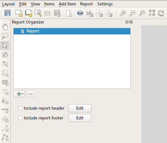
Using the “Project” – “New Report” command, we then create a new blank report. Initially, there’s not much to look at – the dialog which is displayed looks much like the QGIS 3.0 Layout Designer, except for the new “Report Organizer” panel shown on the left:

QGIS reports can consist of multiple, nested sections. In our new blank report we initially have only the main report section. The only options present for this report section is to include an optional header and footer for the report. If we enable these, the header will be included as the very first page (or pages… individual parts of reports can be multi-page if desired) in the report, and the footer would be the last page. Let’s go ahead and enable the header, and hit the “Edit” button next to it:

A few things happen as a result. Firstly, an edit pencil is now shown next to the “Report” section in the Report Organizer, indicating that the report section is currently being edited in the designer. We also see a new blank page shown in the designer itself, with the small “Report Header” title. In QGIS reports, every component of the report is made up of individual layouts. They can be created and modified using the exact same tools as are available for standard print layouts – so you can use any desired combination of labels, pictures, maps, tables, etc. Let’s add some items to our report header to demonstrate:

We’ll also create a simple footer for the report, by checking the “Include report footer” option and hitting “Edit“.

Before proceeding further, let’s export this report and see what we get. Exporting is done from the Report menu – in this case we select “Export Report as PDF” to render the whole report to a PDF file. Here’s the not-very-impressive result – a two page PDF consisting of our header and footer:

Let’s make things more interesting. By hitting the green “+” button in the Report Organizer, we’re given a choice of new sections to add to our report.

Currently there’s two options – a “Single section” and a “Field group“. Expect this list to grow in future QGIS releases, but for now we’ll add a Field Group to our report. At its most basic level, you can think of a Field Group as the equivalent of a print atlas. You select a layer to iterate over, and the report will insert a section for each feature found. Selecting the new Field Group section reveals a number of new related settings:

In this case we’ve setup our Field Group so that we iterate over all the states from the “Admin Level 1” layer, using the values from the “adm1name” field. The same options for header and footer are present, together with a new option to include a “body” for this section. We’ll do that, and edit the body:

We’ve setup this body with a map (set to follow the current report feature – just like how a map item in an atlas can follow the current atlas feature), and a label showing the state’s name. If we went ahead and exported our report now, we’d get something like this:

First, the report header, than a page for each state, and finally the report footer. So more or less an atlas, but with a header and footer page. Let’s make things more interesting by adding a subsection to our state group. We do this by first selecting the state field group in the organizer, then hitting the + button and adding a new Field Group:

When a field group is iterating over its features, it will automatically filter these features to match the feature attributes from its parent groups. In this case, the subsection we added will iterate over a “Populated Places” layer, including a body section for each place encountered. The magic here is that the Populated Places layer has an attribute named “adm1name“, tagging each place with the state it’s contained within (if you’re lucky your data will already be structured like this – if not, run the Processing “Join by Location” algorithm and create your own field). When we export this report, QGIS will grab the first state from the Admin Level 1 layer, and then iterate over all the Populated Places with a matching “adm1name” value. Here’s what we get:

(Here we created a basic body for the Populated Places group, including a map of the place and a table of some place attributes). So our report is now a report header, a page for each state followed by a page for every populated place within that state, and finally the report footer. If we were to add a header for the Populated Places group, it would be included just before listing the populated places for each state:

Similarly, a footer for the Populated Places group would be inserted after the final place for each state is included.

In addition to nested subsections, subsections in a report can also be included consecutively. If we add a second subsection to the Admin Level 1 group for Airports, then our report will first list ALL the populated places for each state, followed by all the airports within that state, before proceeding to the next state. In this case our report would be structured like this:

(The key point here is that our Airports group is a subsection of the Admin Level 1 group – not the Populated Places group). Here’s what our report could look like now:

Combining nested and consecutive sections, together with section headers and footers allows for tons of flexibility. For instance, in the below report we add another field group as a child of the main report for the Ports layer. Now, after listing the states together with their populated places and airports, we’ll get a summary list of all the ports in the region:

This results in the last part of our report exporting as:

As you can start to imagine, reports in QGIS are extremely powerful and flexible! We’re extremely thankful for all the backers of our crowd funding campaign, without whom this work would not have been possible.

Stay tuned for more reporting and layouts work we have planned for QGIS 3.2!


QGIS layouts rewrite – progress report #1

Following our recent successful QGIS Layout and Reporting Engine crowdfunding campaign, we’ve been hard at working ripping up the internals of the QGIS 2.x print composer and rebuilding a brand new, shiny QGIS layouts engine. This is exciting work – it’s very satisfying to be able to cleanup a lot of the old composer code in QGIS and take opportunities along the way to fix long standing bugs and add new features.

While it’s not ready for daily use yet, there’s already been a lot of interesting changes which have landed in the layouts work as a result of this campaign. Let’s take a look at what’s been implemented so far…

  • We’ve added support for different measurements units all throughout layouts. While this means it’s now possible to set page sizes using centimeters, inches, pixels, points, etc, it goes much deeper than just that. In layouts, everything which has a size or position can take advantage of this unit support. So you can have page sizes in centimeters, but a map item with a size set in points, and positioned in millimeters! Having pixels as a unit type makes creation of screen-based layouts much easier – even right down to pixel perfect positioning and sizing of items…
  • Page handling has been totally reworked. Instead of the single “number of pages” control available in QGIS 2.x, layouts have complete flexibility in page setup. It’s now possible to have a layout with mixed page sizes and orientations (including data defined page size for different pages in the layout!). 
  • A revised status bar, with improved layout interaction widgets. We’ve also taken the opportunity to add some new features like a zoom level slider and option to zoom to layout width:
  • Layout interaction tools (such as pan/zoom/insert item/etc) have been reworked. There’s now a much more flexible framework for creation of layout tools (based off the main QGIS map canvas approach), which even allows for plugins to implement their own layout interaction tools! As part of this we’ve addressed a long standing annoyance which meant that creating new items always drew the “preview” shape of the new item as a rectangle – even for non-rectangular items. Now you get a real shape showing exactly how the created item will be sized and positioned:
  • On the topic of plugins – the layout branch has full support for plugin-provided item types. This means that QGIS plugins can create new classes of items which can be added to a layout. This opens the door for plugins allowing charts and visualisations which take advantage of all the mature Python and JS charting libraries! This is a really exciting change – in 2.x there was no way for plugins to extend or interact with composer, so we’re really keen to see where the community takes this when 3.0 is released.
  • We’ve ported another feature commonly found in illustration/DTP applications. Now, when you’re creating a new item and just click in your layout (instead of click-and-drag), you get a handy dialog allowing you to specify the exact position and dimensions for the created item. You can again see in this dialog how layouts have full support for units for both the position and size:
  • Another oft-requested feature which we’ve finally been able to add (thanks to the refactored and cleaned code) is a context menu for layouts! It’s currently quite empty, but will be expanded as this work progresses…
  • Snapping to guides and grids has been reworked. We’ve added a new snapping marker to show exactly were items will be snapped to:
  • Snapping to guides now occurs when creating new layout items (this didn’t happen in Composer in 2.x – only snapping to grids occurred when drawing new items).
  • The snapped cursor position is shown in status bar whenever a snapped point will be used, instead of the unsnapped position.
  • Unlike in Composers in QGIS 2.x, Layouts in 3.0 adopt the standard UX of dragging out rulers to create guide lines (instead of clicking on a ruler position to create a new guide). Creation of a horizontal guide is now done by grabbing the top ruler and dragging it down, and a vertical guide is created by grabbing the left ruler and dragging it out to the layout.
  • Better feedback is given in the ruler when a guide can be dragged. We now show guide positions in the rulers, and give an indication (via mouse cursor change) when these guides can be repositioned by click-and-drag.
  • Another very exciting change is the addition of a new “Guide Manager”. The guide manager allows numeric modification of existing guides and creation of new guides. Finally it’s possible to position guides at exact locations! Again, you can see the full support for layout units in place here – guides can be positioned using any available unit.
  • There’s also a handy new shortcut in the Guide Manager to allow applying the guides from the current page to all other pages in your layout.
  • We’ve refined the snapping logic. In Composer in QGIS 2.x,  grids would always take precedence whenever both a grid and guide were within tolerance of a point. Now, guides will always take precedence – since they have been manually set by users we make the assumption that they have been explicitly placed at highly desirable snapping locations, and should be selected over the general background grid. Additionally, grid snapping was previously only done if BOTH the x and y of the point could be snapped to the grid. We now snap to the nearest grid line for x/y separately. This means if a point is close to a vertical grid line but not a horizontal one it will still snap to that nearby vertical grid line.
  • Lastly, we’ve added a handy context menu to the rulers:

This is just a taster of the great new functionality coming in QGIS 3.0. This is all a direct result of the forward-thinking investments and generosity of the backers in our QGIS Layout and Reporting Engine crowdfunding campaign. Without their contributions, none of this would be possible – so our thanks go out to those organisations and individuals once again!

Stay tuned for more updates as the work continues…


QGIS Layout and Reporting Engine Campaign – a success!

Thanks to the tireless efforts and incredible generosity of the QGIS user community, our crowdfunded QGIS Layout and Reporting Engine campaign was a tremendous success! We’ve reached the funding goal for this project, and as a result QGIS 3.0 will include a more powerful print composer with a reworked code base. You can read more about what we have planned at the campaign page.

We’d like to take this opportunity to extend our heartfelt thanks to all the backers who have pledged to support this project:

We’ve also received numerous anonymous contributions in addition to these – please know that the QGIS community extends their gratitude for your contributions too! This campaign was also successful thanks to The Agency for Data Supply and Efficiency, Denmark, who stepped up and have funded an initial component of this project directly.

We’d also like to thank every member of the QGIS community who assisted with promoting this campaign and bringing it to the attention of these backers. Without your efforts we would not have been able to reach these backers and the campaign would not have been successful.

We’ll be posting more updates as this work progresses. Stay tuned…


QGIS Composer Rewrite and Layout Engine crowdfund – half way there!

If you’ve been following our recent blog posts, you’ll be aware that we are currently running a crowd funding campaign to extend the capabilities of QGIS’ print composer. You can read full details about this over at the campaign page.

The good news is that we’ve just hit the mid way point of the funds! Many generous backers have stepped up with contributions and we’re well on the way to reaching the funding goal. However, we still need your help make this work a reality.

Right now, what we need most is interested users and community members who will reach out to their local QGIS users and seek more backing for the campaign. We need to publicise the campaign beyond the regular online QGIS community, to the thousands of enterprises and organisations which rely on QGIS for their daily mapping operations. We need community members who can get in contact with these organisations and help convince them that investing back into the open source software they utilise is beneficial (and often will even SAVE them money in the long run, due to the increased productivity that changes like our composer improvements will bring!).

So, while social media reshares have been vital to reaching the current stage, we now need more “hands on” helpers who will take this on. If you know of any organisations which depend on QGIS for their mapping outputs, now’s the time to get in contact with them directly and advise them of this campaign!


QGIS Composer Rewrite and Layout Engine crowdfund launched!

At North Road we believe that crowdfunding is a sustainable way to maintain and enhance open source software, like the QGIS open source GIS package. We’ve run a number of successful crowdfunding campaigns in the past, including support in QGIS for live layer effects, a point cluster renderer, and a unique value renderer for raster layers.

Now, we’re proud to announce our latest crowd funding endeavour, and our biggest to date, the QGIS Layout and Reporting Engine Campaign.

This campaign covers stage 1 of a large, ongoing project to modernise and expand on QGIS’ print composer and layout facilities. Over time QGIS’ composer functionality has grown extensively and now is capable of creating flexible, high quality cartographic outputs. However, we’ve now hit a limit where the current code architecture is prohibiting further improvements and important fixes. In order to add a reporting framework to QGIS, it is necessary for us to refactor and improve large sections of the composer code.

If this campaign is successful, we’ll be adding flexible report generation features to QGIS and cleaning up all the existing composer code. As part of these clean up, we’ll be taking the opportunity to tackle a number of current limitations which cannot be addressed in the current composition code:

  • Layouts will become unit aware, allowing for item placement and properties using millimetres, inches, pixels, centimetres, points, etc.
  • Layouts will have the ability to include mixed page sizes and orientations.
  • Plugins will be able to create custom composer item types (eg allow utilisation of 3rd party graphing and visualisation libraries!).
  • Individual layout items can be rasterised without affecting the rest of the layout. For instance, a map which requires rasterisation due to its use of blend modes will not require all other layout items (such as headings, legends, etc) to be rasterised. This will greatly benefit PDF outputs for complex map layouts.
  • The code refresh will allow more extensive use of data defined layout item properties.
  • A render caching system will be implemented for items, speeding up use of the layout designer and also paving the way for use of live paint effects on layout items (eg dynamic drop shadows).

Full details on what we have planned are available here: QGIS Layout and Reporting Engine Campaign.

To make it possible we need 30,000€ pledged before 31 May 2017. You can help make this a reality by supporting the campaign or by sharing the campaign page and increasing exposure to the campaign. Updates to follow!

Point cluster renderer crowdfunding – successful!

Great news! Thanks in part to some generous last minute pledges, our QGIS Point Cluster Renderer campaign has successfully reached its target. This means that QGIS 3.0 will now include a full feature and flexible cluster renderer.

In the meantime, we’d like to extend our warmest thanks to the following generous contributors, whose pledges have made this work possible:

  • Andreas Neumann
  • Qtibia Engineering (Tudor Barascu)
  • Karl-Magnus Jönsson
  • Geonesia (Nicolas Ponzo)

Plus numerous additional anonymous backers whose generous contributions are also highly valued. If you run into any of these funders at a QGIS user group or conference, make sure you treat them like the GIS rock-stars they are!

Keep an eye out on our social media accounts as we’ll be posting more video demonstrations of this work as it lands in the QGIS codebase.

BOTH

Point cluster renderer crowdfunding – the final countdown!

At North Road we are currently running a crowdfunding campaign to sponsor work on a new “Point Cluster Renderer” for QGIS. This is a really exciting new feature which would help make possible some neat styling effects which just aren’t possible in QGIS at the moment. The campaign is now in its final hours and we’ve still got some way to go to reach the campaign goals. If you’re interested in seeing this feature happen, now’s the time to jump onboard and contribute to the campaign!

Before time runs out we’d like to share some more details on how the cluster renderer can be enhanced through the use of data defined symbol overrides. Data defined overrides are where a huge part of QGIS’ symbology power resides. If you’re not familiar with them, we’d suggest grabbing a copy of Anita Graser and Gretchen Peterson’s reference “QGIS Map Design” (seriously – buy this book. You won’t regret it!). Basically, data defined properties allow you to set rules in place which control exactly how each individual feature in a layer is rendered. So, for instance, you can create an override which makes just a single feature render in a different color, or with a larger label, or so that all features with a value over 100 render with a bold label.

We’ve designed the point cluster renderer to take full advantage of QGIS data defined symbology. What this means is that the cluster symbol (ie, the marker which is rendered when 2 or more points are sufficiently close together) will respect any data defined overrides you set for this symbol, and each individual cluster symbol can have a different appearance as a result.

To make this even more flexible, the clusterer will also provide two additional new variables which can be used in data defined overrides for the symbol. The first of these, @cluster_size, will be preset to equal the number of features which have been clustered together at that point. Eg, if the cluster consists of 4 individual neighbouring features, then @cluster_size will be 4 when the cluster symbol is rendered. This can be used to alter the appearance of the cluster symbol based on the number of associated points. The mockup below shows how this could be used to scale the cluster symbol size so that clusters with more points are rendered larger than clusters with less points:

symbol_sizeIn this mockup we’ve also used a font marker symbol layer to render the actual cluster size inside the symbol too. Of course, because almost every property of symbols in QGIS can be data defined there’s almost no limit how @cluster_size could be used – you could use it to change the symbol color by pairing it with QGIS’ ramp_color function, or alter the symbol opacity, or the outline width… basically anything!

The second new expression variable which would be introduced with the cluster renderer is @cluster_color. This variable allows you to access the color of the points contained within each cluster. Since the cluster renderer is built “on top” of an existing renderer, any point which is NOT contained within a cluster is rendered using the specified renderer. For example, if you use a categorized symbol renderer then all points which aren’t in clusters will be drawn using these categorized classes. In this case isolated points will be drawn using different colors to match the predefined classes.

When multiple points are clustered together, @cluster_color will be set to match the color of any contained points. The points must all have the same color, if they differ then @cluster_color will be null. It’s easiest to illustrate this concept! In the below mockup, we’ve used a categorized render to shade points by an attribute (in this case rail line segment name), and used an uninspiring dark grey circle for the cluster markers:

clusters_categorized

Using @cluster_color together with a data defined color override, we can force these cluster markers to retain the colors from the points within each cluster:

clusters_categorized2

Much nicer! You’ll note that a single dark grey point remains, which is where the cluster consists of stations from multiple different line segments. In this case @cluster_color is null, so the data defined override is not applied and the marker falls back to the dark grey color.

Of course, both @cluster_size and @cluster_color can be combined to create some very nice results:

BOTH

So there we have it – using data defined overrides with the cluster marker renderer allows for extremely flexible, powerful cartography!

Now’s the time to get involved… if you’re wanting to see this feature in QGIS, head over to the crowd funding page to find out how YOU can contribute!


  • Page 1 of 2 ( 22 posts )
  • >>
  • crowdfund

Back to Top

Sustaining Members