Related Plugins and Tags

QGIS Planet

Space-Time Cubes – Exploring Twitter Streams III

This post continues my quest of exploring the spatial dimension of Twitter streams. I wanted to try one of the classic spatio-temporal visualization methods: Space-time cubes where the vertical axis represents time while the other two map space. Like the two previous examples, this visualization is written in pyprocessing, a Python port of the popular processing environment.

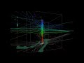
This space-time cube shows twitter trajectories that contain at least one tweet in New York Times Square. The 24-hour day starts at the bottom of the cube and continues to the top. Trajectories are colored based on the time stamp of their start tweet.

Additionally, all trajectories are also drawn in context of the coastline (data: OpenStreetMap) on the bottom of the cube.

While there doesn’t seem to be much going on in the early morning hours, we can see quite a busy coming and going during the afternoon and evening. From the bunch of vertical lines over Times Square, we can also assume that some of our tweet authors spent a considerable time at and near Times Square.

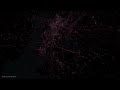
I’ve also created an animated version. Again, I recommend to watch it in HD.


A Visual Exploration of Twitter Streams II

After my first shot at analyzing Twitter data visually I received a lot of great feedback. Thank you!

For my new attempt, I worked on incorporating your feedback such as: filter unrealistic location changes, show connections “grow” instead of just popping up and zoom to an interesting location. The new animation therefore focuses on Manhattan – one of the places with reasonably high geotweet coverage.

The background is based on OpenStreetMap coastline data which I downloaded using QGIS OSM plugin and rendered in pyprocessing together with the geotweets. To really see what’s going on, switch to HD resolution and full screen:

It’s pretty much work-in-progress. The animation shows similar chaotic patterns seen in other’s attempts at animating tweets. To me, the distribution of tweets looks reasonable and many of the connection lines seem to actually coincide with the bridges spanning to and from Manhattan.

This work is an attempt at discovering the potential of Twitter data and at the same time learning some pyprocessing which will certainly be useful for many future tasks. The next logical step seems to be to add information about interactions between users and/or to look at the message content. Another interesting task would be to add interactivity to the visualization.


A Visual Exploration of Twitter Streams

Twitter streams are curious things, especially the spatial data part. I’ve been using Tweepy to collect tweets from the public timeline and what did I discover? Tweets can have up to three different spatial references: “coordinates”, “geo” and “place”. I’ll still have to do some more reading on how to interpret these different attributes.

For now, I have been using “coordinates” to explore the contents of a stream which was collected over a period of five hours using

stream.filter(follow=None,locations=(-180,-90,180,90))

for global coverage. In the video, each georeferenced tweet produces a new dot on the map and if the user’s coordinates change, a blue arrow is drawn:

While pretty, these long blue arrows seem rather suspicious. I’ve only been monitoring the stream for around five hours. Any cross-Atlantic would take longer than that. I’m either misinterpreting the tweets or these coordinates are fake. Seems like it is time to dive deeper into the data.


Mapping Movement Using Tweets

After playing around with some twitter data for animation purposes (in Time Manager), I’m now looking into movement patterns. Series of successive georeferenced tweets can be connected to get an idea of how people move within a city as well as between cities and continents.

Currently, I’m still working on the basics of collecting relevant data. A first proof of concept can be seen in this map which contains locations of a handful of users in the greater Viennese area:

Each user is represented by a differently colored line.

Updates and code samples will follow.


Tweets to QGIS

The idea behind this post was to create a video of twitter activity using Time Manager. You can watch the results of my first test run here:

And this is how it’s done:

First, you have to collect some tweets with location information. The following command will collect tweets within a certain geographic region from the Twitter Stream API using curl. You need a Twitter user account to use the API. (Curl comes readily available with OSGeo4W install.)

curl -k -d @locations.txt https://stream.twitter.com/1/statuses/filter.json -uuser:password > tweets.json

The contents of locations.txt is the geographic extent you are interested in, e.g. for Austria:

locations=9,45,17,50

After collecting some data, you can load the tweets into QGIS. Executing the following lines in Python Console will add an in-memory point layer to the map. (I am only extracting coordinates and time stamp from the tweets, but you can access more information through the JSON object.)

import simplejson
from PyQt4.QtCore import *
from datetime import *

f=open('C:/temp/tweets.json','r')

# create layer
vl = QgsVectorLayer("Point", "tweets", "memory")
vl.startEditing()
pr = vl.dataProvider()

# add fields
pr.addAttributes( [ QgsField("t", QVariant.String) ] )

# create features
for line in f:
   try:
      j=simplejson.loads(line)
      fet=QgsFeature()
      fet.setGeometry(QgsGeometry.fromPoint(QgsPoint(j['geo']['coordinates'][1],j['geo']['coordinates'][0])))
      fet.setAttributeMap({0:QVariant(str(datetime.strptime(j['created_at'],'%a %b %d %H:%M:%S +0000 %Y')))})
      pr.addFeatures([fet])
   except:
      pass

vl.commitChanges()
vl.updateExtents()

QgsMapLayerRegistry.instance().addMapLayer(vl)

To use the result in Time Manager, you have to export the layer to e.g. Shapefile because it’s not possible to add query strings to in-memory layers.

If you are interested in learning more about PyQGIS, you can find a lot of useful material in the PyQGIS Cookbook.


  • Page 1 of 1 ( 5 posts )
  • twitter

Back to Top

Sustaining Members