


QField 3.2 “Congo”: Making your life easier
Focused on stability and usability improvements, most users will find something to celebrate in QField 3.2
Main highlights

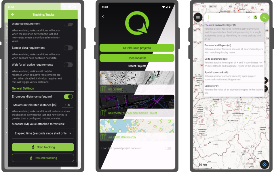
This new release introduces project-defined tracking sessions, which are automatically activated when the project is loaded. Defined while setting up and tweaking a project on QGIS, these sessions permit the automated tracking of device positions without taking any action in QField beyond opening the project itself. This liberates field users from remembering to launch a session on app launch and lowers the knowledge required to collect such data. For more details, please read the relevant QField documentation section.

As good as the above-described functionality sounds, it really shines through in cloud projects when paired with two other new featurs.
First, cloud projects can now automatically push accumulated changes at regular intervals. The functionality can be manually toggled for any cloud project by going to the synchronization panel in QField and activating the relevant toggle (see middle screenshot above). It can also be turned on project load by enabling automatic push when setting up the project in QGIS via the project properties dialog. When activated through this project setting, the functionality will always be activated, and the need for field users to take any action will be removed.
Pushing changes regularly is great, but it could easily have gotten in the way of blocking popups. This is why QField 3.2 can now push changes and synchronize cloud projects in the background. We still kept a ‘successfully pushed changes’ toast message to let you know the magic has happened 
With all of the above, cloud projects on QField can now deliver near real-time tracking of devices in the field, all configured on one desktop machine and deployed through QFieldCloud. Thanks to Groupements forestiers Québec for sponsoring these enhancements.
Other noteworthy feature additions in this release include:
- A brand new undo/redo mechanism allows users to rollback feature addition, editing, and/or deletion at will. The redesigned QField main menu is accessible by long pressing on the top-left dashboard button.
- Support for projects’ titles and copyright map decorations as overlays on top of the map canvas in QField allows projects to better convey attributions and additional context through informative titles.
Additional improvements

The QFieldCloud user experience continues to be improved. In this release, we have reworked the visual feedback provided when downloading and synchronizing projects through the addition of a progress bar as well as additional details, such as the overall size of the files being fetched. In addition, a visual indicator has been added to the dashboard and the cloud projects list to alert users to the presence of a newer project file on the cloud for projects locally available on the device.
With that said, if you haven’t signed onto QFieldCloud yet, try it! Psst, the community account is free 
The creation of relationship children during feature digitizing is now smoother as we lifted the requirement to save a parent feature before creating children. Users can now proceed in the order that feels most natural to them.
Finally, Android users will be happy to hear that a significant rework of native camera, gallery, and file picker activities has led to increased stability and much better integration with Android itself. Activities such as the gallery are now properly overlayed on top of the QField map canvas instead of showing a black screen.
Trajectools 2.0 released 🎉
It’s my pleasure to share with you that Trajectools 2.0 just landed in the official QGIS Plugin Repository.
This is the first version without the “experimental” flag. If you look at the plugin release history, you will see that the previous release was from 2020. That’s quite a while ago and a lot has happened since, including the development of MovingPandas.
Let’s have a look what’s new!

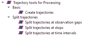
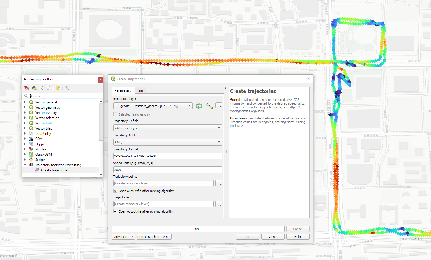
The old “Trajectories from point layer”, “Add heading to points”, and “Add speed (m/s) to points” algorithms have been superseded by the new “Create trajectories” algorithm which automatically computes speeds and headings when creating the trajectory outputs.
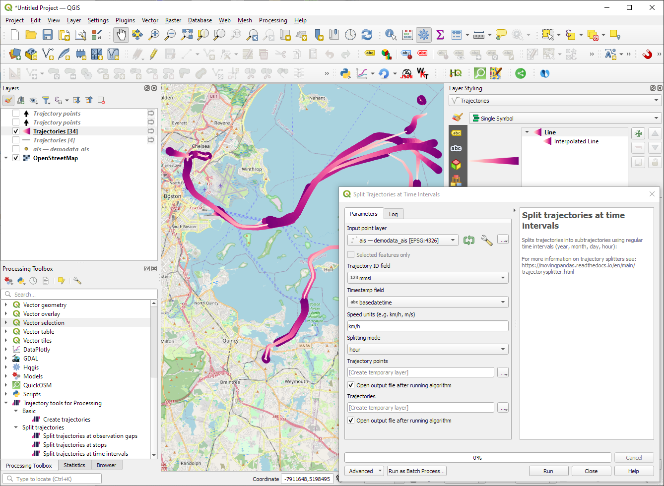
“Day trajectories from point layer” is covered by the new “Split trajectories at time intervals” which supports splitting by hour, day, month, and year.
“Clip trajectories by extent” still exists but, additionally, we can now also “Clip trajectories by polygon layer”
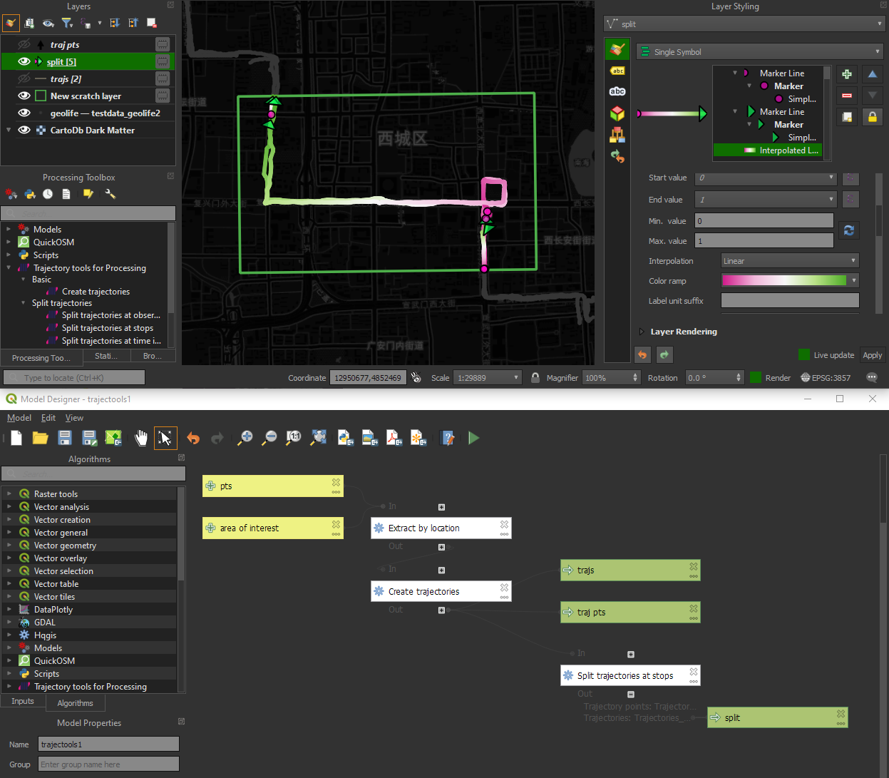
There are two new event extraction algorithms to “Extract OD points” and “Extract OD points”, as well as the related “Split trajectories at stops”. Additionally, we can also “Split trajectories at observation gaps”.
Trajectory outputs, by default, come as a pair of a point layer and a line layer. Depending on your use case, you can use both or pick just one of them. By default, the line layer is styled with a gradient line that makes it easy to see the movement direction:
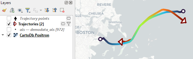
while the default point layer style shows the movement speed:
How to use Trajectools
Trajectools 2.0 is powered by MovingPandas. You will need to install MovingPandas in your QGIS Python environment. I recommend installing both QGIS and MovingPandas from conda-forge:
(base) conda create -n qgis -c conda-forge python=3.9
(base) conda activate qgis
(qgis) mamba install -c conda-forge qgis movingpandas
The plugin download includes small trajectory sample datasets so you can get started immediately.
Outlook
There is still some work to do to reach feature parity with MovingPandas. Stay tuned for more trajectory algorithms, including but not limited to down-sampling, smoothing, and outlier cleaning.
I’m also reviewing other existing QGIS plugins to see how they can complement each other. If you know a plugin I should look into, please leave a note in the comments.
Software quality in QGIS
According to the definition of software quality given by french Wikipedia
An overall assessment of quality takes into account external factors, directly observable by the user, as well as internal factors, observable by engineers during code reviews or maintenance work.
I have chosen in this article to only talk about the latter. The quality of software and more precisely QGIS is therefore not limited to what is described here. There is still much to say about:
- Taking user feedback into account,
- the documentation writing process,
- translation management,
- interoperability through the implementation of standards,
- the extensibility using API,
- the reversibility and resilience of the open source model…
These are subjects that we care a lot and deserve their own article.
I will focus here on the following issue: QGIS is free software and allows anyone with the necessary skills to modify the software. But how can we ensure that the multiple proposals for modifications to the software contribute to its improvement and do not harm its future maintenance?
Self-discipline
All developers contributing to QGIS code doesn’t belong to the same organization. They don’t all live in the same country, don’t necessarily have the same culture and don’t necessarily share the same interests or ambitions for the software. However, they share the awareness of modifying a common good and the desire to take care of it.
This awareness transcends professional awareness, the developer not only has a responsibility towards his employer, but also towards the entire community of users and contributors to the software.
This self-discipline is the foundation of the quality of the contributions of software like QGIS.
However, to err is human and it is essential to carry out checks for each modification proposal.
Automatic checks
With each modification proposal (called Pull Request or Merge Request), the QGIS GitHub platform automatically launches a set of automatic checks.
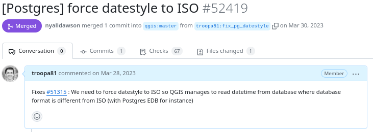
Example of proposed modification
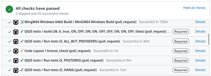
Result of automatic checks on a modification proposal
The first of these checks is to build QGIS on the different systems on which it is distributed (Linux, Windows, MacOS) by integrating the proposed modification. It is inconceivable to integrate a modification that would prevent the application from being built on one of these systems.
The tests
The first problem posed by a proposed modification is the following “How can we be sure that what is going to be introduced does not break what already exists?”
To validate this assertion, we rely on automatic tests. This is a set of micro-programs called tests, which only purpose is to validate that part of the application behaves as expected. For example, there is a test which validates that when the user adds an entry in a data layer, then this entry is then present in the data layer. If a modification were to break this behavior, then the test would fail and the proposal would be rejected (or more likely corrected).
This makes it possible in particular to avoid regressions (they are very often called non-regression tests) and also to qualify the expected behavior.
There are approximately 1.3 Million lines of code for the QGIS application and 420K lines of test code, a ratio of 1 to 3. The presence of tests is mandatory for adding functionality, therefore the quantity of test code increases with the quantity of application code.
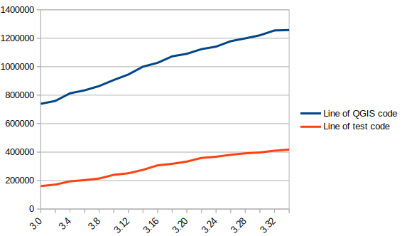
In blue the number of lines of code in QGIS, in red the number of lines of tests
There are currently over 900 groups of automatic tests in QGIS, most of which run in less than 2 seconds, for a total execution time of around 30 minutes.
We also see that certain parts of the QGIS code – the most recent – are better covered by the tests than other older ones. Developers are gradually working to improve this situation to reduce technical debt.
Code checks
Analogous to using a spell checker when writing a document, we carry out a set of quality checks on the source code. We check, for example, that the proposed modification does not contain misspelled words or “banned” words, that the API documentation has been correctly written or that the modified code respects certain formal rules of the programming language.
We recently had the opportunity to add a check based on the clang-tidy tool. The latter relies on the Clang compiler. It is capable of detecting programming errors by carrying out a static analysis of the code.
Clang-tidy is, for example, capable of detecting “narrowing conversions”.

Example of detecting “narrowing conversions”
In the example above, Clang-tidy detects that there has been a “narrowing conversion” and that the value of the port used in the network proxy configuration “may” be corrupted. In this case, this problem was reported on the QGIS issues platform and had to be corrected.
At that time, clang-tidy was not in place. Its use would have made it possible to avoid this anomaly and all the steps which led to its correction (exhaustive description of the issue, multiple exchanges to be able to reproduce it, investigation, correction, review of the modification), meaning a significant amount of human time which could thus have been avoided.
Peer review
A proposed modification that would validate all of the automatic checks described above would not necessarily be integrated into the QGIS code automatically. In fact, its code may be poorly designed or the modification poorly thought out. The relevance of the functionality may be doubtful, or duplicated with another. The integration of the modification would therefore potentially cause a burden for the people in charge of the corrective or evolutionary maintenance of the software.
It is therefore essential to include a human review in the process of accepting a modification.
This is more of a rereading of the substance of the proposal than of the form. For the latter, we favor the automatic checks described above in order to simplify the review process.
Therefore, human proofreading takes time, and this effort is growing with the quantity of modifications proposed in the QGIS code. The question of its funding arises, and discussions are in progress. The QGIS.org association notably dedicates a significant part of its budget to fund code reviews.
More than 100 modification proposals were reviewed and integrated during the month of December 2023. More than 30 different people contributed. More than 2000 files have been modified.
Therefore the wait for a proofreading can sometimes be long. It is also often the moment when disagreements are expressed. It is therefore a phase which can prove frustrating for contributors, but it is an important and rich moment in the community life of a free project.
To be continued !
As a core QGIS developer, and as a pure player OpenSource company, we believe it is fundamental to be involved in each step of the contribution process.
We are investing in the review process, improving automatic checks, and in the QGIS quality process in general. And we will continue to invest in these topics in order to help make QGIS a long-lasting and stable software.
If you would like to contribute or simply learn more about QGIS, do not hesitate to contact us at [email protected] and consult our QGIS support proposal.
Trajectools update: stop detection & trajectory styling
The Trajectools toolbox has continued growing:

I’m continuously testing the algorithms integrated so far to see if they work as GIS users would expect and can to ensure that they can be integrated in Processing model seamlessly.
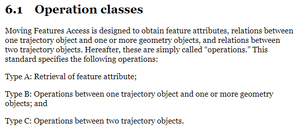
Because naming things is tricky, I’m currently struggling with how to best group the toolbox algorithms into meaningful categories. I looked into the categories mentioned in OGC Moving Features Access but honestly found them kind of lacking:
Andrienko et al.’s book “Visual Analytics of Movement” comes closer to what I’m looking for:
… but I’m not convinced yet. So take the above listed three categories with a grain of salt. Those may change before the release. (Any inputs / feedback / recommendation welcome!)
Let me close this quick status update with a screencast showcasing stop detection in AIS data, featuring the recently added trajectory styling using interpolated lines:

While Trajectools is getting ready for its 2.0 release, you can get the current development version directly from https://github.com/movingpandas/qgis-processing-trajectory.
QGIS Processing Trajectools v2 in the works
Trajectools development started back in 2018 but has been on hold since 2020 when I realized that it would be necessary to first develop a solid trajectory analysis library. With the MovingPandas library in place, I’ve now started to reboot Trajectools.
Trajectools v2 builds on MovingPandas and exposes its trajectory analysis algorithms in the QGIS Processing Toolbox. So far, I have integrated the basic steps of
- Building trajectories including speed and direction information from timestamped points and
- Splitting trajectories at observation gaps, stops, or regular time intervals.
The algorithms create two output layers:
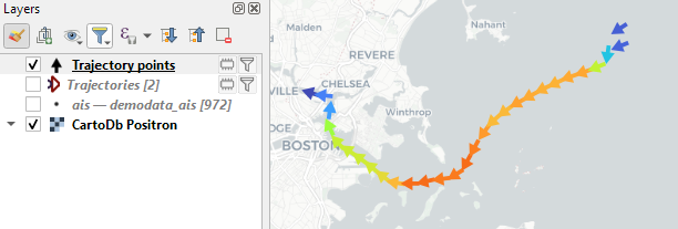
- Trajectory points with speed and direction information that are styled using arrow markers
- Trajectories as LineStringMs which makes it straightforward to count the number of trajectories and to visualize where one trajectory ends and another starts.
So far, the default style for the trajectory points is hard-coded to apply the Turbo color ramp on the speed column with values from 0 to 50 (since I’m simply loading a ready-made QML). By default, the speed is calculated as km/h but that can be customized:
I don’t have a solution yet to automatically create a style for the trajectory lines layer. Ideally, the style should be a categorized renderer that assigns random colors based on the trajectory id column. But in this case, it’s not enough to just load a QML.
In the meantime, I might instead include an Interpolated Line style. What do you think?
Of course, the goal is to make Trajectools interoperable with as many existing QGIS Processing Toolbox algorithms as possible to enable efficient Mobility Data Science workflows.
The easiest way to set up QGIS with MovingPandas Python environment is to install both from conda. You can find the instructions together with the latest Trajectools development version at: https://github.com/movingpandas/qgis-processing-trajectory
This post is part of a series. Read more about movement data in GIS.
New version of PDOKServiceplugin
Sorry, mostly interested for dutch readers
Offline Vector Tile Package .vtpk in QGIS
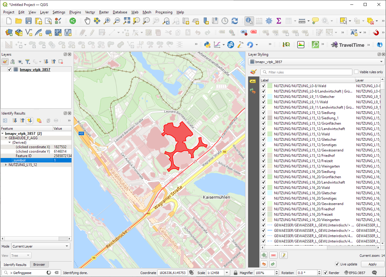
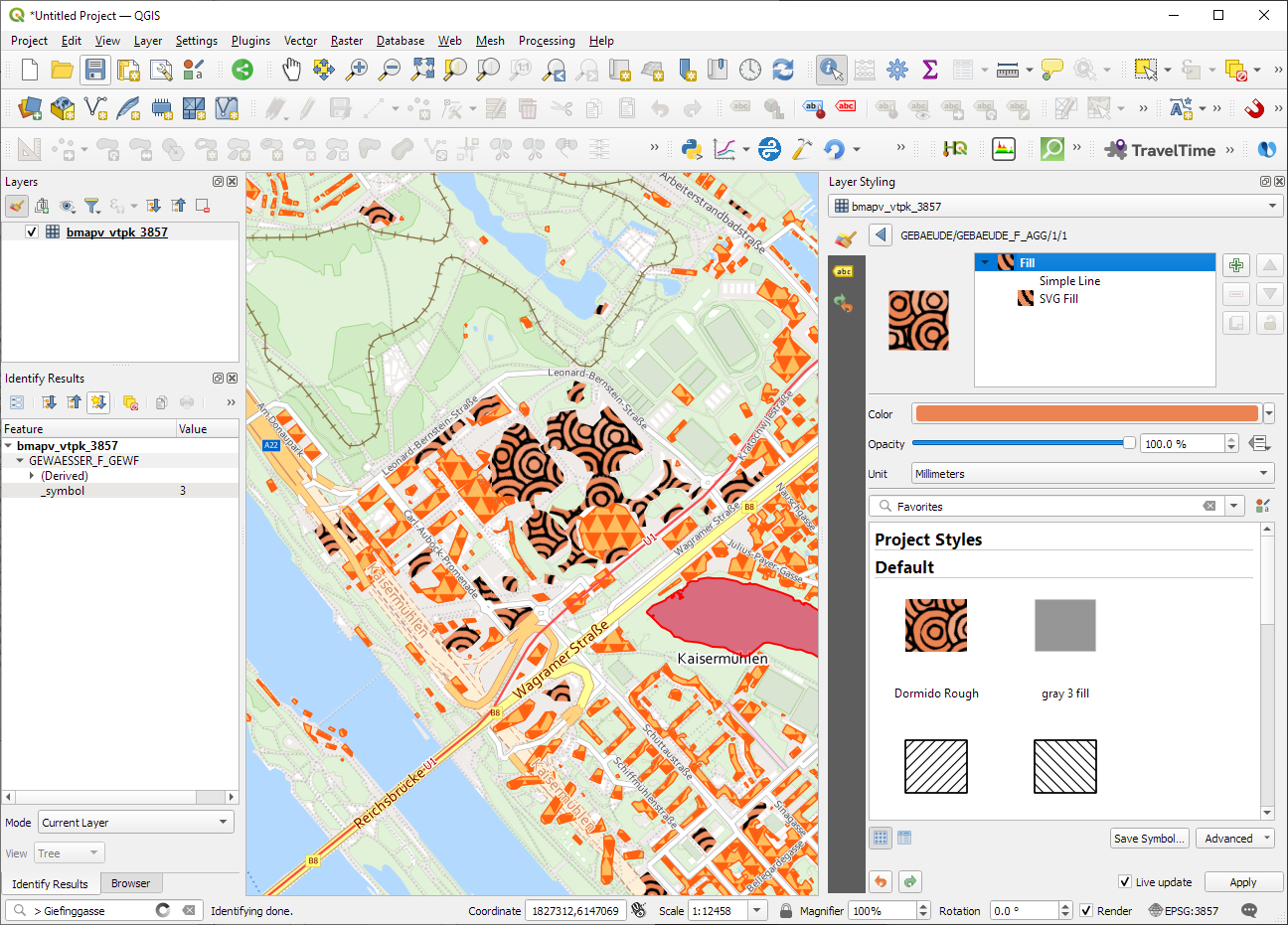
Starting from 3.26, QGIS now supports .vtpk (Vector Tile Package) files out of the box! From the changelog:
ESRI vector tile packages (VTPK files) can now be opened directly as vector tile layers via drag and drop, including support for style translation.
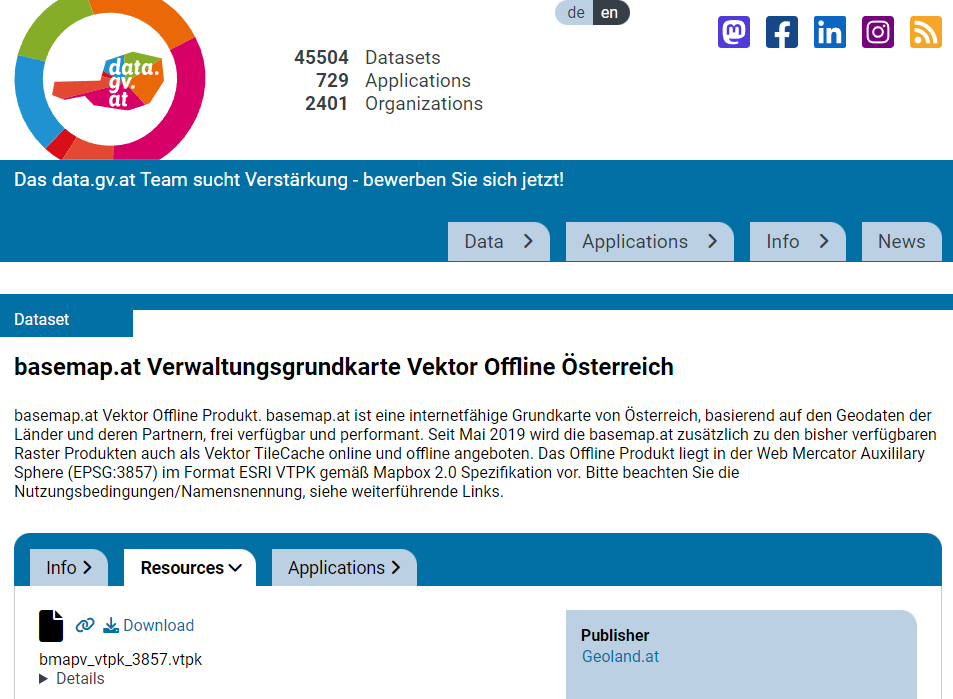
This is great news, particularly for users from Austria, since this makes it possible to use the open government basemap.at vector tiles directly, without any fuss:
1. Download the 2GB offline vector basemap from https://www.data.gv.at/katalog/de/dataset/basemap-at-verwaltungsgrundkarte-vektor-offline-osterreich
2. Add the .vtpk as a layer using the Data Source Manager or via drag-and-drop from the file explorer
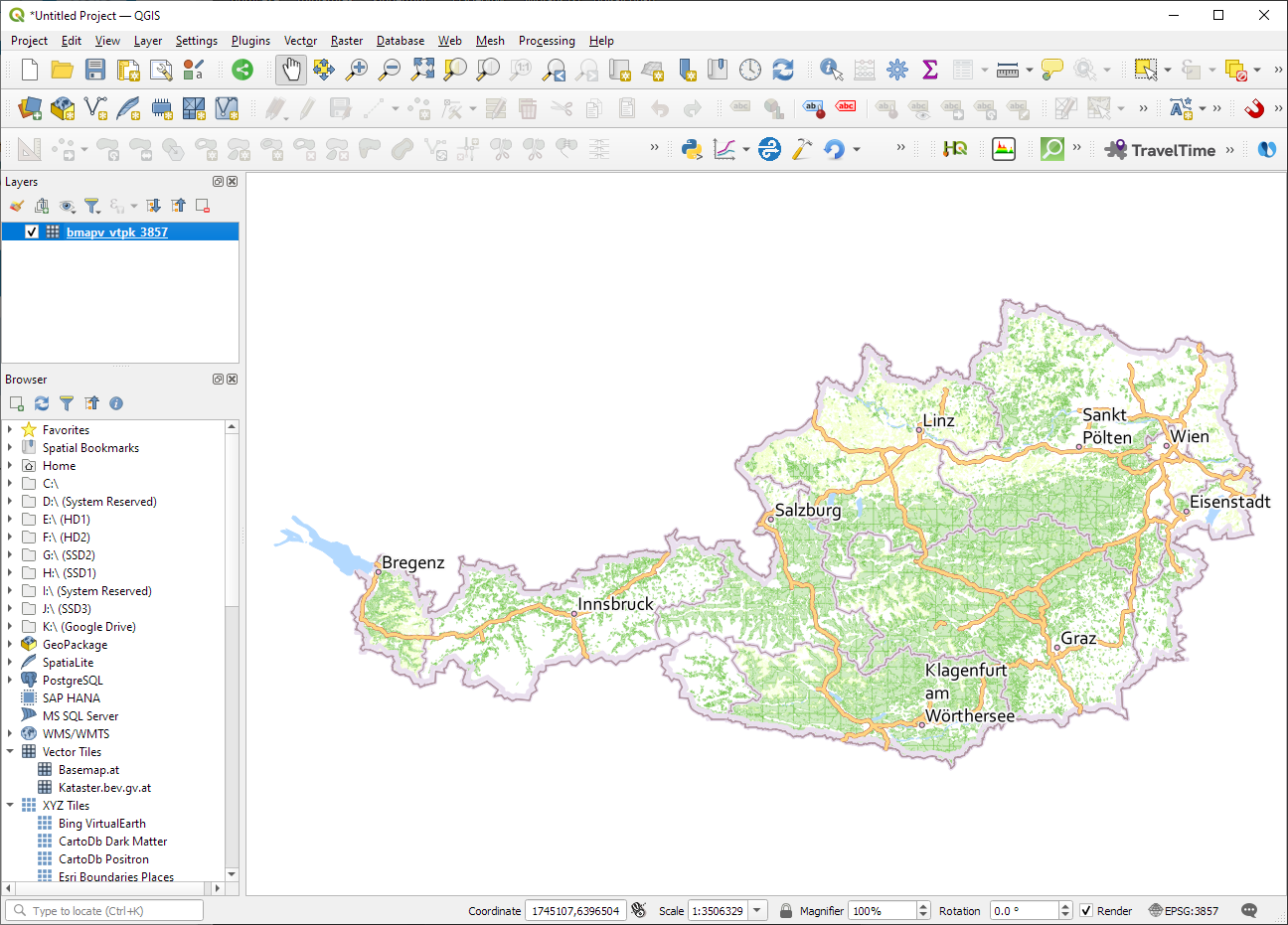
3. All done and ready, including the basemap styling and labeling — which we can customize as well:
Kudos to https://wien.rocks/@DieterKomendera/111568809248327077 for bringing this new feature to my attention.
PS: And interesting tidbit from the developer of this feature, Nyall Dawson:
Adding basemaps to PyQGIS maps in Jupyter notebooks
In the previous post, we investigated how to bring QGIS maps into Jupyter notebooks.
Today, we’ll take the next step and add basemaps to our maps. This is trickier than I would have expected. In particular, I was fighting with “invalid” OSM tile layers until I realized that my QGIS application instance somehow lacked the “WMS” provider.
In addition, getting basemaps to work also means that we have to take care of layer and project CRSes and on-the-fly reprojections. So let’s get to work:
from IPython.display import Image
from PyQt5.QtGui import QColor
from PyQt5.QtWidgets import QApplication
from qgis.core import QgsApplication, QgsVectorLayer, QgsProject, QgsRasterLayer, \
    QgsCoordinateReferenceSystem, QgsProviderRegistry, QgsSimpleMarkerSymbolLayerBase
from qgis.gui import QgsMapCanvas
app = QApplication([])
qgs = QgsApplication([], False)
qgs.setPrefixPath(r"C:\temp", True)  # setting a prefix path should enable the WMS provider
qgs.initQgis()
canvas = QgsMapCanvas()
project = QgsProject.instance()
map_crs = QgsCoordinateReferenceSystem('EPSG:3857')
canvas.setDestinationCrs(map_crs)
print("providers: ", QgsProviderRegistry.instance().providerList())

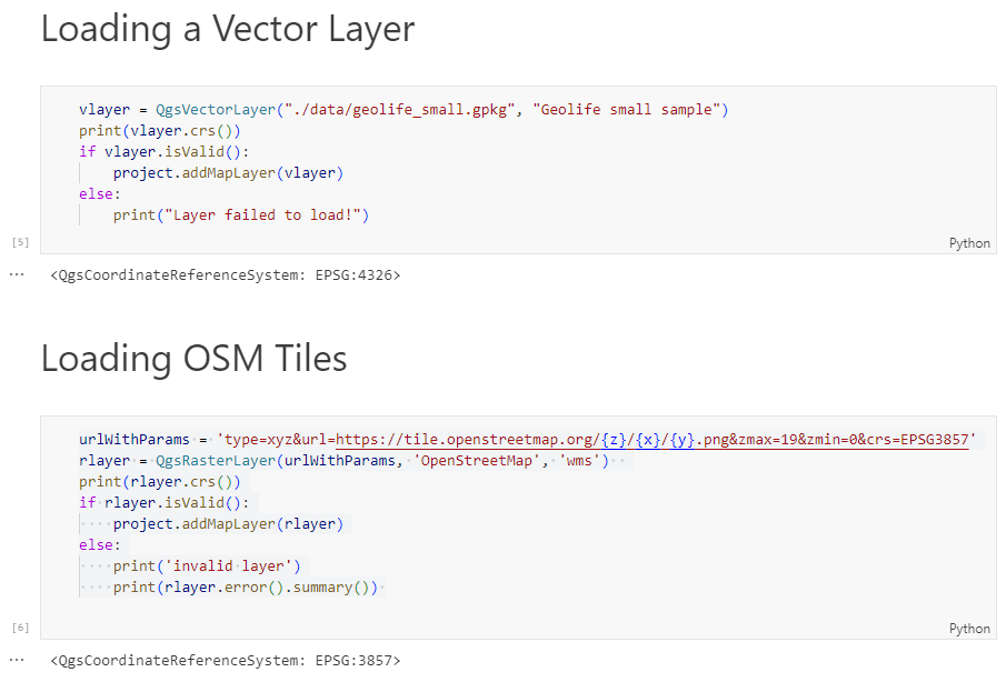
To add an OSM basemap, we use the xyz tiles option of the WMS provider:
urlWithParams = 'type=xyz&url=https://tile.openstreetmap.org/{z}/{x}/{y}.png&zmax=19&zmin=0&crs=EPSG3857'
rlayer = QgsRasterLayer(urlWithParams, 'OpenStreetMap', 'wms')
print(rlayer.crs())
if rlayer.isValid():
    project.addMapLayer(rlayer)
else:
    print('invalid layer')
    print(rlayer.error().summary())
If there are issues with the WMS provider, rlayer.error().summary() should point them out.
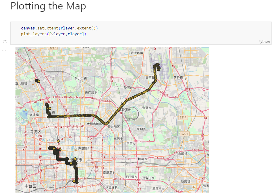
With both the vector layer and the basemap ready, we can finally plot the map:
canvas.setExtent(rlayer.extent())
plot_layers([vlayer,rlayer])
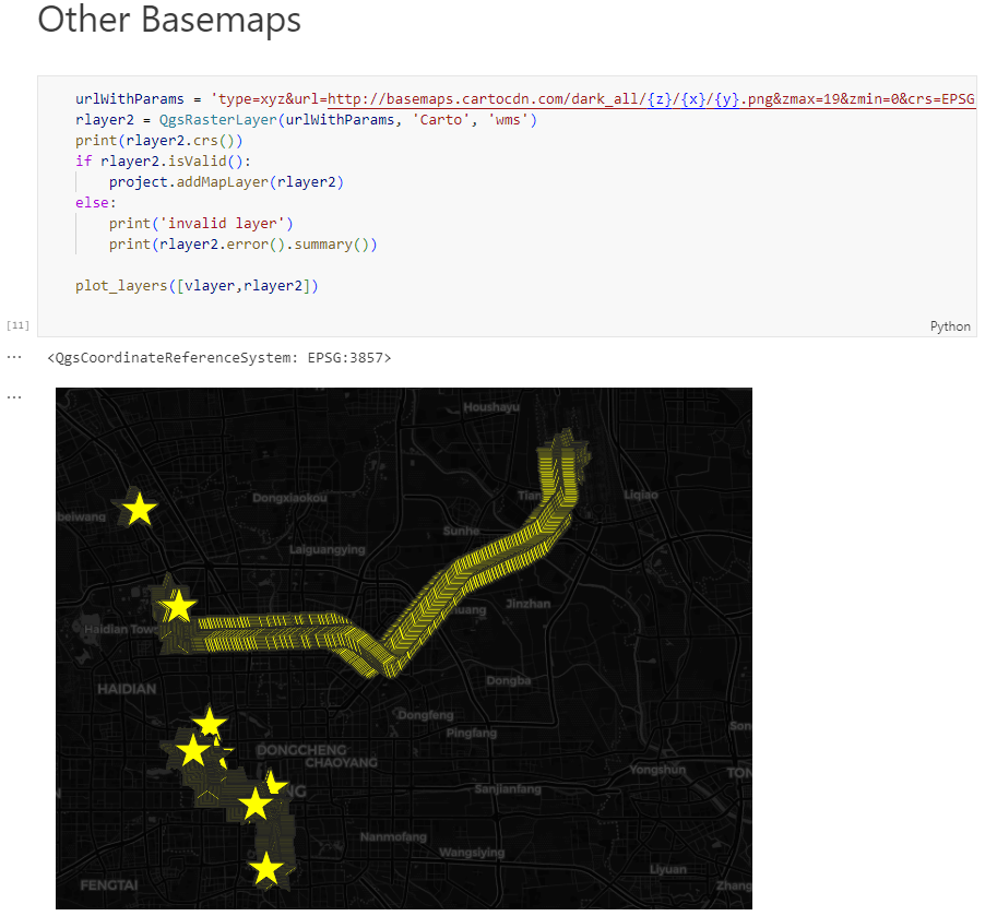
Of course, we can get more creative and style our vector layers:
vlayer.renderer().symbol().setColor(QColor("yellow"))
vlayer.renderer().symbol().symbolLayer(0).setShape(QgsSimpleMarkerSymbolLayerBase.Star)
vlayer.renderer().symbol().symbolLayer(0).setSize(10)
plot_layers([vlayer,rlayer])

And to switch to other basemaps, we just need to update the URL accordingly, for example, to load Carto tiles instead:
urlWithParams = 'type=xyz&url=http://basemaps.cartocdn.com/dark_all/{z}/{x}/{y}.png&zmax=19&zmin=0&crs=EPSG3857'
rlayer2 = QgsRasterLayer(urlWithParams, 'Carto', 'wms')
print(rlayer2.crs())
if rlayer2.isValid():
    project.addMapLayer(rlayer2)
else:
    print('invalid layer')
    print(rlayer2.error().summary())

plot_layers([vlayer,rlayer2])
You can find the whole notebook at: https://github.com/anitagraser/QGIS-resources/blob/master/qgis3/notebooks/basemaps.ipynb
QGIS 3D Tiles – thanks to Cesium Ecosystem Grant!
We’ve recently had the opportunity to implement a very exciting feature in QGIS 3.34 — the ability to load and view 3D content in the “Cesium 3D Tiles” format! This was a joint project with our (very talented!) partners at Lutra Consulting, and was made possible thanks to a generous ecosystem grant from the Cesium project.
Before we dive into all the details, let’s take a quick guided tour showcasing how Cesium 3D Tiles work inside QGIS:
What are 3D tiles?
Cesium 3D Tiles are an OGC standard data format where the content from a 3D scene is split up into multiple individual tiles. You can think of them a little like a 3D version of the vector tile format we’ve all come to rely upon. The 3D objects from the scene are stored in a generalized, simplified form for small-scale, “zoomed out” maps, and in more detailed, complex forms for when the map is zoomed in. This allows the scenes to be incredibly detailed, whilst still covering huge geographic regions (including the whole globe!) and remaining responsive and quick to download. Take a look at the incredible level of detail available in a Cesium 3D Tiles scene in the example below:
Where can you get 3D tile content?
If you’re lucky, your regional government or data custodians are already publishing 3D “digital twins” of your area. Cesium 3D Tiles are the standard way that these digital twin datasets are being published. Check your regional data portals and government open data hubs and see whether they’ve made any content available as 3D tiles. (For Australian users, there’s tons of great content available on the Terria platform!).
Alternatively, there’s many datasets available via the Cesium ion platform. This includes global 3D buildings based on OpenStreetMap data, and the entirety of Google’s photorealistic Google Earth tiles! We’ve published a Cesium ion QGIS plugin to complement the QGIS 3.34 release, which helps make it super-easy to directly load datasets from ion into your QGIS projects.
Lastly, users of the OpenDroneMap photogrammetry application will already have Cesium 3D Tiles datasets of their projects available, as 3D tiles are one of the standard outputs generated by OpenDroneMap.
Why QGIS?
So why exactly would you want to access Cesium 3D tiles within QGIS? Well, for a start, 3D Tiles datasets are intrinsically geospatial data. All the 3D content from these datasets are georeferenced and have accurate spatial information present. By loading a 3D tiles dataset into QGIS, you can easily overlay and compare 3D tile content to all your other standard spatial data formats (such as Shapefiles, Geopackages, raster layers, mesh datasets, WMS layers, etc…). They become just another layer of spatial information in your QGIS projects, and you can utilise all the tools and capabilities you’re familiar with in QGIS for analysing spatial data along with these new data sources.
One large drawcard of adding a Cesium 3D Tile dataset to your QGIS project is that they make fantastic 3D basemaps. While QGIS has had good support for 3D maps for a number of years now, it has been tricky to create beautiful 3D content. That’s because all the standard spatial data formats tend to give generalised, “blocky” representations of objects in 3D. For example, you could use an extruded building footprint file to show buildings in a 3D map but they’ll all be colored as idealised solid blocks. In contrast, Cesium 3D Tiles are a perfect fit for a 3D basemap! They typically include photorealistic textures, and include all types of real-world features you’d expect to see in a 3D map — including buildings, trees, bridges, cliffsides, etc.
What next?
If you’re keen to learn even more about Cesium 3D Tiles in QGIS, you can check out the recent “QGIS Open Day” session we presented. In this session we cover all the details about 3D tiles and QGIS, and talk in depth about what’s possible in QGIS 3.34 and what may be coming in later releases.
Otherwise, grab the latest QGIS 3.34 and start playing…. you’ll quickly find that Cesium 3D Tiles are a fun and valuable addition to QGIS’ capabilities!
Our thanks go to Cesium and their ecosystem grant project for funding this work and making it possible.
QField 3.0 release : field mapping app, based on QGIS
We are very happy and enthusiasts at Oslandia to forward the QField 3.0 release announcement, the new major update of this mobile GIS application based on QGIS.
Oslandia is a strategic partner of OPENGIS.ch, the company at the heart of QField development, as well as the QFieldCloud associated SaaS offering. We join OPENGIS.ch to announce all the new features of QField 3.0.
Shipped with many new features and built with the latest generation of Qt’s cross-platform framework, this new chapter marks an important milestone for the most powerful open-source field GIS solution.
Main highlights
Upon launching this new version of QField, users will be greeted by a revamped recent projects list featuring shiny map canvas thumbnails. While this is one of the most obvious UI improvements, countless interface tweaks and harmonization have occurred. From the refreshed dark theme to the further polishing of countless widgets, QField has never looked and felt better.
The top search bar has a new functionality that allows users to look for features within the currently active vector layer by matching any of its attributes against a given search term. Users can also refine their searches by specifying a specific attribute. The new functionality can be triggered by typing the ‘f’ prefix in the search bar followed by a string or number to retrieve a list of matching features. When expanding it, a new list of functionalities appears to help users discover all of the tools available within the search bar.
QField’s tracking has also received some love. A new erroneous distance safeguard setting has been added, which, when enabled, will dictate the tracker not to add a new vertex if the distance between it and the previously added vertex is greater than a user-specified value. This aims at preventing “spikes” of poor position readings during a tracking session. QField is now also capable of resuming a tracking session after being stopped. When resuming, tracking will reuse the last feature used when first starting, allowing sessions interrupted by battery loss or momentary pause to be continued on a single line or polygon geometry.
On the feature form front, QField has gained support for feature form text widgets, a new read-only type introduced in QGIS 3.30, which allows users to create expression-based text labels within complex feature form configurations. In addition, relationship-related form widgets now allow for zooming to children/parent features within the form itself.
To enhance digitizing work in the field, QField now makes it possible to turn snapping on and off through a new snapping button on top of the map canvas when in digitizing mode. When a project has enabled advanced snapping, the dashboard’s legend item now showcases snapping badges, allowing users to toggle snapping for individual vector layers.
In addition, digitizing lines and polygons by using the volume up/down hardware keys on devices such as smartphones is now possible. This can come in handy when digitizing data in harsh conditions where gloves can make it harder to use a touch screen.
While we had to play favorites in describing some of the new functionalities in QField, we’ve barely touched the surface of this feature-packed release. Other major additions include support for Near-Field Communication (NFC) text tag reading and a new geometry editor’s eraser tool to delete part of lines and polygons as you would with a pencil sketch using an eraser.
Thanks to Deutsches Archäologisches Institut, Groupements forestiers Québec, Amsa, and Kanton Luzern for sponsoring these enhancements.
Quality of life improvements
Starting with this new version, the scale bar overlay will now respect projects’ distance measurement units, allowing for scale bars in imperial and nautical units.
QField now offers a rendering quality setting which, at the cost of a slightly reduced visual quality, results in faster rendering speeds and lower memory usage. This can be a lifesaver for older devices having difficulty handling large projects and helps save battery life.
Vector tile layer support has been improved with the automated download of missing fonts and the possibility of toggling label visibility. This pair of changes makes this resolution-independent layer type much more appealing.
On iOS, layouts are now printed by QField as PDF documents instead of images. While this was the case for other platforms, it only became possible on iOS recently after work done by one of our ninjas in QGIS itself.
Many thanks to DB Fahrwgdienste for sponsoring stabilization efforts and fixes during this development cycle.
Qt 6, the latest generation of the cross-platform framework powering QField
Last but not least, QField 3.0 is now built against Qt 6. This is a significant technological milestone for the project as this means we can fully leverage the latest technological innovations into this cross-platform framework that has been powering QField since day one.
On top of the new possibilities, QField benefited from years of fixes and improvements, including better integration with Android and iOS platforms. In addition, the positioning framework in Qt 6 has been improved with awareness of the newer GNSS constellations that have emerged over the last decade.
Forest-themed release names
Forests are critical in climate regulation, biodiversity preservation, and economic sustainability. Beginning with QField 3.0 “Amazonia” and throughout the 3.X’s life cycle, we will choose forest names to underscore the importance of and advocate for global forest conservation.

Software with service
OPENGIS.ch and Oslandia provides the full range of services around QField and QGIS : training, consulting, adaptation, specific development and core development, maintenance and assistance. Do not hesitate to contact us and detail your needs, we will be happy to collaborate : [email protected]
As always, we hope you enjoy this new release. Happy field mapping!
QGIS Add to Felt Plugin – Phase 2
We have been continuing our work with the Flagship sponsor of QGIS – Felt to develop their QGIS Plugin – Add to Felt that makes it even easier to share your maps and data on the web.
What is the ‘Add to Felt’ QGIS Plugin?
The ‘Add to Felt’ QGIS Plugin is a powerful tool that empowers users to export their QGIS projects and layers directly to a Felt web map. This update introduces two fantastic features:
- Single Layer Sharing: You can now share a single layer from your QGIS project to a Felt map. This means you have greater control over which specific data layers to share, allowing you to tailor your map precisely to your audience’s needs.
- Map Selection: With the updated plugin, you can choose which map on Felt to add your layer to – a new map, or an ongoing project. This flexibility simplifies your workflow and ensures that your data ends up in the right place.
Businesses that rely on QGIS love how these new features provide a seamless way to view and share results, ultimately allowing them to move more quickly and stay in sync:
Why is this Update Important?
Web maps are invaluable tools for sharing data with a wider audience, be it colleagues, clients, or the public. They provide creators with the ability to control data visibility, display options, and audience access, all within an easily shareable digital format. However, creating web maps can be an arduous and complex task.
Here’s where the ‘Add to Felt’ QGIS Plugin update comes to the rescue:
1. Streamlining the Process: Creating web maps traditionally involves website development, data hosting, and map application development—tasks that require a diverse skill set. This complexity can be a significant barrier, especially for smaller operations with limited resources or budget constraints.
2. Felt Simplifies Web Mapping: Felt makes it effortless to create web maps, and share them as easily as you would a Google Doc or Sheet. Simply drag and drop your data, customize the symbology to your liking, and share the map with a link or by inviting collaborators. No need to send large data files or answer questions about the map’s data sources.
3. Integration with QGIS: Now, the ‘Add to Felt’ QGIS Plugin bridges the gap between QGIS and Felt. It seamlessly imports your QGIS data into Felt, eliminating the need for manual data transfers and reducing the complexity of web map creation.
In essence, the ‘Add to Felt’ QGIS Plugin update simplifies the process of sharing and collaborating on web maps. It empowers users to harness the full potential of web-based mapping, making it accessible to everyone, regardless of their technical expertise. The update makes it even easier to share progress updates or model re-run outputs without creating a new map, or sharing a new map link.
So, if you’re a QGIS user looking to enhance your map-sharing capabilities and streamline your workflow, make sure to take advantage of this fantastic update. Say goodbye to the complexities of web map creation and hello to effortless, data-rich web maps with Felt and the ‘Add to Felt’ QGIS Plugin.
How to install and upgrade
- Open QGIS on your computer. You must have version 3.22 or later installed.
- In the plugins tab, select Manage and Install Plugins.
- Search for the ‘Add to Felt’ plugin, select and click Install Plugin.
- Close the Plugins dialog. The Felt plugin toolbar will appear in your toolbar for use.
- Sign into Felt and begin sharing your maps to the web.
If you want more features in this plugin, let us know or you’re interested in exploring how a QGIS plugin can make your service easily accessible to the millions of daily QGIS users, contact us to discuss how we can help!
Strategic partnership agreement between Oslandia and OpenGIS.ch on QField
Who are we?
 For those unfamiliar with Oslandia, OpenGIS.ch, or even QGIS, let’s refresh your memory:
 Oslandia is a French company specializing in open-source Geographic Information Systems (GIS). Since our establishment in 2009, we have been providing consulting, development, and training services in GIS, with reknown expertise. Oslandia is a dedicated open-source player and the largest contributor to the QGIS solution in France.
![]()
As for OPENGIS.ch, they are a Swiss company specializing in the development of open-source GIS software. Founded in 2011, OPENGIS.ch is the largest Swiss contributor to QGIS. OPENGIS.ch is the creator of QField, the most widely used open-source mobile GIS solution for geomatics professionals.
OPENGIS.ch also offers QFieldCloud as a SaaS or on-premise solution for collaborative field project management.
 Some may still be unfamiliar with #QGIS ?
It is a free and open-source Geographic Information System that allows creating, editing, visualizing, analyzing, and publicating geospatial data. QGIS is a cross-platform software that can be used on desktops, servers, as a web application, or as a development library.
![]()
QGIS is open-source software developed by multiple contributors worldwide. It is an official project of the OpenSource Geospatial Foundation (OSGeo) and is supported by the QGIS.org association. See https://qgis.org
A Partnership?
 Today, we are delighted to announce our strategic partnership aimed at strengthening and promoting QField, the mobile application companion of QGIS Desktop.
 This partnership between Oslandia and OPENGIS.ch is a significant step for QField and open-source mobile GIS solutions. It will consolidate the platform, providing users worldwide with simplified access to effective tools for collecting, managing, and analyzing geospatial data in the field.
 QField, developed by OPENGIS.ch, is an advanced open-source mobile application that enables GIS professionals to work efficiently in the field, using interactive maps, collecting real-time data, and managing complex geospatial projects on Android, iOS, or Windows mobile devices.
 QField is cross-platform, based on the QGIS engine, facilitating seamless project sharing between desktop, mobile, and web applications.
 QFieldCloud (https://qfield.cloud), the collaborative web platform for QField project management, will also benefit from this partnership and will be enhanced to complement the range of tools within the QGIS platform.
 ![]()
Reactions
 At Oslandia, we are thrilled to collaborate with OPENGIS.ch on QGIS technologies. Oslandia shares with OPENGIS.ch a common vision of open-source software development: a strong involvement in development communities, work in respect with the ecosystem, an highly skilled expertise, and a commitment to industrial-quality, robust, and sustainable software development.
 With this partnership, we aim to offer our clients the highest expertise across all software components of the QGIS platform, from data capture to dissemination.
 On the OpenGIS.ch side, Marco Bernasocchi adds:
The partnership with Oslandia represents a crucial step in our mission to provide leading mobile GIS tools with a genuine OpenSource credo. The complementarity of our skills will accelerate the development of QField and QFieldCloud and meet the growing needs of our users.
Commitment to open source
 Both companies are committed to continue supporting and improving QField and QFieldCloud as open-source projects, ensuring universal access to this high-quality mobile GIS solution without vendor dependencies.
Ready for field mapping ?
 And now, are you ready for the field?
So, download QField (https://qfield.org/get), create projects in QGIS, and share them on QFieldCloud!
 If you need training, support, maintenance, deployment, or specific feature development on these platforms, don’t hesitate to contact us. You will have access to the best experts available: [email protected].
Analyzing and visualizing large-scale fire events using QGIS processing with ST-DBSCAN
A while back, one of our ninjas added a new algorithm in QGIS’ processing toolbox named ST-DBSCAN Clustering, short for spatio temporal density-based spatial clustering of applications with noise. The algorithm regroups features falling within a user-defined maximum distance and time duration values.
This post will walk you through one practical use for the algorithm: large-scale fire event analysis and visualization through remote-sensed fire detection. More specifically, we will be looking into one of the larger fire events which occurred in Canada’s Quebec province in June 2023.

Fetching and preparing FIRMS data
NASA’s Fire Information for Resource Management System (FIRMS) offers a fantastic worldwide archive of all fire detected through three spaceborne sources: MODIS C6.1 with a resolution of roughly 1 kilometer as well as VIIRS S-NPP and VIIRS NOAA-20 with a resolution of 375 meters. Each detected fire is represented by a point that sits at the center of the source’s resolution grid.
Each source will cover the whole world several times per day. Since detection is impacted by atmospheric conditions, a given pass by one source might not be able to register an ongoing fire event. It’s therefore advisable to rely on more than one source.
To look into our fire event, we have chosen the two fire detection sources with higher resolution – VIIRS S-NPP and VIIRS NOAA-20 – covering the whole month of June 2023. The datasets were downloaded from FIRMS’ archive download page.
After downloading the two separate datasets, we combined them into one merged geopackage dataset using QGIS processing toolbox’s Merge Vector Layers algorithm. The merged dataset will be used to conduct the clustering analysis.

In addition, we will use QGIS’s field calculator to create a new Date & Time field named ACQ_DATE_TIME using the following expression:
to_datetime("ACQ_DATE" || "ACQ_TIME", 'yyyy-MM-ddhhmm')This will allow us to calculate precise time differences between two dates.

Modeling and running the analysis
The large-scale fire event analysis requires running two distinct algorithms:
- a spatiotemporal clustering of points to regroup fires into a series of events confined in space and time; and
- an aggregation of the points within the identified clusters to provide additional information such as the beginning and end date of regrouped events.
This can be achieved through QGIS’ modeler to sequentially execute the ST-DBSCAN Clustering algorithm as well as the Aggregate algorithm against the output of the first algorithm.

The above-pictured model outputs two datasets. The first dataset contains single-part points of detected fires with attributes from the original VIIRS products as well as a pair of new attributes: the CLUSTER_ID provides a unique cluster identifier for each point, and the CLUSTER_SIZE represents the sum of points forming each unique cluster. The second dataset contains multi-part points clusters representing fire events with four attributes: CLUSTER_ID and CLUSTER_SIZE which were discussed above as well as DATE_START and DATE_END to identify the beginning and end time of a fire event.
In our specific example, we will run the model using the merged dataset we created above as the “fire points layer” and select ACQ_DATE_TIME as the “date field”. The outputs will be saved as separate layers within a geopackage file.
Note that the maximum distance (0.025 degrees) and duration (72 hours) settings to form clusters have been set in the model itself. This can be tweaked by editing the model.
Visualizing a specific fire event progression on a map
Once the model has provided its outputs, we are ready to start visualizing a fire event on a map. In this practical example, we will focus on detected fires around latitude 53.0960 and longitude -75.3395.
Using the multi-part points dataset, we can identify two clustered events (CLUSTER_ID 109 and 1285) within the month of June 2023. To help map canvas refresh responsiveness, we can filter both of our output layers to only show features with those two cluster identifiers using the following SQL syntax: CLUSTER_ID IN (109, 1285).
To show the progression of the fire event over time, we can use a data-defined property to graduate the marker fill of the single-part points dataset along a color ramp. To do so, open the layer’s styling panel, select the simple marker symbol layer, click on the data-defined property button next to the fill color and pick the Assistant menu item.
In the assistant panel, set the source expression to the following: day(age(to_date('2023-07-01'),”ACQ_DATE_TIME”)). This will give us the number of days between a given point and an arbitrary reference date (2023-07-01 here). Set the values range from 0 to 30 and pick a color ramp of your choice.

When applying this style, the resulting map will provide a visual representation of the spread of the fire event over time.

Analyzing a fire event through histogram
Through QGIS’ DataPlotly plugin, it is possible to create an histogram of fire events. After installing the plugin, we can open the DataPlotly panel and configure our histogram.
Set the plot type to histogram and pick the model’s single-part points dataset as the layer to gather data from. Make sure that the layer has been filtered to only show a single fire event. Then, set the X field to the following layer attribute: “ACQ_DATE”.
You can then hit the Create Plot button, go grab a coffee, and enjoy the resulting histogram which will appear after a minute or so.
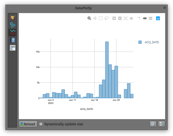
While not perfect, an histogram can quickly provide a good sense of a fire event’s “peak” over a period of time.
Soar.Earth Digital Atlas QGIS Plugin
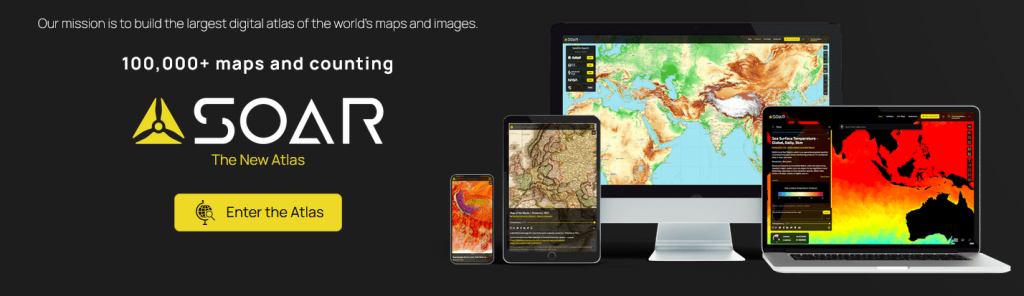
Growing up, I would spend hours lost in National Geographic maps. The feeling of discovering new regions and new ways to view the world was addictive! It’s this same feeling of discovery and exploration which has made me super excited about Soar’s Digital Atlas. Soar is the brainchild of Australian, Amir Farhand, and is fuelled by the talents of staff located across the globe to build a comprehensive digital atlas of the world’s maps and images. Soar has been designed to be an easy to use, expansive collection of diverse maps from all over the Earth. A great aspect of Soar is that it has implemented Strong Community Guidelines and moderation to ensure the maps are fit for purpose.
Recently, North Road collaborated with Soar to help facilitate their digital atlas goals by creating a QGIS plugin for Soar. The Soar plugin allows QGIS users to directly:
- Export their QGIS maps and images straight to Soar
- Browse and load maps from the entire Soar public catalogue into their QGIS projects
There’s lots of extra tweaks we’ve added to help make the plugin user friendly, whilst offering tons of functionality that power users want. For instance, users can:
- Filter Soar maps by their current project extent and/or by category
- Export raw or rendered raster data directly to Soar via a Processing tool
- Batch upload multiple maps to Soar
- Incorporate Soar map publishing into a Processing model or Python based workflow
Soar will be presenting their new plugin at the QGIS Open Day in August so check out the details here and tune in at 2300 AEST or 1300 HR UTC. You can follow along via either YouTube or Jitsi.
Browsing Soar maps from QGIS
One of the main goals of the Soar QGIS plugin was to make it very easy to find new datasets and add them to your QGIS projects. There’s two ways users can explore the Soar catalog from QGIS:
You can open the Soar Browser Panel via the Soar toolbar button ![]() . This opens a floating catalog browser panel which allows you to interactively search Soar’s content while working on your map.
. This opens a floating catalog browser panel which allows you to interactively search Soar’s content while working on your map.
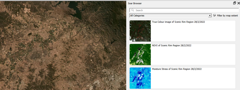
Alternatively, you can also access the Soar catalog and maps from the standard QGIS Data Source Manager dialog. Just open the “Soar” tab and search away!

When you’ve found an interesting map, hit the “Add to Map” button and the map will be added as a new layer into your current project. After the layer is loaded you can freely modify the layer’s style (such as the opacity, colorization, contrast etc) just like any other raster dataset using the standard QGIS Layer Style controls.
Sharing your maps
Before you can share your maps on Soar, you’ll need to first sign up for a free Soar account.
We’ve designed the Soar plugin with two specific use cases in mind for sharing maps. The first use case is when you want to share an entire map (i.e. QGIS project) to Soar. This will publish all the visible content from your map onto Soar, including all the custom styling, labeling, decorations and other content you’ve carefully designed. To do this, just select the Project menu, Import/Export -> Export map to Soar option.

You’ll have a chance to enter all the metadata and descriptive text explaining your map, and then the map will be rendered and uploaded directly to Soar.

All content on the Soar atlas is moderated, so your shared maps get added to the moderation queue ready for review by the Soar team. (You’ll be notified as soon as the review is complete and your map is publicly available).
Alternatively, you might have a specific raster layer which you want to publish on Soar. For instance, you’ve completed some flood modelling or vegetation analysis and want to share the outcome widely. To do this, you can use the “Publish dataset to Soar” tool available from the QGIS Processing toolbox:
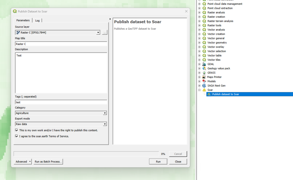
Just pick the raster layer you want to upload, enter the metadata information, and let the plugin do the rest! Since this tool is made available through QGIS’ Processing framework, it also allows you to run it as a batch process (eg uploading a whole folder of raster data to Soar), or as a step in your QGIS Graphical Models!
Some helpful hints
All maps uploaded to Soar require the following information:
- Map Title
- Description
- Tags
- Categories
- Permission to publish
This helps other users to find your maps with ease, and also gives the Soar moderation team the information required for their review process.
We’ve a few other tips to keep in mind to successfully share your maps on Soar:
- The Soar catalog currently works with raster image formats including GeoTIFF / ECW / JP2 / JPEG / PNG
- All data uploaded to Soar must be in the WGS84 Pseudo-Mercator (EPSG: 3857) projection
- Check the size of your data before sharing it, as a large size dataset may take a long time to upload
So there you have it! So simple to start building up your contribution to Soar’s Digital Atlas. Those who might find this useful to upload maps include:
- Community groups
- Hobbyists
- Building a cartographic/geospatial portfolio
- Education/research
- Contributing to world events (some of the biggest news agencies already use this service i.e. BBC)
You can find out more about the QGIS Soar plugin at the QGIS Open Day on August 23rd, 2023 at 2300 HR AEST or 1300 HR UTC. Check here for more information or to watch back after.
If you’re interested in exploring how a QGIS plugin can make your service easily accessible to the millions of daily QGIS users, contact us to discuss how we can help!
‘Add to Felt’ QGIS Plugin

The gift economy of Open Source is community driven and filled by folks with ideas that just go for it!
We at North Road are blessed that we get to join these creatives on their journey in order to get their products to you. Recently, the first QGIS flagship sponsor, Felt, engaged us to further strengthen their support for the up to 600,000 daily QGIS users to integrate their workflows between QGIS and Felt.
The result is the “Add to Felt” QGIS Plugin, which makes it super-simple to publish your QGIS maps to the Felt platform.

To get started, install the Add to Felt Plugin from the QGIS Plugin manager.
If you don’t have a free Felt account, you’ll need to sign up for one online (or from the Add to Felt plugin itself once you have installed it).
Within QGIS, users can easily publish their maps and layers to Felt. You can either:
- Publish a single layer by right-clicking the layer and selecting “Share Layer to Felt” from the Export sub-menu
- Publish your whole QGIS project/map by selecting the Project Menu, Export, “Add to Felt” action
Whilst Felt is loading up your map, you can continue working and it will let you know once your map is ready to open on Felt and share with others.

We are happy to let you know that the collaboration does not stop there! As with our SLYR tool, there is ongoing development as the requirements of the community and technology grow. So install the Add to Felt Plugin via the QGIS Plugin manager, and let us know where you want it to go via the Add to Felt GitHub page.
Read more about it here:
