If you downloaded Trajectools 2.1 and ran into troubles due to the introduced scikit-mobility and gtfs_functions dependencies, please update to Trajectools 2.2.
This new version makes it easier to set up Trajectools since MovingPandas is pip-installable on most systems nowadays and scikit-mobility and gtfs_functions are now truly optional dependencies. If you don’t install them, you simply will not see the extra algorithms they add:
If you encounter any other issues with Trajectools or have questions regarding its usage, please let me know in the Trajectools Discussions on Github.
Last week, I had the pleasure to meet some of the people behind the OGC Moving Features Standard Working group at the IEEE Mobile Data Management Conference (MDM2024). While chatting about the Moving Features (MF) support in MovingPandas, I realized that, after the MF-JSON update & tutorial with official sample post, we never published a complete tutorial on working with MF-JSON encoded data in MovingPandas.
The current MovingPandas development version (to be release as version 0.19) supports:
Reading MF-JSON MovingPoint (single trajectory features and trajectory collections)
Writing MovingPandas Trajectories and TrajectoryCollections to MF-JSON MovingPoint
This means that we can now go full circle: reading — writing — reading.
Reading MF-JSON
Both MF-JSON MovingPoint encoding and Trajectory encoding can be read using the MovingPandas function read_mf_json(). The complete Jupyter notebook for this tutorial is available in the project repo.
import json
with open('mf5.json', 'w') as json_file:
    json.dump(mf_json, json_file, indent=4)
tc = mpd.read_mf_json('mf5.json', traj_id_property='trajectory_id' )
Conclusion
The implemented MF-JSON support covers the basic usage of the encodings. There are some fine details in the standard, such as the distinction of time-varying attribute with linear versus step-wise interpolation, which MovingPandas currently does not support.
If you are working with movement data, I would appreciate if you can give the improved MF-JSON support a spin and report back with your experiences.
With the release of GeoPandas 1.0 this month, we’ve been finally able to close a long-standing issue in MovingPandas by adding support for the explore function which provides interactive maps using Folium and Leaflet.
Explore() will be available in the upcoming MovingPandas 0.19 release if your Python environment includes GeoPandas >= 1.0 and Folium. Of course, if you are curious, you can already test this new functionality using the current development version.
This enables users to access interactive trajectory plots even in environments where it is not possible to install geoviews / hvplot (the previously only option for interactive plots in MovingPandas).
I really like the legend for the speed color gradient, but unfortunately, the legend labels are not readable on the dark background map since they lack the semi-transparent white background that has been applied to the scale bar and credits label.
Speaking of reading / interpreting the plots …
You’ve probably seen the claims that AI will help make tools more accessible. Clearly AI can interpret and describe photos, but can it also interpret MovingPandas plots?
ChatGPT 4o interpretations of MovingPandas plots
Not bad.
And what happens if we ask it to interpret the animated GIF from the beginning of the blog post?
So it looks like ChatGPT extracts 12 frames and analyzes them to answer our question:
Its guesses are not completely off but it made up the facts such as that the view shows “how traffic speeds vary over time”.
The problem remains that models such as ChatGPT rather make up interpretations than concede when they do not have enough information to make a reliable statement.
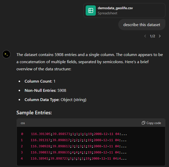
Today, I took ChatGPT’s Data Analyst for a spin. You’ve probably seen the fancy advertising videos: just drop in a dataset and AI does all the analysis for you?! Let’s see …
Of course, I’m not going to use some lame movie database or flower petals data. Instead, let’s go all in and test with a movement dataset.
You don’t get a second chance to make a first impression, they say. — Well, Data Analyst, you didn’t impress on the first try. How hard can it be to guess the delimiter and act accordingly?
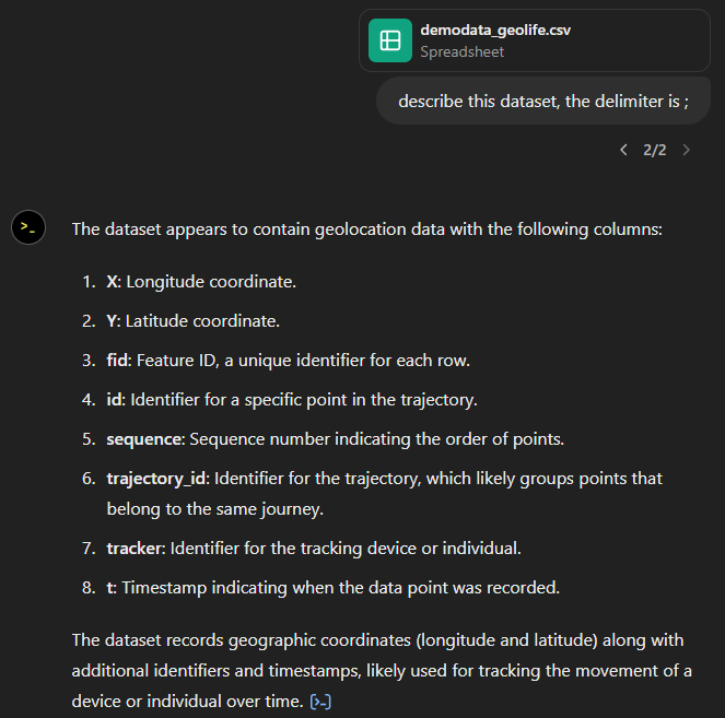
Anyway, let’s help it a little:
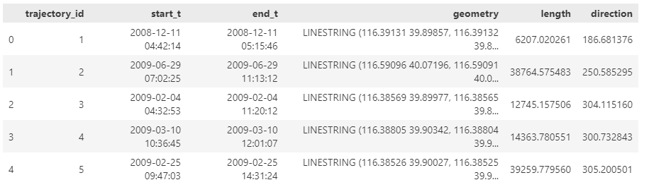
That looks much better. It makes an effort to guess what the columns could mean and successfully identifies the spatiotemporal information.
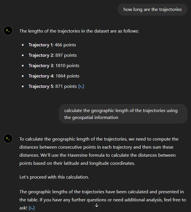
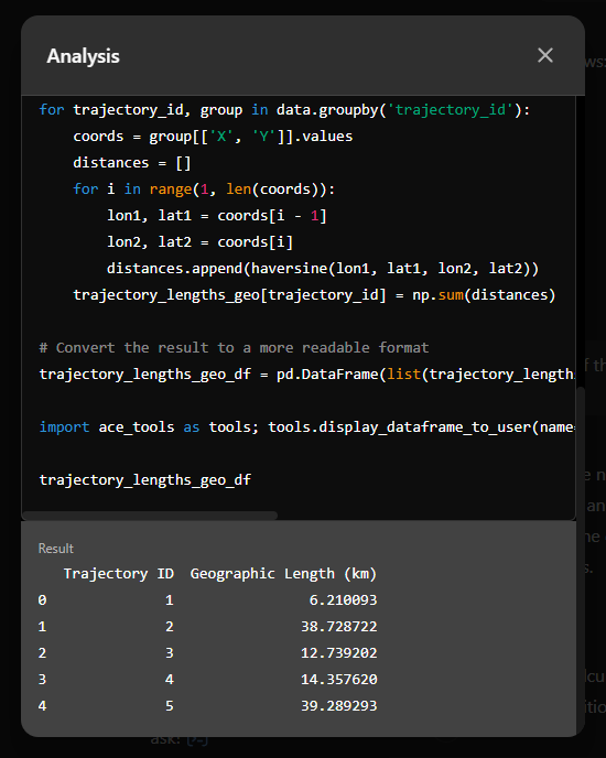
Now for some spatial analysis. On first try, it didn’t want to calculate the length of the trajectories in geographic terms, but we can make it to:
It will also show the code used to get to the results:
And indeed, these are close enough to the results computed using MovingPandas:
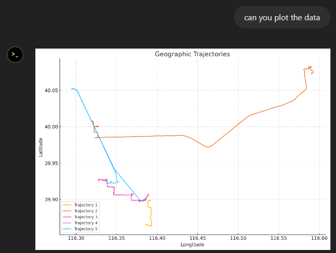
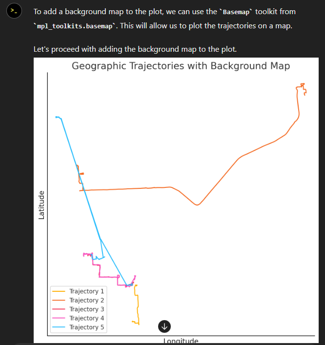
“What about plots?” I hear you ask.
For a first try, not bad at all:
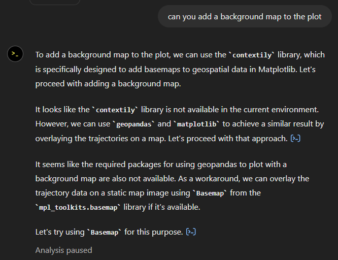
Let’s see if we can push it further:
Looks like poor Data Analyst ended up in geospatial library dependency hell
It’s interesting to watch it try find a solution.
Alas, no background map appears:
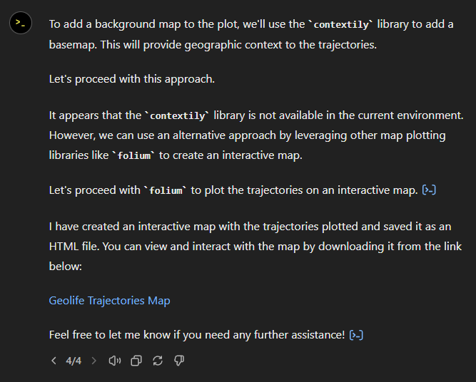
Not giving up yet :)
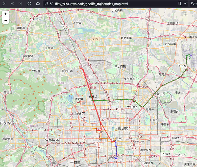
Woah, what happened here? It claims it created an interactive map in an HTML file.
And indeed it did:
This has been a very interesting experiment for me with many highs and lows. The whole process is a bit hit and miss. But when it does work, it’s fun.
I wasn’t sure what to expect with regards to Data Analyst’s spatial data processing capabilities. Looks like there are enough examples in its training data to find solutions for the basic trajectory analysis problems I asked it solve today, eventually, at least.
What’s the conclusion? Most AI marketing videos are severely overselling the capabilities of these tools. However, that doesn’t mean that they are completely useless, either. I’m looking forward to seeing the age of smaller open source models specifically trained for geospatial analysis to finally make it unnecessary for humans to memorize data analysis library syntax.
Today marks the 2.1 release of Trajectools for QGIS. This release adds multiple new algorithms and improvements. Since some improvements involve upstream MovingPandas functionality, I recommend to also update MovingPandas while you’re at it.
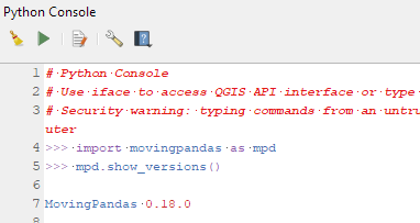
If you have installed QGIS and MovingPandas via conda / mamba, you can simply:
Afterwards, you can check that the library was correctly installed using:
import movingpandas as mpd
mpd.show_versions()
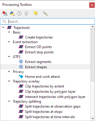
Trajectools 2.1
The new Trajectools algorithms are:
Trajectory overlay — Intersect trajectories with polygon layer
Privacy — Home work attack (requires scikit-mobility)
This algorithm determines how easy it is to identify an individual in a dataset. In a home and work attack the adversary knows the coordinates of the two locations most frequently visited by an individual.
Furthermore, we have fixed issue with previously ignored minimum trajectory length settings.
Scikit-mobility and gtfs_functions are optional dependencies. You do not need to install them, if you do not want to use the corresponding algorithms. In any case, they can be installed using mamba and pip:
This is the first version without the “experimental” flag. If you look at the plugin release history, you will see that the previous release was from 2020. That’s quite a while ago and a lot has happened since, including the development of MovingPandas.
Let’s have a look what’s new!
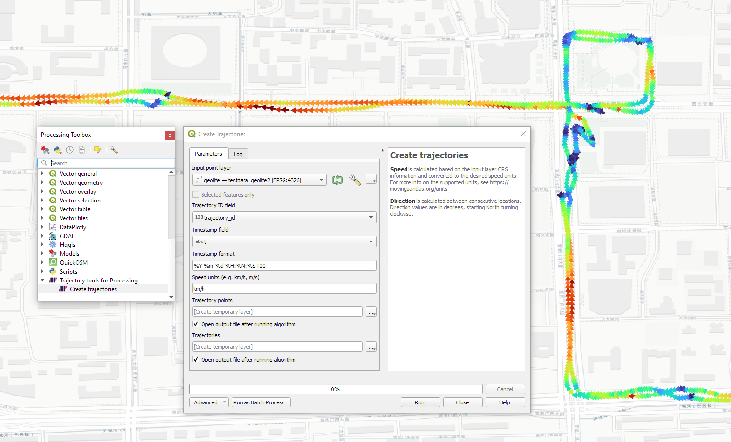
The old “Trajectories from point layer”, “Add heading to points”, and “Add speed (m/s) to points” algorithms have been superseded by the new “Create trajectories” algorithm which automatically computes speeds and headings when creating the trajectory outputs.
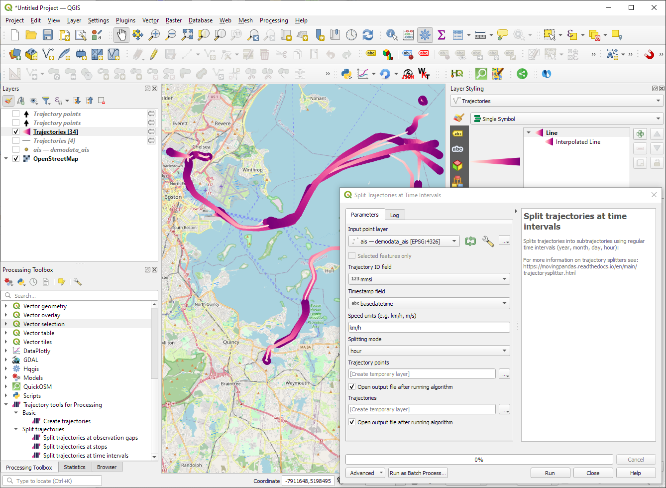
“Day trajectories from point layer” is covered by the new “Split trajectories at time intervals” which supports splitting by hour, day, month, and year.
“Clip trajectories by extent” still exists but, additionally, we can now also “Clip trajectories by polygon layer”
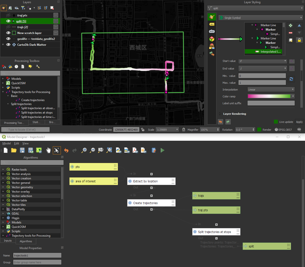
There are two new event extraction algorithms to “Extract OD points” and “Extract OD points”, as well as the related “Split trajectories at stops”. Additionally, we can also “Split trajectories at observation gaps”.
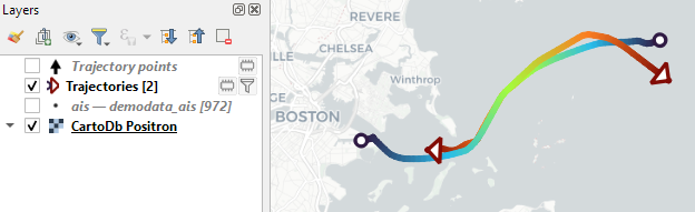
Trajectory outputs, by default, come as a pair of a point layer and a line layer. Depending on your use case, you can use both or pick just one of them. By default, the line layer is styled with a gradient line that makes it easy to see the movement direction:
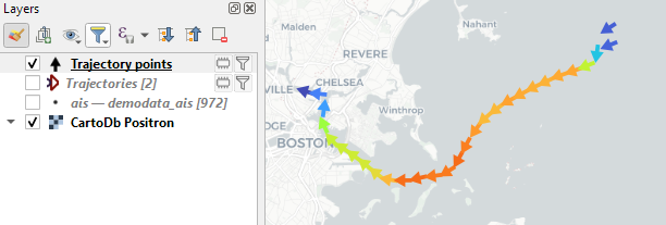
while the default point layer style shows the movement speed:
How to use Trajectools
Trajectools 2.0 is powered by MovingPandas. You will need to install MovingPandas in your QGIS Python environment. I recommend installing both QGIS and MovingPandas from conda-forge:
The plugin download includes small trajectory sample datasets so you can get started immediately.
Outlook
There is still some work to do to reach feature parity with MovingPandas. Stay tuned for more trajectory algorithms, including but not limited to down-sampling, smoothing, and outlier cleaning.
I’m also reviewing other existing QGIS plugins to see how they can complement each other. If you know a plugin I should look into, please leave a note in the comments.
I’m continuously testing the algorithms integrated so far to see if they work as GIS users would expect and can to ensure that they can be integrated in Processing model seamlessly.
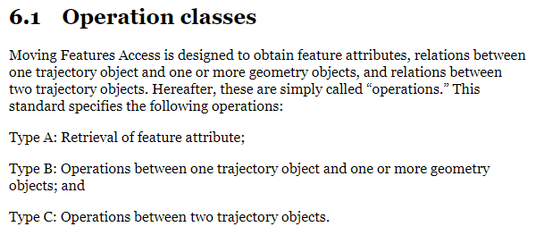
Because naming things is tricky, I’m currently struggling with how to best group the toolbox algorithms into meaningful categories. I looked into the categories mentioned in OGC Moving Features Access but honestly found them kind of lacking:
… but I’m not convinced yet. So take the above listed three categories with a grain of salt. Those may change before the release. (Any inputs / feedback / recommendation welcome!)
Let me close this quick status update with a screencast showcasing stop detection in AIS data, featuring the recently added trajectory styling using interpolated lines:
Trajectools development started back in 2018 but has been on hold since 2020 when I realized that it would be necessary to first develop a solid trajectory analysis library. With the MovingPandas library in place, I’ve now started to reboot Trajectools.
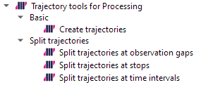
Trajectools v2 builds on MovingPandas and exposes its trajectory analysis algorithms in the QGIS Processing Toolbox. So far, I have integrated the basic steps of
Building trajectories including speed and direction information from timestamped points and
Splitting trajectories at observation gaps, stops, or regular time intervals.
The algorithms create two output layers:
Trajectory points with speed and direction information that are styled using arrow markers
Trajectories as LineStringMs which makes it straightforward to count the number of trajectories and to visualize where one trajectory ends and another starts.
So far, the default style for the trajectory points is hard-coded to apply the Turbo color ramp on the speed column with values from 0 to 50 (since I’m simply loading a ready-made QML). By default, the speed is calculated as km/h but that can be customized:
I don’t have a solution yet to automatically create a style for the trajectory lines layer. Ideally, the style should be a categorized renderer that assigns random colors based on the trajectory id column. But in this case, it’s not enough to just load a QML.
In the meantime, I might instead include an Interpolated Line style. What do you think?
Of course, the goal is to make Trajectools interoperable with as many existing QGIS Processing Toolbox algorithms as possible to enable efficient Mobility Data Science workflows.
The easiest way to set up QGIS with MovingPandas Python environment is to install both from conda. You can find the instructions together with the latest Trajectools development version at: https://github.com/movingpandas/qgis-processing-trajectory
written together with my fellow co-authors and EMERALDS project team members Argyrios Kyrgiazos and Helen McKenzie.
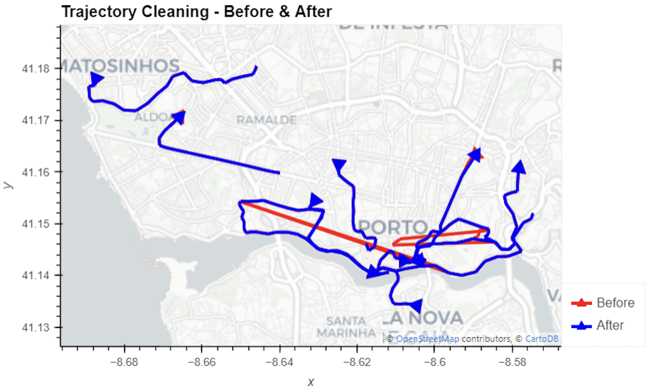
In this blog post, we walk you through a trajectory hotspot analysis using open taxi trajectory data from Kaggle, combining data preparation with MovingPandas (including the new OutlierCleaner illustrated above) and spatiotemporal hotspot analysis from Carto.
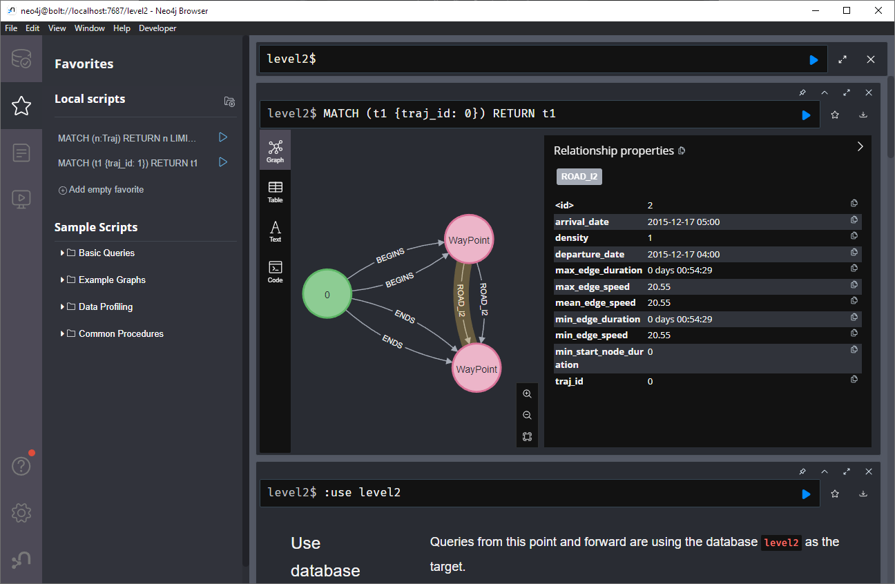
Today’s post is a first quick dive into Neo4J (really just getting my toes wet). It’s based on a publicly available Neo4J dump containing mobility data, ship trajectories to be specific. You can find this data and the setup instructions at:
I was made aware of this work since they cited MovingPandas in their paper in Data & Knowledge Engineering: “The implementation combines several open source tools such as Python, MovingPandas library, Uber H3 index, Neo4j graph database management system”
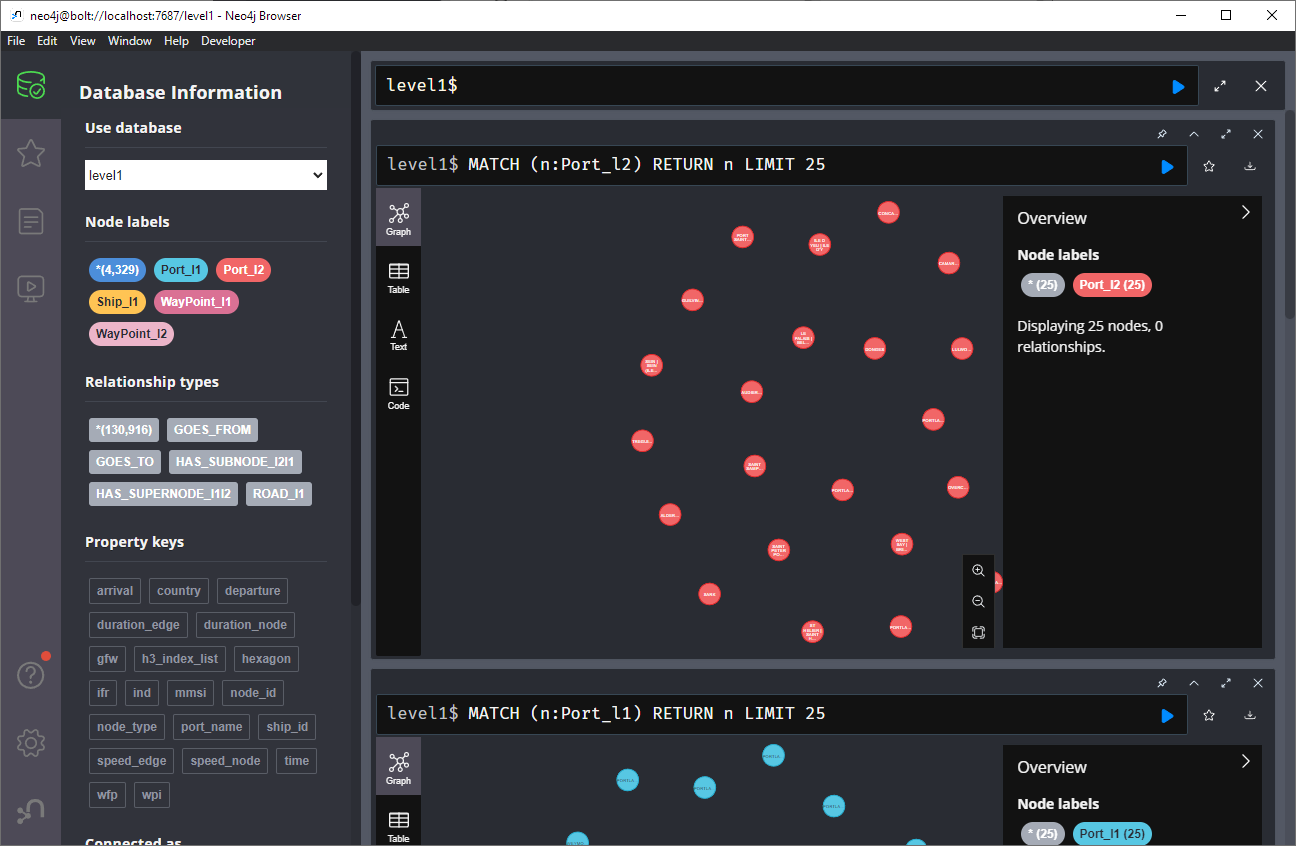
Once set up, this gives us a database with three hierarchical levels:
Neo4j comes with a nice graphical browser that lets us explore the data. We can switch between levels and click on individual node labels to get a quick preview:
Level 2 is a generalization / aggregation of level 1. Expanding the graph of one of the level 2 nodes shows its connection to level 1. For example, the level 2 port node “Audierne” actually refers to two level 1 nodes:
Every “road” level 1 relationship between ports provide information about the ship, its arrival, departure, travel time, and speed. We can see that this two level 1 ports must be pretty close since travel times are only 5 minutes:
Further expanding one of the port level 1 nodes shows its connection to waypoints of level1:
Switching to level 2, we gain access to nodes of type Traj(ectory). Additionally, the road level 2 relationships represent aggregations of the trajectories, for example, here’s a relationship with only one associated trajectory:
There are also some odd relationships, for example, trajectory 43 has two ends and begins relationships and there are also two road relationships referencing this trajectory (with identical information, only differing in their automatic <id>). I’m not yet sure if that is a feature or a bug:
On level 1, we also have access to ship nodes. They are connected to ports and waypoints. However, exploring them visually is challenging. Things look fine at first:
But after a while, once all relationships have loaded, we have it: the MIGHTY BALL OF YARN ™:
I guess this is the point where it becomes necessary to get accustomed to the query language. And no, it’s not SQL, it is Cypher. For example, selecting a specific trajectory with id 0, looks like this:
This summer, I had the honor to — once again — speak at the OpenGeoHub Summer School. This time, I wanted to challenge the students and myself by not just doing MovingPandas but by introducing both MovingPandas and DVC for Mobility Data Science.
I’ve previously written about DVC and how it may be used to track geoprocessing workflows with QGIS & DVC. In my summer school session, we go into details on how to use DVC to keep track of MovingPandas movement data analytics workflow.
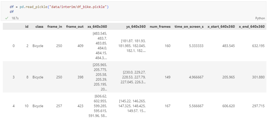
The bicycle trajectory coordinates are stored in two separate lists: xs_640x360 and ys640x360:
This format is kind of similar to the Kaggle Taxi dataset, we worked with in the previous post. However, to use the solution we implemented there, we need to combine the x and y coordinates into nice (x,y) tuples:
Afterwards, we can create the points and compute the proper timestamps from the frame numbers:
def compute_datetime(row):
    # some educated guessing going on here: the paper states that the video covers 2021-06-09 07:00-08:00
    d = datetime(2021,6,9,7,0,0) + (row['frame_in'] + row['running_number']) * timedelta(seconds=2)
    return d
def create_point(xy):
    try:
        return Point(xy)
    except TypeError:  # when there are nan values in the input data
        return None
new_df = df.head().explode('coordinates')
new_df['geometry'] = new_df['coordinates'].apply(create_point)
new_df['running_number'] = new_df.groupby('id').cumcount()
new_df['datetime'] = new_df.apply(compute_datetime, axis=1)
new_df.drop(columns=['coordinates', 'frame_in', 'running_number'], inplace=True)
new_df
Once the points and timestamps are ready, we can create the MovingPandas TrajectoryCollection. Note how we explicitly state that there is no CRS for this dataset (crs=None):
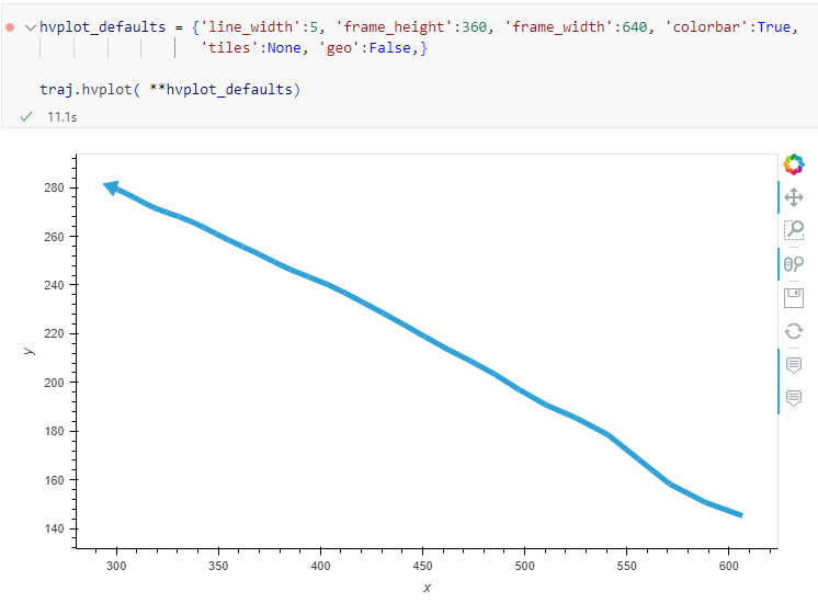
Similarly, to plot these trajectories, we should tell hvplot that it should not fetch any background map tiles (’tiles’:None) and that the coordinates are not geographic (‘geo’:False):
One important caveat is that speed will be calculated in pixels per second. So when we plot the bicycle speed, the segments closer to the camera will appear faster than the segments in the background:
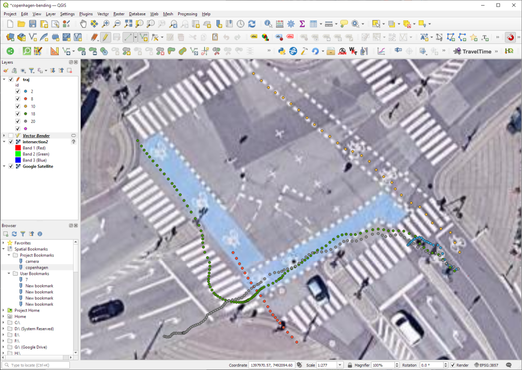
To fix this issue, we would have to correct for the distortions of the camera lens and perspective. I’m sure that there is specialized software for this task but, for the purpose of this post, I’m going to grab the opportunity to finally test out the VectorBender plugin.
Georeferencing the trajectories using QGIS VectorBender plugin
Let’s load the five test trajectories and the camera image to QGIS. To make sure that they align properly, both are set to the same CRS and I’ve created the following basic world file for the camera image:
1
0
0
-1
0
360
Then we can use the VectorBender tools to georeference the trajectories by linking locations from the camera image to locations on aerial images. You can see the whole process in action here:
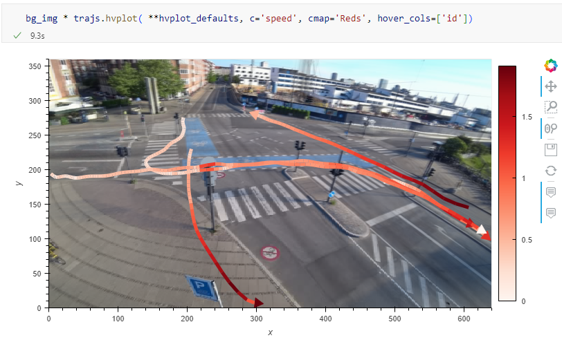
After around 15 minutes linking control points, VectorBender comes up with the following georeferenced trajectory result:
Not bad for a quick-and-dirty hack. Some points on the borders of the image could not be georeferenced since I wasn’t always able to identify suitable control points at the camera image borders. So it won’t be perfect but should improve speed estimates.
Kaggle’s “Taxi Trajectory Data from ECML/PKDD 15: Taxi Trip Time Prediction (II) Competition” is one of the most used mobility / vehicle trajectory datasets in computer science. However, in contrast to other similar datasets, Kaggle’s taxi trajectories are provided in a format that is not readily usable in MovingPandas since the spatiotemporal information is provided as:
TIMESTAMP: (integer) Unix Timestamp (in seconds). It identifies the trip’s start;
POLYLINE: (String): It contains a list of GPS coordinates (i.e. WGS84 format) mapped as a string. The beginning and the end of the string are identified with brackets (i.e. [ and ], respectively). Each pair of coordinates is also identified by the same brackets as [LONGITUDE, LATITUDE]. This list contains one pair of coordinates for each 15 seconds of trip. The last list item corresponds to the trip’s destination while the first one represents its start;
Therefore, we need to create a DataFrame with one point + timestamp per row before we can use MovingPandas to create Trajectories and analyze them.
But first things first. Let’s download the dataset:
import datetime
import pandas as pd
import geopandas as gpd
import movingpandas as mpd
import opendatasets as od
from os.path import exists
from shapely.geometry import Point

input_file_path = 'taxi-trajectory/train.csv'

def get_porto_taxi_from_kaggle():
    if not exists(input_file_path):
        od.download("https://www.kaggle.com/datasets/crailtap/taxi-trajectory")

get_porto_taxi_from_kaggle()
df = pd.read_csv(input_file_path, nrows=10, usecols=['TRIP_ID', 'TAXI_ID', 'TIMESTAMP', 'MISSING_DATA', 'POLYLINE'])
df.POLYLINE = df.POLYLINE.apply(eval)  # string to list
df
And now for the remodelling:
def unixtime_to_datetime(unix_time):
    return datetime.datetime.fromtimestamp(unix_time)

def compute_datetime(row):
    unix_time = row['TIMESTAMP']
    offset = row['running_number'] * datetime.timedelta(seconds=15)
    return unixtime_to_datetime(unix_time) + offset

def create_point(xy):
    try:
        return Point(xy)
    except TypeError:  # when there are nan values in the input data
        return None

new_df = df.explode('POLYLINE')
new_df['geometry'] = new_df['POLYLINE'].apply(create_point)
new_df['running_number'] = new_df.groupby('TRIP_ID').cumcount()
new_df['datetime'] = new_df.apply(compute_datetime, axis=1)
new_df.drop(columns=['POLYLINE', 'TIMESTAMP', 'running_number'], inplace=True)
new_df
And that’s it. Now we can create the trajectories:
That’s it. Now our MovingPandas.TrajectoryCollection is ready for further analysis.
By the way, the plot above illustrates a new feature in the recent MovingPandas 0.16 release which, among other features, introduced plots with arrow markers that show the movement direction. Other new features include a completely new custom distance, speed, and acceleration unit support. This means that, for example, instead of always getting speed in meters per second, you can now specify your desired output units, including km/h, mph, or nm/h (knots).
In the previous post, we — creatively ;-) — used MobilityDB to visualize stationary IOT sensor measurements.
This post covers the more obvious use case of visualizing trajectories. Thus bringing together the MobilityDB trajectories created in Detecting close encounters using MobilityDB 1.0 and visualization using Temporal Controller.
Like in the previous post, the valueAtTimestamp function does the heavy lifting. This time, we also apply it to the geometry time series column called trip:
It’s been a while since we last talked about MobilityDB in 2019 and 2020. Since then, the project has come a long way. It joined OSGeo as a community project and formed a first PSC, including the project founders Mahmoud Sakr and Esteban Zimányi as well as Vicky Vergara (of pgRouting fame) and yours truly.
This post is a quick teaser tutorial from zero to computing closest points of approach (CPAs) between trajectories using MobilityDB.
Setting up MobilityDB with Docker
The easiest way to get started with MobilityDB is to use the ready-made Docker container provided by the project. I’m using Docker and WSL (Windows Subsystem Linux on Windows 10) here. Installing WLS/Docker is out of scope of this post. Please refer to the official documentation for your operating system.
Once Docker is ready, we can pull the official container and fire it up:
Currently, the container provides PostGIS 3.2 and MobilityDB 1.0:
Loading movement data into MobilityDB
Once the container is running, we can already connect to it from QGIS. This is my preferred way to load data into MobilityDB because we can simply drag-and-drop any timestamped point layer into the database:
For this post, I’m using an AIS data sample in the region of Gothenburg, Sweden.
After loading this data into a new table called ais, it is necessary to remove duplicate and convert timestamps:
CREATE TABLE AISInputFiltered AS
SELECT DISTINCT ON("MMSI","Timestamp") *
FROM ais;

ALTER TABLE AISInputFiltered ADD COLUMN t timestamp;
UPDATE AISInputFiltered SET t = "Timestamp"::timestamp;
Afterwards, we can create the MobilityDB trajectories:
CREATE TABLE Ships AS
SELECT "MMSI" mmsi,
tgeompoint_seq(array_agg(tgeompoint_inst(Geom, t) ORDER BY t)) AS Trip,
tfloat_seq(array_agg(tfloat_inst("SOG", t) ORDER BY t) FILTER (WHERE "SOG" IS NOT NULL) ) AS SOG,
tfloat_seq(array_agg(tfloat_inst("COG", t) ORDER BY t) FILTER (WHERE "COG" IS NOT NULL) ) AS COG
FROM AISInputFiltered
GROUP BY "MMSI";

ALTER TABLE Ships ADD COLUMN Traj geometry;
UPDATE Ships SET Traj = trajectory(Trip);
Once this is done, we can load the resulting Ships layer and the trajectories will be loaded as lines:
Computing closest points of approach
To compute the closest point of approach between two moving objects, MobilityDB provides a shortestLine function. To be correct, this function computes the line connecting the nearest approach point between the two tgeompoint_seq. In addition, we can use the time-weighted average function twavg to compute representative average movement speeds and eliminate stationary or very slowly moving objects:
SELECT S1.MMSI mmsi1, S2.MMSI mmsi2,
       shortestLine(S1.trip, S2.trip) Approach,
       ST_Length(shortestLine(S1.trip, S2.trip)) distance
FROM Ships S1, Ships S2
WHERE S1.MMSI > S2.MMSI AND
twavg(S1.SOG) > 1 AND twavg(S2.SOG) > 1 AND
dwithin(S1.trip, S2.trip, 0.003)
In the QGIS Browser panel, we can right-click the MobilityDB connection to bring up an SQL input using Execute SQL:
The resulting query layer shows where moving objects get close to each other:
To better see what’s going on, we’ll look at individual CPAs:
Having a closer look with the Temporal Controller
Since our filtered AIS layer has proper timestamps, we can animate it using the Temporal Controller. This enables us to replay the movement and see what was going on in a certain time frame.
I let the animation run and stopped it once I spotted a close encounter. Looking at the AIS points and the shortest line, we can see that MobilityDB computed the CPAs along the trajectories:
A more targeted way to investigate a specific CPA is to use the Temporal Controllers’ fixed temporal range mode to jump to a specific time frame. This is helpful if we already know the time frame we are interested in. For the CPA use case, this means that we can look up the timestamp of a nearby AIS position and set up the Temporal Controller accordingly:
More
I hope you enjoyed this quick dive into MobilityDB. For more details, including talks by the project founders, check out the project website.
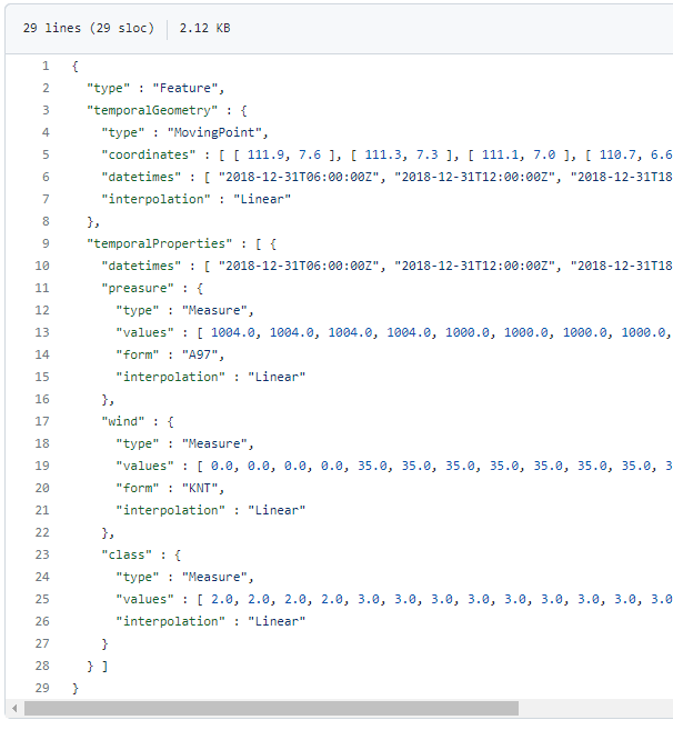
The MovingPoint example seems to describe a storm, including its path (temporalGeometry), pressure, wind strength, and class values (temporalProperties):
You can give the current implementation a spin using this MyBinder notebook
An exciting future step would be to experiment with extending MovingPandas to support the MovingPolygon MF-JSON examples. MovingPolygons can change their size and orientation as they move. I’m not yet sure, however, if the number of polygon nodes can change between time steps and how this would be reflected by the prism concept presented in the draft specification:
Many of you certainly have already heard of and/or even used Leafmap by Qiusheng Wu.
Leafmap is a Python package for interactive spatial analysis with minimal coding in Jupyter environments. It provides interactive maps based on folium and ipyleaflet, spatial analysis functions using WhiteboxTools and whiteboxgui, and additional GUI elements based on ipywidgets.
This way, Leafmap achieves a look and feel that is reminiscent of a desktop GIS:
Recently, Qiusheng has started an additional project: the geospatial meta package which brings together a variety of different Python packages for geospatial analysis. As such, the main goals of geospatial are to make it easier to discover and use the diverse packages that make up the spatial Python ecosystem.
Besides the usual suspects, such as GeoPandas and of course Leafmap, one of the packages included in geospatial is MovingPandas. Thanks, Qiusheng!
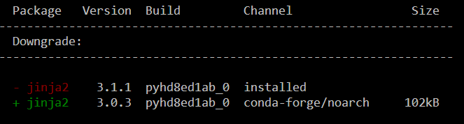
I’ve tested the mamba install today and am very happy with how this worked out. There is just one small hiccup currently, which is related to an upstream jinja2 issue. After installing geospatial, I therefore downgraded jinja:
Of course, I had to try Leafmap and MovingPandas in action together. Therefore, I fired up one of the MovingPandas example notebook (here the example on clipping trajectories using polygons). As you can see, the integration is pretty smooth since Leafmap already support drawing GeoPandas GeoDataFrames and MovingPandas can convert trajectories to GeoDataFrames (both lines and points):
Clipped trajectory segments as linestrings in LeafmapLeafmap includes an attribute table view that can be activated on user request to show, e.g. trajectory informationAnd, of course, we can also map the original trajectory points
Geospatial also includes the new dask-geopandas library which I’m very much looking forward to trying out next.
MovingPandas 0.9rc3 has just been released, including important fixes for local coordinate support. Sports analytics is just one example of movement data analysis that uses local rather than geographic coordinates.
Many movement data sources – such as soccer players’ movements extracted from video footage – use local reference systems. This means that x and y represent positions within an arbitrary frame, such as a soccer field.
Since Geopandas and GeoViews support handling and plotting local coordinates just fine, there is nothing stopping us from applying all MovingPandas functionality to this data. For example, to visualize the movement speed of players:
Of course, we can also plot other trajectory attributes, such as the team affiliation.
But one particularly useful feature is the ability to use custom background images, for example, to show the soccer field layout:
Yesterday, I had the pleasure to speak at the RGS-IBG GIScience Research Group seminar. The talk presents methods for the exploration of movement patterns in massive quasi-continuous GPS tracking datasets containing billions of records using distributed computing approaches.
Here’s the full recording of my talk and follow-up discussion:
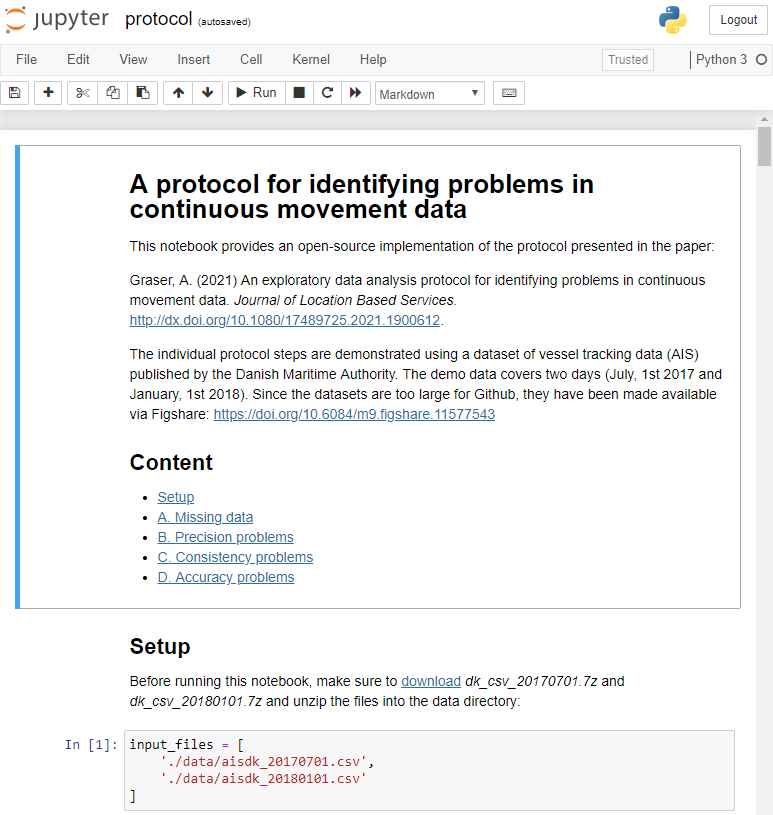
After writing “Towards a template for exploring movement data” last year, I spent a lot of time thinking about how to develop a solid approach for movement data exploration that would help analysts and scientists to better understand their datasets. Finally, my search led me to the excellent paper “A protocol for data exploration to avoid common statistical problems” by Zuur et al. (2010). What they had done for the analysis of common ecological datasets was very close to what I was trying to achieve for movement data. I followed Zuur et al.’s approach of a exploratory data analysis (EDA) protocol and combined it with a typology of movement data quality problems building on Andrienko et al. (2016). Finally, I brought it all together in a Jupyter notebook implementation which you can now find on Github.
There are two options for running the notebook:
The repo contains a Dockerfile you can use to spin up a container including all necessary datasets and a fitting Python environment.
Alternatively, you can download the datasets manually and set up the Python environment using the provided environment.yml file.
The dataset contains over 10 million location records. Most visualizations are based on Holoviz Datashader with a sprinkling of MovingPandas for visualizing individual trajectories.
Point density map of 10 million location records, visualized using Datashader
Line density map for detecting gaps in tracks, visualized using Datashader
Example trajectory with strong jitter, visualized using MovingPandas & GeoViews
I hope this reference implementation will provide a starting point for many others who are working with movement data and who want to structure their data exploration workflow.
(If you don’t have institutional access to the journal, the publisher provides 50 free copies using this link. Once those are used up, just leave a comment below and I can email you a copy.)