In this new release, you will find new algorithms, default output styles, and other usability improvements, in particular for working with public transport schedules in GTFS format, including:
Added GTFS algorithms for extracting stops, fixes #43
Added default output styles for GTFS stops and segments c600060
Added Trajectory splitting at field value changes 286fdbd
Added option to add selected fields to output trajectories layer, fixes #53
Improved UI of the split by observation gap algorithm, fixes #36
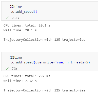
Note: To use this new version of Trajectools, please upgrade your installation of MovingPandas to >= 0.21.2, e.g. using
written together with my fellow co-authors and EMERALDS project team member Argyrios Kyrgiazos.
For the technically inclined, the highlight are the presented UDFs in Snowflake to process and transform the trajectory data. For example, here’s a TemporalSplitter UDF:
CREATE OR REPLACE FUNCTION CARTO_DATABASE.CARTO.TemporalSplitter(geom ARRAY, t ARRAY, mode STRING)
RETURNS ARRAY
LANGUAGE PYTHON
RUNTIME_VERSION = 3.11
PACKAGES = ('numpy','pandas', 'geopandas','movingpandas', 'shapely')
HANDLER = 'udf'
AS $$
import numpy as np
import pandas as pd
import geopandas as gpd
import movingpandas as mpd
import shapely
from shapely.geometry import shape, mapping, Point, Polygon
from shapely.validation import make_valid
from datetime import datetime, timedelta

def udf(geom, t, mode):
    valid_df = pd.DataFrame(geom, columns=['geometry'])
    valid_df['t'] = pd.to_datetime(t)
    valid_df['geometry'] = valid_df['geometry'].apply(lambda x:shapely.wkt.loads(x))
    gdf = gpd.GeoDataFrame(valid_df, geometry='geometry', crs='epsg:4326')
    gdf = gdf.set_index('t')
    traj = mpd.Trajectory(gdf, 1)
    traj_sm = mpd.TemporalSplitter(traj).split(mode=mode)
    if len(traj_sm.trajectories)>0:
        res = traj_sm.to_point_gdf()
        res['geometry'] = res['geometry'].apply(lambda x: shapely.wkt.dumps(x))
        return res.reset_index().values
    else:
        return []
$$;
tldr; Tired of working with large CSV files? Give GeoParquet a try!
“Parquet is a powerful column-oriented data format, built from the ground up to as a modern alternative to CSV files.”https://geoparquet.org/
(Geo)Parquet is both smaller and faster than CSV. Additionally, (Geo)Parquet columns are typed. Text, numeric values, dates, geometries retain their data types. GeoParquet also stores CRS information and support in GIS solutions is growing.
I’ll be giving a quick overview using AIS data in GeoPandas 1.0.1 (with pyarrow) and QGIS 3.38 (with GDAL 3.9.2).
File size
The example AIS dataset for this demo contains ~10 million rows with 22 columns. I’ve converted the original zipped CSV into GeoPackage and GeoParquet using GeoPandas to illustrate the huge difference in file size: ~470 MB for GeoParquet and zipped CSV, 1.6 GB for CSV, and a whopping 2.6 GB for GeoPackage:
Reading performance
Pandas and GeoPandas both support selective reading of files, i.e. we can specify the specific columns to be loaded. This does speed up reading, even from CSV files:
Whole file
Selected columns
CSV
27.9 s
13.1 s
Geopackage
2min 12s
20.2 s
GeoParquet
7.2 s
4.1 s
Indeed, reading the whole GeoPackage is getting quite painful.
Here’s the code I used for timing the read times:
As you can see, these times include the creation of the GeoPandas.GeoDataFrame.
If we don’t need a GeoDataFrame, we can read the files even faster:
Non-spatial DataFrames
GeoParquet files can be read by non-GIS tools, such as Pandas. This makes it easier to collaborate with people who may not be familiar with geospatial data stacks.
And reading plain DataFrames is much faster than creating GeoDataFrames:
But back to GIS …
GeoParquet in QGIS
In QGIS, GeoParquet files can be loaded like any other vector layer, thanks to GDAL:
Loading the GeoParquet and GeoPackage files is pretty quick, especially if we zoom into a small region of interest (even though, unfortunately, it doesn’t seem possible to restrict the columns to further speed up loading). Loading the CSV, however, is pretty painful due to the lack of spatial indexing, which becomes apparent very quickly in the direct comparison:
(You can see how slowly the red CSV points are rendering. I didn’t have the patience to include the whole process in the GIF.)
As far as I can tell, my QGIS 3.38 ‘Grenoble’ does not support writing to or editing of GeoParquet files. So I’m limited to reading GeoParquet for now.
However, seeing how much smaller GeoParquets are compared to GeoPackages (and also faster to write), I hope that we will soon get the option to export to GeoParquet.
For now, I’ll start by converting my large CSV files to GeoParquet using GeoPandas.
GeoAI isn’t one single thing. It’s an umbrella term, including: “AI for Geo” (using AI methods in Geo, e.g. deep learning for object recognition in remote sensing images) and “Geo for AI” (integrating geographic concepts into AI models, e.g. by building spatially explicit models). [Zhang 2020][Li et al. 2024]
Today’s post is a collection of key GeoAI developments I’m aware of. If I missed anything you are excited about, please let me know here in the comments or over on Mastodon.
Background
A week ago, I had the pleasure to attend a “Specialist Meeting” on GeoAI here in Vienna, meeting over 40 researchers from around the world, from Master students to professor emeritus. Huge props to Jano (Prof. Krzysztof Janowicz) and his team at Uni Wien for bringing this awesome group of people together.
The elephant in the room: LLMs
Unsurprisingly, LLMs and the claims they make about geography are a mayor issue due to the mistakes they make and the biases behind them. An infamous example is AI’s issue with understanding topology:
Image source: Janowicz, K. (2023). Philosophical Foundations of GeoAI: Exploring Sustainability, Diversity, and Bias in GeoAI and Spatial Data Science. arXiv e-prints, arXiv-2304.
Even if recent versions of ChatGPT (such as GTP 4o) do a better job with this specific example, this doesn’t make their answers reliable. So between the trustworthiness, reproducibility, explainability, and sustainability issues … LLMs have a long way to go. And it’s not clear whether they are going in the right direction right now.
Geospatial foundation models
Prithvi, a model developed by NASA, IBM, et al. in 2023, is one of the first geospatial foundation models. Like much of GeoAI, Prithvi deals with remote sensing data. Specifically, it is trained on Landsat and Sentinel-2 (HLS) imagery, with applications in flood mapping and wildfire prediction. And maybe best of all: the model is open-source and publicly available.
Spatiotemporal machine learning model specifications
In the general AI community, model cards have become a common way to share information about models. However, identifying the right model for spatiotemporal tasks is hard since there are no standardized descriptions in existing model catalogs (e.g. Hugging Face, DLHub or MLFlow). To address this issue, [Charette-Migneault et al. 2024] have proposed the Machine Learning Model (MLM) extension for the SpatioTemporal Asset Catalogs (STAC). But, yet again, this development is targeting models trained with remote sensing imagery.
For those among us working mostly with vector data, the KnowWhereGraph is an interesting development. It’s the first geo-enriched knowledge graph [Janowicz et al. 2022] that helps answer geospatial questions by integrating a variety of spatial datasets through hierarchical grids, standard region boundaries and appropriate ontology and knowledge graph schema development. However, so far, the KnowWhereGraph is mostly limited to the United States.
Explainable AI (XAI) and geo
While answers from knowledge graphs are intrinsically explainable, many other (Geo)AI solutions are built on AI approaches that result in black box models.
Graph neural networks (GNNs) have become very popular in GeoAI (including in urban analytics and mobility [Jalali et al. 2023] [Liu et al. 2024]) but their black box nature limits their practical usefulness in domains where transparency and trustworthiness are crucial. To offer insights into how model predictions are made, [Liu et al. 2024] propose a spatially explicit GeoAI-based method that combines a graph convolutional network and a graph-based XAI method, called GNNExplainer to explore the correlation between urban objects.
Reproducibility et al.
The AI hype in geo is still going strong. Journals are being flooded with paper submissions and good reviewers are hard to come by. In many geo-related venues, it is still acceptable to present an AI paper without making code or model available. (We recently discussed this issue for mobility AI specifically [Graser et al. 2024].)
I’m convinced we can and should do better: quality over quantity, moving steadily, building and fixing things.
After the initial ChatGPT hype in 2023 (when we saw the first LLM-backed QGIS plugins, e.g. QChatGPT and QGPT Agent), there has been a notable slump in new development. As far as I can tell, none of the early plugins are actively maintained anymore. They were nice tech demos but with limited utility.
However, in the last month, I saw two new approaches for combining LLMs with QGIS that I want to share in this post:
IntelliGeo plugin: generating PyQGIS scripts or graphical models
The workshop was packed. After we installed all dependencies and the plugin, it was exciting to test the graphical model generation capabilities. During the workshop, we used OpenAI’s API but the readme also mentions support for Cohere.
I was surprised to learn that even simple graphical models are actually pretty large files. This makes it very challenging to generate and/or modify models because they take up a big part of the LLM’s context window. Therefore, I expect that the PyQGIS script generation will be easier to achieve. But, of course, model generation would be even more impressive and useful since models are easier to edit for most users than code.
It uses a fine-tuned Llama 2 model in combination with spaCy for entity recognition and WorldKG ontology to write PyQGIS code that can perform a variety of different geospatial analysis tasks on OpenStreetMap data.
The paper is very interesting, describing the LLM fine-tuning, integration with QGIS, and evaluation of the generated code using different metrics. However, as far as I can tell, the tool is not publicly available and, therefore, cannot be tested.
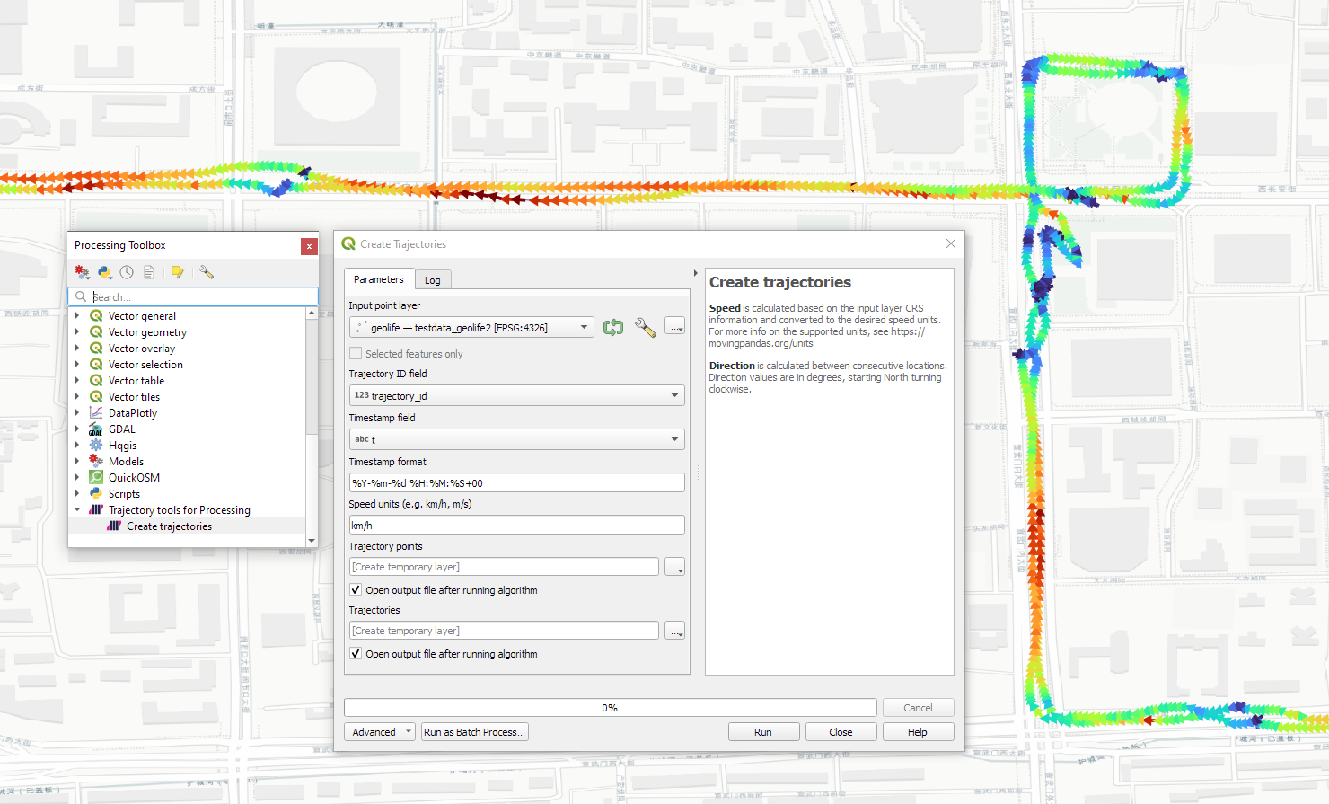
Today marks the release of Trajectools 2.3 which brings a new set of algorithms, including trajectory generalizing, cleaning, and smoothing.
To give you a quick impression of what some of these algorithms would be useful for, this post introduces a trajectory preprocessing workflow that is quite general-purpose and can be adapted to many different datasets.
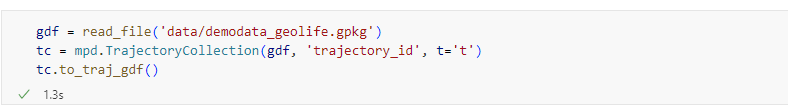
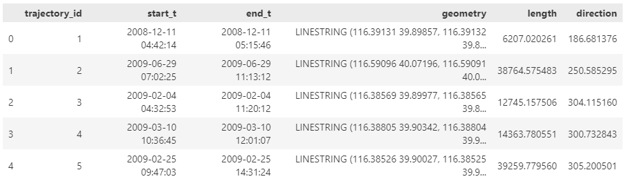
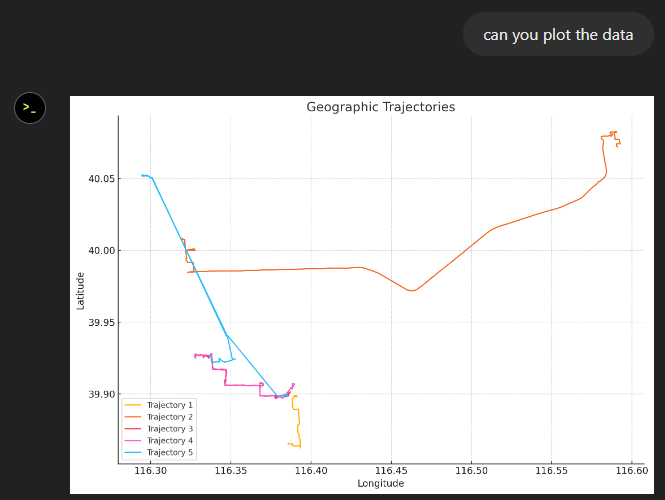
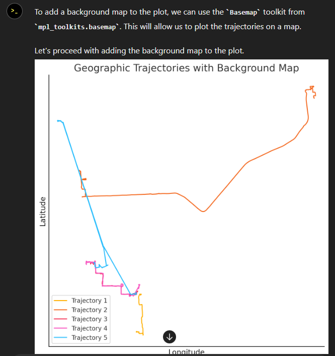
We start out with the Geolife sample dataset which you can find in the Trajectools plugin directory’s sample_data subdirectory. This small dataset includes 5908 points forming 5 trajectories, based on the trajectory_id field:
We first split our trajectories by observation gaps to ensure that there are no large gaps in our trajectories. Let’s make at cut at 15 minutes:
This splits the original 5 trajectories into 11 trajectories:
When we zoom, for example, to the two trajectories in the north western corner, we can see that the trajectories are pretty noisy and there’s even a spike / outlier at the western end:
If we label the points with the corresponding speeds, we can see how unrealistic they are: over 300 km/h!
Let’s remove outliers over 50 km/h:
Better but not perfect:
Let’s smooth the trajectories to get rid of more of the jittering.
(You’ll need to pip/mamba install the optional stonesoup library to get access to this algorithm.)
Depending on the noise values we chose, we get more or less smoothing:
Let’s zoom out to see the whole trajectory again:
Feel free to pan around and check how our preprocessing affected the other trajectories, for example:
Earlier this year, I shared my experience using ChatGPT’s Data Analyst web interface for analyzing spatiotemporal data in the post “ChatGPT Data Analyst vs. Movement Data”. The Data Analyst web interface, while user-friendly, is not equipped to handle all types of spatial data tasks, particularly those involving more complex or large-scale datasets. Additionally, because the code is executed on a remote server, we’re limited to the libraries and tools available in that environment. I’ve often encountered situations where the Data Analyst simply doesn’t have access to the necessary libraries in its Python environment, which can be frustrating if you need specific GIS functionality.
Today, we’ll therefore start to explore alternatives to ChatGPT’s Data Analyst Web Interface, specifically, the OpenAI Assistant API. Later, I plan to dive deeper into even more flexible approaches, like Langchain’s Pandas DataFrame Agents. We’ll explore these options using spatial analysis workflow, such as:
Loading a zipped shapefile and investigate its content
Finding the three largest cities in the dataset
Selecting all cities in a region, e.g. in Scandinavia from the dataset
Creating static and interactive maps
To try the code below, you’ll need an OpenAI account with a few dollars on it. While gpt-3.5-turbo is quite cheap, using gpt-4o with the Assistant API can get costly fast.
OpenAI Assistant API
The OpenAI Assistant API allows us to create a custom data analysis environment where we can interact with our spatial datasets programmatically. To write the following code, I used the assistant quickstart and related docs (yes, shockingly, ChatGPT wasn’t very helpful for writing this code).
Like with Data Analyst, we need to upload the zipped shapefile to the server to make it available to the assistant. Then we can proceed to ask it questions and task it to perform analytics and create maps.
assistant = client.beta.assistants.create(
  name="GIS Analyst",
  instructions="You are a personal GIS data analyst. Write and rund code to answer geospatial analysis questions",
  tools=[{"type": "code_interpreter"}],
  model="gpt-3.5-turbo",  # or "gpt-4o"
  tool_resources={
    "code_interpreter": {
      "file_ids": [file.id]
    }
  }
)
Then we can start asking questions and giving our assistant tasks:
thread = client.beta.threads.create()

message = client.beta.threads.messages.create(
  thread_id=thread.id,
  role="user",
  content="Please load the zipped shapefile and describe the content"
)
assistant > The shapefile has been successfully loaded as a GeoDataFrame with the following details:

- The GeoDataFrame has 243 entries.
- It contains a total of 38 columns with various data types including integer, float, and object types.
- One of the columns is a geometry column representing the spatial information.

If you have any specific analysis or visualizations you would like to perform on this data, feel free to let me know!
The docs have a nice example for how to stream the answers back, e.g. into a Jupyter notebook. I’ve used it to create a small convenience function:
def ask_another_question(question):
    message = client.beta.threads.messages.create(
        thread_id=thread.id,
        role="user",
        content=question
    )
    with client.beta.threads.runs.stream(
        thread_id=thread.id,
        assistant_id=assistant.id,
        event_handler=EventHandler(),
    ) as stream:
        stream.until_done()

ask_another_question("Please list the three largest cities")
assistant > code_interpreter

# Sort the GeoDataFrame by the population in descending order
largest_cities = gdf.sort_values(by='pop_max', ascending=False).head(3)[['name', 'pop_max']]
largest_cities
assistant > The three largest cities in the dataset, along with their maximum population numbers, are as follows:

1. Tokyo: 35,676,000
2. New York: 19,040,000
3. Mexico City: 19,028,000

These cities have the highest recorded maximum population numbers in the dataset. Let me know if you need any further information or analysis!
ask_another_question("extract all scandinavian cities ")
assistant > To extract all the Scandinavian cities from the dataset, we can filter the GeoDataFrame based on the countries typically considered part of Scandinavia. These countries include Norway, Sweden, Denmark, Finland, and sometimes Iceland. Let's filter the GeoDataFrame to extract the Scandinavian cities.
assistant > code_interpreter

# List of countries typically considered part of Scandinavia
scandinavian_countries = ['Norway', 'Sweden', 'Denmark', 'Finland', 'Iceland']

# Filter the GeoDataFrame for Scandinavian cities
scandinavian_cities = gdf[gdf['adm0name'].isin(scandinavian_countries)][['name', 'adm0name']]

scandinavian_cities.head()  # Displaying the first few Scandinavian cities
assistant > Here are some of the Scandinavian cities extracted from the dataset:

1. Reykjavík, Iceland
2. Oslo, Norway
3. Helsinki, Finland
4. København (Copenhagen), Denmark
5. Stockholm, Sweden

These are just a few examples of Scandinavian cities present in the dataset. If you would like the complete list or perform any specific analysis on these cities, feel free to let me know!
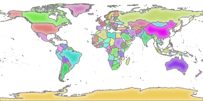
ask_another_question(
    "please create a world map with all cities (use gray circles) "
    "with scandinavian cities highlighted as red circles. "
)
assistant > To create a world map with all cities represented as gray circles and Scandinavian cities highlighted as red circles, we will use the GeoPandas library for mapping. Let's go ahead and create the map.
assistant > code_interpreter

import matplotlib.pyplot as plt

# Plot all cities with gray circles and Scandinavian cities with red circles
fig, ax = plt.subplots(figsize=(12, 8))

# Plot all cities in gray circles
gdf.plot(ax=ax, color='lightgrey', markersize=5)

# Plot Scandinavian cities in red circles
scandinavian_cities.plot(ax=ax, color='red', markersize=50, edgecolor='black', label='Scandinavian Cities')

# Set the title
ax.set_title('World Map with Scandinavian Cities Highlighted', fontsize=16)

# Add legend
ax.legend()

# Display the map
plt.show()
assistant > It seems that there was an error while plotting the map because the GeoDataFrame `scandinavian_cities` does not have the necessary numeric data to plot the map directly.
...
plt.show()

output >

assistant > Here is the world map with all cities represented as gray circles and Scandinavian cities highlighted as red circles. The map provides a visual representation of the locations of the Scandinavian cities in relation to the rest of the cities around the world. If you need any further assistance or modifications, feel free to let me know!
To load and show the image, we can use:
import matplotlib.pyplot as plt
import matplotlib.image as mpimg

def show_image():
    messages = client.beta.threads.messages.list(thread_id=thread.id)

    for m in messages.data:
        if m.role == "user":
            continue
        if m.content[0].type == 'image_file':
            m.content[0].image_file.file_id
            image_data = client.files.content(messages.data[0].content[0].image_file.file_id)
            image_data_bytes = image_data.read()
            with open("./out/my-image.png", "wb") as file:
                file.write(image_data_bytes)
            image = mpimg.imread("./out/my-image.png")
            plt.imshow(image)
            plt.box(False)
            plt.xticks([])
            plt.yticks([])
            plt.show()
            break
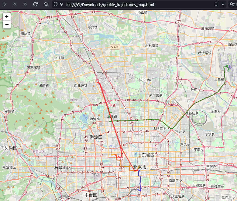
Asking for an interactive map in an html file works in a similar fashion.
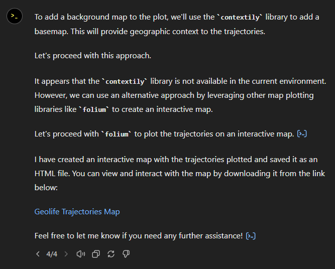
You can see the whole analysis workflow it in action here:
This way, we can use ChatGPT to perform data analysis from the comfort of our Jupyter notebooks. However, it’s important to note that, like the Data Analyst, the code we execute with the Assistant API runs on a remote server. So, again, we are restricted to the libraries available in that server environment. This is an issue we will address next time, when we look into Langchain.
Conclusion
ChatGPT’s Data Analyst Web Interface and the OpenAI Assistant API both come with their own advantages and disadvantages.
The results can be quite random. In the Scandinavia example, every run can produce slightly different results. Sometimes the results just use different assumptions such as, e.g. Finland and Iceland being part of Scandinavia or not, other times, they can be outright wrong.
As always, I’m interested to hear your experiences and thoughts. Have you been testing the LLM plugins for QGIS when they originally came out?
If you downloaded Trajectools 2.1 and ran into troubles due to the introduced scikit-mobility and gtfs_functions dependencies, please update to Trajectools 2.2.
This new version makes it easier to set up Trajectools since MovingPandas is pip-installable on most systems nowadays and scikit-mobility and gtfs_functions are now truly optional dependencies. If you don’t install them, you simply will not see the extra algorithms they add:
If you encounter any other issues with Trajectools or have questions regarding its usage, please let me know in the Trajectools Discussions on Github.
Last week, I had the pleasure to meet some of the people behind the OGC Moving Features Standard Working group at the IEEE Mobile Data Management Conference (MDM2024). While chatting about the Moving Features (MF) support in MovingPandas, I realized that, after the MF-JSON update & tutorial with official sample post, we never published a complete tutorial on working with MF-JSON encoded data in MovingPandas.
The current MovingPandas development version (to be release as version 0.19) supports:
Reading MF-JSON MovingPoint (single trajectory features and trajectory collections)
Writing MovingPandas Trajectories and TrajectoryCollections to MF-JSON MovingPoint
This means that we can now go full circle: reading — writing — reading.
Reading MF-JSON
Both MF-JSON MovingPoint encoding and Trajectory encoding can be read using the MovingPandas function read_mf_json(). The complete Jupyter notebook for this tutorial is available in the project repo.
import json
with open('mf5.json', 'w') as json_file:
    json.dump(mf_json, json_file, indent=4)
tc = mpd.read_mf_json('mf5.json', traj_id_property='trajectory_id' )
Conclusion
The implemented MF-JSON support covers the basic usage of the encodings. There are some fine details in the standard, such as the distinction of time-varying attribute with linear versus step-wise interpolation, which MovingPandas currently does not support.
If you are working with movement data, I would appreciate if you can give the improved MF-JSON support a spin and report back with your experiences.
With the release of GeoPandas 1.0 this month, we’ve been finally able to close a long-standing issue in MovingPandas by adding support for the explore function which provides interactive maps using Folium and Leaflet.
Explore() will be available in the upcoming MovingPandas 0.19 release if your Python environment includes GeoPandas >= 1.0 and Folium. Of course, if you are curious, you can already test this new functionality using the current development version.
This enables users to access interactive trajectory plots even in environments where it is not possible to install geoviews / hvplot (the previously only option for interactive plots in MovingPandas).
I really like the legend for the speed color gradient, but unfortunately, the legend labels are not readable on the dark background map since they lack the semi-transparent white background that has been applied to the scale bar and credits label.
Speaking of reading / interpreting the plots …
You’ve probably seen the claims that AI will help make tools more accessible. Clearly AI can interpret and describe photos, but can it also interpret MovingPandas plots?
ChatGPT 4o interpretations of MovingPandas plots
Not bad.
And what happens if we ask it to interpret the animated GIF from the beginning of the blog post?
So it looks like ChatGPT extracts 12 frames and analyzes them to answer our question:
Its guesses are not completely off but it made up the facts such as that the view shows “how traffic speeds vary over time”.
The problem remains that models such as ChatGPT rather make up interpretations than concede when they do not have enough information to make a reliable statement.
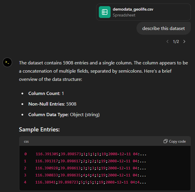
Today, I took ChatGPT’s Data Analyst for a spin. You’ve probably seen the fancy advertising videos: just drop in a dataset and AI does all the analysis for you?! Let’s see …
Of course, I’m not going to use some lame movie database or flower petals data. Instead, let’s go all in and test with a movement dataset.
You don’t get a second chance to make a first impression, they say. — Well, Data Analyst, you didn’t impress on the first try. How hard can it be to guess the delimiter and act accordingly?
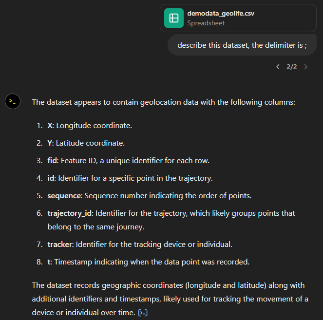
Anyway, let’s help it a little:
That looks much better. It makes an effort to guess what the columns could mean and successfully identifies the spatiotemporal information.
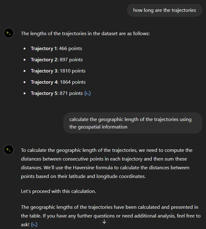
Now for some spatial analysis. On first try, it didn’t want to calculate the length of the trajectories in geographic terms, but we can make it to:
It will also show the code used to get to the results:
And indeed, these are close enough to the results computed using MovingPandas:
“What about plots?” I hear you ask.
For a first try, not bad at all:
Let’s see if we can push it further:
Looks like poor Data Analyst ended up in geospatial library dependency hell
It’s interesting to watch it try find a solution.
Alas, no background map appears:
Not giving up yet :)
Woah, what happened here? It claims it created an interactive map in an HTML file.
And indeed it did:
This has been a very interesting experiment for me with many highs and lows. The whole process is a bit hit and miss. But when it does work, it’s fun.
I wasn’t sure what to expect with regards to Data Analyst’s spatial data processing capabilities. Looks like there are enough examples in its training data to find solutions for the basic trajectory analysis problems I asked it solve today, eventually, at least.
What’s the conclusion? Most AI marketing videos are severely overselling the capabilities of these tools. However, that doesn’t mean that they are completely useless, either. I’m looking forward to seeing the age of smaller open source models specifically trained for geospatial analysis to finally make it unnecessary for humans to memorize data analysis library syntax.
Today marks the 2.1 release of Trajectools for QGIS. This release adds multiple new algorithms and improvements. Since some improvements involve upstream MovingPandas functionality, I recommend to also update MovingPandas while you’re at it.
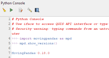
If you have installed QGIS and MovingPandas via conda / mamba, you can simply:
Afterwards, you can check that the library was correctly installed using:
import movingpandas as mpd
mpd.show_versions()
Trajectools 2.1
The new Trajectools algorithms are:
Trajectory overlay — Intersect trajectories with polygon layer
Privacy — Home work attack (requires scikit-mobility)
This algorithm determines how easy it is to identify an individual in a dataset. In a home and work attack the adversary knows the coordinates of the two locations most frequently visited by an individual.
Furthermore, we have fixed issue with previously ignored minimum trajectory length settings.
Scikit-mobility and gtfs_functions are optional dependencies. You do not need to install them, if you do not want to use the corresponding algorithms. In any case, they can be installed using mamba and pip:
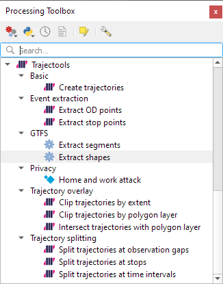
There are a couple of existing plugins that deal with GTFS. However, in my experience, they either don’t integrate with Processing and/or don’t provide the functions I was expecting.
So far, we have two GTFS algorithms to cover essential public transport analysis needs:
The “Extract shapes” algorithm gives us the public transport routes:
The “Extract segments” algorithm has one more options. In addition to extracting the segments between public transport stops, it can also enrich the segments with the scheduled vehicle speeds:
Here you can see the scheduled speeds:
To show the stops, we can put marker line markers on the segment start and end locations:
The segments contain route information and stop names, so these can be extracted and used for labeling as well:
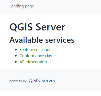
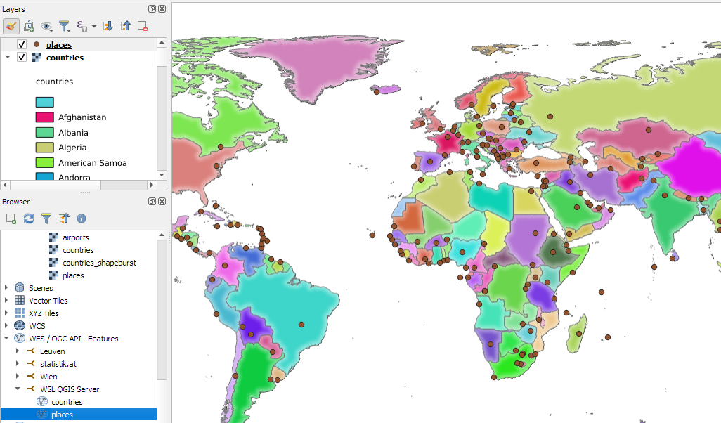
Today’s post is a QGIS Server update. It’s been a while (12 years ) since I last posted about QGIS Server. It would be an understatement to say that things have evolved since then, not least due to the development of Docker which, Wikipedia tells me, was released 11 years ago.
There have been multiple Docker images for QGIS Server provided by QGIS Community members over the years. Recently, OPENGIS.ch’s Docker image has been adopted as official QGIS Server image https://github.com/qgis/qgis-docker which aims to be a starting point for users to develop their own customized applications.
The following steps have been tested on Ubuntu (both native and in WSL).
Once Docker is set up, we can get the QGIS Server, e.g. for the LTR:
docker pull qgis/qgis-server:ltr
Now we only need to start it:
docker run -v $(pwd)/qgis-server-data:/io/data --name qgis-server -d -p 8010:80 qgis/qgis-server:ltr
Note how we are mapping the qgis-server-data directory in our current working directory to /io/data in the container. This is where we’ll put our QGIS project files.
If you instead get the error “<ServerException>Project file error. For OWS services: please provide a SERVICE and a MAP parameter pointing to a valid QGIS project file</ServerException>”, it probably means that the world.qgs file is not found in the qgis-server-data/world directory.
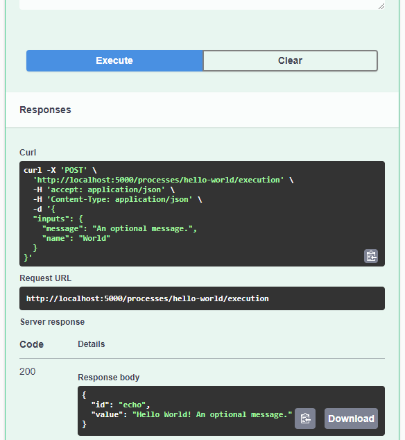
Today’s post is a quick introduction to pygeoapi, a Python server implementation of the OGC API suite of standards. OGC API provides many different standards but I’m particularly interested in OGC API – Processes which standardizes geospatial data processing functionality. pygeoapi implements this standard by providing a plugin architecture, thereby allowing developers to implement custom processing workflows in Python.
I’ll provide instructions for setting up and running pygeoapi on Windows using Powershell. The official docs show how to do this on Linux systems. The pygeoapi homepage prominently features instructions for installing the dev version. For first experiments, however, I’d recommend using a release version instead. So that’s what we’ll do here.
As a first step, lets install the latest release (0.16.1 at the time of writing) from conda-forge:
Next, we’ll clone the GitHub repo to get the example config and datasets:
cd C:\Users\anita\Documents\GitHub\
git clone https://github.com/geopython/pygeoapi.git
cd pygeoapi\
To finish the setup, we need some configurations:
cp pygeoapi-config.yml example-config.yml # There is a known issue in pygeoapi 0.16.1: https://github.com/geopython/pygeoapi/issues/1597 # To fix it, edit the example-config.yml: uncomment the TinyDB option in the server settings (lines 51-54)
As you can see, writing JSON content for curl is a pain. Luckily, pyopenapi comes with a nice web GUI, including Swagger UI for playing with all the functionality, including the hello-world process:
It’s not really a geospatial hello-world example, but it’s a first step.
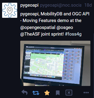
Finally, I wan’t to leave you with a teaser since there are more interesting things going on in this space, including work on OGC API – Moving Features as shared by the pygeoapi team recently:
This is the first version without the “experimental” flag. If you look at the plugin release history, you will see that the previous release was from 2020. That’s quite a while ago and a lot has happened since, including the development of MovingPandas.
Let’s have a look what’s new!
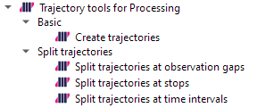
The old “Trajectories from point layer”, “Add heading to points”, and “Add speed (m/s) to points” algorithms have been superseded by the new “Create trajectories” algorithm which automatically computes speeds and headings when creating the trajectory outputs.
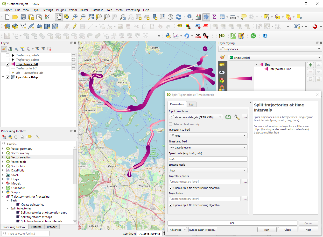
“Day trajectories from point layer” is covered by the new “Split trajectories at time intervals” which supports splitting by hour, day, month, and year.
“Clip trajectories by extent” still exists but, additionally, we can now also “Clip trajectories by polygon layer”
There are two new event extraction algorithms to “Extract OD points” and “Extract OD points”, as well as the related “Split trajectories at stops”. Additionally, we can also “Split trajectories at observation gaps”.
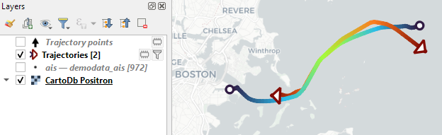
Trajectory outputs, by default, come as a pair of a point layer and a line layer. Depending on your use case, you can use both or pick just one of them. By default, the line layer is styled with a gradient line that makes it easy to see the movement direction:
while the default point layer style shows the movement speed:
How to use Trajectools
Trajectools 2.0 is powered by MovingPandas. You will need to install MovingPandas in your QGIS Python environment. I recommend installing both QGIS and MovingPandas from conda-forge:
The plugin download includes small trajectory sample datasets so you can get started immediately.
Outlook
There is still some work to do to reach feature parity with MovingPandas. Stay tuned for more trajectory algorithms, including but not limited to down-sampling, smoothing, and outlier cleaning.
I’m also reviewing other existing QGIS plugins to see how they can complement each other. If you know a plugin I should look into, please leave a note in the comments.
Besides following hashtags, such as #GISChat, #QGIS, #OpenStreetMap, #FOSS4G, and #OSGeo, curating good lists is probably the best way to stay up to date with geospatial developments.
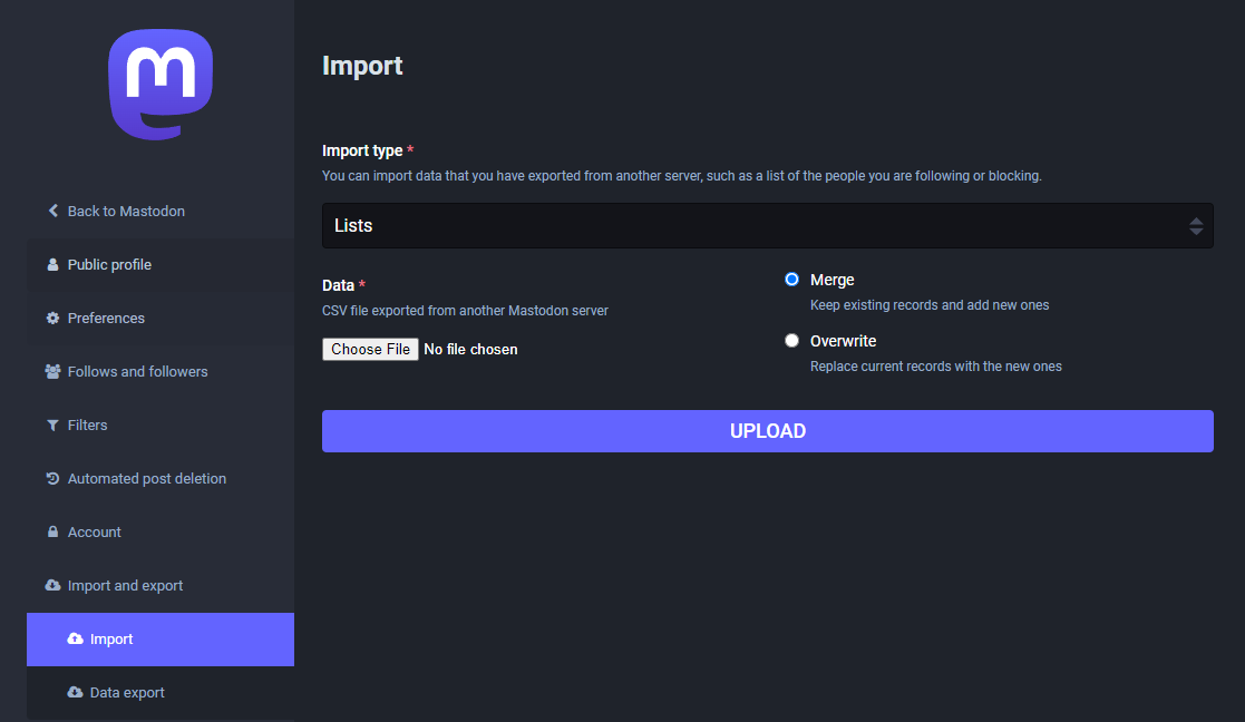
To get you started (or to potentially enrich your existing lists), I thought I’d share my Geospatial and SpatialDataScience lists with you. And the best thing: you don’t need to go through all the >150 entries manually! Instead, go to your Mastodon account settings and under “Import and export” you’ll find a tool to import and merge my list.csv with your lists:
And if you are not following the geospatial hashtags yet, you can search or click on the hashtags you’re interested in and start following to get all tagged posts into your timeline:
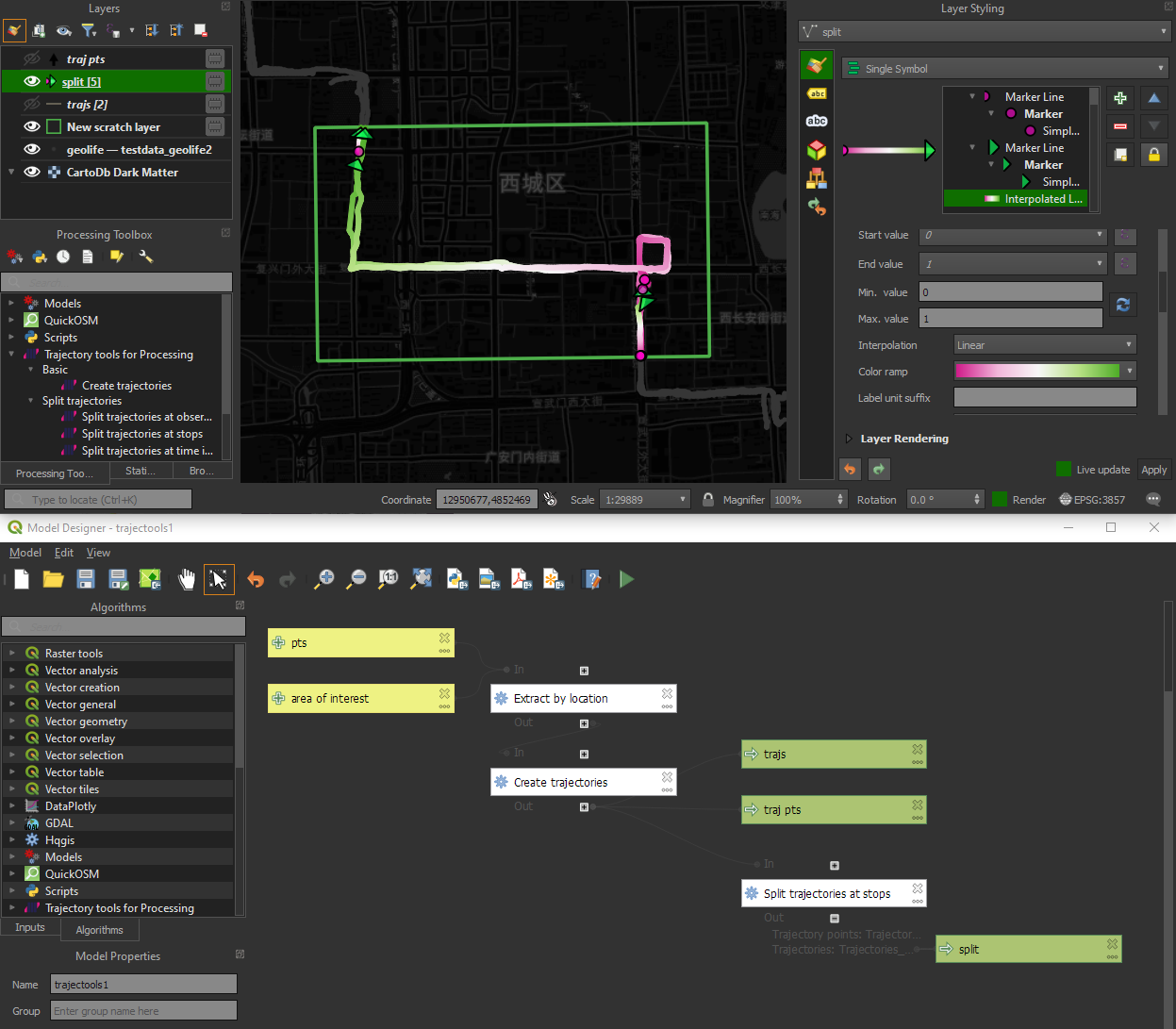
I’m continuously testing the algorithms integrated so far to see if they work as GIS users would expect and can to ensure that they can be integrated in Processing model seamlessly.
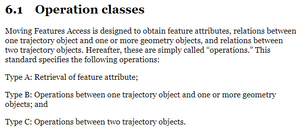
Because naming things is tricky, I’m currently struggling with how to best group the toolbox algorithms into meaningful categories. I looked into the categories mentioned in OGC Moving Features Access but honestly found them kind of lacking:
… but I’m not convinced yet. So take the above listed three categories with a grain of salt. Those may change before the release. (Any inputs / feedback / recommendation welcome!)
Let me close this quick status update with a screencast showcasing stop detection in AIS data, featuring the recently added trajectory styling using interpolated lines:
Trajectools development started back in 2018 but has been on hold since 2020 when I realized that it would be necessary to first develop a solid trajectory analysis library. With the MovingPandas library in place, I’ve now started to reboot Trajectools.
Trajectools v2 builds on MovingPandas and exposes its trajectory analysis algorithms in the QGIS Processing Toolbox. So far, I have integrated the basic steps of
Building trajectories including speed and direction information from timestamped points and
Splitting trajectories at observation gaps, stops, or regular time intervals.
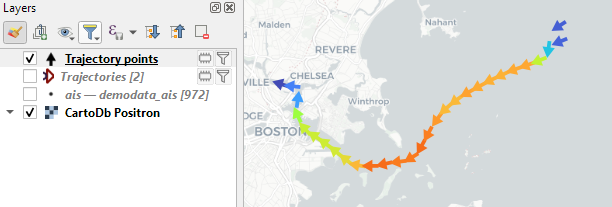
The algorithms create two output layers:
Trajectory points with speed and direction information that are styled using arrow markers
Trajectories as LineStringMs which makes it straightforward to count the number of trajectories and to visualize where one trajectory ends and another starts.
So far, the default style for the trajectory points is hard-coded to apply the Turbo color ramp on the speed column with values from 0 to 50 (since I’m simply loading a ready-made QML). By default, the speed is calculated as km/h but that can be customized:
I don’t have a solution yet to automatically create a style for the trajectory lines layer. Ideally, the style should be a categorized renderer that assigns random colors based on the trajectory id column. But in this case, it’s not enough to just load a QML.
In the meantime, I might instead include an Interpolated Line style. What do you think?
Of course, the goal is to make Trajectools interoperable with as many existing QGIS Processing Toolbox algorithms as possible to enable efficient Mobility Data Science workflows.
The easiest way to set up QGIS with MovingPandas Python environment is to install both from conda. You can find the instructions together with the latest Trajectools development version at: https://github.com/movingpandas/qgis-processing-trajectory