Related Plugins and Tags

QGIS Planet

Introducing the open data analysis OGD.AT Lab

Data sourcing and preparation is one of the most time consuming tasks in many spatial analyses. Even though the Austrian data.gv.at platform already provides a central catalog, the individual datasets still vary considerably in their accessibility or readiness for use.

OGD.AT Lab is a new repository collecting Jupyter notebooks for working with Austrian Open Government Data and other auxiliary open data sources. The notebooks illustrate different use cases, including so far:

  1. Accessing geodata from the city of Vienna WFS
  2. Downloading environmental data (heat vulnerability and air quality)
  3. Geocoding addresses and getting elevation information
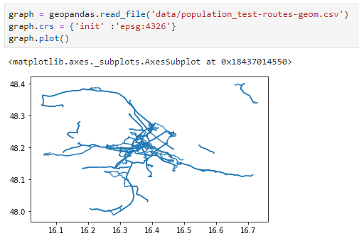
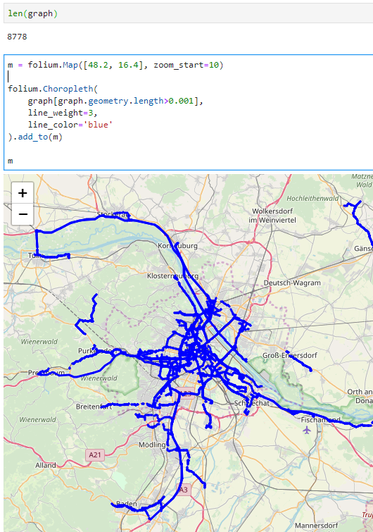
  4. Exploring urban movement data

Data processing and visualization are performed using Pandas, GeoPandas, and Holoviews. GeoPandas makes it straighforward to use data from WFS. Therefore, OGD.AT Lab can provide one universal gdf_from_wfs() function which takes the desired WFS layer as an argument and returns a GeoPandas.GeoDataFrame that is ready for analysis:

Many other datasets are provided as CSV files which need to be joined with spatial datasets to use them in spatial analysis. For example, the “Urban heat vulnerability index” dataset which needs to be joined to statistical areas.


Another issue with many CSV files is that they use German number formatting, where commas are used as a decimal separater instead of dots:

Besides file access, there are also open services provided by other developers, for example, Manfred Egger developed an elevation service that provides elevation information for any point in Austria. In combination with geocoding services, such as Nominatim, this makes is possible to, for example, find the elevation for any address in Austria:

Last but not least, the first version of the mobility notebook showcases open travel time data provided by Uber Movement:

The utility functions for data access included in this repository will continue to grow as new data sources are included. Eventually, it may make sense to extract the data access function into a dedicated library, similar to geofi (Finland) or geobr (Brazil).

If you’re aware of any interesting open datasets or services that should be included in OGD.AT, feel free to reach out here or on Github through the issue tracker or by providing a pull request.

Spatial data exploration with linked plots

In the previous post, we explored how hvPlot and Datashader can help us to visualize large CSVs with point data in interactive map plots. Of course, the spatial distribution of points usually only shows us one part of the whole picture. Today, we’ll therefore look into how to explore other data attributes by linking other (non-spatial) plots to the map.

This functionality, referred to as “linked brushing” or “crossfiltering” is under active development and the following experiment was prompted by a recent thread on Twitter launched by @plotlygraphs announcement of HoloViews 1.14:

Turns out these features are not limited to plotly but can also be used with Bokeh and hvPlot:

Like in the previous post, this demo uses a Pandas DataFrame with 12 million rows (and HoloViews 1.13.4).

In addition to the map plot, we also create a histogram from the same DataFrame:

map_plot = df.hvplot.scatter(x='x', y='y', datashade=True, height=300, width=400)
hist_plot = df.where((df.SOG>0) & (df.SOG<50)).hvplot.hist("SOG",  bins=20, width=400, height=200) 

To link the two plots, we use HoloViews’ link_selections function:

from holoviews.selection import link_selections
linked_plots = link_selections(map_plot + hist_plot)

That’s all! We can now perform spatial filters in the map and attribute value filters in the histogram and the filters are automatically applied to the linked plots:

Linked brushing demo using ship movement data (AIS): filtering records by speed (SOG) reveals spatial patterns of fast and slow movement.

You’ve probably noticed that there is no background map in the above plot. I had to remove the background map tiles to get rid of an error in Holoviews 1.13.4. This error has been fixed in 1.14.0 but I ran into other issues with the datashaded Scatterplot.

It’s worth noting that not all plot types support linked brushing. For the complete list, please refer to http://holoviews.org/user_guide/Linked_Brushing.html

Plotting large point CSV files quickly & interactively

Even with all their downsides, CSV files are still a common data exchange format – particularly between disciplines with different tech stacks. Indeed, “How to Specify Data Types of CSV Columns for Use in QGIS” (originally written in 2011) is still one of the most popular posts on this blog. QGIS continues to be quite handy for visualizing CSV file contents. However, there are times when it’s just not enough, particularly when the number of rows in the CSV is in the range of multiple million. The following example uses a 12 million point CSV:

To give you an idea of the waiting times in QGIS, I’ve run the following script which loads and renders the CSV:

from datetime import datetime

def get_time():
    t2 = datetime.now()
    print(t2)
    print(t2-t1)
    print('Done :)')

canvas = iface.mapCanvas()
canvas.mapCanvasRefreshed.connect(get_time)

print('Starting ...')

t0 = datetime.now()
print(t0)

print('Loading CSV ...')

uri = "file:///E:/Geodata/AISDK/raw_ais/aisdk_20170701.csv?type=csv&amp;xField=Longitude&amp;yField=Latitude&amp;crs=EPSG:4326&amp;"
vlayer = QgsVectorLayer(uri, "layer name you like", "delimitedtext")

t1 = datetime.now()
print(t1)
print(t1 - t0)

print('Rendering ...')

QgsProject.instance().addMapLayer(vlayer)

The script output shows that creating the vector layer takes 02:39 minutes and rendering it takes over 05:10 minutes:

Starting ...
2020-12-06 12:35:56.266002
Loading CSV ...
2020-12-06 12:38:35.565332
0:02:39.299330
Rendering ...
2020-12-06 12:43:45.637504
0:05:10.072172
Done :)

Rendered CSV file in QGIS

Panning and zooming around are no fun either since rendering takes so long. Changing from a single symbol renderer to, for example, a heatmap renderer does not improve the rendering times. So we need a different solutions when we want to efficiently explore large point CSV files.

The Pandas data analysis library is well-know for being a convenient tool for handling CSVs. However, it’s less clear how to use it as a replacement for desktop GIS for exploring large CSVs with point coordinates. My favorite solution so far uses hvPlot + HoloViews + Datashader to provide interactive Bokeh plots in Jupyter notebooks.

hvPlot provides a high-level plotting API built on HoloViews that provides a general and consistent API for plotting data in (Geo)Pandas, xarray, NetworkX, dask, and others. (Image source: https://hvplot.holoviz.org)

But first things first! Loading the CSV as a Pandas Dataframe takes 10.7 seconds. Pandas’ default plotting function (based on Matplotlib), however, takes around 13 seconds and only produces a static scatter plot.

Loading and plotting the CSV with Pandas

hvPlot to the rescue!

We only need two more steps to get faster and interactive map plots (plus background maps!): First, we need to reproject the lat/lon values. (There’s a warning here, most likely since some of the input lat/lon values are invalid.) Then, we replace plot() with hvplot() and voilà:

Plotting the CSV with Datashader

As you can see from the above GIF, the whole process barely takes 2 seconds and the resulting map plot is interactive and very responsive.

12 million points are far from the limit. As long as the Pandas DataFrame fits into memory, we are good and when the datasets get bigger than that, there are Dask DataFrames. But that’s a story for another day.

Movement data in GIS #26: towards a template for exploring movement data

Exploring new datasets can be challenging. Addressing this challenge, there is a whole field called exploratory data analysis that focuses on exploring datasets, often with visual methods.

Concerning movement data in particular, there’s a comprehensive book on the visual analysis of movement by Andrienko et al. (2013) and a host of papers, such as the recent state of the art summary by Andrienko et al. (2017).

However, while the literature does provide concepts, methods, and example applications, these have not yet translated into readily available tools for analysts to use in their daily work. To fill this gap, I’m working on a template for movement data exploration implemented in Python using MovingPandas. The proposed workflow consists of five main steps:

  1. Establishing an overview by visualizing raw input data records
  2. Putting records in context by exploring information from consecutive movement data records (such as: time between records, speed, and direction)
  3. Extracting trajectories & events by dividing the raw continuous tracks into individual trajectories and/or events
  4. Exploring patterns in trajectory and event data by looking at groups of the trajectories or events
  5. Analyzing outliers by looking at potential outliers and how they may challenge preconceived assumptions about the dataset characteristics

To ensure a reproducible workflow, I’m designing the template as a a Jupyter notebook. It combines spatial and non-spatial plots using the awesome hvPlot library:

This notebook is a work-in-progress and you can follow its development at http://exploration.movingpandas.org. Your feedback is most welcome!


References

  • Andrienko G, Andrienko N, Bak P, Keim D, Wrobel S (2013) Visual analytics of movement. Springer Science & Business Media.
  • Andrienko G, Andrienko N, Chen W, Maciejewski R, Zhao Y (2017) Visual Analytics of Mobility and Transportation: State of the Art and Further Research Directions. IEEE Transactions on Intelligent Transportation Systems 18(8):2232–2249, DOI 10.1109/TITS.2017.2683539

Interactive plots for GeoPandas GeoDataFrames of LineStrings

GeoPandas makes it easy to create basic visualizations of GeoDataFrames:

However, if we want interactive plots, we need additional libraries. Folium (which is built on Leaflet) is a great option. However, all examples for plotting GeoDataFrames that I found focused on point or polygon data. So here is what I found to work for GeoDataFrames of LineStrings:

First, some imports:

import pandas as pd
import geopandas
import folium

Loading the data:

graph = geopandas.read_file('data/population_test-routes-geom.csv')
graph.crs = {'init' :'epsg:4326'}

Creating the map using folium.Choropleth:

m = folium.Map([48.2, 16.4], zoom_start=10)

folium.Choropleth(
    graph[graph.geometry.length>0.001],
    line_weight=3,
    line_color='blue'
).add_to(m)

m

I also tried using folium.PolyLine which seemed like the more obvious choice but does not seem to accept GeoDataFrames as input. Instead, it expects a list of coordinate pairs and of course it expects them to be in the opposite order that Shapely.LineString.coords provides … Oh the joys of geodata!

In any case, I had to limit the number of features that get plotted because Folium refuses to plot all 8778 features at once. I decided to filter by line length because drawing really short lines is pointless for my overview visualization anyway.

Dealing with delayed measurements in (Geo)Pandas

Yesterday, I learned about a cool use case in data-driven agriculture that requires dealing with delayed measurements. As Bert mentions, for example, potatoes end up in the machines and are counted a few seconds after they’re actually taken out of the ground:

Therefore, in order to accurately map yield, we need to take this temporal offset into account.

We need to make sure that time and location stay untouched, but need to shift the potato count value. To support this use case, I’ve implemented apply_offset_seconds() for trajectories in movingpandas:

    def apply_offset_seconds(self, column, offset):
        self.df[column] = self.df[column].shift(offset, freq='1s')

The following test illustrates its use: you can see how the value column is shifted by 120 second. Geometry and time remain unchanged but the value column is shifted accordingly. In this test, we look at the row with index 2 which we access using iloc[2]:

    def test_offset_seconds(self):
        df = pd.DataFrame([
            {'geometry': Point(0, 0), 't': datetime(2018, 1, 1, 12, 0, 0), 'value': 1},
            {'geometry': Point(-6, 10), 't': datetime(2018, 1, 1, 12, 1, 0), 'value': 2},
            {'geometry': Point(6, 6), 't': datetime(2018, 1, 1, 12, 2, 0), 'value': 3},
            {'geometry': Point(6, 12), 't': datetime(2018, 1, 1, 12, 3, 0), 'value':4},
            {'geometry': Point(6, 18), 't': datetime(2018, 1, 1, 12, 4, 0), 'value':5}
        ]).set_index('t')
        geo_df = GeoDataFrame(df, crs={'init': '31256'})
        traj = Trajectory(1, geo_df)
        traj.apply_offset_seconds('value', -120)
        self.assertEqual(traj.df.iloc[2].value, 5)
        self.assertEqual(traj.df.iloc[2].geometry, Point(6, 6))

From CSV to GeoDataFrame in two lines

Pandas is great for data munging and with the help of GeoPandas, these capabilities expand into the spatial realm.

With just two lines, it’s quick and easy to transform a plain headerless CSV file into a GeoDataFrame. (If your CSV is nice and already contains a header, you can skip the header=None and names=FILE_HEADER parameters.)

usecols=USE_COLS is also optional and allows us to specify that we only want to use a subset of the columns available in the CSV.

After the obligatory imports and setting of variables, all we need to do is read the CSV into a regular DataFrame and then construct a GeoDataFrame.

import pandas as pd
from geopandas import GeoDataFrame
from shapely.geometry import Point

FILE_NAME = "/temp/your.csv"
FILE_HEADER = ['a', 'b', 'c', 'd', 'e', 'x', 'y']
USE_COLS = ['a', 'x', 'y']

df = pd.read_csv(
    FILE_NAME, delimiter=";", header=None,
    names=FILE_HEADER, usecols=USE_COLS)
gdf = GeoDataFrame(
    df.drop(['x', 'y'], axis=1),
    crs={'init': 'epsg:4326'},
    geometry=[Point(xy) for xy in zip(df.x, df.y)])

It’s also possible to create the point objects using a lambda function as shown by weiji14 on GIS.SE.

Movement data in GIS #18: creating evaluation data for trajectory predictions

We’ve seen a lot of explorative movement data analysis in the Movement data in GIS series so far. Beyond exploration, predictive analysis is another major topic in movement data analysis. One of the most obvious movement prediction use cases is trajectory prediction, i.e. trying to predict where a moving object will be in the future. The two main categories of trajectory prediction methods I see are those that try to predict the actual path that a moving object will take versus those that only try to predict the next destination.

Today, I want to focus on prediction methods that predict the path that a moving object is going to take. There are many different approaches from simple linear prediction to very sophisticated application-dependent methods. Regardless of the prediction method though, there is the question of how to evaluate the prediction results when these methods are applied to real-life data.

As long as we work with nice, densely, and regularly updated movement data, extracting evaluation samples is rather straightforward. To predict future movement, we need some information about past movement. Based on that past movement, we can then try to predict future positions. For example, given a trajectory that is twenty minutes long, we can extract a sample that provides five minutes of past movement, as well as the actually observed position five minutes into the future:

But what if the trajectory is irregularly updated? Do we interpolate the positions at the desired five minute timestamps? Do we try to shift the sample until – by chance – we find a section along the trajectory where the updates match our desired pattern? What if location timestamps include seconds or milliseconds and we therefore cannot find exact matches? Should we introduce a tolerance parameter that would allow us to match locations with approximately the same timestamp?

Depending on the duration of observation gaps in our trajectory, it might not be a good idea to simply interpolate locations since these interpolated locations could systematically bias our evaluation. Therefore, the safest approach may be to shift the sample pattern along the trajectory until a close match (within the specified tolerance) is found. This approach is now implemented in MovingPandas’ TrajectorySampler.

def test_sample_irregular_updates(self):
    df = pd.DataFrame([
        {'geometry':Point(0,0), 't':datetime(2018,1,1,12,0,1)},
        {'geometry':Point(0,3), 't':datetime(2018,1,1,12,3,2)},
        {'geometry':Point(0,6), 't':datetime(2018,1,1,12,6,1)},
        {'geometry':Point(0,9), 't':datetime(2018,1,1,12,9,2)},
        {'geometry':Point(0,10), 't':datetime(2018,1,1,12,10,2)},
        {'geometry':Point(0,14), 't':datetime(2018,1,1,12,14,3)},
        {'geometry':Point(0,19), 't':datetime(2018,1,1,12,19,4)},
        {'geometry':Point(0,20), 't':datetime(2018,1,1,12,20,0)}
        ]).set_index('t')
    geo_df = GeoDataFrame(df, crs={'init': '4326'})
    traj = Trajectory(1,geo_df)
    sampler = TrajectorySampler(traj, timedelta(seconds=5))
    past_timedelta = timedelta(minutes=5)
    future_timedelta = timedelta(minutes=5)
    sample = sampler.get_sample(past_timedelta, future_timedelta)
    result = sample.future_pos.wkt
    expected_result = "POINT (0 19)"
    self.assertEqual(result, expected_result)
    result = sample.past_traj.to_linestring().wkt
    expected_result = "LINESTRING (0 9, 0 10, 0 14)"
    self.assertEqual(result, expected_result)

The repository also includes a demo that illustrates how to split trajectories using a grid and finally extract samples:


Back to Top

Sustaining Members