Related Plugins and Tags

QGIS Planet

Hi ‘Geocomputation with Python’

Today, I want to point out a blog post over at

https://geocompx.org/post/2023/geocompy-bp1/

In this post, Jakub Nowosad introduces our book “Geocomputation with Python”, also known as geocompy. It is an open-source book on geographic data analysis with Python, written by Michael Dorman, Jakub Nowosad, Robin Lovelace, and me with contributions from others. You can find it online at https://py.geocompx.org/

Mapping relationships between Neo4j spatial nodes with GeoPandas

Previously, we mapped neo4j spatial nodes. This time, we want to take it one step further and map relationships.

A prime example, are the relationships between GTFS StopTime and Trip nodes. For example, this is the Cypher query to get all StopTime nodes of Trip 17:

MATCH 
    (t:Trip  {id: "17"})
    <-[:BELONGS_TO]-
    (st:StopTime) 
RETURN st

To get the stop locations, we also need to get the stop nodes:

MATCH 
    (t:Trip {id: "17"})
    <-[:BELONGS_TO]-
    (st:StopTime)
    -[:STOPS_AT]->
    (s:Stop)
RETURN st ,s

Adapting our code from the previous post, we can plot the stops:

from shapely.geometry import Point

QUERY = """MATCH (
    t:Trip {id: "17"})
    <-[:BELONGS_TO]-
    (st:StopTime)
    -[:STOPS_AT]->
    (s:Stop)
RETURN st ,s
ORDER BY st.stopSequence
"""

with driver.session(database="neo4j") as session:
    tx = session.begin_transaction()
    results = tx.run(QUERY)
    df = results.to_df(expand=True)
    gdf = gpd.GeoDataFrame(
        df[['s().prop.name']], crs=4326,
        geometry=df["s().prop.location"].apply(Point)
    )

tx.close() 
m = gdf.explore()
m

Ordering by stop sequence is actually completely optional. Technically, we could use the sorted GeoDataFrame, and aggregate all the points into a linestring to plot the route. But I want to try something different: we’ll use the NEXT_STOP relationships to get a DataFrame of the start and end stops for each segment:

QUERY = """
MATCH (t:Trip {id: "17"})
   <-[:BELONGS_TO]-
   (st1:StopTime)
   -[:NEXT_STOP]->
   (st2:StopTime)
MATCH (st1)-[:STOPS_AT]->(s1:Stop)
MATCH (st2)-[:STOPS_AT]->(s2:Stop)
RETURN st1, st2, s1, s2
"""

from shapely.geometry import Point, LineString

def make_line(row):
    s1 = Point(row["s1().prop.location"])
    s2 = Point(row["s2().prop.location"])
    return LineString([s1,s2])

with driver.session(database="neo4j") as session:
    tx = session.begin_transaction()
    results = tx.run(QUERY)
    df = results.to_df(expand=True)
    gdf = gpd.GeoDataFrame(
        df[['s1().prop.name']], crs=4326,
        geometry=df.apply(make_line, axis=1)
    )

tx.close() 
gdf.explore(m=m)

Finally, we can also use Cypher to calculate the travel time between two stops:

MATCH (t:Trip {id: "17"})
   <-[:BELONGS_TO]-
   (st1:StopTime)
   -[:NEXT_STOP]->
   (st2:StopTime)
MATCH (st1)-[:STOPS_AT]->(s1:Stop)
MATCH (st2)-[:STOPS_AT]->(s2:Stop)
RETURN st1.departureTime AS time1, 
   st2.arrivalTime AS time2, 
   s1.location AS geom1, 
   s2.location AS geom2, 
   duration.inSeconds(
      time(st1.departureTime), 
      time(st2.arrivalTime)
   ).seconds AS traveltime

As always, here’s the notebook: https://github.com/anitagraser/QGIS-resources/blob/master/qgis3/notebooks/neo4j.ipynb

Mapping Neo4j spatial nodes with GeoPandas

In the recent post Setting up a graph db using GTFS data & Neo4J, we noted that — unfortunately — Neomap is not an option to visualize spatial nodes anymore.

GeoPandas to the rescue!

But first we need the neo4j Python driver:

pip install neo4j

Then we can connect to our database. The default user name is neo4j and you get to pick the password when creating the database:

from neo4j import GraphDatabase

URI = "neo4j://localhost"
AUTH = ("neo4j", "password")

with GraphDatabase.driver(URI, auth=AUTH) as driver:
    driver.verify_connectivity()

Once we have confirmed that the connection works as expected, we can run a query:

QUERY = "MATCH (p:Stop) RETURN p.name AS name, p.location AS geom"

records, summary, keys = driver.execute_query(
    QUERY, database_="neo4j",
)

for rec in records:
    print(rec)

Nice. There we have our GTFS stops, their names and their locations. But how to put them on a map?

Conveniently, there is a to_db() function in the Neo4j driver:

import geopandas as gpd
import numpy as np

with driver.session(database="neo4j") as session:
    tx = session.begin_transaction()
    results = tx.run(QUERY)
    df = results.to_df(expand=True)
    df = df[df["geom[].0"]>0]
    gdf = gpd.GeoDataFrame(
        df['name'], crs=4326,
        geometry=gpd.points_from_xy(df['geom[].0'], df['geom[].1']))
    print(gdf)

tx.close() 

Since some of the nodes lack geometries, I added a quick and dirty hack to get rid of these nodes because — otherwise — gdf.explore() will complain about None geometries.

You can find this notebook at: https://github.com/anitagraser/QGIS-resources/blob/1e4ea435c9b1795ba5b170ddb176aa83689112eb/qgis3/notebooks/neo4j.ipynb

Next step will have to be the relationships. Stay posted.

Movement data in GIS #35: stop detection & analysis with MovingPandas

In the last few days, there’s been a sharp rise in interest in vessel movements, and particularly, in understanding where and why vessels stop. Following the grounding of Ever Given in the Suez Canal, satellite images and vessel tracking data (AIS) visualizations are everywhere:

Using movement data analytics tools, such as MovingPandas, we can dig deeper and explore patterns in the data.

The MovingPandas.TrajectoryStopDetector is particularly useful in this situation. We can provide it with a Trajectory or TrajectoryCollection and let it detect all stops, that is, instances were the moving object stayed within a certain area (with a diameter of 1000m in this example) for a an extended duration (at least 3 hours).

stops = mpd.TrajectoryStopDetector(trajs).get_stop_segments(
    min_duration=timedelta(hours=3), max_diameter=1000)

The resulting stop segments include spatial and temporal information about the stop location and duration. To make this info more easily accessible, let’s turn the stop segment TrajectoryCollection into a point GeoDataFrame:

stop_pts = gpd.GeoDataFrame(columns=['geometry']).set_geometry('geometry')
stop_pts['stop_id'] = [track.id for track in stops.trajectories]
stop_pts= stop_pts.set_index('stop_id')

for stop in stops:
    stop_pts.at[stop.id, 'ID'] = stop.df['ID'][0]
    stop_pts.at[stop.id, 'datetime'] = stop.get_start_time()
    stop_pts.at[stop.id, 'duration_h'] = stop.get_duration().total_seconds()/3600
    stop_pts.at[stop.id, 'geometry'] = stop.get_start_location()

Indeed, I think the next version of MovingPandas should include a function that directly returns stops as points.

Now we can explore the stop information. For example, the map plot shows that stops are concentrated in three main areas: the northern and southern ends of the Canal, as well as the Great Bitter Lake in the middle. By looking at the timing of stops and their duration in a scatter plot, we can clearly see that the Ever Given stop (red) caused a chain reaction: the numerous points lining up on the diagonal of the scatter plot represent stops that very likely are results of the blockage:

Before the grounding, the stop distribution nicely illustrates the canal schedule. Vessels have to wait until it’s turn for their direction to go through:

You can see the full analysis workflow in the following video. Please turn on the captions for details.

Huge thanks to VesselsValue for supplying the data!

For another example of MovingPandas‘ stop dectection in action, have a look at Bryan R. Vallejo’s tutorial on detecting stops in bird tracking data which includes some awesome visualizations using KeplerGL:

Kepler.GL visualization by Bryan R. Vallejo

This post is part of a series. Read more about movement data in GIS.

Introducing the open data analysis OGD.AT Lab

Data sourcing and preparation is one of the most time consuming tasks in many spatial analyses. Even though the Austrian data.gv.at platform already provides a central catalog, the individual datasets still vary considerably in their accessibility or readiness for use.

OGD.AT Lab is a new repository collecting Jupyter notebooks for working with Austrian Open Government Data and other auxiliary open data sources. The notebooks illustrate different use cases, including so far:

  1. Accessing geodata from the city of Vienna WFS
  2. Downloading environmental data (heat vulnerability and air quality)
  3. Geocoding addresses and getting elevation information
  4. Exploring urban movement data

Data processing and visualization are performed using Pandas, GeoPandas, and Holoviews. GeoPandas makes it straighforward to use data from WFS. Therefore, OGD.AT Lab can provide one universal gdf_from_wfs() function which takes the desired WFS layer as an argument and returns a GeoPandas.GeoDataFrame that is ready for analysis:

Many other datasets are provided as CSV files which need to be joined with spatial datasets to use them in spatial analysis. For example, the “Urban heat vulnerability index” dataset which needs to be joined to statistical areas.


Another issue with many CSV files is that they use German number formatting, where commas are used as a decimal separater instead of dots:

Besides file access, there are also open services provided by other developers, for example, Manfred Egger developed an elevation service that provides elevation information for any point in Austria. In combination with geocoding services, such as Nominatim, this makes is possible to, for example, find the elevation for any address in Austria:

Last but not least, the first version of the mobility notebook showcases open travel time data provided by Uber Movement:

The utility functions for data access included in this repository will continue to grow as new data sources are included. Eventually, it may make sense to extract the data access function into a dedicated library, similar to geofi (Finland) or geobr (Brazil).

If you’re aware of any interesting open datasets or services that should be included in OGD.AT, feel free to reach out here or on Github through the issue tracker or by providing a pull request.

First working MovingPandas setup on Databricks

In December, I wrote about GeoPandas on Databricks. Back then, I also tried to get MovingPandas working but without luck. (While GeoPandas can be installed using Databricks’ dbutils.library.installPyPI("geopandas") this PyPI install just didn’t want to work for MovingPandas.)

Now that MovingPandas is available from conda-forge, I gave it another try and … *spoiler alert* … it works!

First of all, conda support on Databricks is in beta. It’s not included in the default runtimes. At the time of writing this post, “6.0 Conda Beta” is the latest runtime with conda:

Once the cluster is up and connected to the notebook, a quick conda list shows the installed packages:

Time to install MovingPandas! I went with a 100% conda-forge installation. This takes a looong time (almost half an hour)!

When the installs are finally done, it get’s serious: time to test the imports!

Success!

Now we can put the MovingPandas data structures to good use. But first we need to load some movement data:

Or course, the points in this GeoDataFrame can be plotted. However, the plot isn’t automatically displayed once plot() is called on the GeoDataFrame. Instead, Databricks provides a display() function to display Matplotlib figures:

MovingPandas also uses Matplotlib. Therefore we can use the same approach to plot the TrajectoryCollection that can be created from the GeoDataFrame:

These Matplotlib plots are nice and quick but they lack interactivity and therefore are of limited use for data exploration.

MovingPandas provides interactive plotting (including base maps) using hvplot. hvplot is based on Bokeh and, luckily, the Databricks documentation tells us that bokeh plots can be exported to html and then displayed using  displayHTML():

Of course, we could achieve all this on MyBinder as well (and much more quickly). However, Databricks gets interesting once we can add (Py)Spark and distributed processing to the mix. For example, “Getting started with PySpark & GeoPandas on Databricks” shows a spatial join function that adds polygon information to a point GeoDataFrame.

A potential use case for MovingPandas would be to speed up flow map computations. The recently added aggregator functionality (currently in master only) first computes clusters of significant trajectory points and then aggregates the trajectories into flows between these clusters. Matching trajectory points to the closest cluster could be a potential use case for distributed computing. Each trajectory (or each point) can be handled independently, only the cluster locations have to be broadcast to all workers.

Flow map (screenshot from MovingPandas tutorial 4_generalization_and_aggregation.ipynb)


Movement data in GIS #26: towards a template for exploring movement data

Exploring new datasets can be challenging. Addressing this challenge, there is a whole field called exploratory data analysis that focuses on exploring datasets, often with visual methods.

Concerning movement data in particular, there’s a comprehensive book on the visual analysis of movement by Andrienko et al. (2013) and a host of papers, such as the recent state of the art summary by Andrienko et al. (2017).

However, while the literature does provide concepts, methods, and example applications, these have not yet translated into readily available tools for analysts to use in their daily work. To fill this gap, I’m working on a template for movement data exploration implemented in Python using MovingPandas. The proposed workflow consists of five main steps:

  1. Establishing an overview by visualizing raw input data records
  2. Putting records in context by exploring information from consecutive movement data records (such as: time between records, speed, and direction)
  3. Extracting trajectories & events by dividing the raw continuous tracks into individual trajectories and/or events
  4. Exploring patterns in trajectory and event data by looking at groups of the trajectories or events
  5. Analyzing outliers by looking at potential outliers and how they may challenge preconceived assumptions about the dataset characteristics

To ensure a reproducible workflow, I’m designing the template as a a Jupyter notebook. It combines spatial and non-spatial plots using the awesome hvPlot library:

This notebook is a work-in-progress and you can follow its development at http://exploration.movingpandas.org. Your feedback is most welcome!


References

  • Andrienko G, Andrienko N, Bak P, Keim D, Wrobel S (2013) Visual analytics of movement. Springer Science & Business Media.
  • Andrienko G, Andrienko N, Chen W, Maciejewski R, Zhao Y (2017) Visual Analytics of Mobility and Transportation: State of the Art and Further Research Directions. IEEE Transactions on Intelligent Transportation Systems 18(8):2232–2249, DOI 10.1109/TITS.2017.2683539

Getting started with PySpark & GeoPandas on Databricks

Over the last years, many data analysis platforms have added spatial support to their portfolio. Just two days ago, Databricks have published an extensive post on spatial analysis. I took their post as a sign that it is time to look into how PySpark and GeoPandas can work together to achieve scalable spatial analysis workflows.

If you sign up for Databricks Community Edition, you get access to a toy cluster for experimenting with (Py)Spark. This considerably lowers the entry barrier to Spark since you don’t need to bother with installing anything yourself. They also provide a notebook environment:

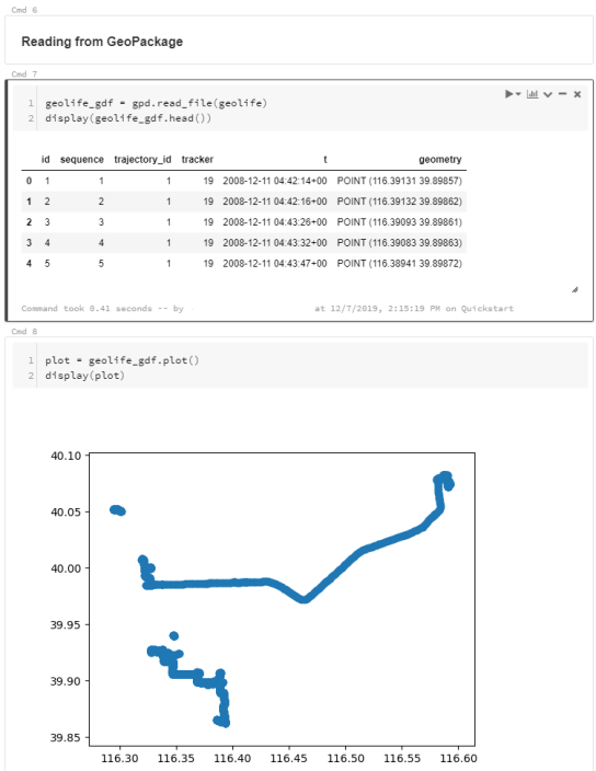
I’ve followed the official Databricks GeoPandas example notebook but expanded it to read from a real geodata format (GeoPackage) rather than from CSV.

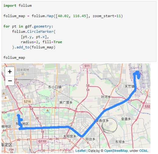
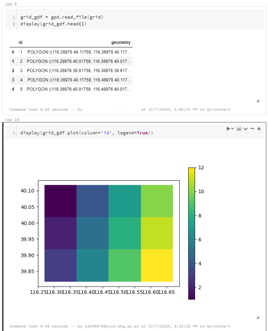
I’m using test data from the MovingPandas repository: demodata_geolife.gpkg contains a hand full of trajectories from the Geolife dataset. Demodata_grid.gpkg contains a simple 3×4 grid that covers the same geographic extent as the geolife sample:

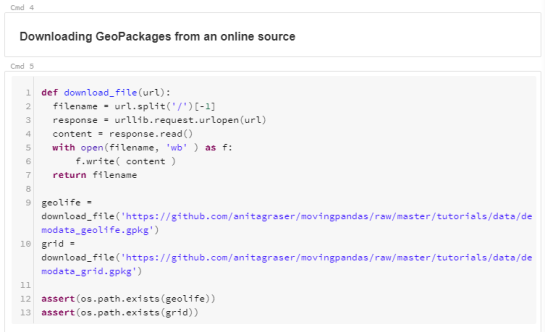
Once the files are downloaded, we can use GeoPandas to read the GeoPackages:

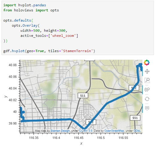
Note that the display() function is used to show the plot.

The same applies to the grid data:

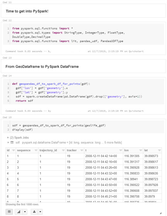
When the GeoDataFrames are ready, we can start using them in PySpark. To do so, it is necessary to convert from GeoDataFrame to PySpark DataFrame. Therefore, I’ve implemented a simple function that performs the conversion and turn the Point geometries into lon and lat columns:

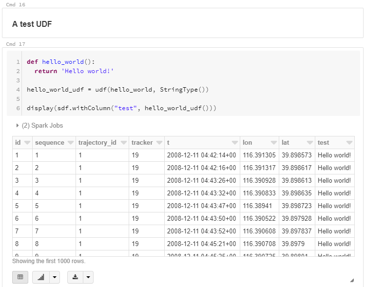
To compute new values for our DataFrame, we can use existing or user-defined functions (UDF). Here’s a simple hello world function and associated UDF:

A spatial UDF is a little more involved. For example, here’s an UDF that finds the first polygon that intersects the specified lat/lon and returns that polygon’s ID. Note how we first broadcast the grid DataFrame to ensure that it is available on all computation nodes:

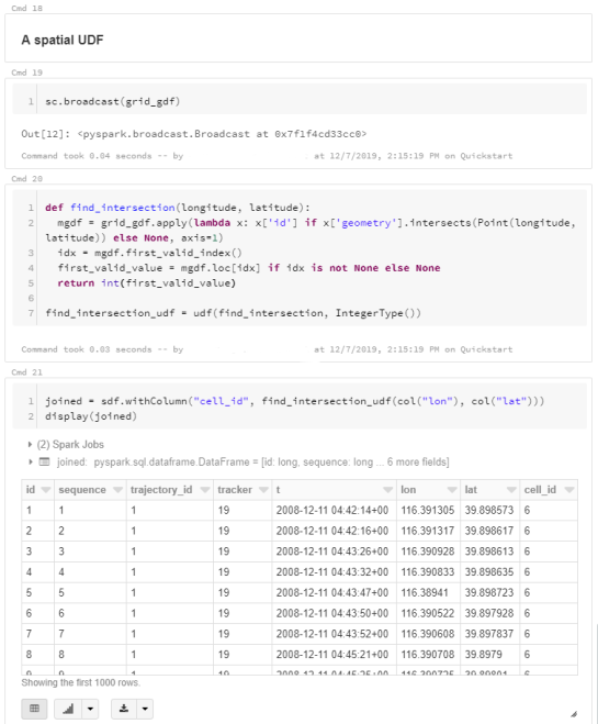
It’s worth noting that PySpark has its peculiarities. Since it’s a Python wrapper of a strongly typed language, we need to pay close attention to types in our Python code. For example, when defining UDFs, if the specified return type (Integertype in the above example) does not match the actual value returned by the find_intersection() function, this will cause rather cryptic errors.

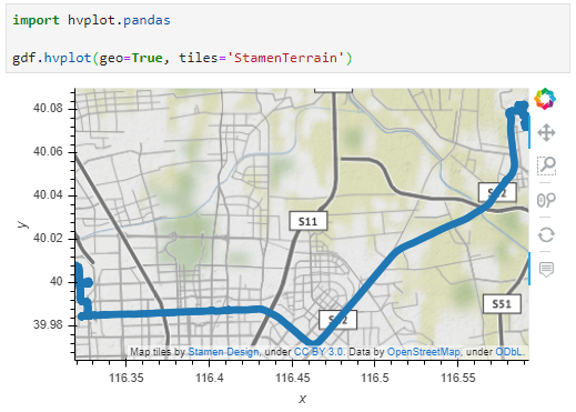
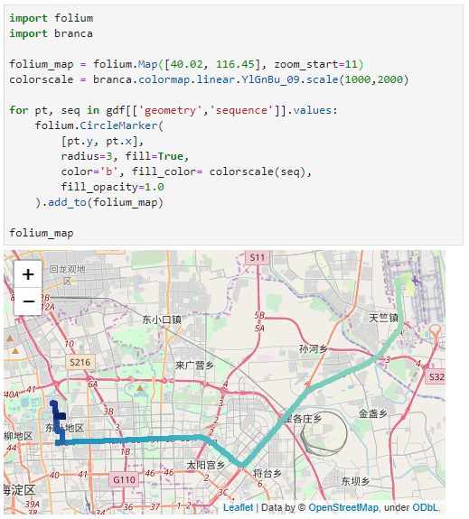
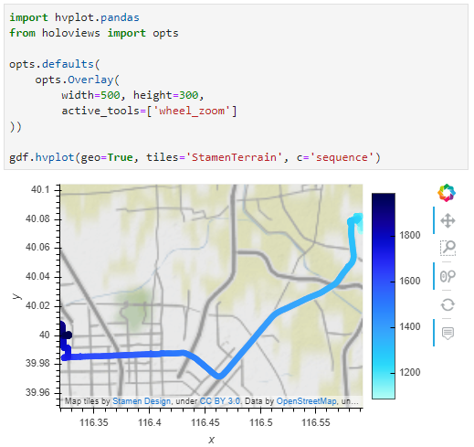
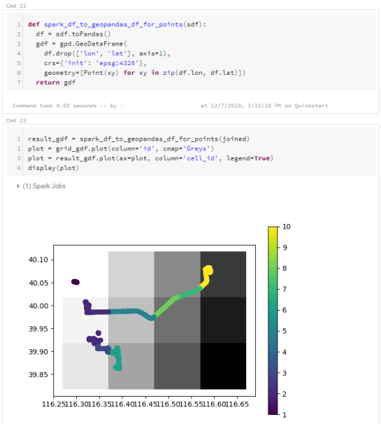
To plot the results, I’m converting the joined PySpark DataFrame back to GeoDataFrame:

I’ve published this notebook so you can give it a try. (Any notebook published on Databricks is supposed to stay online for six months, so if you’re trying to access it after June 2020, this link may be broken.)

Folium vs. hvplot for interactive maps of Point GeoDataFrames

In the previous post, I showed how Folium can be used to create interactive maps of GeoPandas GeoDataFrames. Today’s post continues this theme. Specifically, it compares Folium to another dataviz library called hvplot. hvplot also recently added support for GeoDataFrames, so it’s interesting to see how these different solutions compare.

Minimum viable

The following snippets show the minimum code I found to put a GeoDataFrame of Points onto a map with either Folium or hvplot.

Folium does not automatically zoom to the data extent and I didn’t find a way to add the whole GeoDataFrame of Points without looping through the rows individually:

Hvplot on the other hand registers the hvplot function directly with the GeoDataFrame. This makes it as convenient to use as the original GeoPandas plot function. It also zooms to the data extent:

Standard interaction and zoom to area of interest

The following snippets ensure that the map is set to a useful extent and the map tools enable panning and zooming.

With Folium, we have to set the map center and the zoom. The map tools are Leaflet defaults, so panning and zooming work as expected:

Since hvplot does not come with mouse wheel zoom enabled by default, we need to set that:

Color by attribute

Finally, for many maps, we want to show the point location as well as an attribute value.

To create a continuous color ramp for a numeric value, we can use branca.colormap to define the marker fill color:

In hvplot, it is sufficient to specify the attribute of interest:

I’m pretty impressed with hvplot. The integration with GeoPandas is very smooth. Just don’t forget to set the geo=True parameter if you want to plot lat/lon geometries.

Folium seems less straightforward for this use case. Maybe I missed some option similar to the Choropleth function that I showed in the previous post.

Interactive plots for GeoPandas GeoDataFrames of LineStrings

GeoPandas makes it easy to create basic visualizations of GeoDataFrames:

However, if we want interactive plots, we need additional libraries. Folium (which is built on Leaflet) is a great option. However, all examples for plotting GeoDataFrames that I found focused on point or polygon data. So here is what I found to work for GeoDataFrames of LineStrings:

First, some imports:

import pandas as pd
import geopandas
import folium

Loading the data:

graph = geopandas.read_file('data/population_test-routes-geom.csv')
graph.crs = {'init' :'epsg:4326'}

Creating the map using folium.Choropleth:

m = folium.Map([48.2, 16.4], zoom_start=10)

folium.Choropleth(
    graph[graph.geometry.length>0.001],
    line_weight=3,
    line_color='blue'
).add_to(m)

m

I also tried using folium.PolyLine which seemed like the more obvious choice but does not seem to accept GeoDataFrames as input. Instead, it expects a list of coordinate pairs and of course it expects them to be in the opposite order that Shapely.LineString.coords provides … Oh the joys of geodata!

In any case, I had to limit the number of features that get plotted because Folium refuses to plot all 8778 features at once. I decided to filter by line length because drawing really short lines is pointless for my overview visualization anyway.

Back to Top

Sustaining Members