Related Plugins and Tags

QGIS Planet

Forget label buffers! Better maps with selective label masks in QGIS

Cartographers use all kind of tricks to make their maps look deceptively simple. Yet, anyone who has ever tried to reproduce a cartographer’s design using only automatic GIS styling and labeling knows that the devil is in the details.

This post was motivated by Mika Hall’s retro map style.

There are a lot of things going on in this design but I want to draw your attention to the labels – and particularly their background:

Detail of Mike’s map (c) Mike Hall. You can see that the rail lines stop right before they would touch the A in Valencia (or any other letters in the surrounding labels).

This kind of effect cannot be achieved by good old label buffers because no matter which color we choose for the buffer, there will always be cases when the chosen color is not ideal, for example, when some labels are on land and some over water:

Ordinary label buffers are not always ideal.

Label masks to the rescue!

Selective label masks enable more advanced designs.

Here’s how it’s done:

Selective masking has actually been around since QGIS 3.12. There are two things we need to take care of when setting up label masks:

1. First we need to enable masks in the label settings for all labels we want to mask (for example the city labels). The mask tab is conveniently located right next to the label buffer tab:

2. Then we can go to the layers we want to apply the masks to (for example the railroads layer). Here we can configure which symbol layers should be affected by which mask:

Note: The order of steps is important here since the “Mask sources” list will be empty as long as we don’t have any label masks enabled and there is currently no help text explaining this fact.

I’m also using label masks to keep the inside of the large city markers (the ones with a star inside a circle) clear of visual clutter. In short, I’m putting a circle-shaped character, such as ◍, over the city location:

In the text tab, we can specify our one-character label and – later on – set the label opacity to zero.
To ensure that the label stays in place, pick the center placement in “Offset from Point” mode.

Once we are happy with the size and placement of this label, we can then reduce the label’s opacity to 0, enable masks, and configure the railroads layer to use this mask.

As a general rule of thumb, it makes sense to apply the masks to dark background features such as the railways, rivers, and lake outlines in our map design:

Resulting map with label masks applied to multiple labels including city and marine area labels masking out railway lines and ferry connections as well as rivers and lake outlines.

If you have never used label masks before, I strongly encourage you to give them a try next time you work on a map for public consumption because they provide this little extra touch that is often missing from GIS maps.

Happy QGISing! Make maps not war.

Dynamic Infographic Map Tutorial

This is a guest post by Mickael HOARAU @Oneil974

As an update of the tutorial from previous years, I created a tutorial showing how to make a simple and dynamic color map with charts in QGIS.

In this tutorial you can see some of interesting features of QGIS and its community plugins. Here you’ll see variables, expressions, filters, QuickOSM and DataPlotly plugins and much more. You just need to use QGIS 3.24 Tisler version.

Here is the tutorial.

Snowy day map style now available on the QGIS hub

Today’s post is a follow-up and summary of my mapping efforts this December. It all started with a proof of concept that it is possible to create a nice looking snowfall effect using only labeling:

After a few more iterations, I even included the snowflake style in the first ever QGIS Map Design DLC: a free extra map recipe that shows how to create a map series of Antarctic expeditions. For more details (including project download links), check out my guest post on the Locate Press blog:

If you want to just use the snowflake style in your own projects, the easiest way is to grab the “Snowy Day” project from the QGIS hub (while the GeoPackage is waiting for approval on the official site, you can get it from my Dropbox):

The project is self-contained within the downloaded GeoPackage. One of the most convenient ways to open projects from GeoPackages is through the browser panel:

From here, you can copy-paste the layer style to any other polygon layer.

To change the snowflake color, go to the project properties and edit the “flake_color” variable.

Happy new year!

Great label callout lines

One of the new features in QGIS 3.20 is the option to trim the start and end of simple line symbols. This allows for the line rendering to trim off the first and last sections of a line at a user configured distance, as shown in the visual changelog entry

This new feature makes it much easier to create decorative label callout (or leader) lines. If you know QGIS Map Design 2, the following map may look familiar – however – the following leader lines are even more intricate, making use of the new trimming capabilities:

To demonstrate some of the possibilities, I’ve created a set of four black and four white leader line styles:

You can download these symbols from the QGIS style sharing platform: https://plugins.qgis.org/styles/101/ to use them in your projects. Have fun mapping!

QGIS Atlas on steroids

Today’s post is a video recommendation. In the following video, Alexandre Neto demonstrates an exciting array of tips, tricks, and hacks to create an automated Atlas map series of the Azores islands.

Highlights include:

1. A legend that includes automatically updating statistics

2. A way to support different page sizes

3. A solution for small areas overshooting the map border

You’ll find the video on the QGIS Youtube channel:

This video was recorded as part of the QGIS Open Day June edition. QGIS Open Days are organized monthly on the last Friday of the month. Anyone can take part and present their work for and with QGIS. For more details, see https://github.com/qgis/QGIS/wiki#qgis-open-day

QGIS video tutorials: election maps, hydrology, and more

Mapping spatial decision patterns, such as election results, is always a hot topic. That’s why we decided to include a recipe for election maps in our QGIS Map Design books. What’s new is that this recipe is now available as a free video tutorial recorded by Oliver Burdekin:

This video is just one of many recently published video tutorials that have been created by QGIS community members.

For example, Hans van der Kwast and Kurt Menke have recorded a 7-part series on QGIS for Hydrological Applications:

and Klas Karlsson’s Youtube channel is also always worth a follow:

For the Pythonically inclined among you, there is also a new version of Python in QGIS on the Automating GIS-processes channel:


My favorite new recipe in QGIS Map Design 2nd ed

If you follow me on Twitter, you have probably already heard that the ebook of “QGIS Map Design 2nd Edition” has now been published and we are expecting the print version to be up for sale later this month. Gretchen Peterson and I – together with our editor Gary Sherman (yes, that Gary Sherman!) – have been working hard to provide you with tons of new and improved map design workflows and many many completely new maps. By Gretchen’s count, this edition contains 23 new maps, so it’s very hard to pick a favorite!

Like the 1st edition, we provide increasingly advanced recipes in three chapters, each focusing on either layer styling, labeling, or creating print layouts. If I had to pick a favorite, I’d have to go with “Mastering Rotated Maps”, one of the advanced recipes in the print layouts chapter. It looks deceptively simple but it combines a variety of great QGIS features and clever ideas to design a map that provides information on multiple levels of detail. Besides the name inspiring rotated map items, this design combines

  • map overviews
  • map themes
  • graduated lines and polygons
  • a rotated north arrow
  • fancy leader lines

all in one:

“QGIS Map Design 2nd Edition” provides how-to instructions, as well as data and project files for each recipe. So you can jump right into it and work with the provided materials or apply the techniques to your own data.

The ebook is available at LocatePress.

Freedom of projection in QGIS3

If you have already designed a few maps in QGIS, you are probably aware of a long-standing limitation: Print Composer maps were limited to the project’s coordinate reference system (CRS). It was not possible to have maps with different CRS in a composition.

Note how I’ve been using the past tense? 

Rejoice! QGIS 3 gets rid of this limitation. Print Composer has been replaced by the new Layout dialog which – while very similar at first sight – offers numerous improvements. But today, we’ll focus on projection handling.

For example, this is a simple project using WGS84 as its project CRS:


In the Layouts dialog, each map item now has a CRS property. For example, the overview map is set to World_Robinson while the main map is set to ETRS-LAEA:

As you can see, the red overview frame in the upper left corner is curved to correctly represent the extent of the main map.

Of course, CRS control is not limited to maps. We also have full freedom to add map grids in yet another CRS:

This opens up a whole new level of map design possibilities.

Bonus fact: Another great improvement related to projections in QGIS3 is that Processing tools are now aware of layers with different CRS and will actively reproject layers. This makes it possible, for example, to intersect two layers with different CRS without any intermediate manual reprojection steps.

Happy QGIS mapping!

Drive-time Isochrones from a single Shapefile using QGIS, PostGIS, and Pgrouting

This is a guest post by Chris Kohler .

Introduction:

This guide provides step-by-step instructions to produce drive-time isochrones using a single vector shapefile. The method described here involves building a routing network using a single vector shapefile of your roads data within a Virtual Box. Furthermore, the network is built by creating start and end nodes (source and target nodes) on each road segment. We will use Postgresql, with PostGIS and Pgrouting extensions, as our database. Please consider this type of routing to be fair, regarding accuracy, as the routing algorithms are based off the nodes locations and not specific addresses. I am currently working on an improved workflow to have site address points serve as nodes to optimize results. One of the many benefits of this workflow is no financial cost to produce (outside collecting your roads data). I will provide instructions for creating, and using your virtual machine within this guide.

Steps:–Getting Virtual Box(begin)–

Intro 1. Download/Install Oracle VM(https://www.virtualbox.org/wiki/Downloads)

Intro 2. Start the download/install OSGeo-Live 11(https://live.osgeo.org/en/overview/overview.html).

Pictures used in this workflow will show 10.5, though version 11 can be applied similarly. Make sure you download the version: osgeo-live-11-amd64.iso. If you have trouble finding it, here is the direct link to the download (https://sourceforge.net/projects/osgeo-live/files/10.5/osgeo-live-10.5-amd64.iso/download)
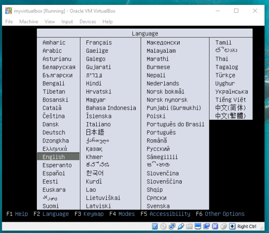
Intro 3. Ready for virtual machine creation: We will utilize the downloaded OSGeo-Live 11 suite with a virtual machine we create to begin our workflow. The steps to create your virtual machine are listed below. Also, here are steps from an earlier workshop with additional details with setting up your virtual machine with osgeo live(http://workshop.pgrouting.org/2.2.10/en/chapters/installation.html).

1.  Create Virutal Machine: In this step we begin creating the virtual machine housing our database.

Open Oracle VM VirtualBox Manager and select “New” located at the top left of the window.

VBstep1

Then fill out name, operating system, memory, etc. to create your first VM.

vbstep1.2

2. Add IDE Controller:  The purpose of this step is to create a placeholder for the osgeo 11 suite to be implemented. In the virtual box main window, right-click your newly-created vm and open the settings.

vbstep2

In the settings window, on the left side select the storage tab.

Find “adds new storage controller button located at the bottom of the tab. Be careful of other buttons labeled “adds new storage attachment”! Select “adds new storage controller button and a drop-down menu will appear. From the top of the drop-down select “Add IDE Controller”.

vbstep2.2

vbstep2.3

You will see a new item appear in the center of the window under the “Storage Tree”.

3.  Add Optical Drive: The osgeo 11 suite will be implemented into the virtual machine via an optical drive. Highlight the new controller IDE you created and select “add optical drive”.

vbstep3

A new window will pop-up and select “Choose Disk”.

vbstep3.2

Locate your downloaded file “osgeo-live 11 amd64.iso” and click open. A new object should appear in the middle window under your new controller displaying “osgeo-live-11.0-amd64.iso”.

vbstep3.3

Finally your virtual machine is ready for use.
Start your new Virtual Box, then wait and follow the onscreen prompts to begin using your virtual machine.

vbstep3.4

–Getting Virtual Box(end)—

4. Creating the routing database, and both extensions (postgis, pgrouting): The database we create and both extensions we add will provide the functions capable of producing isochrones.

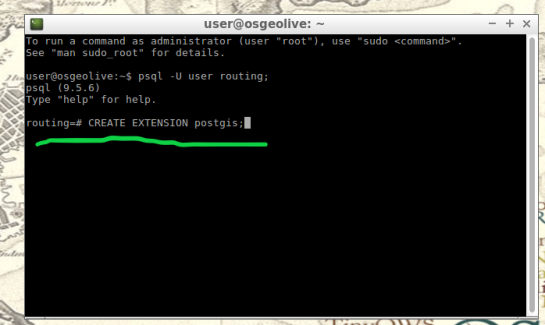
To begin, start by opening the command line tool (hold control+left-alt+T) then log in to postgresql by typing “psql -U user;” into the command line and then press Enter. For the purpose of clear instruction I will refer to database name in this guide as “routing”, feel free to choose your own database name. Please input the command, seen in the figure below, to create the database:

CREATE DATABASE routing;

You can use “\c routing” to connect to the database after creation.

step4

The next step after creating and connecting to your new database is to create both extensions. I find it easier to take two-birds-with-one-stone typing “psql -U user routing;” this will simultaneously log you into postgresql and your routing database.

When your logged into your database, apply the commands below to add both extensions

CREATE EXTENSION postgis;
CREATE EXTENSION pgrouting;

step4.2

step4.3

5. Load shapefile to database: In this next step, the shapefile of your roads data must be placed into your virtual machine and further into your database.

My method is using email to send myself the roads shapefile then download and copy it from within my virtual machines web browser. From the desktop of your Virtual Machine, open the folder named “Databases” and select the application “shape2pgsql”.

step5

Follow the UI of shp2pgsql to connect to your routing database you created in Step 4.

step5.2

Next, select “Add File” and find your roads shapefile (in this guide we will call our shapefile “roads_table”) you want to use for your isochrones and click Open.

step5.3

Finally, click “Import” to place your shapefile into your routing database.

6. Add source & target columns: The purpose of this step is to create columns which will serve as placeholders for our nodes data we create later.

There are multiple ways to add these columns into the roads_table. The most important part of this step is which table you choose to edit, the names of the columns you create, and the format of the columns. Take time to ensure the source & target columns are integer format. Below are the commands used in your command line for these functions.

ALTER TABLE roads_table ADD COLUMN "source" integer;
ALTER TABLE roads_table ADD COLUMN "target" integer;

step6

step6.2

7. Create topology: Next, we will use a function to attach a node to each end of every road segment in the roads_table. The function in this step will create these nodes. These newly-created nodes will be stored in the source and target columns we created earlier in step 6.

As well as creating nodes, this function will also create a new table which will contain all these nodes. The suffix “_vertices_pgr” is added to the name of your shapefile to create this new table. For example, using our guide’s shapefile name , “roads_table”, the nodes table will be named accordingly: roads_table_vertices_pgr. However, we will not use the new table created from this function (roads_table_vertices_pgr). Below is the function, and a second simplified version, to be used in the command line for populating our source and target columns, in other words creating our network topology. Note the input format, the “geom” column in my case was called “the_geom” within my shapefile:

pgr_createTopology('roads_table', 0.001, 'geom', 'id',
 'source', 'target', rows_where := 'true', clean := f)

step7

Here is a direct link for more information on this function: http://docs.pgrouting.org/2.3/en/src/topology/doc/pgr_createTopology.html#pgr-create-topology

Below is an example(simplified) function for my roads shapefile:

SELECT pgr_createTopology('roads_table', 0.001, 'the_geom', 'id')

8. Create a second nodes table: A second nodes table will be created for later use. This second node table will contain the node data generated from pgr_createtopology function and be named “node”. Below is the command function for this process. Fill in your appropriate source and target fields following the manner seen in the command below, as well as your shapefile name.

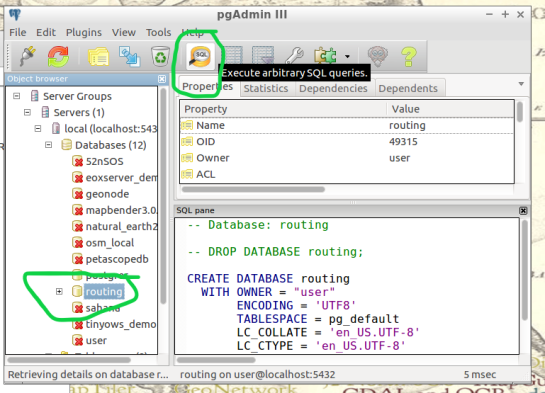
To begin, find the folder on the Virtual Machines desktop named “Databases” and open the program “pgAdmin lll” located within.

step8

Connect to your routing database in pgAdmin window. Then highlight your routing database, and find “SQL” tool at the top of the pgAdmin window. The tool resembles a small magnifying glass.

step8.2

We input the below function into the SQL window of pgAdmin. Feel free to refer to this link for further information: (https://anitagraser.com/2011/02/07/a-beginners-guide-to-pgrouting/)

CREATE TABLE node AS
   SELECT row_number() OVER (ORDER BY foo.p)::integer AS id,
          foo.p AS the_geom
   FROM (     
      SELECT DISTINCT roads_table.source AS p FROM roads_table
      UNION
      SELECT DISTINCT roads_table.target AS p FROM roads_table
   ) foo
   GROUP BY foo.p;

step8.3

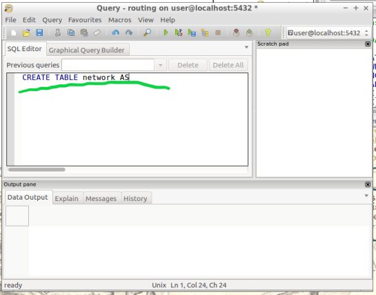
  1.  Create a routable network: After creating the second node table from step 8,  we will combine this node table(node) with our shapefile(roads_table) into one, new, table(network) that will be used as the routing network. This table will be called “network” and will be capable of processing routing queries.  Please input this command and execute in SQL pgAdmin tool as we did in step 8. Here is a reference for more information:(https://anitagraser.com/2011/02/07/a-beginners-guide-to-pgrouting/)   

step8.2


CREATE TABLE network AS
   SELECT a.*, b.id as start_id, c.id as end_id
   FROM roads_table AS a
      JOIN node AS b ON a.source = b.the_geom
      JOIN node AS c ON a.target = c.the_geom;

step9.2

10. Create a “noded” view of the network:  This new view will later be used to calculate the visual isochrones in later steps. Input this command and execute in SQL pgAdmin tool.

CREATE OR REPLACE VIEW network_nodes AS 
SELECT foo.id,
 st_centroid(st_collect(foo.pt)) AS geom 
FROM ( 
  SELECT network.source AS id,
         st_geometryn (st_multi(network.geom),1) AS pt 
  FROM network
  UNION 
  SELECT network.target AS id, 
         st_boundary(st_multi(network.geom)) AS pt 
  FROM network) foo 
GROUP BY foo.id;

step10

11.​ Add column for speed:​ This step may, or may not, apply if your original shapefile contained a field of values for road speeds.

In reality a network of roads will typically contain multiple speed limits. The shapefile you choose may have a speed field, otherwise the discrimination for the following steps will not allow varying speeds to be applied to your routing network respectfully.

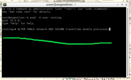
If values of speed exists in your shapefile we will implement these values into a new field, “traveltime“, that will show rate of travel for every road segment in our network based off their geometry. Firstly, we will need to create a column to store individual traveling speeds. The name of our column will be “traveltime” using the format: ​double precision.​ Input this command and execute in the command line tool as seen below.

ALTER TABLE network ADD COLUMN traveltime double precision;

step11

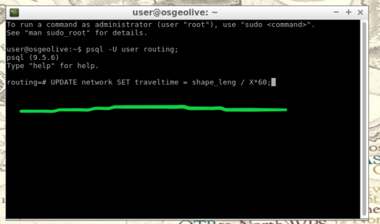
Next, we will populate the new column “traveltime” by calculating traveling speeds using an equation. This equation will take each road segments geometry(shape_leng) and divide by the rate of travel(either mph or kph). The sample command I’m using below utilizes mph as the rate while our geometry(shape_leng) units for my roads_table is in feet​. If you are using either mph or kph, input this command and execute in SQL pgAdmin tool. Below further details explain the variable “X”.

UPDATE network SET traveltime = shape_leng / X*60

step11.2

How to find X​, ​here is an example​: Using example 30 mph as rate. To find X, we convert 30 miles to feet, we know 5280 ft = 1 mile, so we multiply 30 by 5280 and this gives us 158400 ft. Our rate has been converted from 30 miles per hour to 158400 feet per hour. For a rate of 30 mph, our equation for the field “traveltime”  equates to “shape_leng / 158400*60″. To discriminate this calculations output, we will insert additional details such as “where speed = 30;”. What this additional detail does is apply our calculated output to features with a “30” value in our “speed” field. Note: your “speed” field may be named differently.

UPDATE network SET traveltime = shape_leng / 158400*60 where speed = 30;

Repeat this step for each speed value in your shapefile examples:

UPDATE network SET traveltime = shape_leng / X*60 where speed = 45;
UPDATE network SET traveltime = shape_leng / X*60 where speed = 55;

The back end is done. Great Job!

Our next step will be visualizing our data in QGIS. Open and connect QGIS to your routing database by right-clicking “PostGIS” in the Browser Panel within QGIS main window. Confirm the checkbox “Also list tables with no geometry” is checked to allow you to see the interior of your database more clearly. Fill out the name or your routing database and click “OK”.

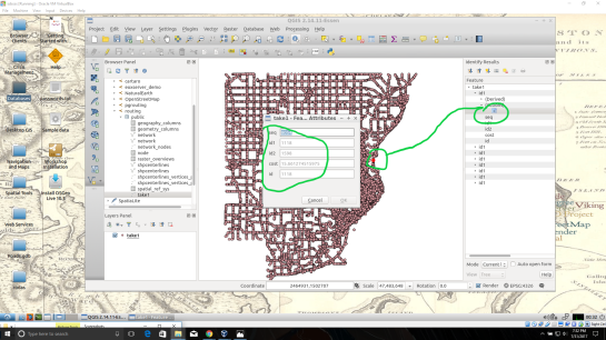
If done correctly, from QGIS you will have access to tables and views created in your routing database. Feel free to visualize your network by drag-and-drop the network table into your QGIS Layers Panel. From here you can use the identify tool to select each road segment, and see the source and target nodes contained within that road segment. The node you choose will be used in the next step to create the views of drive-time.
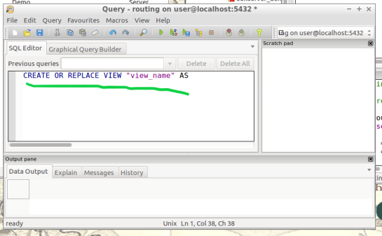
12.Create views​: In this step, we create views from a function designed to determine the travel time cost. Transforming these views with tools will visualize the travel time costs as isochrones.

The command below will be how you start querying your database to create drive-time isochrones. Begin in QGIS by draging your network table into the contents. The visual will show your network as vector(lines). Simply select the road segment closest to your point of interest you would like to build your isochrone around. Then identify the road segment using the identify tool and locate the source and target fields.

step12

step12.2

Place the source or target field value in the below command where you see ​VALUE​, in all caps​.

This will serve you now as an isochrone catchment function for this workflow. Please feel free to use this command repeatedly for creating new isochrones by substituting the source value. Please input this command and execute in SQL pgAdmin tool.

*AT THE BOTTOM OF THIS WORKFLOW I PROVIDED AN EXAMPLE USING SOURCE VALUE “2022”

CREATE OR REPLACE VIEW "​view_name" AS 
SELECT di.seq, 
       di.id1, 
       di.id2, 
       di.cost, 
       pt.id, 
       pt.geom 
FROM pgr_drivingdistance('SELECT
     gid::integer AS id, 
     Source::integer AS source, 
     Target::integer AS target,                                    
     Traveltime::double precision AS cost 
       FROM network'::text, ​VALUE::bigint, 
    100000::double precision, false, false)
    di(seq, id1, id2, cost)
JOIN network_nodes pt ON di.id1 = pt.id;

step12.3

13.Visualize Isochrone: Applying tools to the view will allow us to adjust the visual aspect to a more suitable isochrone overlay.

​After creating your view, a new item in your routing database is created, using the “view_name” you chose. Drag-and-drop this item into your QGIS LayersPanel. You will see lots of small dots which represent the nodes.

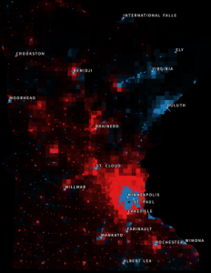
In the figure below, I named my view “take1“.

step13

Each node you see contains a drive-time value, “cost”, which represents the time used to travel from the node you input in step 12’s function.
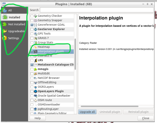
step13.2

Start by installing the QGIS plug-in Interpolation” by opening the Plugin Manager in QGIS interface.

step13.3

Next, at the top of QGIS window select “Raster” and a drop-down will appear, select “Interpolation”.

step13.4


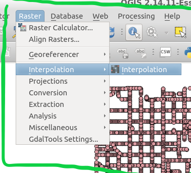
A new window pops up and asks you for input.

step13.5

Select your “​view”​ as the​ vector layer​, select ​”cost​” as your ​interpolation attribute​, and then click “Add”.

step13.6

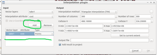
A new vector layer will show up in the bottom of the window, take care the type is Points. For output, on the other half of the window, keep the interpolation method as “TIN”, edit the ​output file​ location and name. Check the box “​Add result to project​”.

Note: decreasing the cellsize of X and Y will increase the resolution but at the cost of performance.

Click “OK” on the bottom right of the window.

step13.7

A black and white raster will appear in QGIS, also in the Layers Panel a new item was created.

step13.8

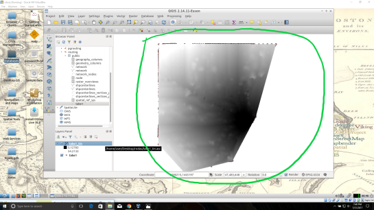
Take some time to visualize the raster by coloring and adjusting values in symbology until you are comfortable with the look.

step13.9

step13.10

14. ​Create contours of our isochrone:​ Contours can be calculated from the isochrone as well.

Find near the top of QGIS window, open the “Raster” menu drop-down and select Extraction → Contour.

step14

Fill out the appropriate interval between contour lines but leave the check box “Attribute name” unchecked. Click “OK”.

step14.2

step14.3

15.​ Zip and Share:​ Find where you saved your TIN and contours, compress them in a zip folder by highlighting them both and right-click to select “compress”. Email the compressed folder to yourself to export out of your virtual machine.

Example Isochrone catchment for this workflow:

CREATE OR REPLACE VIEW "2022" AS 
SELECT di.seq, Di.id1, Di.id2, Di.cost,                           
       Pt.id, Pt.geom 
FROM pgr_drivingdistance('SELECT gid::integer AS id,                                       
     Source::integer AS source, Target::integer AS target, 
     Traveltime::double precision AS cost FROM network'::text, 
     2022::bigint, 100000::double precision, false, false) 
   di(seq, id1, id2, cost) 
JOIN netowrk_nodes pt 
ON di.id1 = pt.id;

References: Virtual Box ORACLE VM, OSGeo-Live 11  amd64 iso, Workshop FOSS4G Bonn(​http://workshop.pgrouting.org/2.2.10/en/index.html​),

Better river styles with tapered lines

In 2012 I published a post on mapping the then newly released Tirol river dataset.

In the comments, reader Michal Zimmermann asked:

Do you think it would be possible to create a river stream which gains width along its way? I mean rivers are usually much narrower on their beginnings, then their width increases and the estuary should be the widest part, right?

For a long time, this kind of river style, also known as “tapered lines” could only be created in vector graphics software, such as Inkscape and Illustrator.

With the help of geometry generators, we can now achieve this look directly in QGIS:

Data cc-by Land Tirol

In the river dataset published by the state of Tirol, all rivers are digitized in upstream direction. For this styling to work, it is necessary that the line direction is consistent throughout the whole dataset.

We use a geometry generator symbol layer to split the river geometry into its individual segments:


Then we can use the information about the total number of segments (accessible via the expression variable @geometry_part_count) and the individual segment’s number (@geometry_part_num) to calculate the segment’s line width.

The stroke width expression furthermore uses the river category (GEW_GRKL) to vary the line width depending on the category:

CASE 
WHEN "GEW_GRKL" = '< 10 km2 Fluss' THEN 0.2
WHEN "GEW_GRKL" = '10 km2 Fluss' THEN 0.4
WHEN "GEW_GRKL" = '100 km2 Fluss' THEN 0.6
WHEN "GEW_GRKL" = '1.000 km2 Fluss' THEN 0.8
ELSE 1.0
END 
* ( 1- ( @geometry_part_num /  @geometry_part_count ))

If the rivers are digitized in downstream direction, you can simply remove the 1- term.

Happy mapping!


Small multiples for OD flow maps using virtual layers

In my previous posts, I discussed classic flow maps that use arrows of different width to encode flows between regions. This post presents an alternative take on visualizing flows, without any arrows. This style is inspired by Go with the Flow by Robert Radburn and Visualisation of origins, destinations and flows with OD maps by J. Wood et al.

The starting point of this visualization is a classic OD matrix.

migration_raw_data

For my previous flow maps, I already converted this data into a more GIS-friendly format: a Geopackage with lines and information about the origin, destination and strength of the flow:

migration_attribute_table

In addition, I grabbed state polygons from Natural Earth Data.

At this point, we have 72 flow features and 9 state polygon features. An ordinary join in the layer properties won’t do the trick. We’d still be stuck with only 9 polygons.

Virtual layers to the rescue!

The QGIS virtual layers feature (Layer menu | Add Layer | Add/Edit Virtual Layer) provides database capabilities without us having to actually set up a database … *win!*

Using a classic SQL query, we can join state polygons and migration flows into a new virtual layer:

virtual_layer

The resulting virtual layer contains 72 polygon features. There are 8 copies of each state.

Now that the data is ready, we can start designing the visualization in the Print Composer.

This is probably the most manual step in this whole process: We need 9 map items, one for each mini map in the small multiples visualization. Create one and configure it to your liking, then copy and paste to create 8 more copies.

I’ve decided to arrange the map items in a way that resembles the actual geographic location of the state that is represented by the respective map, from the state of Vorarlberg (a proud QGIS sponsor by the way) in the south-west to Lower Austria in the north-east.

To configure which map item will represent the flows from which origin state, we set the map item ID to the corresponding state ID. As you can see, the map items are numbered from 1 to 9:

small_multiples_print_composer_init

Once all map items are set up, we can use the map item IDs to filter the features in each map. This can be implemented using a rule based renderer:

small_multiples_style_rules

The first rule will ensure that the each map only shows flows originating from a specific state and the second rule will select the state itself.

We configure the symbol of the first rule to visualize the flow strength. The color represents the number number of people moving to the respective district. I’ve decided to use a smooth gradient instead of predefined classes for the polygon fill colors. The following expression maps the feature’s weight value to a shade on the Viridis color ramp:

ramp_color( 'Viridis',
  scale_linear("weight",0,2000,0,1)
)

You can use any color ramp you like. If you want to use the Viridis color ramp, save the following code into an .xml file and import it using the Style Manager. (This color ramp has been provided by Richard Styron on rocksandwater.net.)

<!DOCTYPE qgis_style>
<qgis_style version="0">
  <symbols/>
    <colorramp type="gradient" name="Viridis">
      <prop k="color1" v="68,1,84,255"/>
      <prop k="color2" v="253,231,36,255"/>
      <prop k="stops" v="0.04;71,15,98,255:0.08;72,29,111,255:0.12;71,42,121,255:0.16;69,54,129,255:0.20;65,66,134,255:0.23;60,77,138,255:0.27;55,88,140,255:0.31;50,98,141,255:0.35;46,108,142,255:0.39;42,118,142,255:0.43;38,127,142,255:0.47;35,137,141,255:0.51;31,146,140,255:0.55;30,155,137,255:0.59;32,165,133,255:0.62;40,174,127,255:0.66;53,183,120,255:0.70;69,191,111,255:0.74;89,199,100,255:0.78;112,206,86,255:0.82;136,213,71,255:0.86;162,218,55,255:0.90;189,222,38,255:0.94;215,226,25,255:0.98;241,229,28,255"/>
    </colorramp>
  </colorramps>
</qgis_style>

If we go back to the Print Composer and update the map item previews, we see it all come together:

small_multiples_print_composer

Finally, we set title, legend, explanatory texts, and background color:

migration

I think it is amazing that we are able to design a visualization like this without having to create any intermediate files or having to write custom code. Whenever a value is edited in the original migration dataset, the change is immediately reflected in the small multiples.


New style: flow map arrows

Last time, I wrote about the little details that make a good flow map. The data in that post was made up and simpler than your typical flow map. That’s why I wanted to redo it with real-world data. In this post, I’m using domestic migration data of Austria.

Raw migration data

Raw migration data, line width scaled to flow strength

With 9 states, that makes 72 potential flow arrows. Since that’s too much to map, I’ve decided in a first step to only show flows with more than 1,000 people.

Following the recommendations mentioned in the previous post, I first designed a basic flow map where each flow direction is rendered as a black arrow:

migration_basic

Basic flow map

Even with this very limited number of flows, the map gets pretty crowded, particularly around the north-eastern node, the Austrian capital Vienna.

To reduce the number of incoming and outgoing lines at each node, I therefore decided to change to colored one-sided arrows that share a common geometry:

migration_twocolor

Colored one-sided arrows

The arrow color is determined automatically based on the arrow direction using the following expression:

CASE WHEN
 "weight" < 1000 THEN color_rgba( 0,0,0,0)
WHEN
 x(start_point( $geometry)) - x(end_point($geometry)) < 0
THEN
 '#1f78b4'
ELSE
 '#ff7f00'
END

The same approach is used to control the side of the one-sided arrow head. The arrow symbol layer has two “arrow type” options for rendering the arrow head: on the inside of the curve or on the outside. This means that, if we wouldn’t use a data-defined approach, the arrow head would be on the same side – independent of the line geometry direction.

CASE WHEN
 x(start_point( $geometry)) - x(end_point($geometry)) < 0
THEN
 1
ELSE
 2
END

Obviously, this ignores the corner case of start and end points at the same x coordinate but, if necessary, this case can be added easily.

Of course the results are far from perfect and this approach still requires manual tweaking of the arrow geometries. Nonetheless, I think it’s very interesting to see how far we can push the limits of data-driven styling for flow maps.

Give it a try! You’ll find the symbol and accompanying sample data on the QGIS resource sharing plugin platform:

resourcesharing_flowmap


Details of good flow maps

In my previous post, I shared a flow map style that was inspired by a hand drawn map. Today’s post is inspired by a recent academic paper recommended to me by Radoslaw Panczak  and Thomas Gratier :

Jenny, B., Stephen, D. M., Muehlenhaus, I., Marston, B. E., Sharma, R., Zhang, E., & Jenny, H. (2016). Design principles for origin-destination flow maps. Cartography and Geographic Information Science, 1-15.

Jenny et al. (2016)  performed a study on how to best design flow maps. The resulting design principles are:

  • number of flow overlaps should be minimized;
  • sharp bends and excessively asymmetric flows should be avoided;
  • acute intersection angles should be avoided;
  • flows must not pass under unconnected nodes;
  • flows should be radially arranged around nodes;
  • quantity is best represented by scaled flow width;
  • flow direction is best indicated with arrowheads;
  • arrowheads should be scaled with flow width, but arrowheads for thin flows should be enlarged; and
  • overlaps between arrowheads and flows should be avoided.

Many of these points concern the arrangement of flow lines but I want to talk about those design principles that can be implemented in a QGIS line style. I’ve summarized the three core ideas:

  1. use arrow heads and scale arrow width according to flow,
  2. enlarge arrow heads for thin flows, and
  3. use nodes to arrange flows and avoid overlaps of arrow heads and flows
Click to view slideshow.

To get started, we can use a standard QGIS arrow symbol layer. To represent the flow value (“weight”) according to the first design principle, all arrow parameters are data-defined:

scale_linear("weight",0,10,0.1,3)

To enlarge the arrow heads for thin flow lines, as required by the second design principle, we can add a fixed value to the data-defined head length and thickness:

scale_linear("weight",0,10,0.1,1.5)+1.5

arrow_head_thickness

The main issue with this flow map is that it gets messy as soon as multiple arrows end at the same location. The arrow heads are plotted on top of each other and at some point it is almost impossible to see which arrow starts where. This is where the third design principle comes into play!

To fix the overlap issue, we can add big round nodes at the flow start and end points. These node buffers are both used to render circles on the map, as well as to shorten the arrows by cutting off a short section at the beginning and end of the lines:

difference(
  difference(
    $geometry,
    buffer( start_point($geometry), 10000 )
  ),
  buffer( end_point( $geometry), 10000 )
)

Note that the buffer values in this expression only produce appropriate results for line datasets which use a CRS in meters and will have to be adjusted for other units.

arrow_nodes

It’s great to have some tried and evaluated design guidelines for our flow maps. As always: Know your cartography rules before you start breaking them!

PS: To draw a curved arrow, the line needs to have one intermediate point between start and end – so three points in total. Depending on the intermediate point’s position, the line is more or less curved.


New style: conveyor belt flows

The QGIS map style I want to share with you today was inspired by a hand-drawn map by Philippe Rekacewicz that I saw on Twitter:

The look reminds me of conveyor belts, thus the name choice.

You can download the symbol and a small sample dataset by adding my repo to the QGIS Resource Sharing plugin.

resourcesharing_conveyor

The conveyor belt is a line symbol that makes extensive use of Geometry generators. One generator for the circle at the flow line start and end point, respectively, another generator for the belt, and a final one for the small arrows around the colored circles. The color and size of the circle are data defined:

conveyor_details

The collection also contains a sample Geopackage dataset which you can use to test the symbol immediately. It is worth noting that the circle size has to be specified in layer CRS units.

It’s great fun playing with the power of Geometry generator symbol layers and QGIS geometry expressions. For example, this is the expression for the final geometry that is used to draw the small arrows around colored circles:

line_merge( 
  intersection(
    exterior_ring( 
      convex_hull( 
        union( 
          buffer( start_point($geometry), "start_size" ),
          buffer( end_point($geometry), 500000 )
        )
      )
    ),
    exterior_ring( 
      buffer( start_point( $geometry), "start_size" )
    )
  )
)

The expression constructs buffer circles, the belt geometry (convex_hull around buffers), and finally extracts the intersecting part from the start circle and the belt geometry.

Hope you enjoy it!

It’s holiday season, why not share one of your own symbols with the QGIS community?


Movement data in GIS #2: visualization

In the first part of the Movement Data in GIS series, I discussed some of the common issues of modeling movement data in GIS, followed by a recommendation to model trajectories as LinestringM features in PostGIS to simplify analyses and improve query performance.

Of course, we don’t only want to analyse movement data within the database. We also want to visualize it to gain a better understanding of the data or communicate analysis results. For example, take one trajectory:

(data credits: GeoLife project)

Visualizing movement direction is easy: just slap an arrow head on the end of the line and done. What about movement speed? Sure! Mean speed, max speed, which should it  be?

Speed along the trajectory, a value for each segment between consecutive positions.

With the usual GIS data model, we are back to square one. A line usually has one color and width. Of course we can create doted and dashed lines but that’s not getting us anywhere here. To visualize speed variations along the trajectory, we therefore split the original trajectory into its segments, 1429 in this case. Then we can calculate speed for each segment and use a graduated or data defined renderer to show the results:

trajectory_segment_features

Speed along trajectory: red = slow to blue = fast

Very unsatisfactory! We had to increase the number of features 1429 times just to show speed variations along the trajectory, even though the original single trajectory feature already contained all the necessary information and QGIS does support geometries with measurement values.

Starting from QGIS 2.14, we have an alternative way to deal with this issue. We can stick to the original single trajectory feature and render it using the new geometry generator symbol layer. (This functionality is also used under the hood of the 2.5D renderer.) Using the segments_to_lines() function, the geometry generator basically creates individual segment lines on the fly:

geomgenerator

Segments_to_lines( $geometry) returns a multi line geometry consisting of a line for every segment in the input geometry

Once this is set up, we can style the segments with a data-defined expression that determines the speed on the segment and returns the respective color along a color ramp:

segment_speed_color

Speed is calculated using the length of the segment and the time between segment start and end point. Then speed values from 0 to 50 km/h are mapped to the red-yellow-blue color ramp:

ramp_color(
  'RdYlBu',
  scale_linear(
    length( 
      transform(
	    geometry_n($geometry,@geometry_part_num),
		'EPSG:4326','EPSG:54027'
		)
    ) / (
      m(end_point(  geometry_n($geometry,@geometry_part_num))) -
      m(start_point(geometry_n($geometry,@geometry_part_num)))
    ) * 3.6,
    0,50,
    0,1
  )
)

Thanks a lot to @nyalldawson for all the help figuring out the details!

While the following map might look just like the previous one in the end, note that we now only deal with the original single line feature:

trajectory_geomgenerator

Similar approaches can be used to label segments or positions along the trajectory without having to break the original feature. Thanks to the geometry generator functionality, we can make direct use of the LinestringM data model for trajectory visualization.


Material design map tutorial for QGIS Composer

This is a guest post by Mickael HOARAU @Oneil974

For those wishing to get a stylized map on QGIS composer, I’ve been working on a tutorial to share with you a project I’m working on. Fan of web design and GIS user since few years, I wanted to merge Material Design Style with Map composer. Here is a tutorial to show you how to make simply a Material Design Map style on QGIS.

Click to view slideshow.

You can download tutorial here:

Tutorial Material Design Map

And sources here:

Sources Material Design Map

An Atlas Powered version is coming soon!


Special FOSS4G offer: 25% off QGIS Map Design

FOSS4G2016 is drawing closer quickly. To get in the mood for a week full of of geogeekery, Locate Press is offering a special FOSS4G discount for QGIS Map Design.

Use the code foss4gbonn to get 25% off your copy.

QGIS Map Design is the reference book to get if you want to bring your mapping skills up to speed. The book comes with a download for all our example map projects:

qmd114 qmd132 qmd140 qmd128 qmd174 qmd58 qmd152 qmd158 qmd64 qmd46 qmd146 qmd188 qmd164 qmd20 qmd90 qmd78 qmd84 qmd108 qmd184 qmd34 qmd180 qmd120 qmd26 qmd104 qmd168 qmd100 qmd52

Looking forward to meeting you in Bonn!


How to create round maps in Print Composer

If you follow me on Twitter, you’ve probably seen previews of my experiments with round maps. These experiments were motivated by a recent question on GIS.stackexchange whether this type of map can be created in QGIS and while it’s not very convenient right now, it is definitely possible:

http://www.quantarctica.org

All maps in this post are created using data from the Quantarctica project.

I’ve been planing to try the Quantarctica datasets for a long time and this use case is just perfect. When you download and open their project, you’ll see that they have already clipped all datasets to a circle around Antarctica:

Quantarctica project with some custom styling

Quantarctica project with some custom styling

Since the map of the full extent of the dataset is already clipped to a circle, the overview map is easy to deal with. The detail map on the other hand is rectangular by default:

circle_maps_start

Since we cannot change the shape of the map item, we have to use a mask instead. To create a circular mask, we can add an ellipse shape:

circle_maps_addellipse

The main challenge when creating the mask is that there is no inverted polygon renderer for shapes in print composer. I’ve evaluated to workarounds: First, I created a style with a wide white outline that would cover all map parts outside the circle shape. But this solution slowed the print composer down a lot. An alternative, which doesn’t suffer from this slowdown is using draw effects:

circle_maps_mask_style

In particular, I created a big outer glow effect:

circle_maps_mask_style_effect

Note that the effect only works if the symbol itself is not transparent. That’s why I set the symbol fill to black and used the Lighten blending mode:

circle_maps_mask

Voilà! Both maps appear are nicely circular.

It is worth noting though that this workaround has a downside: it is not possible to create automatic grids/graticules for these maps. The graticule in the overview map only works because it is a layer in the main project that was already clipped to the circular shape.

Finally, you can add more depth to your map by adding shadows. To create the shadow effect, I added additional ellipse items which are styled with a drop shadow draw effect. If you only enable the drop shadow effect, you will notice that the shadow is cut off at the ellipse bounding box. To avoid this undesired effect, you can add a transform effect, which reduces the size of the drawn shape and it’s shadow so that the shadow fits into the bounding box:

circle_maps_mask_shadow_effect

It requires some manual adjustments to place the shadow at the optimal location on top of the mask:

circle_maps_mask_shadow

Add another ellipse to create the shadow for the overview map.

For more cartography tips and tricks check my new book QGIS Map Design or join my QGIS training courses.


New demos: live labels & gradient editor

Following up on last week’s post, Nyall has continued his work on the QGIS gradient editor:

Latest version of the new QGIS interactive gradient edit. This now includes an interactive plot of the color hue/saturation/lightness/alpha, allowing a visual overview of these color components and easy editing.

Another equally awesome demo has been posted by Nathan, who is currently working on usability improvements for labeling and styling without blocking dialogs:

This is going to be great for map design work because it makes many complex styles much easier to create since you can interact with the map and attribute table at the same time.

These are definitely two developments to follow closely!


Towards better gradients

Interesting developments going on if you like creating your own gradients. After all, that’s not as easy as it might initially seem, as Gregor Aisch describes in his post “Mastering Multi-hued Color Scales with Chroma.js”:

The issues with simple color interpolations, which include nonuniform changes in lightness between classes, also haunt us in cartography. Just have a look at the map and legend on the left-hand side, which has been created using a normal custom QGIS gradient with colors ranging from black to red, yellow and finally white. We end up with three classes in yellow which are nearly impossible to tell apart:

comparing_ramps

For comparison, on the right side, I’ve used Gregor’s corrected color ramp, which ensures that lightness changes evenly from one class to the next.

Wouldn’t it be great if the built-in gradient tool in QGIS could correct for lightness? Too bad the current dialog is not that great:

My first reaction therefore was to write a short script to import gradients from Gregor’s Chroma.js Color Scale Helper into QGIS:

But we’ll probably have a much better solution in QGIS soon since Nyall Dawson has picked up the idea and is already working on a completely new version of the gradient tool. You can see a demo of the current work in progress here:

I’m really looking forward to trying this out once it hits master!


Back to Top

Sustaining Members