Related Plugins and Tags

QGIS Planet

Data engineering for Mobility Data Science (with Python and DVC)

This summer, I had the honor to — once again — speak at the OpenGeoHub Summer School. This time, I wanted to challenge the students and myself by not just doing MovingPandas but by introducing both MovingPandas and DVC for Mobility Data Science.

I’ve previously written about DVC and how it may be used to track geoprocessing workflows with QGIS & DVC. In my summer school session, we go into details on how to use DVC to keep track of MovingPandas movement data analytics workflow.

Here is the recording of the session live stream and you can find the materials at https://github.com/movingpandas/movingpandas-examples/blob/opengeohub2023/README.md

Analyzing video-based bicycle trajectories

Did you know that MovingPandas also supports local image coordinates? Indeed, it does.

In today’s post, we will explore how we can use this feature to analyze bicycle tracks extracted from video footage published by Michael Szell @mszll:

The bicycle trajectory coordinates are stored in two separate lists: xs_640x360 and ys640x360:

This format is kind of similar to the Kaggle Taxi dataset, we worked with in the previous post. However, to use the solution we implemented there, we need to combine the x and y coordinates into nice (x,y) tuples:

df['coordinates'] = df.apply(
    lambda row: list(zip(row['xs_640x360'], row['ys_640x360'])), axis=1)
df.drop(columns=['xs_640x360', 'ys_640x360'], inplace=True)

Afterwards, we can create the points and compute the proper timestamps from the frame numbers:

def compute_datetime(row):
    # some educated guessing going on here: the paper states that the video covers 2021-06-09 07:00-08:00
    d = datetime(2021,6,9,7,0,0) + (row['frame_in'] + row['running_number']) * timedelta(seconds=2)
    return d
def create_point(xy):
    try: 
        return Point(xy)
    except TypeError:  # when there are nan values in the input data
        return None
new_df = df.head().explode('coordinates')
new_df['geometry'] = new_df['coordinates'].apply(create_point)
new_df['running_number'] = new_df.groupby('id').cumcount()
new_df['datetime'] = new_df.apply(compute_datetime, axis=1)
new_df.drop(columns=['coordinates', 'frame_in', 'running_number'], inplace=True)
new_df

Once the points and timestamps are ready, we can create the MovingPandas TrajectoryCollection. Note how we explicitly state that there is no CRS for this dataset (crs=None):

trajs = mpd.TrajectoryCollection(
    gpd.GeoDataFrame(new_df), 
    traj_id_col='id',  t='datetime', crs=None)

Plotting trajectories with image coordinates

Similarly, to plot these trajectories, we should tell hvplot that it should not fetch any background map tiles (’tiles’:None) and that the coordinates are not geographic (‘geo’:False):

If you want to explore the full source code, you can find my Github fork with the Jupyter notebook at: https://github.com/anitagraser/desirelines/blob/main/mpd.ipynb

The repository also contains a camera image of the intersection, which we can use as a background for our trajectory plots:

bg_img = hv.RGB.load_image('img/intersection2.png', bounds=(0,0,640,360)) 

One important caveat is that speed will be calculated in pixels per second. So when we plot the bicycle speed, the segments closer to the camera will appear faster than the segments in the background:

To fix this issue, we would have to correct for the distortions of the camera lens and perspective. I’m sure that there is specialized software for this task but, for the purpose of this post, I’m going to grab the opportunity to finally test out the VectorBender plugin.

Georeferencing the trajectories using QGIS VectorBender plugin

Let’s load the five test trajectories and the camera image to QGIS. To make sure that they align properly, both are set to the same CRS and I’ve created the following basic world file for the camera image:

1
0
0
-1
0
360

Then we can use the VectorBender tools to georeference the trajectories by linking locations from the camera image to locations on aerial images. You can see the whole process in action here:

After around 15 minutes linking control points, VectorBender comes up with the following georeferenced trajectory result:

Not bad for a quick-and-dirty hack. Some points on the borders of the image could not be georeferenced since I wasn’t always able to identify suitable control points at the camera image borders. So it won’t be perfect but should improve speed estimates.


This post is part of a series. Read more about movement data in GIS.

Visualizing trajectories with QGIS & MobilityDB

In the previous post, we — creatively ;-) — used MobilityDB to visualize stationary IOT sensor measurements.

This post covers the more obvious use case of visualizing trajectories. Thus bringing together the MobilityDB trajectories created in Detecting close encounters using MobilityDB 1.0 and visualization using Temporal Controller.

Like in the previous post, the valueAtTimestamp function does the heavy lifting. This time, we also apply it to the geometry time series column called trip:

SELECT mmsi,
    valueAtTimestamp(trip, '2017-05-07 08:55:40') geom,
    valueAtTimestamp(SOG, '2017-05-07 08:55:40') SOG
FROM "public"."ships"

Using this SQL query, we again set up a — not yet Temporal Controller-controlled — QueryLayer.

To configure Temporal Controller to update the timestamp in our SQL query, we again need to run the Python script from the previous post.

With this done, we are all set up to animate and explore the movement patterns in our dataset:


This post is part of a series. Read more about movement data in GIS.

Detecting close encounters using MobilityDB 1.0

It’s been a while since we last talked about MobilityDB in 2019 and 2020. Since then, the project has come a long way. It joined OSGeo as a community project and formed a first PSC, including the project founders Mahmoud Sakr and Esteban Zimányi as well as Vicky Vergara (of pgRouting fame) and yours truly.

This post is a quick teaser tutorial from zero to computing closest points of approach (CPAs) between trajectories using MobilityDB.

Setting up MobilityDB with Docker

The easiest way to get started with MobilityDB is to use the ready-made Docker container provided by the project. I’m using Docker and WSL (Windows Subsystem Linux on Windows 10) here. Installing WLS/Docker is out of scope of this post. Please refer to the official documentation for your operating system.

Once Docker is ready, we can pull the official container and fire it up:

docker pull mobilitydb/mobilitydb
docker volume create mobilitydb_data
docker run --name "mobilitydb" -d -p 25432:5432 -v mobilitydb_data:/var/lib/postgresql mobilitydb/mobilitydb
psql -h localhost -p 25432 -d mobilitydb -U docker

Currently, the container provides PostGIS 3.2 and MobilityDB 1.0:

Loading movement data into MobilityDB

Once the container is running, we can already connect to it from QGIS. This is my preferred way to load data into MobilityDB because we can simply drag-and-drop any timestamped point layer into the database:

For this post, I’m using an AIS data sample in the region of Gothenburg, Sweden.

After loading this data into a new table called ais, it is necessary to remove duplicate and convert timestamps:

CREATE TABLE AISInputFiltered AS
SELECT DISTINCT ON("MMSI","Timestamp") *
FROM ais;

ALTER TABLE AISInputFiltered ADD COLUMN t timestamp;
UPDATE AISInputFiltered SET t = "Timestamp"::timestamp;

Afterwards, we can create the MobilityDB trajectories:

CREATE TABLE Ships AS
SELECT "MMSI" mmsi,
tgeompoint_seq(array_agg(tgeompoint_inst(Geom, t) ORDER BY t)) AS Trip,
tfloat_seq(array_agg(tfloat_inst("SOG", t) ORDER BY t) FILTER (WHERE "SOG" IS NOT NULL) ) AS SOG,
tfloat_seq(array_agg(tfloat_inst("COG", t) ORDER BY t) FILTER (WHERE "COG" IS NOT NULL) ) AS COG
FROM AISInputFiltered
GROUP BY "MMSI";

ALTER TABLE Ships ADD COLUMN Traj geometry;
UPDATE Ships SET Traj = trajectory(Trip);

Once this is done, we can load the resulting Ships layer and the trajectories will be loaded as lines:

Computing closest points of approach

To compute the closest point of approach between two moving objects, MobilityDB provides a shortestLine function. To be correct, this function computes the line connecting the nearest approach point between the two tgeompoint_seq. In addition, we can use the time-weighted average function twavg to compute representative average movement speeds and eliminate stationary or very slowly moving objects:

SELECT S1.MMSI mmsi1, S2.MMSI mmsi2, 
       shortestLine(S1.trip, S2.trip) Approach,
       ST_Length(shortestLine(S1.trip, S2.trip)) distance
FROM Ships S1, Ships S2
WHERE S1.MMSI > S2.MMSI AND
twavg(S1.SOG) > 1 AND twavg(S2.SOG) > 1 AND
dwithin(S1.trip, S2.trip, 0.003)

In the QGIS Browser panel, we can right-click the MobilityDB connection to bring up an SQL input using Execute SQL:

The resulting query layer shows where moving objects get close to each other:

To better see what’s going on, we’ll look at individual CPAs:

Having a closer look with the Temporal Controller

Since our filtered AIS layer has proper timestamps, we can animate it using the Temporal Controller. This enables us to replay the movement and see what was going on in a certain time frame.

I let the animation run and stopped it once I spotted a close encounter. Looking at the AIS points and the shortest line, we can see that MobilityDB computed the CPAs along the trajectories:

A more targeted way to investigate a specific CPA is to use the Temporal Controllers’ fixed temporal range mode to jump to a specific time frame. This is helpful if we already know the time frame we are interested in. For the CPA use case, this means that we can look up the timestamp of a nearby AIS position and set up the Temporal Controller accordingly:

More

I hope you enjoyed this quick dive into MobilityDB. For more details, including talks by the project founders, check out the project website.


This post is part of a series. Read more about movement data in GIS.

New OGC Moving Features JSON support in MovingPandas

First time, we talked about the OGC Moving Features standard in a post from 2017. Back then, we looked at the proposed standard way to encode trajectories in CSV and discussed its issues. Since then, the Moving Features working group at OGC has not been idle. Besides the CSV and XML encodings, they have designed a new JSON encoding that addresses many of the downsides of the previous two. You can read more about this in our 2020 preprint “From Simple Features to Moving Features and Beyond”.

Basically Moving Features JSON (MF-JSON) is heavily inspired by GeoJSON and it comes with a bunch of mandatory and optional key/value pairs. There is support for static properties as well as dynamic temporal properties and, of course, temporal geometries (yes geometries, not just points).

I think this format may have an actual chance of gaining more widespread adoption.

Image source: http://www.opengis.net/doc/BP/mf-json/1.0

Inspired by Pandas.read_csv() and GeoPandas.read_file(), I’ve started implementing a read_mf_json() function in MovingPandas. So far, it supports basic MovingFeature JSONs with MovingPoint geometry:

You’ll need to use the current development version to test this feature.

Next steps will be MovingFeatureCollection JSONs and support for static as well as temporal properties. We’ll have to see if MovingPandas can be extended to go beyond moving point geometries. Storing moving linestrings and polygons in the GeoDataFrame will be the simple part but analytics and visualization will certainly be more tricky.


This post is part of a series. Read more about movement data in GIS.

Movement data in GIS #37: “Understanding Movement Data” webinar

Two weeks ago, I had the pleasure to speak at SystemX’s seminar series. The talk features a live demonstration of my protocol for exploring movement data, powered by Jupyter, Pandas, Holoviews, Datashader, GeoPandas, and MovingPandas. So if you haven’t read the paper yet, here’s the chance to watch the talk version:

Movement data in GIS #34: a protocol for exploring movement data

After writing “Towards a template for exploring movement data” last year, I spent a lot of time thinking about how to develop a solid approach for movement data exploration that would help analysts and scientists to better understand their datasets. Finally, my search led me to the excellent paper “A protocol for data exploration to avoid common statistical problems” by Zuur et al. (2010). What they had done for the analysis of common ecological datasets was very close to what I was trying to achieve for movement data. I followed Zuur et al.’s approach of a exploratory data analysis (EDA) protocol and combined it with a typology of movement data quality problems building on Andrienko et al. (2016). Finally, I brought it all together in a Jupyter notebook implementation which you can now find on Github.

There are two options for running the notebook:

  1. The repo contains a Dockerfile you can use to spin up a container including all necessary datasets and a fitting Python environment.
  2. Alternatively, you can download the datasets manually and set up the Python environment using the provided environment.yml file.

The dataset contains over 10 million location records. Most visualizations are based on Holoviz Datashader with a sprinkling of MovingPandas for visualizing individual trajectories.

Point density map of 10 million location records, visualized using Datashader

Line density map for detecting gaps in tracks, visualized using Datashader

Example trajectory with strong jitter, visualized using MovingPandas & GeoViews


I hope this reference implementation will provide a starting point for many others who are working with movement data and who want to structure their data exploration workflow.

If you want to dive deeper, here’s the paper:

[1] Graser, A. (2021). An exploratory data analysis protocol for identifying problems in continuous movement data. Journal of Location Based Services. doi:10.1080/17489725.2021.1900612.

(If you don’t have institutional access to the journal, the publisher provides 50 free copies using this link. Once those are used up, just leave a comment below and I can email you a copy.)

References


This post is part of a series. Read more about movement data in GIS.

Movement data in GIS #35: stop detection & analysis with MovingPandas

In the last few days, there’s been a sharp rise in interest in vessel movements, and particularly, in understanding where and why vessels stop. Following the grounding of Ever Given in the Suez Canal, satellite images and vessel tracking data (AIS) visualizations are everywhere:

Using movement data analytics tools, such as MovingPandas, we can dig deeper and explore patterns in the data.

The MovingPandas.TrajectoryStopDetector is particularly useful in this situation. We can provide it with a Trajectory or TrajectoryCollection and let it detect all stops, that is, instances were the moving object stayed within a certain area (with a diameter of 1000m in this example) for a an extended duration (at least 3 hours).

stops = mpd.TrajectoryStopDetector(trajs).get_stop_segments(
    min_duration=timedelta(hours=3), max_diameter=1000)

The resulting stop segments include spatial and temporal information about the stop location and duration. To make this info more easily accessible, let’s turn the stop segment TrajectoryCollection into a point GeoDataFrame:

stop_pts = gpd.GeoDataFrame(columns=['geometry']).set_geometry('geometry')
stop_pts['stop_id'] = [track.id for track in stops.trajectories]
stop_pts= stop_pts.set_index('stop_id')

for stop in stops:
    stop_pts.at[stop.id, 'ID'] = stop.df['ID'][0]
    stop_pts.at[stop.id, 'datetime'] = stop.get_start_time()
    stop_pts.at[stop.id, 'duration_h'] = stop.get_duration().total_seconds()/3600
    stop_pts.at[stop.id, 'geometry'] = stop.get_start_location()

Indeed, I think the next version of MovingPandas should include a function that directly returns stops as points.

Now we can explore the stop information. For example, the map plot shows that stops are concentrated in three main areas: the northern and southern ends of the Canal, as well as the Great Bitter Lake in the middle. By looking at the timing of stops and their duration in a scatter plot, we can clearly see that the Ever Given stop (red) caused a chain reaction: the numerous points lining up on the diagonal of the scatter plot represent stops that very likely are results of the blockage:

Before the grounding, the stop distribution nicely illustrates the canal schedule. Vessels have to wait until it’s turn for their direction to go through:

You can see the full analysis workflow in the following video. Please turn on the captions for details.

Huge thanks to VesselsValue for supplying the data!

For another example of MovingPandas‘ stop dectection in action, have a look at Bryan R. Vallejo’s tutorial on detecting stops in bird tracking data which includes some awesome visualizations using KeplerGL:

Kepler.GL visualization by Bryan R. Vallejo

This post is part of a series. Read more about movement data in GIS.

Movement data in GIS #33: “Exploratory analysis of massive movement data” webinar

Yesterday, I had the pleasure to speak at the RGS-IBG GIScience Research Group seminar. The talk presents methods for the exploration of movement patterns in massive quasi-continuous GPS tracking datasets containing billions of records using distributed computing approaches.

Here’s the full recording of my talk and follow-up discussion:

and slides are available as well.


This post is part of a series. Read more about movement data in GIS.

Movement data in GIS #32: “Exploring movement data” webinar

Last October, I had the pleasure to speak at the Uni Liverpool’s Geographic Data Science Lab Brown Bag Seminar. The talk starts with examples from different movement datasets that illustrate why we need data exploration to better understand our datasets. Then we dive into different options for exploring movement data before ending on ongoing challenges for future development of the field.

Here’s the full recording of my talk and follow-up discussion:


This post is part of a series. Read more about movement data in GIS.

Generating trajectories from massive movement datasets

To explore travel patterns like origin-destination relationships, we need to identify individual trips with their start/end locations and trajectories between them. Extracting these trajectories from large datasets can be challenging, particularly if the records of individual moving objects don’t fit into memory anymore and if the spatial and temporal extent varies widely (as is the case with ship data, where individual vessel journeys can take weeks while crossing multiple oceans). 

This is part 2 of “Exploring massive movement datasets”.

Roughly speaking, trip trajectories can be generated by first connecting consecutive records into continuous tracks and then splitting them at stops. This general approach applies to many different movement datasets. However, the processing details (e.g. stop detection parameters) and preprocessing steps (e.g. removing outliers) vary depending on input dataset characteristics.

For example, in our paper [1], we extracted vessel journeys from AIS data which meant that we also had to account for observation gaps when ships leave the observable (usually coastal) areas. In the accompanying 10-minute talk, I went through a 4-step trajectory exploration workflow for assessing our dataset’s potential for travel time prediction:

Click to watch the recorded talk

Like the M³ prototype computation presented in part 1, our trajectory aggregation approach is implemented in Spark. The challenges are both the massive amounts of trajectory data and the fact that operations only produce correct results if applied to a complete and chronologically sorted set of location records.This is challenging because Spark core libraries (version 2.4.5 at the time) are mostly geared towards dealing with unsorted data. This means that, when using high-level Spark core functionality incorrectly, an aggregator needs to collect and sort the entire track in the main memory of a single processing node. Consequently, when dealing with large datasets, out-of-memory errors are frequently encountered.

To solve this challenge, our implementation is based on the Secondary Sort pattern and on Spark’s aggregator concept. Secondary Sort takes care to first group records by a key (e.g. the moving object id), and only in the second step, when iterating over the records of a group, the records are sorted (e.g. chronologically). The resulting iterator can be used by an aggregator that implements the logic required to build trajectories based on gaps and stops detected in the dataset.

If you want to dive deeper, here’s the full paper:

[1] Graser, A., Dragaschnig, M., Widhalm, P., Koller, H., & Brändle, N. (2020). Exploratory Trajectory Analysis for Massive Historical AIS Datasets. In: 21st IEEE International Conference on Mobile Data Management (MDM) 2020. doi:10.1109/MDM48529.2020.00059


This post is part of a series. Read more about movement data in GIS.

Movement data in GIS #30: synchronized trajectory animations with QGIS temporal controller

QGIS Temporal Controller is a powerful successor of TimeManager. Temporal Controller is a new core feature of the current development version and will be shipped with the 3.14 release. This post demonstrates two key advantages of this new temporal support:

  1. Expression support for defining start and end timestamps
  2. Integration into the PyQGIS API

These features come in very handy in many use cases. For example, they make it much easier to create animations from folders full of GPS tracks since the files can now be loaded and configured automatically:

Script & Temporal Controller in action (click for full resolution)

All tracks start at the same location but at different times. (Kudos for Andrew Fletcher for recordings these tracks and sharing them with me!) To create an animation that shows all tracks start simultaneously, we need to synchronize them. This synchronization can be achieved on-the-fly by subtracting the start time from all track timestamps using an expression:

directory = "E:/Google Drive/QGIS_Course/05_TimeManager/Example_Dayrides/"

def load_and_configure(filename):
    path = os.path.join(directory, filename)
    uri = 'file:///' + path + "?type=csv&escape=&useHeader=No&detectTypes=yes"
    uri = uri + "&crs=EPSG:4326&xField=field_3&yField=field_2"
    vlayer = QgsVectorLayer(uri, filename, "delimitedtext")
    QgsProject.instance().addMapLayer(vlayer)

    mode = QgsVectorLayerTemporalProperties.ModeFeatureDateTimeStartAndEndFromExpressions
    expression = """to_datetime(field_1) -
    make_interval(seconds:=minimum(epoch(to_datetime("field_1")))/1000)
    """

    tprops = vlayer.temporalProperties()
    tprops.setStartExpression(expression)
    tprops.setEndExpression(expression) # optional
    tprops.setMode(mode)
    tprops.setIsActive(True)

for filename in os.listdir(directory):
    if filename.endswith(".csv"):
        load_and_configure(filename)

The above script loads all CSV files from the given directory (field_1 is the timestamp, field_2 is y, and field_3 is x), enables sets the start and end expression as well as the corresponding temporal control mode and finally activates temporal rendering. The resulting config can be verified in the layer properties dialog:

To adapt this script to other datasets, it’s sufficient to change the file directory and revisit the layer uri definition as well as the field names referenced in the expression.


This post is part of a series. Read more about movement data in GIS.

Movement data in GIS #29: power your web apps with movement data using mobilitydb-sqlalchemy

This is a guest post by Bommakanti Krishna Chaitanya @chaitan94

Introduction

This post introduces mobilitydb-sqlalchemy, a tool I’m developing to make it easier for developers to use movement data in web applications. Many web developers use Object Relational Mappers such as SQLAlchemy to read/write Python objects from/to a database.

Mobilitydb-sqlalchemy integrates the moving objects database MobilityDB into SQLAlchemy and Flask. This is an important step towards dealing with trajectory data using appropriate spatiotemporal data structures rather than plain spatial points or polylines.

To make it even better, mobilitydb-sqlalchemy also supports MovingPandas. This makes it possible to write MovingPandas trajectory objects directly to MobilityDB.

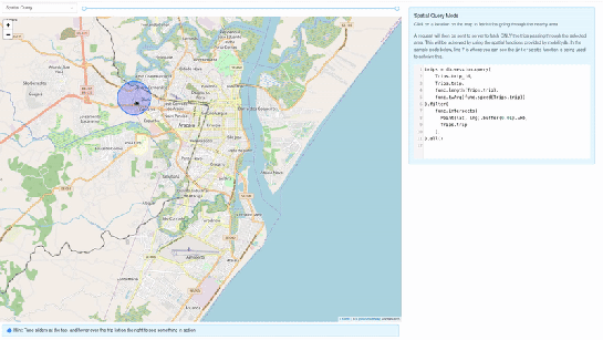
For this post, I have made a demo application which you can find live at https://mobilitydb-sqlalchemy-demo.adonmo.com/. The code for this demo app is open source and available on GitHub. Feel free to explore both the demo app and code!

In the following sections, I will explain the most important parts of this demo app, to show how to use mobilitydb-sqlalchemy in your own webapp. If you want to reproduce this demo, you can clone the demo repository and do a “docker-compose up –build” as it automatically sets up this docker image for you along with running the backend and frontend. Just follow the instructions in README.md for more details.

Declaring your models

For the demo, we used a very simple table – with just two columns – an id and a tgeompoint column for the trip data. Using mobilitydb-sqlalchemy this is as simple as defining any regular table:

from flask_sqlalchemy import SQLAlchemy
from mobilitydb_sqlalchemy import TGeomPoint

db = SQLAlchemy()

class Trips(db.Model):
   __tablename__ = "trips"
   trip_id = db.Column(db.Integer, primary_key=True)
   trip = db.Column(TGeomPoint)

Note: The library also allows you to use the Trajectory class from MovingPandas as well. More about this is explained later in this tutorial.

Populating data

When adding data to the table, mobilitydb-sqlalchemy expects data in the tgeompoint column to be a time indexed pandas dataframe, with two columns – one for the spatial data  called “geometry” with Shapely Point objects and one for the temporal data “t” as regular python datetime objects.

from datetime import datetime
from shapely.geometry import Point

# Prepare and insert the data
# Typically it won’t be hardcoded like this, but it might be coming from 
# other data sources like a different database or maybe csv files
df = pd.DataFrame(
   [
       {"geometry": Point(0, 0), "t": datetime(2012, 1, 1, 8, 0, 0),},
       {"geometry": Point(2, 0), "t": datetime(2012, 1, 1, 8, 10, 0),},
       {"geometry": Point(2, -1.9), "t": datetime(2012, 1, 1, 8, 15, 0),},
   ]
).set_index("t")

trip = Trips(trip_id=1, trip=df)
db.session.add(trip)
db.session.commit()

Writing queries

In the demo, you see two modes. Both modes were designed specifically to explain how functions defined within MobilityDB can be leveraged by our webapp.

1. All trips mode – In this mode, we extract all trip data, along with distance travelled within each trip, and the average speed in that trip, both computed by MobilityDB itself using the ‘length’, ‘speed’ and ‘twAvg’ functions. This example also shows that MobilityDB functions can be chained to form more complicated queries.

mobilitydb-sqlalchemy-demo-1

trips = db.session.query(
   Trips.trip_id,
   Trips.trip,
   func.length(Trips.trip),
   func.twAvg(func.speed(Trips.trip))
).all()

2. Spatial query mode – In this mode, we extract only selective trip data, filtered by a user-selected region of interest. We then make a query to MobilityDB to extract only the trips which pass through the specified region. We use MobilityDB’s ‘intersects’ function to achieve this filtering at the database level itself.

mobilitydb-sqlalchemy-demo-2

trips = db.session.query(
   Trips.trip_id,
   Trips.trip,
   func.length(Trips.trip),
   func.twAvg(func.speed(Trips.trip))
).filter(
   func.intersects(Point(lat, lng).buffer(0.01).wkb, Trips.trip),
).all()

Using MovingPandas Trajectory objects

Mobilitydb-sqlalchemy also provides first-class support for MovingPandas Trajectory objects, which can be installed as an optional dependency of this library. Using this Trajectory class instead of plain DataFrames allows us to make use of much richer functionality over trajectory data like analysis speed, interpolation, splitting and simplification of trajectory points, calculating bounding boxes, etc. To make use of this feature, you have set the use_movingpandas flag to True while declaring your model, as shown in the below code snippet.

class TripsWithMovingPandas(db.Model):
   __tablename__ = "trips"
   trip_id = db.Column(db.Integer, primary_key=True)
   trip = db.Column(TGeomPoint(use_movingpandas=True))

Now when you query over this table, you automatically get the data parsed into Trajectory objects without having to do anything else. This also works during insertion of data – you can directly assign your movingpandas Trajectory objects to the trip column. In the below code snippet we show how inserting and querying works with movingpandas mode.

from datetime import datetime
from shapely.geometry import Point

# Prepare and insert the data
# Typically it won’t be hardcoded like this, but it might be coming from 
# other data sources like a different database or maybe csv files
df = pd.DataFrame(
   [
       {"geometry": Point(0, 0), "t": datetime(2012, 1, 1, 8, 0, 0),},
       {"geometry": Point(2, 0), "t": datetime(2012, 1, 1, 8, 10, 0),},
       {"geometry": Point(2, -1.9), "t": datetime(2012, 1, 1, 8, 15, 0),},
   ]
).set_index("t")

geo_df = GeoDataFrame(df)
traj = mpd.Trajectory(geo_df, 1)

trip = Trips(trip_id=1, trip=traj)
db.session.add(trip)
db.session.commit()

# Querying over this table would automatically map the resulting tgeompoint 
# column to movingpandas’ Trajectory class
result = db.session.query(TripsWithMovingPandas).filter(
   TripsWithMovingPandas.trip_id == 1
).first()

print(result.trip.__class__)
# <class 'movingpandas.trajectory.Trajectory'>

Bonus: trajectory data serialization

Along with mobilitydb-sqlalchemy, recently I have also released trajectory data serialization/compression libraries based on Google’s Encoded Polyline Format Algorithm, for python and javascript called trajectory and trajectory.js respectively. These libraries let you send trajectory data in a compressed format, resulting in smaller payloads if sending your data through human-readable serialization formats like JSON. In some of the internal APIs we use at Adonmo, we have seen this reduce our response sizes by more than half (>50%) sometimes upto 90%.

Want to learn more about mobilitydb-sqlalchemy? Check out the quick start & documentation.


This post is part of a series. Read more about movement data in GIS.

Movement data in GIS #28: open geospatial tools for movement data exploration

We recently published a new paper on “Open Geospatial Tools for Movement Data Exploration” (open access). If you liked Movement data in GIS #26: towards a template for exploring movement data, you will find even more information about the context, challenges, and recent developments in this paper.

It also presents three open source stacks for movement data exploration:

  1. QGIS + PostGIS: a combination that will be familiar to most open source GIS users
  2. Jupyter + MovingPandas: less common so far, but Jupyter notebooks are quickly gaining popularity (even in the proprietary GIS world)
  3. GeoMesa + Spark: for when datasets become too big to handle using other means

and discusses their capabilities and limitations:


This post is part of a series. Read more about movement data in GIS.

Movement data in GIS #27: extracting trip origin clusters from MovingPandas trajectories

This post is a follow-up to the draft template for exploring movement data I wrote about in my previous post. Specifically, I want to address step 4: Exploring patterns in trajectory and event data.

The patterns I want to explore in this post are clusters of trip origins. The case study presented here is an extension of the MovingPandas ship data analysis notebook.

The analysis consists of 4 steps:

  1. Splitting continuous GPS tracks into individual trips
  2. Extracting trip origins (start locations)
  3. Clustering trip origins
  4. Exploring clusters

Since I have already removed AIS records with a speed over ground (SOG) value of zero from the dataset, we can use the split_by_observation_gap() function to split the continuous observations into individual trips. Trips that are shorter than 100 meters are automatically discarded as irrelevant clutter:

traj_collection.min_length = 100
trips = traj_collection.split_by_observation_gap(timedelta(minutes=5))

The split operation results in 302 individual trips:

Passenger vessel trajectories are blue, high-speed craft green, tankers red, and cargo vessels orange. Other vessel trajectories are gray.

To extract trip origins, we can use the get_start_locations() function. The list of column names defines which columns are carried over from the trajectory’s GeoDataFrame to the origins GeoDataFrame:

 
origins = trips.get_start_locations(['SOG', 'ShipType']) 

The following density-based clustering step is based on a blog post by Geoff Boeing and uses scikit-learn’s DBSCAN implementation:

from sklearn.cluster import DBSCAN
from geopy.distance import great_circle
from shapely.geometry import MultiPoint

origins['lat'] = origins.geometry.y
origins['lon'] = origins.geometry.x
matrix = origins.as_matrix(columns=['lat', 'lon'])

kms_per_radian = 6371.0088
epsilon = 0.1 / kms_per_radian

db = DBSCAN(eps=epsilon, min_samples=1, algorithm='ball_tree', metric='haversine').fit(np.radians(matrix))
cluster_labels = db.labels_
num_clusters = len(set(cluster_labels))
clusters = pd.Series([matrix[cluster_labels == n] for n in range(num_clusters)])
print('Number of clusters: {}'.format(num_clusters))

Resulting in 69 clusters.

Finally, we can add the cluster labels to the origins GeoDataFrame and plot the result:

origins['cluster'] = cluster_labels

To analyze the clusters, we can compute summary statistics of the trip origins assigned to each cluster. For example, we compute a representative (center-most) point, count the number of trips, and compute the mean speed (SOG) value:

 
def get_centermost_point(cluster):
    centroid = (MultiPoint(cluster).centroid.x, MultiPoint(cluster).centroid.y)
    centermost_point = min(cluster, key=lambda point: great_circle(point, centroid).m)
    return Point(tuple(centermost_point)[1], tuple(centermost_point)[0])
centermost_points = clusters.map(get_centermost_point) 

The largest cluster with a low mean speed (indicating a docking or anchoring location) is cluster 29 which contains 43 trips from passenger vessels, high-speed craft, an an undefined vessel:

To explore the overall cluster pattern, we can plot the clusters colored by speed and scaled by the number of trips:

Besides cluster 29, this visualization reveals multiple smaller origin clusters with low speeds that indicate different docking locations in the analysis area.

Cluster locations with high speeds on the other hand indicate locations where vessels enter the analysis area. In a next step, it might be interesting to compute flows between clusters to gain insights about connections and travel times.

It’s worth noting that AIS data contains additional information, such as vessel status, that could be used to extract docking or anchoring locations. However, the workflow presented here is more generally applicable to any movement data tracks that can be split into meaningful trips.

For the full interactive ship data analysis tutorial visit https://mybinder.org/v2/gh/anitagraser/movingpandas/binder-tag


This post is part of a series. Read more about movement data in GIS.

Movement data in GIS #26: towards a template for exploring movement data

Exploring new datasets can be challenging. Addressing this challenge, there is a whole field called exploratory data analysis that focuses on exploring datasets, often with visual methods.

Concerning movement data in particular, there’s a comprehensive book on the visual analysis of movement by Andrienko et al. (2013) and a host of papers, such as the recent state of the art summary by Andrienko et al. (2017).

However, while the literature does provide concepts, methods, and example applications, these have not yet translated into readily available tools for analysts to use in their daily work. To fill this gap, I’m working on a template for movement data exploration implemented in Python using MovingPandas. The proposed workflow consists of five main steps:

  1. Establishing an overview by visualizing raw input data records
  2. Putting records in context by exploring information from consecutive movement data records (such as: time between records, speed, and direction)
  3. Extracting trajectories & events by dividing the raw continuous tracks into individual trajectories and/or events
  4. Exploring patterns in trajectory and event data by looking at groups of the trajectories or events
  5. Analyzing outliers by looking at potential outliers and how they may challenge preconceived assumptions about the dataset characteristics

To ensure a reproducible workflow, I’m designing the template as a a Jupyter notebook. It combines spatial and non-spatial plots using the awesome hvPlot library:

This notebook is a work-in-progress and you can follow its development at http://exploration.movingpandas.org. Your feedback is most welcome!


References

  • Andrienko G, Andrienko N, Bak P, Keim D, Wrobel S (2013) Visual analytics of movement. Springer Science & Business Media.
  • Andrienko G, Andrienko N, Chen W, Maciejewski R, Zhao Y (2017) Visual Analytics of Mobility and Transportation: State of the Art and Further Research Directions. IEEE Transactions on Intelligent Transportation Systems 18(8):2232–2249, DOI 10.1109/TITS.2017.2683539

Movement data in GIS #25: moving object databases

Recently there has been some buzz on Twitter about a new moving object database (MOD) called MobilityDB that builds on PostgreSQL and PostGIS (Zimányi et al. 2019). The MobilityDB Github repo has been published in February 2019 but according to the following presentation at PgConf.Russia 2019 it has been under development for a few years:

Of course, moving object databases have been around for quite a while. The two most commonly cited MODs are HermesDB (Pelekis et al. 2008) which comes as an extension for either PostgreSQL or Oracle and is developed at the University of Piraeus and SECONDO (de Almeida et al. 2006) which is a stand-alone database system developed at the Fernuniversität Hagen. However, both MODs remain at the research prototype level and have not achieved broad adoption.

It will be interesting to see if MobilityDB will be able to achieve the goal they have set in the title of Zimányi et al. (2019) to become “a mainstream moving object database system”. It’s promising that they are building on PostGIS and using its mature spatial analysis functionality instead of reinventing the wheel. They also discuss why they decided that PostGIS trajectories (which I’ve written about in previous posts) are not the way to go:

However, the presentation does not go into detail whether there are any straightforward solutions to visualizing data stored in MobilityDB.

According to the Github readme, MobilityDB runs on Linux and needs PostGIS 2.5. They also provide an online demo as well as a Docker container with MobilityDB and all its dependencies. If you give it a try, I would love to hear about your experiences.

References

  • de Almeida, V. T., Guting, R. H., & Behr, T. (2006). Querying moving objects in secondo. In 7th International Conference on Mobile Data Management (MDM’06) (pp. 47-47). IEEE.
  • Pelekis, N., Frentzos, E., Giatrakos, N., & Theodoridis, Y. (2008). HERMES: aggregative LBS via a trajectory DB engine. In Proceedings of the 2008 ACM SIGMOD international conference on Management of data (pp. 1255-1258). ACM.
  • Zimányi, E., Sakr, M., Lesuisse, A., & Bakli, M. (2019). MobilityDB: A Mainstream Moving Object Database System. In Proceedings of the 16th International Symposium on Spatial and Temporal Databases (pp. 206-209). ACM.

This post is part of a series. Read more about movement data in GIS.

Movement data in GIS #24: MovingPandas hands-on tutorials

Last week, I had the pleasure to give a movement data analysis workshop at the OpenGeoHub summer school at the University of Münster in Germany. The workshop materials consist of three Jupyter notebooks that have been designed to also support self-study outside of a workshop setting. So you can try them out as well!

All materials are available on Github:

  • Tutorial 0 provides an introduction to the MovingPandas Trajectory class.
  • Tutorials 1 and 2 provide examples with real-world datasets covering one day of ship movement near Gothenburg and multiple years of gull migration, respectively.

Here’s a quick preview of the bird migration data analysis tutorial (click for full size):

Tutorial 2: Bird migration data analysis

You can run all three Jupyter notebooks online using MyBinder (no installations required).

Alternatively or if you want to dig deeper: installation instructions are available on movingpandas.org

The OpenGeoHub summer school this year had a strong focus on spatial analysis with R and GRASS (sometimes mixing those two together). It was great to meet @mdsumner (author of R trip) and @edzerpebesma (author of R trajectories) for what might have well been the ultimate movement data libraries geek fest. In the ultimate R / Python cross-over,  0_getting_started.Rmd

Both talks and workshops have been recorded. Here’s the introduction:

and this is the full workshop recording:


This post is part of a series. Read more about movement data in GIS.

Movement data in GIS #23: trajectories in context

Today’s post continues where “Why you should be using PostGIS trajectories” leaves off. It’s the result of a collaboration with Eva Westermeier. I had the pleasure to supervise her internship at AIT last year and also co-supervised her Master’s thesis [0] on the topic of enriching trajectories with information about their geographic context.

Context-aware analysis of movement data is crucial for different domains and applications, from transport to ecology. While there is a wealth of data, efficient and user-friendly contextual trajectory analysis is still hampered by a lack of appropriate conceptual approaches and practical methods. (Westermeier, 2018)

Part of the work was focused on evaluating different approaches to adding context information from vector datasets to trajectories in PostGIS. For example, adding land cover context to animal movement data or adding information on anchoring and harbor areas to vessel movement data.

Classic point-based model vs. line-based model

The obvious approach is to intersect the trajectory points with context data. This is the classic point data model of contextual trajectories. It’s straightforward to add context information in the point-based model but it also generates large numbers of repeating annotations. In contrast, the line data model using, for example, PostGIS trajectories (LinestringM) is more compact since trajectories can be split into segments at context borders. This creates one annotation per segment and the individual segments are convenient to analyze (as described in part #12).

Spatio-temporal interpolation as provided by the line data model offers additional advantages for the analysis of annotated segments. Contextual segments start and end at the intersection of the trajectory linestring with context polygon borders. This means that there are no gaps like in the point-based model. Consequently, while the point-based model systematically underestimates segment length and duration, the line-based approach offers more meaningful segment length and duration measurements.

Schematic illustration of a subset of an annotated trajectory in two context classes, a) systematic underestimation of length or duration in the point data model, b) full length or duration between context polygon borders in the line data model (source: Westermeier (2018))

Another issue of the point data model is that brief context changes may be missed or represented by just one point location. This makes it impossible to compute the length or duration of the respective context segment. (Of course, depending on the application, it can be desirable to ignore brief context changes and make the annotation process robust towards irrelevant changes.)

Schematic illustration of context annotation for brief context changes, a) and b)
two variants for the point data model, c) gapless annotation in the line data model (source: Westermeier (2018) based on Buchin et al. (2014))

Beyond annotations, context can also be considered directly in an analysis, for example, when computing distances between trajectories and contextual point objects. In this case, the point-based approach systematically overestimates the distances.

Schematic illustration of distance measurement from a trajectory to an external
object, a) point data model, b) line data model (source: Westermeier (2018))

The above examples show that there are some good reasons to dump the classic point-based model. However, the line-based model is not without its own issues.

Issues

Computing the context annotations for trajectory segments is tricky. The main issue is that ST_Intersection drops the M values. This effectively destroys our trajectories! There are ways to deal with this issue – and the corresponding SQL queries are published in the thesis (p. 38-40) – but it’s a real bummer. Basically, ST_Intersection only provides geometric output. Therefore, we need to reconstruct the temporal information in order to create usable trajectory segments.

Finally, while the line-based model is well suited to add context from other vector data, it is less useful for context data from continuous rasters but that was beyond the scope of this work.

Conclusion

After the promising results of my initial investigations into PostGIS trajectories, I was optimistic that context annotations would be a straightforward add-on. The line-based approach has multiple advantages when it comes to analyzing contextual segments. Unfortunately, generating these contextual segments is much less convenient and also slower than I had hoped. Originally, I had planned to turn this work into a plugin for the Processing toolbox but the results of this work motivated me to look into other solutions. You’ve already seen some of the outcomes in part #20 “Trajectools v1 released!”.

References

[0] Westermeier, E.M. (2018). Contextual Trajectory Modeling and Analysis. Master Thesis, Interfaculty Department of Geoinformatics, University of Salzburg.


This post is part of a series. Read more about movement data in GIS.

Movement data in GIS #20: Trajectools v1 released!

In previous posts, I already wrote about Trajectools and some of the functionality it provides to QGIS Processing including:

There are also tools to compute heading and speed which I only talked about on Twitter.

Trajectools is now available from the QGIS plugin repository.

The plugin includes sample data from MarineCadastre downloads and the Geolife project.

Under the hood, Trajectools depends on GeoPandas!

If you are on Windows, here’s how to install GeoPandas for OSGeo4W:

  1. OSGeo4W installer: install python3-pip
  2. Environment variables: add GDAL_VERSION = 2.3.2 (or whichever version your OSGeo4W installation currently includes)
  3. OSGeo4W shell: call C:\OSGeo4W64\bin\py3_env.bat
  4. OSGeo4W shell: pip3 install geopandas (this will error at fiona)
  5. From https://www.lfd.uci.edu/~gohlke/pythonlibs/#fiona: download Fiona-1.7.13-cp37-cp37m-win_amd64.whl
  6. OSGeo4W shell: pip3 install path-to-download\Fiona-1.7.13-cp37-cp37m-win_amd64.whl
  7. OSGeo4W shell: pip3 install geopandas
  8. (optionally) From https://www.lfd.uci.edu/~gohlke/pythonlibs/#rtree: download Rtree-0.8.3-cp37-cp37m-win_amd64.whl and pip3 install it

If you want to use this functionality outside of QGIS, head over to my movingpandas project!

Back to Top

Sustaining Members