If you downloaded Trajectools 2.1 and ran into troubles due to the introduced scikit-mobility and gtfs_functions dependencies, please update to Trajectools 2.2.
This new version makes it easier to set up Trajectools since MovingPandas is pip-installable on most systems nowadays and scikit-mobility and gtfs_functions are now truly optional dependencies. If you don’t install them, you simply will not see the extra algorithms they add:
If you encounter any other issues with Trajectools or have questions regarding its usage, please let me know in the Trajectools Discussions on Github.
Today marks the 2.1 release of Trajectools for QGIS. This release adds multiple new algorithms and improvements. Since some improvements involve upstream MovingPandas functionality, I recommend to also update MovingPandas while you’re at it.
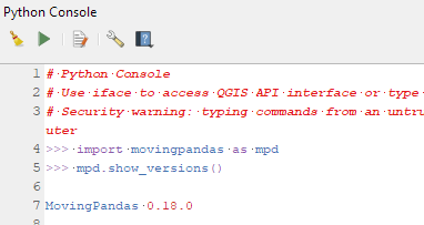
If you have installed QGIS and MovingPandas via conda / mamba, you can simply:
Afterwards, you can check that the library was correctly installed using:
import movingpandas as mpd
mpd.show_versions()
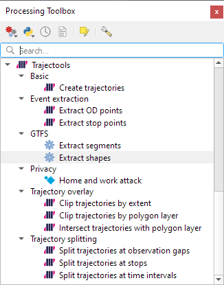
Trajectools 2.1
The new Trajectools algorithms are:
Trajectory overlay — Intersect trajectories with polygon layer
Privacy — Home work attack (requires scikit-mobility)
This algorithm determines how easy it is to identify an individual in a dataset. In a home and work attack the adversary knows the coordinates of the two locations most frequently visited by an individual.
Furthermore, we have fixed issue with previously ignored minimum trajectory length settings.
Scikit-mobility and gtfs_functions are optional dependencies. You do not need to install them, if you do not want to use the corresponding algorithms. In any case, they can be installed using mamba and pip:
There are a couple of existing plugins that deal with GTFS. However, in my experience, they either don’t integrate with Processing and/or don’t provide the functions I was expecting.
So far, we have two GTFS algorithms to cover essential public transport analysis needs:
The “Extract shapes” algorithm gives us the public transport routes:
The “Extract segments” algorithm has one more options. In addition to extracting the segments between public transport stops, it can also enrich the segments with the scheduled vehicle speeds:
Here you can see the scheduled speeds:
To show the stops, we can put marker line markers on the segment start and end locations:
The segments contain route information and stop names, so these can be extracted and used for labeling as well:
This is the first version without the “experimental” flag. If you look at the plugin release history, you will see that the previous release was from 2020. That’s quite a while ago and a lot has happened since, including the development of MovingPandas.
Let’s have a look what’s new!
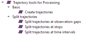
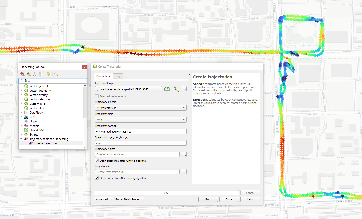
The old “Trajectories from point layer”, “Add heading to points”, and “Add speed (m/s) to points” algorithms have been superseded by the new “Create trajectories” algorithm which automatically computes speeds and headings when creating the trajectory outputs.
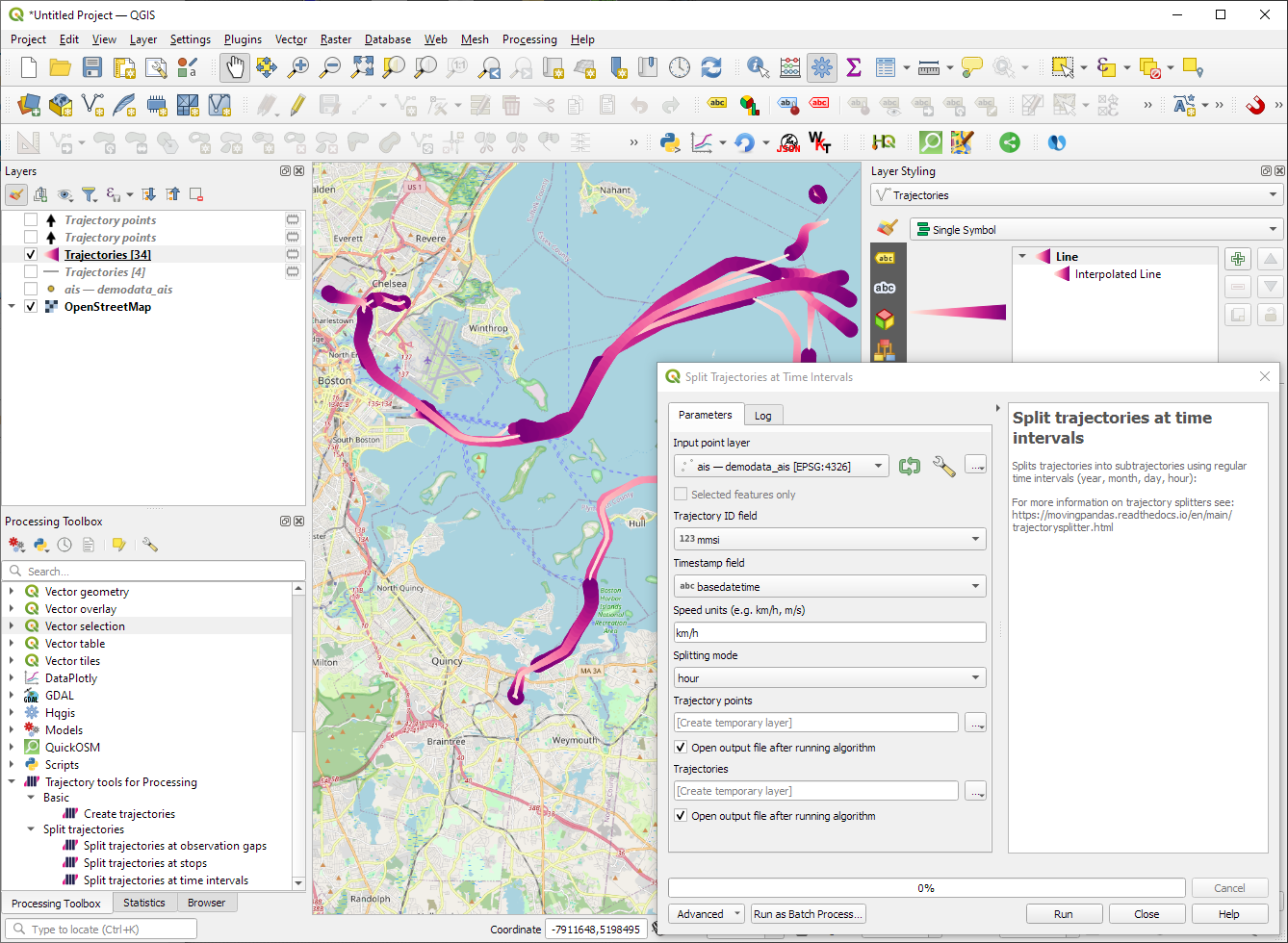
“Day trajectories from point layer” is covered by the new “Split trajectories at time intervals” which supports splitting by hour, day, month, and year.
“Clip trajectories by extent” still exists but, additionally, we can now also “Clip trajectories by polygon layer”
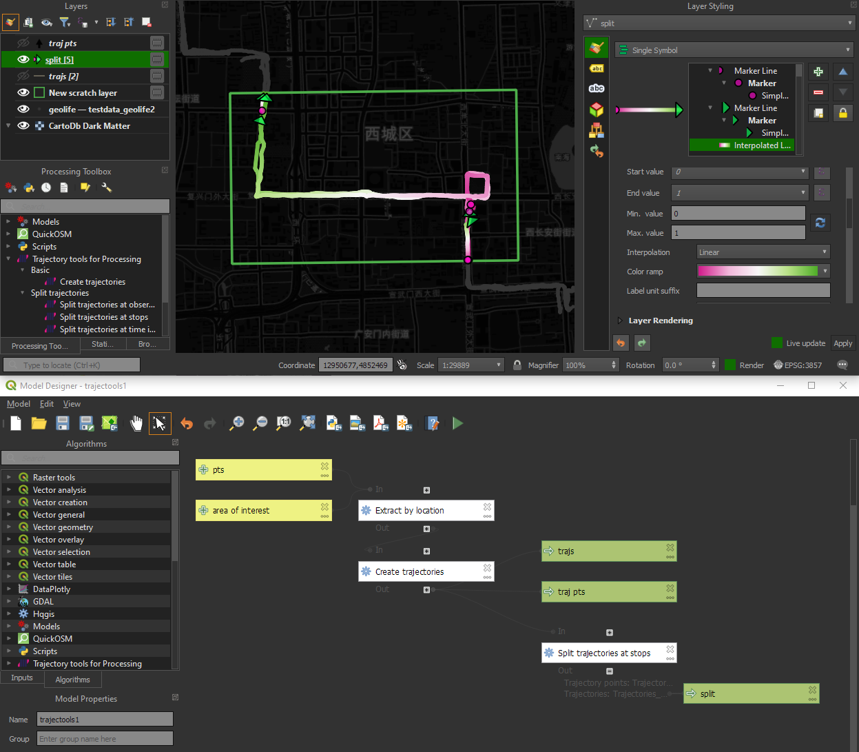
There are two new event extraction algorithms to “Extract OD points” and “Extract OD points”, as well as the related “Split trajectories at stops”. Additionally, we can also “Split trajectories at observation gaps”.
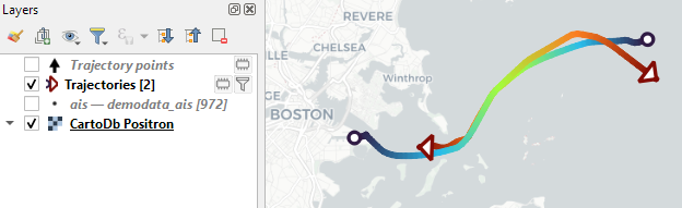
Trajectory outputs, by default, come as a pair of a point layer and a line layer. Depending on your use case, you can use both or pick just one of them. By default, the line layer is styled with a gradient line that makes it easy to see the movement direction:
while the default point layer style shows the movement speed:
How to use Trajectools
Trajectools 2.0 is powered by MovingPandas. You will need to install MovingPandas in your QGIS Python environment. I recommend installing both QGIS and MovingPandas from conda-forge:
The plugin download includes small trajectory sample datasets so you can get started immediately.
Outlook
There is still some work to do to reach feature parity with MovingPandas. Stay tuned for more trajectory algorithms, including but not limited to down-sampling, smoothing, and outlier cleaning.
I’m also reviewing other existing QGIS plugins to see how they can complement each other. If you know a plugin I should look into, please leave a note in the comments.
I’m continuously testing the algorithms integrated so far to see if they work as GIS users would expect and can to ensure that they can be integrated in Processing model seamlessly.
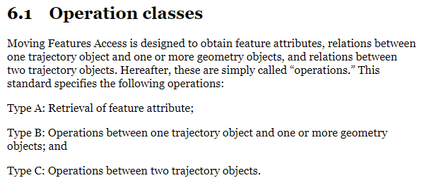
Because naming things is tricky, I’m currently struggling with how to best group the toolbox algorithms into meaningful categories. I looked into the categories mentioned in OGC Moving Features Access but honestly found them kind of lacking:
… but I’m not convinced yet. So take the above listed three categories with a grain of salt. Those may change before the release. (Any inputs / feedback / recommendation welcome!)
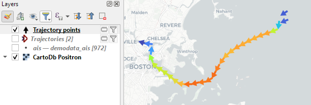
Let me close this quick status update with a screencast showcasing stop detection in AIS data, featuring the recently added trajectory styling using interpolated lines:
Trajectools development started back in 2018 but has been on hold since 2020 when I realized that it would be necessary to first develop a solid trajectory analysis library. With the MovingPandas library in place, I’ve now started to reboot Trajectools.
Trajectools v2 builds on MovingPandas and exposes its trajectory analysis algorithms in the QGIS Processing Toolbox. So far, I have integrated the basic steps of
Building trajectories including speed and direction information from timestamped points and
Splitting trajectories at observation gaps, stops, or regular time intervals.
The algorithms create two output layers:
Trajectory points with speed and direction information that are styled using arrow markers
Trajectories as LineStringMs which makes it straightforward to count the number of trajectories and to visualize where one trajectory ends and another starts.
So far, the default style for the trajectory points is hard-coded to apply the Turbo color ramp on the speed column with values from 0 to 50 (since I’m simply loading a ready-made QML). By default, the speed is calculated as km/h but that can be customized:
I don’t have a solution yet to automatically create a style for the trajectory lines layer. Ideally, the style should be a categorized renderer that assigns random colors based on the trajectory id column. But in this case, it’s not enough to just load a QML.
In the meantime, I might instead include an Interpolated Line style. What do you think?
Of course, the goal is to make Trajectools interoperable with as many existing QGIS Processing Toolbox algorithms as possible to enable efficient Mobility Data Science workflows.
The easiest way to set up QGIS with MovingPandas Python environment is to install both from conda. You can find the instructions together with the latest Trajectools development version at: https://github.com/movingpandas/qgis-processing-trajectory
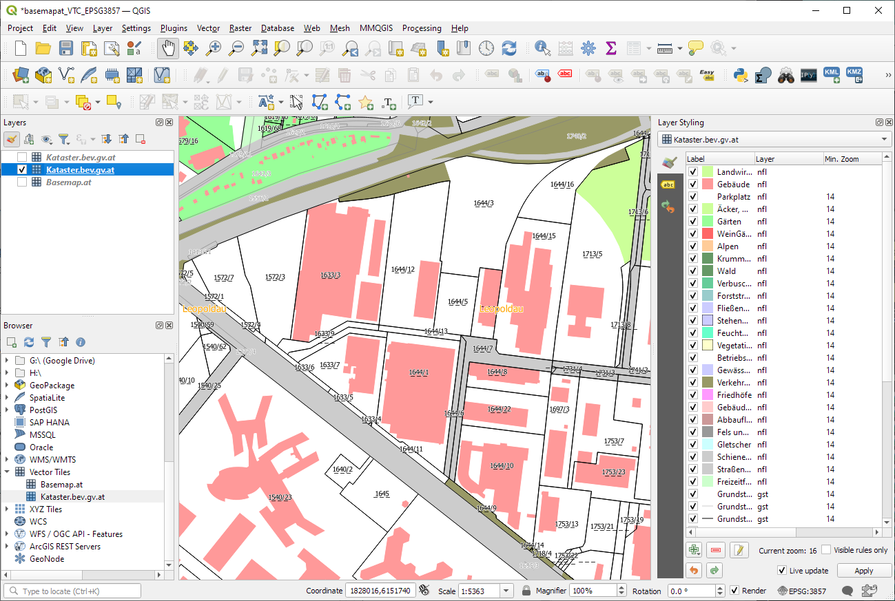
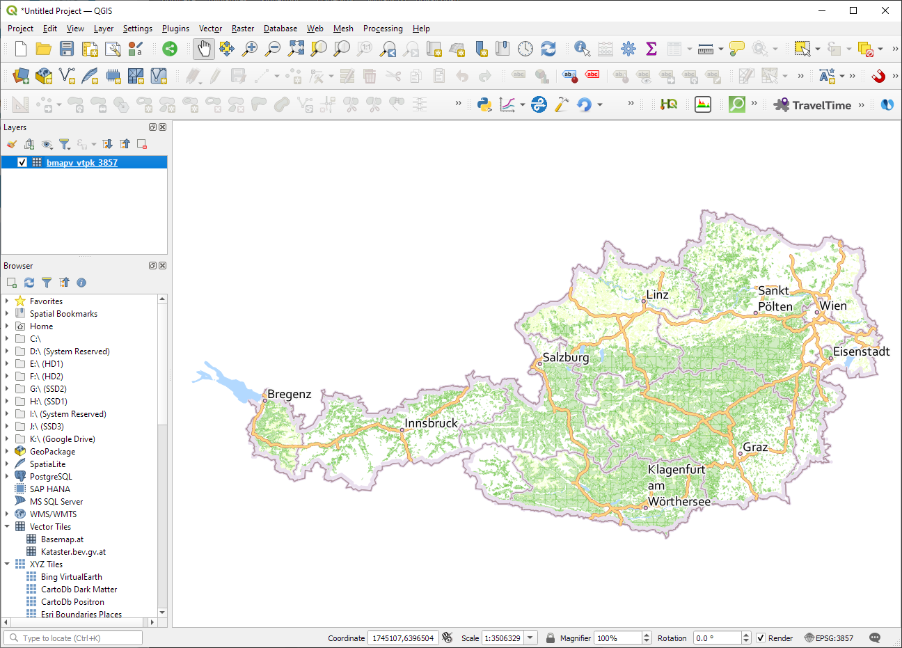
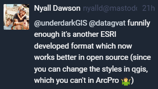
ESRI vector tile packages (VTPK files) can now be opened directly as vector tile layers via drag and drop, including support for style translation.
This is great news, particularly for users from Austria, since this makes it possible to use the open government basemap.at vector tiles directly, without any fuss:
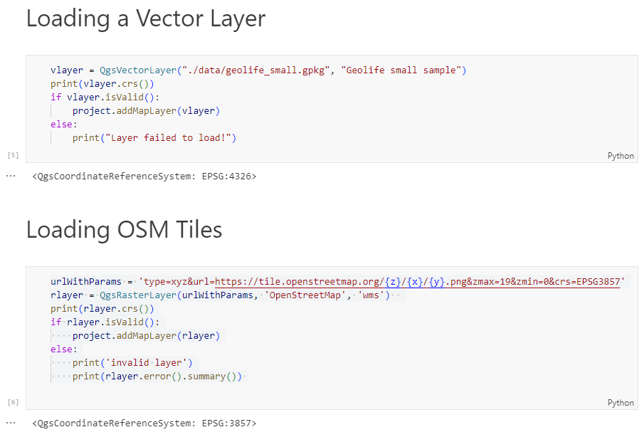
Today, we’ll take the next step and add basemaps to our maps. This is trickier than I would have expected. In particular, I was fighting with “invalid” OSM tile layers until I realized that my QGIS application instance somehow lacked the “WMS” provider.
In addition, getting basemaps to work also means that we have to take care of layer and project CRSes and on-the-fly reprojections. So let’s get to work:
from IPython.display import Image
from PyQt5.QtGui import QColor
from PyQt5.QtWidgets import QApplication
from qgis.core import QgsApplication, QgsVectorLayer, QgsProject, QgsRasterLayer, \
    QgsCoordinateReferenceSystem, QgsProviderRegistry, QgsSimpleMarkerSymbolLayerBase
from qgis.gui import QgsMapCanvas
app = QApplication([])
qgs = QgsApplication([], False)
qgs.setPrefixPath(r"C:\temp", True)  # setting a prefix path should enable the WMS provider
qgs.initQgis()
canvas = QgsMapCanvas()
project = QgsProject.instance()
map_crs = QgsCoordinateReferenceSystem('EPSG:3857')
canvas.setDestinationCrs(map_crs)
print("providers: ", QgsProviderRegistry.instance().providerList())
To add an OSM basemap, we use the xyz tiles option of the WMS provider:
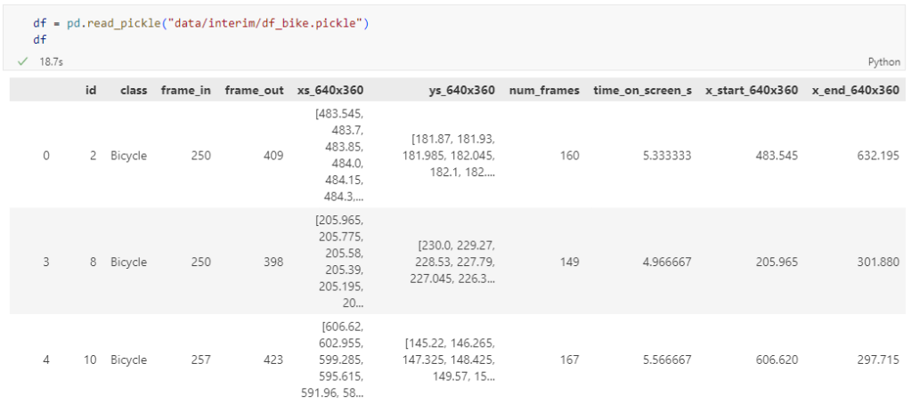
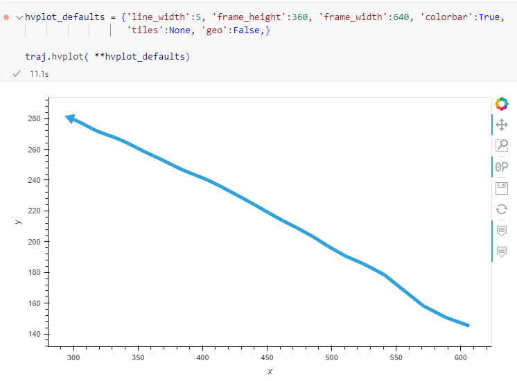
The bicycle trajectory coordinates are stored in two separate lists: xs_640x360 and ys640x360:
This format is kind of similar to the Kaggle Taxi dataset, we worked with in the previous post. However, to use the solution we implemented there, we need to combine the x and y coordinates into nice (x,y) tuples:
Afterwards, we can create the points and compute the proper timestamps from the frame numbers:
def compute_datetime(row):
    # some educated guessing going on here: the paper states that the video covers 2021-06-09 07:00-08:00
    d = datetime(2021,6,9,7,0,0) + (row['frame_in'] + row['running_number']) * timedelta(seconds=2)
    return d
def create_point(xy):
    try:
        return Point(xy)
    except TypeError:  # when there are nan values in the input data
        return None
new_df = df.head().explode('coordinates')
new_df['geometry'] = new_df['coordinates'].apply(create_point)
new_df['running_number'] = new_df.groupby('id').cumcount()
new_df['datetime'] = new_df.apply(compute_datetime, axis=1)
new_df.drop(columns=['coordinates', 'frame_in', 'running_number'], inplace=True)
new_df
Once the points and timestamps are ready, we can create the MovingPandas TrajectoryCollection. Note how we explicitly state that there is no CRS for this dataset (crs=None):
Similarly, to plot these trajectories, we should tell hvplot that it should not fetch any background map tiles (’tiles’:None) and that the coordinates are not geographic (‘geo’:False):
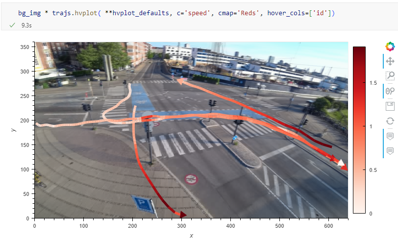
One important caveat is that speed will be calculated in pixels per second. So when we plot the bicycle speed, the segments closer to the camera will appear faster than the segments in the background:
To fix this issue, we would have to correct for the distortions of the camera lens and perspective. I’m sure that there is specialized software for this task but, for the purpose of this post, I’m going to grab the opportunity to finally test out the VectorBender plugin.
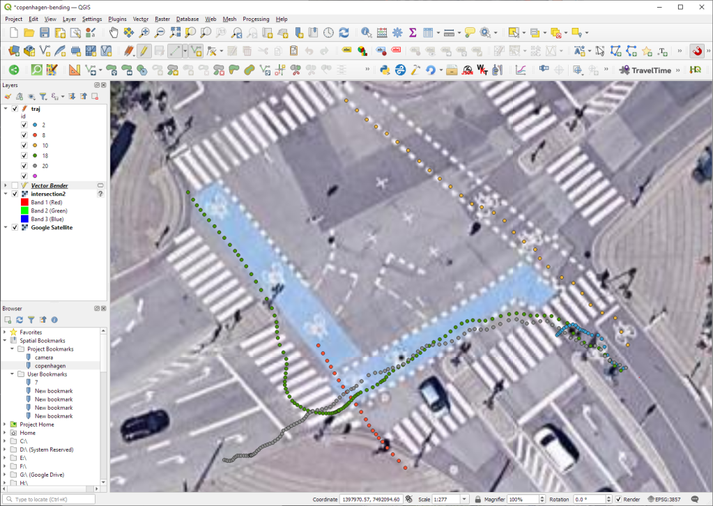
Georeferencing the trajectories using QGIS VectorBender plugin
Let’s load the five test trajectories and the camera image to QGIS. To make sure that they align properly, both are set to the same CRS and I’ve created the following basic world file for the camera image:
1
0
0
-1
0
360
Then we can use the VectorBender tools to georeference the trajectories by linking locations from the camera image to locations on aerial images. You can see the whole process in action here:
After around 15 minutes linking control points, VectorBender comes up with the following georeferenced trajectory result:
Not bad for a quick-and-dirty hack. Some points on the borders of the image could not be georeferenced since I wasn’t always able to identify suitable control points at the camera image borders. So it won’t be perfect but should improve speed estimates.
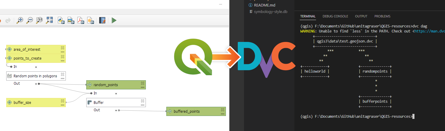
DVC tracks data, parameters, and code. If anything changes, we simply rerun the process and DVC will figure out which stages need to be recomputed and which can be skipped by re-using cached results.
This can lead to huge time savings compared to re-running the whole model
I’m using DVC with the DVC plugin for VSCode but DVC can be used completely from the command line, if you prefer this appraoch.
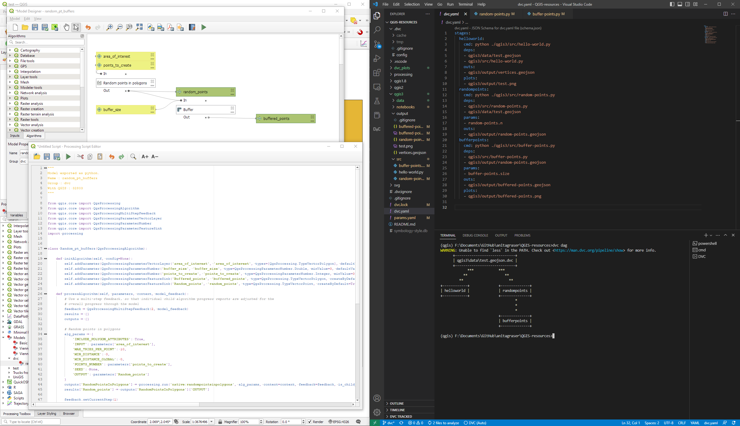
Basically, what follows is a proof of concept: converting a QGIS Processing model to a DVC workflow. In the following screenshot, you can see the main stages
The QGIS model in the upper left corner
The Python script exported from the QGIS model builder in the lower left corner
The DVC stages in my dvc.yaml file in the upper right corner (And please ignore the hello world stage. It’s a left over from my first experiment)
The DVC DAG visualizing the sequence of stages. Looks similar to the QGIS model, doesn’t it ;-)
Besides the stage definitions in dvc.yaml, there’s a parameters file:
random-points:
  n: 10
buffer-points:
  size: 0.5
And, of course, the two stages, each as it’s own Python script.
First, random-points.py which reads the random-points.n parameter to create the desired number of points within the polygon defined in qgis3/data/test.geojson:
With these things in place, we can use dvc to run the workflow, either from within VSCode or from the command line. Here, you can see the workflow (and how dvc skips stages and fetches results from cache) in action:
If you try it out yourself, let me know what you think.
Similarly, we’ve seen posts on using PyQGIS in Jupyter notebooks. However, I find the setup with *.bat files rather tricky.
This post presents a way to set up a conda environment with QGIS that is ready to be used in Jupyter notebooks.
The first steps are to create a new environment and install QGIS. I use mamba for the installation step because it is faster than conda but you can use conda as well:
If we now try to import the qgis module in Python, we get an error:
(qgis) PS C:\Users\anita> python
Python 3.9.15 | packaged by conda-forge | (main, Nov 22 2022, 08:41:22) [MSC v.1929 64 bit (AMD64)] on win32
Type "help", "copyright", "credits" or "license" for more information.
>>> import qgis
Traceback (most recent call last):
  File "<stdin>", line 1, in <module>
ModuleNotFoundError: No module named 'qgis'
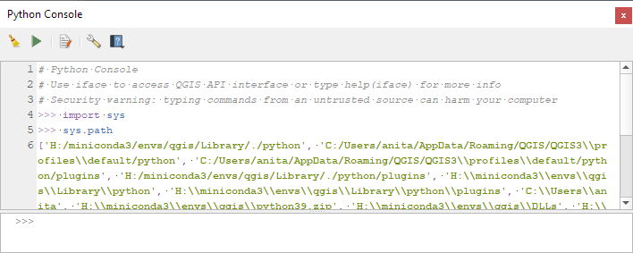
To fix this error, we need to get the paths from the Python console inside QGIS:
In the previous post, we — creatively ;-) — used MobilityDB to visualize stationary IOT sensor measurements.
This post covers the more obvious use case of visualizing trajectories. Thus bringing together the MobilityDB trajectories created in Detecting close encounters using MobilityDB 1.0 and visualization using Temporal Controller.
Like in the previous post, the valueAtTimestamp function does the heavy lifting. This time, we also apply it to the geometry time series column called trip:
Today’s post presents an experiment in modelling a common scenario in many IOT setups: time series of measurements at stationary sensors. The key idea I want to explore is to use MobilityDB’s temporal data types, in particular the tfloat_inst and tfloat_seq for instances and sequences of temporal float values, respectively.
For info on how to set up MobilityDB, please check my previous post.
Setting up our DB tables
As a toy example, let’s create two IOT devices (in table iot_devices) with three measurements each (in table iot_measurements) and join them to create the tfloat_seq (in table iot_joined):
CREATE TABLE iot_devices (
    id integer,
    geom geometry(Point, 4326)
);

INSERT INTO iot_devices (id, geom) VALUES
(1, ST_SetSRID(ST_MakePoint(1,1), 4326)),
(2, ST_SetSRID(ST_MakePoint(2,3), 4326));

CREATE TABLE iot_measurements (
    device_id integer,
    t timestamp,
    measurement float
);

INSERT INTO iot_measurements (device_id, t, measurement) VALUES
(1, '2022-10-01 12:00:00', 5.0),
(1, '2022-10-01 12:01:00', 6.0),
(1, '2022-10-01 12:02:00', 10.0),
(2, '2022-10-01 12:00:00', 9.0),
(2, '2022-10-01 12:01:00', 6.0),
(2, '2022-10-01 12:02:00', 1.5);

CREATE TABLE iot_joined AS
SELECT
    dev.id,
    dev.geom,
    tfloat_seq(array_agg(
        tfloat_inst(m.measurement, m.t) ORDER BY t
    )) measurements
FROM iot_devices dev
JOIN iot_measurements m
  ON dev.id = m.device_id
GROUP BY dev.id, dev.geom;
We can load the resulting layer in QGIS but QGIS won’t be happy about the measurements column because it does not recognize its data type:
Query layer with valueAtTimestamp
Instead, what we can do is create a query layer that fetches the measurement value at a specific timestamp:
SELECT id, geom,
    valueAtTimestamp(measurements, '2022-10-01 12:02:00')
FROM iot_joined
Which gives us a layer that QGIS is happy with:
Time for TemporalController
Now the tricky question is: how can we wire our query layer to the Temporal Controller so that we can control the timestamp and animate the layer?
I don’t have a GUI solution yet but here’s a way to do it with PyQGIS: whenever the Temporal Controller signal updateTemporalRange is emitted, our update_query_layer function gets the current time frame start time and replaces the datetime in the query layer’s data source with the current time:
l = iface.activeLayer()
tc = iface.mapCanvas().temporalController()

def update_query_layer():
    tct = tc.dateTimeRangeForFrameNumber(tc.currentFrameNumber()).begin().toPyDateTime()
    s = l.source()
    new = re.sub(r"(\d{4})-(\d{2})-(\d{2}) (\d{2}):(\d{2}):(\d{2})", str(tct), s)
    l.setDataSource(new, l.sourceName(), l.dataProvider().name())

tc.updateTemporalRange.connect(update_query_layer)
Future experiments will have to show how this approach performs on lager datasets but it’s exciting to see how MobilityDB’s temporal types may be visualized in QGIS without having to create tables/views that join a geometry to each and every individual measurement.
It’s been a while since we last talked about MobilityDB in 2019 and 2020. Since then, the project has come a long way. It joined OSGeo as a community project and formed a first PSC, including the project founders Mahmoud Sakr and Esteban Zimányi as well as Vicky Vergara (of pgRouting fame) and yours truly.
This post is a quick teaser tutorial from zero to computing closest points of approach (CPAs) between trajectories using MobilityDB.
Setting up MobilityDB with Docker
The easiest way to get started with MobilityDB is to use the ready-made Docker container provided by the project. I’m using Docker and WSL (Windows Subsystem Linux on Windows 10) here. Installing WLS/Docker is out of scope of this post. Please refer to the official documentation for your operating system.
Once Docker is ready, we can pull the official container and fire it up:
Currently, the container provides PostGIS 3.2 and MobilityDB 1.0:
Loading movement data into MobilityDB
Once the container is running, we can already connect to it from QGIS. This is my preferred way to load data into MobilityDB because we can simply drag-and-drop any timestamped point layer into the database:
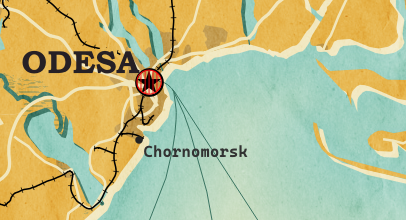
For this post, I’m using an AIS data sample in the region of Gothenburg, Sweden.
After loading this data into a new table called ais, it is necessary to remove duplicate and convert timestamps:
CREATE TABLE AISInputFiltered AS
SELECT DISTINCT ON("MMSI","Timestamp") *
FROM ais;

ALTER TABLE AISInputFiltered ADD COLUMN t timestamp;
UPDATE AISInputFiltered SET t = "Timestamp"::timestamp;
Afterwards, we can create the MobilityDB trajectories:
CREATE TABLE Ships AS
SELECT "MMSI" mmsi,
tgeompoint_seq(array_agg(tgeompoint_inst(Geom, t) ORDER BY t)) AS Trip,
tfloat_seq(array_agg(tfloat_inst("SOG", t) ORDER BY t) FILTER (WHERE "SOG" IS NOT NULL) ) AS SOG,
tfloat_seq(array_agg(tfloat_inst("COG", t) ORDER BY t) FILTER (WHERE "COG" IS NOT NULL) ) AS COG
FROM AISInputFiltered
GROUP BY "MMSI";

ALTER TABLE Ships ADD COLUMN Traj geometry;
UPDATE Ships SET Traj = trajectory(Trip);
Once this is done, we can load the resulting Ships layer and the trajectories will be loaded as lines:
Computing closest points of approach
To compute the closest point of approach between two moving objects, MobilityDB provides a shortestLine function. To be correct, this function computes the line connecting the nearest approach point between the two tgeompoint_seq. In addition, we can use the time-weighted average function twavg to compute representative average movement speeds and eliminate stationary or very slowly moving objects:
SELECT S1.MMSI mmsi1, S2.MMSI mmsi2,
       shortestLine(S1.trip, S2.trip) Approach,
       ST_Length(shortestLine(S1.trip, S2.trip)) distance
FROM Ships S1, Ships S2
WHERE S1.MMSI > S2.MMSI AND
twavg(S1.SOG) > 1 AND twavg(S2.SOG) > 1 AND
dwithin(S1.trip, S2.trip, 0.003)
In the QGIS Browser panel, we can right-click the MobilityDB connection to bring up an SQL input using Execute SQL:
The resulting query layer shows where moving objects get close to each other:
To better see what’s going on, we’ll look at individual CPAs:
Having a closer look with the Temporal Controller
Since our filtered AIS layer has proper timestamps, we can animate it using the Temporal Controller. This enables us to replay the movement and see what was going on in a certain time frame.
I let the animation run and stopped it once I spotted a close encounter. Looking at the AIS points and the shortest line, we can see that MobilityDB computed the CPAs along the trajectories:
A more targeted way to investigate a specific CPA is to use the Temporal Controllers’ fixed temporal range mode to jump to a specific time frame. This is helpful if we already know the time frame we are interested in. For the CPA use case, this means that we can look up the timestamp of a nearby AIS position and set up the Temporal Controller accordingly:
More
I hope you enjoyed this quick dive into MobilityDB. For more details, including talks by the project founders, check out the project website.
Cartographers use all kind of tricks to make their maps look deceptively simple. Yet, anyone who has ever tried to reproduce a cartographer’s design using only automatic GIS styling and labeling knows that the devil is in the details.
This post was motivated by Mika Hall’s retro map style.
New print designs on the way: these are some snippets from a project I began last year to map the provinces of Spain in a retro style, which I've decided to revisit this summer. Prints will be available later in the year! pic.twitter.com/gUJirBFv0x
There are a lot of things going on in this design but I want to draw your attention to the labels – and particularly their background:
Detail of Mike’s map (c) Mike Hall. You can see that the rail lines stop right before they would touch the A in Valencia (or any other letters in the surrounding labels).
This kind of effect cannot be achieved by good old label buffers because no matter which color we choose for the buffer, there will always be cases when the chosen color is not ideal, for example, when some labels are on land and some over water:
Ordinary label buffers are not always ideal.
Label masks to the rescue!
Selective label masks enable more advanced designs.
Here’s how it’s done:
Selective masking has actually been around since QGIS 3.12. There are two things we need to take care of when setting up label masks:
1. First we need to enable masks in the label settings for all labels we want to mask (for example the city labels). The mask tab is conveniently located right next to the label buffer tab:
2. Then we can go to the layers we want to apply the masks to (for example the railroads layer). Here we can configure which symbol layers should be affected by which mask:
Note: The order of steps is important here since the “Mask sources” list will be empty as long as we don’t have any label masks enabled and there is currently no help text explaining this fact.
I’m also using label masks to keep the inside of the large city markers (the ones with a star inside a circle) clear of visual clutter. In short, I’m putting a circle-shaped character, such as ◍, over the city location:
In the text tab, we can specify our one-character label and – later on – set the label opacity to zero.To ensure that the label stays in place, pick the center placement in “Offset from Point” mode.
Once we are happy with the size and placement of this label, we can then reduce the label’s opacity to 0, enable masks, and configure the railroads layer to use this mask.
As a general rule of thumb, it makes sense to apply the masks to dark background features such as the railways, rivers, and lake outlines in our map design:
Resulting map with label masks applied to multiple labels including city and marine area labels masking out railway lines and ferry connections as well as rivers and lake outlines.
If you have never used label masks before, I strongly encourage you to give them a try next time you work on a map for public consumption because they provide this little extra touch that is often missing from GIS maps.
When configuring the vector tiles in QGIS, we specify the desired tile and style URLs, for example:
For example, this is the “gis” style:
And this is the “basic” style:
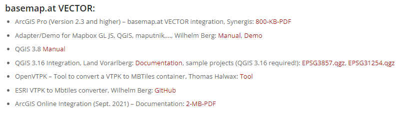
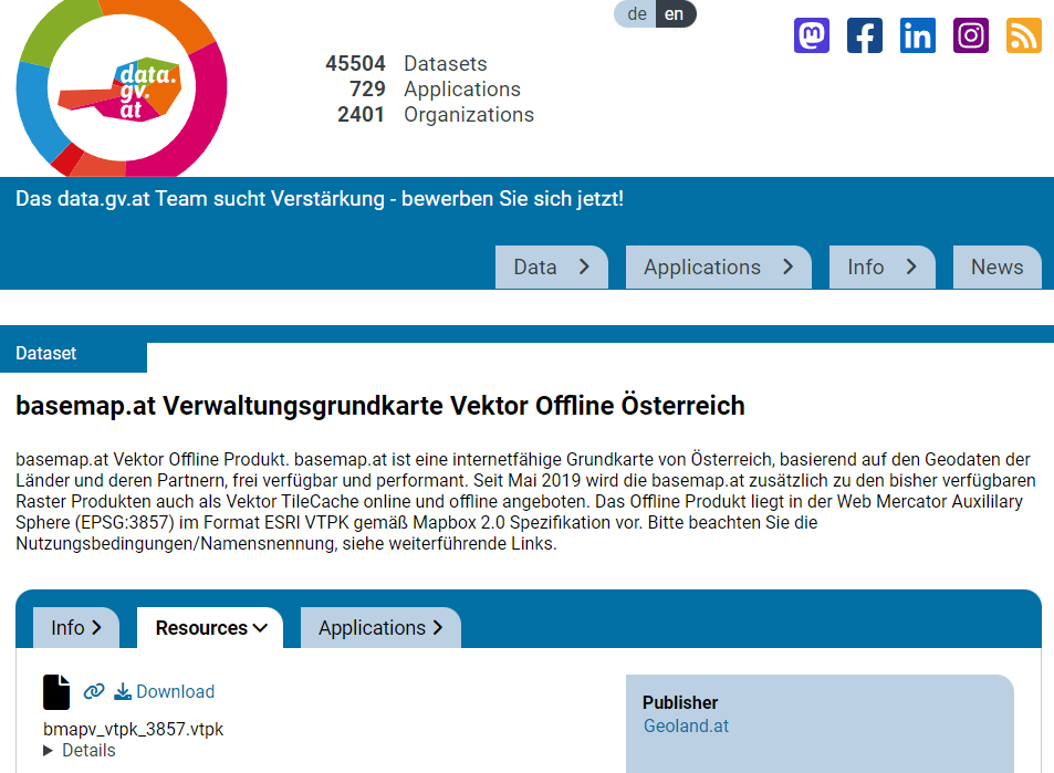
The second vector tile source I want to mention is basemap.at. It has been around for a while, however, early versions suffered from a couple of issues that have now been resolved.
The basemap.at project provides extensive documentation on how to use the dataset in QGIS and other GIS, including manuals and sample projects:
Here’s the basic configuration: make sure to set the max zoom level to 16, otherwise, the map will not be rendered when you zoom in too far.
The level of detail is pretty impressive, even if it cannot quite keep up with the basemap raster tiles:
Vector tile details at Resselpark, ViennaRaster basemap details at Resselpark, Vienna
As an update of the tutorial from previous years, I created a tutorial showing how to make a simple and dynamic color map with charts in QGIS.
In this tutorial you can see some of interesting features of QGIS and its community plugins. Here you’ll see variables, expressions, filters, QuickOSM and DataPlotly plugins and much more. You just need to use QGIS 3.24 Tisler version.
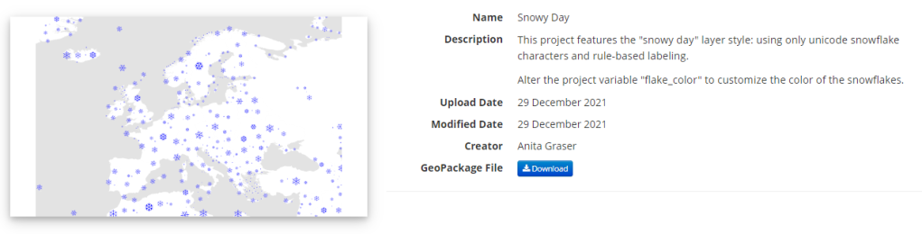
Today’s post is a follow-up and summary of my mapping efforts this December. It all started with a proof of concept that it is possible to create a nice looking snowfall effect using only labeling:
After a few more iterations, I even included the snowflake style in the first ever QGIS Map Design DLC: a free extra map recipe that shows how to create a map series of Antarctic expeditions. For more details (including project download links), check out my guest post on the Locate Press blog:
The project is self-contained within the downloaded GeoPackage. One of the most convenient ways to open projects from GeoPackages is through the browser panel:
From here, you can copy-paste the layer style to any other polygon layer.
To change the snowflake color, go to the project properties and edit the “flake_color” variable.
The Central Institution for Meteorology and Geodynamics (ZAMG) is Austrian’s meteorological and geophysical service. And as such, they have a large database of historical weather data which they have now made publicly available, as announced on 28th Oct 2021:
Ab sofort sind hochwertige #Wetter–#Daten der ZAMG für zahlreiche Wetterstationen Österreichs seit Messbeginn kostenlos abrufbar (im Rahmen der Public Sector Information Richtlinie der #EU). Infos und Zugang auf https://t.co/TEArms2sNR
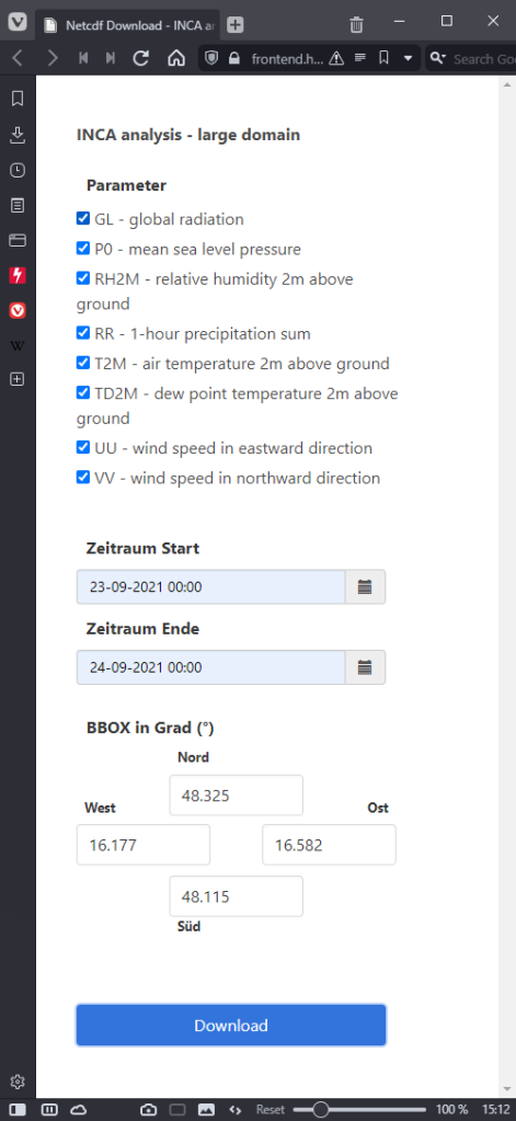
The new ZAMG Data Hub provides weather and station data, mainly in NetCDF and CSV formats:
I decided to grab a NetCDF sample from their analysis and nowcasting system INCA. I went with all available parameters for a period of one day (the data has a temporal resolution of one hour) and a bounding box around Vienna:
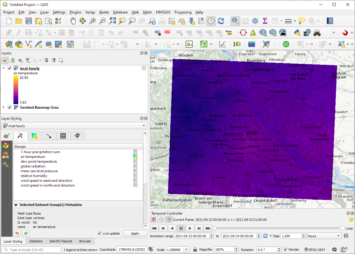
The loading screen of QGIS 3.22 shows the different NetCDF layers:
After adding the incal-hourly layer to QGIS, the layer styling panel provides access to the different weather parameters. We can switch between these parameters by clicking the gradient icon next to the parameter names. Here you can see the air temperature:
And because the NetCDF layer is time-aware, we can also use the QGIS Temporal Controller to step through the hourly measurements / create an animation:
Make sure to grab the latest version of QGIS to get access to all the functionality shown here.
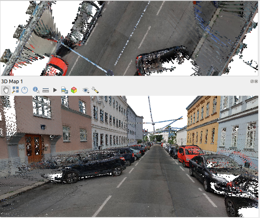
Kappazunder is the city of Vienna’s database created during their recent mobile mapping campaign. Using vehicle-mounted Lidar and cameras, they collected street-level Lidar and street view images.
The shapefiles contain vehicle location updates, photo locations, and areas describing the extent of the point clouds. Since the shapefile lack .prj files, we need to manually specify the correct CRS (EPSG:31256 MGI / Austria GK East).
The vehicle location updates and photo locations contain timestamps as epoch. However, the format is a little special:
To display a human-readable timestamp, I therefore used the following label expression:
Adding these labels also reveals that the whole trajectory is just 2 minutes long. This puts the download size of over 5GB into perspective. The whole dataset will be massive.
Lidar
The .laz files are between 100 and 200MB, each. There are four .laz files, even though the previously loaded point cloud extent areas only suggested three:
Loading the .laz files for the first time takes a while and there seem to be some issues – either on the user end (me) or in the files themselves. Trying to load content of the ept_ folders only results in very few points and multiple “invalid data source” errors:
For the few point that are loaded, it looks like the height information is available:
Update on 2021-10-01: I’ve reported the data loss issue and Martin Dobias has provided a first work-around that makes it possible to view the data in QGIS:
Images
The street view images are published as cubemaps. Here’s a sample of the side view:


 New print designs on the way: these are some snippets from a project I began last year to map the provinces of Spain in a retro style, which I've decided to revisit this summer.