Related Plugins and Tags

QGIS Planet

TimeManager is dead, long live the Temporal Controller!

TimeManager turns 10 this year. The code base has made the transition from QGIS 1.x to 2.x and now 3.x and it would be wrong to say that it doesn’t show ;-)

Now, it looks like the days of TimeManager are numbered. Four days ago, Nyall Dawson has added native temporal support for vector layers to QGIS. This is part of a larger effort of adding time support for rasters, meshes, and now also vectors.

The new Temporal Controller panel looks similar to TimeManager. Layers are configured through the new Temporal tab in Layer Properties. The temporal dimension can be used in expressions to create fancy time-dependent styles:

temporal1

TimeManager Geolife demo converted to Temporal Controller (click for full resolution)

Obviously, this feature is brand new and will require polishing. Known issues listed by Nyall include limitations of supported time fields (only fields with datetime type are supported right now, strings cannot be used) and worse performance than TimeManager since features are filtered in QGIS rather than in the backend.

If you want to give the new Temporal Controller a try, you need to install the current development version, e.g. qgis-dev in OSGeo4W.


Update from May 16:

Many of the limitations above have already been addressed.

Last night, Nyall has recorded a one hour tutorial on this new feature, enjoy:

TimeManager 3.0.2 released!

Bugfix release 3.0.2 fixes an issue where “accumulate features” was broken for timestamps with milliseconds.

If you like TimeManager, know your way around setting up Travis for testing QGIS plugins, and want to help improve TimeManager stability, please get in touch!

TimeManager 2.5 published

TimeManager 2.5 is quite likely going to be the final TimeManager release for the QGIS 2 series. It comes with a couple of bug fixes and enhancements:

  • Fixed #245: updated help.htm
  • Fixed #240: now hiding unmanageable WFS layers
  • Fixed #220: fixed issues with label size
  • Fixed #194: now exposing additional functions: animation_time_frame_size, animation_time_frame_type, animation_start_datetime, animation_end_datetime

Besides updating the help, I also decided to display it more prominently in the settings dialog (similarly to how the help is displayed in the field calculator or in Processing):

So far, I haven’t started porting to QGIS 3 yet. If you are interested in TimeManager and want to help, please get in touch.

On this note, let me leave you with a couple of animation inspirations from the Twitterverse:

Movement data in GIS #7: animated trajectories with TimeManager

In this post, we use TimeManager to visualize the position of a moving object over time along a trajectory. This is another example of what is possible thanks to QGIS’ geometry generator feature. The result can look like this:

What makes this approach interesting is that the trajectory is stored in PostGIS as a LinestringM instead of storing individual trajectory points. So there is only one line feature loaded in QGIS:

(In part 2 of this series, we already saw how a geometry generator can be used to visualize speed along a trajectory.)

The layer is added to TimeManager using t_start and t_end attributes to define the trajectory’s temporal extent.

TimeManager exposes an animation_datetime() function which returns the current animation timestamp, that is, the timestamp that is also displayed in the TimeManager dock, as well as on the map (if we don’t explicitly disable this option).

Once TimeManager is set up, we can edit the line style to add a point marker to visualize the position of the moving object at the current animation timestamp. To do that, we interpolate the position along the trajectory segments. The first geometry generator expression splits the trajectory in its segments:

The second geometry generator expression interpolates the position on the segment that contains the current TimeManager animation time:

The WHEN statement compares the trajectory segment’s start and end times to the current TimeManager animation time. Afterwards, the line_interpolate_point function is used to draw the point marker at the correct position along the segment:

CASE 
WHEN (
m(end_point(geometry_n($geometry,@geometry_part_num)))
> second(age(animation_datetime(),to_datetime('1970-01-01 00:00')))
AND
m(start_point(geometry_n($geometry,@geometry_part_num)))
<= second(age(animation_datetime(),to_datetime('1970-01-01 00:00')))
)
THEN
line_interpolate_point( 
  geometry_n($geometry,@geometry_part_num),
  1.0 * (
    second(age(animation_datetime(),to_datetime('1970-01-01 00:00')))
	- m(start_point(geometry_n($geometry,@geometry_part_num)))
  ) / (
    m(end_point(geometry_n($geometry,@geometry_part_num)))
	- m(start_point(geometry_n($geometry,@geometry_part_num)))
  ) 
  * length(geometry_n($geometry,@geometry_part_num))
)
END

Here is the animation result for a part of the trajectory between 08:00 and 09:00:


Read more:


Report from the Essen dev meeting

From 28th April to 1st May the QGIS project organized another successful developer meeting at the Linuxhotel in Essen, Germany. Here is a quick summary of the key topics I’ve been working on during these days.

New logo rollout

It’s time to get the QGIS 3 logo out there! We’ve started changing our social media profile pictures and Website headers to the new design: 

Resource sharing platform 

In QGIS 3, the resource sharing platform will be available by default – just like the plugin manager is today in QGIS 2. We are constantly looking for people to share their mapping resources with the community. During this developer meeting Paolo Cavallini and I added two more SVG collections:

Road sign SVGs by Bertrand Bouteilles & Roulex_45 (CC BY-SA 3.0)

SVGs by Yury Ryabov & Pavel Sergeev (CC-BY 3.0)

Unified Add Layer button

We also discussed the unified add layer dialog and are optimistic that it will make its way into 3.0. The required effort for a first version is currently being estimated by the developers at Boundless.

TimeManager

The new TimeManager version 2.4 fixes a couple of issues related to window resizing and display on HiDPI screens. Additionally, it now saves all label settings in the project file. This is the change log:

- Fixed #222: hide label if TimeManager is turned off
- Fixed #156: copy parent style to interpolation layer
- Fixed #109: save label settings in project
- Fixed window resizing issues in label options gui
- Fixed window resizing issues in video export gui
- Fixed HiDPI issues with arch gui

How to visualize bird migration data with QGIS TimeManager

A common use case of the QGIS TimeManager plugin is visualizing tracking data such as animal migration data. This post illustrates the steps necessary to create an animation from bird migration data. I’m using a dataset published on Movebank:

Fraser KC, Shave A, Savage A, Ritchie A, Bell K, Siegrist J, Ray JD, Applegate K, Pearman M (2016) Data from: Determining fine-scale migratory connectivity and habitat selection for a migratory songbird by using new GPS technology. Movebank Data Repository. doi:10.5441/001/1.5q5gn84d.

It’s a CSV file which can be loaded into QGIS using the Add delimited text layer tool. Once loaded, we can get started:

1. Identify time and ID columns

Especially if you are new to the dataset, have a look at the attribute table and identify the attributes containing timestamps and ID of the moving object. In our sample dataset, time is stored in the aptly named timestamp attribute and uses ISO standard formatting %Y-%m-%d %H:%M:%S.%f. This format is ideal for TimeManager and we can use it without any changes. The object ID attribute is titled individual-local-identifier.

movebank_data

The dataset contains 128 positions of 14 different birds. This means that there are rather long gaps between consecutive observations. In our animation, we’ll want to fill these gaps with interpolated positions to get uninterrupted movement traces.

2. Configuring TimeManager

To set up the animation, go to the TimeManager panel and click Settings | Add Layer. In the following dialog we can specify the time and ID attributes which we identified in the previous step. We also enable linear interpolation. The interpolation option will create an additional point layer in the QGIS project, which contains the interpolated positions.

timemanager_settings

When using the interpolation option, please note that it currently only works if the point layer is styled with a Single symbol renderer. If a different renderer is configured, it will fail to create the interpolation layer.

Once the layer is configured, the minimum and maximum timestamps will be displayed in the TimeManager dock right bellow the time slider. For this dataset, it makes sense to set the Time frame size, that is the time between animation frames, to one day, so we will see one frame per day:

timemanager_dock

Now you can test the animation by pressing the TimeManager’s play button. Feel free to add more data, such as background maps or other layers, to your project. Besides exploring the animated data in QGIS, you can also create a video to share your results.

3. Creating a video

To export the animation, click the Export video button. If you are using Linux, you can export videos directly from QGIS. On Windows, you first need to export the animation frames as individual pictures, which you can then convert to a video (for example using the free Windows Movie Maker application).

These are the basic steps to set up an animation for migration data. There are many potential extensions to this animation, including adding permanent traces of past movements. While this approach serves us well for visualizing bird migration routes, it is easy to imagine that other movement data would require different interpolation approaches. Vehicle data, for example, would profit from network-constrained interpolation between observed positions.

If you find the TimeManager plugin useful, please consider supporting its development or getting involved. Many features, such as interpolation, are weekend projects that are still in a proof-of-concept stage. In addition, we have the huge upcoming challenge of migrating the plugin to Python 3 and Qt5 to support QGIS3 ahead of us. Happy QGISing!


Using TimeManager for WMS-T layers

This is a guest post by Karolina Alexiou (aka carolinux), Anita’s collaborator on the Time Manager plugin.

As of version 2.1.5, TimeManager provides some support for stepping through WMS-T layers, a format about which Anita has written  in the past.  From the official definition, the OpenGIS® Web Map Service Interface Standard (WMS) provides a simple HTTP interface for requesting geo-registered map images from one or more distributed geospatial databases. A WMS request defines the geographic layer(s) and area of interest to be processed. The response to the request is one or more geo-registered map images (returned as JPEG, PNG, etc) that can be displayed in a browser application. QGIS can display those images as a raster layer. The WMS-T standard allows the user of the service to set a time boundary in addition to a geographical boundary with their HTTP request.

We are going to add the following url as the web map provider service: http://mesonet.agron.iastate.edu/cgi-bin/wms/nexrad/n0r-t.cgi

From QGIS, go to Layer>Add Layer>Add WMS/WMST Layer and add a new server and connect to it. For the service we have chosen, we only need to specify a name and the url.

Select the top level layer, in our case named nexrad_base_reflect and click Add. Now you have added the layer to your QGIS project.

To add it to TimeManager as well, add it as a raster with the settings from the screenshot below. Start time and end time have the values 2005-08-29:03:10:00Z and 2005-08-30:03:10:00Z respectively, which is a period which overlaps with hurricane Katrina. Now, the WMS-T standard uses a handful of different time formats, and at this time, the plugin requires you to know this format and input the start and end values in this format. If there’s interest to sponsor this feature, in the future we may get the format directly from the web service description. The web service description is an XML document (see here for an example) which, among other information, contains a section that defines the format, default time and granularity of the time dimension.

add_raster

If we set the time step to 2 hours and click play, we will see that TimeManager renders each interval by querying the web map service for it, as you can see in this short video.

Querying the web service and waiting for the response takes some time. So, the plugin requires some patience for looking at this particular layer format in interactive mode. If we export the frames, however, we can get a nice result. This is an animation showing hurricane Katrina progressing over a 30 minute interval.

whoosh

If you want to sponsor further development of the Time Manager plugin, you can arrange a session with me – Karolina Alexiou – via Codementor.


Video tutorial: animated heatmaps with QGIS

Do you like the QGIS heatmap functionality? Did you know that QGIS can also create animated heatmaps?

The following video tutorial shows all necessary steps. To reproduce it, you can get the sample data from my Time Manager workshop at #QGIS2015.


Time Manager workshop at #QGIS2015

Today was the final day of #QGIS2015 the first joint QGIS conference and developer meeting. I had the pleasure to meet Time Manager co-developer Karolina Alexiou aka carolinux in person and give a talk including a hands-on workshop on Time Manager together. Time Manager makes it possible to explore spatio-temporal data by creating animations directly in QGIS.

The talk presents QGIS visualization tools with a focus on efficient use of layer styling to both explore and present spatial data. Examples include the recently added heatmap style as well as sophisticated rule-based and data-defined styles. The focus of this presentation is exploring and presenting spatio-temporal data using the Time Manager plugin. A special treat are time-dependent styles using expression-based styling which access the current Time Manager timestamp.

To download the example data and QGIS projects download Time_Manager_Examples.zip.


Trajectory animations with fadeout effect

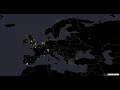
Today’s post is a short tutorial for creating trajectory animations with a fadeout effect using QGIS Time Manager. This is the result we are aiming for:

The animation shows the current movement in pink which fades out and leaves behind green traces of the trajectories.

About the data

GeoLife GPS Trajectories were collected within the (Microsoft Research Asia) Geolife project by 182 users in a period of over three years (from April 2007 to August 2012). [1,2,3] The GeoLife GPS Trajectories download contains many text files organized in multiple directories. The data files are basically CSVs with 6 lines of header information. They contain the following fields:

Field 1: Latitude in decimal degrees.
Field 2: Longitude in decimal degrees.
Field 3: All set to 0 for this dataset.
Field 4: Altitude in feet (-777 if not valid).
Field 5: Date – number of days (with fractional part) that have passed since 12/30/1899.
Field 6: Date as a string.
Field 7: Time as a string.

Data prep: PostGIS

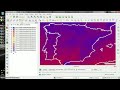
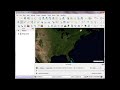
Since any kind of GIS operation on text files will be quite inefficient, I decided to load the data into a PostGIS database. This table of millions of GPS points can then be sliced into appropriate chunks for exploration, for example, a day in Beijing:

CREATE MATERIALIZED VIEW geolife.beijing 
AS SELECT trajectories.id,
    trajectories.t_datetime,
    trajectories.t_datetime + interval '1 day' as t_to_datetime,
    trajectories.geom,
    trajectories.oid
   FROM geolife.trajectories
   WHERE st_dwithin(trajectories.geom,
           st_setsrid(
             st_makepoint(116.3974589, 
                           39.9388838), 
             4326), 
           0.1) 
   AND trajectories.t_datetime >= '2008-11-11 00:00:00'
   AND trajectories.t_datetime < '2008-11-12 00:00:00'
WITH DATA

Trajectory viz: a fadeout effect for point markers

The idea behind this visualization is to show both the current movement as well as the history of the trajectories. This can be achieved with a fadeout effect which leaves behind traces of past movement while the most recent positions are highlighted to stand out.

Map tiles by Stamen Design, under CC BY 3.0. Data by OpenStreetMap, under ODbL.

Map tiles by Stamen Design, under CC BY 3.0. Data by OpenStreetMap, under ODbL.

This effect can be created using a Single Symbol renderer with a marker symbol with two symbol layers: one layer serves as the highlights layer (pink) while the second layer represents the traces (green) which linger after the highlights disappear. Feature blending is used to achieve the desired effect for overlapping markers.

Screenshot 2015-05-06 23.52.40

The highlights layer has two expression-based properties: color and size. The color fades to white and the point size shrinks as the point ages. The age can be computed by comparing the point’s t_datetime timestamp to the Time Manager animation time $animation_datetime.

This expression creates the color fading effect:

color_hsv(  
  311,
  scale_exp( 
    minute(age($animation_datetime,"t_datetime")),
    0,60,
    100,0,
    0.2
  ),
  90
)

and this expression makes the point size shrink:

scale_exp( 
  minute(age($animation_datetime,"t_datetime")),
  0,60,
  24,0,
  0.2
)

Outlook

I’m currently preparing this and a couple of other examples for my Time Manager workshop at the upcoming 1st QGIS conference in Nødebo. The workshop materials will be made available online afterwards.

Literature

[1] Yu Zheng, Lizhu Zhang, Xing Xie, Wei-Ying Ma. Mining interesting locations and travel sequences from GPS trajectories. In Proceedings of International conference on World Wild Web (WWW 2009), Madrid Spain. ACM Press: 791-800.
[2] Yu Zheng, Quannan Li, Yukun Chen, Xing Xie, Wei-Ying Ma. Understanding Mobility Based on GPS Data. In Proceedings of ACM conference on Ubiquitous Computing (UbiComp 2008), Seoul, Korea. ACM Press: 312-321.
[3] Yu Zheng, Xing Xie, Wei-Ying Ma, GeoLife: A Collaborative Social Networking Service among User, location and trajectory. Invited paper, in IEEE Data Engineering Bulletin. 33, 2, 2010, pp. 32-40.


Time Manager 1.6 – now with feature interpolation

Over the last couple of weeks, Karolina has been very busy improving and expanding Time Manager. This post is to announce the 1.6 release of Time Manager which brings you many fixes and exciting new features.

Screenshot 2015-03-25 17.58.38

What’s this feature interpolation you’re talking about?

Interpolation is really helpful if you have multiple observations of the same (moving) real-world object at different points in time and you want to visualize the movement between the observations. This can be used to visualize animal paths, vehicle tracks, or any other movement in space.

The following example shows a simple layer which contains 12 point features (3 for each id value).

Screenshot 2015-03-25 17.50.55

Using Time Manager interpolation, it is easy to create animations with interpolated positions between observations:

animation

How is it done?

When you open the Time Manager 1.6 Settings | Add layer dialog, you will find a new option for interpolation settings. This first version supports linear interpolation of point features but more options might be added in the future. Note how the id attribute is specified to let Time Manager know which features belong to the same real-world object.

Screenshot 2015-03-25 17.43.08

For the interpolation, Time Manager creates a new layer which contains the interpolated features. You can see this layer in the layer list.

Screenshot 2015-03-25 17.46.13

I’m really looking forward to seeing all the great animations this feature will enable. Thanks Karolina for making this possible!


Releasing TimeManager 1.2

Today, I’ve released TimeManager 1.2 which adds support for additional time formats: DD.MM.YYYY, DD/MM/YYYY, and DD-MM-YYYY (thanks to a pull request by vmora) as well as French translation (thanks to bbouteilles).

TimeManager now automatically detects formats such as DD.MM.YYYY

TimeManager now automatically detects formats such as DD.MM.YYYY

But there is more: the QGIS team has released a bugfix version 2.6.1 which you can already find in Ubuntu repos and the OSGeo4W installer. Go get it! And please support the bugfix release effort whenever you can.


TimeManager in QGIS master

Today, I updated my QGIS Time Manager plugin to version 0.8. It now works with QGIS master and that means that we can take advantage of all the cool new features in our animations. The following quick example uses the “multiply” blend mode with the tweet sample data which is provided by default when you install the plugin:

(The video here is a little small. Watch it on Youtube to see the details.)


Exploring Mobility Data Using Time Manager

Data from various vehicles is collected for many purposes in cities worldwide. To get a feeling for just how much data is available, I created the following video using QGIS Time Manager which has been shown at the Austrian Museum of Applied Arts “MADE 4 YOU – Design for Change”. It shows one hour of taxi tracks in the city of Vienna:

If you like the video, please go to http://www.ertico.com/2012-its-video-competition-open-vote and vote for it in the category “Videos directed at the general public”.


Adding Raster Layer Support to Time Manager

So far, Time Manager has been limited to vector layers. Support for raster layers has been on the wish list for quite a while. I’ve been considering different approaches and for now I have settled with one that keeps the way how raster layers work as close to the workings of vector layers as possible:

All layers have to be loaded before they can be added to Time Manager. The layers are added one-by-one and start and end time values are defined. (This differs from vector layers where start/end attribute are defined instead.) All raster layers that are not within the current time frame are set to 100 % transparency.

I’m not certain yet whether this is a good approach though. I’ll probably keep trying different approaches for a while.

This is a screen cast of the current status:

The plugin source is available on Github, as usual. It’s still going to take a while until there will be a plugin package including this feature.

I’m looking forward to reading your comments here or on Youtube. Do you think this approach is usable?


TimeManager is now on Github

TimeManager is now available on Github (right beside pgRoutingLayer).

If you want to try it, you can install version 0.4 from the new QGIS Plugin Repository. I’ve also uploaded some test data such as the twitter file used for the animation I presented recently.


Nice Animations with Time Manager’s Offset Feature

You probably know this video from my previous post “Tweets to QGIS”. Today, I want to show you how it is done.

After importing the Twitter JSON file, I saved it as a Shapefile.
Every point in the Shapefile contains the timestamp of the tweet. Additionally, I added a second field called “forever” which will allow me to configure Time Manager to show features permanently.

A "forever" field will help with showing features permanently.

To create the flash effect you see in the video, we load the tweet Shapefile three times. Every layer gets a different role and style in the final animation:

  • Layer “start_flash” is a medium sized dot that marks the appearance of a new tweet.
  • Layer “big_flash” is a bigger dot of the same color which will appear after “start_flash”.
  • Layer “permanent” is a small dot that will be visible even after the flash vanishes.
Three layers with different styles will make the animation more interesting.

styling the tweet layers

We’ll plan the final animation with a time step size of 10 seconds. That means that every animation frame will cover a real-world timespan of 10 seconds.

We configure Time Manager by adding all three tweet layers:
Layer “start_flash” starts at the orginal time t. Layer “big_flash” gets an offset of -10 seconds, which means that it will display ten seconds after time t. Layer “permanent” gets an offset of -20 seconds and ends at time forever.

Layers can be timed using the "offset" feature.

Finally – in Time Manager dock – we can start the animation with a time step size of 10 seconds:

Use a time step size of 10 seconds so it fits to the offset values we specified earlier.

Besides watching the animation inside QGIS, Time Manager also enables you to export the animation to an image series using “Export Video” button. Actual video export is not implemented yet, but you can use mencoder on the resulting image series to create a video file:

mencoder "mf://*.PNG" -mf fps=10 -o output.avi -ovc lavc -lavcopts vcodec=mpeg4

Time offsets are a new feature in version 0.4 of Time Manager. You can get it directly from the project SVN and soon from the official QGIS repo.


Tweets to QGIS

The idea behind this post was to create a video of twitter activity using Time Manager. You can watch the results of my first test run here:

And this is how it’s done:

First, you have to collect some tweets with location information. The following command will collect tweets within a certain geographic region from the Twitter Stream API using curl. You need a Twitter user account to use the API. (Curl comes readily available with OSGeo4W install.)

curl -k -d @locations.txt https://stream.twitter.com/1/statuses/filter.json -uuser:password > tweets.json

The contents of locations.txt is the geographic extent you are interested in, e.g. for Austria:

locations=9,45,17,50

After collecting some data, you can load the tweets into QGIS. Executing the following lines in Python Console will add an in-memory point layer to the map. (I am only extracting coordinates and time stamp from the tweets, but you can access more information through the JSON object.)

import simplejson
from PyQt4.QtCore import *
from datetime import *

f=open('C:/temp/tweets.json','r')

# create layer
vl = QgsVectorLayer("Point", "tweets", "memory")
vl.startEditing()
pr = vl.dataProvider()

# add fields
pr.addAttributes( [ QgsField("t", QVariant.String) ] )

# create features
for line in f:
   try:
      j=simplejson.loads(line)
      fet=QgsFeature()
      fet.setGeometry(QgsGeometry.fromPoint(QgsPoint(j['geo']['coordinates'][1],j['geo']['coordinates'][0])))
      fet.setAttributeMap({0:QVariant(str(datetime.strptime(j['created_at'],'%a %b %d %H:%M:%S +0000 %Y')))})
      pr.addFeatures([fet])
   except:
      pass

vl.commitChanges()
vl.updateExtents()

QgsMapLayerRegistry.instance().addMapLayer(vl)

To use the result in Time Manager, you have to export the layer to e.g. Shapefile because it’s not possible to add query strings to in-memory layers.

If you are interested in learning more about PyQGIS, you can find a lot of useful material in the PyQGIS Cookbook.


QGIS Time Manager Example: Visualizing Storm Data

Today, I’ve compiled a short video showcasing one of the possible uses of Time Manager plugin: Storm tracking. (Storm data can be downloaded from www.nhc.noaa.gov.)

Point size shows storm class, labels read maximum speed in mph.

If you are using Time Manager for your work, I’d love to hear about it.


FOSSGIS2011 – After Action Report

FOSSGIS2011 in Heidelberg was a great success for the QGIS project and for me personally. The audience was really impressed by Marco’s and Andreas’ presentation on QGIS Mapserver and GeoExt Web Client. My presentation on Time Manager for QGIS was followed by a series of interesting questions and comments concerning use cases in e.g. land use mapping. Requested features include support for raster layers and support for timestamps before year 19xx.
I’ll be posting an English version of the Time Manager presentation including some additional comments here soon.


Back to Top

Sustaining Members