


Creating circular insets and other fun QGIS layout tricks
Thanks to the recent popularity of the “30 Day Map Challenge“, the month of November has become synonymous with beautiful maps and cartography. During this November we’ll be sharing a bunch of tips and tricks which utilise some advanced QGIS functionality to help create beautiful maps.
One technique which can dramatically improve the appearance of maps is to swap out rectangular inset maps for more organic shapes, such as circles or ovals.
Back in 2020, we had the opportunity to add support for directly creating circular insets in QGIS Print Layouts (thanks to sponsorship from the City of Canning, Australia!). While this functionality makes it easy to create non-rectangular inset maps the steps, many QGIS users may not be aware that this is possible, so we wanted to highlight this functionality for our first 30 Day Map Challenge post.
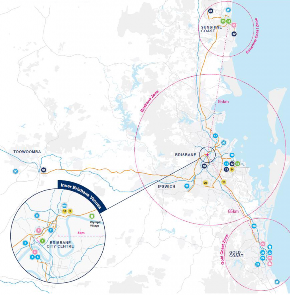
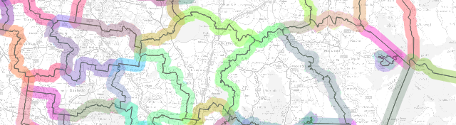
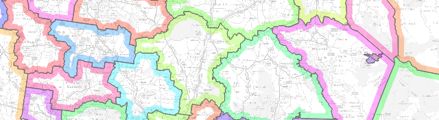
Let’s kick things off with an example map. We’ve shown below an extract from the 2032 Brisbane Olympic Bid that some of the North Road team helped create (on behalf of SMEC for EKS). This map is designed to highlight potential venues around South East Queensland and the travel options between these regions:
Circles featured heavily in previous Olympic bid maps (such as Budapest) where we took our inspiration from. This may, or may not, play a part in using the language of the target map audience – think Olympic rings!
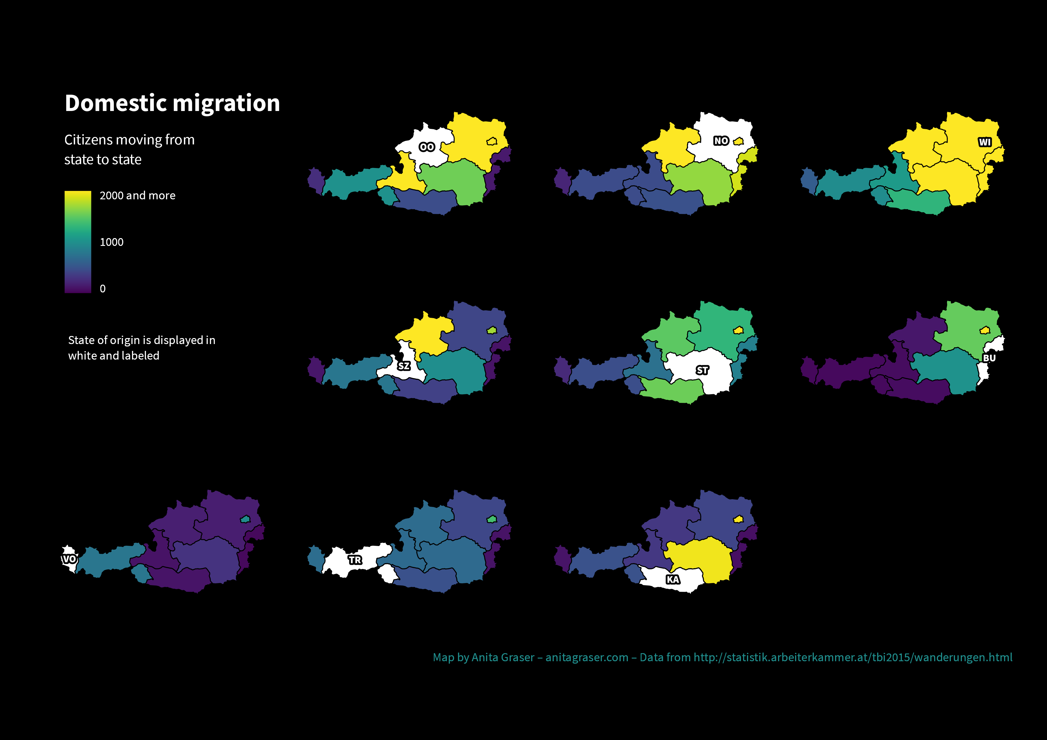
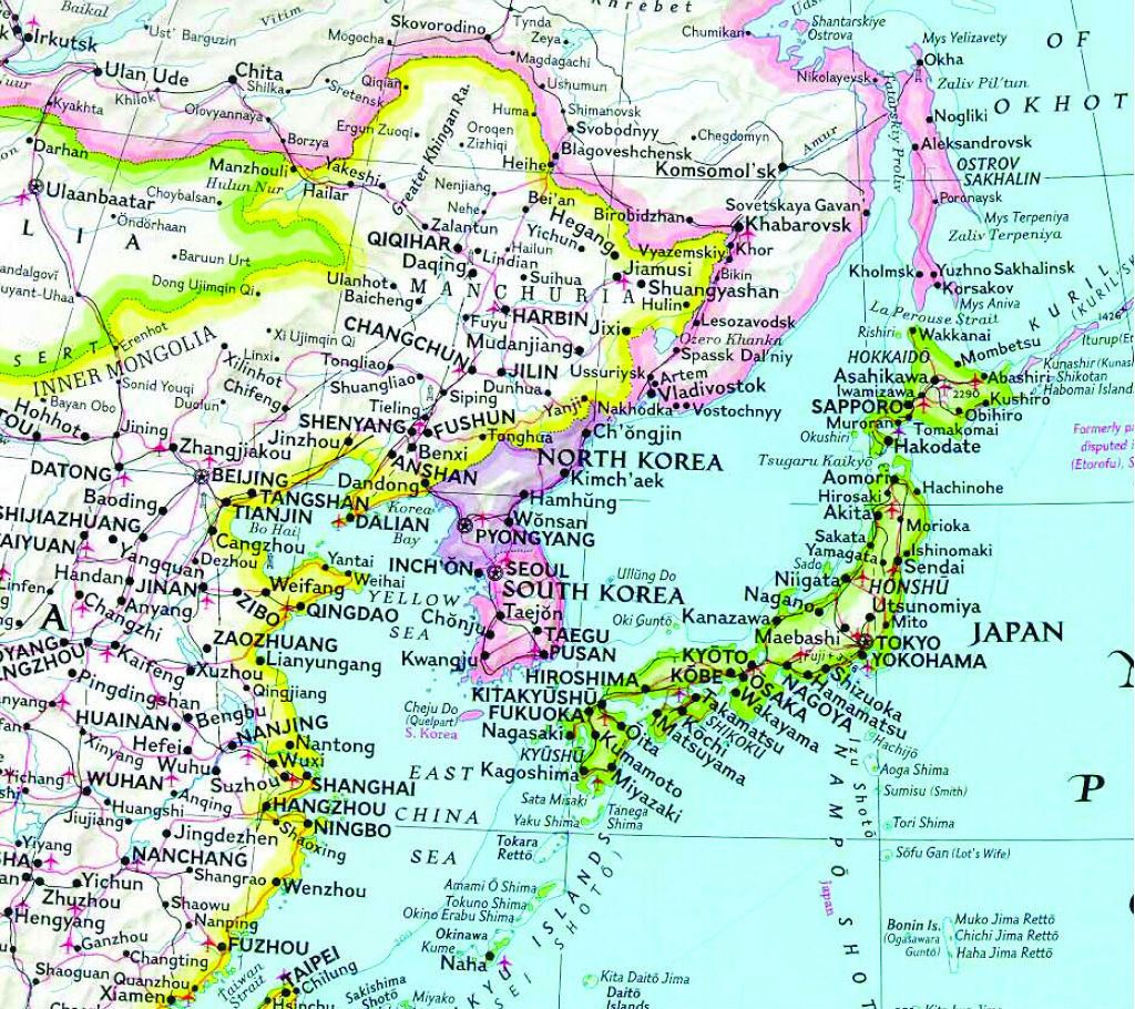
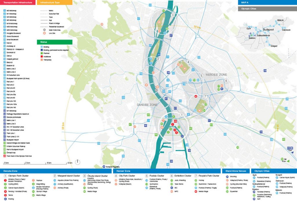 Budapest Olympics 2024 Masterplan
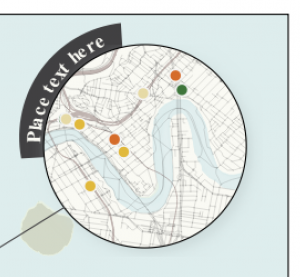
Step by Step Guide to Creating a Circle Inset
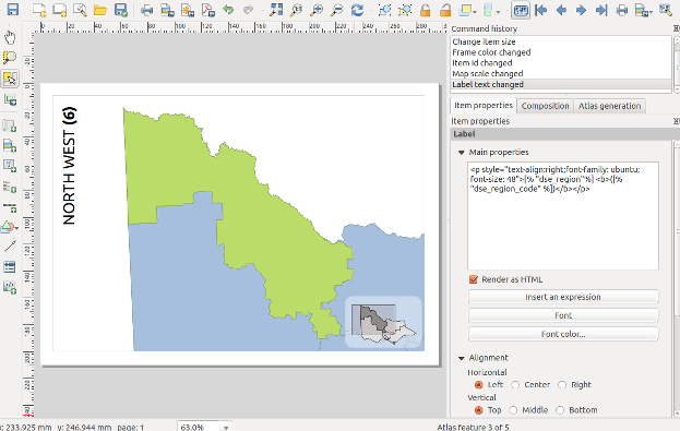
Firstly, prepare a print layout with both a main map and an inset map. Make sure that your inset map is large enough to cover your circular shape:

From the Print Layout toolbar, click on the Add Shape button and then select Add Ellipse:

Draw the ellipse over the middle of your inset map (hint: holding down Shift while drawing the ellipse will force it to a circular shape!). If you didn’t manage to create an exact circle then you can manually specify the width and height in the shape item’s properties. For this one, we went with a 50mm x 50mm circle:

Next, select the Inset Map item and in its Item Properties click on the Clipping Settings button:

In the Clipping Settings, scroll down to the second section and tick the Clip to Item box and select your Ellipse item from the list. (If you have labels shown in your inset map you may also want to check the “force labels inside clipping shape” option to force these labels inside the circle. If you don’t check this option then labels will be allowed to overflow outside of the circle shape.)

Your inset map will now be bound to the ellipse!

Here’s a bit more magic you could add to this map – in the Main Map’s properties, click on Overviews and set create one for the Inset map – it will nicely show the visible circular area and not the rectangle!

Bonus Points: Circular Title Text!
For advanced users, we’ve another fun tip…and when we say fun, we mean ‘let’s play with radians’! Here we’re going to create some title text and a wedged background which curves around the outside of our circular inset. This takes some fiddly playing around, but the end result can be visually striking! Here we’re going to push the QGIS print layout “HTML” item to create some advanced graphics, so some HTML and CSS coding experience is advantageous. (An alternative approach would be to use a vector illustration application like Inkscape, and add your title and circular background as an SVG item in the print layout).
We’ll start by creating some curved circular text:

First, add a “HTML frame” to your print layout:

HTML frames allow placement of dynamic content in your layouts, which can use HTML, CSS and JavaScript to create graphical components.
In the HTML item’s “source” box, add the following code:
<svg height="300" width="350">
        <defs>
            <clipPath id="circleView">
                <circle id="curve" cx="183" cy="156" r="25" fill="transparent" />
            </clipPath>
        </defs>
        <path id="forText" d="M 28,150, C 25,50, 180,-32,290,130" stroke="" fill="none"/>
            <text x="0" y="35" width="100">
                <textpath xlink:href="#forText">
                    <tspan font-weight="bold" fill="black">Place text here</tspan>
                </textpath>
            </text>
             <style>
    <![CDATA[
      text{
        dominant-baseline: hanging;
        font: 20px Arial;
      }
    ]]>
  </style>
</svg>
Now, let’s add in a background to bring more focus onto the title!
To add in the background, create another HTML item. We’ll again create the arc shape using an SVG element, so add the following code into the item’s source box:
<svg width="750" height="750" xmlns="http://www.w3.org/2000/svg">
  <path d="M 90 70
           A 56 56, 0, 0, 0, 133 140
           L 150 90 Z" fill="#414042" transform=" scale(2.1) rotate(68 150 150) " />/>
</svg>
(You can read more about SVG curves and arcs paths over at MDN)
So there we go! These two techniques can help push your QGIS map creations further and make it easier to create beautiful cartography directly in QGIS itself. If you found these tips useful, keep an eye on this blog as we post more tips and tricks over the month of November. And don’t forget to follow the 30 day Map Challenge for a smorgasbord of absolutely stunning maps.


