Related Plugins and Tags

QGIS Planet

QGIS video tutorials: election maps, hydrology, and more

Mapping spatial decision patterns, such as election results, is always a hot topic. That’s why we decided to include a recipe for election maps in our QGIS Map Design books. What’s new is that this recipe is now available as a free video tutorial recorded by Oliver Burdekin:

This video is just one of many recently published video tutorials that have been created by QGIS community members.

For example, Hans van der Kwast and Kurt Menke have recorded a 7-part series on QGIS for Hydrological Applications:

and Klas Karlsson’s Youtube channel is also always worth a follow:

For the Pythonically inclined among you, there is also a new version of Python in QGIS on the Automating GIS-processes channel:


Movement data in GIS #24: MovingPandas hands-on tutorials

Last week, I had the pleasure to give a movement data analysis workshop at the OpenGeoHub summer school at the University of Münster in Germany. The workshop materials consist of three Jupyter notebooks that have been designed to also support self-study outside of a workshop setting. So you can try them out as well!

All materials are available on Github:

  • Tutorial 0 provides an introduction to the MovingPandas Trajectory class.
  • Tutorials 1 and 2 provide examples with real-world datasets covering one day of ship movement near Gothenburg and multiple years of gull migration, respectively.

Here’s a quick preview of the bird migration data analysis tutorial (click for full size):

Tutorial 2: Bird migration data analysis

You can run all three Jupyter notebooks online using MyBinder (no installations required).

Alternatively or if you want to dig deeper: installation instructions are available on movingpandas.org

The OpenGeoHub summer school this year had a strong focus on spatial analysis with R and GRASS (sometimes mixing those two together). It was great to meet @mdsumner (author of R trip) and @edzerpebesma (author of R trajectories) for what might have well been the ultimate movement data libraries geek fest. In the ultimate R / Python cross-over,  0_getting_started.Rmd

Both talks and workshops have been recorded. Here’s the introduction:

and this is the full workshop recording:


This post is part of a series. Read more about movement data in GIS.

Add Realistic Mist and Fog to Topography in QGIS 3.2

I recently came across a great tutorial by in which he demonstrated how to create map of Switzerland in the style of Edward Imhof, the famed Swiss cartographer renowned for his hand painted maps of Switzerland and other mountainous regions of the world. John’s map used traditional hillshading, multidirectional hillshading and crucially, a translucent topographic layer that created a mist like appearance he likened to the sfumato technique used by painters since the Renascence.

I followed John’s tutorial in QGIS 3.2 and I was quite pleased with the initial result below. However, the process creating it is a bit too complicated for a tutorial so I set about simplifying the process and rather than imitating Imhof’s distinct style, my goal this time is realism.

The heart of the effect involves the very clever idea of using the topographic layer as a subtle opacity mask to simulate mist, fog and atmospheric haze. Have a look at the image below taken on March 17th, 2005 by NASA’s Terra satellite. This is the industrialised Po valley of northern Italy, surrounded by the Alps and Apennine Mountains that rise above the valley’s hazy pollution. The haze adds a sense of depth to the surrounding hills and mountains. It’s not uncommon to see fog and pollution in satellite imagery that gives way to the clear air in high mountains e.g. northern India and Nepal, China, Pakistan and India. Creating a similar mist effect in QGIS is actually quite simple.

First download topography for the Alps and Po region (a 68.55 Mb GeoTiff file derived from freely available EU-DEM data I resampled from 25 to 100m resolution). Next, make sure you have the plugin QuickMapServics (QMS) installed (menu Plugins – Manage and Install Plugins). This great plugin provides access to over 1000 basemaps.

Load the GeoTiff file into QGIS (Raster – Load) and rename the layer Hillshade. Right click the layer to open the Layer Properties window. In the Symbology panel, next to Render Type, choose Hillshade. Change the altitude to 35 degrees, Azimuth to 300 degrees and Z Factor of 1.5 (illuminating the landscape from the top left). Finally, change the Blending mode to Multiply. Click OK to close the dialogue.

To add the basemap layer, Esri World Imagery (Clarity), type “ESRI clarity” in the QMS search bar to find and add the basemap; Go to View – Panels and activate the QMS search bar if it isn’t initially visible. Make sure it’s the bottommost layer.

Oh, that’s a bit disappointing, we only increased the relief little a bit. It’s missing the vitally important mist layer.

To create mist, right click the Hillshade layer and choose Duplicate. Rename the new layer Mist and make sure it’s above the Hillshade layer. Now open the Layer Properties window of the layer, we’re going edit it’s attributes to make it look like mist.

Change the Render type to Singleband Pseudocolor and use 0 and 3000 for the min and max values (limiting maximum latitude of the mist to 3000 meters). Then open the colour ramp window by clicking on the Color ramp and enter these values:

  • Left Gradient – HSV 215 15 50 and 75% transparency
  • Right Gradient – HSV 215 15 50 and 0% transparency

Close the Color Ramp dialogue. In the Layer Properties window, and this is very important, change the Blending mode to Lighten. Click OK to close the Layer Properties window.

Wow, we have mist!

The mist effect looks great. It certainly adds a lot of realism to the topographic map, it now looks quite like NASA’s images. This is just a quick and basic map so there’s lots of scope to improve the effect. Play around with the colour of the mist layer and its opacity, or even brighten the Hillshade layer underneath. See what effects these changes have.

Here’s another example below. In this example I duplicated the hillshade layer and set the second hillshade layer to Multidirectional Hillshading (yes, QGIS 3.2 has Multidirectional Hillshading). I then adjusted the transparency of both hillshade layers so they blended together nicely. I then replaced the basemap with another duplicated topography layer that I coloured using the gradient sd-a (by Jim Mossman, 2005) using the cpt-city plugin. And lastly, I doubled the opacity of the mist layer turning it into a milky fog. I think it looks great!

What next? Well, there’s lots of possibilities. Perhaps download Martian topography and add mist to the bottom of Valles Marineris?

References:

Eduard Imhof – Biography

TV documentary about Eduard Imhof

The Map as an Artistic Territory: Relief Shading Works and Studies by Eduard Imhof

Haze in northern Italy – NASA Terra Satellite

Tzvetkov, J., 2018. Relief visualization techniques using free and open source GIS tools. Polish Cartographical Review, 50(2), pp.61-71.

Adding ESRI’s World Hillshade layer to QGIS

You may have seen my earlier tutorial where I described how to make nice looking hillshaded maps in QGIS using SRTM elevation data. Well, we don’t have to stop with just one hillshade layer on a map, it is possible to overlay multiple hillshades; a procedure that can increase the visual quality and detail. The following image is the hillshade we made before. Once you re-create a hillshade, following the previous tutorial, you can head to the next step (note that brightness and contrast settings may be different due to changes in how QGIS generates and displays hillshades).

We can improve the SRTM hillshade further by adding ESRI’s World Hillshade layer, which uses multi-directional illumination (also called a Swiss Hillshade in tribute to the celebrated Swiss cartographer Eduard Imhof). In addition, World Hillshade has a much higher resolution than SRTM 30m data in some regions of the world, it is 2m for most of the England and Wales, 10m for most of the US, 5m for Spain and 3m for Holland etc. The only drawback is that the style of this layer is somewhat controversial, some love it, some hate it, it looks like it’s illuminated from above, but mixing it with the SRTM hillshade obviates some of it criticised flaws.

To add the World Hillshade layer in QGIS go to the Layer Menu – Add Layer – Add ArcGIS MapServer Layer – click New and add the following URL:

https://services.arcgisonline.com/arcgis/rest/services/Elevation/World_Hillshade/MapServer

Notice QGIS 2.18 no longer needs a plugin to add ESRI layers, it new has this functionality built in. Also, open the url in a browser such as Firefox, it brings up a webpage that describes the layer. We also see links to other other layers. Yes, they can all be added to QGIS by simply taking the URL of the webpage that describe the layer and connecting to it via the ArcGIS MapServer Layer connector.

Name the layer World Hillshade and click Connect, then click and highlight the layer it connects to. Finally, click the Add button to add the layer to the canvas.

Next, we need to adjust the properties of the World Hillshade layer to properly overlay it above the SRTM hillshade layer. Make sure the World hillshade layer is the topmost layer. In the Layers Panel, right click Layer properties and in the window that opens up, click Style (if not visible). Next, change the Layer Blending mode (under color rendering) to Overlay. Adjust the layer’s brightness to around -20 and leave contrast at 0. If you find the scene is still too dark, brighten the SRTM Hillshade by increasing the layer’s brightness. You may also have to change (lower) the Min value of the Min – Max value boxes. Leave the contrast at 0 for the SRTM hillshade. Also, don’t brighten it too much as it might become washed out, loose detail, especially in bright areas. Play around the controls, settings may vary depending on the SRTM data you download and the version of QGIS you use.

Here’s a comparison in Ireland, a ring like structure of hills with a central peak. No, it’s not a meteorite crater. It’s a different kind of geological marvel, the Slieve Gullion Complex and its ring dyke; the deeply eroded remains of a 410 million year old Caledonian volcano. The SRTM hillshade is on the left and World Hillshade + SRTM hillshade is on the right (click on the image, it’s best appreciated full size):

We can see the World Hillshade + SRTM Hillshade layer shows much finer detail. We see a parallel array of roughly north-south orientated lines, these are fractures and faults that cut the Slieve Gullion Complex that were perhaps enhanced by glacial erosion. Also, look carefully, there seems to be some roads meandering across the landscape (hint, bottom of the map and right of the scale bar). You should get even better results with higher resolution World Hillshade data. We also notice that bending SRTM derived hillshade with World Hillshade adds a naturalistic illumination not apparent in multi-directional hillshading. So we have the best of both worlds, a high resolution hillshade and realistic looking illumination.

Hope you found this tutorial helpful.

References:

Baxter, S., 2008. A Geological Field Guide to Cooley Gullion, Mourne & Slieve Croob [pdf]. Geological Survey of Ireland, Dublin. p. 43-53.

Imhof, E. 1982. Cartographic Relief Presentation. Walter de Gruyter GmbH & Co KG.

Using Trigonometry To Place And Orientate Labels

Geologists display the dip and strike of rock layers on geological maps using a dip and strike symbol, where dip in degrees indicates the maximum angle a rock layer descends relative to the horizontal. However, it is not directly possible in QGIS 2.18, using basic label settings, to place and orient a dip label next to a dip and strike symbol.

However, there is a way around this issue using Trigonometry and editing the layer’s Attribute Table. This method may be useful for controlling the position and orientation of labels around point features in general. The first step involves adding values to the Attribute Table. First, add these two new columns:

  • Angle – 0° is North and values increases clockwise up to 359°
  • Distance – label distance from a point feature

You can add Angle and Distance values to these columns manually or use the Field Calculator (see below) to add values if you have lots of points. Also, I chose Map Units (not millimeters) for Symbol Size, Font Size and Distance for my map, as I prefered to keep symbol size, font size and position of labels fixed when zooming in and out.


Note – I use Strike (Angle) and Label Distance (Distance)  in my Attribute Table

The next step is to control the position of the label around the points using trigonometry. Right click the points layer and choose:

Properties – Labels – Placement

Check that Offset From Point is checked and then click the Data Defined Override next to the Offset X, Y boxes and choose Edit. The Expression String Builder will appear. Enter the following expression in the Expression String Builder window:

to_string ( ((-1) * ( “Distance” )) * cos ( radians ( “Angle” ))) ||’,’|| to_string (((-1) * ( “Distance” )) * sin ( radians ( “Angle” )) )

The expression takes the angle and distance values from the Attribute Table (edited earlier) and calculates an X, Y label position relative to the point feature. You may also optionally control the angle of a symbol or icon itself via:

Layer Properties – Style – click Data Defined Override icon – Edit

Then enter the following expression in the Data Defined Override dialogue:

“Angle” – 90

Finally, to control the rotation of label text, so text follows the orientation (angle) of a rotating symbol or icon, choose:

Layer Properties – Labels – Placement – Data Defined – Rotation

Click the Data Defined Override Icon again and then choose Edit. Enter the following expression in the Data Defined Override dialogue:

(“Angle” – 90) * -1

The following geological map of the Old Head of Kinsale in southern Ireland shows the results of the above procedure. We see that the dip labels rotate and currently follow the orientation of the dip and strike symbols (note that the points are at the intersection of the T symbol).


Geological Survey of Ireland – Creative Commons Attribution 4.0 license

You may have several different symbols, of various sizes, each requiring an appropriate label distance expressed in the Attribute Table. It took me a few tries before I found the right distances for my geological symbols, from 90 to 230 meters distance depending on the symbol size and type.

Lastly, the expressions “Angle” – 90 and (“Angle” – 90) * -1 were necessary in my case because I needed to place my labels next to the dip and strike symbol’s barb. You may need to use a different expression e.g.Angle” and (“Angle”) * -1, or a value other than 90° depending on the symbol used and the prefered label placement location. Some trial and error is may be required to find the correct label position.

Creating a Tissot’s Indicatrix in QGIS

The task of projecting, or unfolding the spherical Earth onto a flat map, is an age old problem in cartography. Projection almost always introduces distortion, most projections cannot preserve angles, areas and distances at the same time, they may be conformal (angle-preserving), equal-area (area-preserving) or equidistant (distance preserving) but not all at once. The only exception is a Globe, which preserves angles, areas and distances perfectly. Thus a projection is a compromise.

The choice of projection depends on a map’s use, scale and audience. Conformal projections, for example, are preferred for nautical charts or small scale maps because they locally preserve angles necessary for navigation and survey drawings. Equal-area projections are best suited for maps of broad continental region as they preserve the relative sizes of countries, seas and oceans and allow comparison between regions. Finally, there are hybrid projections that minimise the distortion by merging conformal and equal-area projections, these can be used to create visually pleasing maps of the entire Earth (for a guide to selecting a map projection see Fig. 9 in Jenny (2011), link below).

But how does one measure the degree and type of distortion in a map projection?

One elegant method was developed in the 1880s century by the French cartographer Monsieur Nicolas Auguste Tissot, the Tissot’s Indicatrix (or Tissot’s Ellipse). This mathematical contrivance consists of a grid of infinitely small circles that measures the degree and type of distortion caused by projection. While Monsieur Tissot’s approach is mathematical, involving infinity small circles, his technique can be approximated overlaying a regular grid of large circles and crosses to a map.

The Indicatrix Mapper plugin for QGIS by Ervin Wirth and Peter Kun creates a Tissot’s Indicatrix by adding a vector layer of circles and crosses in a gridded pattern on a map. The degree and type of distortion of the Tissot’s Indicatrix reveals the class of map projection as follows: –

  • If a projection is conformal, the area of circles and sizes of the crosses will change while the shapes of circles remain the same and intersection angle of the crosses will always meet at 90 degrees e.g. Mercator projection
  • If a projection is equal-area, the area of the circles will remain the same while the shape of the circles change and intersection angle of the crosses will not always meet at 90 degrees e.g. Mollweide projection or Hammer projection
  • If a projection preserves neither property, the area of the circles and their shape will change, and the intersection angle of the crosses will not always meet at 90 degrees e.g. Robinson

After adding the Indicatrix Mapper plugin to QGIS (menu Plugins – Manage and Install Plugins) first add a basemap using the OpenLayers plugin e.g. Bing Aerial layer, then click the Indicatrix Mapper icon and run the plugin using default settings. You can then select different projections (lower right in world icon QGIS) to see the effects of various protections on the Tissot Indicatrix. If the circles appear as squares after selecting a different projection, right click the Circles layer in the layers panel, then select the Rendering tab and deselect the Simplify geometry check box. Also, turn off the basemap layer when using different projections, unfortunately the OpenLayers plugin only supports Google Mercator projection (EPSG 3857). To create the basemap below, that can be displayed using different projections, I styled vector data downloaded from Natural Earth and OpenStreetMap.

Mercator

Mercator Projection – the area of the circles and size of the crosses increase towards the poles but their shape remains the same.

Mollweide

Mollweide Projection – the area of the circles remain the same but their shapes are distorted, the crosses do not always intersect at 90 degrees.

Robinson

Robinson Projection – both the area of the circles and intersection angle of the crosses circles vary.

It is important to note that a Tissot’s Indicatrix generated in QGIS is an approximation of mathematical ideal, we are not no longer dealing with infinity small circles. As a result, here will be some minor distortion visible towards the edge of a map independent of the projection used; notice that the circles in the Mercator projection nearest the poles are not quite symmetrical or the circles at the edge of the Mollweide projection do not appear to preserve area as they should. This anomalous distortion can be minimised by reducing the size and spacing of the circles and crosses created by the Indicatrix Mapper plugin. However, despite these limitations a Tissot’s Indicatrix elegantly reveals the distortion present. This is something to important to understand when when choosing a map projection.

References:

Jenny, B., 2012. Adaptive composite map projections [PDF]. Visualization and Computer Graphics, IEEE Transactions on, 18, 2575–2582.

Create great looking hillshaded maps in QGIS

Wicklow-Topo-original

In this tutorial I will show you how to create a Hillshaded topographic map in QGIS. We will be using Shuttle Radar Topography Mission (SRTM) data, a near global Digital Elevation Model (DEM) collected in February 2000 aboard NASA’s Space Shuttle Endeavour (mission STS-99). The mission used a X-Band mapping radar to measure the Earth’s topography, built in collaboration with the U.S. Jet Propulsion Laboratory, the U.S. National Imagery and Mapping Agency (now the National Geospatial-Intelligence Agency), and the German and Italian space agencies.

The raw radar data has been continuously processed and improved since it was first collected. Countless artefacts have been painstakingly removed and areas of missing data have been filled using alternate data sources. The version we will be using is the 1 Arc-Second Global SRTM dataset, an enhanced 30 meter resolution DEM that was released last year. It is a substantial improvement over the 3 Arc-Second / 90 meter SRTM data previously available for Ireland. SRTM elevation data can be downloaded from the United States Geological Survey’s EarthExplorer website.

When first loaded into QGIS (via Add Raster Layer), the DEM is displayed as a rather uninformative black and white image.

Wicklow-Topo-blackwhite

It is therefore necessary to apply a suitable colour ramp that accentuates topography. While it is possible to create your own colour ramp, or use one of the colour ramps provided by QGIS, superior colour ramps can be downloaded using Etienne Tourigny’s Color Ramp Manager (Plugins – Manage and Install Plugins). After the plugin is added to QGIS, go to the Plugins menu again and choose the Colour Ramp Manager.

In the window that pops up, choose the full opt-city package and click check for update. The plugin will then download the cpt-city library, a collection of over a hundred cartographic gradients (version 2.15). After the package downloads, quit the dialogue.

Back in QGIS, right click the DEM layer to bring up the Layer Properties dialogue. In the Style tab, change the render type from single band grey to single band pseudocolor. Then click new color ramp and new color ramp again, choose the cpt-city color ramp to bring up the cpt-city dialogue. Click topography and choose the sd-a colour ramp. While this is an excellent colour ramp, I find its colours are a bit too strong for my liking.

Still in the Layer Properties dialogue, change the min and max values to match your DEM’s lowest and highest elevations values and click classify, this applies the new colour ramp. Next, change the brightness to 30 and lower the contrast and saturation to -20. Click OK to apply the new style and quit the Layer Properties dialogue.

Wicklow-Topo-noShade

Next we need to create a Hillshade layer from the DEM, a 3D like visual representation of topographic relief. This is achieved via the menu Raster – Analysis – DEM (Terrain models). There is one small catch, the hillshading algorithm assumes the DEM’s horizontal units are in meters (they are decimal degrees). We need to enter a scale correction factor of 111120 (in the Scale ratio vert. units to horiz. box). Once that is all done, select an output path to save the generated hillshade and click OK. Generating a hillshade may take up to a minute depending on the size of your DEM.

Wicklow-Topo-hillshade

After the hillshade is created, open its Layer properties dialogue. Change the min and max values to 125 and 255, increase its brightness to 45 and contrast to 20. Finally, switch the blending mode from normal to multiply. This allows the DEM beneath the hillshade to show though. Click OK to apply the new style.

If you followed these steps correctly you will have created a fine looking topographic map similar to the one below. It’s also possible to create contours but that’s a tutorial for another day.

Wicklow-Topo

Technical note:

There are two hillshading algorithms available in QGIS, one by Horne (1981) and another by Zevenbergen and Thorne (1987). Jones (1998) examined the quality of hillshading algorithms, he found the algorithm of Fleming and Ho€er (1979) is slightly superior to Horne’s (1981) algorithm. Zevenbergen and Thorne’s (1987) algorithm is a derivation of Fleming and Ho€er’s (1979) formula. QGIS uses Horne’s (1981) algorithm by default.

References:

Horn, B.K., 1981. Hill shading and the reflectance map. Proceedings of the IEEE, 69, 14–47.

Jones, K.H., 1998. A comparison of algorithms used to compute hill slope as a property of the DEM [PDF]. Computers & Geosciences, 24, 315–323.

Zevenbergen, L.W. & Thorne, C.R., 1987. Quantitative analysis of land surface topography. Earth surface processes and landforms, 12, 47–56.

Adding ESRI’s Online World Imagery Dataset to QGIS

ESRI’s ArcGIS Online World Imagery is a high resolution satellite and aerial imagery base map for use in Google Earth, ArcMap and ArcGIS Explorer. The same excellent imagery is used by the Bing Maps Aerial layer. Somewhat surprisingly, World Imagery can also be accessed by QGIS, as it supports ESRI’s map servers that use Representational State Transfer (REST) and Simple Object Assess Protocol (SOAP) standards.

Simply copy and past the following code into the Python Console in QGIS and press return (Plugins – Console):

qgis.utils.iface.addRasterLayer("http://server.arcgisonline.com/arcgis/rest/services/ESRI_Imagery_World_2D/MapServer?f=json&pretty=true","raster")

The code adds an ESRI Online World Imagery base map to QGIS. It has a number of advantages over the popular OpenLayers Plugin that adds various Google, Bing and OpenStreetMap image layers to QGIS. Unlike images downloaded by the OpenLayers plugin the ESRI World Imagery base map is a true Raster who’s attributes are fully editable e.g. brightness, blending mode and transparency can be adjusted. World Imagery can also be printed at a very high resolution with other QGIS layers on a map and without it shifting relative to other layers; a conspicuous problem with OpenLayers that does not use “On the Fly” re-projection and only prints Google, Bing layers at a low resolution. It is an ideal aerial base map.

References:

QGIS: Adding An ArcServer Rest Service

Connecting to ArcGIS “mapserver” layers

Edit: Updated to correct URL

Note: This method has been superseded by a plug-in that adds ESRI imagery and other REST layers via a GUI


The Coastal Vignette

Vignette2

Coastal Vignette seen on an old Irish ‘6-Inch map’

Occasionally on old maps you may see a pleasing decorative effect on bodies of water called a “Coastal Vignette”, these are fine lines that highlight coastlines and lake shores. The example seen above is from a ca. 100 year old “6-inch map” of Lough Nafooey in County Galway, Ireland. I presume the Coastal Vignette effect in this example was hand drawn, it required considerable skill and patience.

These is no plugin for creating Coastal Vignettes in QGIS just yet, so I developed a simple technique to recreate the effect using the raster Proximity (Raster Distance)’ algorithm accessible in the Processing Toolbox.

In order to use the Proximity Analysis tool I first converted a Shapefile polygon depicting the sea off Dublin into a 10 by 10 metre resolution Raster using the menu command ‘Raster – Conversion – Rasterize (Vector to raster)’.

Box

This generated a Raster that coded the Sea as ‘1’ (white) and ‘0’ (black) for Land.

Next, I selected ‘Proximity (raster distance)’  from the Processing Toolbox – (GDAL/OGR) – [GDAL] Analysis – Proximity (raster distance). You can quickly find the command by typing the algorithm’s name in the box above the Processing Toolbox.

Screenshot5

I entered 0 in the ‘Values’ box, this tells the Proximity algorithm to measure the distance away from land (a value of 0). The resulting Raster contains cell values that correspond to the distance away from the coast in metres, which I styled below.

The final step is to create Contours Lines from the Proximity analysis result using the menu item Raster – Contour. In my case I used an “interval between the contour lines” of 200 metres and I added an Attribute name called “DIST”.

Screenshot7

The resulting contour lines have distance attributes attached to them can be used to create a Graduated colour style if needed, though in my cause I manually edited the attributes of 10 contour lines nearest the coast and I gradually increased the transparency of the mid-grey contour lines from opaque at the coast to fully transparent out at sea. I made the remaining contour lines transparent.

And here is the finished result, with the Sea and an OpenStreetMap base map styled to look just like Google Maps.

Finished Vignette 2


Nautical Charts in QGIS – The Compass Rose

Before the advent of shipborne satellite navigation systems, navigation at sea required three precise measurements – Solar or Stellar Declination for Latitude, Time at Greenwich for Longitude and True North that determined the ship’s heading. True North was obtained from the ship’s Magnetic Compass, an instrument who’s name indicates at an additional complication.

A magnetic compass does not point towards True North. Magnetic North is 100s km from the Geographic North Pole and the Earth’s magnetic field is uneven, it is distorted by magnetic irregularities within the Outer Core and intrinsically magnetic Mantle and Crustal rock. Additionally, the position of Magnetic North is not fixed, it is presently drifting from Arctic Canada towards Russia at 15 km per year. Therefore True North has to be derived from Magnetic North using a correction called Magnetic Declination (or Magnetic Variation), the angular difference between Magnetic North and True North. Magnetic Declination varies from location to location and over time.

Nautical navigation charts typically contain one or more Compass Roses, also called a Windrose, these consist of two circles – an outer circle that displays the cardinal directions of North, East, South and West and a inner circle that displays the direction of Magnetic North. The Magnetic Declination and its annual rate of change is typically printed within the Compass Rose, it is therefore possible to calculate the Magnetic Declination several years after a map is printed.

In this tutorial I will show you a process that to create a Compass Rose with the correct Magnetic Declination and Annual Rate of Change for any terrestrial location for use in QGIS. First we need to obtain a suitable Compass Rose graphic. Conveniently the United States National Oceanic and Atmospheric Administration (NOAA) published a Compass Rose in the Public Domain i.e. it is free to use without limitation. I downloaded a version of the NOAA Compass Rose from Wikimedia (or you can right click and save the Compass Rose below). Additionally, the background of this Compass Rose is transparent, this allows a map (or indeed a web page) to show though (note the Magnetic Declination in 1985 was 4 degrees 15 minutes west of True North and it had an annual decrease of 8 minutes of a degree per year).

800px-Modern_nautical_compass_rose.svg

There are several handy on-line utilities that can calculate Magnetic Declination and the Annual Rate of Change but we shall use Charles F. F. Karney’s excellent cross-platform GeographicLib in this case. GeographicLib is a suite of command line utilities for solving solving various geodesic problems such as conversions between geographic, UTM, UPS, MGRS, geocentric and local cartesian coordinates, gravity calculations, determining geoid height, and magnetic field calculations. The latest version can be obtained as a pre-compiled binary from Sourceforge or as source code.

The other essential step is to measure the precise map location in WGS84 coordinates. This can be done using the Coordinated Capture plug-in provided as standard with QGIS. To select the WGS84 coordinate reference system (CRS) click the sphere symbol in Coordinated Capture panel to open the Coordinate Reference System Selector. After setting the CRS to WGS84 (EPSG: 4326), click the icon left of the “Copy to Clipboard” button (this toggles real time display of captured coordinates) and then click “Start Capture”. The position in Decimal Degrees will be updated in the upper window as you move the cursor across the map, the lower window will display projected coordinates (in my case Pseudo Mercator EPSG: 3857). Clicking the map will select a coordinate point and the real time display will cease updating.

Wordpress

The MagneticField utility of GeographicLib is then used to calculate the Magnetic Declination and Annual Rate of Change for the captured coordinate, in this case a location east of Howth, Ireland.

$ MagneticField -r -t 2014-08-04 --input-string "53.37772 6.00935"

-3.57 67.81 18572.9 18536.9 -1152.2 45528.7 49171.3
0.17 -0.01 17.9 21.2 52.4 19.6 24.9

The results are: Magnetic Declination in degrees (-3.57); the inclination of the Magnetic Field in degrees (67.81); the horizontal strength of the magnetic field in nanotesla (18572.9 nT); the north component of the field (18536.9 nT); the east component of the field in (-1152.2 nT); the vertical component of the field in nT (45528.7 nT) and the total field (49171.3 nT). The numbers on the second line are the annual rate of change of these values, the first number is. We only need the first numbers on each line; the Magnetic Declination (-3.57) and Annual Rate of Change of Magnetic Declination (0.17). We can convert these to Degrees Minutes Seconds if required.

After calculating the Magnetic Declination and Annual Rate of Change, edit the NOAA Compass Rose in a graphics program such as  GIMP or Photoshop. In my case I copied the inner circle to a separate layer and I rotated it 3.57 degrees anticlockwise. I then added text to the Compass Rose stating the Magnetic Declination (Var.) and the Annual Rate of Change (Annual Decrease). After editing the Compass Rose graphic I finally added it to my Nautical Chart as a Image in Map Composer of QGIS.

Further Reading:

Bowditch, N. & ‎National Imagery and Mapping Agency, 2002. CHAPTER 3. NAUTICAL CHARTS. In: The American Practical Navigator: An Epitome of Navigation. Bethesda, MD : Washington, DC, Paradise Cay Publications, 9, 23–50. ISBN: 978-0939837540 http://msi.nga.mil/MSISiteContent/StaticFiles/NAV_PUBS/APN/Chapt-03.pdf


Map corner coordinates in QGIS

EN | PT

Some time ago in the qgis-pt mailing list, someone asked how to show the coordinates of a map corners using QGIS. Since this features wasn’t available (yet), I have tried to reach a automatic solution, but without success,  After some thought about it and after reading a blog post by Nathan Woodrow, it came to me that the solution could be creating a user defined function for the expression builder to be used in labels in the map.

Closely following the blog post instructions, I have created a file called userfunctions.py in the  .qgis2/python folder and, with a help from Nyall Dawson I wrote the following code.

from qgis.utils import qgsfunction, iface
from qgis.core import QGis

@qgsfunction(2,"python")
def map_x_min(values, feature, parent):
 """
 Returns the minimum x coordinate of a map from
 a specific composer.
 """
 composer_title = values[0]
 map_id = values[1]
 composers = iface.activeComposers()
 for composer_view in composers():
  composer_window = composer_view.composerWindow()
  window_title = composer_window.windowTitle()
  if window_title == composer_title:
   composition = composer_view.composition()
   map = composition.getComposerMapById(map_id)
   if map:
    extent = map.currentMapExtent()
    break
 result = extent.xMinimum()
 return result

After running the command import userfunctions in the python console  (Plugins > Python Console), it was already possible to use the  map_x_min() function (from the python category) in an expression to get the minimum X value of the map.

Screenshot from 2014-09-09 16^%29^%29

All I needed now was to create the other three functions,  map_x_max(), map_y_min() and map_y_max().  Since part of the code would be repeated, I have decided to put it in a function called map_bound(), that would use the print composer title and map id as arguments, and return the map extent (in the form of a QgsRectangle).

from qgis.utils import qgsfunction, iface
from qgis.core import QGis

def map_bounds(composer_title, map_id):
 """
 Returns a rectangle with the bounds of a map
 from a specific composer
 """
 composers = iface.activeComposers()
 for composer_view in composers:
  composer_window = composer_view.composerWindow()
  window_title = composer_window.windowTitle()
  if window_title == composer_title:
   composition = composer_view.composition()
   map = composition.getComposerMapById(map_id)
   if map:
    extent = map.currentMapExtent()
    break
 else:
  extent = None

 return extent

With this function available, I could now use it in the other functions to obtain the map X and Y minimum and maximum values, making the code more clear and easy to maintain. I also add some mechanisms to the original code to prevent errors.

@qgsfunction(2,"python")
def map_x_min(values, feature, parent):
 """
 Returns the minimum x coordinate of a map from a specific composer.
 Calculations are in the Spatial Reference System of the project.
<h2>Syntax</h2>
map_x_min(composer_title, map_id)
<h2>Arguments</h2>
composer_title - is string. The title of the composer where the map is.
 map_id - integer. The id of the map.
<h2>Example</h2>
map_x_min('my pretty map', 0) -> -12345.679

 """
 composer_title = values[0]
 map_id = values[1]
 map_extent = map_bounds(composer_title, map_id)
 if map_extent:
  result = map_extent.xMinimum()
 else:
  result = None

 return result

@qgsfunction(2,"python")
def map_x_max(values, feature, parent):
 """
 Returns the maximum x coordinate of a map from a specific composer.
 Calculations are in the Spatial Reference System of the project.
<h2>Syntax</h2>
map_x_max(composer_title, map_id)
<h2>Arguments</h2>
composer_title - is string. The title of the composer where the map is.
 map_id - integer. The id of the map.
<h2>Example</h2>
map_x_max('my pretty map', 0) -> 12345.679

 """
 composer_title = values[0]
 map_id = values[1]
 map_extent = map_bounds(composer_title, map_id)
 if map_extent:
  result = map_extent.xMaximum()
 else:
  result = None

 return result

@qgsfunction(2,"python")
def map_y_min(values, feature, parent):
 """
 Returns the minimum y coordinate of a map from a specific composer.
 Calculations are in the Spatial Reference System of the project.
<h2>Syntax</h2>
map_y_min(composer_title, map_id)
<h2>Arguments</h2>
composer_title - is string. The title of the composer where the map is.
 map_id - integer. The id of the map.
<h2>Example</h2>
map_y_min('my pretty map', 0) -> -12345.679

 """
 composer_title = values[0]
 map_id = values[1]
 map_extent = map_bounds(composer_title, map_id)
 if map_extent:
  result = map_extent.yMinimum()
 else:
  result = None

 return result

@qgsfunction(2,"python")
def map_y_max(values, feature, parent):
 """
 Returns the maximum y coordinate of a map from a specific composer.
 Calculations are in the Spatial Reference System of the project.
<h2>Syntax</h2>
map_y_max(composer_title, map_id)
<h2>Arguments</h2>
composer_title - is string. The title of the composer where the map is.
 map_id - integer. The id of the map.
<h2>Example</h2>
map_y_max('my pretty map', 0) -> 12345.679

 """
 composer_title = values[0]
 map_id = values[1]
 map_extent = map_bounds(composer_title, map_id)
 if map_extent:
  result = map_extent.yMaximum()
 else:
  result = None

 return result

The functions became available to the expression builder in the “Python” category (could have been any other name) and the functions descriptions are formatted as help texts to provide the user all the information needed to use them.

Screenshot from 2014-09-09 15^%39^%19

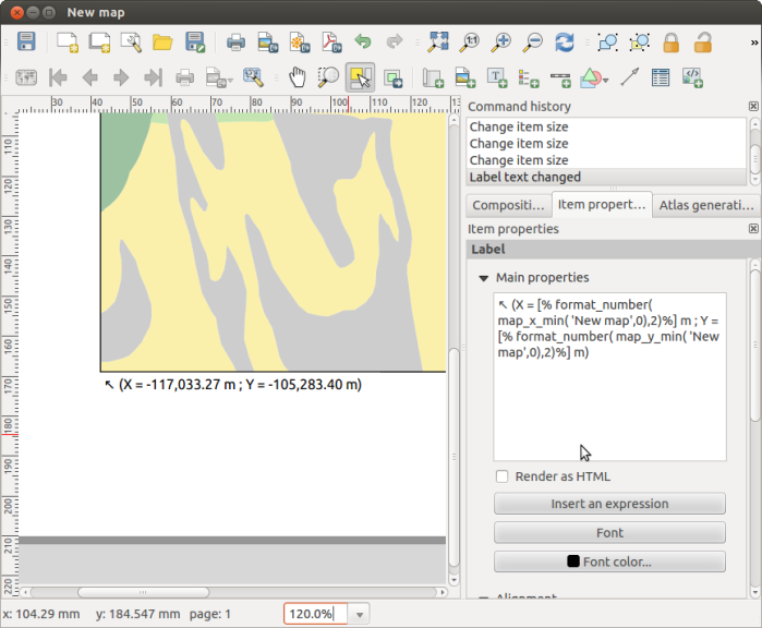
Using the created functions, it was now easy to put the corner coordinates in labels near the map corners. Any change to the map extents is reflected in the label, therefore quite useful to use with the atlas mode.

Screenshot from 2014-09-09 15^%40^%27

The functions result can be used with other functions. In the following image, there is an expression to show the coordinates in a more compact way.

Screenshot from 2014-09-09 15^%43^%55

There was a setback… For the functions to become available, it was necessary to manually import them in each QGIS session. Not very practical. Again with Nathan’s help, I found out that it’s possible to import python modules at QGIS startup by putting a startup.py file with the import statements in the .qgis2/python folder. In my case, this was enough.

import userfunctions

I was pretty satisfied with the end result. The ability to create your own functions in expressions demonstrates once more how easy it is to customize QGIS and create your own tools. I’m already thinking in more applications for this amazing functionality.

UT 9 - Qta da Peninha - Vegetação potencial

You can download the Python files with the functions HERE. Just unzip both files to the .qgis2/python folder, and restart QGIS, and the functions should become available.

Disclaimer: I’m not an English native speaker, therefore I apologize for any errors, and I will thank any advice on how to improve the text.

Profile Tool tutorial

Profile Tool is a plugin for QGIS which makes it possible to generate (elevation) profiles for line features. The plugin is available through the default QGIS plugin repository. While testing the plugin, I found some aspects of using the tool might require additional instructions.

After installing and enabling the plugin, you will find the “Terrain profile” button in the plugin toolbar:

qgisprofiletool

The basic use case is as follows:

  1. Load the elevation raster and select this raster layer in the layer list.
  2. Press the “Terrain profile” button. This opens the plugin panel which consists of a graph area on the left and a raster layer list on the right. The raster layer you had selected will be added to the raster layer list.
  3. If you have “Selection: Temporary polyline” enabled, you can now draw a line in the map area. Double-click left to end drawing the line. (If you are paying close attention, you might have noticed the instructions in the status bar.)
  4. After you have finished drawing the line, the graph area will update and display the profile.

qgisprofiletool2

If you want to add another raster layer to the plugin, you need to first select the raster layer in the QGIS layer list and then press the “Add Layer” button in the Profile Tool panel.

To generate the profile for an existing line feature, you need to change the selection mode from “Temporary polyline” to “Selected polyline”. Then you need to select the vector layer which contains the line feature you want to use in the QGIS layer list. Finally, you can click on the line feature in the map area to select it. (Note that this selection is independent of any selections you might have going on using the default QGIS feature selection tools.)

If you change from the Profile Tool to any other tool such as “Pan Map” or “Identify”, you have to click the “Terrain profile” button again to re-enable drawing/selection a line for the Profile Tool.

Due to a bug, it is currently not possible to export the profile graph. An alternative is to open the “Table” tab of the Profile Tool panel which provides access to the profile data and copy the data into your preferred graphing application such as Calc or Excel.

If you want to see the Profile Tool in action, I recommend watching the introduction video by Lene Fischer (University of Copenhagen).


Group Stats Tutorial

Group Stats is a plugin for QGIS which makes it easy to calculate statistics for feature groups in a vector layer. Note that the plugin is still marked “experimental” so you have to allow experimental plugins in order to install it. I tried this plugin for the first time today and decided to write this post because it didn’t seem immediately obvious how to use it.

The plugin button is added to the vector toolbar and of course you can access it via vector menu.

groupstatsicon

The example I want to show is: How to calculate the total area of of each Corine Land Cover (CLC) class per state.

corineAT

After adding state information to the CLC datasets by intersecting CLC and state geometries from Natural Earth we can get started with Group Stats.

groupstats

The big area on the left will display the results. The input fields are on the right. The general idea is to drag and drop fields and/or functions into the “columns”, “rows” and “values” sections. (Double-clicking field names does not do anything.) To remove fields again, you have to drop them back into the field list.

To calculate the total area of of each Corine Land Cover (CLC) class per state, I chose land cover classes as columns, state names as rows and sum of areas as values:

groupstatsclc

It’s also possible to add multiple functions in the columns/rows input sections to calculate different statistics at once:

groupstats_functions

Group Stats can be used in many cases that otherwise require a Spreadsheet software. The results can be exported to CSV easily. Usability could certainly be improved by allowing common interactions such as removing fields by pressing the delete key or adding fields by double-clicking.


QGIS Video Tutorials

QGIS wiki now has it’s own section listing QGIS video tutorials.
If you know of any tutorials not listed yet, leave a comment and I’ll add them.

Together with the newly started “How to I do that in QGIS” tutorial collection, this will hopefully become the number one reference for both new users doing their first GIS-related work and advanced uses interested in the latest QGIS features.


  • Page 1 of 1 ( 14 posts )
  • tutorial

Back to Top

Sustaining Members