Related Plugins and Tags

QGIS Planet

Soar.Earth Digital Atlas QGIS Plugin

Soar banner

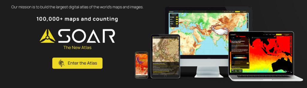
Growing up, I would spend hours lost in National Geographic maps. The feeling of discovering new regions and new ways to view the world was addictive! It’s this same feeling of discovery and exploration which has made me super excited about Soar’s Digital Atlas. Soar is the brainchild of Australian, Amir Farhand, and is fuelled by the talents of staff located across the globe to build a comprehensive digital atlas of the world’s maps and images. Soar has been designed to be an easy to use, expansive collection of diverse maps from all over the Earth. A great aspect of Soar is that it has implemented Strong Community Guidelines and moderation to ensure the maps are fit for purpose.

Recently, North Road collaborated with Soar to help facilitate their digital atlas goals by creating a QGIS plugin for Soar. The Soar plugin allows QGIS users to directly:

  • Export their QGIS maps and images straight to Soar
  • Browse and load maps from the entire Soar public catalogue into their QGIS projects

There’s lots of extra tweaks we’ve added to help make the plugin user friendly, whilst offering tons of functionality that power users want. For instance, users can:

  • Filter Soar maps by their current project extent and/or by category
  • Export raw or rendered raster data directly to Soar via a Processing tool
  • Batch upload multiple maps to Soar
  • Incorporate Soar map publishing into a Processing model or Python based workflow

Soar will be presenting their new plugin at the QGIS Open Day in August so check out the details here and tune in at 2300 AEST or 1300 HR UTC. You can follow along via either YouTube or Jitsi.

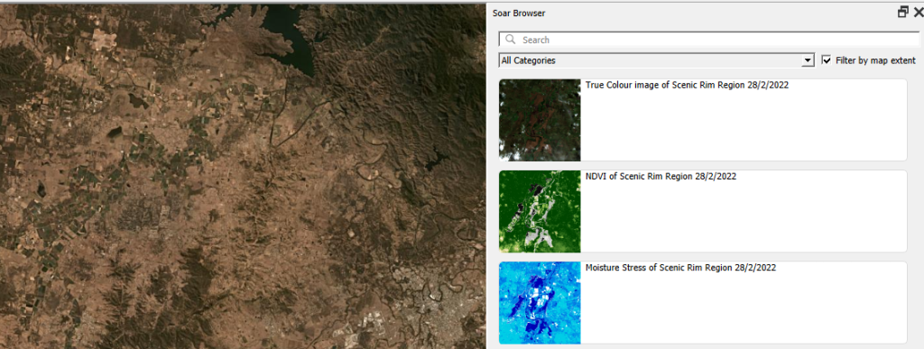
Browsing Soar maps from QGIS

One of the main goals of the Soar QGIS plugin was to make it very easy to find new datasets and add them to your QGIS projects. There’s two ways users can explore the Soar catalog from QGIS:

You can open the Soar Browser Panel via the Soar toolbar button  Soar browser . This opens a floating catalog browser panel which allows you to interactively search Soar’s content while working on your map.

Soar browser panel

Alternatively, you can also access the Soar catalog and maps from the standard QGIS Data Source Manager dialog. Just open the “Soar” tab and search away!

When you’ve found an interesting map, hit the “Add to Map” button and the map will be added as a new layer into your current project. After the layer is loaded you can freely modify the layer’s style (such as the opacity, colorization, contrast etc) just like any other raster dataset using the standard QGIS Layer Style controls.

Sharing your maps

Before you can share your maps on Soar, you’ll need to first sign up for a free Soar account.

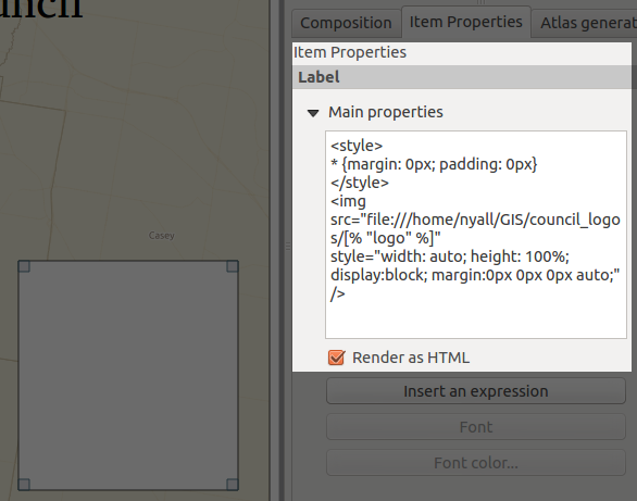
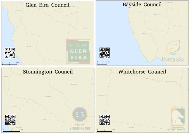
We’ve designed the Soar plugin with two specific use cases in mind for sharing maps. The first use case is when you want to share an entire map (i.e. QGIS project) to Soar. This will publish all the visible content from your map onto Soar, including all the custom styling, labeling, decorations and other content you’ve carefully designed. To do this, just select the Project menu, Import/Export -> Export map to Soar option.

Upload via Project to Soar

You’ll have a chance to enter all the metadata and descriptive text explaining your map, and then the map will be rendered and uploaded directly to Soar.

Soar Metadata

All content on the Soar atlas is moderated, so your shared maps get added to the moderation queue ready for review by the Soar team. (You’ll be notified as soon as the review is complete and your map is publicly available).

Alternatively, you might have a specific raster layer which you want to publish on Soar. For instance, you’ve completed some flood modelling or vegetation analysis and want to share the outcome widely. To do this, you can use the “Publish dataset to Soar” tool available from the QGIS Processing toolbox:

Upload product to Soar via processing tools

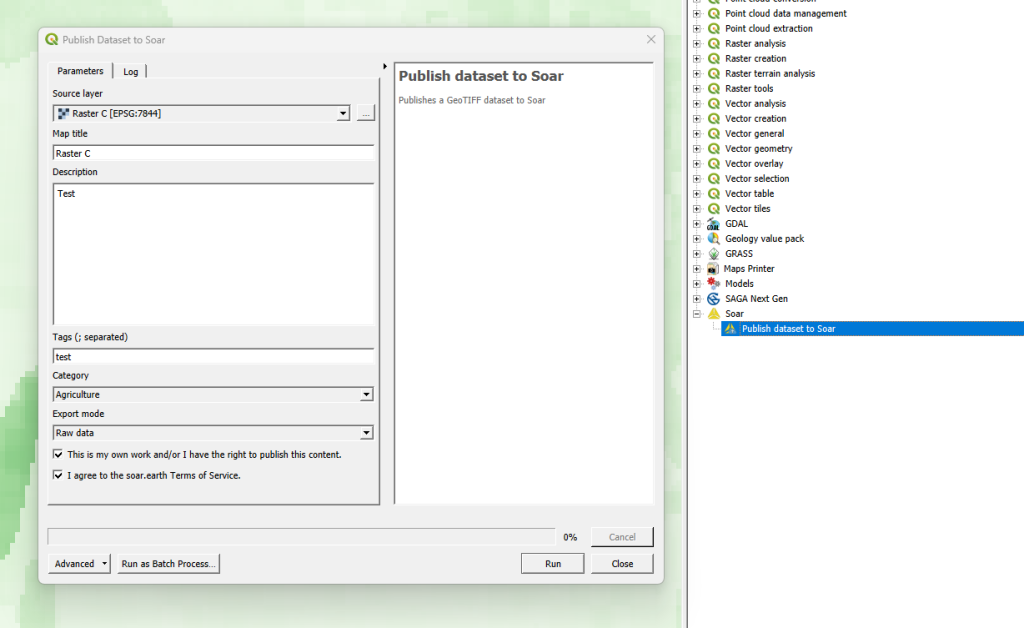
Just pick the raster layer you want to upload, enter the metadata information, and let the plugin do the rest! Since this tool is made available through QGIS’ Processing framework, it also allows you to run it as a batch process (eg uploading a whole folder of raster data to Soar), or as a step in your QGIS Graphical Models!

Some helpful hints

All maps uploaded to Soar require the following information:

  • Map Title
  • Description
  • Tags
  • Categories
  • Permission to publish

This helps other users to find your maps with ease, and also gives the Soar moderation team the information required for their review process.

We’ve a few other tips to keep in mind to successfully share your maps on Soar:

  • The Soar catalog currently works with raster image formats including GeoTIFF / ECW / JP2 / JPEG / PNG
  • All data uploaded to Soar must be in the WGS84 Pseudo-Mercator (EPSG: 3857) projection
  • Check the size of your data before sharing it, as a large size dataset may take a long time to upload

So there you have it! So simple to start building up your contribution to Soar’s Digital Atlas. Those who might find this useful to upload maps include:

  • Community groups
  • Hobbyists
  • Building a cartographic/geospatial portfolio
  • Education/research
  • Contributing to world events (some of the biggest news agencies already use this service i.e. BBC)

You can find out more about the QGIS Soar plugin at the QGIS Open Day on August 23rd, 2023 at 2300 HR AEST or 1300 HR UTC. Check here for more information or to watch back after.

If you’re interested in exploring how a QGIS plugin can make your service easily accessible to the millions of daily QGIS users, contact us to discuss how we can help!

Multiple format map series using QGIS 2.6 – Part 2

EN | PT

In my last post, I have tried to show how I used QGIS 2.6 to create a map series where the page’s orientation adapted to the shape of the atlas features. This method is useful when the final scale of the maps is irrelevant, or when the size of the atlas elements is  similar, allowing one to use a fixed scale. On the other hand, when using a fixed scale is mandatory and the features size are too different, it is needed to change the size of the paper. In this second part ot the post, I will try to show how I came to a solution for that.

As a base, I used the map created in the previous post, from which I did a duplicate. To exemplify the method, I tried to create a map series at 1:2.000.000 scale. Since I was going to change both width and height of the paper, I did not need to set an orientation, and therefore, I deactivated the data defined properties of the orientation option:

ith some maths with the map scale, the size of the atlas feature and the already defined margins, I came up with the following expressions to use, respectively,  in width and height:

((bounds_width( $atlasgeometry ) / 2000000.0) * 1000.0) * 1.1 + 10
((bounds_height( $atlasgeometry ) / 2000000.0) * 1000.0) * 1.1 + 30

Allow me to clarify. (bounds_width( $atlasgeometry ) / 2000000.0) is the atlas feature’s width in meters when represented at 1:2.000.000. This is multiplied by 1000 to convert it to millimeters (the composer’s settings units). In order to keep the atlas feature not to close to the margin, I have decided to add 10% of margin around it, hence the multiplication by 1.1. To finish I add the map margins value that were already set in the previous post (i.e.,20 mm, 5 mm, 10 mm, 5 mm)

As one can see from the previous image, after setting the expressions in the paper width and height options, it’s size already changed according to the size of the atlas features. But, as expected, all the itens stubbornly kept their positions.For that reason, it has been necessary to change the size and position expressions for each of then.

Starting by the map item size, the expressions to use in width and height were not difficult to understand since they would be the paper size without the margins size:

((bounds_width( $atlasgeometry ) / 2000000.0) * 1000.0) * 1.1
((bounds_height( $atlasgeometry ) / 2000000.0) * 1000.0) * 1.1

Screenshot from 2014-11-16 23:07:43

To position the items correctly, all was needed was to replace the “CASE WHEN … THEN … END” statement by the expressions defined before. For instance, the expressions used in the X and Y options for the legend position:

(CASE WHEN  bounds_width(  $atlasgeometry ) >=  bounds_height( $atlasgeometry) THEN 297 ELSE 210 END) - 7
(CASE WHEN  bounds_width(  $atlasgeometry ) >=  bounds_height( $atlasgeometry) THEN 210 ELSE 297 END) - 12

Became, respectively:

(((bounds_width( $atlasgeometry ) / 2000000.0) * 1000.0) * 1.1 + 10) - 7
(((bounds_height( $atlasgeometry ) / 2000000.0) * 1000.0) * 1.1 + 30) - 12

Screenshot from 2014-11-16 23:22:40

Changing the expressions of the X and Y position options for the remaining composer’s items I have reached the final layout.

alaska_region_Kenai Peninsula

Once again, printing/exporting all (25) maps was only one click away.

mosaico_regioes_fixed

Since QGIS allows exporting the composer as georeferenced images, opening all maps in QGIS I got this interesting result.

Screenshot from 2014-11-17 00:02:38

As one can see by the results, using this method, we can get some quite strange formats. That is why in the 3rd and last post of this article, I will try to show how to create a fixed scale map series using standard paper formats (A4, A3, A2, A1 e A0).

Disclaimer: I’m not an English native speaker, therefore I apologize for any errors, and I will thank any advice on how to improve the text.

Multiple format map series using QGIS 2.6 – Part 1

EN | PT

As always, the new QGIS version (QGIS 2.6 Brigthon) brings a vast new set of features that will allow the user to do more, better and faster than with the earlier version. One of this features is the ability to control some of the composer’s items properties with data (for instance, size and position). Something that will allow lots of new interesting usages. In the next posts, I propose to show how to create map series with multiple formats.

In this first post, the goal is that, keeping the page size, the map is created with the most suitable orientation (landscape or portrait) to fit the atlas feature. To exemplify, I will be using the Alaska’s sample dataset to create a map for each of Alaska’s regions.

I have started by creating the layout in one of the formats, putting the items in the desired positions.

mapa_base_atlas

To control the page orientation with the atlas feature, in the composition tab, I used the following expression in the orientation data defined properties:

CASE WHEN bounds_width( $atlasgeometry ) >=  bounds_height( $atlasgeometry ) THEN 'landscape' ELSE 'portrait' END

Using the atlas preview, I could verify that the page’s orientation changed according to the form of the atlas feature. However, the composition’s items did not follow this change and some got even outside the printing area

Screenshot from 2014-11-08 23:29:49

To control both size and position of the composition’s items I had in consideration the A4 page size (297 x 210 mm), the map margins ( 20 mm, 5 mm, 10 mm, 5 mm) and the item’s reference points.

For the map item, using the upper left corner as reference point, it was necessary to change it’s height and width. I knew that the item height was the subtraction of the top and bottom margins (30 mm) from the page height, therefore I used the following expression:

(CASE WHEN  bounds_width(  $atlasgeometry ) >=  bounds_height( $atlasgeometry) THEN 297 ELSE 210 END) - 30

Likewise, the expression to use in the width was:

(CASE WHEN  bounds_width(  $atlasgeometry ) >=  bounds_height( $atlasgeometry) THEN 210 ELSE 297 END) - 10

Screenshot from 2014-11-09 00:02:15

The rest of the items were always at a relative position of the page without the need to change their size and therefore only needed to control their position. For example, the title was centered at the page’s top, and therefore, using the top-center as reference point, all that was needed was the following expression for the X position:

Screenshot from 2014-11-09 00:13:17

(CASE WHEN  bounds_width(  $atlasgeometry ) >=  bounds_height( $atlasgeometry)  THEN 297 ELSE 210 END)  / 2.0

Screenshot from 2014-11-09 00:30:57

On the other hand, the legend needed to change the position in both X and Y. Using the bottom-right-corner as reference point, the X position expression was:

(CASE WHEN  bounds_width(  $atlasgeometry ) >=  bounds_height( $atlasgeometry) THEN 297 ELSE 210 END) - 7

And for the Y position:

(CASE WHEN  bounds_width(  $atlasgeometry ) >=  bounds_height( $atlasgeometry) THEN 210 ELSE 297 END) - 12

Screenshot from 2014-11-09 00:47:28

For the remaining items (North arrow, scalebar, and bottom left text), the expression were similar to the ones already mentioned, and, after setting them for each item, I got a layout that would adapt to both page orientation.

output_9

From that point, printing/exporting all (25) maps was one click away.

mosaico_regioes

In the next post of the series, I will try to explain how to create map series where it’s the size of the page that change to keep the scale’s value of the scale constant.

Composition styling in QGIS 2.2

Here’s a quick run-down on some new feature in QGIS 2.2 which I never got around to writing about before the release. I feel like I’ve got to give these features their due publicity before moving on to all the exciting new stuff which is being added for 2.4. So, without further ado, let’s take a dive into print composer shape and page styling in QGIS 2.2…

Shape styling

It’s no secret that QGIS has pretty impressive capabilities when it comes to cartographic styling of polygon features. Everything from line and point pattern fills, SVG image fills, gradients and even buffered gradients (new in 2.4 — more on that in a later post) can be used to shade polygons. That’s all in addition to the whole range of line styles which can be used to outline the edges of polygons. In QGIS 2.2 all these fill effects are now available for styling shapes in the print composer. What exactly does this mean?

Well, now you can draw a frame onto your print layout and style it with a gradient fill…

Gradient shape fill in composer

…or a line pattern fill….

Line pattern fill in composer

…or some crazy combination of everything…

Advanced fill in composer

It’s totally up to you how far you take this! Here’s a nice example of a map created in QGIS 2.2’s print composer using these new styling options.

Page styling for compositions

Why is this cool? Well, for a start, if we take a quick look at the QGIS map showcase on Flickr very few of the maps shown there have a white background. In previous versions of QGIS achieving a non-white background would require drawing a giant coloured rectangle over your whole composition, banishing it to the back of the stack, and then continually being annoyed by it getting in the way while you tried to work on the rest of the composition. Now, just like the shape styling described above, you can style the page background using any of the available options in QGIS for polygon fills!

Creating a composition with a black page background

Creating a composition with a black page background

It doesn’t end there though. Since the page background can now be styled like this, it’s also possible to have transparent or semi-transparent page backgrounds. I’ll show the result opened here in GIMP so that you can see the full transparency effect over GIMP’s checkerboard background pattern:

A composition exported with a transparent background

A QGIS 2.2 composition exported with a transparent background

Using a transparent composition background like this also allows for transparency effects in map layers to show through – so, for instance, if your map layer is set to 50% transparent then the resultant export from the composer will also be 50% transparent.

And now for the final stinger…

Have I mentioned yet that you can also use data defined symbology for both shape and page styling? No? Well, this was actually my main motivator in adding styling support to these elements. For a long time I’ve been wanting to create atlases which vary the page background based on attributes in the atlas coverage layer. Think flip-book style maps, where the page border is colour-coded to highlight areas that need attention. For example, areas with high rates showing with red borders, average rates with yellow, and low rates with green borders. Using a combination of page and shape styling, data defined symbology, and QGIS’ atlas features, this is now possible!

…And that (belatedly) wraps up my exploration of new features in QGIS 2.2. Next up I’ll start showcasing all the sweet new features which have landed for 2.4…

Atlas previews in QGIS 2.2

QGIS 2.2 includes some great additions to the map composer’s “Atlas” feature. If you’re not familiar with atlas prints they are QGIS’ equivalent of ArcGIS’s “data driven pages”, or something like a map based version of Microsoft Word’s “mail merge”. In an atlas composition you can select one of your map layers to use as a “coverage layer“, and QGIS will automatically generate multiple pages from the composition with each page highlighting a different feature from this coverage layer.

Atlas Previews

Thanks to funding from SIGE, I’ve added some useful new features to QGIS’ atlas abilities for 2.2. The first of these is the ability to preview atlas compositions before printing them. In QGIS 2.0, atlas generation took a bit of guess work. You’d set up the parameters for the atlas, then export the whole atlas in one shot and just hope you’d got the settings right. If not, you’d have to tweak the settings and export the whole lot again to see the result. But not any more! Now, in QGIS 2.2, you can switch on a live atlas preview mode by clicking “Preview Atlas” in the new atlas preview toolbar:

The new atlas preview toolbar

The new atlas preview toolbar

The composer window will switch to showing you a preview of exactly how the atlas will look when exported. You can tweak the appearance of any layout item, adjust the atlas and map parameters, or experiment with the new options for atlas feature styling to see instantly what the final export will look like.

The composer window in atlas preview mode

The composer window in atlas preview mode (complete with gratuitous use of label rotation and rounded rectangles…) 

When this Atlas Preview mode is enabled, you navigate through all the features in the coverage layer by clicking any of the navigation buttons in the atlas preview toolbar:

Navigating the atlas preview

Navigating the atlas preview

While previewing you can export individual pages from the atlas. So, if just one or two pages in your atlas need to be individually tweaked you can do that as you step through the features. A neat thing with this is that you can make temporary tweaks to the extent and scale of the map items as you go, without affecting how the rest of the atlas maps look.

(Oh, by the way, I should mention that as an added bonus QGIS 2.2 lets you control more than one map with an atlas print!)

Selecting the current atlas feature

The second part of the work funded by SIGE was creation of shortcut actions for selecting the current atlas feature. If your atlas coverage layer has many records it may not be practical to step through the atlas previews one at a time until you find a specific feature. That’s where these new shortcut actions come in handy!

There’s a few ways of jumping directly to a specific atlas feature. The first is to open a browser window for your coverage layer, then right click a row and choose “Set as atlas feature for …“:

Setting the atlas feature from the browser window

Setting the atlas feature from the browser window

Selecting this menu item will cause the composer to immediately jump to the matching atlas row. Another way of selecting the current atlas feature is to use the “Set as atlas feature” map action. You activate this by first selecting your coverage layer in the layers panel, then clicking the “Run Feature Action” tool button and selecting “Set as atlas feature…“:

The set atlas feature map action

The set atlas feature map action

The mouse cursor will change to a cross-hair, and clicking any matching feature in the map window will cause the composer atlas preview to jump straight to that feature. Lastly, you can also activate the “Set as atlas feature” action directly from the identify results window.

That’s just a small taste of some of the new atlas creation features which will be available in QGIS 2.2, coming your way by the end of February 2014!

(One last note – as mentioned, this work was kindly sponsored by SIGE. If there’s a specific composer based feature or bug you’d like me to work on, I’m available for further sponsored work. Just contact me directly for details.)

A neat trick in QGIS 2.0 – images in atlas prints

Here’s a cool trick which you can do in QGIS 2.0. It builds on two new features introduced in version 2.0 – atlas prints and html labels.

Atlas prints (previously available as a plugin, now integrated into QGIS core) were developed by Oslandia, and allow you to create data driven map layouts from a specified coverage layer. You can read more about them here.

Another new feature in QGIS 2.0 is the ability to render composer labels as html (courtesy of Olivier Dalang). This allows all kinds of fantastic effects, such as formatting text in the middle of a label (using <b>, <i>, and <font> tags) or creating labels which contain HTML tables. You can even use CSS stylesheets and rules to format the HTML! I’ve been told JavaScript also works inside the labels, but I’ve yet to try this out.

You can combine these two new features for some great tricks. Let’s say we’d like to create a set of maps of local councils, and we want each map to have a watermarked logo of the council on it. For this example I’ve created a basic basemap of Victorian councils, and I’ve downloaded all the council logos (in a variety of formats) to a local folder. Next, I’ll add an extra column to the council layer containing the name of the logo image:

adding_logo_column

Adding a logo column to the table

Then, we’ll throw together a simple composition containing the map and set it up as an atlas print:

setting_up_atlas

Generating an atlas

Now for the fun bit. I’ll add a label item to the composer, set it to “Render as HTML”, and insert some specially-crafted html:

The magic HTML label...

The magic HTML label…

For copy/paste purposes here’s the label contents again:

<style>
* {margin: 0px; padding: 0px}
</style>
<img src="file:///home/nyall/GIS/council_logos/[% "logo" %]"
style="width: auto; height: 100%; display: block; margin: 0px 0px 0px auto;" />

There’s a couple of things to note here. First, the magic happens in the image’s src attribute (“file:///home/nyall/GIS/council_logos/[% "logo" %]“). When the composer is exported, QGIS will replace the [% "logo" %] part with the contents of the logo field for each row in the councils table. This means the image source will then point to the local copy of the council’s logo, eg “file:///home/nyall/GIS/council_logos/glen_eira.jpg” for the first row.

Secondly, I’ve styled the image with the css:

width: auto; height: 100%; display: block;

This allows the image to resize to 100% of the height of the label while maintaining its correct aspect ratio. I’ve also added the rule

margin: 0px 0px 0px auto;

to force the image to right align within the html label. This ensures that all the watermarked logos will appear in a consistent size and position for each map.

Lastly, I’ll remove the label’s frame and background by unchecking these options, then set its transparency to 80% under the new “Rendering” section:

Yet another new feature in QGIS 2.0...

Yet another new feature in QGIS 2.0…

Ok, we’re all done. Now, when I select Composer -> “Export as Image”, we’ll get a lovely set of council maps complete with watermarked council logo!

A watermarked atlas!

A watermarked atlas!

There we go — all ready for print, with no manipulation in external programs required at all!

Bonus post-credits section

Here’s a kicker — the linked images don’t need to be local. That means you can even piggy-back off an existing web service to generate an image on the fly! Let’s say you were asked to add QR codes to your maps to link directly to the council website. All it takes is adding a new column to the table, then modifying the image src to read:

src="http://qrfree.kaywa.com/?l=1&s=8&d=[% "url" %]"

Now when we export the maps we’ll also get a QR image generated on the fly and inserted into the layout!

Complete with dynamically generated QR code!

Complete with dynamically generated QR code!

Combining HTML labels and atlas prints in this way is extremely powerful. This example is just touching the tip of the iceberg – I’m keen to see what the community can do with this when QGIS 2.0 is released!

  • Page 1 of 1 ( 6 posts )
  • atlas

Back to Top

Sustaining Members