Related Plugins and Tags

QGIS Planet

Offline Vector Tile Package .vtpk in QGIS

Starting from 3.26, QGIS now supports .vtpk (Vector Tile Package) files out of the box! From the changelog:

ESRI vector tile packages (VTPK files) can now be opened directly as vector tile layers via drag and drop, including support for style translation.

This is great news, particularly for users from Austria, since this makes it possible to use the open government basemap.at vector tiles directly, without any fuss:

1. Download the 2GB offline vector basemap from https://www.data.gv.at/katalog/de/dataset/basemap-at-verwaltungsgrundkarte-vektor-offline-osterreich


2. Add the .vtpk as a layer using the Data Source Manager or via drag-and-drop from the file explorer


3. All done and ready, including the basemap styling and labeling — which we can customize as well:

Kudos to https://wien.rocks/@DieterKomendera/111568809248327077 for bringing this new feature to my attention.

PS: And interesting tidbit from the developer of this feature, Nyall Dawson:

Routing in polygon layers? Yes we can!

A few weeks ago, the city of Vienna released a great dataset: the so-called “Flächen-Mehrzweckkarte” (FMZK) is a polygon vector layer with an amazing level of detail which contains roads, buildings, sidewalk, parking lots and much more detail:

preview of the Flächen-Mehrzweckkarte

preview of the Flächen-Mehrzweckkarte

Now, of course we can use this dataset to create gorgeous maps but wouldn’t it be great to use it for analysis? One thing that has been bugging me for a while is routing for pedestrians and how it’s still pretty bad in many situations. For example, if I’d be looking for a route from the northern to the southern side of the square in the previous screenshot, the suggestions would look something like this:

Pedestrian routing in Google Maps

Pedestrian routing in Google Maps

… Great! Google wants me to walk around it …

Pedestrian routing on openstreetmap.org

Pedestrian routing on openstreetmap.org

… Openstreetmap too – but on the other side :P

Wouldn’t it be nice if we could just cross the square? There’s no reason not to. The routing graphs of OSM and Google just don’t contain a connection. Polygon datasets like the FMZK could be a solution to the issue of routing pedestrians over squares. Here’s my first attempt using GRASS r.walk:

Routing with GRASS r.walk

Routing with GRASS r.walk (Green areas are walk-friendly, yellow/orange areas are harder to cross, and red buildings are basically impassable.)

… The route crosses the square – like any sane pedestrian would.

The key steps are:

  1. Assigning pedestrian costs to different polygon classes
  2. Rasterizing the polygons
  3. Computing a cost raster for moving using r.walk
  4. Computing the route using r.drain

I’ve been using GRASS 7 for this example. GRASS 7 is not yet compatible with QGIS but it would certainly be great to have access to this functionality from within QGIS. You can help make this happen by supporting the crowdfunding initiative for the GRASS plugin update.


Exploring open government population data collected by ODVIS-AT

At FOSS4G2013, I had the pleasure to attend a presentation about the ODVIS.AT project by Marius Schebella from the FH Salzburg. The goal of the project – which ended in Summer 2014 – was “to display open data (demographic, open government data) in a quick and easy way to end users” by combining it with OpenStreetMap. Even though their visualization does not work for me (“unable to get datasets” error), not all is lost because they provide an SQL dump of their PostGIS database.

Checking the data, it quickly becomes apparent that each data publisher decided to publish a slightly different dataset: some published their population counts as timelines over multiple years, others classified population by migration background, age, or gender. Also, according to the metadata table, no data from Salzburg and Burgenland were included. Most datasets’ reference date is between 2011 and 2013 but the data of the westernmost state Vorarlberg seems to be from 2001.

Based on this database, I created a dataset combining the municipalities with the Viennese districts and joined the population data from the individual state tables. The following map shows the population density based on this dataset: it is easy to recognize the densely populated regions around Vienna, Linz, Graz, and in the big Alpine valleys.

odvis_popdens

Overall, it is incredibly time-consuming to create this seemingly simple dataset. It would be very helpful if the publishers would agree on a common scheme for releasing at least the most basic information.

Considering that OpenStreetMap already contains population data, it barely seems worth all the trouble to merge these OGD datasets. Granted, the time lines of population development would be interesting but they are not available for each state.

P.S. If anyone is interested in the edited database, I would be happy to share the SQL dump.


Vienna elevation model

Since I finally managed to download the elevation model of the city of Vienna, I thought I’d share some eye candy with you: The map uses layer blending to combine hillshade and elevation raster, and the elevation raster’s color ramp is a modified “garish14″ from QGIS’ cpt-city color ramp collection.

wien_elevation by underdarkGIS
wien_elevation, a photo by underdarkGIS on Flickr.

Update

Here is how you get access to the “garish14″ color ramp:

Start by selecting the "new color ramp" option in the raster's style window.

Start by selecting the “new color ramp” option in the raster’s style window.

Chose the "cpt-city" color ramp type.

Chose the “cpt-city” color ramp type.

In the "cpt-city color ramp" window, you will find lots of different premade color ramps. "garish14" is part of the "Topography" collection.

In the “cpt-city color ramp” window, you will find lots of different premade color ramps. “garish14″ is part of the “Topography” collection.


Public transport isochrones with pgRouting

This post covers a simple approach to calculating isochrones in a public transport network using pgRouting and QGIS.

For this example, I’m using the public transport network of Vienna which is loaded into a pgRouting-enable database as network.publictransport. To create the routable network run:

select pgr_createTopology('network.publictransport', 0.0005, 'geom', 'id');

Note that the tolerance parameter 0.0005 (units are degrees) controls how far link start and end points can be apart and still be considered as the same topological network node.

To create a view with the network nodes run:

create or replace view network.publictransport_nodes as
select id, st_centroid(st_collect(pt)) as geom
from (
	(select source as id, st_startpoint(geom) as pt
	from network.publictransport
	) 
union
	(select target as id, st_endpoint(geom) as pt
	from network.publictransport
	) 
) as foo
group by id;

To calculate isochrones, we need a cost attribute for our network links. To calculate travel times for each link, I used speed averages: 15 km/h for buses and trams and 32km/h for metro lines (similar to data published by the city of Vienna).

alter table network.publictransport add column length_m integer;
update network.publictransport set length_m = st_length(st_transform(geom,31287));

alter table network.publictransport add column traveltime_min double precision;
update network.publictransport set traveltime_min = length_m  / 15000.0 * 60; -- average is 15 km/h
update network.publictransport set traveltime_min = length_m  / 32000.0 * 60 where "LTYP" = '4'; -- average metro is 32 km/h

That’s all the preparations we need. Next, we can already calculate our isochrone data using pgr_drivingdistance, e.g. for network node #1:

create or replace view network.temp as
 SELECT seq, id1 AS node, id2 AS edge, cost, geom
  FROM pgr_drivingdistance(
    'SELECT id, source, target, traveltime_min as cost FROM network.publictransport',
    1, 100000, false, false
  ) as di
  JOIN network.publictransport_nodes pt
  ON di.id1 = pt.id;

The resulting view contains all network nodes which are reachable within 100,000 cost units (which are minutes in our case).

Let’s load the view into QGIS to visualize the isochrones:

isochrone_publictransport_1

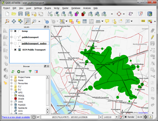
The trick is to use data-defined size to calculate the different walking circles around the public transport stops. For example, we can set up 10 minute isochrones which take into account how much time was used to travel by pubic transport and show how far we can get by walking in the time that is left:

1. We want to scale the circle radius to reflect the remaining time left to walk. Therefore, enable Scale diameter in Advanced | Size scale field:

scale_diameter

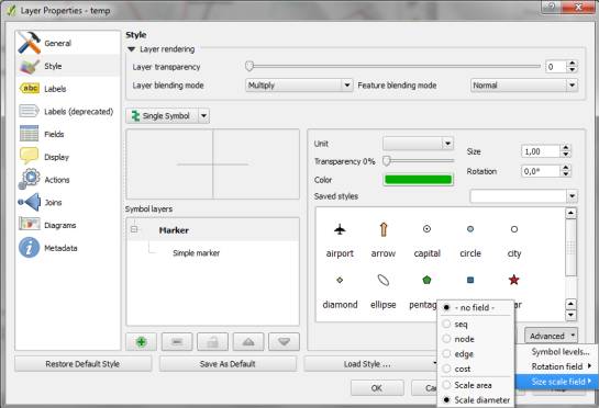
2. In the Simple marker properties change size units to Map units.
3. Go to data defined properties to set up the dynamic circle size.

datadefined_size

The expression makes sure that only nodes reachable within 10 minutes are displayed. Then it calculates the remaining time (10-"cost") and assumes that we can walk 100 meters per minute which is left. It additionally multiplies by 2 since we are scaling the diameter instead of the radius.

To calculate isochrones for different start nodes, we simply update the definition of the view network.temp.

While this approach certainly has it’s limitations, it’s a good place to start learning how to create isochrones. A better solution should take into account that it takes time to change between different lines. While preparing the network, more care should to be taken to ensure that possible exchange nodes are modeled correctly. Some network links might only be usable in one direction. Not to mention that there are time tables which could be accounted for ;)


Improving Population Density Maps Using Dasymetric Mapping

Yesterday, I described my process to generate a basic population density map from the city of Vienna’s open government data. In the end of that post, I described some ideas for further improvement. Today, I want to follow-up on those ideas using what is known as dasymetric mapping. GIS Dictionary defines it well (much better than Wikipedia):

Dasymetric mapping is a technique in which attribute data that is organized by a large or arbitrary area unit is more accurately distributed within that unit by the overlay of geographic boundaries that exclude, restrict, or confine the attribute in question.
For example, a population attribute organized by census tract might be more accurately distributed by the overlay of water bodies, vacant land, and other land-use boundaries within which it is reasonable to infer that people do not live.

That’s exactly what I want to do: Based on subdistricts with population density values and auxiliary data – Corine Land Cover to be exact – I want to create an improved representation of population density within the city.

This is the population density map I start out with:

… and this is the Corine Land Cover dataset for the same area:

It shows built-up areas (red), parks and natural areas (green) as well as water-covered regions (blue). For further analysis, I follow the assumption that people only live in areas with Corine code 111 “Continuous urban fabric” and 112 “Discontinuous urban fabric”. Therefore, I use the Intersection tool to clip only these residential areas from the subdistrict polygons. The subdistrict population can now be distributed over these new, smaller areas (use Field Calculator) to create a more realistic visualization of population density:

For easier comparison, I put the original density and the dasymetric map into a looping animation. Some subdistricts change their population density values quite drastically, especially in regions where big parts covered by water or rail infrastructure were removed:

Corine Land Cover is not too detailed but I think it still usable on this scale. One thing to note is that I used data from 2006 with population data from 2012 so some areas in the outer districts will have been turned residential in the meantime. But I hope this doesn’t distort the overall picture too much.


Mapping OGDWien Population Density

The city of Vienna provides both subdistrict geometries and population statistics. Mapping the city’s population density should be straightforward, right? Let’s see …

We should be able to join on ZBEZ and SUB_DISTRICT_CODE, check! But what about the actual population counts? Unfortunately, there is no file which simply lists population per subdistrict. The file I found contains four lines for each subdistrict: females 2011, males 2011, females 2012 and males 2012. That’s not the perfect format for mapping general population density.

A quick way to prepare our input data is applying pivot tables, eg. in Open Office: The goal is to have one row per subdistrict and columns for population in 2011 and 2012:

Export as CSV, add CSVT and load into QGIS. Finally, we can join geometries and CSV table:

A quick look at the joined data confirms that each subdistrict now has a population value. But visualizing absolute values results in misleading maps. Big subdistricts with only average density will overrule smaller but much denser subdistricts:

That’s why we need to calculate population density. This is easy to do using Field Calculator. The subdistrict file already contains area values but even if they were missing, we could calculate it using the $area operator: "pop2012" / ($area / 10000). The resulting population density in population per ha finally shows which subdistricts are the most densely populated:

One could argue that this is still no accurate representation of population density: Big parts of some subdistricts are actually covered by water – especially along the Danube – and therefore uninhabited. There are also big parks which could be excluded from the subdistrict area. But that’s going to be the topic of another post.

If you want to use my results so far, you can download the GeoJSON file from Github.


WFS to PostGIS in 3 Steps

This is a quick note on how to download features from a WFS and import them into a PostGIS database. The first line downloads a zipped Shapefile from the WFS. The second one unzips it and the last one loads the data into my existing “gis_experimental” database:

wget "http://data.wien.gv.at/daten/geoserver/ows?service=WFS&request=GetFeature&version=1.1.0&typeName=ogdwien:BEZIRKSGRENZEOGD&srsName=EPSG:4326&outputFormat=shape-zip" -O BEZIRKSGRENZEOGD.zip
unzip -d /tmp BEZIRKSGRENZEOGD.zip
shp2pgsql -s 4326 -I -S -c -W Latin1 "/tmp/BEZIRKSGRENZEOGD.shp" | psql gis_experimental

Now, I’d just need a loop through the WFS Capabilities to automatically fetch all offered layers … Ideas anyone?

Thanks to Tim for his post “Batch importing shapefiles into PostGIS” which was very useful here.

Update: Many readers have pointed out that ogr2ogr is a great tool for this kind of use cases and can do the above in one line. That’s true – if it works. Unfortunately, it is picky about the supported encodings, e.g. doesn’t want to parse ISO-8859-15. In such cases, the three code lines above can be a good alternative.


Mapping Density with Hexagonal Grids

A very common approach for mapping point density is to use heat maps. If you are aiming for a different style, give hexagonal grids a try. The workflow is very simple in QGIS:

  1. Load the point layer
  2. Create a hexagonal grid using MMQGIS – Create Grid Layer
  3. Count points per polygon (Vector menu)

I’ve applied this method to an OGD dataset of the Viennese tree cadastre containing 119,744 tree positions:

Default style: One dot per tree

Rendering tree counts per hexagonal grid cell reveals some of Vienna’s greenest spots, such as the Prater or Türkenschanzpark.

Tree density in a hexagonal grid

There’s also a printable version.

Some notes on the necessary steps:

MMQGIS – Create Grid Layer performs great. Creating the 18,400 hexagons in this map was very fast. Note though, that this tool doesn’t seem to write correct projection information to the resulting Shapefile. Therefore it is necessary to set the projection manually after loading the file.

As a result, it is very likely that the Points in Polygon tool will warn you that the point and polygon layer are not in the same projection. I ignored the warning and everything went fine. This step was reasonably fast considering the number of points (119,744) and polygons (18,400).


Green Vienna – Tree Cadastre

The Viennese tree cadastre “Baumkataster” contains all trees growing on city property. Amongst the attributes you can find the tree species and year of plantation as well as the diameter of it’s crown.

Using the crown diameter, we can create a foliage map of the city of Vienna. (Note that trees on private ground are missing.)

trees in Vienna scaled by crown diameter

Here’s a high-resolution version of the map: PDF (10 MB)

The tree cadastre is still under construction. If you miss a tree, let the OGD team know.


Open Government Data Wien in QGIS

Vienna’s Open Government Data initiative is publishing an increasing amount of Geodata and the best thing is: They’re publishing it via open standardized services! Both WMS and WFS are available and ready to be used in QGIS.

Let’s see how we can use the data available through their WFS using the district information layer “Bezirksgrenzen” as an example. The page lists a GML and a GeoJSON version of WFS. For now, we’ll use GeoJSON.

In QGIS, the layer can be loaded using “Add vector layer” – “Protocol” and inserting the GeoJSON url there. The encoding should be changed to ISO8859-15 to account for “Umlaute”.

The loaded GeoJSON layer "Bezirksgrenzen"

Now, we have geodata. Let’s add some attribute data too! Attribute data is available in CSV format. After downloading e.g. some information on the district population, check the file content and remove excessive header lines so that there is only one header line containing attribute names left. Then, you can load the CSV file into QGIS too (“Add vector layer”).

Last step: Joining geodata and attribute data! Go to the vector layer’s properties – Join tab and add the following join relation:

Joining GeoJSON and attribute layer

Now, the attribute table of the vector layer contains the additional CSV attributes – ready for further analysis. If you want to classify based on numerical CSV attributes, you’ll have to create a .csvt file first otherwise all fields are interpreted as texts.

Works great. Thumbs up for this great initiative!


  • Page 1 of 1 ( 11 posts )
  • ogdwien

Back to Top

Sustaining Members