Related Plugins and Tags

QGIS Planet

Using Trigonometry To Place And Orientate Labels

Geologists display the dip and strike of rock layers on geological maps using a dip and strike symbol, where dip in degrees indicates the maximum angle a rock layer descends relative to the horizontal. However, it is not directly possible in QGIS 2.18, using basic label settings, to place and orient a dip label next to a dip and strike symbol.

However, there is a way around this issue using Trigonometry and editing the layer’s Attribute Table. This method may be useful for controlling the position and orientation of labels around point features in general. The first step involves adding values to the Attribute Table. First, add these two new columns:

  • Angle – 0° is North and values increases clockwise up to 359°
  • Distance – label distance from a point feature

You can add Angle and Distance values to these columns manually or use the Field Calculator (see below) to add values if you have lots of points. Also, I chose Map Units (not millimeters) for Symbol Size, Font Size and Distance for my map, as I prefered to keep symbol size, font size and position of labels fixed when zooming in and out.


Note – I use Strike (Angle) and Label Distance (Distance)  in my Attribute Table

The next step is to control the position of the label around the points using trigonometry. Right click the points layer and choose:

Properties – Labels – Placement

Check that Offset From Point is checked and then click the Data Defined Override next to the Offset X, Y boxes and choose Edit. The Expression String Builder will appear. Enter the following expression in the Expression String Builder window:

to_string ( ((-1) * ( “Distance” )) * cos ( radians ( “Angle” ))) ||’,’|| to_string (((-1) * ( “Distance” )) * sin ( radians ( “Angle” )) )

The expression takes the angle and distance values from the Attribute Table (edited earlier) and calculates an X, Y label position relative to the point feature. You may also optionally control the angle of a symbol or icon itself via:

Layer Properties – Style – click Data Defined Override icon – Edit

Then enter the following expression in the Data Defined Override dialogue:

“Angle” – 90

Finally, to control the rotation of label text, so text follows the orientation (angle) of a rotating symbol or icon, choose:

Layer Properties – Labels – Placement – Data Defined – Rotation

Click the Data Defined Override Icon again and then choose Edit. Enter the following expression in the Data Defined Override dialogue:

(“Angle” – 90) * -1

The following geological map of the Old Head of Kinsale in southern Ireland shows the results of the above procedure. We see that the dip labels rotate and currently follow the orientation of the dip and strike symbols (note that the points are at the intersection of the T symbol).


Geological Survey of Ireland – Creative Commons Attribution 4.0 license

You may have several different symbols, of various sizes, each requiring an appropriate label distance expressed in the Attribute Table. It took me a few tries before I found the right distances for my geological symbols, from 90 to 230 meters distance depending on the symbol size and type.

Lastly, the expressions “Angle” – 90 and (“Angle” – 90) * -1 were necessary in my case because I needed to place my labels next to the dip and strike symbol’s barb. You may need to use a different expression e.g.Angle” and (“Angle”) * -1, or a value other than 90° depending on the symbol used and the prefered label placement location. Some trial and error is may be required to find the correct label position.

Adding ESRI’s Online World Imagery Dataset to QGIS

ESRI’s ArcGIS Online World Imagery is a high resolution satellite and aerial imagery base map for use in Google Earth, ArcMap and ArcGIS Explorer. The same excellent imagery is used by the Bing Maps Aerial layer. Somewhat surprisingly, World Imagery can also be accessed by QGIS, as it supports ESRI’s map servers that use Representational State Transfer (REST) and Simple Object Assess Protocol (SOAP) standards.

Simply copy and past the following code into the Python Console in QGIS and press return (Plugins – Console):

qgis.utils.iface.addRasterLayer("http://server.arcgisonline.com/arcgis/rest/services/ESRI_Imagery_World_2D/MapServer?f=json&pretty=true","raster")

The code adds an ESRI Online World Imagery base map to QGIS. It has a number of advantages over the popular OpenLayers Plugin that adds various Google, Bing and OpenStreetMap image layers to QGIS. Unlike images downloaded by the OpenLayers plugin the ESRI World Imagery base map is a true Raster who’s attributes are fully editable e.g. brightness, blending mode and transparency can be adjusted. World Imagery can also be printed at a very high resolution with other QGIS layers on a map and without it shifting relative to other layers; a conspicuous problem with OpenLayers that does not use “On the Fly” re-projection and only prints Google, Bing layers at a low resolution. It is an ideal aerial base map.

References:

QGIS: Adding An ArcServer Rest Service

Connecting to ArcGIS “mapserver” layers

Edit: Updated to correct URL

Note: This method has been superseded by a plug-in that adds ESRI imagery and other REST layers via a GUI


Nautical Charts in QGIS – The Compass Rose

Before the advent of shipborne satellite navigation systems, navigation at sea required three precise measurements – Solar or Stellar Declination for Latitude, Time at Greenwich for Longitude and True North that determined the ship’s heading. True North was obtained from the ship’s Magnetic Compass, an instrument who’s name indicates at an additional complication.

A magnetic compass does not point towards True North. Magnetic North is 100s km from the Geographic North Pole and the Earth’s magnetic field is uneven, it is distorted by magnetic irregularities within the Outer Core and intrinsically magnetic Mantle and Crustal rock. Additionally, the position of Magnetic North is not fixed, it is presently drifting from Arctic Canada towards Russia at 15 km per year. Therefore True North has to be derived from Magnetic North using a correction called Magnetic Declination (or Magnetic Variation), the angular difference between Magnetic North and True North. Magnetic Declination varies from location to location and over time.

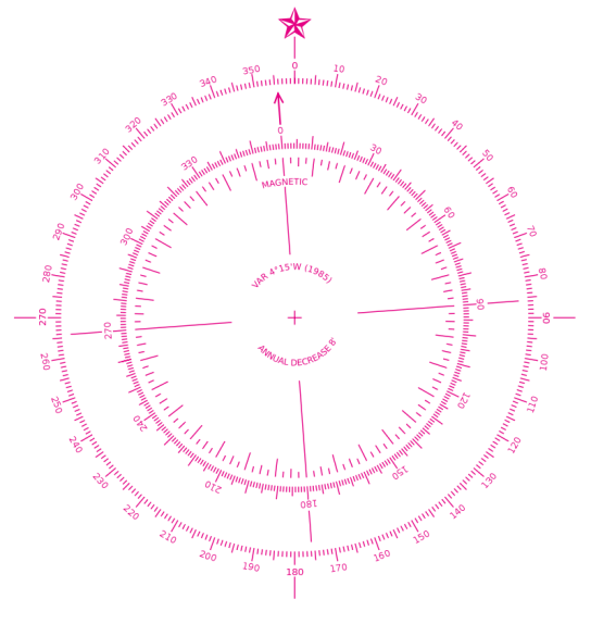
Nautical navigation charts typically contain one or more Compass Roses, also called a Windrose, these consist of two circles – an outer circle that displays the cardinal directions of North, East, South and West and a inner circle that displays the direction of Magnetic North. The Magnetic Declination and its annual rate of change is typically printed within the Compass Rose, it is therefore possible to calculate the Magnetic Declination several years after a map is printed.

In this tutorial I will show you a process that to create a Compass Rose with the correct Magnetic Declination and Annual Rate of Change for any terrestrial location for use in QGIS. First we need to obtain a suitable Compass Rose graphic. Conveniently the United States National Oceanic and Atmospheric Administration (NOAA) published a Compass Rose in the Public Domain i.e. it is free to use without limitation. I downloaded a version of the NOAA Compass Rose from Wikimedia (or you can right click and save the Compass Rose below). Additionally, the background of this Compass Rose is transparent, this allows a map (or indeed a web page) to show though (note the Magnetic Declination in 1985 was 4 degrees 15 minutes west of True North and it had an annual decrease of 8 minutes of a degree per year).

800px-Modern_nautical_compass_rose.svg

There are several handy on-line utilities that can calculate Magnetic Declination and the Annual Rate of Change but we shall use Charles F. F. Karney’s excellent cross-platform GeographicLib in this case. GeographicLib is a suite of command line utilities for solving solving various geodesic problems such as conversions between geographic, UTM, UPS, MGRS, geocentric and local cartesian coordinates, gravity calculations, determining geoid height, and magnetic field calculations. The latest version can be obtained as a pre-compiled binary from Sourceforge or as source code.

The other essential step is to measure the precise map location in WGS84 coordinates. This can be done using the Coordinated Capture plug-in provided as standard with QGIS. To select the WGS84 coordinate reference system (CRS) click the sphere symbol in Coordinated Capture panel to open the Coordinate Reference System Selector. After setting the CRS to WGS84 (EPSG: 4326), click the icon left of the “Copy to Clipboard” button (this toggles real time display of captured coordinates) and then click “Start Capture”. The position in Decimal Degrees will be updated in the upper window as you move the cursor across the map, the lower window will display projected coordinates (in my case Pseudo Mercator EPSG: 3857). Clicking the map will select a coordinate point and the real time display will cease updating.

Wordpress

The MagneticField utility of GeographicLib is then used to calculate the Magnetic Declination and Annual Rate of Change for the captured coordinate, in this case a location east of Howth, Ireland.

$ MagneticField -r -t 2014-08-04 --input-string "53.37772 6.00935"

-3.57 67.81 18572.9 18536.9 -1152.2 45528.7 49171.3
0.17 -0.01 17.9 21.2 52.4 19.6 24.9

The results are: Magnetic Declination in degrees (-3.57); the inclination of the Magnetic Field in degrees (67.81); the horizontal strength of the magnetic field in nanotesla (18572.9 nT); the north component of the field (18536.9 nT); the east component of the field in (-1152.2 nT); the vertical component of the field in nT (45528.7 nT) and the total field (49171.3 nT). The numbers on the second line are the annual rate of change of these values, the first number is. We only need the first numbers on each line; the Magnetic Declination (-3.57) and Annual Rate of Change of Magnetic Declination (0.17). We can convert these to Degrees Minutes Seconds if required.

After calculating the Magnetic Declination and Annual Rate of Change, edit the NOAA Compass Rose in a graphics program such as  GIMP or Photoshop. In my case I copied the inner circle to a separate layer and I rotated it 3.57 degrees anticlockwise. I then added text to the Compass Rose stating the Magnetic Declination (Var.) and the Annual Rate of Change (Annual Decrease). After editing the Compass Rose graphic I finally added it to my Nautical Chart as a Image in Map Composer of QGIS.

Further Reading:

Bowditch, N. & ‎National Imagery and Mapping Agency, 2002. CHAPTER 3. NAUTICAL CHARTS. In: The American Practical Navigator: An Epitome of Navigation. Bethesda, MD : Washington, DC, Paradise Cay Publications, 9, 23–50. ISBN: 978-0939837540 http://msi.nga.mil/MSISiteContent/StaticFiles/NAV_PUBS/APN/Chapt-03.pdf


Creating a Nautical Chart in QGIS 2.4

Continuing with a nautical theme, here is a nautical chart I creating using QGIS 2.4. It includes a Graticule in decimal degrees, a Compass Rose and a scale bar in Nautical Miles. A magnetic declination of 3º 35′ was determined using the MagneticField utility of GeographicLib, an advanced software library for solving geodesic problems. I will post a full tutorial shortly.

Nautical Chart for North Dublin Bay


  • Page 1 of 1 ( 4 posts )
  • map

Back to Top

Sustaining Members