ChatGPT Data Analyst vs movement data
Today, I took ChatGPT’s Data Analyst for a spin. You’ve probably seen the fancy advertising videos: just drop in a dataset and AI does all the analysis for you?! Let’s see …
Of course, I’m not going to use some lame movie database or flower petals data. Instead, let’s go all in and test with a movement dataset.
You don’t get a second chance to make a first impression, they say. — Well, Data Analyst, you didn’t impress on the first try. How hard can it be to guess the delimiter and act accordingly?
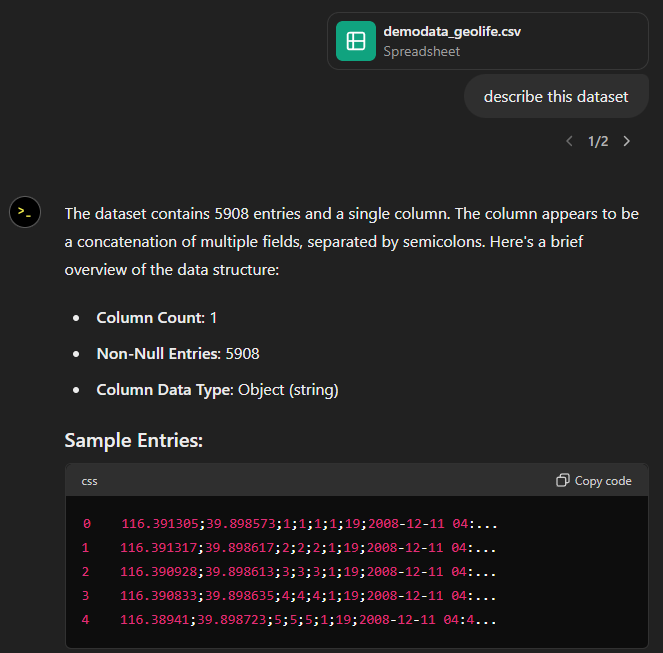
Anyway, let’s help it a little:
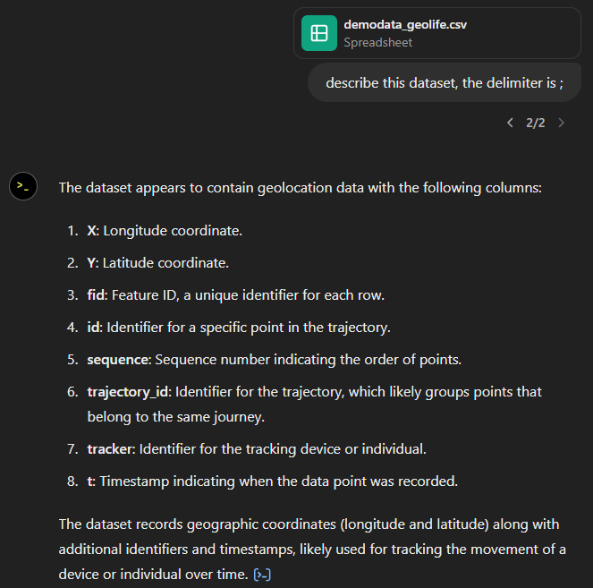
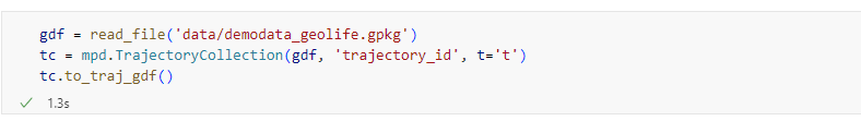
That looks much better. It makes an effort to guess what the columns could mean and successfully identifies the spatiotemporal information.
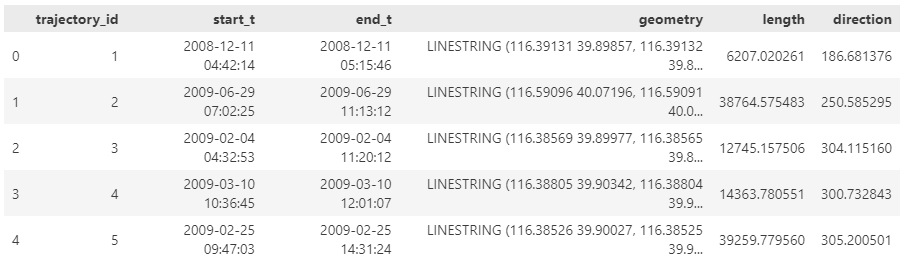
Now for some spatial analysis. On first try, it didn’t want to calculate the length of the trajectories in geographic terms, but we can make it to:
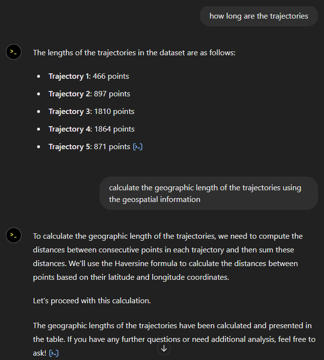
It will also show the code used to get to the results:
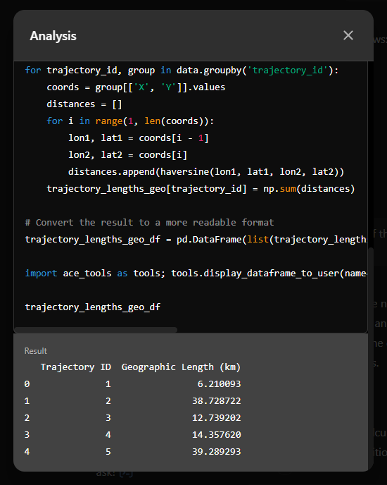
And indeed, these are close enough to the results computed using MovingPandas:
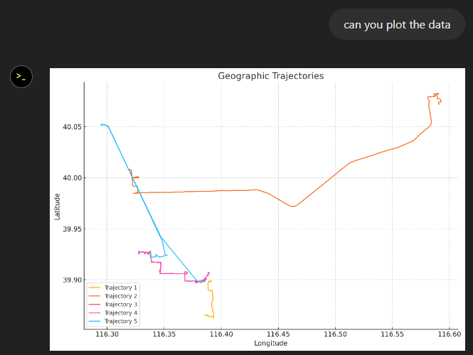
“What about plots?” I hear you ask.
For a first try, not bad at all:
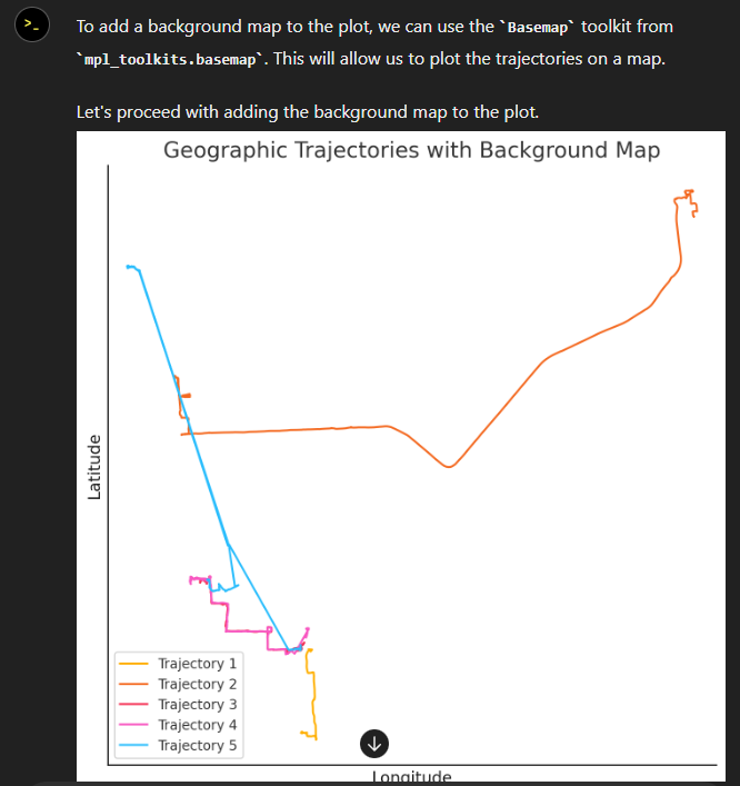
Let’s see if we can push it further:
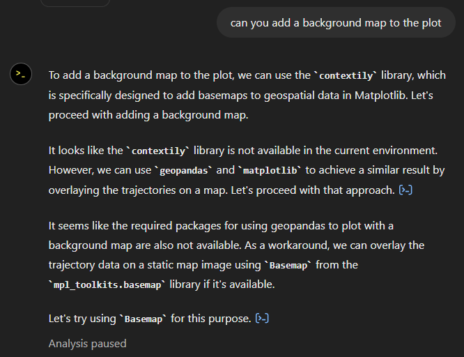
Looks like poor Data Analyst ended up in geospatial library dependency hell 
It’s interesting to watch it try find a solution.
Alas, no background map appears:
Not giving up yet :)
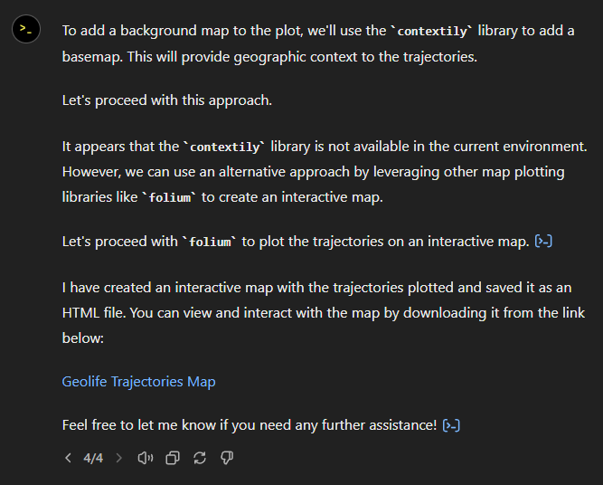
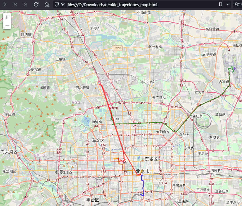
Woah, what happened here? It claims it created an interactive map in an HTML file.
And indeed it did:
This has been a very interesting experiment for me with many highs and lows. The whole process is a bit hit and miss. But when it does work, it’s fun.
I wasn’t sure what to expect with regards to Data Analyst’s spatial data processing capabilities. Looks like there are enough examples in its training data to find solutions for the basic trajectory analysis problems I asked it solve today, eventually, at least.
What’s the conclusion? Most AI marketing videos are severely overselling the capabilities of these tools. However, that doesn’t mean that they are completely useless, either. I’m looking forward to seeing the age of smaller open source models specifically trained for geospatial analysis to finally make it unnecessary for humans to memorize data analysis library syntax.