Related Plugins and Tags

QGIS Planet

Movement data in GIS #33: “Exploratory analysis of massive movement data” webinar

Yesterday, I had the pleasure to speak at the RGS-IBG GIScience Research Group seminar. The talk presents methods for the exploration of movement patterns in massive quasi-continuous GPS tracking datasets containing billions of records using distributed computing approaches.

Here’s the full recording of my talk and follow-up discussion:

and slides are available as well.


This post is part of a series. Read more about movement data in GIS.

Extracting trajectory-based flows between M³ prototypes

Rendering large sets of trajectory lines gets messy fast. Different aggregation approaches have been developed to address this issue. However, most approaches, such as mobility graphs or generalized flow maps, cannot handle large input datasets. Building on M³ prototypes, the following approach can be used in distributed computing environments to extracts flows from large datasets. 

This is part 3 of “Exploring massive movement datasets”.

This flow extraction is based on a two-step process, conceptually similar to Andrienko flow maps: first, we extract M³ prototypes from the movement data. In the second step, we determine flows between these prototypes, including information about: distribution of travel speeds and number of observed transitions. The resulting flows can be visualized, for example, to explore the popularity of different paths of movement:

After the prototypes have been computed, the flow algorithm computes transitions between pairs of prototypes. An object moving from prototype A to prototype B triggers an update of the corresponding flow. To allow for distributed processing, each node in the distributed computing environment needs a copy of the previously computed prototypes. Additionally, the raw movement data records need to be converted into trajectories. Afterwards, each trajectory is processed independently, going through its records in chronological order:

  1. Find the best matching prototype for the current record
  2. Ensure that the distance to the match is below the distance threshold and that the matched prototype is different from the previous prototype
  3. Get or create the flow between the two prototypes
  4. Ensure that the prototype and flow directions are a good match for the current record’s direction
  5. Update the flow properties: travel speed and number of transitions, as well as the previous prototype reference

This approach scales to large datasets since only the prototypes, the (intermediate) flow results, and the trajectory currently being worked on have to be kept in memory for each iteration. However, this algorithm does not allow for continuous updates. Flows would have to be recomputed (at least locally) whenever prototypes changed. Therefore, the algorithm does not support exploration of continuous data streams. However, it can be used to explore large historical datasets:

Flow example: passenger vessel speed patterns showing mean flow speeds (line color: darker colors equal higher speeds) and speed variation (line width)

If you want to dive deeper, here’s the full paper:

[1] Graser, A., Widhalm, P., & Dragaschnig, M. (2020). Extracting Patterns from Large Movement Datasets. GI_Forum – Journal of Geographic Information Science, 1-2020, 153-163. doi:10.1553/giscience2020_01_s153.


This post is part of a series. Read more about movement data in GIS.

M³ Massive Movement Model: aggregating movement data using prototypes

Visualizations of raw movement data records, that is, simple point maps or point density (“heat”) maps provide very limited data exploration capabilities. Therefore, we need clever aggregation approaches that can actually reveal movement patterns. Many existing aggregation approaches, however, do not scale to large datasets. We therefore developed the M³ Massive Movement Model [1] which supports distributed computing environments and can be incrementally updated with new data.

This is part 1 of “Exploring massive movement datasets”.

Using state-of-the-art big gespatial tools, such as GeoMesa, it is quite straightforward to ingest, index and query large amounts of timestamped location records. Thanks to GeoMesa’s GeoServer integration, it is also possible to publish GeoMesa tables as WMS and WFS which can be visualized in QGIS and explored (for more about GeoMesa, see Scalable spatial vector data processing ).So far so good! But with this basic setup, we only get point maps and point density maps which don’t tell us much about important movement characteristics like speed and direction (particularly if the reporting interval between consecutive location records is irregular). Therefore, we developed an aggregation method which models local record density, as well as movement speed and direction which we call M³.

For distributed computation, we need to split large datasets into chunks. To build models of local movement characteristics, it makes sense to create spatial or spatiotemporal chunks that can be processed independently. We therefore split the data along a regular grid but instead of computing one average value per grid cell, we create a flexible number of prototypes that describe the movement in the cell. Each prototype models a location, speed, and direction distribution (mean and sigma).

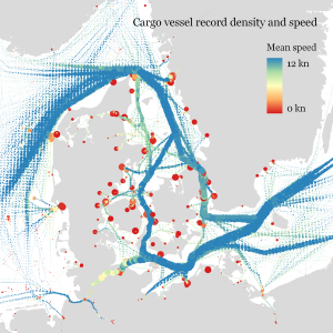
In our paper, we used M³ to explore ship movement data. We turned roughly 4 billion AIS records into prototypes:

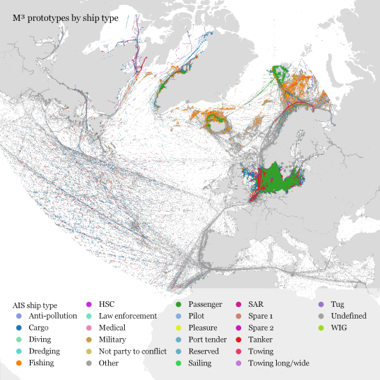
M³ for ship movement data during January to December 2017 (3.9 billion records turned into 3.4 million prototypes; computing time: 41 minutes)

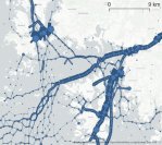
The above plot really only gives a first impression of the spatial distribution of ship movement records. The real value of M³ becomes clearer when we zoom in and start exploring regional patterns. Then we can discover vessel routes, speeds, and movement directions:

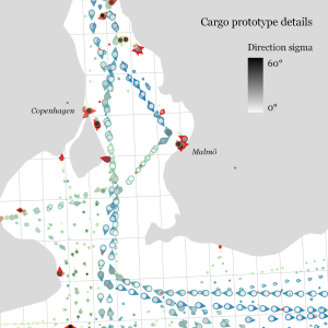
The prototype details on the right side, in particular, show the strength of the prototype idea: even though the grid cells we use are rather large, the prototypes clearly form along vessel routes. We can see exactly where these routes are and what speeds ship travel there, without having to increase the grid resolution to impractical values. Slow prototypes with high direction sigma (red+black markers) are clear indicators of ports. The marker size shows the number of records per prototype and thus helps distinguish heavily traveled routes from minor ones.

M³ is implemented in Spark. We read raw location records from GeoMesa and write prototypes to GeoMesa. All maps have been created in QGIS using prototype data published as GeoServer WFS.

If you want to dive deeper, here’s the full paper:

[1] Graser. A., Widhalm, P., & Dragaschnig, M. (2020). The M³ massive movement model: a distributed incrementally updatable solution for big movement data exploration. International Journal of Geographical Information Science. doi:10.1080/13658816.2020.1776293.


This post is part of a series. Read more about movement data in GIS.

Generating trajectories from massive movement datasets

To explore travel patterns like origin-destination relationships, we need to identify individual trips with their start/end locations and trajectories between them. Extracting these trajectories from large datasets can be challenging, particularly if the records of individual moving objects don’t fit into memory anymore and if the spatial and temporal extent varies widely (as is the case with ship data, where individual vessel journeys can take weeks while crossing multiple oceans). 

This is part 2 of “Exploring massive movement datasets”.

Roughly speaking, trip trajectories can be generated by first connecting consecutive records into continuous tracks and then splitting them at stops. This general approach applies to many different movement datasets. However, the processing details (e.g. stop detection parameters) and preprocessing steps (e.g. removing outliers) vary depending on input dataset characteristics.

For example, in our paper [1], we extracted vessel journeys from AIS data which meant that we also had to account for observation gaps when ships leave the observable (usually coastal) areas. In the accompanying 10-minute talk, I went through a 4-step trajectory exploration workflow for assessing our dataset’s potential for travel time prediction:

Click to watch the recorded talk

Like the M³ prototype computation presented in part 1, our trajectory aggregation approach is implemented in Spark. The challenges are both the massive amounts of trajectory data and the fact that operations only produce correct results if applied to a complete and chronologically sorted set of location records.This is challenging because Spark core libraries (version 2.4.5 at the time) are mostly geared towards dealing with unsorted data. This means that, when using high-level Spark core functionality incorrectly, an aggregator needs to collect and sort the entire track in the main memory of a single processing node. Consequently, when dealing with large datasets, out-of-memory errors are frequently encountered.

To solve this challenge, our implementation is based on the Secondary Sort pattern and on Spark’s aggregator concept. Secondary Sort takes care to first group records by a key (e.g. the moving object id), and only in the second step, when iterating over the records of a group, the records are sorted (e.g. chronologically). The resulting iterator can be used by an aggregator that implements the logic required to build trajectories based on gaps and stops detected in the dataset.

If you want to dive deeper, here’s the full paper:

[1] Graser, A., Dragaschnig, M., Widhalm, P., Koller, H., & Brändle, N. (2020). Exploratory Trajectory Analysis for Massive Historical AIS Datasets. In: 21st IEEE International Conference on Mobile Data Management (MDM) 2020. doi:10.1109/MDM48529.2020.00059


This post is part of a series. Read more about movement data in GIS.

Movement data in GIS #31: exploring massive movement datasets

Exploring large movement datasets is hard because visualizations of movement data quickly get cluttered and hard to interpret. Therefore, we need to aggregate the data. Density maps are commonly used since they are readily available and quick to compute but they provide only very limited insight. In contrast, meaningful aggregations that can help discover patterns are computationally expensive and therefore slow to generate.

This post serves as a starting point for a series of new approaches to exploring massive movement data. This series will summarize parts of my PhD research and – for those of you who are interested in more details – there will be links to the relevant papers.

Starting with the raw location records, we use different forms of aggregation to learn more about what information a movement dataset contains:

  1. Summarizing movement using prototypes by aggregating raw location records using our flexible M³ Massive Movement Model [1]
  2. Generating trajectories by connecting consecutive records into continuous tracks and splitting them into meaningful trajectories [2]
  3. Extracting flows by summarizing trajectory-based transitions between prototypes [3]

Besides clever aggregation approaches, massive movement datasets also require appropriate computing resources. To ensure that we can efficiently explore large datasets, we have implemented the above mentioned aggregation steps in Spark. This enables us to run the computations on general purpose computing clusters that can be scaled according to the dataset size.

In the next post, we’ll look at how to summarize movement using M³ prototypes. So stay tuned!

But if you don’t want to wait, these are the original papers:

[1] Graser. A., Widhalm, P., & Dragaschnig, M. (2020). The M³ massive movement model: a distributed incrementally updatable solution for big movement data exploration. International Journal of Geographical Information Science. doi:10.1080/13658816.2020.1776293.
[2] Graser, A., Dragaschnig, M., Widhalm, P., Koller, H., & Brändle, N. (2020). Exploratory Trajectory Analysis for Massive Historical AIS Datasets. In: 21st IEEE International Conference on Mobile Data Management (MDM) 2020. doi:10.1109/MDM48529.2020.00059
[3] Graser, A., Widhalm, P., & Dragaschnig, M. (2020). Extracting Patterns from Large Movement Datasets. GI_Forum – Journal of Geographic Information Science, 1-2020, 153-163. doi:10.1553/giscience2020_01_s153.


This post is part of a series. Read more about movement data in GIS.

Getting started with PySpark & GeoPandas on Databricks

Over the last years, many data analysis platforms have added spatial support to their portfolio. Just two days ago, Databricks have published an extensive post on spatial analysis. I took their post as a sign that it is time to look into how PySpark and GeoPandas can work together to achieve scalable spatial analysis workflows.

If you sign up for Databricks Community Edition, you get access to a toy cluster for experimenting with (Py)Spark. This considerably lowers the entry barrier to Spark since you don’t need to bother with installing anything yourself. They also provide a notebook environment:

I’ve followed the official Databricks GeoPandas example notebook but expanded it to read from a real geodata format (GeoPackage) rather than from CSV.

I’m using test data from the MovingPandas repository: demodata_geolife.gpkg contains a hand full of trajectories from the Geolife dataset. Demodata_grid.gpkg contains a simple 3×4 grid that covers the same geographic extent as the geolife sample:

Once the files are downloaded, we can use GeoPandas to read the GeoPackages:

Note that the display() function is used to show the plot.

The same applies to the grid data:

When the GeoDataFrames are ready, we can start using them in PySpark. To do so, it is necessary to convert from GeoDataFrame to PySpark DataFrame. Therefore, I’ve implemented a simple function that performs the conversion and turn the Point geometries into lon and lat columns:

To compute new values for our DataFrame, we can use existing or user-defined functions (UDF). Here’s a simple hello world function and associated UDF:

A spatial UDF is a little more involved. For example, here’s an UDF that finds the first polygon that intersects the specified lat/lon and returns that polygon’s ID. Note how we first broadcast the grid DataFrame to ensure that it is available on all computation nodes:

It’s worth noting that PySpark has its peculiarities. Since it’s a Python wrapper of a strongly typed language, we need to pay close attention to types in our Python code. For example, when defining UDFs, if the specified return type (Integertype in the above example) does not match the actual value returned by the find_intersection() function, this will cause rather cryptic errors.

To plot the results, I’m converting the joined PySpark DataFrame back to GeoDataFrame:

I’ve published this notebook so you can give it a try. (Any notebook published on Databricks is supposed to stay online for six months, so if you’re trying to access it after June 2020, this link may be broken.)

  • Page 1 of 1 ( 6 posts )
  • spark

Back to Top

Sustaining Members