Related Plugins and Tags

QGIS Planet

Movement data in GIS #34: a protocol for exploring movement data

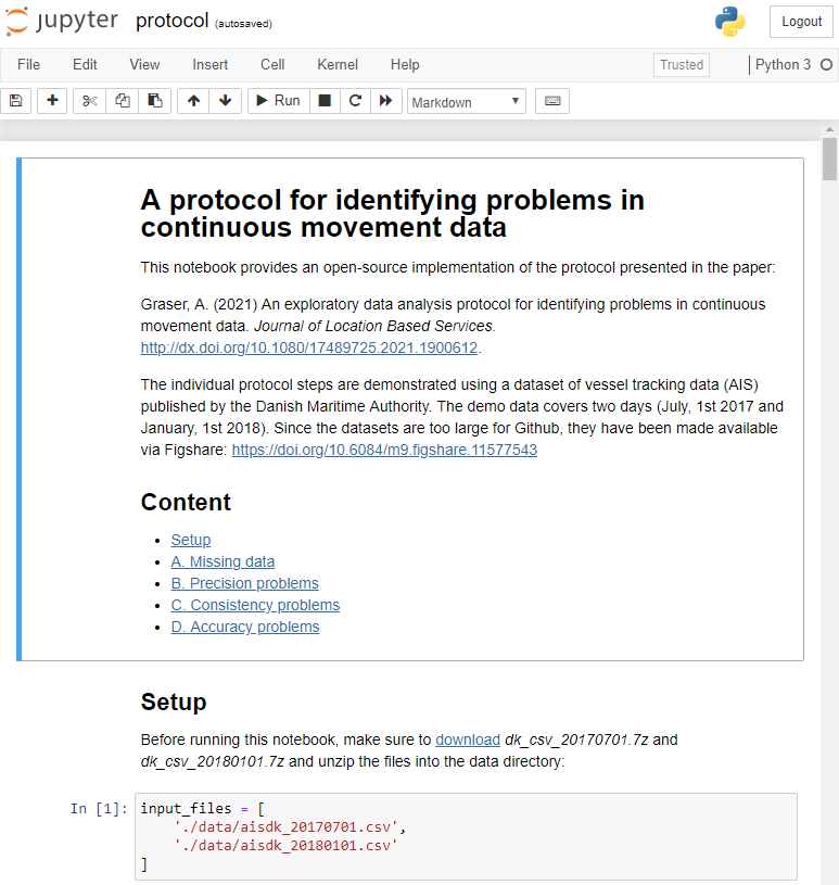
After writing “Towards a template for exploring movement data” last year, I spent a lot of time thinking about how to develop a solid approach for movement data exploration that would help analysts and scientists to better understand their datasets. Finally, my search led me to the excellent paper “A protocol for data exploration to avoid common statistical problems” by Zuur et al. (2010). What they had done for the analysis of common ecological datasets was very close to what I was trying to achieve for movement data. I followed Zuur et al.’s approach of a exploratory data analysis (EDA) protocol and combined it with a typology of movement data quality problems building on Andrienko et al. (2016). Finally, I brought it all together in a Jupyter notebook implementation which you can now find on Github.

There are two options for running the notebook:

  1. The repo contains a Dockerfile you can use to spin up a container including all necessary datasets and a fitting Python environment.
  2. Alternatively, you can download the datasets manually and set up the Python environment using the provided environment.yml file.

The dataset contains over 10 million location records. Most visualizations are based on Holoviz Datashader with a sprinkling of MovingPandas for visualizing individual trajectories.

Point density map of 10 million location records, visualized using Datashader

Line density map for detecting gaps in tracks, visualized using Datashader

Example trajectory with strong jitter, visualized using MovingPandas & GeoViews


I hope this reference implementation will provide a starting point for many others who are working with movement data and who want to structure their data exploration workflow.

If you want to dive deeper, here’s the paper:

[1] Graser, A. (2021). An exploratory data analysis protocol for identifying problems in continuous movement data. Journal of Location Based Services. doi:10.1080/17489725.2021.1900612.

(If you don’t have institutional access to the journal, the publisher provides 50 free copies using this link. Once those are used up, just leave a comment below and I can email you a copy.)

References


This post is part of a series. Read more about movement data in GIS.

OSM quality assessment with QGIS: network length

In my previous post, I presented a Processing model to determine positional accuracy of street networks. Today, I’ll cover another very popular tool to assess OSM quality in a region: network length comparison. Here’s the corresponding slide from my FOSS4G presentation which shows an example of this approach applied to OSM and OS data in the UK:

foss4g_osm_data_quality_12

One building block of this tool is the Total graph length model which calculates the length of a network within specified regions. Like the model for positional accuracy, this model includes reprojection steps to ensure all layers are in the same CRS before the actual geoprocessing starts:

total_graph_length

The final Compare total graph length model combines two instances of “Total graph length” whose results are then joined to eventually calculate the length difference (lenDIFF).

compare_total_graph_length

As usual, you can find the models on Github. If you have any questions, don’t hesitate to ask in the comments and if you find any issues please report them on Github.


OSM quality assessment with QGIS: positional accuracy

Over the last years, research on OpenStreetMap data quality has become increasingly popular. At this year’s FOSS4G, I had the honor to present some work we did at the AIT to assess OSM quality in Vienna, Austria. In the meantime, our paper “Towards an Open Source Analysis Toolbox for Street Network Comparison” has been published for early access. Thanks to the conference organizers who made this possible! I’ve implemented comparison tools found in related OSM literature as well as new tools for oneway street and turn restriction comparison using Sextante scripts and models for QGIS 1.8. All code is available on Github to enable collaboration. If you are interested in OSM data quality research, I’d like to invite you to give the tools a try.

Since most users probably don’t have access to QGIS 1.8 anymore, I’ll be updating the tools to QGIS 2.0 Processing. I’m starting today with the positional accuracy comparison tool. It is based on a method described by Goodchild & Hunter (1997). Here’s the corresponding slide from my FOSS4G presentation:

foss4g_osm_data_quality_10

The basic idea is to evaluate the positional accuracy of a street graph by comparing it with a reference graph. To do that, we check how much of the graph lies within a certain tolerance (buffer) of the reference graph.

The processing model uses the following input: the two street graphs which should be compared, the size of the buffer (tolerance for positional accuracy), a polygon layer with analysis regions, and the field containing the region id. This is how the model looks in Processing modeler:

graph_covered_by_buffered_reference_graph

First, all layers are reprojected into a common CRS. This will have to be adjusted if the tool is used in other geographic regions. Then the reference graph is buffered and – since I found that dissolving buffers directly in the buffer tool can become very slow with big datasets – the faster difference tool is used to dissolve the buffers before we calculate the graph length inside the buffer (inbufLEN) as well as the total graph length in the analysis region (totalLEN). Finally, the two results are joined based on the region id field and the percentage of graph length within the buffered reference graph (inbufPERC) is calculated. A high percentage shows that both graphs agree very well geometrically.

The following image shows the tool applied to a sample of OpenStreetMap (red) and official data published by the city of Vienna (purple) at Wien Handelskai. OSM was used as a reference graph and the buffer size was set to 10 meters.

ogd_osm_positional_accuracy

In general, both graphs agree quite well. The percentage of the official graph within 10 meters of the OSM graph is 93% in the 20th district. In the above image, we can see that links available in OSM are not contained in the official graph (mostly pedestrian/bike links) and there seem to be some connectivity issues as well in the upper right corner of the image.

In my opinion, Processing models are a great solution to document geoprocessing work flows and share them with others. If you want to collaborate on building more models for OSM-related analysis, just leave a comment bellow.


  • Page 1 of 1 ( 3 posts )
  • data quality

Back to Top

Sustaining Members