QGIS Print Layouts Graphs and Charts Campaign – Complete!
Last week saw the exciting release of version 3 of the QGIS DataPlotly plugin, which incorporates all the work done as a result of our Print Layouts Graphs and Charts crowdfunding campaign crowd funding campaign. Now, beautiful charts and graphs are available directly within QGIS print layouts, and all it takes is the easy installation of the “DataPlotly” plugin from your QGIS install!
In this post we’ll showcase the functionality which has been added during this campaign, and which is available today in the plugin.
UI modernisation and tweaks
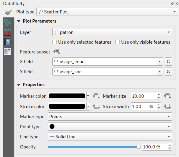
First up, during our work on this plugin we’ve invested some time in refreshing the plugin’s UI to ensure it follows all the widget conventions used elsewhere in QGIS. Now, the plugin blends seamlessly into your QGIS window, and all the chart setting widgets behave in just the way you’re used to. We’ve also used this opportunity to fix a number of issues the plugin had when running on hi-dpi displays (such as Apple retina displays)!
Dynamic charting of selected and visible features
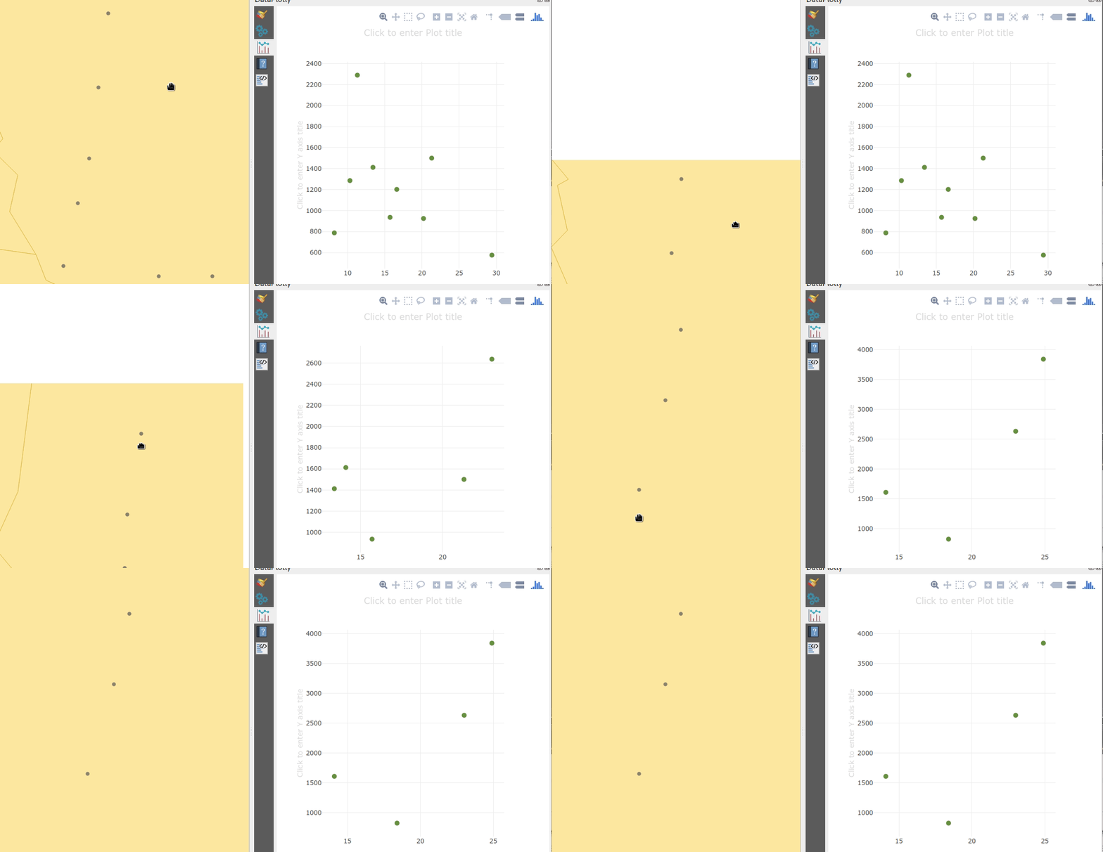
If you’ve used earlier versions of the DataPlotly plugin, you’ll likely notice that there’s many new options shown in the screenshot above. Possibly the most exciting of these is the new “Use only selected features” and “Use only visible features” checkboxes. When either of these options are enabled, then your chart will immediately respond to changes in layer selections or changes to the visible map canvas extent respectively. Previously, interactivity in the plugin only went one way (from the chart to the canvas) – but now the charts are truly interactive, and respond dynamically to changes in the canvas too!

Improved handling of “data defined” settings
During the plugin refactoring, we reworked how “data defined” settings are handled within charts. If you’re not familiar with these, “data defined” settings are QGIS’ approach for exposing per-feature control over the map rendering process. In DataPlotly charts, we expose this functionality to allow per-feature control over the chart appearance (e.g., showing different scatter plot dot colors based on feature attributes). The new code uses the same code model as QGIS itself, so data-defined settings in your charts now have full access to the whole suite of QGIS expression functions and variables that you’re used to! Additionally, QGIS data-defined assistants are fully supported in the charts too. Ultimately, this enables some very advanced styling options, such as charts which dynamically change color and appearance on every page of your print atlas…

Charts in print layouts
We’ve previously covered this feature in depth, but the DataPlotly v3 release brings print-layout based charts to the masses! When a chart is inserted into a print layout, some additional options are available for controlling the plot behavior:

These new options allow you to link the chart to a map item within the layout, which lets you filter the content of the chart to only include features visible within the map. If your print layout is setup as an atlas export, you can also filter out included features to only show those which are geographically located inside the current atlas feature.
Our partners from Faunalia demonstrate this in the screencast below:
Saving plot configuration
An often-requested functionality previous missing from the plugin was the ability to save and restore plot configuration. Now, plot configuration is automatically saved within your QGIS project and restored when you reopen the project. You no longer have to re-create all your charts from scratch at every session (ouch!). We also added the ability to export chart configuration to XML files, allowing you to share and reuse chart configuration across projects.
Behind the scenes work
Aside from all the wonderful new features added to the plugin, we’ve extensively refactored most of the plugin backend. Unit tests and CI infrastructure have been added, which will ensure the plugin remains stable and regression-free in future releases. The code cleanup and simplification has drastically lowered the barrier of contribution to the project, and we’ve already seen new contributors adding more new features to the plugin as a result of this! (Kudos to Simon Gröchenig, who added the new “Feature subset” expression option you can see in the above screenshots!).
Project sponsors
All this work is thanks to the backers of our crowdfunding campaign. Without their contributions this work would not have been possible! In no particular order, our thanks go out to:
- Federico Gianoli
- Papercraft Mountains
- Liam McCrae
- Henry Walshaw
- Raúl Sangonzalo
- Ferdinando Urbano
- pitsch-ing.ch
- Carbon-X
- Gabriel Diosan
- Rene Giovanni Borella
- Enrico Bertonati
- Guido Ingwer
- David Addy
- Gerd Jünger
- Andreas Neumann
- Stefano Campus
- Michael Jabot
- Korto
- Enrico Ferreguti
- Carlo A. Nicolini
- Salvatore Fiandaca
- Alberto Grava
- Hans van der Kwast
- Ben Hur Pintor
- Silvio Grosso
- Nobusuke Iwasaki
- Alasdair Rae
- Manori Senanayake
- Canton de Neuchâtel
- Matthias Daues
- Alteri Seculo
- SunGIS Ltd.
- Stu Smith
- Keolis Rennes
- Gabriel Diosan
- Aiden Price
- Giacomo Ponticelli
- Diane Fritz
- Gemio Bissolati
- Claire Birnie
- Nicolas Roelandt
- Rocco Pispico
- Gabriel Bengtsson
- Birds Eye View
- Barend Köbben
- Roberto Marzocchi (GTER)
- Yoichi Kayama
- Alessandro Sarretta
- Luca Angeli
- Luca Bellani
- giswelt
- Stefan Giese
- Ben Harding
- Joao Gaspar
- Romain Lacroix
- Ryan Cooper
- Daniele Bonaposta
- QGIS Swedish User Group
- Nino Formica
- Michael Gieding
- Amedeo Fadini
- Andrew Hannell
- Stefano
- Phil Wyatt
- Brett Edmond Carlock
- Transitec
Keep an eye out on the North Road blog for future crowd-funding initiatives. Coming soon: a QGIS Processing grab-bag of ETL modelling improvements!


