This post is a follow-up to the draft template for exploring movement data I wrote about in my previous post. Specifically, I want to address step 4: Exploring patterns in trajectory and event data.
The patterns I want to explore in this post are clusters of trip origins. The case study presented here is an extension of the MovingPandas ship data analysis notebook.
The analysis consists of 4 steps:
- Splitting continuous GPS tracks into individual trips
- Extracting trip origins (start locations)
- Clustering trip origins
- Exploring clusters
Since I have already removed AIS records with a speed over ground (SOG) value of zero from the dataset, we can use the split_by_observation_gap() function to split the continuous observations into individual trips. Trips that are shorter than 100 meters are automatically discarded as irrelevant clutter:
traj_collection.min_length = 100
trips = traj_collection.split_by_observation_gap(timedelta(minutes=5))
The split operation results in 302 individual trips:

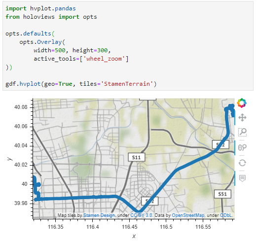
Passenger vessel trajectories are blue, high-speed craft green, tankers red, and cargo vessels orange. Other vessel trajectories are gray.
To extract trip origins, we can use the get_start_locations() function. The list of column names defines which columns are carried over from the trajectory’s GeoDataFrame to the origins GeoDataFrame:
origins = trips.get_start_locations(['SOG', 'ShipType'])
The following density-based clustering step is based on a blog post by Geoff Boeing and uses scikit-learn’s DBSCAN implementation:
from sklearn.cluster import DBSCAN
from geopy.distance import great_circle
from shapely.geometry import MultiPoint

origins['lat'] = origins.geometry.y
origins['lon'] = origins.geometry.x
matrix = origins.as_matrix(columns=['lat', 'lon'])

kms_per_radian = 6371.0088
epsilon = 0.1 / kms_per_radian

db = DBSCAN(eps=epsilon, min_samples=1, algorithm='ball_tree', metric='haversine').fit(np.radians(matrix))
cluster_labels = db.labels_
num_clusters = len(set(cluster_labels))
clusters = pd.Series([matrix[cluster_labels == n] for n in range(num_clusters)])
print('Number of clusters: {}'.format(num_clusters))
Resulting in 69 clusters.
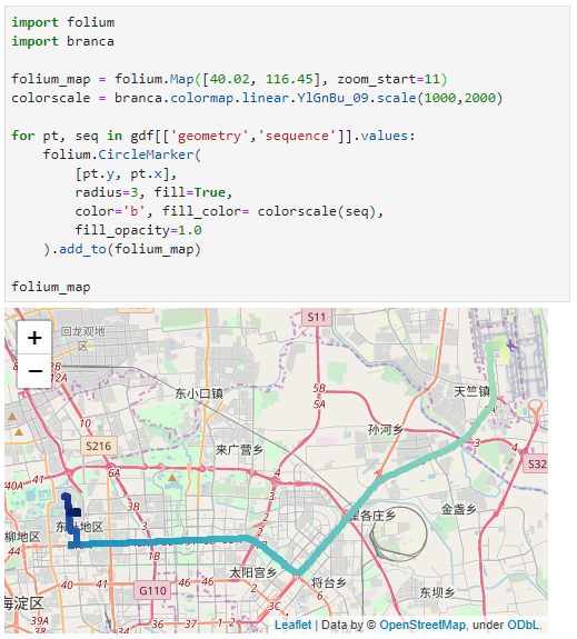
Finally, we can add the cluster labels to the origins GeoDataFrame and plot the result:
origins['cluster'] = cluster_labels

To analyze the clusters, we can compute summary statistics of the trip origins assigned to each cluster. For example, we compute a representative (center-most) point, count the number of trips, and compute the mean speed (SOG) value:
def get_centermost_point(cluster):
    centroid = (MultiPoint(cluster).centroid.x, MultiPoint(cluster).centroid.y)
    centermost_point = min(cluster, key=lambda point: great_circle(point, centroid).m)
    return Point(tuple(centermost_point)[1], tuple(centermost_point)[0])
centermost_points = clusters.map(get_centermost_point)
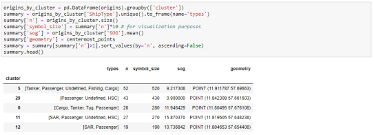
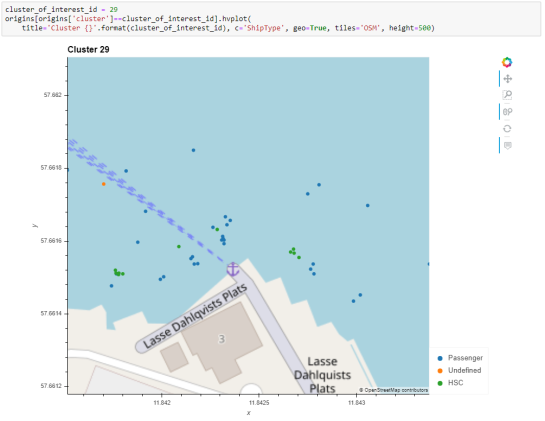
The largest cluster with a low mean speed (indicating a docking or anchoring location) is cluster 29 which contains 43 trips from passenger vessels, high-speed craft, an an undefined vessel:
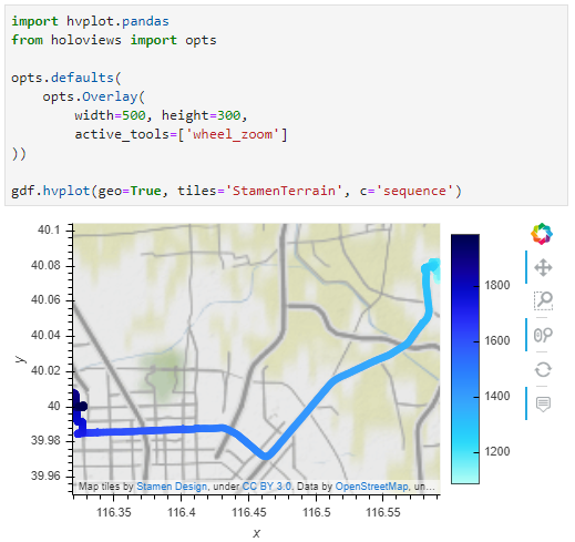
To explore the overall cluster pattern, we can plot the clusters colored by speed and scaled by the number of trips:
 Besides cluster 29, this visualization reveals multiple smaller origin clusters with low speeds that indicate different docking locations in the analysis area.
Cluster locations with high speeds on the other hand indicate locations where vessels enter the analysis area. In a next step, it might be interesting to compute flows between clusters to gain insights about connections and travel times.
It’s worth noting that AIS data contains additional information, such as vessel status, that could be used to extract docking or anchoring locations. However, the workflow presented here is more generally applicable to any movement data tracks that can be split into meaningful trips.
For the full interactive ship data analysis tutorial visit https://mybinder.org/v2/gh/anitagraser/movingpandas/binder-tag
This post is part of a series. Read more about movement data in GIS.


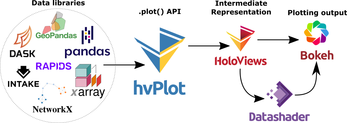
 Dash HoloViews was just released as part of
  Automatically link selections across multiple plots (crossfiltering)