Related Plugins and Tags

QGIS Planet

Movement data in GIS #27: extracting trip origin clusters from MovingPandas trajectories

This post is a follow-up to the draft template for exploring movement data I wrote about in my previous post. Specifically, I want to address step 4: Exploring patterns in trajectory and event data.

The patterns I want to explore in this post are clusters of trip origins. The case study presented here is an extension of the MovingPandas ship data analysis notebook.

The analysis consists of 4 steps:

  1. Splitting continuous GPS tracks into individual trips
  2. Extracting trip origins (start locations)
  3. Clustering trip origins
  4. Exploring clusters

Since I have already removed AIS records with a speed over ground (SOG) value of zero from the dataset, we can use the split_by_observation_gap() function to split the continuous observations into individual trips. Trips that are shorter than 100 meters are automatically discarded as irrelevant clutter:

traj_collection.min_length = 100
trips = traj_collection.split_by_observation_gap(timedelta(minutes=5))

The split operation results in 302 individual trips:

Passenger vessel trajectories are blue, high-speed craft green, tankers red, and cargo vessels orange. Other vessel trajectories are gray.

To extract trip origins, we can use the get_start_locations() function. The list of column names defines which columns are carried over from the trajectory’s GeoDataFrame to the origins GeoDataFrame:

 
origins = trips.get_start_locations(['SOG', 'ShipType']) 

The following density-based clustering step is based on a blog post by Geoff Boeing and uses scikit-learn’s DBSCAN implementation:

from sklearn.cluster import DBSCAN
from geopy.distance import great_circle
from shapely.geometry import MultiPoint

origins['lat'] = origins.geometry.y
origins['lon'] = origins.geometry.x
matrix = origins.as_matrix(columns=['lat', 'lon'])

kms_per_radian = 6371.0088
epsilon = 0.1 / kms_per_radian

db = DBSCAN(eps=epsilon, min_samples=1, algorithm='ball_tree', metric='haversine').fit(np.radians(matrix))
cluster_labels = db.labels_
num_clusters = len(set(cluster_labels))
clusters = pd.Series([matrix[cluster_labels == n] for n in range(num_clusters)])
print('Number of clusters: {}'.format(num_clusters))

Resulting in 69 clusters.

Finally, we can add the cluster labels to the origins GeoDataFrame and plot the result:

origins['cluster'] = cluster_labels

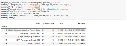
To analyze the clusters, we can compute summary statistics of the trip origins assigned to each cluster. For example, we compute a representative (center-most) point, count the number of trips, and compute the mean speed (SOG) value:

 
def get_centermost_point(cluster):
    centroid = (MultiPoint(cluster).centroid.x, MultiPoint(cluster).centroid.y)
    centermost_point = min(cluster, key=lambda point: great_circle(point, centroid).m)
    return Point(tuple(centermost_point)[1], tuple(centermost_point)[0])
centermost_points = clusters.map(get_centermost_point) 

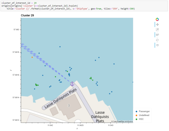
The largest cluster with a low mean speed (indicating a docking or anchoring location) is cluster 29 which contains 43 trips from passenger vessels, high-speed craft, an an undefined vessel:

To explore the overall cluster pattern, we can plot the clusters colored by speed and scaled by the number of trips:

Besides cluster 29, this visualization reveals multiple smaller origin clusters with low speeds that indicate different docking locations in the analysis area.

Cluster locations with high speeds on the other hand indicate locations where vessels enter the analysis area. In a next step, it might be interesting to compute flows between clusters to gain insights about connections and travel times.

It’s worth noting that AIS data contains additional information, such as vessel status, that could be used to extract docking or anchoring locations. However, the workflow presented here is more generally applicable to any movement data tracks that can be split into meaningful trips.

For the full interactive ship data analysis tutorial visit https://mybinder.org/v2/gh/anitagraser/movingpandas/binder-tag


This post is part of a series. Read more about movement data in GIS.

QGIS Snapping improvements

A few months ago, we proposed to the QGIS grant program to make improvements to the snap cache in QGIS. The community vote selected our project which was funded by QGIS.org. Developments are now mostly finished.

In short, snapping is crucial for editing geospatial features. It is the only way to ensuring they are topologically related, ie, connected vertices have exactly the same coordinates even if manual digitizing on screen is imprecise by nature.  Snapping correctly supposes QGIS have in memory an indexed cache of the geometries to snap to. And maintainting this cache when data is modified, sometimes by another user or database logic, can be a real challenge. This it exactly what this work adresses.

The proposal was divided into two different tasks:

  • Manage circular dependencies
  • Relax the snap cache index build

Manage cicular data dependencies

Data dependencies

Data dependency is an existing feature that allows you to configure QGIS to reload layers (and their snapping cache) when a layer is modified.

It is useful when you store your data in a database and you set up triggers to maintain consistency between the different tables of your data model.

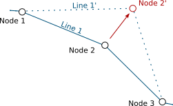
For instance, say you have topological informations containing lines and nodes. Nodes are part of lines and lines go through nodes. Then, you move a node in QGIS, and save your modifications to the database. In order to keep the data consistent, a trigger updates the geometry of the line going through the modified node.

Node 2 is modified, Line 1 is updated accordingly

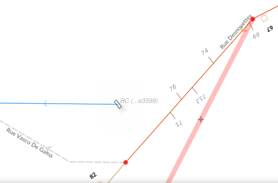
QGIS, as a database client, has no information that the line layer currently displayed in the canvas needs to be refreshed after the trigger. Although the map canvas will be up to date, because QGIS fetches data for display without any caching system, the snapping cache is not and you’ll end up with ghost snapping highlights issues.

Snapping highlights (light red) differ from real line (orange)

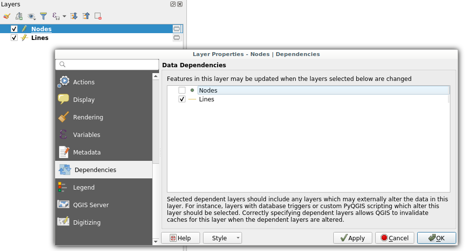
Defining a dependency between nodes and lines layers tells QGIS that it has to refresh the line layer when a node is modified.

Dependencies configuration: Lines layer will be refreshed whenever Nodes layer is modified

It also have to work the other way, modifying a line should update the nodes to ensure they still are on the line.

Circular data dependencies

So here we are, lines depend on nodes which depend on lines which depend on nodes which…

That’s what circular dependencies is about. This specific behavior was previously forbidden and needed a special way to deal with it. Thanks to this recent development, it is now possible.

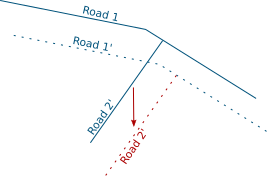
It’s also possible to add the layer itself as one of its own dependencies. It helps dealing with specific cases where one feature modification could lead to a modification of another feature in the same layer (to keep consistency on road networks for instance).

Road 2 is modified, Road 1 is updated accordingly

This feature is available in the next QGIS LTR version 3.10.

Relax the snapping cache index build

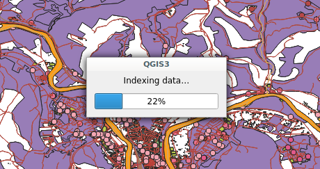
If you work in QGIS with huge projects displaying a lot of vector data, and you enable snapping while editing these data, you probably already met this dialog:

Snap indexing dialog

This dialog informs you that data are currently being indexed so you can snap on them while you will edit feature geometry. And for big projects, this dialog can last for a really long time. Let’s work on speeding it up!

What’s a snap index?

Let’s say you want to move a line and snap it onto another one. While you drag your line with the mouse, QGIS will look for an existing geometry beneath the mouse cursor (with a certain pixel tolerance) every time you move your mouse. Without spatial index, QGIS will have to go through every geometry in your layer to check if the given geometry is beneath the cursor position. This would be very ineffective.

In order to prevent this, QGIS keeps an index where vector data are stored in a way that it can quickly find out what geometry is beneath the mouse cursor. The building of this data structure takes time and that is what the progress dialog is about.

Firstly: Parallelize snap index build

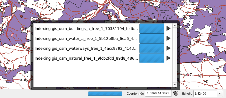
If you want to be able to snap on all layers in your project, then QGIS will have to build one snap index for each layer. This operation was made sequentially meaning that if you have for instance 20 layers and the index building last approximatively 3 seconds for each, then the whole index building will last 1 minute. We made modifications to QGIS so that index building could be done in parallel. As a result, the total index building time could theoretically be 3 seconds!

4 layers snap index being built in parallel

However, parallel operations are limited by the number of CPU cores of your machine, meaning that if you have 4 cores (core i7 for instance) then the total time will be up to 4 times faster than when the building is sequential (and last 15 seconds in our example).

Secondly: relax the snap build

For big projects, parallelizing index building is not enough and still takes too much time. Futhermore, to reduce snap index building, an existing optimisation was to build the spatial index for a specific area of interest (determined according to the displayed area and layer size). As a consequence, when you’ve done waiting for an index currently building and you move the map or zoom in/out, you could possibly trigger another snap index building and wait again.

So, the idea was to avoid waiting at all. Snap index is now built whenever it needs to (when you first enable snapping, when you move or zoom) but the user doesn’t have to wait for the build to be over and can continue what it was doing (creating feature, moving…). Snapping highlights will be missing when the index is currently being built and will appear gradually as soon as they finished. That’s what we call the relaxing mode.

No waiting dialog, snapping highlights appears as soon as snap index is ready

This feature has been merged into current QGIS master and will be present in future QGIS 3.12 release. We keep working on this feature in order to make it more stable and efficient.

What’s next

We’ll continue to improve this feature in the coming days, if you have the chance to test it and encounter issues please let us know on the QGIS tracker. If you think about a missing feature or just want to know more about QGIS, feel free to contact us at [email protected]. And please have a look at our support offering for QGIS.

Many thanks to QGIS grant program for funding these new features. Thanks also to all the people involved in reviewing the code and helping to better understand the existing mechanism.


Reports from the winning grant proposals 2018

With the QGIS Grant Programme 2018, we were able to support seven proposals that were aimed to improve the QGIS project, including software, infrastructure, and documentation. These are the reports on the work that has been done within the individual projects:

  1. Increased stability for Processing GUI and External Providers (Nyall Dawson)
    Many bugs in 3rd party providers have been fixed and lots of new unit tests added. The GUI includes new C++ classes and a  new framework that landed in QGIS 3.4. For more details see Nyall’s report on the mailing list.
  2. OSGeo4W updates (Jürgen Fischer)
    The updates performed in this project were essential to bring QGIS 3.x to Windows.
  3. Resurrect Processing “R” Provider (Nyall Dawson)
    The R provider has been implemented as a provider plugin. The plugin’s beta phase was first announced in Nov 2018 and the plugin is now available for general use.
  4. OpenCL support for processing core algs (Alessandro Pasotti)
    The following processing algorithms have been ported: slope, aspect, hillshade, and ruggedness. Even if was not in scope for this QEP, the hillshade renderer has also been optimized. For more details see qgis/QGIS#7451.
  5. QGIS server OGC compliant and certified for WFS (Régis Haubourg)
    This project fixed numerous issues to get closer to the goal of getting QGIS Server WFS certified. However, the project ran out of resources before the goal could be achieved. For details see the current WFS tests status page.
  6. Charts and drawings on attribute forms (Matthias Kuhn)
    For details read “The new QML widgets in QGIS” and see qgis/QGIS#7801.
  7. Update of QGIS Training Manual (Matteo Ghetta)
    This project hasn’t been completed yet.

Thank you to everyone who participated and made this round of grants a great success and thank you to all our sponsor and donors who make this initiative possible!

Movement data in GIS #26: towards a template for exploring movement data

Exploring new datasets can be challenging. Addressing this challenge, there is a whole field called exploratory data analysis that focuses on exploring datasets, often with visual methods.

Concerning movement data in particular, there’s a comprehensive book on the visual analysis of movement by Andrienko et al. (2013) and a host of papers, such as the recent state of the art summary by Andrienko et al. (2017).

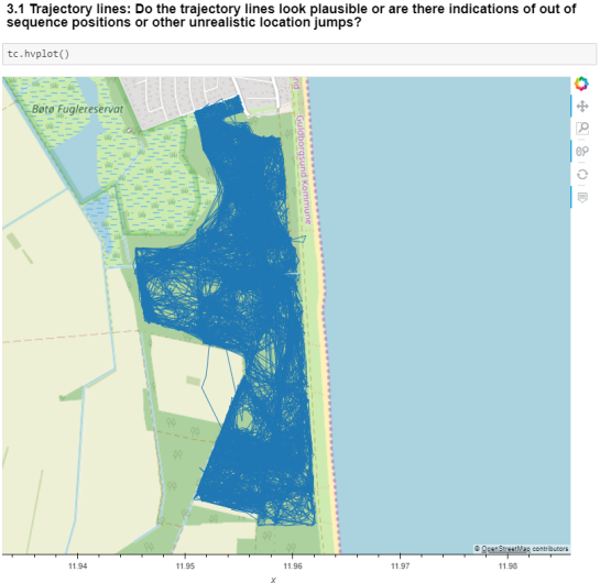
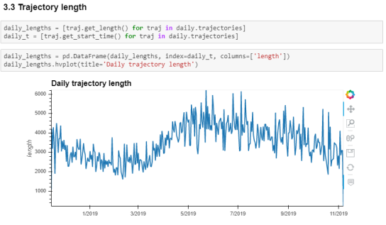
However, while the literature does provide concepts, methods, and example applications, these have not yet translated into readily available tools for analysts to use in their daily work. To fill this gap, I’m working on a template for movement data exploration implemented in Python using MovingPandas. The proposed workflow consists of five main steps:

  1. Establishing an overview by visualizing raw input data records
  2. Putting records in context by exploring information from consecutive movement data records (such as: time between records, speed, and direction)
  3. Extracting trajectories & events by dividing the raw continuous tracks into individual trajectories and/or events
  4. Exploring patterns in trajectory and event data by looking at groups of the trajectories or events
  5. Analyzing outliers by looking at potential outliers and how they may challenge preconceived assumptions about the dataset characteristics

To ensure a reproducible workflow, I’m designing the template as a a Jupyter notebook. It combines spatial and non-spatial plots using the awesome hvPlot library:

This notebook is a work-in-progress and you can follow its development at http://exploration.movingpandas.org. Your feedback is most welcome!


References

  • Andrienko G, Andrienko N, Bak P, Keim D, Wrobel S (2013) Visual analytics of movement. Springer Science & Business Media.
  • Andrienko G, Andrienko N, Chen W, Maciejewski R, Zhao Y (2017) Visual Analytics of Mobility and Transportation: State of the Art and Further Research Directions. IEEE Transactions on Intelligent Transportation Systems 18(8):2232–2249, DOI 10.1109/TITS.2017.2683539

GRASS GIS 7.8.2 released

GRASS GIS 7.8.2 released with updated PROJ 6 and GDAL 3 support

What’s new in a nutshell

As a follow-up to the recent GRASS GIS 7.8.1 we have pusblished the new stable release GRASS GIS 7.8.2.
Besides other improvements, the release contains important PROJ 4/5/6 related datum handling fixes, wxGUI fixes and a fix for the vector import from PostGIS databases.

An overview of the new features in the 7.8 release series is available at new features in GRASS GIS 7.8.

Binaries/Installer download:

Source code download:

See also our detailed announcement:

First time users may explore the first steps tutorial after installation.

About GRASS GIS

The Geographic Resources Analysis Support System (https://grass.osgeo.org/), commonly referred to as GRASS GIS, is an Open Source Geographic Information System providing powerful raster, vector and geospatial processing capabilities in a single integrated software suite. GRASS GIS includes tools for spatial modeling, visualization of raster and vector data, management and analysis of geospatial data, and the processing of satellite and aerial imagery. It also provides the capability to produce sophisticated presentation graphics and hardcopy maps. GRASS GIS has been translated into about twenty languages and supports a huge array of data formats. It can be used either as a stand-alone application or as backend for other software packages such as QGIS and R geostatistics. It is distributed freely under the terms of the GNU General Public License (GPL). GRASS GIS is a founding member of the Open Source Geospatial Foundation (OSGeo).

The GRASS Development Team, December 2019

The post GRASS GIS 7.8.2 released appeared first on GFOSS Blog | GRASS GIS and OSGeo News.

Getting started with PySpark & GeoPandas on Databricks

Over the last years, many data analysis platforms have added spatial support to their portfolio. Just two days ago, Databricks have published an extensive post on spatial analysis. I took their post as a sign that it is time to look into how PySpark and GeoPandas can work together to achieve scalable spatial analysis workflows.

If you sign up for Databricks Community Edition, you get access to a toy cluster for experimenting with (Py)Spark. This considerably lowers the entry barrier to Spark since you don’t need to bother with installing anything yourself. They also provide a notebook environment:

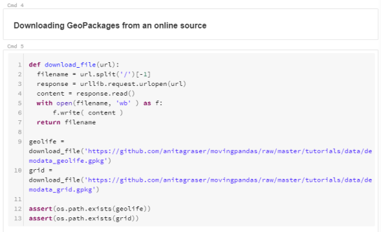
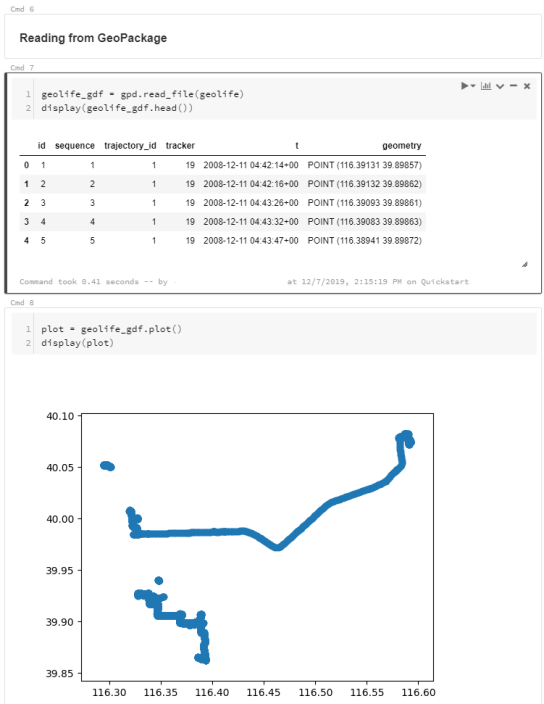
I’ve followed the official Databricks GeoPandas example notebook but expanded it to read from a real geodata format (GeoPackage) rather than from CSV.

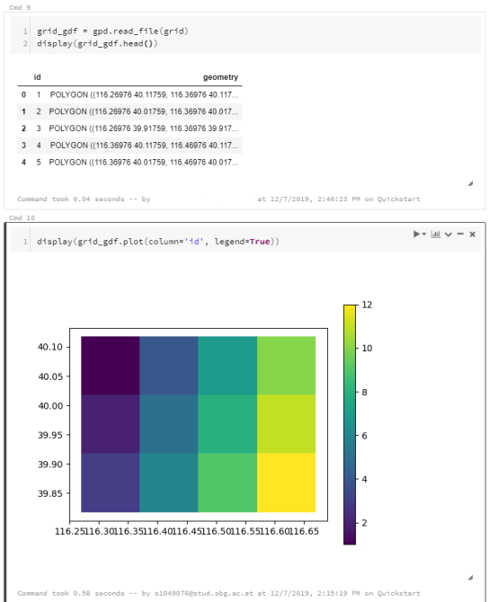
I’m using test data from the MovingPandas repository: demodata_geolife.gpkg contains a hand full of trajectories from the Geolife dataset. Demodata_grid.gpkg contains a simple 3×4 grid that covers the same geographic extent as the geolife sample:

Once the files are downloaded, we can use GeoPandas to read the GeoPackages:

Note that the display() function is used to show the plot.

The same applies to the grid data:

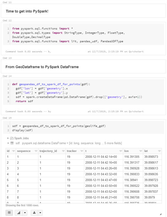
When the GeoDataFrames are ready, we can start using them in PySpark. To do so, it is necessary to convert from GeoDataFrame to PySpark DataFrame. Therefore, I’ve implemented a simple function that performs the conversion and turn the Point geometries into lon and lat columns:

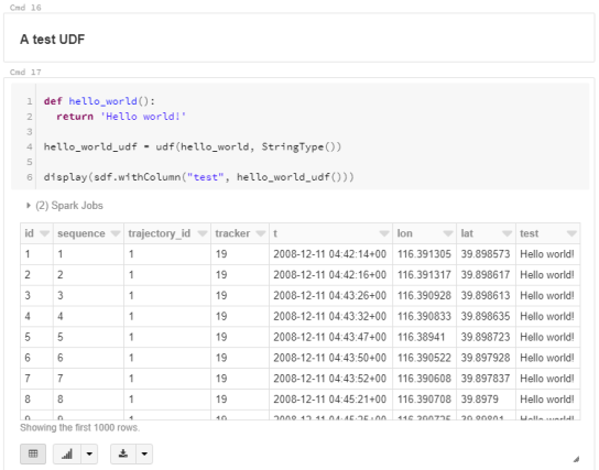
To compute new values for our DataFrame, we can use existing or user-defined functions (UDF). Here’s a simple hello world function and associated UDF:

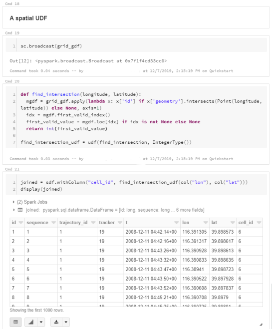
A spatial UDF is a little more involved. For example, here’s an UDF that finds the first polygon that intersects the specified lat/lon and returns that polygon’s ID. Note how we first broadcast the grid DataFrame to ensure that it is available on all computation nodes:

It’s worth noting that PySpark has its peculiarities. Since it’s a Python wrapper of a strongly typed language, we need to pay close attention to types in our Python code. For example, when defining UDFs, if the specified return type (Integertype in the above example) does not match the actual value returned by the find_intersection() function, this will cause rather cryptic errors.

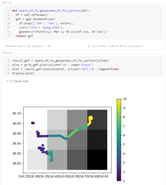
To plot the results, I’m converting the joined PySpark DataFrame back to GeoDataFrame:

I’ve published this notebook so you can give it a try. (Any notebook published on Databricks is supposed to stay online for six months, so if you’re trying to access it after June 2020, this link may be broken.)

De Ruimtelijke Plannen plugin profiteert van Open Source

Rececently the ruimtelijkeplannen plugin for using dutch spatial zoning plans in QGIS was renewed. A lot of extra functionality was added, sponsored by LBP|SIGHT, a company which uses this plugin frequently. As it happened, we now have a small list list of organizations who contributed to the development of this plugin, illustrating the power of […]

Remarks on SVN-trac to GitHub migration

GRASS GIS is an open source geoinformation system which is developed by a globally distributed team of developers. Besides the source code developers also message translators, people who write documentation, those who report bugs and wishes and more are involved.

1. Early days… from pre-Internet to CVS and SVN

While GRASS GIS is under development since 1982 (no typo!) it has been put into a centralized source code management system in December 1999. Why so late? Because the World Wide Web (WWW) became available in the 1990s along with tools like browsers and such, followed by the development of distributed source code management tools. We moved on 29th Dec 1999 (think Y2K bug) the entire code into our instance of CVS (Concurrent Versioning System). With OSGeo being founded in 2006, we migrated the CVS repository to SVN (Subversion for the source code management) and trac (bug and wish tracker) on 8 Dec 2007. See here for historic details on our various bug trackers.

2. Time to move on: git

Now, after more than 10 years using SVN/trac time had come to move on and join the large group of projects managing their source code in git (see also our related Wiki page on migration). Git comes with numerous advantages, yet we needed to decide which hosting platform to use. Options where github.com, gitlab.com, gitlab or gitea on OSGeo infrastructure, or other platforms. Through a survey we found out that the preference among contributors is GitHub. While not being open source itself it offers several advantages: it is widely known (good to get new developers interested and involved), numerous OSGeo projects are hosted there under the GitHub “OSGeo organization“.

If all fails (say, one day GitHub no longer being a reasonable choice) the import of our project from GitHub to GitLab is always possible. Indeed, we meanwhile mirror our code on OSGeo’s gitea server.

Relevant script code and migration ticket:

Relevant steps:

  • migrated SVN trunk -> git master
  • migrated and tagged release branches (milestones)
  • deleted “develbranch6” (we compared it to “releasebranch_6_4” and didn’t discover relevant differences)
  • Fix commit messages (yes, we really wanted to be brave, updating decades of commit messages!):
    • references to old RT tracker tickets (used Dec 2000 – Dec 2006)
    • references to old GForge tracker tickets (used Jan 2007 – Dec 2008)
    • references to other trac tickets (#x -> https://trac.osgeo.org/…)

3. Source code migration: the new git repositories

  • github repository “grass” (repo)

    • Source code from 1999 to present day (SVN-trunk -> git-master)
    • all 7.x release branches
  • github repository “grass-legacy” (repo)

    • separate repository for older GRASS GIS releases (3.2, 4.x, 5.x, 6.x), hence source code now available in git since 1987!
  • github repository “grass-addons” (repo)

    • repository for addons
  • github repository “grass-promo” (repo)
    • repository for promotional material
  • github repository “grass-website” (repo)
    • repository for upcoming new Website

4. Remarks on the “grass-legacy” repository

What special about it:

  • the source code goes back to 1987!
  • file timestamps (which I tried to preserve for decades :-) have been used to reconstruct the source code history (e.g., releasebranch_3_2)
  • junk files removed (plenty of leftover old binary files, files consisting of a special char only etc)
  • having this grass-legacy repo available in parallel to the main grass repo which contains the  recent source code we have a continuous source code coverage from 1987 to today in git.
  • size is about 250MB

What’s missing

  • the 4.3 source code doesn’t have distinct timestamps. Someone must have once packaged without mtime preservation… a pity. Perhaps a volunteer may fix that by carrying over the timestamps from GRASS GIS 4.2 in case the md5sum of a file is identical (or so).

5. Trac issue migration

A series of links had to be updated. Martin Landa invested days and days on that (thanks!!). He used the related GDAL efforts as a basis (Even Rouault: thanks!). As the date for the trac migration we selected 2007-12-09 (r25479) as it was the first SVN commit (after the years in CVS). The migration of trac bugs to github (i.e. transfer of trac ticket content) required several steps:

Link updates in the ticket texts:

  • links to other tickets (now to be pointed to full trac URL). Note that there were many styles of referring in the commit log message which had to be parsed accordingly
  • links to trac wiki (now to be pointed to full trac URL)
  • links source code in SVN (now to be pointed to full trac URL)
  • images and attachments (now to be pointed to full trac URL)

Transferring:

  • “operating system” trac label into the github issue text itself (following the new issue reporting template)
  • converting milestones/tickets/comments/labels
  • converting trac usernames to Github usernames
  • setting assignees if possible, set new “grass-svn2git” an assignee otherwise
  • slowing down transfer to match the 60 requests per second API limit rate at github

6. Fun with user name mapping

Given GRASS GIS’ history of 35+ years we had to invest major effort in identifying and mapping user names throughout the decades (see also bug tracker history). The following circumstances could be identified:

  • user present in CVS but not in SVN
  • user present in SVN but not in CVS
  • user present in both with identical name
  • user present in both with different name (well, in our initial CVS days in 1999 we often naivly picked our surnames like “martin”, “helena”, “markus”, “michael” … cute yet no scaling very much over the years!) as some were changed in the CVS to SVN migration in 2007, leading to
    • colliding user names
  • some users already having a github account (with mostly different name again)

We came up with several lookup tables, aiming at catching all variants. Just a “few” hours to dig in old source code files and in emails for finding all the missing email addresses…

7. Labels for issues

We cleaned up the trac component of the bug reports, coming up with the following categories which have to be visually grouped by color since the label list is just sorted alphabetically in github/gitlab:

  • Issue category:
    • bug
    • enhancement
  • Issue solution (other than fixing and closing it normally):
    • duplicate
    • invalid
    • wontfix
    • worksforme
  • Priority:
    • blocker
    • critical
    • feedback needed
  • Components:
    • docs
    • GUI
    • libs
    • modules
    • packaging
    • python
    • translations
    • unittests
    • Windows specific

Note that the complete issue migration is still to be done (as of Nov. 2019). Hopefully addressed at the GRASS GIS Community Sprint Prague 2019.

8. Setting up the github repository

In order to avoid users being flooded by emails due to the parsing of user contributions which normally triggers an email from github) we reached out to GitHub support in order to temporarily disable these notifications until all source code and selected issues were migrated.

The issue conversion rate was 4 min per trac bug to be converted and uploaded to github. Fairly slow but likely due to the API rate limit imposed and the fact that the migration script above generates a lot of API requests rather than combined ones..
Note to future projects to be migrated: use the new gihub import API (unfortunately we got to know about its existence too late in our migration process).

Here out timings which occurred during the GRASS GIS project migration from SVN to github:

  • grass repo: XX hours (all GRASS GIS 7.x code)
  • grass-legacy repo: XX hours (all GRASS GIS 3.x-6.x code)
  • NNN issues: XX hours – forthcoming.

9. New issue reporting template

In order to guide the user when reporting new issues, we will develop a small template – forthcoming.

10. Email notifications: issues to grass-dev and commits to grass-commit

We changed the settings from SVN post-hook to Github commit notifications and they flow in smoothly into the grass-commit mailing list. Join it to follow the development.

Overall, after now several months of using our new workflow we can state that things work fine.

The post Remarks on SVN-trac to GitHub migration appeared first on GFOSS Blog | GRASS GIS and OSGeo News.

QGIS Server is ready for the new OGC API for Features protocol.

The new OGC API for Features (OAPIF) (also formerly known as WFS3) is one of the first protocols of the new generation of OGC web services and we are happy to announce that QGIS Server is ready to serve data following the specifications of this new protocol.

A lot of work has been going on during last summer to make sure QGIS Server was ready to support the new family of REST APIs, the underlying architecture allows in fact to expand QGIS Server API capabilities with any kind of new API that will be available in the future.

The new API is very similar to the well known WFS, but it also comes with a distinct set of features like content negotiations, REST actions, HTML templates, JSON as a first class citizen, self-documentation of the API (following OpenAPI specifications) and a preliminary implementation (the specifications are not yet finalized) of the simple transactions.

The new API is already in the QGIS Server documentation, it only misses the transaction part because the specifications are not yet final and we don’t want people start relying on an API that is probably going to change quite soon.

The vast majority of this new development has been possible thanks to the volunteer work of our core developers but we also wish to thank OSGeo and QGIS sustaining members and donors for funding a substantial part of the following activities:

OPENAPI validation (completed)
Online demo (TODO)
CI validation/ OGC CITE (started)
Expose Schema (completed)
Simple Transactions (completed)
Returned fields filter (completed)
Documentation (completed except for transactions)
JSON performance comparison with WFS (TODO)
Time filter support (completed)

Enjoy the new API and beware that this is only the first of a brand new series of OGC APIs that will make much easier for users to interact with data and for developers to create applications that consume those data.

Text provided by Alessandro Pasotti (QGIS core developer)

Tracking, calculating and merging vector changes with Input and QGIS

The latest beta release of Input (v.0.4.90) comes with smart diff support for vectors. This will allow you to use the app (current beta version) in a collaborative environment, where several users can make changes to a single survey layer (geopackage).

What does it mean?

It is often the case, where multiple users need to make changes to a single vector layer. If you work in office, this issue is usually addressed by having a central geodatabase (e.g. Postgres/PostGIS). If you want extra information (e.g. audit trails, versioning, latest changes, etc), you can modify your database, to keep track of it.

The problem arises when you want to collect data, without having access to the central geodatabase. You can do some manual work to handle this scenario, but it can easily lead into data management nightmare.

To simplify the workflow, we have developed Geodiff, a multi-platform library to keep track of changes, calculate the differences, merge and consolidate the differences.

How can I use it?

Geodiff has been integrated into the beta version of Input. This will allow you to share a project with your team and edit a single layer (geopackage format) all at the same time, even when you are offline.

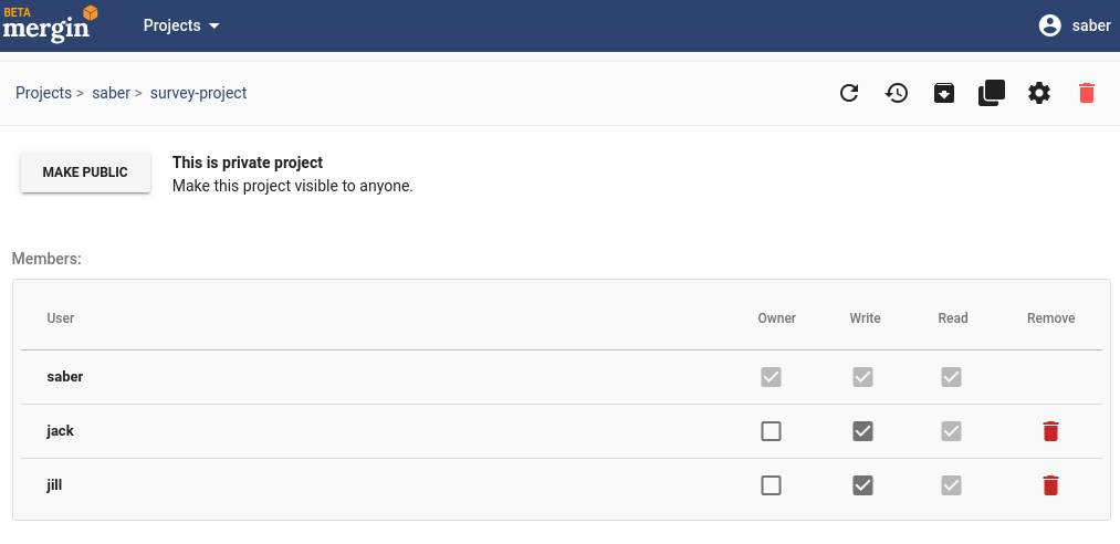
To start with, you need to create a project and upload it to Mergin. You can then share the project (with write access) with your colleagues:

Sharing projects through Mergin

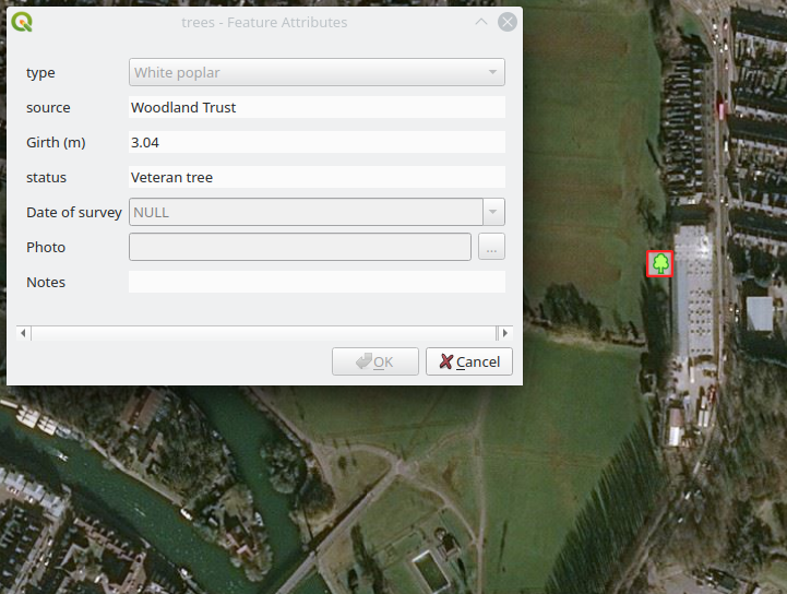
The project contains a survey layer (trees.gpkg). There is only one feature present within the layer:

Sharing projects through Mergin

The project is shared with two users. Both users download the project and take their devices to the field:

User 1, carried out a survey (using iPhone!), by adding a tree and editing the attribute table of the existing one. The changes were synchronised back through the Mergin:

Meanwhile, User 2 added a new feature to the survey layer. Once User 2 tries to synchronise the changes, Input automatically detects the changes not only made through User 2, but also the ones uploaded to the Mergin. The layer will be patched both locally and on the server to take all the changes into account:

The data administrator can now pull all the changes from both users in QGIS:

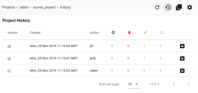
You can also see the history of changes to the project and the survey layer on the Mergin website. Below shows the changes from different users:

Sharing projects through Mergin

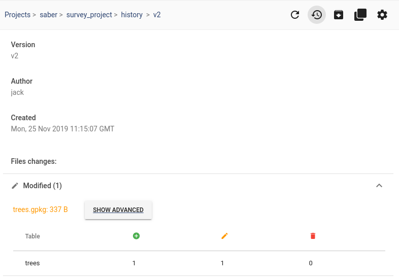
To see changes from each user, you can click on the version and it lists the changes. In this example, User 1 (jack) added a new feature and modified an existing feature:

Sharing projects through Mergin

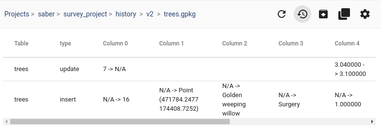
You can also see the extended history and see where the changes have been made:

Sharing projects through Mergin

How can I test this new feature?

You can use Beta version of Input app in Android or TestFlight in iOS:

Get it on Google Play Get it on App Store

For any issues or feedback, please file a ticket on Input repository

Kort verslag oprichtingsvergadering QGIS gebruikersgroep

Sorry, this entry is only available in Dutch.

Lid worden?

Sorry, this entry is only available in Dutch.

Movement data in GIS #25: moving object databases

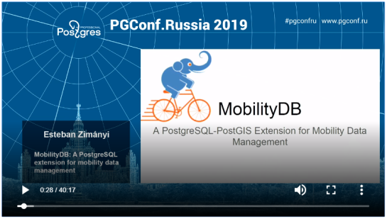
Recently there has been some buzz on Twitter about a new moving object database (MOD) called MobilityDB that builds on PostgreSQL and PostGIS (Zimányi et al. 2019). The MobilityDB Github repo has been published in February 2019 but according to the following presentation at PgConf.Russia 2019 it has been under development for a few years:

Of course, moving object databases have been around for quite a while. The two most commonly cited MODs are HermesDB (Pelekis et al. 2008) which comes as an extension for either PostgreSQL or Oracle and is developed at the University of Piraeus and SECONDO (de Almeida et al. 2006) which is a stand-alone database system developed at the Fernuniversität Hagen. However, both MODs remain at the research prototype level and have not achieved broad adoption.

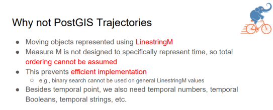
It will be interesting to see if MobilityDB will be able to achieve the goal they have set in the title of Zimányi et al. (2019) to become “a mainstream moving object database system”. It’s promising that they are building on PostGIS and using its mature spatial analysis functionality instead of reinventing the wheel. They also discuss why they decided that PostGIS trajectories (which I’ve written about in previous posts) are not the way to go:

However, the presentation does not go into detail whether there are any straightforward solutions to visualizing data stored in MobilityDB.

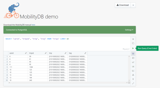
According to the Github readme, MobilityDB runs on Linux and needs PostGIS 2.5. They also provide an online demo as well as a Docker container with MobilityDB and all its dependencies. If you give it a try, I would love to hear about your experiences.

References

  • de Almeida, V. T., Guting, R. H., & Behr, T. (2006). Querying moving objects in secondo. In 7th International Conference on Mobile Data Management (MDM’06) (pp. 47-47). IEEE.
  • Pelekis, N., Frentzos, E., Giatrakos, N., & Theodoridis, Y. (2008). HERMES: aggregative LBS via a trajectory DB engine. In Proceedings of the 2008 ACM SIGMOD international conference on Management of data (pp. 1255-1258). ACM.
  • Zimányi, E., Sakr, M., Lesuisse, A., & Bakli, M. (2019). MobilityDB: A Mainstream Moving Object Database System. In Proceedings of the 16th International Symposium on Spatial and Temporal Databases (pp. 206-209). ACM.

This post is part of a series. Read more about movement data in GIS.

GRASS GIS 7.8.1 released with PROJ 6 and GDAL 3 support

What’s new in a nutshell

As a follow-up to the recent GRASS GIS 7.8.0 release we have pusblished the new stable release GRASS GIS 7.8.1. Besides improving the Python 3 compatibility efforts have concentrated on implementing PROJ 6 and GDAL 3 support.

An overview of the new features in the 7.8 release series is available at new features in GRASS GIS 7.8.

Binaries/Installer download:

Source code download:

More details:

See also our detailed announcement:

About GRASS GIS

The Geographic Resources Analysis Support System (https://grass.osgeo.org/), commonly referred to as GRASS GIS, is an Open Source Geographic Information System providing powerful raster, vector and geospatial processing capabilities in a single integrated software suite. GRASS GIS includes tools for spatial modeling, visualization of raster and vector data, management and analysis of geospatial data, and the processing of satellite and aerial imagery. It also provides the capability to produce sophisticated presentation graphics and hardcopy maps. GRASS GIS has been translated into about twenty languages and supports a huge array of data formats. It can be used either as a stand-alone application or as backend for other software packages such as QGIS and R geostatistics. It is distributed freely under the terms of the GNU General Public License (GPL). GRASS GIS is a founding member of the Open Source Geospatial Foundation (OSGeo).

The GRASS Development Team, November 2019

The post GRASS GIS 7.8.1 released with PROJ 6 and GDAL 3 support appeared first on GFOSS Blog | GRASS GIS and OSGeo News.

SLYR ESRI to QGIS compatibility suite – November 2019 update

It’s a been a month full of huge improvements since the last update, and we have some exciting news to share about our SLYR ESRI to QGIS compatibility suite. With the recently published plugin version 3.7, MXD conversion has moved from a “beta” state to being fully supported and available out-of-the-box for all users!

Based on our massive library of reference files (almost 10,000 files covering a huge range of ArcGIS versions and features!), the tool is now able to successfully convert 96% of LYR files and 94.5% of MXD documents. This is a significant milestone, and with it we decided that MXD conversion support is now stable enough to move out of its previous beta state.

Aside from this milestone, the 3.7 release brings many more enhancements and improvements, including:

  • SLYR now has full support for PMF published map documents created by ArcGIS Publisher, along with a new Processing algorithm to convert from a PMF document to a QGS projects
  • We’ve also added support for converting ArcScene SXD scenes to QGS projects. This conversion is 2-dimensional only for now, but we plan on adding 3D conversion when QGIS’ 3D support further matures.
  • We now convert all data frames contained within MXD documents, instead of just the first data frame. Currently, these are exposed as their own individual groups within the project layer tree (when we enable support for page layout conversion we’ll be automatically creating corresponding map themes from each data frame).
  • We’ve added support for reading many more layer types, including raster catalog layers, topology layers, terrain layers, and LAS dataset layers. While QGIS doesn’t have support for these layer types, we need to fully parse them in order to convert the rest of the MXD document contents. Whenever an unsupported layer type like these are encountered the plugin shows a warning advising users which layers could not be successfully converted.
  • We’ve also added support for reading TIN layers. Although previous QGIS versions had no means to read ESRI tin layers, thanks to work done in the MDAL library the upcoming QGIS 3.10.1 release adds full support for reading these data files! Accordingly, we’ll be unlocking support for converting TIN layers contained within MXD documents following the 3.10.1 release.
  • Full support for WMTS and tiled internet layers
  • Support for reading MXD documents which have repaired by the MXD Doctor utility
  • Support for layers with a geopackage source
  • Conversion of ImageServer based layers (since QGIS only has basic support for ESRI ImageServers, we convert these layers to their equivalent MapServer versions wherever possible)
  • Basic support for representation renderers. Although QGIS has no capability to utilise the symbology linked with a representation renderer, we’ve added support for rendering these layers using any geometry overrides which may be present for the features.
  • Conversion support for simple scale dependent renderers (these are a funny beast, which can’t be created directly through the ArcMap interface and which require custom ArcObjects code to create! That said, we’ve encountered a few examples of these inside our test library so have added support for converting them to the equivalent QGIS rule based renderer).
  • We added a new “random marker fill” symbol type to the upstream QGIS project, which will be available in QGIS 3.12 along with support in SLYR for conversion of ESRI random marker fills.

So what’s next for SLYR? Over the remainder of 2019 we’ll be working furiously toward 100% conversion rates for LYR and MXD files. We’ll also start rolling out conversion support for page layouts to QGIS print layouts, and support for automatic conversion of ArcMap TIN layers to QGIS mesh layers.

Keep an eye on this blog and our Twitter channel for further updates!


QGIS Print Layouts Graphs and Charts Campaign – Complete!

Last week saw the exciting release of version 3 of the QGIS DataPlotly plugin, which incorporates all the work done as a result of our Print Layouts Graphs and Charts crowdfunding campaign crowd funding campaign. Now, beautiful charts and graphs are available directly within QGIS print layouts, and all it takes is the easy installation of the “DataPlotly” plugin from your QGIS install!

In this post we’ll showcase the functionality which has been added during this campaign, and which is available today in the plugin.

UI modernisation and tweaks

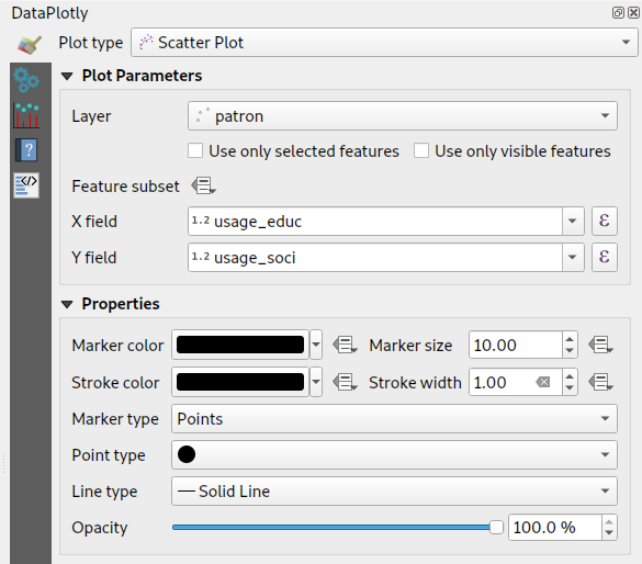
First up, during our work on this plugin we’ve invested some time in refreshing the plugin’s UI to ensure it follows all the widget conventions used elsewhere in QGIS. Now, the plugin blends seamlessly into your QGIS window, and all the chart setting widgets behave in just the way you’re used to. We’ve also used this opportunity to fix a number of issues the plugin had when running on hi-dpi displays (such as Apple retina displays)!


Dynamic charting of selected and visible features

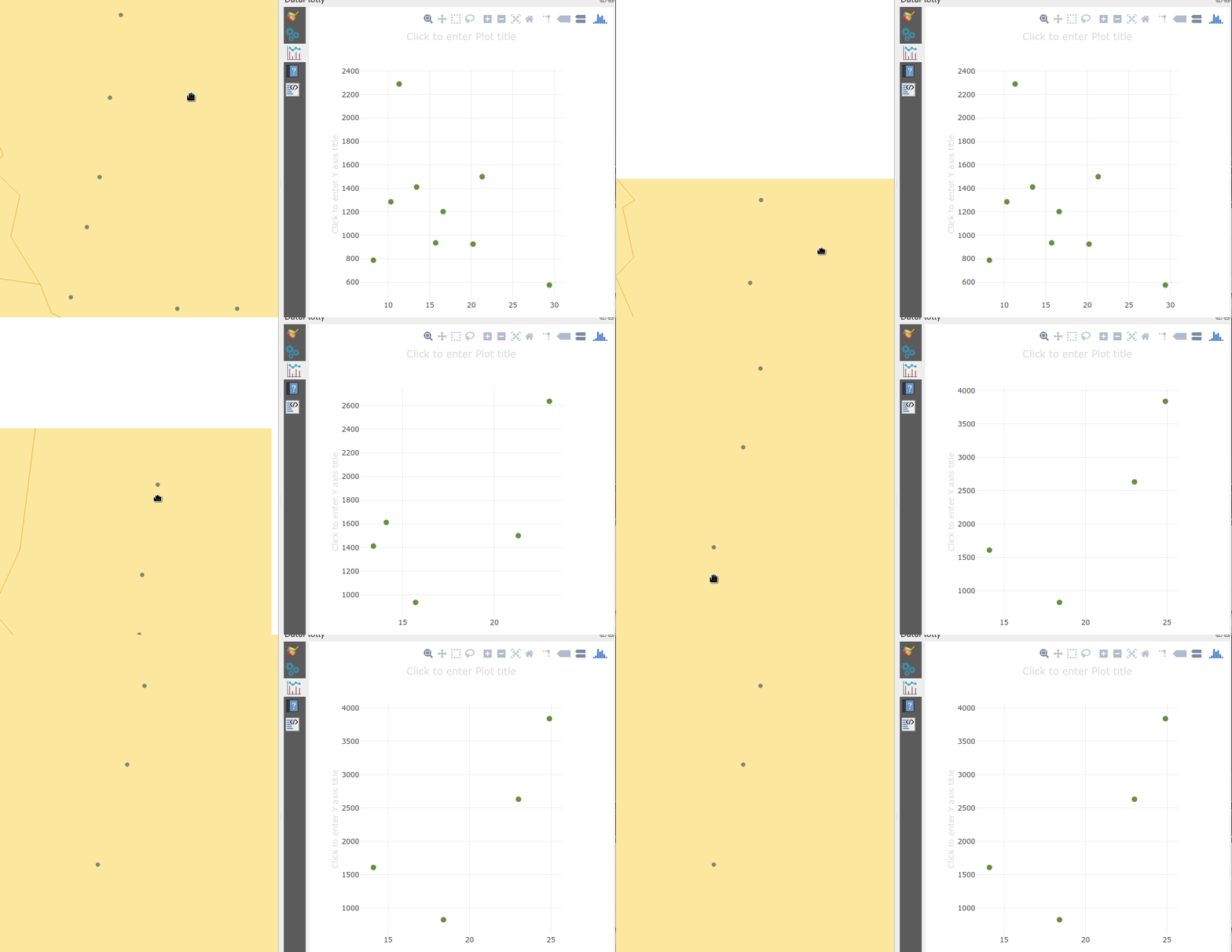
If you’ve used earlier versions of the DataPlotly plugin, you’ll likely notice that there’s many new options shown in the screenshot above. Possibly the most exciting of these is the new “Use only selected features” and “Use only visible features” checkboxes. When either of these options are enabled, then your chart will immediately respond to changes in layer selections or changes to the visible map canvas extent respectively. Previously, interactivity in the plugin only went one way (from the chart to the canvas) – but now the charts are truly interactive, and respond dynamically to changes in the canvas too!


Improved handling of “data defined” settings

During the plugin refactoring, we reworked how “data defined” settings are handled within charts. If you’re not familiar with these, “data defined” settings are QGIS’ approach for exposing per-feature control over the map rendering process. In DataPlotly charts, we expose this functionality to allow per-feature control over the chart appearance (e.g., showing different scatter plot dot colors based on feature attributes). The new code uses the same code model as QGIS itself, so data-defined settings in your charts now have full access to the whole suite of QGIS expression functions and variables that you’re used to! Additionally, QGIS data-defined assistants are fully supported in the charts too. Ultimately, this enables some very advanced styling options, such as charts which dynamically change color and appearance on every page of your print atlas…

Charts in print layouts

We’ve previously covered this feature in depth, but the DataPlotly v3 release brings print-layout based charts to the masses! When a chart is inserted into a print layout, some additional options are available for controlling the plot behavior:

These new options allow you to link the chart to a map item within the layout, which lets you filter the content of the chart to only include features visible within the map. If your print layout is setup as an atlas export, you can also filter out included features to only show those which are geographically located inside the current atlas feature.

Our partners from Faunalia demonstrate this in the screencast below:


Saving plot configuration

An often-requested functionality previous missing from the plugin was the ability to save and restore plot configuration. Now, plot configuration is automatically saved within your QGIS project and restored when you reopen the project. You no longer have to re-create all your charts from scratch at every session (ouch!). We also added the ability to export chart configuration to XML files, allowing you to share and reuse chart configuration across projects.

Behind the scenes work

Aside from all the wonderful new features added to the plugin, we’ve extensively refactored most of the plugin backend. Unit tests and CI infrastructure have been added, which will ensure the plugin remains stable and regression-free in future releases. The code cleanup and simplification has drastically lowered the barrier of contribution to the project, and we’ve already seen new contributors adding more new features to the plugin as a result of this! (Kudos to Simon Gröchenig, who added the new “Feature subset” expression option you can see in the above screenshots!).

Project sponsors

All this work is thanks to the backers of our crowdfunding campaign. Without their contributions this work would not have been possible! In no particular order, our thanks go out to:

  • Federico Gianoli
  • Papercraft Mountains
  • Liam McCrae
  • Henry Walshaw
  • Raúl Sangonzalo
  • Ferdinando Urbano
  • pitsch-ing.ch
  • Carbon-X
  • Gabriel Diosan
  • Rene Giovanni Borella
  • Enrico Bertonati
  • Guido Ingwer
  • David Addy
  • Gerd Jünger
  • Andreas Neumann
  • Stefano Campus
  • Michael Jabot
  • Korto
  • Enrico Ferreguti
  • Carlo A. Nicolini
  • Salvatore Fiandaca
  • Alberto Grava
  • Hans van der Kwast
  • Ben Hur Pintor
  • Silvio Grosso
  • Nobusuke Iwasaki
  • Alasdair Rae
  • Manori Senanayake
  • Canton de Neuchâtel
  • Matthias Daues
  • Alteri Seculo
  • SunGIS Ltd.
  • Stu Smith
  • Keolis Rennes
  • Gabriel Diosan
  • Aiden Price
  • Giacomo Ponticelli
  • Diane Fritz
  • Gemio Bissolati
  • Claire Birnie
  • Nicolas Roelandt
  • Rocco Pispico
  • Gabriel Bengtsson
  • Birds Eye View
  • Barend Köbben
  • Roberto Marzocchi (GTER)
  • Yoichi Kayama
  • Alessandro Sarretta
  • Luca Angeli
  • Luca Bellani
  • giswelt
  • Stefan Giese
  • Ben Harding
  • Joao Gaspar
  • Romain Lacroix
  • Ryan Cooper
  • Daniele Bonaposta
  • QGIS Swedish User Group
  • Nino Formica
  • Michael Gieding
  • Amedeo Fadini
  • Andrew Hannell
  • Stefano
  • Phil Wyatt
  • Brett Edmond Carlock
  • Transitec

Keep an eye out on the North Road blog for future crowd-funding initiatives. Coming soon: a QGIS Processing grab-bag of ETL modelling improvements!

Folium vs. hvplot for interactive maps of Point GeoDataFrames

In the previous post, I showed how Folium can be used to create interactive maps of GeoPandas GeoDataFrames. Today’s post continues this theme. Specifically, it compares Folium to another dataviz library called hvplot. hvplot also recently added support for GeoDataFrames, so it’s interesting to see how these different solutions compare.

Minimum viable

The following snippets show the minimum code I found to put a GeoDataFrame of Points onto a map with either Folium or hvplot.

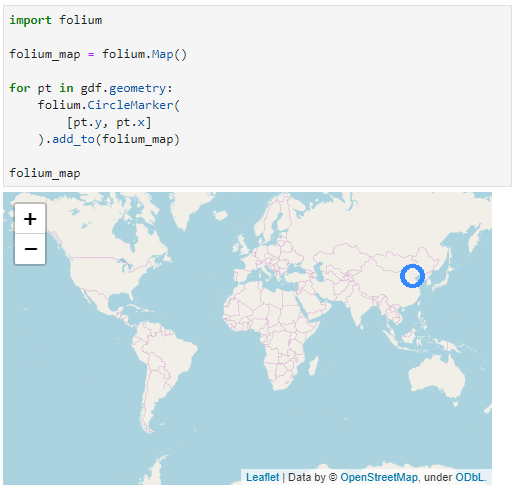
Folium does not automatically zoom to the data extent and I didn’t find a way to add the whole GeoDataFrame of Points without looping through the rows individually:

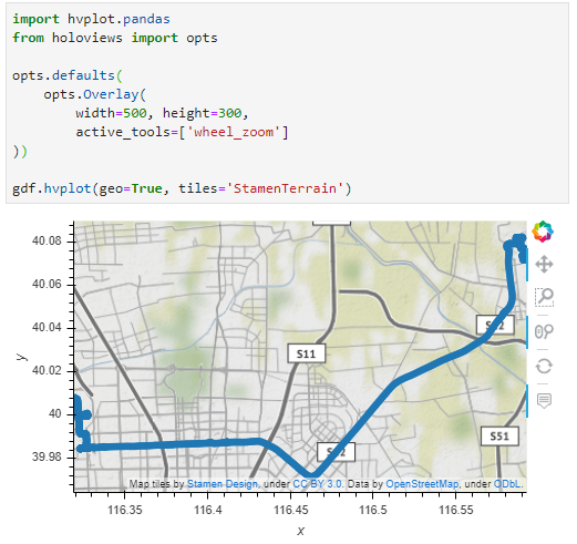
Hvplot on the other hand registers the hvplot function directly with the GeoDataFrame. This makes it as convenient to use as the original GeoPandas plot function. It also zooms to the data extent:

Standard interaction and zoom to area of interest

The following snippets ensure that the map is set to a useful extent and the map tools enable panning and zooming.

With Folium, we have to set the map center and the zoom. The map tools are Leaflet defaults, so panning and zooming work as expected:

Since hvplot does not come with mouse wheel zoom enabled by default, we need to set that:

Color by attribute

Finally, for many maps, we want to show the point location as well as an attribute value.

To create a continuous color ramp for a numeric value, we can use branca.colormap to define the marker fill color:

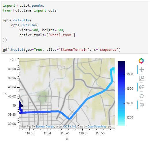
In hvplot, it is sufficient to specify the attribute of interest:

I’m pretty impressed with hvplot. The integration with GeoPandas is very smooth. Just don’t forget to set the geo=True parameter if you want to plot lat/lon geometries.

Folium seems less straightforward for this use case. Maybe I missed some option similar to the Choropleth function that I showed in the previous post.

QGIS 3.10 A Coruña is released!

We are pleased to announce the release of QGIS 3.10 ‘A Coruña’! A Coruña was the location of our developer meeting and user conference in March 2019.

Installers for all supported operating systems are already out. QGIS 3.10 comes with tons of new features, as you can see in our visual changelog.

We would like to thank the developers, documenters, testers and all the many folks out there who volunteer their time and effort (or fund people to do so). From the QGIS community we hope you enjoy this release! If you wish to donate time, money or otherwise get involved in making QGIS more awesome, please wander along to qgis.org and lend a hand!

QGIS is supported by donors and sustaining members. A current list of donors who have made financial contributions large and small to the project can be seen on our donors list. If you would like to become a sustaining member, please visit our page for sustaining members for details. Your support helps us fund our six monthly developer meetings, maintain project infrastructure and fund bug fixing efforts.

QGIS is Free software and you are under no obligation to pay anything to use it – in fact we want to encourage people far and wide to use it regardless of what your financial or social status is – we believe empowering people with spatial decision making tools will result in a better society for all of humanity.

Interactive plots for GeoPandas GeoDataFrames of LineStrings

GeoPandas makes it easy to create basic visualizations of GeoDataFrames:

However, if we want interactive plots, we need additional libraries. Folium (which is built on Leaflet) is a great option. However, all examples for plotting GeoDataFrames that I found focused on point or polygon data. So here is what I found to work for GeoDataFrames of LineStrings:

First, some imports:

import pandas as pd
import geopandas
import folium

Loading the data:

graph = geopandas.read_file('data/population_test-routes-geom.csv')
graph.crs = {'init' :'epsg:4326'}

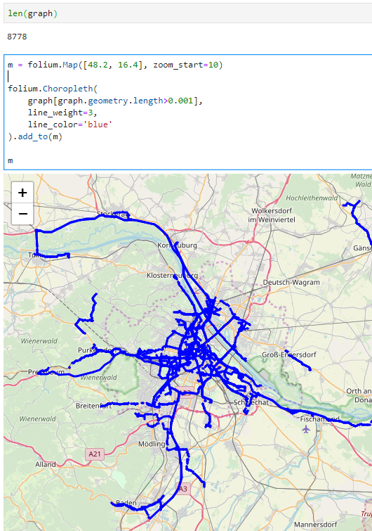
Creating the map using folium.Choropleth:

m = folium.Map([48.2, 16.4], zoom_start=10)

folium.Choropleth(
    graph[graph.geometry.length>0.001],
    line_weight=3,
    line_color='blue'
).add_to(m)

m

I also tried using folium.PolyLine which seemed like the more obvious choice but does not seem to accept GeoDataFrames as input. Instead, it expects a list of coordinate pairs and of course it expects them to be in the opposite order that Shapely.LineString.coords provides … Oh the joys of geodata!

In any case, I had to limit the number of features that get plotted because Folium refuses to plot all 8778 features at once. I decided to filter by line length because drawing really short lines is pointless for my overview visualization anyway.

Results of the user questionnaire from Sep’19

Last month’s user question focused on QGIS documentation. More specifically, we asked how you learn how to use QGIS. And many of you answered our call. Indeed we collected 824 responses over a period of two weeks:

The answers to the first question show that the top three first sources of information on how to use QGIS features or solve problems are: 1. search engines, 2. Stack Exchange, and 3. the QGIS User Manual:

The answers to the second question show that most respondents look for information around 2-3 times a week:

The third question asked specifically about the official QGIS documentation and answers revealed that most users sometimes or often find answers there:

Overall respondents use the official documentation rather rarely:

Finally, there was an open ended question:

You can download the full responses if you’re interested in the details.

The results and lessons we can learn from the responses are currently being discussed on the community mailing list.

  • <<
  • Page 28 of 141 ( 2808 posts )
  • >>

Back to Top

Sustaining Members