
3.0.4 - Amazonia
Changes
🐛 Bug Fixes
- Fix project load failure (i.e. blank canvas) for project containing font marker symbols
Full Changelog: v3.0.3...v3.0.4
Last update:
Thu May 16 22:00:27 2024
 •
•
 •
•

 •
•
 •
•

Full Changelog: v3.0.3...v3.0.4
We’re so excited and proud of this latest QField version that we’ve opted for a major 3.0 version update.
Shipped with many new features and built with the latest generation of Qt’s cross-platform framework, this new chapter marks an important milestone for the most powerful open-source field GIS solution.
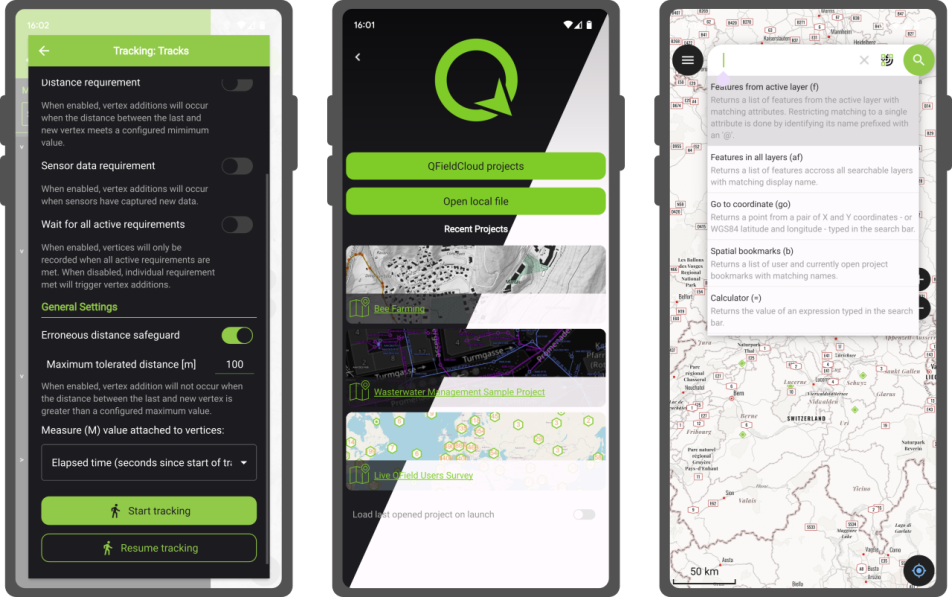
Upon launching this new version of QField, users will be greeted by a revamped recent projects list featuring shiny map canvas thumbnails. While this is one of the most obvious UI improvements, countless interface tweaks and harmonization have occurred. From the refreshed dark theme to the further polishing of countless widgets, QField has never looked and felt better.
The top search bar has a new functionality that allows users to look for features within the currently active vector layer by matching any of its attributes against a given search term. Users can also refine their searches by specifying a specific attribute. The new functionality can be triggered by typing the ‘f’ prefix in the search bar followed by a string or number to retrieve a list of matching features. When expanding it, a new list of functionalities appears to help users discover all of the tools available within the search bar.
QField’s tracking has also received some love. A new erroneous distance safeguard setting has been added, which, when enabled, will dictate the tracker not to add a new vertex if the distance between it and the previously added vertex is greater than a user-specified value. This aims at preventing “spikes” of poor position readings during a tracking session. QField is now also capable of resuming a tracking session after being stopped. When resuming, tracking will reuse the last feature used when first starting, allowing sessions interrupted by battery loss or momentary pause to be continued on a single line or polygon geometry.
On the feature form front, QField has gained support for feature form text widgets, a new read-only type introduced in QGIS 3.30, which allows users to create expression-based text labels within complex feature form configurations. In addition, relationship-related form widgets now allow for zooming to children/parent features within the form itself.
To enhance digitizing work in the field, QField now makes it possible to turn snapping on and off through a new snapping button on top of the map canvas when in digitizing mode. When a project has enabled advanced snapping, the dashboard’s legend item now showcases snapping badges, allowing users to toggle snapping for individual vector layers.
In addition, digitising lines and polygons by using the volume up/down hardware keys on devices such as smartphones is now possible. This can come in handy when digitizing data in harsh conditions where gloves can make it harder to use a touch screen.
While we had to play favourites in describing some of the new functionalities in QField, we’ve barely touched the surface of this feature-packed release. Other major additions include support for Near-Field Communication (NFC) text tag reading and a new geometry editor’s eraser tool to delete part of lines and polygons as you would with a pencil sketch using an eraser.
Thanks to Deutsches Archäologisches Institut, Groupements forestiers Québec, Amsa, and Kanton Luzern for sponsoring these enhancements.
Starting with this new version, the scale bar overlay will now respect projects’ distance measurement units, allowing for scale bars in imperial and nautical units.
QField now offers a rendering quality setting which, at the cost of a slightly reduced visual quality, results in faster rendering speeds and lower memory usage. This can be a lifesaver for older devices having difficulty handling large projects and helps save battery life.
Vector tile layer support has been improved with the automated download of missing fonts and the possibility of toggling label visibility. This pair of changes makes this resolution-independent layer type much more appealing.
On iOS, layouts are now printed by QField as PDF documents instead of images. While this was the case for other platforms, it only became possible on iOS recently after work done by one of our ninjas in QGIS itself.
Many thanks to DB Fahrwgdienste for sponsoring stabilization efforts and fixes during this development cycle.
Last but not least, QField 3.0 is now built against Qt 6. This is a significant technological milestone for the project as this means we can fully leverage the latest technological innovations into this cross-platform framework that has been powering QField since day one.
On top of the new possibilities, QField benefited from years of fixes and improvements, including better integration with Android and iOS platforms. In addition, the positioning framework in Qt 6 has been improved with awareness of the newer GNSS constellations that have emerged over the last decade.

Forests are critical in climate regulation, biodiversity preservation, and economic sustainability. Beginning with QField 3.0 “Amazonia” and throughout the 3.X’s life cycle, we will choose forest names to underscore the importance of and advocate for global forest conservation.
As always, we hope you enjoy this new release. Happy field mapping!
Full Changelog: v3.0.2...v3.0.3
Full Changelog: v3.0.0...v3.0.1
Full Changelog: v3.0.1...v3.0.2
What’s new in a nutshell The GRASS GIS 8.3.0 release provides more than 360 changes compared to the 8.2 branch. This new minor release brings in many fixes and improvements in GRASS GIS modules and the graphical user interface (GUI) which now has the single window layout by default. Some of the most relevant changes […]
The post GRASS GIS 8.3.0 released appeared first on Markus Neteler Consulting.
We have been continuing our work with the Flagship sponsor of QGIS – Felt to develop their QGIS Plugin – Add to Felt that makes it even easier to share your maps and data on the web.
What is the ‘Add to Felt’ QGIS Plugin?
The ‘Add to Felt’ QGIS Plugin is a powerful tool that empowers users to export their QGIS projects and layers directly to a Felt web map. This update introduces two fantastic features:
Businesses that rely on QGIS love how these new features provide a seamless way to view and share results, ultimately allowing them to move more quickly and stay in sync:
Why is this Update Important?
Web maps are invaluable tools for sharing data with a wider audience, be it colleagues, clients, or the public. They provide creators with the ability to control data visibility, display options, and audience access, all within an easily shareable digital format. However, creating web maps can be an arduous and complex task.
Here’s where the ‘Add to Felt’ QGIS Plugin update comes to the rescue:
1. Streamlining the Process: Creating web maps traditionally involves website development, data hosting, and map application development—tasks that require a diverse skill set. This complexity can be a significant barrier, especially for smaller operations with limited resources or budget constraints.
2. Felt Simplifies Web Mapping: Felt makes it effortless to create web maps, and share them as easily as you would a Google Doc or Sheet. Simply drag and drop your data, customize the symbology to your liking, and share the map with a link or by inviting collaborators. No need to send large data files or answer questions about the map’s data sources.
3. Integration with QGIS: Now, the ‘Add to Felt’ QGIS Plugin bridges the gap between QGIS and Felt. It seamlessly imports your QGIS data into Felt, eliminating the need for manual data transfers and reducing the complexity of web map creation.
In essence, the ‘Add to Felt’ QGIS Plugin update simplifies the process of sharing and collaborating on web maps. It empowers users to harness the full potential of web-based mapping, making it accessible to everyone, regardless of their technical expertise. The update makes it even easier to share progress updates or model re-run outputs without creating a new map, or sharing a new map link.
So, if you’re a QGIS user looking to enhance your map-sharing capabilities and streamline your workflow, make sure to take advantage of this fantastic update. Say goodbye to the complexities of web map creation and hello to effortless, data-rich web maps with Felt and the ‘Add to Felt’ QGIS Plugin.
If you want more features in this plugin, let us know or you’re interested in exploring how a QGIS plugin can make your service easily accessible to the millions of daily QGIS users, contact us to discuss how we can help!
General features:
Tracking features:
Digitizing features:
QField built against Qt6:
Quality of life improvements:
 Background
Our web site (https://qgis.org) dates back to 2013, it is time for a revision!
As well as modernizing the look and feel of the site, we want the content to be updated to represent changes in the maturity of the project.
We want to appeal to new audiences, especially business and NGO decision makers (in particular the experience for the front pages), whilst still maintaining appeal to grass roots users (especially the lower level pages which contain many technical details and community collaboration notes).
We want to enhance our fund raising efforts through a site that encourages people to contribute to, as well as take from, the project.
 Existing effort
First some key links:
The above websites were created with a mix of technologies:
It will not be possible to unify the technology used for all of the above sites, but we want all of the web sites to have a cohesive appearance and the navigation flow between them to be seamless. For the main website at https://qgis.org and its child pages, we want to re-implement the site to provide a new experience – according to the design we have laid out in our figma board. Note that we want to follow this design. Some small tweaks will be fine but we are not looking for a ‘from scratch’ re-implementation of our design.
This will be our website for the next 10 years – you need to hand it over to us in a way that we can continue working on it and maintaining it without your intervention.
We are calling for proposals to help us with this migration as per the phases described below.
 Timeline
 Proposed site structure
 Outcome: We have a clear roadmap and design guide for migrating all of our websites to a consistent unified experience.
During this phase the contractor will focus on migrating the content of the main site to the new platform.
There will be an iterative review and feedback from the QGIS web team should be incorporated from biweekly check-in calls.
Outcome: https://qgis.org new site goes live! (Target date end of February 2024)
This is out of scope of the current call for proposals but should be part of the overall planning process:
This would be a collaborative process involving a QGIS funded web developer and the consultant.
Iterative review and feedback from the QGIS web team should be incorporated from biweekly check in calls.
Outcome: Auxiliary sites goes live with a cohesive look and feel to match the main site.
 What we will provide
 Qualification criteria
 Must have an established track record of website design and content creation.
Individuals or companies equally welcome to apply.
Any potential conflict of interest should be declared in your application.
Discussions will happen in English, with live discussions as well as written communication via issues or Pull request. Being reasonably fluent in English and understand the soft skills required to interact in a community project will be more than appreciated
 Payment milestones
10 % Kick off
40 % Phase 1 Completion
50 % Phase 2 Completion
 Indicative budget
We would like to point you to the QGIS Annual Budget so that you have a sense of our broad financial means (i.e. we will not be able to afford proposals in excess of €25,000 for phase 1+2).
https://www.qgis.org/en/site/getinvolved/governance/annual_reports/index.html
 Technology choices and IP:
 Proposal submission
Your proposal should consist of no more than 5 pages (include links to relevant annexes if needed) covering the following:
Please send your proposal to [email protected] by October 29nd 2023 midnight, anywhere on earth.
Thanks to our generous donors and sustaining members, we are in the wonderful position to be able to further extend our 2023 Grant Programme and to fund two additional projects that came in very close 5th and 6th in the voting results:
 the QGIS loading times
On behalf of the QGIS.ORG project, I would like to thank everyone who helped with the fund raising and everyone who stepped up and joined our donor and sustaining membership programme.

This summer, I had the honor to — once again — speak at the OpenGeoHub Summer School. This time, I wanted to challenge the students and myself by not just doing MovingPandas but by introducing both MovingPandas and DVC for Mobility Data Science.
I’ve previously written about DVC and how it may be used to track geoprocessing workflows with QGIS & DVC. In my summer school session, we go into details on how to use DVC to keep track of MovingPandas movement data analytics workflow.
Here is the recording of the session live stream and you can find the materials at https://github.com/movingpandas/movingpandas-examples/blob/opengeohub2023/README.md
This post is part of a series. Read more about movement data in GIS.
 For those unfamiliar with Oslandia, OpenGIS.ch, or even QGIS, let’s refresh your memory:
 Oslandia is a French company specializing in open-source Geographic Information Systems (GIS). Since our establishment in 2009, we have been providing consulting, development, and training services in GIS, with reknown expertise. Oslandia is a dedicated open-source player and the largest contributor to the QGIS solution in France.
![]()
As for OPENGIS.ch, they are a Swiss company specializing in the development of open-source GIS software. Founded in 2011, OPENGIS.ch is the largest Swiss contributor to QGIS. OPENGIS.ch is the creator of QField, the most widely used open-source mobile GIS solution for geomatics professionals.
OPENGIS.ch also offers QFieldCloud as a SaaS or on-premise solution for collaborative field project management.
 Some may still be unfamiliar with #QGIS ?
It is a free and open-source Geographic Information System that allows creating, editing, visualizing, analyzing, and publicating geospatial data. QGIS is a cross-platform software that can be used on desktops, servers, as a web application, or as a development library.
![]()
QGIS is open-source software developed by multiple contributors worldwide. It is an official project of the OpenSource Geospatial Foundation (OSGeo) and is supported by the QGIS.org association. See https://qgis.org
 Today, we are delighted to announce our strategic partnership aimed at strengthening and promoting QField, the mobile application companion of QGIS Desktop.
 This partnership between Oslandia and OPENGIS.ch is a significant step for QField and open-source mobile GIS solutions. It will consolidate the platform, providing users worldwide with simplified access to effective tools for collecting, managing, and analyzing geospatial data in the field.
 QField, developed by OPENGIS.ch, is an advanced open-source mobile application that enables GIS professionals to work efficiently in the field, using interactive maps, collecting real-time data, and managing complex geospatial projects on Android, iOS, or Windows mobile devices.
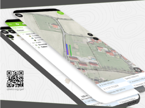
 QField is cross-platform, based on the QGIS engine, facilitating seamless project sharing between desktop, mobile, and web applications.
 QFieldCloud (https://qfield.cloud), the collaborative web platform for QField project management, will also benefit from this partnership and will be enhanced to complement the range of tools within the QGIS platform.
 ![]()
 At Oslandia, we are thrilled to collaborate with OPENGIS.ch on QGIS technologies. Oslandia shares with OPENGIS.ch a common vision of open-source software development: a strong involvement in development communities, work in respect with the ecosystem, an highly skilled expertise, and a commitment to industrial-quality, robust, and sustainable software development.
 With this partnership, we aim to offer our clients the highest expertise across all software components of the QGIS platform, from data capture to dissemination.
 On the OpenGIS.ch side, Marco Bernasocchi adds:
The partnership with Oslandia represents a crucial step in our mission to provide leading mobile GIS tools with a genuine OpenSource credo. The complementarity of our skills will accelerate the development of QField and QFieldCloud and meet the growing needs of our users.
 Both companies are committed to continue supporting and improving QField and QFieldCloud as open-source projects, ensuring universal access to this high-quality mobile GIS solution without vendor dependencies.
 And now, are you ready for the field?
So, download QField (https://qfield.org/get), create projects in QGIS, and share them on QFieldCloud!
 If you need training, support, maintenance, deployment, or specific feature development on these platforms, don’t hesitate to contact us. You will have access to the best experts available: [email protected].
A while back, one of our ninjas added a new algorithm in QGIS’ processing toolbox named ST-DBSCAN Clustering, short for spatio temporal density-based spatial clustering of applications with noise. The algorithm regroups features falling within a user-defined maximum distance and time duration values.
This post will walk you through one practical use for the algorithm: large-scale fire event analysis and visualization through remote-sensed fire detection. More specifically, we will be looking into one of the larger fire events which occurred in Canada’s Quebec province in June 2023.

NASA’s Fire Information for Resource Management System (FIRMS) offers a fantastic worldwide archive of all fire detected through three spaceborne sources: MODIS C6.1 with a resolution of roughly 1 kilometer as well as VIIRS S-NPP and VIIRS NOAA-20 with a resolution of 375 meters. Each detected fire is represented by a point that sits at the center of the source’s resolution grid.
Each source will cover the whole world several times per day. Since detection is impacted by atmospheric conditions, a given pass by one source might not be able to register an ongoing fire event. It’s therefore advisable to rely on more than one source.
To look into our fire event, we have chosen the two fire detection sources with higher resolution – VIIRS S-NPP and VIIRS NOAA-20 – covering the whole month of June 2023. The datasets were downloaded from FIRMS’ archive download page.
After downloading the two separate datasets, we combined them into one merged geopackage dataset using QGIS processing toolbox’s Merge Vector Layers algorithm. The merged dataset will be used to conduct the clustering analysis.

In addition, we will use QGIS’s field calculator to create a new Date & Time field named ACQ_DATE_TIME using the following expression:
to_datetime("ACQ_DATE" || "ACQ_TIME", 'yyyy-MM-ddhhmm')This will allow us to calculate precise time differences between two dates.

The large-scale fire event analysis requires running two distinct algorithms:
This can be achieved through QGIS’ modeler to sequentially execute the ST-DBSCAN Clustering algorithm as well as the Aggregate algorithm against the output of the first algorithm.

The above-pictured model outputs two datasets. The first dataset contains single-part points of detected fires with attributes from the original VIIRS products as well as a pair of new attributes: the CLUSTER_ID provides a unique cluster identifier for each point, and the CLUSTER_SIZE represents the sum of points forming each unique cluster. The second dataset contains multi-part points clusters representing fire events with four attributes: CLUSTER_ID and CLUSTER_SIZE which were discussed above as well as DATE_START and DATE_END to identify the beginning and end time of a fire event.
In our specific example, we will run the model using the merged dataset we created above as the “fire points layer” and select ACQ_DATE_TIME as the “date field”. The outputs will be saved as separate layers within a geopackage file.
Note that the maximum distance (0.025 degrees) and duration (72 hours) settings to form clusters have been set in the model itself. This can be tweaked by editing the model.
Once the model has provided its outputs, we are ready to start visualizing a fire event on a map. In this practical example, we will focus on detected fires around latitude 53.0960 and longitude -75.3395.
Using the multi-part points dataset, we can identify two clustered events (CLUSTER_ID 109 and 1285) within the month of June 2023. To help map canvas refresh responsiveness, we can filter both of our output layers to only show features with those two cluster identifiers using the following SQL syntax: CLUSTER_ID IN (109, 1285).
To show the progression of the fire event over time, we can use a data-defined property to graduate the marker fill of the single-part points dataset along a color ramp. To do so, open the layer’s styling panel, select the simple marker symbol layer, click on the data-defined property button next to the fill color and pick the Assistant menu item.
In the assistant panel, set the source expression to the following: day(age(to_date('2023-07-01'),”ACQ_DATE_TIME”)). This will give us the number of days between a given point and an arbitrary reference date (2023-07-01 here). Set the values range from 0 to 30 and pick a color ramp of your choice.

When applying this style, the resulting map will provide a visual representation of the spread of the fire event over time.

Through QGIS’ DataPlotly plugin, it is possible to create an histogram of fire events. After installing the plugin, we can open the DataPlotly panel and configure our histogram.
Set the plot type to histogram and pick the model’s single-part points dataset as the layer to gather data from. Make sure that the layer has been filtered to only show a single fire event. Then, set the X field to the following layer attribute: “ACQ_DATE”.
You can then hit the Create Plot button, go grab a coffee, and enjoy the resulting histogram which will appear after a minute or so.
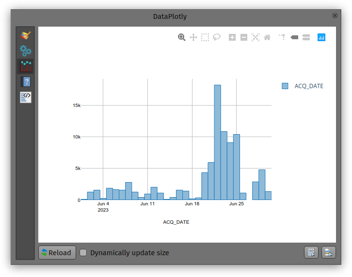
While not perfect, an histogram can quickly provide a good sense of a fire event’s “peak” over a period of time.
In August 13 new plugins that have been published in the QGIS plugin repository.
Here’s the quick overview in reverse chronological order. If any of the names or short descriptions piques your interest, you can find the direct link to the plugin page in the table below the screenshot.

| Cesium ion |
| Browse and add datasets from Cesium ion |
| Land Use Analyzer |
| A plugin for Land Use spatial analysis tools |
| GNAVS |
| GNSS Navigate and Save |
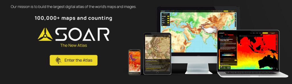
| Soar – the new atlas |
| Import or export maps via the Soar platform |
| FotovolCAT |
| Spatial analysis automation for solar power station sitting in Catalonia |
| QGISSPARQL-Layer2Triple |
| Layer2Triple |
| osm2topomap |
| A plugin intended to intermediate the process of using OSM data for official (authoritative) Topographc Maps, or rather, databases |
| Plugin Exporter |
| A QGIS plugin for exporting plugins |
| GetBaseLine |
| GetBaseLine |
| Fast Field Filler |
| The plugin was created to quickly fill in the fields in the attribute table. |
| Radiation ToolBox Plugin |
| Plugin for loading data from Safecast and other radiation monitoring devices |
| LocationIQ Geocoding and Maps |
| LocationIQ integration to add geocoding and map tiles to QGIS |
| Proxy Handler |
| Adds prefix proxy addresses to connections |
Today, I want to point out a blog post over at
https://geocompx.org/post/2023/ogh23/
written together with my fellow “Geocomputation with Python” co-authors Robin Lovelace, Michael Dorman, and Jakub Nowosad.
In this blog post, we talk about our experience teaching R and Python for geocomputation. The context of this blog post is the OpenGeoHub Summer School 2023 which has courses on R, Python and Julia. The focus of the blog post is on geographic vector data, meaning points, lines, polygons (and their ‘multi’ variants) and the attributes associated with them. We plan to cover raster data in a future post.
New version of MapTiler QGIS Plugin 3.0 with detailed global terrain, contour lines, hillshading, and maps using these terrain data for outdoor activities.
Note: on Windows, while the installer filename contains 2.8.5, the actual version is 2.8.2
Growing up, I would spend hours lost in National Geographic maps. The feeling of discovering new regions and new ways to view the world was addictive! It’s this same feeling of discovery and exploration which has made me super excited about Soar’s Digital Atlas. Soar is the brainchild of Australian, Amir Farhand, and is fuelled by the talents of staff located across the globe to build a comprehensive digital atlas of the world’s maps and images. Soar has been designed to be an easy to use, expansive collection of diverse maps from all over the Earth. A great aspect of Soar is that it has implemented Strong Community Guidelines and moderation to ensure the maps are fit for purpose.
Recently, North Road collaborated with Soar to help facilitate their digital atlas goals by creating a QGIS plugin for Soar. The Soar plugin allows QGIS users to directly:
There’s lots of extra tweaks we’ve added to help make the plugin user friendly, whilst offering tons of functionality that power users want. For instance, users can:
Soar will be presenting their new plugin at the QGIS Open Day in August so check out the details here and tune in at 2300 AEST or 1300 HR UTC. You can follow along via either YouTube or Jitsi.
One of the main goals of the Soar QGIS plugin was to make it very easy to find new datasets and add them to your QGIS projects. There’s two ways users can explore the Soar catalog from QGIS:
You can open the Soar Browser Panel via the Soar toolbar button ![]() . This opens a floating catalog browser panel which allows you to interactively search Soar’s content while working on your map.
. This opens a floating catalog browser panel which allows you to interactively search Soar’s content while working on your map.
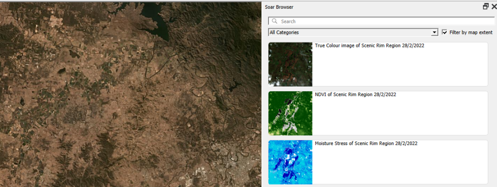
Alternatively, you can also access the Soar catalog and maps from the standard QGIS Data Source Manager dialog. Just open the “Soar” tab and search away!

When you’ve found an interesting map, hit the “Add to Map” button and the map will be added as a new layer into your current project. After the layer is loaded you can freely modify the layer’s style (such as the opacity, colorization, contrast etc) just like any other raster dataset using the standard QGIS Layer Style controls.
Before you can share your maps on Soar, you’ll need to first sign up for a free Soar account.
We’ve designed the Soar plugin with two specific use cases in mind for sharing maps. The first use case is when you want to share an entire map (i.e. QGIS project) to Soar. This will publish all the visible content from your map onto Soar, including all the custom styling, labeling, decorations and other content you’ve carefully designed. To do this, just select the Project menu, Import/Export -> Export map to Soar option.

You’ll have a chance to enter all the metadata and descriptive text explaining your map, and then the map will be rendered and uploaded directly to Soar.

All content on the Soar atlas is moderated, so your shared maps get added to the moderation queue ready for review by the Soar team. (You’ll be notified as soon as the review is complete and your map is publicly available).
Alternatively, you might have a specific raster layer which you want to publish on Soar. For instance, you’ve completed some flood modelling or vegetation analysis and want to share the outcome widely. To do this, you can use the “Publish dataset to Soar” tool available from the QGIS Processing toolbox:
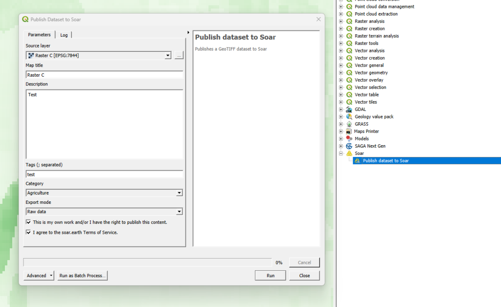
Just pick the raster layer you want to upload, enter the metadata information, and let the plugin do the rest! Since this tool is made available through QGIS’ Processing framework, it also allows you to run it as a batch process (eg uploading a whole folder of raster data to Soar), or as a step in your QGIS Graphical Models!
All maps uploaded to Soar require the following information:
This helps other users to find your maps with ease, and also gives the Soar moderation team the information required for their review process.
We’ve a few other tips to keep in mind to successfully share your maps on Soar:
So there you have it! So simple to start building up your contribution to Soar’s Digital Atlas. Those who might find this useful to upload maps include:
You can find out more about the QGIS Soar plugin at the QGIS Open Day on August 23rd, 2023 at 2300 HR AEST or 1300 HR UTC. Check here for more information or to watch back after.
If you’re interested in exploring how a QGIS plugin can make your service easily accessible to the millions of daily QGIS users, contact us to discuss how we can help!
Note: on Windows, while the installer filename contains 2.8.5, the actual version is 2.8.2
