Related Plugins and Tags

QGIS Planet

Bringing QGIS maps into Jupyter notebooks

Earlier this year, we explored how to use PyQGIS in Juypter notebooks to run QGIS Processing tools from a notebook and visualize the Processing results using GeoPandas plots.

Today, we’ll go a step further and replace the GeoPandas plots with maps rendered by QGIS.

The following script presents a minimum solution to this challenge: initializing a QGIS application, canvas, and project; then loading a GeoJSON and displaying it:

from IPython.display import Image

from PyQt5.QtGui import QColor
from PyQt5.QtWidgets import QApplication

from qgis.core import QgsApplication, QgsVectorLayer, QgsProject, QgsSymbol, \
    QgsRendererRange, QgsGraduatedSymbolRenderer, \
    QgsArrowSymbolLayer, QgsLineSymbol, QgsSingleSymbolRenderer, \
    QgsSymbolLayer, QgsProperty
from qgis.gui import QgsMapCanvas

app = QApplication([])
qgs = QgsApplication([], False)
canvas = QgsMapCanvas()
project = QgsProject.instance()

vlayer = QgsVectorLayer("./data/traj.geojson", "My trajectory")
if not vlayer.isValid():
    print("Layer failed to load!")

def saveImage(path, show=True): 
    canvas.saveAsImage(path)
    if show: return Image(path)

project.addMapLayer(vlayer)
canvas.setExtent(vlayer.extent())
canvas.setLayers([vlayer])
canvas.show()
app.exec_()

saveImage("my-traj.png")

When this code is executed, it opens a separate window that displays the map canvas. And in this window, we can even pan and zoom to adjust the map. The line color, however, is assigned randomly (like when we open a new layer in QGIS):

To specify a specific color, we can use:

vlayer.renderer().symbol().setColor(QColor("red"))

vlayer.triggerRepaint()
canvas.show()
app.exec_()
saveImage("my-traj.png")

But regular lines are boring. We could easily create those with GeoPandas plots.

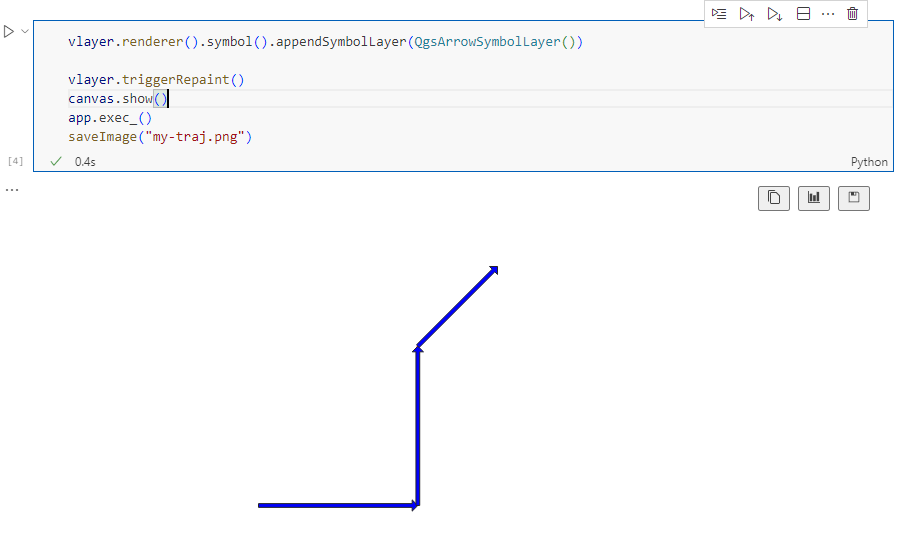
Things get way more interesting when we use QGIS’ custom symbols and renderers. For example, to draw arrows using a QgsArrowSymbolLayer, we can write:

vlayer.renderer().symbol().appendSymbolLayer(QgsArrowSymbolLayer())

vlayer.triggerRepaint()
canvas.show()
app.exec_()
saveImage("my-traj.png")

We can also create a QgsGraduatedSymbolRenderer:

geom_type = vlayer.geometryType()
myRangeList = []

symbol = QgsSymbol.defaultSymbol(geom_type)
symbol.setColor(QColor("#3333ff"))
myRange = QgsRendererRange(0, 1, symbol, 'Group 1')
myRangeList.append(myRange)

symbol = QgsSymbol.defaultSymbol(geom_type)
symbol.setColor(QColor("#33ff33"))
myRange = QgsRendererRange(1, 3, symbol, 'Group 2')
myRangeList.append(myRange)

myRenderer = QgsGraduatedSymbolRenderer('speed', myRangeList)
vlayer.setRenderer(myRenderer)

vlayer.triggerRepaint()
canvas.show()
app.exec_()
saveImage("my-traj.png")

And we can combine both QgsGraduatedSymbolRenderer and QgsArrowSymbolLayer:

geom_type = vlayer.geometryType()
myRangeList = []

symbol = QgsSymbol.defaultSymbol(geom_type)
symbol.appendSymbolLayer(QgsArrowSymbolLayer())
symbol.setColor(QColor("#3333ff"))
myRange = QgsRendererRange(0, 1, symbol, 'Group 1')
myRangeList.append(myRange)

symbol = QgsSymbol.defaultSymbol(geom_type)
symbol.appendSymbolLayer(QgsArrowSymbolLayer())
symbol.setColor(QColor("#33ff33"))
myRange = QgsRendererRange(1, 3, symbol, 'Group 2')
myRangeList.append(myRange)

myRenderer = QgsGraduatedSymbolRenderer('speed', myRangeList)
vlayer.setRenderer(myRenderer)

vlayer.triggerRepaint()
canvas.show()
app.exec_()
saveImage("my-traj.png")

Maybe the most powerful option is to use data-defined symbology. For example, to control line width and color:

renderer = QgsSingleSymbolRenderer(QgsSymbol.defaultSymbol(geom_type))

exp_width = 'scale_linear("speed", 0, 3, 0, 7)'
exp_color = "coalesce(ramp_color('Viridis',scale_linear(\"speed\", 0, 3, 0, 1)), '#000000')"

# https://qgis.org/pyqgis/3.0/core/Symbol/QgsSymbolLayer.html?highlight=property#qgis.core.QgsSymbolLayer.PropertySize
renderer.symbol().symbolLayer(0).setDataDefinedProperty(
    QgsSymbolLayer.PropertyStrokeWidth, QgsProperty.fromExpression(exp_width))
renderer.symbol().symbolLayer(0).setDataDefinedProperty(
    QgsSymbolLayer.PropertyStrokeColor, QgsProperty.fromExpression(exp_color))
renderer.symbol().symbolLayer(0).setDataDefinedProperty(
    QgsSymbolLayer.PropertyCapStyle, QgsProperty.fromExpression("'round'"))

vlayer.setRenderer(renderer)

vlayer.triggerRepaint()
canvas.show()
app.exec_()
saveImage("my-traj.png")

Find the full notebook at: https://github.com/anitagraser/QGIS-resources/blob/master/qgis3/notebooks/layer-styling.ipynb

(Nederlands) Gebruikersbijeenkomst: QGIS in Organisaties

Sorry, this entry is only available in Dutch.

QGIS 3D Tiles – thanks to Cesium Ecosystem Grant!

We’ve recently had the opportunity to implement a very exciting feature in QGIS 3.34 — the ability to load and view 3D content in the “Cesium 3D Tiles” format! This was a joint project with our (very talented!) partners at Lutra Consulting, and was made possible thanks to a generous ecosystem grant from the Cesium project.

Before we dive into all the details, let’s take a quick guided tour showcasing how Cesium 3D Tiles work inside QGIS:

What are 3D tiles?

Cesium 3D Tiles are an OGC standard data format where the content from a 3D scene is split up into multiple individual tiles. You can think of them a little like a 3D version of the vector tile format we’ve all come to rely upon. The 3D objects from the scene are stored in a generalized, simplified form for small-scale, “zoomed out” maps, and in more detailed, complex forms for when the map is zoomed in. This allows the scenes to be incredibly detailed, whilst still covering huge geographic regions (including the whole globe!) and remaining responsive and quick to download. Take a look at the incredible level of detail available in a Cesium 3D Tiles scene in the example below:

Where can you get 3D tile content?

If you’re lucky, your regional government or data custodians are already publishing 3D “digital twins” of your area. Cesium 3D Tiles are the standard way that these digital twin datasets are being published. Check your regional data portals and government open data hubs and see whether they’ve made any content available as 3D tiles. (For Australian users, there’s tons of great content available on the Terria platform!).

Alternatively, there’s many datasets available via the Cesium ion platform. This includes global 3D buildings based on OpenStreetMap data, and the entirety of Google’s photorealistic Google Earth tiles! We’ve published a Cesium ion QGIS plugin to complement the QGIS 3.34 release, which helps make it super-easy to directly load datasets from ion into your QGIS projects.

Lastly, users of the OpenDroneMap photogrammetry application will already have Cesium 3D Tiles datasets of their projects available, as 3D tiles are one of the standard outputs generated by OpenDroneMap.

Why QGIS?

So why exactly would you want to access Cesium 3D tiles within QGIS? Well, for a start, 3D Tiles datasets are intrinsically geospatial data. All the 3D content from these datasets are georeferenced and have accurate spatial information present. By loading a 3D tiles dataset into QGIS, you can easily overlay and compare 3D tile content to all your other standard spatial data formats (such as Shapefiles, Geopackages, raster layers, mesh datasets, WMS layers, etc…). They become just another layer of spatial information in your QGIS projects, and  you can utilise all the tools and capabilities you’re familiar with in QGIS for analysing spatial data along with these new data sources.

One large drawcard of adding a Cesium 3D Tile dataset to your QGIS project is that they make fantastic 3D basemaps. While QGIS has had good support for 3D maps for a number of years now, it has been tricky to create beautiful 3D content. That’s because all the standard spatial data formats tend to give generalised, “blocky” representations of objects in 3D. For example, you could use an extruded building footprint file to show buildings in a 3D map but they’ll all be colored as idealised solid blocks. In contrast, Cesium 3D Tiles are a perfect fit for a 3D basemap! They typically include photorealistic textures, and include all types of real-world features you’d expect to see in a 3D map — including buildings, trees, bridges, cliffsides, etc.

What next?

If you’re keen to learn even more about Cesium 3D Tiles in QGIS, you can check out the recent “QGIS Open Day” session we presented. In this session we cover all the details about 3D tiles and QGIS, and talk in depth about what’s possible in QGIS 3.34 and what may be coming in later releases.

Otherwise, grab the latest QGIS 3.34 and start playing…. you’ll quickly find that Cesium 3D Tiles are a fun and valuable addition to QGIS’ capabilities!

Our thanks go to Cesium and their ecosystem grant project for funding this work and making it possible.

Exploring a hierarchical graph-based model for mobility data representation and analysis

Today’s post is a first quick dive into Neo4J (really just getting my toes wet). It’s based on a publicly available Neo4J dump containing mobility data, ship trajectories to be specific. You can find this data and the setup instructions at:

Maryam Maslek ELayam, Cyril Ray, & Christophe Claramunt. (2022). A hierarchical graph-based model for mobility data representation and analysis [Data set]. Zenodo. https://doi.org/10.5281/zenodo.6405212

I was made aware of this work since they cited MovingPandas in their paper in Data & Knowledge Engineering“The implementation combines several open source tools such as Python, MovingPandas library, Uber H3 index, Neo4j graph database management system”

Once set up, this gives us a database with three hierarchical levels:

Neo4j comes with a nice graphical browser that lets us explore the data. We can switch between levels and click on individual node labels to get a quick preview:

Level 2 is a generalization / aggregation of level 1. Expanding the graph of one of the level 2 nodes shows its connection to level 1. For example, the level 2 port node “Audierne” actually refers to two level 1 nodes:

Every “road” level 1 relationship between ports provide information about the ship, its arrival, departure, travel time, and speed. We can see that this two level 1 ports must be pretty close since travel times are only 5 minutes:

Further expanding one of the port level 1 nodes shows its connection to waypoints of level1:

Switching to level 2, we gain access to nodes of type Traj(ectory). Additionally, the road level 2 relationships represent aggregations of the trajectories, for example, here’s a relationship with only one associated trajectory:

There are also some odd relationships, for example, trajectory 43 has two ends and begins relationships and there are also two road relationships referencing this trajectory (with identical information, only differing in their automatic <id>). I’m not yet sure if that is a feature or a bug:

On level 1, we also have access to ship nodes. They are connected to ports and waypoints. However, exploring them visually is challenging. Things look fine at first:

But after a while, once all relationships have loaded, we have it: the MIGHTY BALL OF YARN ™:

I guess this is the point where it becomes necessary to get accustomed to the query language. And no, it’s not SQL, it is Cypher. For example, selecting a specific trajectory with id 0, looks like this:

 MATCH (t1 {traj_id: 0}) RETURN t1

But more on this another time.


This post is part of a series. Read more about movement data in GIS.

QGIS 3.34 Prizren is released!

We are pleased to announce the release of QGIS 3.34 Prizren!

Installers for Windows and Linux are already out. QGIS 3.34 comes with tons of new features, as you can see in our visual changelog. QGIS 3.34 Prizren is named after this year’s FOSS4G host city.

We would like to thank the developers, documenters, testers and all the many folks out there who volunteer their time and effort (or fund people to do so). From the QGIS community we hope you enjoy this release! If you wish to donate time, money or otherwise get involved in making QGIS more awesome, please wander along to qgis.org and lend a hand!

QGIS is supported by donors and sustaining members. A current list of donors who have made financial contributions large and small to the project can be seen on our donors list. If you would like to become a sustaining member, please visit our page for sustaining members for details. Your support helps us fund our six monthly developer meetings, maintain project infrastructure and fund bug fixing efforts.

QGIS is Free software and you are under no obligation to pay anything to use it – in fact we want to encourage people far and wide to use it regardless of what your financial or social status is – we believe empowering people with spatial decision making tools will result in a better society for all of humanity.

FOSS4G SotM Oceania 2023 Auckland round up

Recently, we had the pleasure of helping organise the FOSS4G SotM Oceania 2023 conference in Auckland. It was a fantastic week and felt like a worthy return to pre-covid events full of great presentations, catching up with old friends, making new ones, and of course – delicious food! The venue, Auckland University of Technology, put on a really professional event with catering, venue spaces and their Audio Visual operations. Auckland gave us great weather, and great venues to enjoy each others company in.

We were blown away with the variety of presentations and the talent our Oceania region holds. We got to meet some of our clients in person including Koordinates, A.B. Heritage and Soar, which we loved, plus we spent valuable time connecting with our community.

At North Road we are passionate about supporting open-source and our local Oceania region, so we took an active part in making this year’s conference happen. Aside from being a conference sponsor, our very own powerhouse Emma Hain worked tirelessly as Program Chair to organise the conference program and ensure that the talks ran smoothly and were of very high value.  Nyall ran a workshop for Advanced Cartography, presented on his journey in the FOSS4G workspace and contributed as panel member on making  a living in FOSS4G. Emma also presented a lightning talk on GitHub QGIS Issues and was a community day facilitator on an exciting project to develop digital stories with a map component. We really love community and being involved in “building it” is integral. But it is also super fun as well!

One of the great things about this conference is the legacy it leaves, not only in the relationships formed, but in the recordings of all the presentations that end up on the FOSS4G Oceania YouTube channel. This is not only knowledge captured for the community, but also a showcase for the talent that exists in FOSS4G. Not every  presentations was technical or about case studies, they also covered personal observations, hobbies and general mapping topics.

You can view the presentations from our staff below:

Also, check out the presentations from some of the great companies we have worked with:

Soar: Soar: lessons from our start-up experience, From Satellites to Slobs,   Maps, Media and Manipulation

Koordinates: Kart – the geospatial version control system – now with Rasters!Making it up: map making bots, generative mapping and TTRPG tools

Community Day

On the last day of the conference we attended the Community Day. This involves a Mapathon run by HOTOSM, and rooms for brainstorming and workshopping of ideas. These were really valuable! First we attended the FOSS4G Hui run by Byron Cochrane from OpenWork (one of the conference sponsors). It was a great discussion on how to make FOSS4G more relevant in Oceania. If you are keen to help out with this, contact the OSGeo Oceania Board – as they need helpers with Communications and members to espouse FOSS4G at outside conferences.

Emma also ran the session on developing digital stories with a map component in a FOSS4G environment. This was well attended with a lot of ideas. We developed our MVP and we are now looking at our next steps. The question here is do we develop a new tool within existing software, find a standalone software where we could add in a map component, or approach a current OS Story Map software and provide our MVP and find funding. If you’re keen to take part in these discussions, you can join in on the Maptime Oceania slack channel under #foss4g-productdev.

A Big Thank-you!

The Organisation committee worked so hard on putting this conference on, and we would like to express our heartfelt thanks for this. This is the keystone event for our community and so much grows from this. Without the Organisation Committee’s sweat, tears, frustration and joy this would not have happened. We thank their families who supported them whilst they gave up their valuable time and their employers who supported them to give their time and effort to making this special event happen.

Bring on FOSS4G/SOTM Oceania 2024!

3.0.6 - Amazonia

Changes

🐛 Bug Fixes

  • Stability improvements

GRASS GIS 8.3.1 released

What’s new in a nutshell The GRASS GIS 8.3.1 maintenance release provides more than 60 changes compared to 8.3.0. This new patch release brings in important fixes and improvements in GRASS GIS modules and the graphical user interface (GUI) which stabilizes the new single window layout active by default. Some of the most relevant changes […]

The post GRASS GIS 8.3.1 released appeared first on Markus Neteler Consulting.

QField 3.0 release : field mapping app, based on QGIS

We are very happy and enthusiasts at Oslandia to forward the QField 3.0 release announcement, the new major update of this mobile GIS application based on QGIS.

Oslandia is a strategic partner of OPENGIS.ch, the company at the heart of QField development, as well as the QFieldCloud associated SaaS offering. We join OPENGIS.ch to announce all the new features of QField 3.0.

Get QField 3.0 now !

QField 3.0 screenshots


Shipped with many new features and built with the latest generation of Qt’s cross-platform framework, this new chapter marks an important milestone for the most powerful open-source field GIS solution.

Main highlights

Upon launching this new version of QField, users will be greeted by a revamped recent projects list featuring shiny map canvas thumbnails. While this is one of the most obvious UI improvements, countless interface tweaks and harmonization have occurred. From the refreshed dark theme to the further polishing of countless widgets, QField has never looked and felt better.

The top search bar has a new functionality that allows users to look for features within the currently active vector layer by matching any of its attributes against a given search term. Users can also refine their searches by specifying a specific attribute. The new functionality can be triggered by typing the ‘f’ prefix in the search bar followed by a string or number to retrieve a list of matching features. When expanding it, a new list of functionalities appears to help users discover all of the tools available within the search bar.

QField’s tracking has also received some love. A new erroneous distance safeguard setting has been added, which, when enabled, will dictate the tracker not to add a new vertex if the distance between it and the previously added vertex is greater than a user-specified value. This aims at preventing “spikes” of poor position readings during a tracking session. QField is now also capable of resuming a tracking session after being stopped. When resuming, tracking will reuse the last feature used when first starting, allowing sessions interrupted by battery loss or momentary pause to be continued on a single line or polygon geometry.

On the feature form front, QField has gained support for feature form text widgets, a new read-only type introduced in QGIS 3.30, which allows users to create expression-based text labels within complex feature form configurations. In addition, relationship-related form widgets now allow for zooming to children/parent features within the form itself.

To enhance digitizing work in the field, QField now makes it possible to turn snapping on and off through a new snapping button on top of the map canvas when in digitizing mode. When a project has enabled advanced snapping, the dashboard’s legend item now showcases snapping badges, allowing users to toggle snapping for individual vector layers.

In addition, digitizing lines and polygons by using the volume up/down hardware keys on devices such as smartphones is now possible. This can come in handy when digitizing data in harsh conditions where gloves can make it harder to use a touch screen.

While we had to play favorites in describing some of the new functionalities in QField, we’ve barely touched the surface of this feature-packed release. Other major additions include support for Near-Field Communication (NFC) text tag reading and a new geometry editor’s eraser tool to delete part of lines and polygons as you would with a pencil sketch using an eraser.

Thanks to Deutsches Archäologisches Institut, Groupements forestiers Québec, Amsa, and Kanton Luzern for sponsoring these enhancements.

Quality of life improvements

Starting with this new version, the scale bar overlay will now respect projects’ distance measurement units, allowing for scale bars in imperial and nautical units.

QField now offers a rendering quality setting which, at the cost of a slightly reduced visual quality, results in faster rendering speeds and lower memory usage. This can be a lifesaver for older devices having difficulty handling large projects and helps save battery life.

Vector tile layer support has been improved with the automated download of missing fonts and the possibility of toggling label visibility. This pair of changes makes this resolution-independent layer type much more appealing.

On iOS, layouts are now printed by QField as PDF documents instead of images. While this was the case for other platforms, it only became possible on iOS recently after work done by one of our ninjas in QGIS itself.

Many thanks to DB Fahrwgdienste for sponsoring stabilization efforts and fixes during this development cycle.

Qt 6, the latest generation of the cross-platform framework powering QField

Last but not least, QField 3.0 is now built against Qt 6. This is a significant technological milestone for the project as this means we can fully leverage the latest technological innovations into this cross-platform framework that has been powering QField since day one.

On top of the new possibilities, QField benefited from years of fixes and improvements, including better integration with Android and iOS platforms. In addition, the positioning framework in Qt 6 has been improved with awareness of the newer GNSS constellations that have emerged over the last decade.

Forest-themed release names

Forests are critical in climate regulation, biodiversity preservation, and economic sustainability. Beginning with QField 3.0 “Amazonia” and throughout the 3.X’s life cycle, we will choose forest names to underscore the importance of and advocate for global forest conservation.

Software with service

OPENGIS.ch and Oslandia provides the full range of services around QField and QGIS : training, consulting, adaptation, specific development and core development, maintenance and assistance. Do not hesitate to contact us and detail your needs, we will be happy to collaborate : [email protected]

As always, we hope you enjoy this new release. Happy field mapping!

3.0.5 - Amazonia

Changes

🐛 Bug Fixes

  • Fix line and polygon highlight on rotated map canvas
  • Fix display of feature form's HTML widget
  • Fix corrupted Exif image orientation metadata when maximum image size setting is enabled

3.0.4 - Amazonia

Changes

🐛 Bug Fixes

  • Fix project load failure (i.e. blank canvas) for project containing font marker symbols

Full Changelog: v3.0.3...v3.0.4

QField 3.0 “Amazonia” is here – Feature-packed and super slick.

We’re so excited and proud of this latest QField version that we’ve opted for a major 3.0 version update.

Shipped with many new features and built with the latest generation of Qt’s cross-platform framework, this new chapter marks an important milestone for the most powerful open-source field GIS solution.

Main highlights

Upon launching this new version of QField, users will be greeted by a revamped recent projects list featuring shiny map canvas thumbnails. While this is one of the most obvious UI improvements, countless interface tweaks and harmonization have occurred. From the refreshed dark theme to the further polishing of countless widgets, QField has never looked and felt better.

The top search bar has a new functionality that allows users to look for features within the currently active vector layer by matching any of its attributes against a given search term. Users can also refine their searches by specifying a specific attribute. The new functionality can be triggered by typing the ‘f’ prefix in the search bar followed by a string or number to retrieve a list of matching features. When expanding it, a new list of functionalities appears to help users discover all of the tools available within the search bar.

QField’s tracking has also received some love. A new erroneous distance safeguard setting has been added, which, when enabled, will dictate the tracker not to add a new vertex if the distance between it and the previously added vertex is greater than a user-specified value. This aims at preventing “spikes” of poor position readings during a tracking session. QField is now also capable of resuming a tracking session after being stopped. When resuming, tracking will reuse the last feature used when first starting, allowing sessions interrupted by battery loss or momentary pause to be continued on a single line or polygon geometry.  

On the feature form front, QField has gained support for feature form text widgets, a new read-only type introduced in QGIS 3.30, which allows users to create expression-based text labels within complex feature form configurations. In addition, relationship-related form widgets now allow for zooming to children/parent features within the form itself.

To enhance digitizing work in the field, QField now makes it possible to turn snapping on and off through a new snapping button on top of the map canvas when in digitizing mode. When a project has enabled advanced snapping, the dashboard’s legend item now showcases snapping badges, allowing users to toggle snapping for individual vector layers

QField 3.0 snapping capabilities

In addition, digitising lines and polygons by using the volume up/down hardware keys on devices such as smartphones is now possible. This can come in handy when digitizing data in harsh conditions where gloves can make it harder to use a touch screen. 

While we had to play favourites in describing some of the new functionalities in QField, we’ve barely touched the surface of this feature-packed release. Other major additions include support for Near-Field Communication (NFC) text tag reading and a new geometry editor’s eraser tool to delete part of lines and polygons as you would with a pencil sketch using an eraser.

Thanks to Deutsches Archäologisches Institut, Groupements forestiers Québec, Amsa, and Kanton Luzern for sponsoring these enhancements. 

Quality of life improvements

Starting with this new version, the scale bar overlay will now respect projects’ distance measurement units, allowing for scale bars in imperial and nautical units.

QField now offers a rendering quality setting which, at the cost of a slightly reduced visual quality, results in faster rendering speeds and lower memory usage. This can be a lifesaver for older devices having difficulty handling large projects and helps save battery life.

Vector tile layer support has been improved with the automated download of missing fonts and the possibility of toggling label visibility. This pair of changes makes this resolution-independent layer type much more appealing.

On iOS, layouts are now printed by QField as PDF documents instead of images. While this was the case for other platforms, it only became possible on iOS recently after work done by one of our ninjas in QGIS itself.

Many thanks to DB Fahrwgdienste for sponsoring stabilization efforts and fixes during this development cycle.

Qt 6, the latest generation of the cross-platform framework powering QField

Last but not least, QField 3.0 is now built against Qt 6. This is a significant technological milestone for the project as this means we can fully leverage the latest technological innovations into this cross-platform framework that has been powering QField since day one.

On top of the new possibilities, QField benefited from years of fixes and improvements, including better integration with Android and iOS platforms. In addition, the positioning framework in Qt 6 has been improved with awareness of the newer GNSS constellations that have emerged over the last decade.

Forest-themed release names

Forests are critical in climate regulation, biodiversity preservation, and economic sustainability. Beginning with QField 3.0 “Amazonia” and throughout the 3.X’s life cycle, we will choose forest names to underscore the importance of and advocate for global forest conservation. 

As always, we hope you enjoy this new release. Happy field mapping!

3.0.3 - Amazonia

Changes

🐛 Bug Fixes

  • Fix crash with QML, HTML, and Text editor widget
  • Fix resumption of tracks erase the last vertex of the previous session
  • Fix fill ring geometry editor tool
  • Fix QFieldCloud wrong password feedback mistaken for an expired session

Full Changelog: v3.0.2...v3.0.3

3.0.1 - Amazonia

Changes

🐛 Bug Fixes

  • Fix mouse clicks on map canvas blocked when feature {form,list} panel is visible
  • Fix wrong screen DPI assigned to the map canvas (leading to tiny markers and fonts)
  • Fix handling of hyperlinks in the feature form's text widget
  • Fix oauth2 authentication not forgotten on app restart

Full Changelog: v3.0.0...v3.0.1

3.0.2 - Amazonia

Changes

🐛 Bug Fixes

  • Fix iOS release #4640
  • Avoid feature form crashes when the configuration contains QML, HTML, or Text widgets #4639
  • Fix relation child deletion button #4644
  • Fix a glitch whereas feature form tabs overlap each other #4647

Full Changelog: v3.0.1...v3.0.2

GRASS GIS 8.3.0 released

What’s new in a nutshell The GRASS GIS 8.3.0 release provides more than 360 changes compared to the 8.2 branch. This new minor release brings in many fixes and improvements in GRASS GIS modules and the graphical user interface (GUI) which now has the single window layout by default. Some of the most relevant changes […]

The post GRASS GIS 8.3.0 released appeared first on Markus Neteler Consulting.

QGIS Add to Felt Plugin – Phase 2

We have been continuing our work with the Flagship sponsor of QGISFelt to develop their QGIS Plugin – Add to Felt  that makes it even easier to share your maps and data on the web.

What is the ‘Add to Felt’ QGIS Plugin?

The ‘Add to Felt’ QGIS Plugin is a powerful tool that empowers users to export their QGIS projects and layers directly to a Felt web map. This update introduces two fantastic features:

  1. Single Layer Sharing: You can now share a single layer from your QGIS project to a Felt map. This means you have greater control over which specific data layers to share, allowing you to tailor your map precisely to your audience’s needs.
  2. Map Selection: With the updated plugin, you can choose which map on Felt to add your layer to – a new map, or an ongoing project. This flexibility simplifies your workflow and ensures that your data ends up in the right place.

Businesses that rely on QGIS love how these new features provide a seamless way to view and share results, ultimately allowing them to move more quickly and stay in sync:

“Felt helps us keep each other updated on what we’ve done, what we’ve modeled, how things are progressing.” – ICON Engineering

Why is this Update Important?

Web maps are invaluable tools for sharing data with a wider audience, be it colleagues, clients, or the public. They provide creators with the ability to control data visibility, display options, and audience access, all within an easily shareable digital format. However, creating web maps can be an arduous and complex task.

Here’s where the ‘Add to Felt’ QGIS Plugin update comes to the rescue:

1. Streamlining the Process: Creating web maps traditionally involves website development, data hosting, and map application development—tasks that require a diverse skill set. This complexity can be a significant barrier, especially for smaller operations with limited resources or budget constraints.

2. Felt Simplifies Web Mapping: Felt makes it effortless to create web maps, and share them as easily as you would a Google Doc or Sheet. Simply drag and drop your data, customize the symbology to your liking, and share the map with a link or by inviting collaborators. No need to send large data files or answer questions about the map’s data sources.

3. Integration with QGIS: Now, the ‘Add to Felt’ QGIS Plugin bridges the gap between QGIS and Felt. It seamlessly imports your QGIS data into Felt, eliminating the need for manual data transfers and reducing the complexity of web map creation.

In essence, the ‘Add to Felt’ QGIS Plugin update simplifies the process of sharing and collaborating on web maps. It empowers users to harness the full potential of web-based mapping, making it accessible to everyone, regardless of their technical expertise. The update makes it even easier to share progress updates or model re-run outputs without creating a new map, or sharing a new map link.

So, if you’re a QGIS user looking to enhance your map-sharing capabilities and streamline your workflow, make sure to take advantage of this fantastic update. Say goodbye to the complexities of web map creation and hello to effortless, data-rich web maps with Felt and the ‘Add to Felt’ QGIS Plugin.

How to install and upgrade

  • Open QGIS on your computer. You must have version 3.22 or later installed.
  • In the plugins tab, select Manage and Install Plugins.
  • Search for the ‘Add to Felt’ plugin, select and click Install Plugin.
  • Close the Plugins dialog. The Felt plugin toolbar will appear in your toolbar for use.
  • Sign into Felt and begin sharing your maps to the web.

If you want more features in this plugin, let us know or you’re interested in exploring how a QGIS plugin can make your service easily accessible to the millions of daily QGIS users, contact us to discuss how we can help!

3.0.0 - Amazonia

Changes

30splash

🚀 Features

General features:

  • Near-Field Communication (NFC) text tag reading support
  • The welcome screen’s recent projects list is now equipped with a map canvas preview
  • New active layer feature search functionality in the top search bar
  • New map canvas rendering quality setting to unlocked faster rendering speeds and lower memory usage at the cost of a slightly rendering quality reduction
  • A list of feature(s) under which a long press has occurred is now appended to the map canvas menu with action shortcuts
  • Relationship-related editor widgets now allows for zooming onto the child/parent within the feature form
  • Layer credits are now displayed within the layer properties panel when available in opened projects
  • Imperial and nautical scale bar support
  • Feature form text widget support

Tracking features:

  • New erroneous position safeguard defined as a maximum distance threshold
  • Resumption of tracking across sessions

Digitizing features:

  • New snapping button which allows users to toggle snapping on/off while digitizing
  • New legend snapping badges when project is set up to advanced snapping mode
  • Digitizing of geometry vertices through volume keys
  • Brand new geometry editor’s eraser tool allowing users to remove parts of a geometry by drawing areas of deletion

✨ Improvements

QField built against Qt6:

  • Dramatically improved Material theme used to style UI elements such as combo boxes
  • Improved dark theme color scheme
  • Improved internal positioning handling of satellite information
  • Years worth of fixes and improves when compared to the previously used version

Quality of life improvements:

  • The value relation editor widget has received several fixes and UX improvements
  • When duplicating features, users are now asked to move the duplicated feature immediately
  • Duplication of features will now copy any children of any existing relationships set to composition strength
  • Missing project fonts are now downloaded in the background and automatically added into QField
  • Labels visibility on vector tile layers can now be toggle on/off
  • QField now exports layouts as PDFs on iOS
  • Improvements in the handling of altitude with external GNSS receivers
  • Countless optimizations have made QField’s UI smoother than ever

2.8.8 🌈

Changes

🚀 Features

  • Allow for tracking session to be resumed (inc. across QField restarts) (#4590)
  • Implement digitizing through volume keys on Android devices (#4594)
  • Brand new geometry editor' erase tool functionality (#4584)
  • Brand new tracker functionality: maximum distance tolerance (#4589)
  • Brand new search bar active layer feature matching functionality + UI/UX improvements (#4546)
  • Implement near-field tag/target reading capability (#4539)

Call for Proposals: QGIS Website Overhaul 2023/2024

📒 Background

Our web site (https://qgis.org) dates back to 2013, it is time for a revision!

As well as modernizing the look and feel of the site, we want the content to be updated to represent changes in the maturity of the project.

We want to appeal to new audiences, especially business and NGO decision makers (in particular the experience for the front pages), whilst still maintaining appeal to grass roots users (especially the lower level pages which contain many technical details and community collaboration notes).

We want to enhance our fund raising efforts through a site that encourages people to contribute to, as well as take from, the project.

🏋️‍♂️Existing effort

First some key links:

The above websites were created with a mix of technologies:

  • Sphinx (rst)
  • Doxygen
  • Custom Django Apps

It will not be possible to unify the technology used for all of the above sites, but we want all of the web sites to have a cohesive appearance and the navigation flow between them to be seamless. For the main website at https://qgis.org and its child pages, we want to re-implement the site to provide a new experience – according to the design we have laid out in our figma board. Note that we want to follow this design. Some small tweaks will be fine but we are not looking for a ‘from scratch’ re-implementation of our design.

This will be our website for the next 10 years – you need to hand it over to us in a way that we can continue working on it and maintaining it without your intervention.

We are calling for proposals to help us with this migration as per the phases described below.

Phase 1⃣: Project planning

  • ⌚Timeline
  • 🏗 Proposed site structure
    • What content will be kept
    • What will be removed
    • What is new to be added
  • Keep front page as starting point
    • Suggest tweaks if needed
  • Establish a clear vocabulary of page types
    • Second and third level page design
    • Special pages such as
      • Download
      • Release countdown
      • Donation / sustaining members
      • Gallery
      • and any other you identify as non-standard second/third level
  • Guidance and standards for producing visuals like screenshots etc. For example, how we present QGIS screenshots in a flattering way.
  • Establish a plan for auxiliary sites:
    • Plugins.qgis.org
    • Api.qgis.org
    • Docs.qgis.org
    • etc. (see intro for more exhaustive list)
  • Iterative review and feedback from the QGIS web team should be incorporated from biweekly check in calls.

🏆 Outcome: We have a clear roadmap and design guide for migrating all of our websites to a consistent unified experience.

Phase 2⃣: Content migration of the main site

During this phase the contractor will focus on migrating the content of the main site to the new platform.

There will be an iterative review and feedback from the QGIS web team should be incorporated from biweekly check-in calls.

🏆 Outcome: https://qgis.org new site goes live! (Target date end of February 2024)

Phase 3⃣: Auxiliary sites migrations

This is out of scope of the current call for proposals but should be part of the overall planning process:

This would be a collaborative process involving a QGIS funded web developer and the consultant. 

Iterative review and feedback from the QGIS web team should be incorporated from biweekly check in calls.

🏆 Outcome: Auxiliary sites goes live with a cohesive look and feel to match the main site.

☕ What we will provide

  • Maps and screenshots, videos, animations (with inputs from design team)
  • Inputs in terms of content review

🎓 Qualification criteria

✅ Must have an established track record of website design and content creation.

✅ Individuals or companies equally welcome to apply.

✅ Any potential conflict of interest should be declared in your application.

✅ Discussions will happen in English, with live discussions as well as written communication via issues or Pull request. Being reasonably fluent in English and understand the soft skills required to interact in a community project will be more than appreciated

🗓 Payment milestones

10 % Kick off

40 % Phase 1 Completion

50 % Phase 2 Completion

💸 Indicative budget

We would like to point you to the QGIS Annual Budget so that you have a sense of our broad financial means (i.e. we will not be able to afford proposals in excess of €25,000 for phase 1+2).

https://www.qgis.org/en/site/getinvolved/governance/annual_reports/index.html

👩‍💻 Technology choices and IP:

  • Must be wholly based on Open Source tooling (e.g. javascript, css, web frameworks)
  • Needs to be ideally implemented in Hugo (or Sphinx)
  • Must produce a static web site (except for existing django based sites)
  • Publication and development workflow will follow standard pull request / review process via our GitHub repositories
  • Mobile friendly
  • Site will be english only – any auto-translation tooling that can be added so that users can trivially see an auto-translated version of the site will be considered favourably.

📃 Proposal submission

Your proposal should consist of no more than 5 pages (include links to relevant annexes if needed) covering the following:

  • Overview of yourself / your organization
  • Delivery timeline
  • Team composition
  • Budget for each phase
  • Examples of prior work
  • Bonus things to mention if relevant: GIS experience & working with Open Source projects

Please send your proposal to [email protected] by October 29nd 2023 midnight, anywhere on earth.

  • <<
  • Page 5 of 136 ( 2717 posts )
  • >>

Back to Top

Sustaining Members