Related Plugins and Tags

QGIS Planet

Recent labelling improvements in QGIS master

If you’re not like me and don’t keep a constant eye over at QGIS development change log (be careful – it’s addictive!), then you’re probably not aware of a bunch of labelling improvements which recently landed in QGIS master version. I’ve been working recently on a large project which involves a lot (>300) of atlas map outputs, and due to the size of this project it’s not feasible to manually tweak placements of labels. So, I’ve been totally at the mercy of QGIS’ labelling engine for automatic label placements. Generally it’s quite good but there were a few things missing which would help this project. Fortunately, due to the open-source nature of QGIS, I’ve been able to dig in and enhance the label engine to handle these requirements (insert rhetoric about beauty of open source here!). Let’s take a look at them one-by-one:

Data defined quadrant in “Around Point” placement mode

First up, it’s now possible to specify a data defined quadrant when a point label is set to the Around Point placement mode. In the past, you had a choice of either Around Point mode, in which QGIS automatically places labels around point features in order to maximise the number of labels shown, or the Offset from Point mode, in which all labels are placed at a specified position relative to the points (eg top-left). In Offset from Point mode you could use data defined properties to force labels for a feature to be placed at a specific relative position by binding the quadrant to a field in your data. This allowed you to manually tweak the placement for individual labels, but at the cost of every other label being forced to the same relative position. Now, you’ve also got the option to data define the relative position when in Around Point mode, so that the rest of the labels will fall back to being automatically placed. Here’s a quick example – I’ll start with a layer with labels in Around Point mode:

Around Point placement mode

Around Point placement mode

You can see that some labels are sitting to the top right of the points, others to the bottom right, and some in the top middle, in order to fit all the labels for these points. With this new option, I can setup a data defined quadrant for the labels, and then force the ‘Tottenham’ label (top left of the map) to display below and to the left of the point:

Setting a data-defined quadrant

Setting a data-defined quadrant

Here’s what the result looks like:

Manually setting the quadrant for the Tottenham label

Manually setting the quadrant for the Tottenham label

The majority of the labels are still auto-placed, but Tottenham is now force to the lower left corner.

Data defined label priority

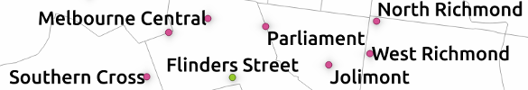
Another often-requested feature which landed recently is the ability to set the priority for individual labels. QGIS has long had the ability to set the priority for an entire labelling layer, but you couldn’t control the priority of features within a layer. That would lead to situations like that shown below, where the most important central station (the green point) hasn’t been labelled:

What... no label for the largest station in Melbourne?

What… no label for the largest station in Melbourne?

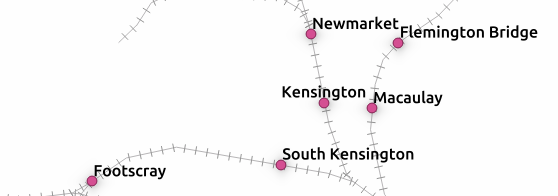
By setting a data defined priority for labels, I can set the priority either via values manually entered in a field or by taking advantage of an existing “number of passengers” field present in my data. End result is that this central station is now prioritised over any others:

Much better! (in case you're wondering... I've manually forced some other non-optimal placement settings for illustrative purposes!)

Much better! (in case you’re wondering… I’ve manually forced some other non-optimal placement settings for illustrative purposes!)

Obstacle only layers

The third new labelling feature is the option for “Obstacle only” layers. What this option does is allow a non-labelled layer to act as an obstacle for the labels in other layers, so they will be discouraged from drawing labels over the features in the obstacle layer. Again, it’s best demonstrated with an example. Here’s my stations layer with labels placed automatically – you can see that some labels are placed right over the features in the rail lines layer:

Labels over rail lines...

Labels over rail lines…

Now, let’s set the rail lines layer to act as an obstacle for other labels:

... setting the layer as an obstacle...

… setting the layer as an obstacle…

The result is that labels will be placed so that they don’t cover the rail lines anymore! (Unless there’s no other choice). Much nicer.

No more clashing labels!

No more clashing labels!

Control over how polygons act as obstacles for labels

This change is something I’m really pleased about. It’s only applicable for certain situations, but when it works the improvements are dramatic.

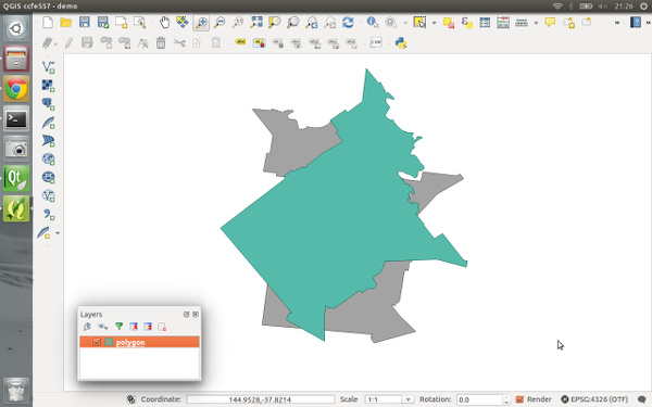
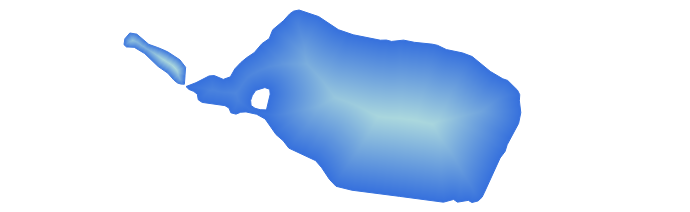
Let’s start with my labelled stations map, this time with an administrative boundary layer in the background:

Stations with administrative boundaries

Stations with administrative boundaries

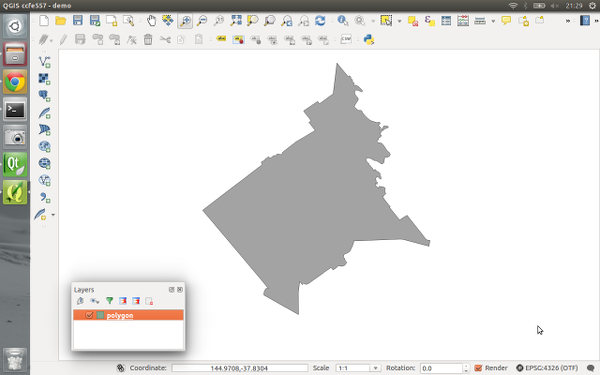
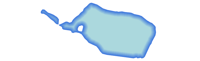
Notice anything wrong with this map? If you’re like me, you won’t be able to look past those labels which cross over the admin borders. Yuck. What’s happening here is that although my administrative regions layer is set to discourage labels being placed over features, there’s actually nowhere that labels can possibly be placed which will avoid this. The admin layer covers the entire map, so regardless of where the labels are placed they will always cover an administrative polygon feature. This is where the new option to control how polygon layers act as obstacles comes to the rescue:

...change a quick setting...

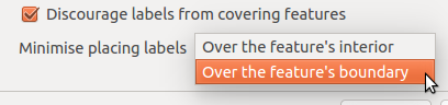
…change a quick setting…

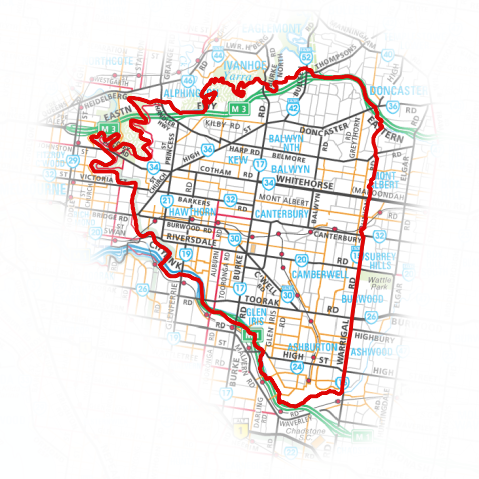
Now, I can set the administrative layer to only avoid placing labels over feature’s boundaries! I don’t care that they’ll still be placed inside the features (since we have no choice!), but I don’t want them sitting on top of these boundaries. The result is a big improvement:

Much better!

Much better!

Now, QGIS has avoided placing labels over the boundaries between regions. Better auto-placement of labels like this means much less time required manually tweaking their positioning, and that’s always a good thing!

Draw only labels which fit inside a polygon

The last change is fairly self explanatory, so no nice screenshots here. QGIS now has the ability to prevent drawing labels which are too large to fit inside their corresponding polygon features. Again, in certain circumstances this can make a huge cartographic improvement to your map.

So there you go. Lots of new labelling goodies to look forward to when QGIS 2.12 rolls around.


QGIS on the rise with journalists

If you are following QGIS on Twitter you’ve probably noticed the increasing number of tweets by journalists using QGIS.

For example this map in the Financial Times by Hannah Dormido

or this one with overview maps and three different levels of details

or this map with semi-transparent label backgrounds and nice flag images

or even Time Manager animations by raoulranoa in the Los Angeles Times

I think this is a great development and a sign of how wide-spread QGIS usage is today.

If you know of any other examples or if you are a journalist using QGIS yourself, I’d love to see more!


QGIS 2.10 symbology feature preview

With the release of 2.10 right around the corner, it’s time to have a look at the new features this version of QGIS will bring. One area which has received a lot of development attention is layer styling. In particular, I want to point out the following new features:

1. Graduated symbol size

The graduated renderer has been expanded. Formerly, only color-graduated symbols could be created automatically. Now, it is possible to choose between color and size-graduated styles:

Screenshot 2015-06-21 18.39.25

2. Symbol size assistant

On a similar note, I’m sure you’ll enjoy the size assistant for data-defined size:

Screenshot 2015-06-21 23.16.10 Screenshot 2015-06-21 23.16.01

What’s particularly great about this feature is that it also creates a proper legend for the data-defined sizes:

Screenshot 2015-06-21 23.18.46

3. Interactive class exploration and definition

Another great addition to the graduated renderer dialog is the histogram tab which visualizes the distribution of values as well as the defined class borders. Additionally, the user can interactively change the classes by moving the class borders:

Screenshot 2015-06-21 18.43.09

4. Live layer effects

Since Nyall’s crowd funding initiative for live layer effects was a resounding success, it is now possible to create amazing effects for your vector styles such as shadows, glow, and blur effects:

Screenshot 2015-06-21 18.45.22

I’m very much looking forward to seeing all the new map designs this enables on the QGIS map Flickr group.

Thanks to everyone who was involved in developing and funding these new features!


How to create illuminated contours, Tanaka-style

In the category “last night on Twitter”, a challenge I couldn’t resist: creating illuminated contours (aka Tanaka contours) in QGIS. Daniel P. Huffman started the thread by posting this great example:

CFnWnA5UkAAuFm9

This was quickly picked up by Hannes Kröger who blogged about his first attempt at reproducing the effect using QGIS and GIMP. Obviously, that left the challenge of finding a QGIS-only solution.

Everything that’s needed to create this effect is a DEM. As Hannes describes in his post, the DEM can then be used to compute the contour lines, e.g. with Raster | Extraction | Contour:

gdal_contour -a ELEV -i 100.0 C:\Users\anita\Geodata\misc\mt-st-helens\10.2.1.1043901.dem C:/Users/anita/Geodata/misc/mt-st-helens/countours

Screenshot 2015-05-24 11.17.49

contours

In order to be able to compute the brightness of the illuminated contours, we need to compute the orientation of every subsection of the contours. Therefore, we need to split the contour lines at each node. One way to do this is using v.split from the Processing toolbox:

Screenshot 2015-05-24 11.23.11

When we split the contours and visualize the result using arrows, we can see that they all wrap around the mountain in clockwise direction (light DEM cells equal higher elevation):

split_contours

After the split, we can compute the orientation of the contour subsections using, for example, a user-defined function:

Screenshot 2015-05-24 19.09.12

This function can then be used in a Field calculator expression:

Screenshot 2015-05-24 19.11.53

Based on the orientation, we can then write an expression to control the contour line color. For example, if we want the sun to appear in the north west (-45°) we can use:

color_hsl( 0,0, 
  scale_linear( abs(
    ( CASE WHEN "azimuth"-45 < 0
      THEN "azimuth"-45+360 
      ELSE "azimuth"-45
    END )
  -180), 0, 180, 0, 100)
  )

This will color the lines which are directly exposed to the sun white hsl(0,0,100) while the ones in the shadows will be black hsl(0,0,0).

Screenshot 2015-05-24 11.55.50

Use the Overlay layer blending mode to blend contours and DEM color:

illuminated_contours

The final step, to get as close to the original design as possible, is to create the effect of discrete elevation classes instead of a smooth color gradient. This can easily be achieved by changing the color interpolation mode of the DEM from Linear to Discrete:

Screenshot 2015-05-24 12.11.01

This leaves us with the following gorgeous effect:

tanaka_contours

As Hannes pointed out, another important aspect of Tanaka’s method is to also alter the contour line width. Lines in the sun or shadow should be wider (1 in this example) than those in orthogonal direction (0.2 in this example):

scale_linear( 
abs( abs(
  ( CASE WHEN "azimuth"-45 < 0
    THEN  "azimuth"-45+360
    ELSE  "azimuth"-45
  END )
-180) -90),
0, 90, 0.2, 1)

datadefined_line_width

Enjoy!


Introducing QGIS live layer effects!

I’m pleased to announce that the crowdfunded work on layer effects for QGIS is now complete and available in the current development snapshots! Let’s dive in and explore how these effects work, and check out some of the results possible using them.

I’ll start with a simple polygon layer, with some nice plain styling:

Nice and boring polygon layer

A nice and boring polygon layer

If I open the properties for this layer and switch to the Style tab, there’s a new checkbox for “Draw effects“. Let’s enable that, and then click the little customise effects button to its right:

Enabling effects for the layer

Enabling effects for the layer

A new “Effects Properties” dialog opens:

Effects Properties dialog

Effects Properties dialog

You can see that currently the only effect listed is a “Source” effect. Source effects aren’t particularly exciting – all they do is draw the original layer unchanged. I’m going to change this to a “Blur” effect by clicking the “Effect type” combo box and selecting “Blur“:

Changing to a blur effect

Changing to a blur effect

If I apply the settings now, you’ll see that the polygon layer is now blurry. Now we’re getting somewhere!

Blurry polygons!

Blurry polygons!

Ok, so back to the Effects Properties dialog. Let’s try something a bit more advanced. Instead of just a single effect, it’s possible to chain multiple effects together to create different results. Let’s make a traditional drop shadow by adding a “Drop shadow” effect under the “Source” effect:

Setting up a drop shadow

Setting up a drop shadow

Effects are drawn top-down, so the drop shadow will appear below the source polygons:

Live drop shadows!

Live drop shadows!

Of course, if you really wanted, you could rearrange the effects so that the drop shadow effect is drawn above the source!..

Hmmmm

Hmmmm…

You can stack as many effects as you like. Here’s a purple inner glow over a source effect, with a drop shadow below everything:

Inner glow, source, drop shadow...

Inner glow, source, drop shadow…

Now it’s time to get a bit more creative… Let’s explore the “transform” effect. This effect allows you to apply all kinds of transformations to your layer, including scaling, shearing, rotation and translation:

The transform effect

The transform effect

Here’s what the layer looks like if I add a horizontally shearing transform effect above an outer glow effect:

Getting freaky...

Getting tricky…

Transforms can get really freaky. Here’s what happens if we apply a 180° rotation to a continents layer (with a subtle nod to xkcd):

Change your perspective on the world!

Change your perspective on the world!

Remember that all these effects are applied when the layers are rendered, so no modifications are made to the underlying data.

Now, there’s one last concept regarding effects which really blasts open what’s possible with them, and that’s “Draw modes“. You’ll notice that this combo box contains a number of choices, including “Render“, “Modify” and “Render and Modify“:

"Draw mode" options

“Draw mode” options

These draw modes control how effects are chained together. It’s easiest to demonstrate how draw modes work with an example, so this time I’ll start with a Transform effect over a Colorise effect. The transform effect is set to a 45° rotation, and the colorise effect set to convert to grayscale. To begin, I’ll set the transform effect to a draw mode of Render only:

The "Render only" draw mode

The “Render only” draw mode

In this mode, the results of the effect will be drawn but won’t be used to modify the underlying effects:

Rotation effect over the grayscale effect

Rotation effect over the grayscale effect

So what we have here is that the polygon is drawn rotated by 45° by the transform effect, and then underneath that there’s a grayscale copy of the original polygon drawn by the colorise effect. The results of the transform effect have been rendered, but they haven’t affected the underlying colorise effect.

If I instead set the Transform effect’s draw mode to “Modifier only” the results are quite different:

Rotation modifier for grayscale effect

Rotation modifier for grayscale effect

Now, the transform effect is rotating the polygon by 45° but the result is not rendered. Instead, it is passed on to the subsequent colorise effect, so that now the colorise effect draws a grayscale copy of the rotated polygon. Make sense? We could potentially chain a whole stack of modifier effects together to get some great results. Here’s a transform, blur, colorise, and drop shadow effect all chained together using modifier only draw modes:

A stack of modifier effects

A stack of modifier effects

The final draw mode, “Render and modify” both renders the effect and applies its result to underlying effects. It’s a combination of the two other modes. Using draw modes to customise the way effects chain is really powerful. Here’s a combination of effects which turn an otherwise flat star marker into something quite different:

Lots of effects!

Lots of effects!

The last thing I’d like to point out is that effects can be either applied to an entire layer, or to the individual symbol layers for features within a layer. Basically, the possibilities are almost endless! Python plugins can also extend this further by implementing additional effects.

All this work was funded through the 71 generous contributors who donated to the crowdfunding campaign. A big thank you goes out to you all whole made this work possible! I honestly believe that this feature takes QGIS’ cartographic possibilities to whole new levels, and I’m really excited to see the maps which come from it.

Lastly, there’s two other crowdfunding campaigns which are currently in progress. Lutra consulting is crowdfunding for a built in auto trace feature, and Radim’s campaign to extend the functionality of the QGIS GRASS plugin. Please check these out and contribute if you’re interested in their work and would like to see these changes land in QGIS.

Hack to adjust map symbols location in QGIS

EN | PT

Now and then I get too many map symbols (points) in the same place, and I thought how nice it would be if we could drag n’ drop them around without messing with their geometries position, just like we do with labels. That thought gave me an idea for a cool hack.

Choose your point layer and start by creating two new fields called symbX and symbY (Type: Decimal number; Size: 20; Precision: 5). Now go the layer properties and in the Style tab edit your symbol. For each level of your symbol select “map units” as the offset units, and set the following expression in the offset data define properties option:


CASE WHEN symbX IS NOT NULL AND symbY IS NOT NULL THEN
    tostring($x - symbX) + ',' + tostring($y - symbY)
ELSE
    '0,0'
END

Screenshot from 2015-02-22 18:18:43

Be aware that, if your coordinates have negative values, you need to adapt the code. E.g., If you have negative values in X you should use “tostring(symbX -$x)” instead.

Now, temporarly  label your layer with a small convenient text (I used a centered ‘+’ (plus sign) with a white buffer) and set its coordinates to data defined using the symbX and symbY Fields.

Screenshot from 2015-02-22 22:42:07

From this point on, when you use the move label tool, not only the label position change but also the actual symbol! Pretty cool, isn’t it?

anim

Notice that the features geometries are not changed during the process. Also, remember that in this case you can also add leading lines to connect the symbols to the original position of the points.

Labels leading lines with QGIS and Postgis

EN | PT

Recently I had the need to add labels to features with very close geometries, resulting in their collision.

Capturar_3

Using data-defined override for label’s position (I have used layer to labeled layer plugin to set this really fast) and the QGIS tool to move labels, it was quite easy to relocate them to better places. However, in same cases, it was difficult to understand to which geometry they belonged.

Capturar_2

I needed some kind of leading lines to connect, whenever necessary, label and feature. I knew another great plugin called “Easy Custom Labeling“, by Regis Haubourg, that did what I needed, but it would create a memory duplicate of the original layer, wish meant that any edition on the original layer wouldn’t be updated in the labels.

Since the data were stored in a PostgreSQL/Postgis database, I have decided to create a query that would return a layer with leading lines. I used the following query in DB manager:

SELECT
  gid,
  label,
  ST_Makeline(St_setSRID(ST_PointOnSurface(geom),27493), St_setSRID(St_Point(x_label::numeric, y_label::numeric),27493))
FROM
  epvu.sgev
WHERE
  x_label IS NOT NULL AND
  y_label IS NOT NULL AND
  NOT ST_Within(ST_Makeline(St_setSRID(ST_PointOnSurface(geom),27493), St_setSRID(St_Point(x_label::numeric, y_label::numeric),27493)),geom))

This query creates a line by using the feature centroid as starting point and the label coordinate as end point. The last condition on the WHERE statement assures that the lines are only created for labels outside the feature.

Capturar_1

With the resulting layer loaded in my project, all I need is to move my labels and save the edition (and press refresh) to show a nice leading line.

guidelines

How to: watercolor pastel style in QGIS

Today’s post is a follow-up to a recent map experiment which I published in the QGIS Flickr group. It’s basically an inverted Stamen Toner style with an image in the map composition background instead of a solid color (similar to the approach described for vintage maps):

That’s nice but with this approach we only get to enjoy the complete design in the print composer but not in the main window. So what other options do we have? – SVG fills to the rescue!

But first we need a suitable SVG with this nice pastel style. I used Gimp to create a seamless version of the pastel image and then embedded the image in an SVG using Inkscape:

LT_RemixedChalkPastel_snakk_seamless

In QGIS, this SVG can now be used in any SVG fill. It’s important to set the Texture width setting to a quite high value when working with SVGs containing big textures, otherwise the images will be rendered very small and the repeating patterns will be very obvious.

Screenshot 2015-01-04 17.49.11

Once the background is in place, we can add the line work and labels. The roads are white with black outlines for bridges which – together with the Lighten blending mode – produce the desired effect:

Screenshot 2015-01-04 17.37.33


Kickstarter Alert – Live Layer Effects for QGIS

QGIS is well regarded for its fantastic cartographic abilities – it’s got a huge range of symbology styles and options which can be used to style your maps. But there’s more we can do to push this even further.

One long requested cartographic feature has been for live drop shadows on layers. Why stop there? Why not inner and outer glow effects and live blur effects? Just imagine the cartographic possibilities if this functionality was available from within a GIS, and didn’t require exporting maps to external editors…

I’ve launched a Kickstarter project to fund implementing live layer effects like this within QGIS. Please consider donating or spreading the word if you’d find this feature useful!

Map corner coordinates in QGIS

EN | PT

Some time ago in the qgis-pt mailing list, someone asked how to show the coordinates of a map corners using QGIS. Since this features wasn’t available (yet), I have tried to reach a automatic solution, but without success,  After some thought about it and after reading a blog post by Nathan Woodrow, it came to me that the solution could be creating a user defined function for the expression builder to be used in labels in the map.

Closely following the blog post instructions, I have created a file called userfunctions.py in the  .qgis2/python folder and, with a help from Nyall Dawson I wrote the following code.

from qgis.utils import qgsfunction, iface
from qgis.core import QGis

@qgsfunction(2,"python")
def map_x_min(values, feature, parent):
 """
 Returns the minimum x coordinate of a map from
 a specific composer.
 """
 composer_title = values[0]
 map_id = values[1]
 composers = iface.activeComposers()
 for composer_view in composers():
  composer_window = composer_view.composerWindow()
  window_title = composer_window.windowTitle()
  if window_title == composer_title:
   composition = composer_view.composition()
   map = composition.getComposerMapById(map_id)
   if map:
    extent = map.currentMapExtent()
    break
 result = extent.xMinimum()
 return result

After running the command import userfunctions in the python console  (Plugins > Python Console), it was already possible to use the  map_x_min() function (from the python category) in an expression to get the minimum X value of the map.

Screenshot from 2014-09-09 16^%29^%29

All I needed now was to create the other three functions,  map_x_max(), map_y_min() and map_y_max().  Since part of the code would be repeated, I have decided to put it in a function called map_bound(), that would use the print composer title and map id as arguments, and return the map extent (in the form of a QgsRectangle).

from qgis.utils import qgsfunction, iface
from qgis.core import QGis

def map_bounds(composer_title, map_id):
 """
 Returns a rectangle with the bounds of a map
 from a specific composer
 """
 composers = iface.activeComposers()
 for composer_view in composers:
  composer_window = composer_view.composerWindow()
  window_title = composer_window.windowTitle()
  if window_title == composer_title:
   composition = composer_view.composition()
   map = composition.getComposerMapById(map_id)
   if map:
    extent = map.currentMapExtent()
    break
 else:
  extent = None

 return extent

With this function available, I could now use it in the other functions to obtain the map X and Y minimum and maximum values, making the code more clear and easy to maintain. I also add some mechanisms to the original code to prevent errors.

@qgsfunction(2,"python")
def map_x_min(values, feature, parent):
 """
 Returns the minimum x coordinate of a map from a specific composer.
 Calculations are in the Spatial Reference System of the project.
<h2>Syntax</h2>
map_x_min(composer_title, map_id)
<h2>Arguments</h2>
composer_title - is string. The title of the composer where the map is.
 map_id - integer. The id of the map.
<h2>Example</h2>
map_x_min('my pretty map', 0) -> -12345.679

 """
 composer_title = values[0]
 map_id = values[1]
 map_extent = map_bounds(composer_title, map_id)
 if map_extent:
  result = map_extent.xMinimum()
 else:
  result = None

 return result

@qgsfunction(2,"python")
def map_x_max(values, feature, parent):
 """
 Returns the maximum x coordinate of a map from a specific composer.
 Calculations are in the Spatial Reference System of the project.
<h2>Syntax</h2>
map_x_max(composer_title, map_id)
<h2>Arguments</h2>
composer_title - is string. The title of the composer where the map is.
 map_id - integer. The id of the map.
<h2>Example</h2>
map_x_max('my pretty map', 0) -> 12345.679

 """
 composer_title = values[0]
 map_id = values[1]
 map_extent = map_bounds(composer_title, map_id)
 if map_extent:
  result = map_extent.xMaximum()
 else:
  result = None

 return result

@qgsfunction(2,"python")
def map_y_min(values, feature, parent):
 """
 Returns the minimum y coordinate of a map from a specific composer.
 Calculations are in the Spatial Reference System of the project.
<h2>Syntax</h2>
map_y_min(composer_title, map_id)
<h2>Arguments</h2>
composer_title - is string. The title of the composer where the map is.
 map_id - integer. The id of the map.
<h2>Example</h2>
map_y_min('my pretty map', 0) -> -12345.679

 """
 composer_title = values[0]
 map_id = values[1]
 map_extent = map_bounds(composer_title, map_id)
 if map_extent:
  result = map_extent.yMinimum()
 else:
  result = None

 return result

@qgsfunction(2,"python")
def map_y_max(values, feature, parent):
 """
 Returns the maximum y coordinate of a map from a specific composer.
 Calculations are in the Spatial Reference System of the project.
<h2>Syntax</h2>
map_y_max(composer_title, map_id)
<h2>Arguments</h2>
composer_title - is string. The title of the composer where the map is.
 map_id - integer. The id of the map.
<h2>Example</h2>
map_y_max('my pretty map', 0) -> 12345.679

 """
 composer_title = values[0]
 map_id = values[1]
 map_extent = map_bounds(composer_title, map_id)
 if map_extent:
  result = map_extent.yMaximum()
 else:
  result = None

 return result

The functions became available to the expression builder in the “Python” category (could have been any other name) and the functions descriptions are formatted as help texts to provide the user all the information needed to use them.

Screenshot from 2014-09-09 15^%39^%19

Using the created functions, it was now easy to put the corner coordinates in labels near the map corners. Any change to the map extents is reflected in the label, therefore quite useful to use with the atlas mode.

Screenshot from 2014-09-09 15^%40^%27

The functions result can be used with other functions. In the following image, there is an expression to show the coordinates in a more compact way.

Screenshot from 2014-09-09 15^%43^%55

There was a setback… For the functions to become available, it was necessary to manually import them in each QGIS session. Not very practical. Again with Nathan’s help, I found out that it’s possible to import python modules at QGIS startup by putting a startup.py file with the import statements in the .qgis2/python folder. In my case, this was enough.

import userfunctions

I was pretty satisfied with the end result. The ability to create your own functions in expressions demonstrates once more how easy it is to customize QGIS and create your own tools. I’m already thinking in more applications for this amazing functionality.

UT 9 - Qta da Peninha - Vegetação potencial

You can download the Python files with the functions HERE. Just unzip both files to the .qgis2/python folder, and restart QGIS, and the functions should become available.

Disclaimer: I’m not an English native speaker, therefore I apologize for any errors, and I will thank any advice on how to improve the text.

Multiple format map series using QGIS 2.6 – Part 1

EN | PT

As always, the new QGIS version (QGIS 2.6 Brigthon) brings a vast new set of features that will allow the user to do more, better and faster than with the earlier version. One of this features is the ability to control some of the composer’s items properties with data (for instance, size and position). Something that will allow lots of new interesting usages. In the next posts, I propose to show how to create map series with multiple formats.

In this first post, the goal is that, keeping the page size, the map is created with the most suitable orientation (landscape or portrait) to fit the atlas feature. To exemplify, I will be using the Alaska’s sample dataset to create a map for each of Alaska’s regions.

I have started by creating the layout in one of the formats, putting the items in the desired positions.

mapa_base_atlas

To control the page orientation with the atlas feature, in the composition tab, I used the following expression in the orientation data defined properties:

CASE WHEN bounds_width( $atlasgeometry ) >=  bounds_height( $atlasgeometry ) THEN 'landscape' ELSE 'portrait' END

Using the atlas preview, I could verify that the page’s orientation changed according to the form of the atlas feature. However, the composition’s items did not follow this change and some got even outside the printing area

Screenshot from 2014-11-08 23:29:49

To control both size and position of the composition’s items I had in consideration the A4 page size (297 x 210 mm), the map margins ( 20 mm, 5 mm, 10 mm, 5 mm) and the item’s reference points.

For the map item, using the upper left corner as reference point, it was necessary to change it’s height and width. I knew that the item height was the subtraction of the top and bottom margins (30 mm) from the page height, therefore I used the following expression:

(CASE WHEN  bounds_width(  $atlasgeometry ) >=  bounds_height( $atlasgeometry) THEN 297 ELSE 210 END) - 30

Likewise, the expression to use in the width was:

(CASE WHEN  bounds_width(  $atlasgeometry ) >=  bounds_height( $atlasgeometry) THEN 210 ELSE 297 END) - 10

Screenshot from 2014-11-09 00:02:15

The rest of the items were always at a relative position of the page without the need to change their size and therefore only needed to control their position. For example, the title was centered at the page’s top, and therefore, using the top-center as reference point, all that was needed was the following expression for the X position:

Screenshot from 2014-11-09 00:13:17

(CASE WHEN  bounds_width(  $atlasgeometry ) >=  bounds_height( $atlasgeometry)  THEN 297 ELSE 210 END)  / 2.0

Screenshot from 2014-11-09 00:30:57

On the other hand, the legend needed to change the position in both X and Y. Using the bottom-right-corner as reference point, the X position expression was:

(CASE WHEN  bounds_width(  $atlasgeometry ) >=  bounds_height( $atlasgeometry) THEN 297 ELSE 210 END) - 7

And for the Y position:

(CASE WHEN  bounds_width(  $atlasgeometry ) >=  bounds_height( $atlasgeometry) THEN 210 ELSE 297 END) - 12

Screenshot from 2014-11-09 00:47:28

For the remaining items (North arrow, scalebar, and bottom left text), the expression were similar to the ones already mentioned, and, after setting them for each item, I got a layout that would adapt to both page orientation.

output_9

From that point, printing/exporting all (25) maps was one click away.

mosaico_regioes

In the next post of the series, I will try to explain how to create map series where it’s the size of the page that change to keep the scale’s value of the scale constant.

Labels as text in SVG exports

Today’s post is inspired by a recent thread on the QGIS user mailing list titled “exporting text to Illustrator?”. The issue was that with the introduction of the new labeling system, all labels were exported as paths when creating an SVG. Unnoticed by almost everyone (and huge thanks to Alex Mandel for pointing out!) an option has been added to 2.4 by Larry Shaffer which allows exporting labels as texts again.

To export labels as text, open the Automatic Placement Settings (button in the upper right corner of the label dialog) and uncheck the Draw text as outlines option.

Screenshot 2014-09-20 21.03.26

Note that we are also cautioned that

For now the developers recommend you only toggle this option right
before exporting
and that you recheck it after.

Alex even recorded a video showcasing the functionality:


Visualizing direction-dependent values

When mapping flows or other values which relate to a certain direction, styling these layers gets interesting. I faced the same challenge when mapping direction-dependent error values. Neighboring cell pairs were connected by two lines, one in each direction, with an associated error value. This is what I came up with:

srtm_errors_1200px

Each line is drawn with an offset to the right. The size of the offset depends on the width of the line which in turn depends on the size of the error. You can see the data-defined style properties here:

directed_error_style

To indicate the direction, I added a marker line with one > marker at the center. This marker line also got assigned the same offset to match the colored line bellow. I’m quite happy with how these turned out and would love to hear about your approaches to this issue.

srtm_errors_detail

These figures are part of a recent publication with my AIT colleagues: A. Graser, J. Asamer, M. Dragaschnig: “How to Reduce Range Anxiety? The Impact of Digital Elevation Model Quality on Energy Estimates for Electric Vehicles” (2014).


OSM Toner style town labels explained

The point table of the Spatialite database created from OSM north-eastern Austria contains more than 500,000 points. This post shows how the style works which – when applied to the point layer – wil make sure that only towns and (when zoomed in) villages will be marked and labeled.

Screenshot 2014-07-12 12.30.21

In the attribute table, we can see that there are two tags which provide context for populated places: the place and the population tag. The place tag has it’s own column created by ogr2ogr when converting from OSM to Spatialite. The population tag on the other hand is listed in the other_tags column.

Screenshot 2014-07-12 13.00.15

for example

"opengeodb:lat"=>"47.5000237","opengeodb:lon"=>"16.0334769","population"=>"623"

Overview maps would be much too crowded if we simply labeled all cities and towns. Therefore, it is necessary to filter towns based on their population and only label the bigger ones. I used limits of 5,000 and 10,000 inhabitants depending on the scale.

Screenshot 2014-07-12 12.56.33

At the core of these rules is an expression which extracts the population value from the other_tags attribute: The strpos() function is used to locate the text "population"=>" within the string attribute value. The population value is then extracted using the left() function to get the characters between "population"=>" and the next occurrence of ". This value can ten be cast to integer using toint() and then compared to the population limit:

5000 < toint( 
   left (
      substr(
         "other_tags",
         strpos("other_tags" ,'"population"=>"')+16,
         8
      ),
      strpos(
         substr(
            "other_tags",
            strpos("other_tags" ,'"population"=>"')+16,
            8
         ),
        '"'
      )
   )
) 

There is also one additional detail concerning label placement in this style: When zoomed in closer than 1:400,000 the labels are placed on top of the points but when zoomed out further, the labels are put right of the point symbol. This is controlled using a scale-based expression in the label placement:

Screenshot 2014-07-12 13.32.47

As usual, you can find the style on Github: https://github.com/anitagraser/QGIS-resources/blob/master/qgis2/osm_spatialite/osm_spatialite_tonerlite_point.qml


QGIS – Mapping Election Results, pt 2: Adding and overlaying the data in QGIS

Continuing on from the previous tutorial:-

Return to QGIS. Add the westminster_const_region.shp file if necessary

  1. Press the Add Delimitated Text file button, and select the .csv export of the cleansed electoral data
  2. The two options I changed from the default settings are:-
  • First record contains field names
  • No geometry (attribute only table)
QGIS - Create layer from text file

QGIS – Create layer from text file

Step 3 – Joining the data

Joining the polygons in westminster_const_region.shp to the data imported from the Results_Cleansed spreadsheet will allow the data to be presented in a spatial and visual format which will be much easier to interpret, allow for spatial analysis and also give the viewer an idea of the geographic spread. Using QGIS’ Join function will hopefully save a lot of copying and pasting!

Right click on westminster_const_region.shp and select Properties to open the Properties dialog

  • Select the Joins button from the left panel
  • Join Layer – the layer that you want to join to
  • Join Field – the field that you want to join to
  • Target Field – the field in this layer that contains the matching data
QGIS - Add vector layer

QGIS – Add vector layer

The join will now appear in the layer’s Joins list:-

QGIS layer properties

QGIS layer properties

The attribute table will now show the combined  data for both layers:-

QGIS attribute table

QGIS attribute table

This data can now be used to create a thematic map that colours each constituency according to party that won the seat in 2010.

I won’t go through all the steps of creating a thematic map as an earlier tutorial does this.

I’ve used the same colours that the different parties in the UK use:-

QGIS Layer properties

QGIS Layer properties

The thematic map shows the results across the entire UK. It is easy to identify patterns in the result, for example

  • The Liberal Democrats mostly won seats in Scotland, the North East, Wales and South West.
  • There is strong Labour support in South West Scotland, North West England, West Midlands, South Wales, London, Liverpool and Manchester.
  • The Conservative support covers much of the rest of England, especially South East England, excluding London.
2010 election results map

2010 election results map


Shapeburst fill styles in QGIS 2.4

With QGIS 2.4 getting closer (only a few weeks away now) I’d like to take some time to explore an exciting new feature which will be available in the upcoming release… shapeburst fills!

As a bit of background, QGIS 2.2 introduced a gradient fill style for polygons, which included linear, radial and conical gradients. While this was a nice feature, it was missing the much-requested ability to create so-called “buffered” gradient fills. If you’re not familiar with buffered gradients, a great example is the subtle shading of water bodies in the latest incarnation of Google maps. ArcGIS users will also be familiar with the type of effects possible using buffered gradients.

Gradient fills on water bodies in Google maps

Gradient fills on water bodies in Google maps

Implementing buffered gradients in QGIS originally started as a bit of a challenge to myself. I wanted to see if it was possible to create these fill effects without a major impact on the rendering speed of a layer. Turns out you can… well, you can get pretty close anyway. (QGIS 2.4’s new multi-threaded responsive rendering helps a lot here too).

So, without further delay, let’s dive into how shapeburst fills work in QGIS 2.4! (I’ve named this fill effect ‘shapeburst fills’, since that’s what GIMP calls it and it sounds much cooler than ‘buffered gradients’!)

Basic shapeburst fills

For those of you who aren’t familiar with this fill effect, a shapeburst fill is created by shading each pixel in the interior of a polygon by its distance to the closest edge. Here’s how a lake feature polygon looks in QGIS 2.4 with a shapeburst from a dark blue to a lighter blue colour:

A simple shapeburst fill from a dark blue to a lighter blue

A simple shapeburst fill from a dark blue to a lighter blue

You can see in the image above that both polygons are shaded with the dark blue colour at their outer boundaries through to the lighter blue at their centres. The screenshot below shows the symbol settings used to create this particular fill:

A simple shapeburst fill from a dark blue to a lighter blue

Creating a simple shapeburst fill from a dark blue to a lighter blue

Here we’ve used the ‘Two color‘ option, and chosen our shades of blue manually. You can also use the ‘Color ramp’ option, which allows shading using a complex gradient containing multi stops and alpha channels. In the image below I’ve created a red to yellow to transparent colour ramp for the shapeburst:

Colour ramp shapeburst with alpha channels

Colour ramp shapeburst with alpha channels

Controlling shading distance

In the above examples the shapeburst fill has been drawn using the whole interior of the polygon. If desired, you can change this behaviour and instead only shade to a set distance from the polygon edge. Let’s take the blue shapeburst from the first example above and set it to shade to a distance of 5 mm from the edge:

Shapeburst fills can shade to a set distance only

Shapeburst fills can also shade to a set distance from the polygon’s exterior

This distance can either be set in millimetres, so that it stays constant regardless of the map’s scale, or in map units, so that it scales along with the map. Here’s what our lake looks like shaded to a 5 millimetre distance:

Shading to 5mm from the lake's edge

Shading to 5mm from the lake’s edge

Let’s zoom in on a portion of this shape and see the result. Note how the shaded distance remains the same even though we’ve increased the scale:

Zooming in maintains a constant shaded distance

Zooming in maintains a constant shaded distance

Smoothing shapeburst fills

A pure buffered gradient fill can sometimes show an odd optical effect which gives it an undesirable ‘spiny’ look for certain polygons. This is most strongly visible when using two highly contrasting colours for the fill. Note the white lines which appear to branch toward the polygon’s exterior in the image below:

Spiny artefacts on a pure buffered gradient fill

Spiny artefacts on a pure buffered gradient fill

To overcome this effect, QGIS 2.4 offers the option to blur the results of a shapeburst fill:

Blur option for shapeburst fills

Blur option for shapeburst fills

Cranking up the blur helps smooth out these spines and results in a nicer fill:

Adding a blur to the shapeburst fill

Adding a blur to the shapeburst fill

Ignoring interior rings

Another option you can control for shapeburst fills is whether interior polygon rings should be ignored. This option is useful for shading water bodies to give the illusion of depth. In this case you may not want islands in the polygon to affect their surrounding water ‘depth’. So, checking the ‘Ignore rings in polygons while shading‘ option results in this fill:

Ignoring interior rings while shading

Ignoring interior rings while shading

Compare this image with the first image posted above, and note how the shading differs around the small island on the polygon’s left.

Some extra bonuses…

There’s two final killer features with shapeburst fills I’d like to highlight. First, every parameter for the fill can be controlled via data defined expressions. This means every feature in your layer could have a different start and end colour, distance to shade, or blur strength, and these could be controlled directly from the attributes of the features themselves! Here’s a quick and dirty example using a random colour expression to create a basic ‘tint band‘ effect:

Using a data defined expression for random colours

Using a data defined expression for random colours

Last but not least, shapeburst fills also work nicely with QGIS 2.4’s new “inverted polygon” renderer. The inverted polygon renderer flips a normal fill’s behaviour so that it shades the area outside a polygon. If we combine this with a shapeburst fill from transparent to opaque white, we can achieve this kind of masking effect:

Creating a smooth exterior mask using the "inverted polygons" renderer

Creating a smooth exterior mask using the “inverted polygons” renderer

This technique plays nicely with atlas prints, so you can now smoothly fade out the areas outside of your coverage layer’s features for every page in your atlas print!

All this and more, coming your way in a few short weeks when QGIS 2.4 is officially released…

Toner-lite styles for QGIS

In my opinion, Stamen’s Toner-lite map is one of the best background maps to use together with colorful overlays. The only downsides of using it in QGIS are that the OpenLayers plugin can not provide the tiles at print resolution and that the projection is limited to Web Mercator. That’s why I’ve started to recreate the style for OSM Spatialite databases:

toner-lite

So far, there are styles for lines and polygons and they work quite well for the scale range between 1:1 and 1:250000. As always, you can download the styles from QGIS-resources on Github.


A guide to GoogleMaps-like maps with OSM in QGIS

Using OSM data in QGIS is a hot topic but so far, no best practices for downloading, preprocessing and styling the data have been established. There are many potential solutions with all their advantages and disadvantages. To give you a place to start, I thought I’d share a workflow which works for me to create maps like the following one from nothing but OSM:

osm_google_100k

Getting the data

Raw OSM files can be quite huge. That’s why it’s definitely preferable to download the compressed binary .pbf format instead of the XML .osm format.

As a download source, I’d recommend Geofabrik. The area in the example used in this post is part of the region Pays de la Loire, France.

Preparing the data for QGIS

In the preprocessing step, we will extract our area of interest and convert the .pbf into a spatialite database which can be used directly in QGIS.

This can be done in one step using ogr2ogr:

C:\Users\anita_000\Geodata\OSM_Noirmoutier>ogr2ogr -f "SQLite" -dsco SPATIALITE=YES -spat 2.59 46.58 -1.44 47.07 noirmoutier.db noirmoutier.pbf

where the -spat option controls the area of interest to be extracted.

When I first published this post, I suggested a two step approach. You can find it here for future reference:

For the first step: extracting the area of interest, we need Osmosis. (For Windows, you can get osmosis from openstreetmap.org. Unpack to use. Requires Java.)

When you have Osmosis ready, we can extract the area of interest to the .osm format:

C:\Users\anita_000\Geodata\OSM_Noirmoutier>..\bin\osmosis.bat --read-pbf pays-de-la-loire-latest.osm.pbf --bounding-box left=-2.59 bottom=46.58 right=-1.44 top=47.07 --write-xml noirmoutier.osm

While QGIS can also load .osm files, I found that performance and access to attributes is much improved if the .osm file is converted to spatialite. Luckily, that’s easy using ogr2ogr:

C:\Users\anita_000\Geodata\OSM_Noirmoutier>ogr2ogr -f "SQLite" -dsco SPATIALITE=YES noirmoutier.db noirmoutier.osm

Finishing preprocessing in QGIS

In QGIS, we’ll want to load the points, lines, and multipolygons using Add SpatiaLite Layer:

Screenshot 2014-05-31 11.39.40

When we load the spatialite tables, there are a lot of features and some issues:

  • There is no land polygon. Instead, there are “coastline” line features.
  • Most river polygons are missing. Instead there are “riverbank” line features.

Screenshot 2014-05-31 11.59.58

Luckily, creating the missing river polygons is not a big deal:

  1. First, we need to select all the lines where waterway=riverbank.
    Screenshot 2014-05-31 13.14.00
  2. Then, we can use the Polygonize tool from the processing toolbox to automatically create polygons from the areas enclosed by the selected riverbank lines. (Note that Processing by default operates only on the selected features but this setting can be changed in the Processing settings.)
    Screenshot 2014-05-31 13.40.16

Creating the land polygon (or sea polygon if you prefer that for some reason) is a little more involved since most of the time the coastline will not be closed for the simple reason that we are often cutting a piece of land out of the main continent. Therefore, before we can use the Polygonize tools, we have to close the area. To do that, I suggest to first select the coastline using "other_tags" LIKE '%"natural"=>"coastline"%' and create a new layer from this selection (save selection as …) and edit it (don’t forget to enable snapping!) to add lines to close the area. Then polygonize.

Screenshot 2014-05-31 14.38.48

Styling the data

Now that all preprocessing is done, we can focus on the styling.

You can get the styles used in the map from my Github QGIS-resources repository:

  • osm_spatialite_googlemaps_multipolygon.qml … rule-based renderer incl. rules for: water, natural, residential areas and airports
  • osm_spatialite_googlemaps_lines.qml … rule-based renderer incl. rules for roads, rails, and rivers, as well as rules for labels
  • osm_spatialite_googlemaps_roadshields.qml … special label style for road shields
  • osm_spatialite_googlemaps_places.qml … label style for populated places such as cities and towns

qgis_osm_google_100k


Topology in QGIS

Introduction

Topology rules define the permissible relationships of features within a given GIS layer or between features in two different GIS layers. An example is that features in a road dataset must be connected to other roads at both ends, unless the road is specified as a dead end street.

Advantage of topology over queries

A lot of the checks that topology rules carry out could be achieved using spatial queries. You may have to use queries if the GIS software you’re using doesn’t have a topology feature.

Topology rules have the advantage that they only need be created once and then they can check your work as you go.

Queries would need to be re-created each time they are run. They can be saved, depending on the GIS being used, but this is still more time consuming and it is a task that must be carried out separately at the end of a work session.

Rules

QGIS 2.2 topology tool has the following rules pre-defined:-

  • End points must be covered by (e.g. a railway line usually begins and ends at a station)
  • Must contain (e.g. a building polygon must contain at least one address point seed)
  • Must not have dangles (a line must begin and end at another line)
  • Must not have duplicates (each feature should be unique, e.g. postcode areas)
  • Must not have gaps (e.g. administrative area polygons cannot have gaps)
  • Must not have invalid geometries
  • Must not have multi-part geometries (each feature should be a separate entry)
  • Must not overlap (e.g. administrative area polygons cannot overlap each other)
  • Must not overlap with (a feature from layer must not overlap with another layer)

Example 1 – Roads must not have dangles

The following example uses the “Must not have dangles” rule to identify polylines from a roads dataset that are not snapped to other lines. Roads usually begin and end at a junction with another road, so this is a useful rule to identify where lines were not correctly snapped together.

To create and validate a Topology Rule

  • Open the Topology Panel, by selecting Vector menu, Topology Checker, Topology Checker
  • The Topology Panel appears in the lower right corner of the QGIS desktop window

Image

  • Press the Configure button to open the Topology Rule Settings dialog
  • The top of the box will have 2 or 3 pull down boxes depending on the layer and rule that is chosen. Use these to build the rule and then press the Add Rule button.

Image

  • Press OK when done, the dialog box closes and the window returns to the QGIS Desktop.
  • Press either the Validate All or Validate extent, depending on whether you wish to validate the entire dataset or just the current view extent.
  • The errors will be listed. Double click on a row will make the map window zoom and pan to the error.

Image


Scottish QGIS User Group Overview

Scottish QGIS User Group
Stirling, 19th March 2014

It was a long time coming but the wait was worth it. Forty two excited QGIS users and open-source GIS enthusiasts arrived at the Stirling Management Centre on a brilliantly sunny March day.  People had traveled from all over the UK to make the day happen: Charley Glynn from OS in Southampton, Pete Wells, Martin Dobias and Saber Razmjooei from Brighton as well as others from Aberdeen, Inverness, Dundee, Edinburgh, Glasgow, Cumbria and most places inbetween. The event was supported by thinkWhere, based in Stirling, and Neil Benny and Heikki Vesanto provided suitably geeky geo entertainment.

Neil Benny, QGIS EvangelistFirst up was Neil Benny (thinkWhere) who provided us with an overview of QGIS through the years to the current top features available in version 2.2 “Valmiera”. The questions on everyone’s minds were answered when he presented a series of slides outlining the benefits of using open source software, highlighting the savings and investments and the importance of investing in training. His top 10 feature comparison of proprietary v open source desktop GIS provoked much discussion.

After a coffee break I presented a short talk on how Angus Council is moving to a mixed hybrid GIS environment to take advantage of the flexibility of the open source licence and the variety of tools available to deliver results. Available here http://vimeo.com/89959143

Martin Dobias of Lutra Consulting and core QGIS developer revealed some of the performance enhancements available in the development version of QGIS. The multi-threaded multi-core rendering impressed everyone and will prove a huge draw card to seasoned GIS’ers used to single threaded applications.Martin Dobias, Core Developer

Saber Razmjooei (Lutra) filled in an open slot talking about the autoTrace plugin they developed for a group of Local Authorities across the UK. Modeled on the MapInfo trace tool it forms a key part of a lot of Council workflows and is a good example of how future plugin development work can deliver savings.

Pete Wells, plugin developerPete Wells (Lutra) delivered a very comprehensive overview of Python and QGIS and how they interact at different levels through the python bindings. There was a lot of interest in this and this was reflected in the feedback forms we collected where Python, plugins, hands-on workshops and tutorials feature high on the list of wants.

Charley Glynn (OS) unveiled some fantastic cartography using the OS vector products of MasterMap, VectorMap Local and District. He also revealed the work OS has been doing to make corporate styles available to the public and the Ordnance Survey’s bias towards open source software. Again the feedback forms revealed a desire to get hands on with QGIS to create good looking custom cartography. The next Scottish user group meeting will definitely be having some hands-on workshops.Charley Glynn, OS Cartographer IMG_20140319_152620

Heikki Vesanto (thinkWhere) bravely ventured into live demos of how to connect to just about any spatial data format available. Local files, local databases, WMS feeds, WFS feeds, text files, CSV and URLs with images and custom map templates using the Atlas generator. An excellent overview of just how flexible QGIS is when it comes to consuming data and converting data to almost every format supported by OGR and GDAL.

Thanks must go to the generosity of thinkWhere in supporting a feature filled programme of presentations and keeping us topped up with coffee. As a result the first Scottish QGIS user group meeting was a success and there is definitely a desire for more events like this.

Slides and videos of the presentations will be available here shortly.


  • <<
  • Page 3 of 5 ( 81 posts )
  • >>
  • cartography

Back to Top

Sustaining Members