


QGIS – Two neat features in 2.2
Here’s a quick run-down on two nice new styling options which I’ve recently added to QGIS 2.2.
Map styling for compositions
This little feature was suggested by Mathieu Pellerin, who is always pushing the boundaries of QGIS’ cartographic tools and coming up with great ideas for new styling features (you can check out some of his work via Flickr). Mathieu’s idea was for a new ‘$map‘ variable for the expression builder. This variable holds the id of the map item which is drawing the map, and allows for some nice tweaking of maps in the composer.
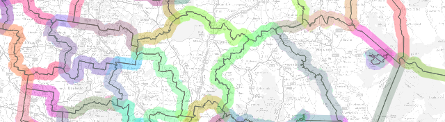
The $map variable is most useful when you have more than one map in your composition. The example below shows $map being used to change the styling of a single layer from the main map to the smaller inset map:

Using $map to style a single layer in two maps with different colours
In this example the composition has two maps, the larger has an id of “main_map” and the smaller has “inset_map“. The boundary layer has been styled using the rule based renderer, with one rule for $map=’main_map’ and one for $map=’inset_map’, as shown below:
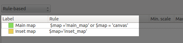
Rule based rendering using the $map variable
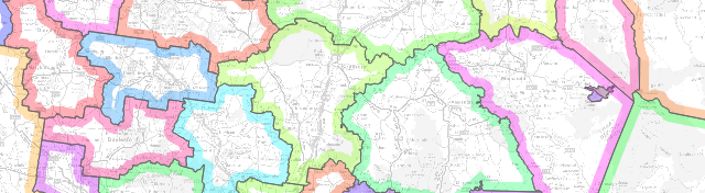
The end result is that the layer will be rendered using the two different styles depending on which composer map item it is being drawn into. This trick can also be used to tweak labelling rules between the maps. In the example above I’ve restricted the labelling to only show in the main map. This is achieved by setting an expression for the data defined “Show label” property. I’ve used the expression “$map=’main_map’” so that labels are only shown in the main map and not the smaller inset map.

Tweaking label settings using the $map variable
This small addition to QGIS 2.2 allows for some rather powerful improvements to multi-map compositions!
Drawing polygon borders only inside the polygon
The second new feature I wanted to highlight is a new option for polygon outlines which causes the outline to be drawn only on the inside of a polygon feature. The usual behaviour is for outlines to be drawn directly over the centre of the feature boundary, so that half of the outline is drawn inside the feature and half on the outside.

This means that the outline in a simple line symbol layer overlaps into the neighbouring polygons, and the result is that outlines from these features blend together:
Shaded borders pre QGIS 2.2 – see how the colours bleed into the neighbouring features and overlap
This looks like a big muddy mess. A feature I’ve wanted for a long time is the ability to restrict these outlines so that they are only drawn inside the feature. This effect is commonly seen in world atlases and National Geographic maps, where each neighbouring country is shaded with it’s own unique outline colour. Now it’s possible to do this in QGIS just by ticking a single box!

The new “Draw line only inside polygon” option
As you can see in the above image, the simple line outline style has a new checkbox, “Draw line only inside polygon“. Ticking this box will clip the outline so that only the portion of it which falls inside the feature is rendered. Here’s the result:
Shaded borders with “Draw line only inside polygon” checked
So much nicer then the earlier output – now none of the borders overlap into their neighbouring regions! Ok, so it is possible to achieve a similar result by creating a specially crafted layer consisting of negatively buffered polygons subtracted from the original polygons, but this takes a lot of fiddling around. It also has the major disadvantage in that the result is scale dependant, and zooming in or out of the map will alter the size of the polygon outlines. But using this wonderful new checkbox in QGIS, we get proper scale-independent borders, and zooming in or out of the map keeps a consistent border width!

Zooming in keeps a consistent border width…
So there we go – two small new features added in QGIS 2.2 which have huge potential for your cartographic outputs! As per usual, if you come up with some fancy way of utilising these, don’t forget to add your maps to the QGIS Showcase on Flickr.


