Related Plugins and Tags

QGIS Planet

Installing PySAL for OSGeo4W

Today’s post is a summary of how to install PySAL on Windows for OSGeo4W Python.

The most important resource was https://trac.osgeo.org/osgeo4w/wiki/ExternalPythonPackages

In the OSGeo4W Shell run:

C:\Users\anita_000\Desktop>curl http://python-distribute.org/distribute_setup.py | python

Update: Note that python-distribute.org has gone down since I posted this. See http://www.gossamer-threads.com/lists/python/python/1158958 for more info.

Then download https://raw.githubusercontent.com/pypa/pip/master/contrib/get-pip.py to the Desktop and run:

C:\Users\anita_000\Desktop>python get-pip.py

When pip is ready, install PySAL:

C:\Users\anita_000\Desktop>pip install pysal

Test the installation:

C:\Users\anita_000\Desktop>python
Python 2.7.5 (default, May 15 2013, 22:44:16) [MSC v.1500 64 bit (AMD64)] on win 32
Type "help", "copyright", "credits" or "license" for more information.
>>> import pysal

OSM Toner style town labels explained

The point table of the Spatialite database created from OSM north-eastern Austria contains more than 500,000 points. This post shows how the style works which – when applied to the point layer – wil make sure that only towns and (when zoomed in) villages will be marked and labeled.

Screenshot 2014-07-12 12.30.21

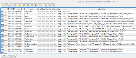
In the attribute table, we can see that there are two tags which provide context for populated places: the place and the population tag. The place tag has it’s own column created by ogr2ogr when converting from OSM to Spatialite. The population tag on the other hand is listed in the other_tags column.

Screenshot 2014-07-12 13.00.15

for example

"opengeodb:lat"=>"47.5000237","opengeodb:lon"=>"16.0334769","population"=>"623"

Overview maps would be much too crowded if we simply labeled all cities and towns. Therefore, it is necessary to filter towns based on their population and only label the bigger ones. I used limits of 5,000 and 10,000 inhabitants depending on the scale.

Screenshot 2014-07-12 12.56.33

At the core of these rules is an expression which extracts the population value from the other_tags attribute: The strpos() function is used to locate the text "population"=>" within the string attribute value. The population value is then extracted using the left() function to get the characters between "population"=>" and the next occurrence of ". This value can ten be cast to integer using toint() and then compared to the population limit:

5000 < toint( 
   left (
      substr(
         "other_tags",
         strpos("other_tags" ,'"population"=>"')+16,
         8
      ),
      strpos(
         substr(
            "other_tags",
            strpos("other_tags" ,'"population"=>"')+16,
            8
         ),
        '"'
      )
   )
) 

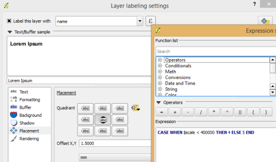
There is also one additional detail concerning label placement in this style: When zoomed in closer than 1:400,000 the labels are placed on top of the points but when zoomed out further, the labels are put right of the point symbol. This is controlled using a scale-based expression in the label placement:

Screenshot 2014-07-12 13.32.47

As usual, you can find the style on Github: https://github.com/anitagraser/QGIS-resources/blob/master/qgis2/osm_spatialite/osm_spatialite_tonerlite_point.qml


QGIS – Mapping Election Results, pt 2: Adding and overlaying the data in QGIS

Continuing on from the previous tutorial:-

Return to QGIS. Add the westminster_const_region.shp file if necessary

  1. Press the Add Delimitated Text file button, and select the .csv export of the cleansed electoral data
  2. The two options I changed from the default settings are:-
  • First record contains field names
  • No geometry (attribute only table)
QGIS - Create layer from text file

QGIS – Create layer from text file

Step 3 – Joining the data

Joining the polygons in westminster_const_region.shp to the data imported from the Results_Cleansed spreadsheet will allow the data to be presented in a spatial and visual format which will be much easier to interpret, allow for spatial analysis and also give the viewer an idea of the geographic spread. Using QGIS’ Join function will hopefully save a lot of copying and pasting!

Right click on westminster_const_region.shp and select Properties to open the Properties dialog

  • Select the Joins button from the left panel
  • Join Layer – the layer that you want to join to
  • Join Field – the field that you want to join to
  • Target Field – the field in this layer that contains the matching data
QGIS - Add vector layer

QGIS – Add vector layer

The join will now appear in the layer’s Joins list:-

QGIS layer properties

QGIS layer properties

The attribute table will now show the combined  data for both layers:-

QGIS attribute table

QGIS attribute table

This data can now be used to create a thematic map that colours each constituency according to party that won the seat in 2010.

I won’t go through all the steps of creating a thematic map as an earlier tutorial does this.

I’ve used the same colours that the different parties in the UK use:-

QGIS Layer properties

QGIS Layer properties

The thematic map shows the results across the entire UK. It is easy to identify patterns in the result, for example

  • The Liberal Democrats mostly won seats in Scotland, the North East, Wales and South West.
  • There is strong Labour support in South West Scotland, North West England, West Midlands, South Wales, London, Liverpool and Manchester.
  • The Conservative support covers much of the rest of England, especially South East England, excluding London.
2010 election results map

2010 election results map


Combining skills – Mapping Election Results

I would like to show you how to use QGIS to combine different skills to

  • Import data from Excel or other spreadsheets
  • Analyse the data
  • Present the results as a thematic map
  • Use a feature subset to hide superfluous data

There is a year to go to the next general election. Under the British electoral system, the country is divided into 660 constituencies. The MP for each constituency is elected using the First Past the Post system, where the candidate with the most votes is chosen as MP for that constituency. The party that has the most MPs elected wins the election, and the right to form the nest government.

Parties concentrate their resources on the constituencies that they are most likely to win or lose. These are usually the ones where majority in the previous election was closest.

This project will use QGIS to join fields between OS Boundary line data and the 2010 election results to identify and map these constituencies.

I downloaded the following data sets:-

OS Boundaryline:  https://www.ordnancesurvey.co.uk/opendatadownload/products.html

Election results: http://www.electoralcommission.org.uk/__data/assets/excel_doc/0020/105725/GE2010-constituency-results-website.xls

Step 1 – Examine and prepare the data

I need both data sets to use exactly the same name and formatting in order to In order to add the 2010 election results to the OS Boundary line polygons.

  1. Start QGIS and set the map projection to OSGB.
  2. Use the Add Vector Layer button to add the file westminster_const_region.shp from the OS Boundary line data
  3. Open the attribute table to check the data structure and contents:-
Image

Constituency attribute table

Now to check the GE2010-constituency-results-website.xls


Image

Election results Excel screenshot

Unfortunately the two datasets don’t use exactly the same constituency names! It is fairly easy, but time consuming to match the record from the Election Results dataset to the OS Boundary Line record using Excel or Libre Office.

To export the OS Boundary line polygon names to Excel:-

  1. Right click on the westminster_const_region.shp in the Layers Panel
  2. Select Save As

I prefer to use the .dbf format when exchanging data between GIS and Excel as it is quicker to import than using .csv format.


Image

Both name fields are needed. The first, constituency _name will be used to link to the constituency polygons once the table is imported into QGIS. The second, Results_Table_Name is used by the VLOOKUP query that adds the five columns from the results data.

Image

Excel screenshot showing the cleansed election results matched to constituency names

Save the data as a .csv file when this stage is complete.


Getting started writing QGIS 2.x plugins

This post shows how to quickly and easily create a small QGIS plugin for counting the number of features within a vector layer.

To get started, you will need QGIS and Qt Designer (to design the user interface) installed. If you are on Windows, I suggest WinPython which provides Qt Designer and Spyder (a Python IDE).

The great thing about creating plugins for QGIS: There is a plugin for that! It’s called Plugin Builder. And while you are at it, also install Plugin Reloader. Reloader is very useful for plugin developers because it lets you quickly reload your plugin without having to restart QGIS every time you make changes to the code.

installPluginBuilder

Plugin Builder will create all the files we need for our plugin. Just start it and select a name for your plugin class (one word in CamelCase), as well as a name for the plugin itself and the plugin menu entry (can be multiple words). Once you press Ok, you’re asked to select a folder to store the plugin. You can save directly to the QGIS plugin folder ~\.qgis2\python\plugins.

pluginBuilder

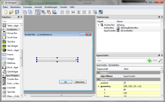
Next, open the newly created folder (in my case ~\.qgis2\python\plugins\BuilderTest). Amongst other files, it contains the user interface file ui_buildertest.ui. Our plugin will count the number of features in a vector layer. Therefore, it needs a combobox which allows the user to select a layer. Open the .ui file in Qt Designer and add a combobox to the dialog. Change the object name of the combobox to layerCombo. We’ll later use this name in the plugin code to add items to the combobox. Save the dialog and close Qt Designer.

qtDesigner

Now, we need to compile the .ui and the resources.qrc file to turn the dialog and the icon into usable Python code. This is done on the command line. On Windows, I suggest using the OSGeo4W Shell. Navigate to the plugin folder and run:

pyuic4 -o ui_buildertest.py ui_buildertest.ui
pyrcc4 -o resources_rc.py resources.qrc

If you enable and run the plugin now, you will already see the dialog but the combobox will be empty. To populate the combobox, we need to write a few lines of code in buildertest.py. First, we’ll fetch all loaded layers and add all vector layers to the combobox. Then, we’ll add code to compute and display the number of features in the selected layer. To achieve this, we expand the run() method:

def run(self):        
    # show the dialog
    self.dlg.show()

    layers = QgsMapLayerRegistry.instance().mapLayers().values()
    for layer in layers:
        if layer.type() == QgsMapLayer.VectorLayer:
            self.dlg.layerCombo.addItem( layer.name(), layer ) 
         
    # Run the dialog event loop
    result = self.dlg.exec_()
    # See if OK was pressed
    if result == 1:
        # do something useful 
        index = self.dlg.layerCombo.currentIndex()
        layer = self.dlg.layerCombo.itemData(index)
        QMessageBox.information(self.iface.mainWindow(),"hello world","%s has %d features." %(layer.name(),layer.featureCount()))

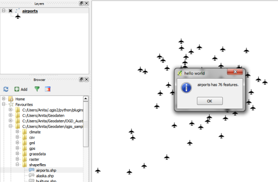
When you are done with the code, you can use Plugin Reloader to load the new version. When you start the plugin now, the combobox will be populated with the names of the vector layers in your current project. And on pressing Ok, the plugin will compute and display the number of features.

builderTEst

builderTestResult

For more information on PyQGIS and more code samples I warmly recommend the PyQGIS Cookbook. Have fun!


Topology in QGIS

Introduction

Topology rules define the permissible relationships of features within a given GIS layer or between features in two different GIS layers. An example is that features in a road dataset must be connected to other roads at both ends, unless the road is specified as a dead end street.

Advantage of topology over queries

A lot of the checks that topology rules carry out could be achieved using spatial queries. You may have to use queries if the GIS software you’re using doesn’t have a topology feature.

Topology rules have the advantage that they only need be created once and then they can check your work as you go.

Queries would need to be re-created each time they are run. They can be saved, depending on the GIS being used, but this is still more time consuming and it is a task that must be carried out separately at the end of a work session.

Rules

QGIS 2.2 topology tool has the following rules pre-defined:-

  • End points must be covered by (e.g. a railway line usually begins and ends at a station)
  • Must contain (e.g. a building polygon must contain at least one address point seed)
  • Must not have dangles (a line must begin and end at another line)
  • Must not have duplicates (each feature should be unique, e.g. postcode areas)
  • Must not have gaps (e.g. administrative area polygons cannot have gaps)
  • Must not have invalid geometries
  • Must not have multi-part geometries (each feature should be a separate entry)
  • Must not overlap (e.g. administrative area polygons cannot overlap each other)
  • Must not overlap with (a feature from layer must not overlap with another layer)

Example 1 – Roads must not have dangles

The following example uses the “Must not have dangles” rule to identify polylines from a roads dataset that are not snapped to other lines. Roads usually begin and end at a junction with another road, so this is a useful rule to identify where lines were not correctly snapped together.

To create and validate a Topology Rule

  • Open the Topology Panel, by selecting Vector menu, Topology Checker, Topology Checker
  • The Topology Panel appears in the lower right corner of the QGIS desktop window

Image

  • Press the Configure button to open the Topology Rule Settings dialog
  • The top of the box will have 2 or 3 pull down boxes depending on the layer and rule that is chosen. Use these to build the rule and then press the Add Rule button.

Image

  • Press OK when done, the dialog box closes and the window returns to the QGIS Desktop.
  • Press either the Validate All or Validate extent, depending on whether you wish to validate the entire dataset or just the current view extent.
  • The errors will be listed. Double click on a row will make the map window zoom and pan to the error.

Image


Re-Projecting Vector Layers in QGIS

QGIS can re-project a layer using both on-the-fly re-projection for the current session; and by saving a copy of the layer with a new Co-ordinate Reference System (CRS) defined.

On the fly

This is useful when a layer only needs to be re-projected for the current session.

Add the layer. If the CRS is known, QGIS will re-project it if necessary.

To check which CRS has been specified for the layer, right click on the layer in the Layers Panel, select Properties, and then select the General tab.

QGIS Layers Property

QGIS Layers Property


To save a new copy

It is a good practice to save a copy of a layer once it has been re-projected. This is to ensure the new CRS and transformations are permanently assigned to it. This avoids transformation errors when it is added to later map documents.

To save a copy:-

  1. Right click on the layer in the Layers Panel , select Save As.
  2. In the Save Vector layer as dialog, specify the filename, plus the new Co-ordinate Reference System. It is possible to add a symbology reference scale and new attributes. It is a good idea to add the new layer to the map to check it is correctly projected.
QGIS Save Vector Layer Dialog

QGIS Save Vector Layer Dialog


podcast.qgis.org

This weekend, I had the pleasure to join Tim Sutton for the second edition of the QGIS Podcast. Every episode, the podcast aims to summarize the latest mailing list discussions and greatest new features.
This episode’s topics include: new CAD tools, usability and the new UX mailing list, new QGIS user groups (QUGs), point cloud support plans, and QGIS design.

If you would like to ask a question or suggest a topic, you can write to [email protected].


FOSS4G 2014 is taking off

If you want to become an active part of this year’s FOSS4G, it’s now time to start thinking about your contributions!

FOSS4G 2014 will be taking place in Portland, Oregon, USA from Sept 8th-12th. Like last year in Nottingham, there will be a regular track for presentations as well as an academic track and a series of workshops.

logo_horiz_500x231

If you are looking for inspiration, you might want the check out last year’s programme or read about the interesting story behind this years conference logo.


A QGIS 2.2 preview

With the major release of version 2.0, QGIS is once more returning to a fast release cycle. You can find the project road map on qgis.org. The QGIS 2.2 release is scheduled for Feb, 21st and we are already in feature freeze. This means that now is the time to get the nightly version, do some testing and report possible bugs before the new version is being shipped.

Like for version 2.0, the QGIS team has prepared a great visual change log listing many new features. For me, one of the feature highlights is the possibility to export maps with world files from Print Composer because it means that we can finally create high-resolution, georeferenced images comfortably from within the application.

Another feature which will help save a lot of time is the ability to invert color ramps. So far, we had to recreate the color ramp or use work-arounds involving expression-based color settings to achieve the same effect.

invertcolorramp

These are just my personal favorites. If you haven’t checked out the change log yet, I certainly encourage you to have a look and decide for yourself. Also, if you find the time, please help by testing and reporting any issues you encounter. This way, we can all help to make 2.2 another successful release.


Happy new year!

and thank you for a great 2013!

It has been a very busy year between writing my first book, going to FOSS4G, writing my first journal article and continuing to write this blog. The blog view counter shows a staggering 310,000 views for 2013.

The most popular posts of 2013 were:

  1. pgRouting 2.0 for Windows quick guide
  2. Vintage map design using QGIS
  3. Group Stats tutorial
  4. the Print Composer 2.0 series
  5. and Public transport isochrones with pgRouting

All the best for 2014!


OSM quality assessment with QGIS: network length

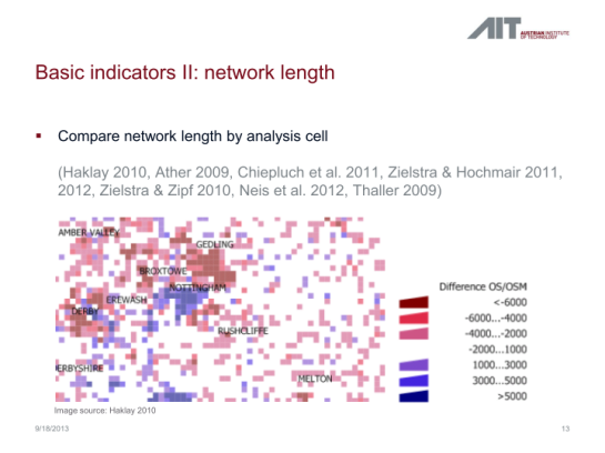
In my previous post, I presented a Processing model to determine positional accuracy of street networks. Today, I’ll cover another very popular tool to assess OSM quality in a region: network length comparison. Here’s the corresponding slide from my FOSS4G presentation which shows an example of this approach applied to OSM and OS data in the UK:

foss4g_osm_data_quality_12

One building block of this tool is the Total graph length model which calculates the length of a network within specified regions. Like the model for positional accuracy, this model includes reprojection steps to ensure all layers are in the same CRS before the actual geoprocessing starts:

total_graph_length

The final Compare total graph length model combines two instances of “Total graph length” whose results are then joined to eventually calculate the length difference (lenDIFF).

compare_total_graph_length

As usual, you can find the models on Github. If you have any questions, don’t hesitate to ask in the comments and if you find any issues please report them on Github.


OSM quality assessment with QGIS: positional accuracy

Over the last years, research on OpenStreetMap data quality has become increasingly popular. At this year’s FOSS4G, I had the honor to present some work we did at the AIT to assess OSM quality in Vienna, Austria. In the meantime, our paper “Towards an Open Source Analysis Toolbox for Street Network Comparison” has been published for early access. Thanks to the conference organizers who made this possible! I’ve implemented comparison tools found in related OSM literature as well as new tools for oneway street and turn restriction comparison using Sextante scripts and models for QGIS 1.8. All code is available on Github to enable collaboration. If you are interested in OSM data quality research, I’d like to invite you to give the tools a try.

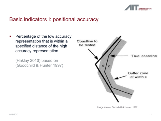
Since most users probably don’t have access to QGIS 1.8 anymore, I’ll be updating the tools to QGIS 2.0 Processing. I’m starting today with the positional accuracy comparison tool. It is based on a method described by Goodchild & Hunter (1997). Here’s the corresponding slide from my FOSS4G presentation:

foss4g_osm_data_quality_10

The basic idea is to evaluate the positional accuracy of a street graph by comparing it with a reference graph. To do that, we check how much of the graph lies within a certain tolerance (buffer) of the reference graph.

The processing model uses the following input: the two street graphs which should be compared, the size of the buffer (tolerance for positional accuracy), a polygon layer with analysis regions, and the field containing the region id. This is how the model looks in Processing modeler:

graph_covered_by_buffered_reference_graph

First, all layers are reprojected into a common CRS. This will have to be adjusted if the tool is used in other geographic regions. Then the reference graph is buffered and – since I found that dissolving buffers directly in the buffer tool can become very slow with big datasets – the faster difference tool is used to dissolve the buffers before we calculate the graph length inside the buffer (inbufLEN) as well as the total graph length in the analysis region (totalLEN). Finally, the two results are joined based on the region id field and the percentage of graph length within the buffered reference graph (inbufPERC) is calculated. A high percentage shows that both graphs agree very well geometrically.

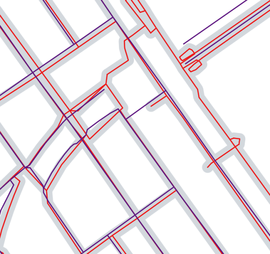
The following image shows the tool applied to a sample of OpenStreetMap (red) and official data published by the city of Vienna (purple) at Wien Handelskai. OSM was used as a reference graph and the buffer size was set to 10 meters.

ogd_osm_positional_accuracy

In general, both graphs agree quite well. The percentage of the official graph within 10 meters of the OSM graph is 93% in the 20th district. In the above image, we can see that links available in OSM are not contained in the official graph (mostly pedestrian/bike links) and there seem to be some connectivity issues as well in the upper right corner of the image.

In my opinion, Processing models are a great solution to document geoprocessing work flows and share them with others. If you want to collaborate on building more models for OSM-related analysis, just leave a comment bellow.


QGIS Distance Calculator

I want to find a location that is close to existing industrial areas (red polygons) and away from Sites of Special Scientific Interest (green polygons)

I will do this by using the Proximity (Raster Distance) analysis tool to create distance thematics, then using the Raster calculator to average the distance from each criterion.

Original layers

Original layers

Convert to Raster

The process only works with input files that are in raster format. As our source is in vector format (it’s a polygon .shp file), we need to convert it to a raster file.

It is good practice to add an attribute column, set its value to 1 so the resulting raster has a value of 1 for all the polygons. This can be done using the Field Calculator in the Attribute table.

QGIS Rasterize tool

QGIS Rasterize tool

Change display properties

The raster initially appears as a grey box. Don’t worry, this is normal. I am going to adjust its display properties so I can see the information.

  1. Right click on the layer
  2. Select Properties
  3. Select Stretch to MinMax under Contrast Enhancement
  4. Select the style tab
  5. Tick Invert Colour map. This makes the areas with a value of 1 black and the areas with a value of 0 white
QGIS Layers dialog

QGIS Layers dialog

The colours look quite stark, so I’m going to apply a transparency:-

  1. Select the Transparency tab
  2. In the Transparent Pixel List box, enter 1 under Gray and 50 under % Transparent
QGIS Layers dialog

QGIS Layers dialog

Its appearance is now less over-powering and I can see other layers too:-

QGIS Distance Calculator4

Calculate Proximity/Distance

Now to create a thematic based on the proximity (or distance) between each pixel and the nearest point of a SSSI site:-

  1. Open the Proximity calculator by selecting Raster menu, Analysis, Proximity (Raster Distance)
  2. Select the input raster and output raster (I found it works best if the output file is in .tif format)
Proximity (Raster Distance) calculator dialog

Proximity (Raster Distance) calculator dialog

  • I want to measure the distance to SSSI pixels with a value of 1 (that is what I set to be the value used for areas with SSSI designation)
  • Distance units are Geo (geographical) rather than pixels

The output is initially a grey square. I have made the following adjustments:-

  • Colour map – Puseudo colour
  • Global Transparency – 50%

It is worth exploring the options to invert the colour map and Contrast Enhancement

The SSSI sites are visible as the green polygons, the thematic is red for areas closest to sites and blue for areas furthest away:-

QGIS Distance Calculator Results1

Repeat the process for all the necessary layers:

Proximity Distance Calculator Results

Proximity Distance Calculator Results

Raster Calculator

The raster calculator is a powerful tool that performs mathematical operations on each cell in a raster. Examples of this can be to calculate elevation, distance or density.

In this case, I am going to use it to identify the areas that are greater than 1km from a SSSI site by applying queries to identify matching pixel values.

  1. Open the raster calculator
  2. Enter the following expression SSSI_Distance@1 > 1000

The map units are in metres, so 1,000m = 1km

The resulting raster appears as a grey box. As usual, adjust its display properties (e.g. Contrast Enhancement, Invert Map and Transparency). The areas that are further than 1km from a SSSI site are now highlighted in grey, with the sites visible in green:-

QGIS Distance Calculator5


Interview on GIS Lounge

It has been a real pleasure to chat with Caitlin Dempsey at GIS Lounge about open source GIS and how I got hooked on QGIS.

In related news: It’s great to see the many great and creative contributions to the QGIS Map Showcase on Flickr! If you have some maps you are proud of, please share them with the community. If you would like to see your image reused on the QGIS website or in other QGIS marketing material, please choose an appropriate license for your image.

I’ve also started to work on a new Processing script that identifies similar line features. It currently uses a length comparison and the Hausdorff distance between two line features to calculate the similarity value, but more on that in a future post!


50th ICA-OSGeo Lab established at Fondazione Edmund Mach (FEM)

We are pleased to announce that the 50th ICA-OSGeo Lab has been established at the GIS and Remote Sensing Unit (Piattaforma GIS & Remote Sensing, PGIS), Research and Innovation Centre (CRI), Fondazione Edmund Mach (FEM), Italy. CRI is a multifaceted research organization established in 2008 under the umbrella of FEM, a private research foundation funded by the government of Autonomous Province of Trento. CRI focuses on studies and innovations in the fields of agriculture, nutrition, and environment, with the aim to generate new sharing knowledge and to contribute to economic growth, social development and the overall improvement of quality of life.

The mission of the PGIS unit is to develop and provide multi-scale approaches for the description of 2-, 3- and 4-dimensional biological systems and processes. Core activities of the unit include acquisition, processing and validation of geo-physical, ecological and spatial datasets collected within various research projects and monitoring activities, along with advanced scientific analysis and data management. These studies involve multi-decadal change analysis of various ecological and physical parameters from continental to landscape level using satellite imagery and other climatic layers. The lab focuses on the geostatistical analysis of such information layers, the creation and processing of indicators, and the production of ecological, landscape genetics, eco-epidemiological and physiological models. The team pursues actively the development of innovative methods and their implementation in a GIS framework including the time series analysis of proximal and remote sensing data.

The GIS and Remote Sensing Unit (PGIS) members strongly support the peer reviewed approach of Free and Open Source software development which is perfectly in line with academic research. PGIS contributes extensively to the open source software development in geospatial (main contributors to GRASS GIS), often collaborating with various other developers and researchers around the globe. In the new ICA-OSGeo lab at FEM international PhD students, university students and trainees are present.

PGIS is focused on knowledge dissemination of open source tools through a series of courses designed for specific user requirement (schools, universities, research institutes), blogs, workshops and conferences. Their recent publication in Trends in Ecology and Evolution underlines the need on using Free and Open Source Software (FOSS) for completely open science. Dr. Markus Neteler, who is leading the group since its formation, has two decades of experience in developing and promoting open source GIS software. Being founding member of the Open Source Geospatial Foundation (OSGeo.org, USA), he served on its board of directors from 2006-2011. Luca Delucchi, focal point and responsible person for the new ICA-OSGeo Lab is member of the board of directors of the Associazione Italiana per l’Informazione Geografica Libera (GFOSS.it, the Italian Local Chapter of OSGeo). He contributes to several Free and Open Source software and open data projects as developer and trainer.

Details about the GIS and Remote Sensing Unit at http://gis.cri.fmach.it/

Open Source Geospatial Foundation (OSGeo) is a not-for-profit organisation founded in 2006 whose mission is to support and promote the collaborative development of open source geospatial technologies and data.

International Cartographic Association (ICA) is the world authoritative body for cartography and GIScience. See also the new ICA-OSGeo Labs website.

Combining Raster Calculator with elevations

I want to identify which areas of Chetney Marshes would be flooded by a 2m rise in sea level.  I used LIDAR data in contour format as the elevation data:-

Chetney Marshes map

Chetney Marshes map

Create TIN

I am using the TIN method to create an elevation model as the area is relatively small and the data is supplied as contours. TIN’s are more accurate, especially if the source data isn’t in grid format. However they are slower to process, especially over very large areas.

Select Plugins, Interpolation to open the Interpolation dialogue:-

Raster Calc2

I made the following changes to the display properties:-

  • Colour map – Pusedocolour
  • Transparency – I set global transparency to 50%
Chetney Marsh after colour adjustment

Chetney Marsh after colour adjustment

Raster Calculator

I now have an elevation model of the area. I now use the Raster Calculator to identify each pixel with an elevation of less than 2m. The elevation is stored in the pixel value. The raster calculator will identify each pixel with band value of less than 2.

The expression is elevation < 2

Select Raster, Raster Calculator to open the Raster Calculator:-

Raster Calc4

To change the Display Properties for a layer, Right click on the Layer in the layers panel (Table of Contents) and select Properties. I made the following changes to the display properties so the areas that are less than 2m, and susceptible to flooding appear highlighted in blue:-

  • Style tab: Color map – Colormap
  • Transparency: Global transparency 50%
  • Colormap tab: I added 2 entries:-
    • 0.00 white
    • 1.00 blue
Chetney Marsh showing raster calculation results

Chetney Marsh showing raster calculation results


Processing Landsat 8 data in GRASS GIS 7: RGB composites and pan sharpening

banner_pansharpening

In our first posting (“Processing Landsat 8 data in GRASS GIS 7: Import and visualization“) we imported a Landsat 8 scene (covering Raleigh, NC, USA). In this exercise we use Landsat data converted to reflectance with i.landsat.toar as shown in the first posting.

Here we will try color balancing and pan-sharpening, i.e. applying the higher resolution panchromatic channel to the color channels, using i.landsat.rgb.

1. Landsat 8 – RGB color balancing: natural color composites

After import, the RGB (bands 4,3,2 for Landsat 8) may look initially less exciting than expected.This is easy to fix by a histogram based auto-balancing of the RGB color tables.

landsat8_rgb_composite_unbalanced

To brighten up the RGB composite, we can use the color balancing tool of GRASS GIS 7:

grass7_landsat_rgb0

As input, we specify the bands 4, 3, and 2:

grass7_landsat_rgb1

Using a “Cropping intensity (upper brightness level)” of 99 (percent), the result look as follows:

landsat10_rgb_composite_autobalance_99percent_crop

For special purposes or under certain atmospheric/ground conditions it may be useful to make use of the functions “Preserve relative colors, adjust brightness only” or “Extend colors to full range of data on each channel” in the “Optional” tab of i.landsat.rgb.

landsat9_rgb_composite_preserve_relative_colors

You will need to experiment since the results depend directly on the image data.

2. Landsat 8 pansharpening

Pansharpening is a technique to merge the higher geometrical pixel resolution of the panchromatic band (Band 8) with the lower resolution color bands (Bands 4, 3, 2).

GRASS GIS 7 offers several methods through the command i.pansharpen.

1) Brovey transform:

landsat8_pansharpen_brovey1

This module runs in multi-core mode parallelized. The management of the resolution (i.e., apply the higher resolution of the panchromatic band) is performed automatically.

landsat8_pansharpen_brovey2

2. IHS transform

Here we select as above the bands in the i.pansharpen interface but use the “ihs” method.

landsat8_pansharpen_ihs1

HINT: If the colors should look odd, then apply i.landsat.rgb to the pan-sharpened bands (see above).

Color-adjusted IHS pansharpening (with “Cropping intensity: strength=99″):

landsat8_pansharpen_ihs_color_adjusted

Comparison of Landsat 8 RGB composite (39m) and IHS pansharpened RGB composite (15m):

landsat8_rgb432_color_adjusted_zoom landsat8_rgb432_pansharpen_ihs_color_adjusted_zoom

3. PCA transform

Here we select as above the bands in the i.pansharpen interface but use the “pca” method.

landsat8_pansharpen_pca1

Likewise other channels may be merged with i.pansharpen, even when originating from different sensors.

3. Conclusions

Overall, the IHS pansharpening method along with auto-balancing of colors appears to perform very well with Landsat 8.

Getting ready for FOSS4G

It’s almost here, the biggest open source GIS event of the year: the FOSS4G 2013 in Nottingham. It’s going to be my first visit to FOSS4G and I’m looking forward to present a project I did together with two colleagues at AIT where we compared OpenStreetMap to the official Austrian street network using tools developed in QGIS 1.8 Sextante. The presentation is scheduled for the first day and it would be great to meet you there:

I also have the honor to present Victor Olaya’s Sextante/Processing in a workshop together with Paolo Cavallini on the 20th:

I guess I owe Victor a geobeer or two ;-)

See you in Nottingham! And for those who can’t make it to the UK: I’ll try to keep you posted if the conference wifi allows it.


OSGeo-Live 7.0 Released

The OSGeo-Live geospatial software collection version 7.0 has been released, featuring more than sixty open source, standards compliant geospatial desktop applications, web applications and frameworks. A complete installation kit and high-quality sample data in multiple industry standard formats are included. The OSGeo Live will be officially launched at FOSS4G 2013 in Nottingham, UK, 17-21 September, 2013.

Release Highlights

Projects new to this release include:

  • GeoNode — a web-based application and platform for developing geospatial information systems (GIS) and for deploying spatial data infrastructures (SDI)
  • Leaflet — a modern, open source JavaScript library for mobile-friendly interactive maps
  • ncWMS — a Web Map Service (WMS) for geospatial data stored in CF-compliant NetCDF files
  • netCDF dataset — daily maximum temperature and rainfall, worldwide

All geospatial applications on the disc have been updated to their latest stable releases.

About OSGeo-Live

OSGeo-Live is a self-contained bootable DVD, USB flash drive and Virtual Machine based upon Ubuntu Linux (version 12.04 LTS). OSGeo-Live is pre-configured with a wide variety of robust open source geospatial software. All applications can be trialled without installing anything on your computer, simply by booting the computer from a DVD or USB drive, or running in a Virtual Machine environment. Each featured package is accompanied by both a publication quality one page descriptive summary and a short tutorial on how to get started using it.

http://live.osgeo.org

OSGeo-Live includes:

  • Over sixty quality geospatial Open Source applications installed and pre-configured
  • Free world maps and geodata
  • One page overview and quick start guide for every application
  • Overviews of key OGC standards
  • Translations to multiple languages

Credits

Over 160 people have directly helped with OSGeo-Live packaging, documenting and translating, and thousands have been involved in building the packaged software.

Packagers, documenters and translators include:

Activity Workshop, Agustín Dí­ez, Aikaterini Kapsampeli, Alan Beccati, Alan Boudreault, Alessandro Furieri, Alexander Bruy, Alexander Kleshnin, Alexander Muriy, Alexandre Dube, Alexey Ardyakov, Alex Mandel, Amy Gao, Andrea Antonello, Andrea Yanza, Andrey Syrokomskiy, Andry Rustanto, Angelos Tzotsos, Anna Muñoz, Antonio Falciano, Anton Novichikhin, Anton Patrushev, Argyros Argyridis, Ariel Núñez, Assumpció Termens, Astrid Emde, Barry Rowlingson, Benjamin Pross, Brian Hamlin, Bruno Binet, Cameron Shorter, Christophe Tufféry, Christos Iossifidis, Cristhian Pin, Damian Wojsław, Dane Springmeyer, Daniel Kastl, Daria Svidzinska, David Mateos, Denis Rykov, Diego González, Diego Migliavacca, Dimitar Misev, Dmitry Baryshnikov, Dominik Helle, Edgar Soldin, Eike Hinderk Jürrens, Elena Mezzini, Eric Lemoine, Estela Llorente, Etienne Delay, Etienne Dube, Evgeny Nikulin, Fran Boon, François Prunayre, Frank Gasdorf, Frank Warmerdam, Friedjoff Trautwein, Gavin Treadgold, Giuseppe Calamita, Gerald Fenoy, Grigory Rozhentsov, Guy Griffiths, Hamish Bowman, Haruyuki Seki, Henry Addo, Hernan Olivera, Howard Butler, Hyeyeong Choe, Ian Edwards, Ian Turton, Ilya Filippov, Jackie Ng, Jan Drewnak, Jane Lewis, Javier Rodrigo, Javier Sánchez, Jesús Gómez, Jim Klassen, Jing Wang, Jinsongdi Yu, Jody Garnett, Johan Van de Wauw, John Bryant, Jorge Arévalo, Jorge Sanz, José Antonio Canalejo, José Vicente Higón, Judit Mays, Klokan Petr Pridal, Kristof Lange, kuzkok, Lance McKee, Lars Lingner, Luca Delucchi, Lucía Sanjaime, Mage Whopper, Manuel Grizonnet, Marc-André Barbeau, Marco Curreli, Marco Puppin, Marc Torres, Margherita Di Leo, Maria Vakalopoulou, Mario Andino, Mark Leslie, Massimo Di Stefano, Mauricio Miranda, Mauricio Pazos, Maxim Dubinin, Michaël Michaud, Michael Owonibi, Micha Silver, Mike Adair, Milena Nowotarska, M Iqnaul Haq Siregar, Nacho Varela, Nadiia Gorash, Nathaniel V. Kelso, Ned Horning, Nobusuke Iwasaki, Oliver Tonnhofer, Òscar Fonts, Otto Dassau, Pasquale Di Donato, Patric Hafner, Paul Meems, Pavel, Pedro-Juan Ferrer, Pirmin Kalberer, Raf Roset, Ricardo Pinho, Roald de Wit, Roberta Fagandini, Roberto Antolin, Roberto Antolí­n, Roger Veciana, Ruth Schoenbuchner, Samuel Mesa, Scott Penrose, Sergey Grachev, Sergio Baños, Simon Cropper, Simon Pigot, Stefan A. Tzeggai, Stefan Hansen, Stefan Steiniger, Stephan Meissl, Steve Lime, Thierry Badard, Thomas Baschetti, Thomas Gratier, Tom Kralidis, Toshikazu Seto, Trevor Wekel, Valenty González, Vera, Xianfeng Song, Yoichi Kayama, Zhengfan Lin

Sponsoring organisations


  • <<
  • Page 9 of 15 ( 292 posts )
  • >>
  • gis

Back to Top

Sustaining Members