Our training courses are structured to give trainees step-by-step guide using the latest QGIS features. Here is an example of one our practicals for creating professional maps.
Trainees will learn how to
- Assign multiple style to a layer
- Working with presets
- Working QGIS print composer
- Generating maps using Atlas
Creating professional maps with the Print Composer
QGIS’ Print Composer allows users to create professional maps for
printing. It supports legends, frames, logos and all the other features
you’d expect to see in a print quality map.
In this example, we’ll use some of the most common features required to
generate a map for printing.
We’ll first load the electricity usage data created in
another tutorial, style it using a simple colour ramp, then
create a new map composer complete with title and legend.
Loading data in QGIS
The styling of a vector layer can be performed using a single style, or
a varying style, based on the value of one or more attributes. We are
going to first load the London energy usage layer prepared in
an another tutorial by joining electricity usage with the LSOAs vector layer.
Start a new QGIS project

Add the MSOA_GL_ElecUsage.shp layer under extracted
downloaded folder
The vector layer should now look like the figure below.
 Energy consumption in London
Next, we are going to add a shapefile of London Boroughs to identify
areas of high and low usage.
Add London_boroughs.shp from extracted downloaded
folder

Open layer properties and under Style:

Set the style of the polygons to "No Brush" with a
"Dash Line".

Styles for London Boroughs vector layer (Click to enlarge)
Your map now should look like the figure below:
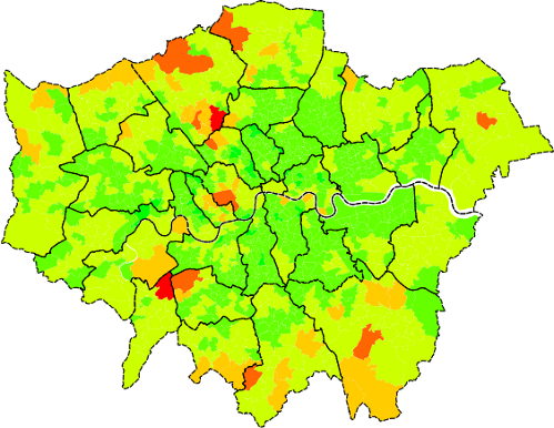 Energy consumption in London
In QGIS, you can apply multiple styles to a single layer. Using this
method, we do not need to load the same layer multiple times. In this
case, we need two styles for London boroughs layer:
-
Without labels (as created above); to be used as an overview map
-
With labels (next section); for the main map
We can save the current style (without label):
Right-click on London_boroughs layer from the layer
tree and select Styles > Add

For the new style, type 'no label' and click OK
We can save the new styles (with labels) for the layer:
Right-click on London_boroughs layer from the layer
tree and select Styles > Add

For the new style, type 'with label' and click OK
Changes in the next section (adding label) will be saved in with
label style.
Labels
We’ll now add labels to each of the boroughs. The name of each borough
is stored as the value of the NAME attribute.
Click on the London_boroughs layer in the ToC

Form the main menu, select Layer > Labelling
This window will allow us the set an attribute for label and also change font, size, rotation, buffer, etc.
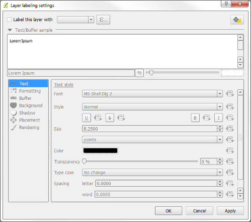 Setting up labels on the London boroughs layer
Enable the Label this layer with option

Set Field with labels to NAME

Under Text section, set the font to 7 pt

Under Buffer section:

  Enable Draw text buffer

  Set the Size to 0.5 mm

Click OK
You should now be able to see a label for each borough.
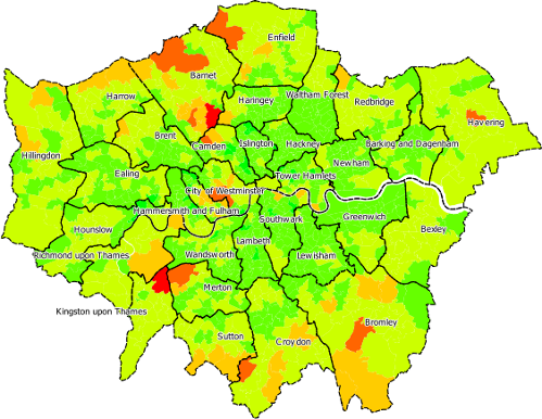 London boroughs with labels
Presets
In QGIS, you can create presets for layer visibility and styles. In this
example we are going to create the following presets:
To create the first preset:
Ensure both layers are visible

Right-click on London_boroughs and select
Style > with label
On top of the legend tree in QGIS, you can see the icon for Manage
Layer Visibility

Click on the Manage Layer Visibility icon

From the drop-down menu, select Add preset...

For the Name of the new preset insert Energy map

Click OK
To ensure the preset has been correctly set, you can change the
visibility of the layer, or change the style, and select the preset from
the Manage Layer Visibility menu.
To create the second preset:
Hide All Layers from Manage Layer Visibility or simply
press Ctrl+Shift+H

Turn on the visibility for London_boroughs

Right-click on London_boroughs and select
Style > no label

On top of the legend tree in QGIS, click on
Manage Layer Visibility

From the drop-down menu, select Add preset...

For the Name of the new preset insert overview map
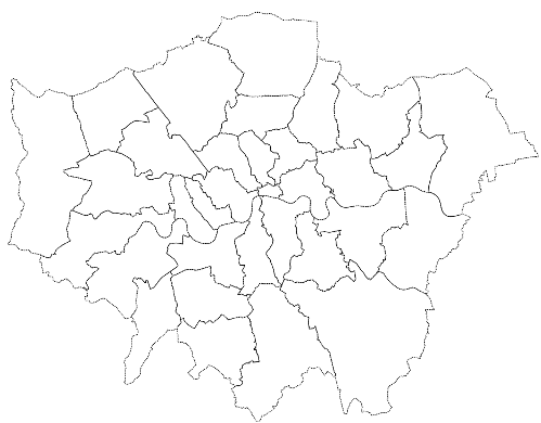 London boroughs
Now you should be able to switch between those two presets, and later
use them as print composer frames.
Print Composer
Creating layout
The map is almost ready to be printed. Before printing, we’ll need to
add a border, logos, legends, scale, etc.
There are quite a few steps involved in configuring the print composer
so it’s recommended to regularly save your progress by saving the QGIS
project.
From the main menu, select File > New Print Composer

A new window will appear for Composer title

Type Energy usage in London
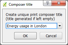 The print composer title window
The print composer will appear. See Figure.
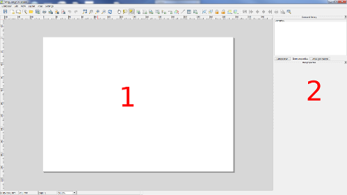 The print composer window
The print composer is split into two sections. Section 1 shows the map
to be outputted and section 2 shows the settings for selected items in
section 1.
The map we are going to produce is an A4 landscape PNG file.
In section 2, under Composition, for Presets, select
A4(210 x 297 mm)
Now we need to add frames for the map extent and legend sections. You can add a rectangular shape by clicking on  from the main toolbar.
From the main toolbar, add a new rectangle

Click and drag a shape in section 1
Now let’s change the position and size of the rectangle:
Ensure the rectangle shape is selected in section 1

Click on Item properties in section 2

Under Shape, select Position and size

Set the option as shown in Figure
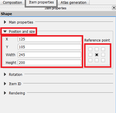 Shape options
Add second, third and fourth rectangles with the
following information

Rectangle 2:

  X: 270

  Y: 145

  Width: 43.5

  Height: 60

  Reference Point: Centre

Rectangle 3:

  X: 270

  Y: 95

  Width: 43.5

  Height: 60

  Reference Point: Centre

Rectangle 4:

  X: 270

  Y: 105

  Width: 43.5

  Height: 200

  Reference Point: Centre

Lock the position of each window by right-clicking
on each of them
Section 1 of the print composer should look like this:
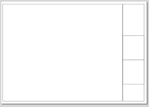 The print composer with placeholders layout
Adding image
Let’s add the logos.
From the main menu, select Layout > Add Image

Click within the middle rectangle on the right

An empty box will appear

In the right-hand panel (section 2), under the
Item properties tab,

	click on Main properties button

For Path, click on ... and browse to the folder where
your images are located.

Select an image
You should now see something similar to the image below.
 Logos added to the composer
Adding text
Now we’ll add some text in the rectangle below the logos:
From the main menu, select Layout > Add Label

Click somewhere within the lower right-hand box
A new text box will appear, reading QGIS.
From the right-hand panel, click on Item properties

In Main properties, change the text to refer to the
source of the data and copyright notices.
 Copyright notices
Adding map
Now we’ll add the map from the QGIS canvas.
From the main menu, select Layout > Add map

Drag a box in the main window
A map similar to the image below should now appear in the
print composer.
To finalise the main map window, a few more changes will need to be
made.
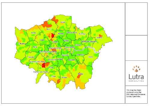 Adding map to the print composer
From the right panel, click on the Item properties tab

  Under the Main properties, set the following values:

    Tick the box for Lock layers for map item see
image below

  Under Extents:

    Tick the box for Controlled by atlas
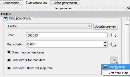 Adding a preset for map view
Add scalebar
To add a scalebar:
From the main menu, select Layout > Add Scalebar
 Adding a scalebar to the map
A scalebar with default settings should appear on the map. See Figure
[PrintComposerAddScalebar]. To change the scalebar:
Select the scalebar from the map

Click on Item Properties from the left-hand panel

Under Segments

   Set left 0 and right 2

   Set Size to 1000

   Set Height to 2 mm
Adding legend
Next, we’ll add a legend:
From the main menu, select Layout > Add Legend

Click somewhere within the upper right-hand box
QGIS will automatically add a legend for all the layers loaded in the
canvas. We can edit the legend’s settings and remove the legend entries
that we do not want to show. Manual edits of the legend text can also be
performed to make it more readable.
To be able to edit the legend items, you first need to untick the box for Auto update. Use icons under the Legend items to edit or change the order of the items.
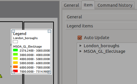 The default legend
From the right-hand panel, click on the Item properties

  Under Legend items:

    Select London_boroughs and then click on the red
    minus sign


    Select MSOA_GL_ElecUsage and click on the edit
    sign, a new window will appear.

    Change the content of Item text to Electricity
	Usage

    Click on the first value 2576.2400 – 3000.0000
	and select edit sign to change the range to
	2000 – 3000

    Repeat for the rest of the values to round them
	and remove any unwanted zeros.
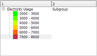 Editing legend values
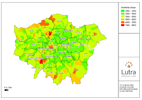 Map with legend
Add overview
To add an overview:
Add a new map (Map 1) to the place-holder between
the map legend and the logos

For Map 1, from the Item properties,

Under Main properties

   Select Lock layers for map item

   From the visibility preset, select overview map

Under Overviews tab

   Click on the plus sign,
	Overview 1 should be added to the overview list

   Ensure Draw "Overview 1" overview is selected

   For Map frame, select Map 0
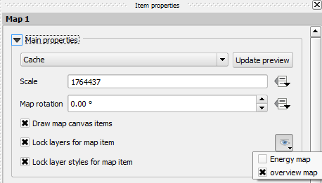 Setting the preset view for the overview map
The map is now almost ready. You can export it as PNG or a PDF. Or you can keep reading for
even more excitement!
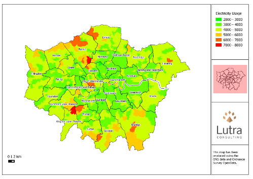 The completed map
Atlas generation
The map is now ready to be printed or outputted as an image. But, we are
going to use this layout as a template and auto-generate energy
consumption for each borough.
To set the coverage (this is already set, but make sure the option is
enabled):
While Map 0 (the main map) item is selected, click on
Item properties from the right-hand panel

Select the option for Controlled by atlas generation
You can change the Margin around feature if you like, but we can
keep at 10%. Further settings are also required:
Click on Atlas generation tab from the right-hand panel

Tick the box for Generate an atlas

Under Configuration, for Coverage layer select
	London_boroughs

Under Output, for Output filename expression type:
	'energy_'|| "NAME"
The expression for output will set the name of each output file. In this
example we are going to have a name with ‘energy_‘ combined with
the value of NAME column (what do you think this value is?)
To generate the maps:
In the print composer, from the main menu, select
Atlas > Export Atlas as Images...

Select a folder to output maps and press Choose
The process may take a while but you will eventually have 33 maps of the
energy consumption for each borough. Note the overview for the maps and
also the naming of the output files. See
Figure beloq as an example of the maps created.
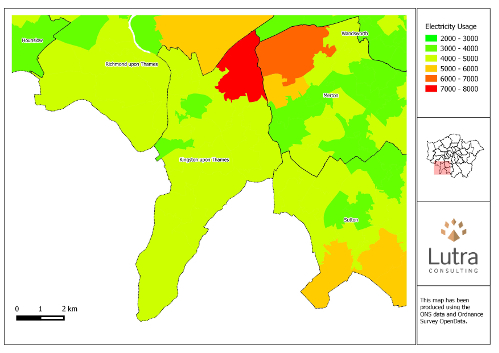 Final energy map for Kingston upon Thames generated by the Atlas

























 Energy consumption in London
 Energy consumption in London
 Setting up labels on the London boroughs layer
 London boroughs with labels
 London boroughs
 The print composer title window
 The print composer window
 from the main toolbar.
 Shape options
 The print composer with placeholders layout
 Logos added to the composer
 Copyright notices
 Adding map to the print composer
 Adding a preset for map view
 Adding a scalebar to the map
 The default legend
 Editing legend values
 Map with legend
 Setting the preset view for the overview map
 The completed map
 Final energy map for Kingston upon Thames generated by the Atlas