(Nederlands) TopoTijdReis kaartlagen in QGIS
Sorry, this entry is only available in the Dutch language
Sorry, this entry is only available in the Dutch language
We developped a tool to manage data history, branches, and to work offline with your PostGIS-stored data and QGIS. Read more to get the insight of QGIS Versioning plugin.
The QGIS plugin is available in QGIS plugin repository, and you can `fork it on GitHub too https://github.com/Oslandia/qgis-versioning !
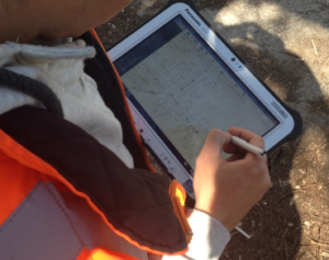
Even if the necessity of data versioning often arises, no standard solution exist for databases.
The GeoGit project proposes a solution to store versioned geospatial data. There is also an existing plugin for QGIS, pgversion, which uses views and triggers to version a PostGIS database. Unfortunately those solutions were not adapted to the specific constrains of this project, namely: using a PostGIS database as the main repository (excludes GeoGit) and the ability to working off-line (excludes pgversion).The project we developed QGIS/PostGIS versioning looks like the following.
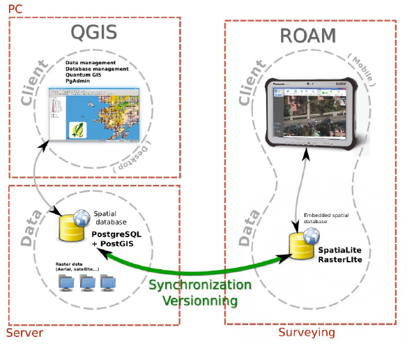
The database is stored in a PostGIS schema, the complete schema is versioned (i.e. not individual tables). Revisions are identified by a revision number. A revision table in the versioned schema, called ‘revisions’, keeps track of the date, author, commit message and branch of all revisions.
Once a table structure is defined, three operations can be performed on rows: INSERT, DELETE and UPDATE. To be able to track history, every row is kept in the tables. Deleted rows are marked as such and updated rows are a combined insertion-deletion where the deleted and added rows are linked to one another as parent and child.|
A total of five columns are needed for versioning the first branch:
PRIMARY KEY
a unique identifier across the table
branch_rev_begin
revision when this record was inserted
branch_rev_end
last revision for which this record exist (i.e. revision when it was deleted minus one)
branch_parent
in case the row has been inserted as the result of an update, this fields stores the hid of the row that has been updated
branch_child
in case the row has been marked as deleted as the result of an update, this field stores the hid of the row that has been inserted in its place.
For each additional branch, four additional columns are needed (the ones with the prefix branch_).
Note:
If the branch_rev_begin is null, it means that a row belongs to another branch.
SQL views are used to see the database for a given revision number. If we note ‘rev’ the revision we want to see. For each table, the condition for a row to be present is the view is::
(branch_rev_end IS NULL OR branch_rev_end >= rev) AND branch_rev_begin <= rev
In the special case of the current revision, or head revision, the condition reads::
branch_rev_end IS NULL AND branch_rev_begin IS NOT NULL
Note:
Since elements are not deleted (but merely marked as such) from an historized table, care must be taken with the definition of constrains, in particular the conceptual unicity of a field values.
Withing the PostGIS database, the views on revisions must be read-only and historized tables should not be edited directly. This is a basic principle for version control: editions must be made to working copies an then committed to the database. Please note that by default PostGIS 9.3 creates updatable views.
This setup allows for multiple users to use and edit data offline from a central repository, and commit their modifications concurrently.
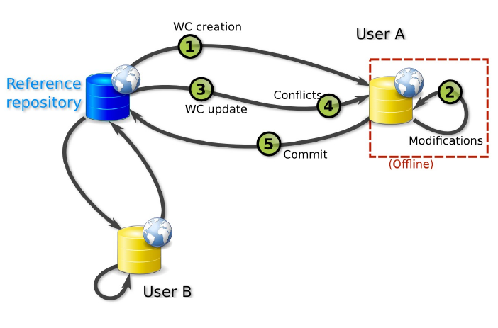
Two kinds of working copies are available:
SpatiaLite working copies
They are meant to be used off-line. They consist of the versioned tables of a given versioned database (i.e. PostGIS schema) or any subset. For each table, only the elements that have not been marked as deleted in the head revision need to be present. Furthermore only a subset of the elements the user needs to edit can be selected (e.g. a spatial extend). To create a working copy (i.e. to checkout), tables from the versioned schema (or the aforementioned subsets) are converted to a SpatiaLite database using ogr2ogr.
PostGIS working copies
They are meant to be used when the connection to the original database will remain available. They are quite similar to pgversion working copies since they only store differences from a given revision (the one checked out).
The following description is aimed at understanding the inner workings of the qgis versioning plugin. The user does not need to perform the described operations manually.
For each versioned table in the working copy, a view is created with the suffix _view (e.g. mytable_view). Those views typically filters out the historization columns and shows the head revision. A set of triggers is defined to allow updating on those views (DELETE, UPDATE and INSERT).
The DELETE trigger simply marks the end revision of a given record.
The INSERT trigger create a new record and fills the branch_rev_begin field.
The UPDATE trigger create a new record and fills the branch_rev_begin and branch_parent fields. It then marks the parent record as deleted, and fills the branch_rev_end and branch_child fields.
Changes can be made to the database while editing the working copy. In order to reconcile those edition, the user needs to update the working copy.
When updating, a set of records can be in conflicts: the records for which the end revision has been set since the initial checkout or last update if any.
Multiple editions can be made to the same record. Therefore the child relation must be followed to the last child in order to present tu user with the latest state of a given conflicting feature.
Conflicts are stored in a table and identified with a conflict id and the tag ‘theirs’ or ‘mine’. A DELETE trigger on this table is used for conflict resolution. On deletion of ‘mine’, the working copy edition is discarded, on deletion of ‘theirs’ the working copy edition is appended to the feature history (i.e. the working copy feature becomes a child of the last state of the feature in the historized database).
If a working copy is up to date, the editions can be integrated in the versioned database. This operation consists simply in the insertion of a record in the revisions table, and, for each versioned table, the update of rows that are different and inserting rows that are not present.
A branch can be created from any revision by adding the four history columns and setting the branch_rev_begin field of features that are present in their revision.
Groups are used for all versioning operations in QGIS since the versions are for a complete PostGIS schema or SpatiaLite database.
The versioning toolbar will change depending on the group selected in the QGIS legend.
Note:
The group elements must share the same connection information (i.e. share the same database and schema for PostGIS working copies and revision views or share same SpatiaLite database for SpatiaLite working copies).
Starting with an unversioned database, import a number of layers from a schema that needs to be versioned into a QGIS project.
Once the layers are imported, they must be grouped together.
Selecting the newly created group will cause the versioning toolbar to display the historize button (green V). On click a confirmation is requested to version the database schema.
The versioned layers are imported in a new group and the original layers are removed from the project.
Note:
The symobology is not kept in the process.
Versioned layers can be imported in QGIS. The layers must be from a head revision or a view on any revision.
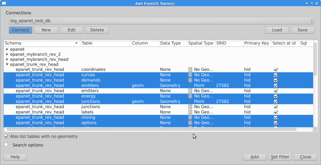
Once the layers are in QGIS, they must be grouped.
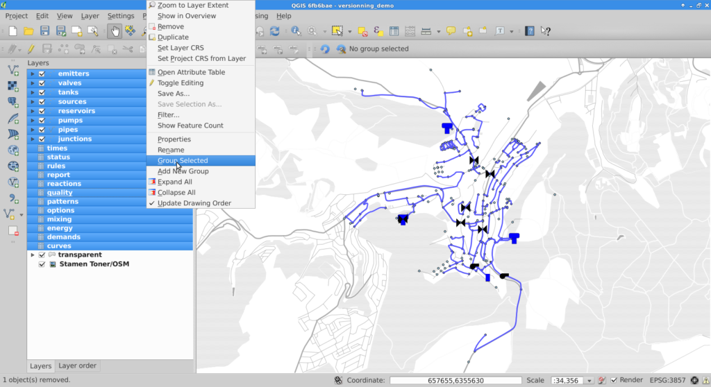
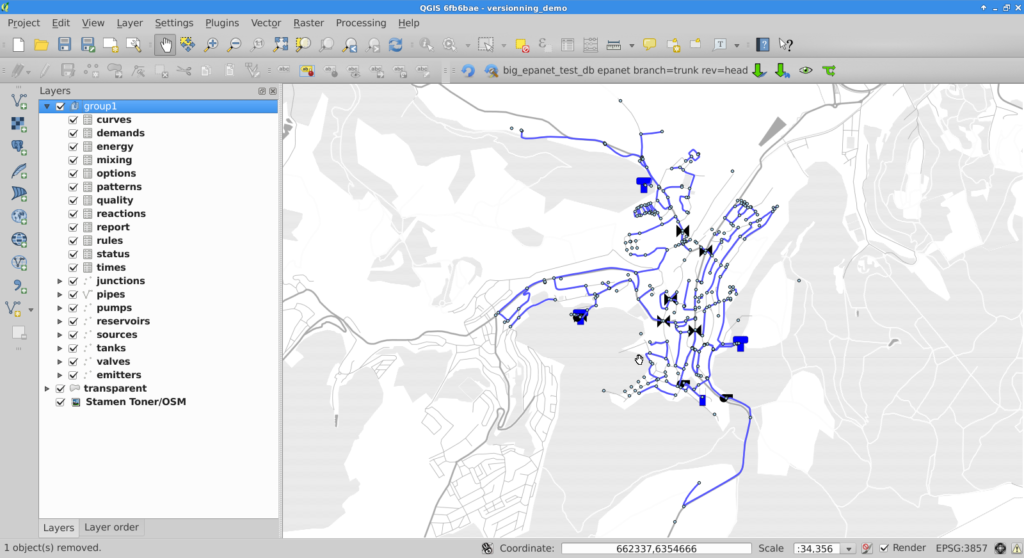
For PostGIS groups at head revision, the versioning plugin allows the user to create a SpatiaLite or a PostGIS working copy, create a view on a given revision or create a branch. A corresponding group will be imported in QGIS.
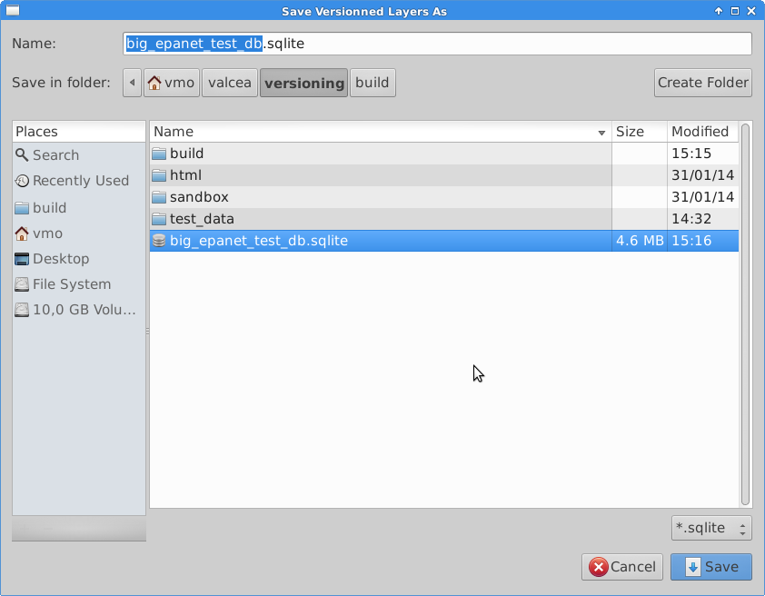
If the user chooses to create a SpatiaLite working copy, he will be asked to select a file to store the working copy.
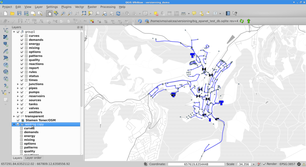
Once the working copy is imported in QGIS, the user can start edition of its layers. With SpatiaLite working copies, this edition can be done off-line.
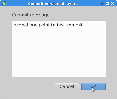
When the user is done with edition, he can commit the changes to the database and if commit is feasible (i.e. the working copy is up to date with the versioned database), he will be prompted for a commit message and subsequently be informed of the revision number he committed.

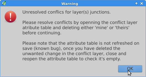
If the commit is not feasible, the user will be informed that he must update his working copy prior to commit.

Conflicts are detected during update, the user is informed, and conflicts layers are imported into QGIS.
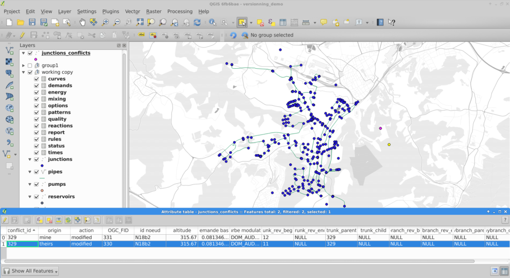
To resolve conflicts, the user can open the conflict layer’s attribute table. Selected entries are also selected on the map canvas and the user can decide which version, either his or the database’s, he wants to keep. User version is tagged with ‘mine’ and database version with ‘theirs’. The conflict is resolved by deleting the unwanted entry in the conflict layer.
Note:
On deletion of one conflict entry, both entries are removed (by a trigger) but the attribute table (and canvas) are not refreshed. As a workaround, the user can close and re-open the attribute table to see the actual state of the conflict table.
Once the conflict table is empty, the commit can be done.
Due to design choices and tools used for conversion to SpatiaLite, a number of restrictions apply to the versioned database:
Note
Do not edit OGC_FID or ROWID
Note
The constrains on the tables are be lost in the PostGIS to SpatiaLite conversion.
The conflict layer won’t be loaded automatically is it has no geometry. The user will have to load it manually.
Have you ever wondered how to mask features on a map, so that only a particular zone is highlighted ? There have been a simple plugin to do that for a while. Called ‘Mask’, it allowed to turn a vector selection into a new memory layer with only one geometry made by the geometric inversion of the selection: the polygons that were selected get transformed into holes of a squared polygon bigger than the current extent.
One could then use this new layer, like any other one and apply a vector symbology on it. An opaque color to mask everything but the selection, or some semi-transparent color in order to only highlight the selection. It was very useful but came with some limitations, and especially the fact that no update of the ‘mask’ layer was done during an atlas printing.
Thanks to the support of Agence de l’Eau Adour Garonne, Oslandia has been developing some evolutions to the core of QGIS, as well as to the mask plugin.
The core part consists of a new feature renderer that can be used on any polygon vector layer, as a symbology element. It is called inverted polygon renderer and allows to apply any other renderer to polygons that have been inverted.
It was designed originally to allow only simple filling mode to be applied to the exterior ring of polygons, but it now allows to use more complex renderers like graduated, categorized or even rule-based renderers.
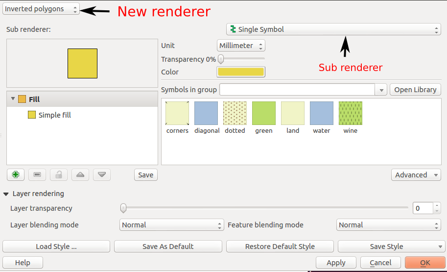
The simplest usage is to select the default sub renderer that is set to “single symbol” in order to have a uniform exterior fill of a layer.
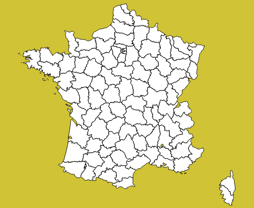
When the sub-renderer used by the inverted polygon renderer has different symbol categories, features are grouped by symbol category before being inverted and rendered. It then only makes sense when the symbology used is partly transparent, so that the different inverted polygons can be distinguished from each other.
This can be used for example to render a semi-transparent shapeburst fill around the current atlas feature.
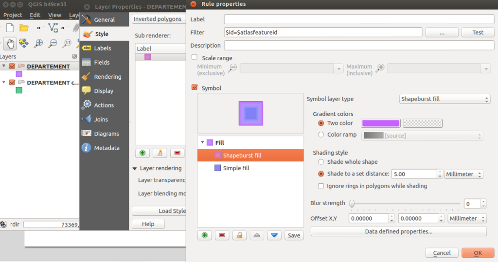
In this example, we have an inverted polygon renderer with a rule-based sub renderer. The rule will only select the current atlas geometry, thanks to the expression $id=$atlasfeatureid.
The symbol used is made of two symbol layers: a semi-transparent blue simple fill and a shapeburst fill on top of it.
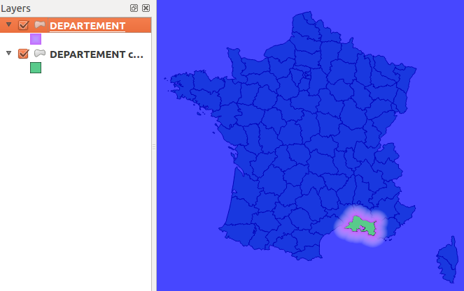
The polygon layer is then duplicated to also have a green “interior fill” for each polygon.
The output can be seen hereafter:
When the map has labels enabled, this inverted polygon renderer is not sufficient to mask labels as well. When a user wants to highlight a particular zone on a map, she usually also wants to mask labels that are around, or at least make them less visible. The way QGIS handles labels out of the box is not directly compatible with this need. QGIS always displays labels on top of every other layers.
To circumvent this, the original ‘mask’ plugin has been enhanced in order to be aware of layers with labels. A new ‘mask’ layer can be computed and its geometry can be used to test whether a feature has to be labeled or not. The plugin exposes two special variables that are available for any expressions :
Different spatial predicates can be used to test if the current feature lies inside the highlighted zone. A different type of predicate will be used for polygon layers, line layers and point layers.
Suppose we have a map of some french départements with a background raster map, and some linear layer displaying rivers.
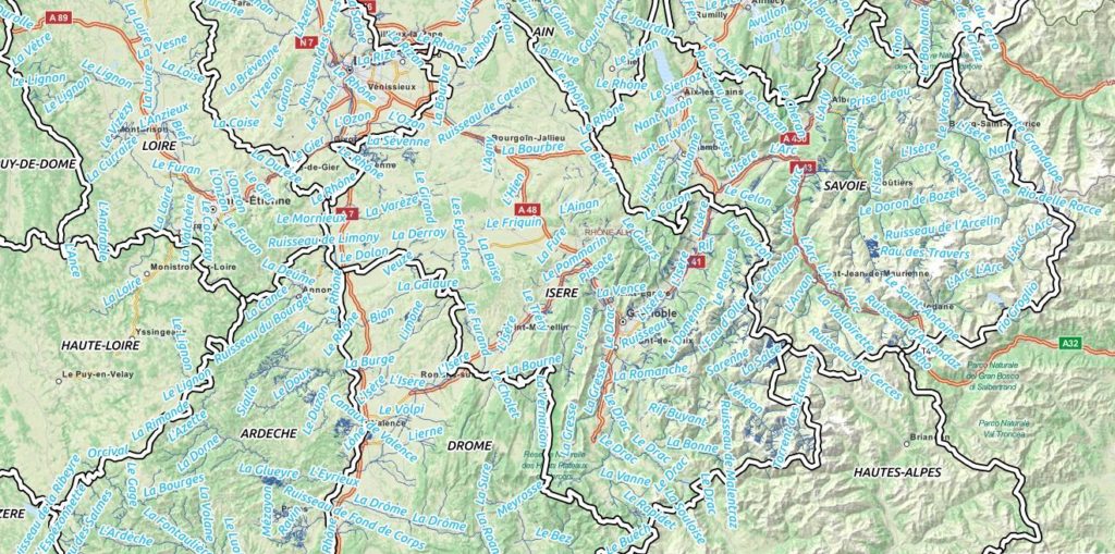
If we want to highlight only one département, we can use the mask plugin for that. We will first select it and call the plugin.
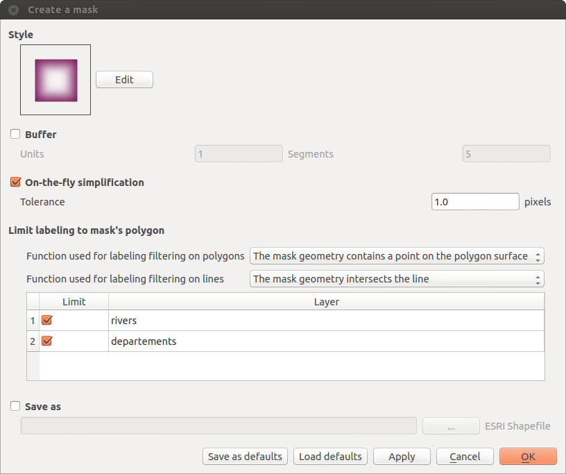
A fancy inverted polygon symbology, based on a shapeburst fill is created. We see here that we can choose the function that will be used for filtering the labeling. By default these functions are “pointOnSurface” for polygon layers and “intersects” for line layers.Here, we want both the départements layer and the rivers layers to see their labeling rules modified in order to hide the labels outside of the defined mask polygon.
By modifying the mask symbology, adding a little bit of transparency, we obtain the following result :
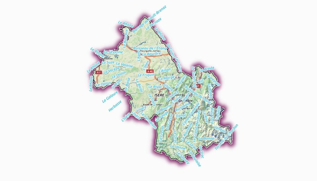
The plugin is able to interact with the atlas printing and will update its mask geometry as well as the labels that are allowed to be displayed.
The mask layer can also be saved with the project, using a memory layer if you use the Memory Layer Saver plugin, or using an OGR vector file format.
Here is a short video that shows how the plugin can be setup for a simple mask with an atlas print.
The new mask plugin is available in its 1.0 version on the QGIS official repository of plugins. It requires QGIS 2.4. We are currently investigating the addition of this label masking feature to the QGIS core. The idea would be to have a concept of “label layer” that could then be hidden by others, or even made partly transparent.
It is not an easy task, though, since it would require to rework parts of the labeling and rendering engine.
If you are interested by such a feature, please let us know !
Oslandia releases today a new plugin for the QGIS processing framework, allowing for water distribution network simulation. It integrates the opensource EPANET simulation software. EPANET models water distribution networks. It’s a widely used public-domain simulation software developed by the US Environmental Protection Agency.
Hydraulic simulation is used to understand water distribution in distribution network, to forecast the impact of network alterations, to dimension network elements or study extreme case scenarios (e.g. important demand for firefighting, pipes breakages, interruption in supply).
QGIS provides a graphical user interface that can be used to import/edit/export hydraulic model elements and simulation parameters from various sources, launch simulation and visualize results directly inside QGIS.
A hydraulic model consists of junctions (POINT) and pipes (LINESTRING) along with various other elements like tanks, pumps and valves. Those elements can be stored as features in a spatially enabled database. Features attributes can be simple (e.g. pipe diameter) or complex (e.g. pumps characteristic curves or water consumption). Complex attributes are stored via a foreign key in other alphanumeric tables.
This is the kind of data QGIS is designed to handle. It can import/export them from/to a variety of sources and also display and edit them.
Simulation parameters and options (e.g. simulation time step or accuracy) are key-value pairs. The values can be stored in a table which columns are keys. Each set of simulation parameters is then a record in this table. This kind of table can be loaded in QGIS as a vector layer without geometry.
Once the hydraulic model and simulation parameters are loaded in QGIS, the simulation can be launched through the Processing toolbox. The plugin uses the standalone command line interface of EPANET (CLI) which path needs to be specified in processing Options and configuration.
The plugin assembles an EPANET input file, runs EPANET and parses its output to generate result layers.
One interesting aspect with processing modules is that they can be used for chained processing: the user can use other modules to do additional transformations of simulation results, as feeding them into another simulation model.
Simulation results are water pressure and velocity at all points in the network along with state of network elements (e.g. volume in tanks, power of pumps) for all simulation time steps . This represent a huge amount of data that are usually displayed either as time-plots or as map-plots of time aggregated data (e.g. max and min during simulation).
Results of particular interest are:
QGIS is naturally suited for map-plots. Time-aggregated simulation results are automatically joined to map layers when the result table is added to the map. Rule-based symbology is used to highlight zones of concern (e.g. low water velocity or empty reservoirs).
The matplotlib library provides 2D plotting facilities in python and QGIS provides an extensive set of selection tools (on the map or in tables). The plugin’s button plots the appropriate value depending on the selected feature type (e.g. water level for tanks, pressure for junctions).
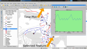
For a full demo of this plugin, see the following video :
The plugin is available on GitHub and should be available soon on QGIS plugin repository : https://github.com/Oslandia/qgis-epanet
This work has been funded by European Funds. Many thanks to the GIS Office of Apavil, Valcea County (Romania). Oslandia has developped this plugin, and provides support and development around QGIS, PostGIS and this plugin. Get in touch if you need more : [email protected]
We are looking for a free dataset with full informations (pumps, tanks, valves, pipes and their characteristics…) to distribute with this plugin as a test case and demonstration. If you can provide this, mail us !
We also are implementing a Processing plugin for SWMM, the public domain Waste-water simulation tool. If you are interested to participate to the development, please contact us.
There is a new QGIS release out : version 2.4, codename Chugiak is now available. Binary packages for your platform have been generated, and you can directly download and try out this new release of the famous Desktop GIS software. QGIS 2.4 has a lot of new features in all of its components. There is a visual changelog available where you can discover QGIS improvements.
Oslandia is a **QGIS core contributor**, and we have been busy improving QGIS 2.4. We contributed to various of these new features. Here are a few enhancements we developped.
When working with atlas map items, you can now specify a predefined scale mode for the map. It will use the best fitting option from the list of predefined scales in you your project properties settings (see Project -> Project Properties -> General -> Project Scales to configure these predefined scales).
This feature has been funded by `the city of Uster
The biggest feature Oslandia developped is the inverted Polygon renderer. This feature has been funded by Agence de l’Eau Adour-Garonne and mainly developped by Hugo Mercier.
A new renderer has been added for polygon features, allowing you to style everything outside your polygons. This can be useful for highlighting areas, or for creating cartographic masks. When used with new shapeburst style, you can now produce output as shown in the image for this entry.
Alongside with the inverted polygon renderer feature, Oslandia developped a new Mask plugin. It enables you to make atlases focusing on the specific feature you are interested in, occulting the rest with a really nice effect. Furthermore, it helps masking the labels when you mask geometry objects.
This plugin has also be funded by Agence de l’Eau Adour Garonne.

Another feature implemented in this version is the ability to export layered SVG files. Beforehand, all features were exported as a single layer, whatever the QGIS layer was. Now you can use Inkscape or Illustrator and their layering capabilities to finish the design of your map with greater ease of use. There also is an option to vectorize labels.
This feature has been funded by Agence de Développement du Grand Amiénois (ADUGA).
The WAsP format is the standard format for roughness and elevation in the wind science field. This format was not supported by QGIS until recently, when Vincent Mora added WAsP to QGIS supported GIS file formats. In fact, we did better as we implemented WAsP support in GDAL/OGR, so that any software using this library is now able to read and write WASP files. WAsP is available starting from GDAL/OGR >= 1.11.0.
This was an opportunity to add Vincent Mora as an official GDAL/OGR commiter, in charge of maintaining this driver. This feature will enable wind management operations to be completed on QGIS with a better user experience. No more file conversion before working on the GIS side. We also developped a companion plugin to manage data simplification when needed. It is available in QGIS plugins repository.
With this work, QGIS becomes a great complement to opensource computational wind engineering softwares like ZephyTools.
This work has been funded by La Compagnie du Vent
Oslandia has integrated the EPANET water distribution model inside QGIS Processing, as a plugin. Epanet integration has been funded by European funds and the GIS office of Apavil, Romania.
Vizitown is part of our efforts on 3D GIS development, alongside PostGIS 3D and more. It is a QGIS plugin allowing users to display QGIS layers in 3D in a Three.js / WebGL environment, in a browser. It can leverage PostGIS 3D, and display live data from the database, as well as other sources of data. It can display DEM, a raster background, 2D vector data draped on the DEM, 2.5D data (e.g. buildings), or real 3D Meshes. The user can set a symbology in QGIS and see the modifications live in the browser in 3D.
You can see Vizitown in action on Youtube. Vizitown has been developped with IG3 students from ESIPE
Oslandia also work continuously on improving QGIS quality, and we try to fix as many bugs as we can. These bugfixes are funded by our `QGIS support offer clients, and also by the french Ministère de l’environnement and Agence de l’Eau Adour-Garonne.
We continue to work on new QGIS features, corrections, refactoring and integration with other tools. We namely studied a possible unification of all database-like features in QGIS, using SQLITE/Spatialite features. We intend to work on Native Read+Write support of Mapinfo TAB files.
We offer a wide range of services around QGIS, be it for training, assistance, development, or consulting in general.
We also propose `various support opportunities for QGIS. This is the best way for you to improve the quality of this software, contribute to its development, and ensure that you can work in good conditions without having to worry about potential bugs. Our team of experienced engineers, who contribute to QGIS core, will be available in any case of critical bug.
We can offer you personalized support, with specific conditions and fares. Do not hesitate to contact us at [email protected] .
The latest PostGIS and QGIS 3D enhancements presented at FOSS4G by Oslandia are available online.We suggest you to have a look on our PostGIS 3D / QGIS 3D video demonstration using SFCGAL library and the QGIS Horao plugin.
A step by step workshop, (really close to the video workflow) is also available online https://github.com/Oslandia/Workshops/tree/master/FOSS4G_2013_PostGIS_3D
We can provide you the full virtual machine on demand, with proper software environment (6GB Virtual Box Image).
We would be really interested in having your advice on these new 3D features, and the use cases you could be interested in. Do not hesitate to get in touch.
Contact us at [email protected] for any information.
Developers and contributors from the QGIS project are used to gather physically twice a year across different countries. Such an event allows people to synchronize their effort, and discuss new possible developments.cThe latest QGIS community meeting took place in Brighton from the 12th to the 16th of September, just before the FOSS4G event. It was the biggest community meeting organized so far, with close to 50 people attending ! Everything went smooth thanks to the perfect organization by Lutra Consulting.
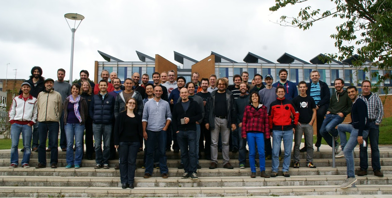
This session was of particular interest in the project’s history, since it was dedicated to the release of the eagerly-awaited new 2.0 version of QGIS.
Oslandia is used to take part in the event and even organized the march 2012 session in Lyon.
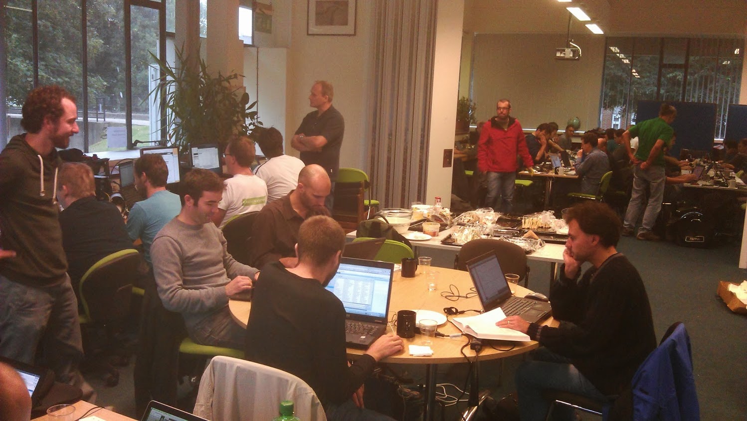
Despite being originally oriented toward code and translations, some presentations took place during the event. Some of them have been video recorded, some did not. Hereafter is a subset of them.
In parallel to the release of the 2.0 version, the QGIS website has been updated. Its look and feel, but also the way it is now build. Richard Duivenvoorde presented the efforts that have been put on the support of multiple languages, adaptation to mobile devices, and the reuse of tools used for building the documentation of the project. The new website is now online.
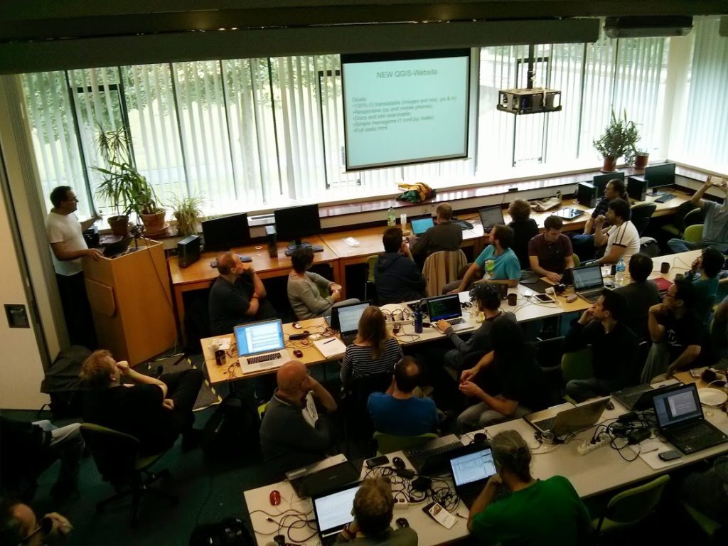
Richard presenting the new website
Presentation of the new website : http://www.ustream.tv/recorded/38687971
Some more developer-oriented presentations and discussions also took place. Matthias Kuhn and Nathan Woodrow presented an idea about extending the way attributes are handled by QGIS. In particular, the concept of constrained attributes emerged. The idea is to be able to express, manipulate and edit contrains on attributes (possible range of values for instance) as it is found in databases. This could then be used to constrain user editing of layers, presenting to the user an appropriate widget (combo box for an enumeration for instance), especially for layers that do not have native support for these constraints.
RealworldSystems presented their work on what they called the “QGIS Mobility framework”, based on previous works by Marco Bernasocchi on QGIS for Android. It is dedicated to the design of custom QGIS applications for deployment on Android tablets (for on-the-field editing campains for instance). It looks promising and has already been used in a real-world application for gaz pipeline inspection. The framework can be found on github.
Andreas Neumann presented evolutions of QGIS webserver and webclient. More can be found in the corresponding video.
Andreas presenting the work on QGIS webserver and webclient
Video 1 http://www.ustream.tv/recorded/38741015
Matthias Kuhn presented evolutions he made to the Globe plugin that allows to display a 3D earth with different kinds of data on it. Lots of osgearth features are now integrated into the Globe plugin (in particular the support for 2D vector layers).
Matthias presenting its work on the Globe plugin
Video 2 http://www.ustream.tv/recorded/38737991
Oslandia presented also its ongoing work on the integration of Postgis 3D. After a thourought evaluation of osgearth, which is the base of the Globe plugin, we decided to develop our own 3D visualisation stack directly on top of OpenSceneGraph.
A QGIS plugin has also been developed in order to be able to view QGIS layers in 3D.
With this new 3D visualisation stack we are able to display and manipulate data of a whole city between 20 and 60 frames per second on a laptop (here the demo has been designed on data from the city of Lyon) , when we were hardly able to display a small city quarter with Globe.
Oslandia presenting its work on its 3D visualisation stack
Video 3 http://www.ustream.tv/recorded/38738897
Slides https://github.com/Oslandia/presentations/tree/master/qgis_hf_2013
All the work done during this community meeting allowed to polish the 2.0 version of QGIS which has been publicly announced during the FOSS4G in Nottingham by Tim Sutton.
Waiting now for the 2.1 release 
In my previous posts, I discussed classic flow maps that use arrows of different width to encode flows between regions. This post presents an alternative take on visualizing flows, without any arrows. This style is inspired by Go with the Flow by Robert Radburn and Visualisation of origins, destinations and flows with OD maps by J. Wood et al.
The starting point of this visualization is a classic OD matrix.
For my previous flow maps, I already converted this data into a more GIS-friendly format: a Geopackage with lines and information about the origin, destination and strength of the flow:
In addition, I grabbed state polygons from Natural Earth Data.
At this point, we have 72 flow features and 9 state polygon features. An ordinary join in the layer properties won’t do the trick. We’d still be stuck with only 9 polygons.
Virtual layers to the rescue!
The QGIS virtual layers feature (Layer menu | Add Layer | Add/Edit Virtual Layer) provides database capabilities without us having to actually set up a database … *win!*
Using a classic SQL query, we can join state polygons and migration flows into a new virtual layer:
The resulting virtual layer contains 72 polygon features. There are 8 copies of each state.
Now that the data is ready, we can start designing the visualization in the Print Composer.
This is probably the most manual step in this whole process: We need 9 map items, one for each mini map in the small multiples visualization. Create one and configure it to your liking, then copy and paste to create 8 more copies.
I’ve decided to arrange the map items in a way that resembles the actual geographic location of the state that is represented by the respective map, from the state of Vorarlberg (a proud QGIS sponsor by the way) in the south-west to Lower Austria in the north-east.
To configure which map item will represent the flows from which origin state, we set the map item ID to the corresponding state ID. As you can see, the map items are numbered from 1 to 9:

Once all map items are set up, we can use the map item IDs to filter the features in each map. This can be implemented using a rule based renderer:
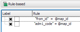
The first rule will ensure that the each map only shows flows originating from a specific state and the second rule will select the state itself.
We configure the symbol of the first rule to visualize the flow strength. The color represents the number number of people moving to the respective district. I’ve decided to use a smooth gradient instead of predefined classes for the polygon fill colors. The following expression maps the feature’s weight value to a shade on the Viridis color ramp:
ramp_color( 'Viridis',
  scale_linear("weight",0,2000,0,1)
)
You can use any color ramp you like. If you want to use the Viridis color ramp, save the following code into an .xml file and import it using the Style Manager. (This color ramp has been provided by Richard Styron on rocksandwater.net.)
<!DOCTYPE qgis_style>
<qgis_style version="0">
  <symbols/>
    <colorramp type="gradient" name="Viridis">
      <prop k="color1" v="68,1,84,255"/>
      <prop k="color2" v="253,231,36,255"/>
      <prop k="stops" v="0.04;71,15,98,255:0.08;72,29,111,255:0.12;71,42,121,255:0.16;69,54,129,255:0.20;65,66,134,255:0.23;60,77,138,255:0.27;55,88,140,255:0.31;50,98,141,255:0.35;46,108,142,255:0.39;42,118,142,255:0.43;38,127,142,255:0.47;35,137,141,255:0.51;31,146,140,255:0.55;30,155,137,255:0.59;32,165,133,255:0.62;40,174,127,255:0.66;53,183,120,255:0.70;69,191,111,255:0.74;89,199,100,255:0.78;112,206,86,255:0.82;136,213,71,255:0.86;162,218,55,255:0.90;189,222,38,255:0.94;215,226,25,255:0.98;241,229,28,255"/>
    </colorramp>
  </colorramps>
</qgis_style>
If we go back to the Print Composer and update the map item previews, we see it all come together:

Finally, we set title, legend, explanatory texts, and background color:
I think it is amazing that we are able to design a visualization like this without having to create any intermediate files or having to write custom code. Whenever a value is edited in the original migration dataset, the change is immediately reflected in the small multiples.
We are pleased to announce the stable release of GRASS GIS 7.2.0
After almost two years of development the new stable major release GRASS GIS 7.2.0 is available. It provides more than 1950 stability fixes and manual improvements compared to the former stable release version 7.0.5. The new version includes a series of new modules to analyse raster and vector data along with new temporal algebra functionality.More than 50 new addons are also available. A summary of the new features is available at New Features in GRASS GIS 7.2.
About GRASS GIS 7: Its graphical user interface supports the user to make complex GIS operations as simple as possible. The updated Python interface to the C library permits users to create new GRASS GIS-Python modules in a simple way while yet obtaining powerful and fast modules. Furthermore, the libraries were again significantly improved for speed and efficiency, along with support for huge files. A lot of effort has been invested to standardize parameter and flag names. Finally, GRASS GIS 7 comes with a series of new modules to analyse raster and vector data, along with a full temporal framework. For a detailed overview, see the list of new features. As a stable release series, 7.2.x enjoys long-term support.
Binaries/Installer download:
Source code download:
More details:
See also our detailed announcement:
First time users may explore the first steps tutorial after installation.
About GRASS GIS
The Geographic Resources Analysis Support System (https://grass.osgeo.org/), commonly referred to as GRASS GIS, is an Open Source Geographic Information System providing powerful raster, vector and geospatial processing capabilities in a single integrated software suite. GRASS GIS includes tools for spatial modeling, visualization of raster and vector data, management and analysis of geospatial data, and the processing of satellite and aerial imagery. It also provides the capability to produce sophisticated presentation graphics and hardcopy maps. GRASS GIS has been translated into about twenty languages and supports a huge array of data formats. It can be used either as a stand-alone application or as backend for other software packages such as QGIS and R geostatistics. It is distributed freely under the terms of the GNU General Public License (GPL). GRASS GIS is a founding member of the Open Source Geospatial Foundation (OSGeo).
The GRASS Development Team, December 2016
The post New major release: GRASS GIS 7.2.0 available appeared first on GFOSS Blog | GRASS GIS Courses.
Where is QGIS being developed?
That is a questions my students often ask. Open Source is a strange and new ‘world’ for most of them. So I try to explain: QGIS is a software, developed and maintained from all over the world by developers who are employed by companies, self-employed or working for free…
Some of the work is paid for by QGIS and some by users and as written – some do it for free – yay! The core developers meet two times a year for ‘Hackfests’ (do not confuse with ‘Hacking’).
Sometimes a Hackfest is combined with a user conference – where developers and users can meet, listen to presentations and discuss functionality.
In 2017, the first Hackfest will take place at the Linuxhotel in Essen – Germany from Friday from 28th April – 1st May. This Hackfest is only going to be hard work for the developers – QGIS 3.0 is being developed and launched this year. More details and signing in for this weekend on the event wiki page.
The second Hackfest in 2017 will include a Summer Camp and take place in Nødebo at University of Copenhagen, Forest and Landscape College (Denmark) from Wednesday 2. August till Friday 11. august
The Summer Camp will be a combination of work and leisure for the developers. And for users there will be workshops.
It is the first time we are having a Summer Camp at the Forest and Landscape College. We have both the place for work and the nature for exploring.
There are 28 rooms/56 beds, 3 large shelters and a large lawn where you can bring a tent sleeping bag and mattress.
Nearby the wonderful forest and lake.
The setup is as following:
Users pay for participating in workshops, food and accommodation (room/bed) – Shelter and tent are free.
Developers and workshop lecturers stays for free.
Call for workshops and sponsors: If you have a topic for a workshop or want to contribute as sponsor, please send me an e-mail at [email protected]
Save the dates – and we will send out more information about the Summer Camp later this month.
Posted on behalf of Lene Fischer, QGIS Community Organizer
It is our pleasure to announce that the QGIS.org voting members have unanimously agreed to the adoption of the proposed new logo.

We are currently planning the roll out of the new logo to all our applications, web platforms, and social media accounts. In addition, we will create marketing material with the new QGIS branding. Since this is a volunteer effort, we are planning to approach this step-by-step. The goal is to have everything ready by the time of the QGIS 3.0 release.
If you are interested in helping with this effort, please leave a comment here and we will get in touch!
A year ago I have asked QGIS’s community what were their favourite QGIS new features from 2015 and published this blog post. This year I decided to ask it again. In 2016, we add the release of the second long-term release (2.14 LTR), and two other stable versions (2.16 and 2.18).
2016 was again very productive year for the QGIS community, with lots of improvements and new features landing on QGIS source code, not to speak of all the work already in place for QGIS 3. This is a great assurance of the project’s vitality.
As a balance, I have asked users to choose wich were their favorite new features during 2016 (from the visual changelogs list). As a result, I got the following Top 5 features list.
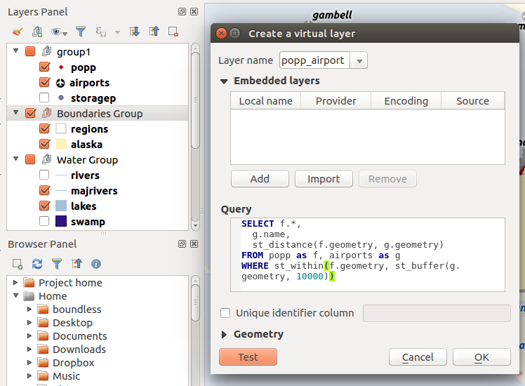
This is a productivity functionaly that I just realized that existed now, with so many people voting on it. If copy/paste styles was, in my opinion, a killer feature, being able to use it in multiple layers or even a group is just great.
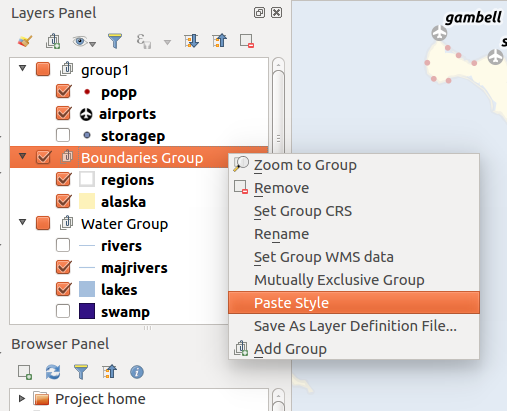
While checking the Vector Menu, the tools seem the same as previous version, but it’s when you open them that you understand the difference. All vector tools, provided until now by the fTools core plugin, were replaced by equivalent processing Algoritms. For the users it means easier access to more functionality, like running the tools in batch mode, or getting outputs as temporary layers. Besides some of the tools have been improved.
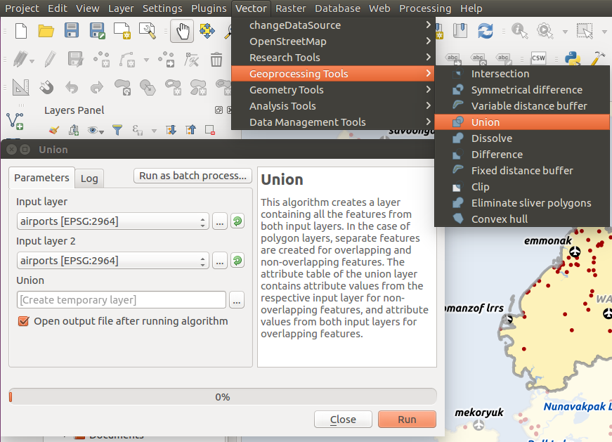
This is definitly one of my favourite new features, and it seems I’m not alone. With virtual layers you can run SQL queries using the layers loaded in the project, even when the layers are not stored in a relational database. We are not talking about WHERE statments to filter data, with this you can do real SQL queries, with spatial analysis, aggregations, and so on. Besides, virtual layers will act as VIEWs and any changes to any of the input layers will automatically update the layer.
It’s no surprise that speed and memory improvements we one of the most voted features. Lots of improvements were made for loading and managing large datasets, and this have a tremendous impact in all users. According to the changelog, zoom is faster, selecting features is faster, updating attributes on selected features is faster, and it consumes less memory. So don’t be afraid to put QGIS to the test.
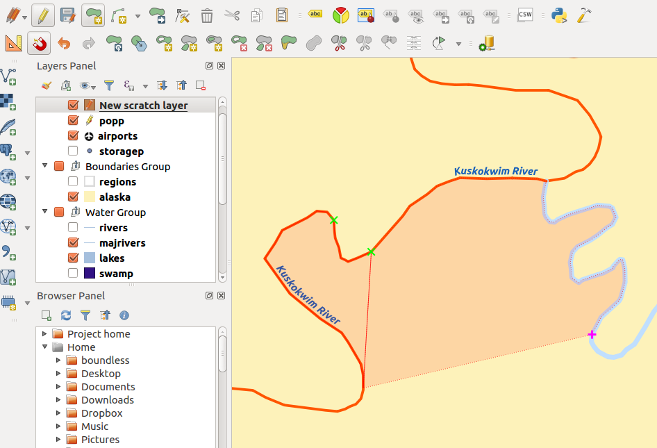
If you do lots of digitising, you better look into this new feaure that landed on QGIS 2.14. It allows you to digitize new feature by using other layers boundaries. Besides the quality improvement of layers topology, this can make digitizing almost feel pleasing and fast! Just click the first point, move your mouse around other features edged to pick up more vertex.
There were other new features that also made the delight of many users. For example, several improvements on the labeling, Georeference outputs (eg PDF) from composer (2.16), Filter legend by expression (2.14), 2.5D Renderer. Personally, the Style docker made my day/year. But you can check the full results of the survey, if you like.
Obviously, this list means nothing at all. All new features were of tremendous value, and will be useful for thousands (yes thousands) of people. It was a mere exercise as, with such a diverse QGIS crowd, it would be impossible to build a list that would fit us all. Besides, there were many great enhancements, introduced during 2016, that might have fallen under the radar for most users. Check the visual changelogs for a full list of new features.
On my behalf, to all developers, sponsors, and general QGIS contributors, once again
2016 was an exciting year for us. It was a year with three great releases (2.14 LTR, 2.16 & 2.18), lots of developer and community events (including our 2nd user conference in Girona, the developer meeting in Bonn before FOSS4G & a QGIS Server sprint in Lyon) and many firsts, including the first round of QGIS grants and our new QGIS.org organizational structure.
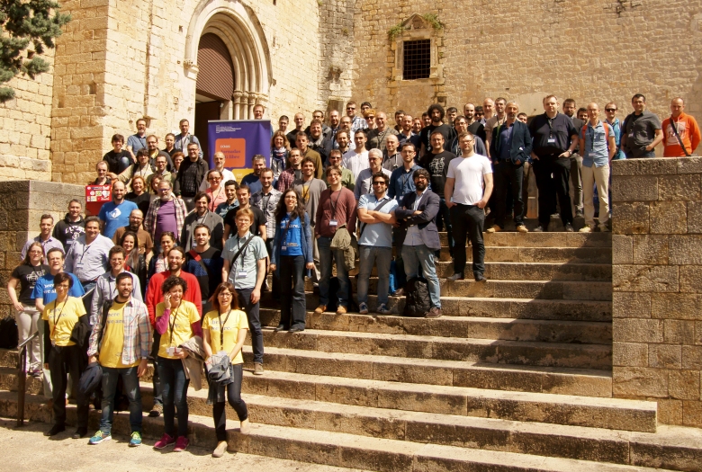
Many of these initiatives would not be possible without support by our community, dedicated developers and our sponsors, who enable us to keep up our infrastructure and improve software and documentation. We’re particularly proud to welcome three user groups among our top sponsors, with the Swiss user group as our most prominent Gold sponsor:

Thank you for helping us improve the QGIS experience for everyone!
If you are following this blog, you are already aware that we have even bigger plans for 2017, including but not limited to the big QGIS 3.0 release and a completely overhauled QGIS logo.
We’re looking forward to another great year with the QGIS community.
Keep on QGISing!
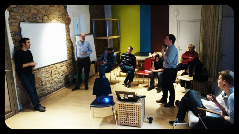
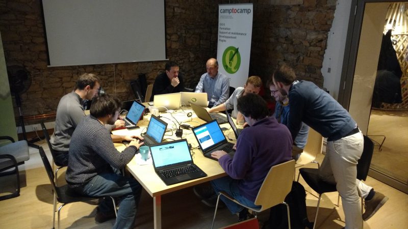
QGIS Developer Sprint in Lyon QGIS Server 3.0 is going to be better than ever! Last week I attended to the mini code-sprint organized by the french QGIS developers in Lyon. The code sprint was focused on QGIS Server refactoring to reach the following goals:
The post QGIS Developer Sprint in Lyon first appeared on Open Web Solutions, GIS & Python Development.
Last time, I wrote about the little details that make a good flow map. The data in that post was made up and simpler than your typical flow map. That’s why I wanted to redo it with real-world data. In this post, I’m using domestic migration data of Austria.
With 9 states, that makes 72 potential flow arrows. Since that’s too much to map, I’ve decided in a first step to only show flows with more than 1,000 people.
Following the recommendations mentioned in the previous post, I first designed a basic flow map where each flow direction is rendered as a black arrow:
Even with this very limited number of flows, the map gets pretty crowded, particularly around the north-eastern node, the Austrian capital Vienna.
To reduce the number of incoming and outgoing lines at each node, I therefore decided to change to colored one-sided arrows that share a common geometry:
The arrow color is determined automatically based on the arrow direction using the following expression:
CASE WHEN
 "weight" < 1000 THEN color_rgba( 0,0,0,0)
WHEN
 x(start_point( $geometry)) - x(end_point($geometry)) < 0
THEN
 '#1f78b4'
ELSE
 '#ff7f00'
END
The same approach is used to control the side of the one-sided arrow head. The arrow symbol layer has two “arrow type” options for rendering the arrow head: on the inside of the curve or on the outside. This means that, if we wouldn’t use a data-defined approach, the arrow head would be on the same side – independent of the line geometry direction.
CASE WHEN
 x(start_point( $geometry)) - x(end_point($geometry)) < 0
THEN
 1
ELSE
 2
END
Obviously, this ignores the corner case of start and end points at the same x coordinate but, if necessary, this case can be added easily.
Of course the results are far from perfect and this approach still requires manual tweaking of the arrow geometries. Nonetheless, I think it’s very interesting to see how far we can push the limits of data-driven styling for flow maps.
Give it a try! You’ll find the symbol and accompanying sample data on the QGIS resource sharing plugin platform:
Geopaparazzi 5.1.2 is a mobile app for Android which allows the user to quickly collect information on his or her surrounding area. This is done with the help of geometries, pictures and notes. Additionally to the notes which are available by default, a person skilled with .json forms may write their own forms for collecting data. In this blog I will cover:
This process is remarkably simple!
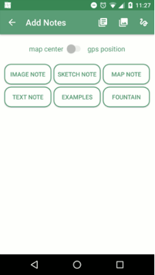
As the first step we need to create our new Geopaparazzi form.
You may wish to test your .json file with a JSONLint validator before proceeding.
Now that you have your form dialog written, we now need to add it to the Geopaparazzi app in order to use it.

The tags.json file contains all of the forms which the app can use. Simply copy your code into the bottom of the tags.json file. Don’t forget to seperate the previous form section (in my case it was examples) from the new one with a ‘,’.
Now your Geopaparazzi app should feature your new custom form. You might have to restart the app for it to display.
Once you have collected all the information you want, it is time to export your data to QGIS for further examination and use.
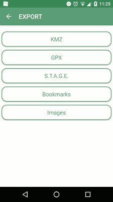
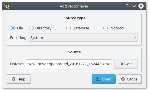
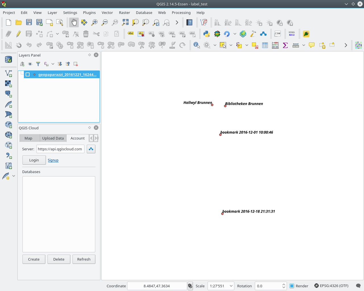
Once this is done you should have a vector layer which displays all of the notes and bookmarks you made on the project. From here you can further style them (e.g. adding labels to your points).
Following filetypes are used by the Geopaparazzi app:
The Geopaparazzi project file (.gpap), is the main project file and contains all the important information which is recorded during your work. This is the file which is handled in the Export dialog and can be exported by Geopaparazzi into following formats:
An important addendum would be that the .KMZ files which are generated during the export appear to actually be .KML files, as they are not compressed into binary.
The .mbtiles files are found in the geopaparazzi/defaulttiles directory and are seen as the background map in the Mapview.
The .sqlite files can be generated via the Import/Default Database menu. They contain three columns: polygon, points and lines. These columns then save the information of the geometry which the user creates in the Mapview.
For more information on the datasets from Geopaparazzi or how one goes about creating a GeoPaparazzi friendly spatialite database please refer to this documentation
In my previous post, I shared a flow map style that was inspired by a hand drawn map. Today’s post is inspired by a recent academic paper recommended to me by Radoslaw Panczak @RPanczak and Thomas Gratier @ThomasG77:
Jenny et al. (2016) performed a study on how to best design flow maps. The resulting design principles are:
- number of flow overlaps should be minimized;
- sharp bends and excessively asymmetric flows should be avoided;
- acute intersection angles should be avoided;
- flows must not pass under unconnected nodes;
- flows should be radially arranged around nodes;
- quantity is best represented by scaled flow width;
- flow direction is best indicated with arrowheads;
- arrowheads should be scaled with flow width, but arrowheads for thin flows should be enlarged; and
- overlaps between arrowheads and flows should be avoided.
Many of these points concern the arrangement of flow lines but I want to talk about those design principles that can be implemented in a QGIS line style. I’ve summarized the three core ideas:
To get started, we can use a standard QGIS arrow symbol layer. To represent the flow value (“weight”) according to the first design principle, all arrow parameters are data-defined:
scale_linear("weight",0,10,0.1,3)
To enlarge the arrow heads for thin flow lines, as required by the second design principle, we can add a fixed value to the data-defined head length and thickness:
scale_linear("weight",0,10,0.1,1.5)+1.5
The main issue with this flow map is that it gets messy as soon as multiple arrows end at the same location. The arrow heads are plotted on top of each other and at some point it is almost impossible to see which arrow starts where. This is where the third design principle comes into play!
To fix the overlap issue, we can add big round nodes at the flow start and end points. These node buffers are both used to render circles on the map, as well as to shorten the arrows by cutting off a short section at the beginning and end of the lines:
difference(
  difference(
    $geometry,
    buffer( start_point($geometry), 10000 )
  ),
  buffer( end_point( $geometry), 10000 )
)
Note that the buffer values in this expression only produce appropriate results for line datasets which use a CRS in meters and will have to be adjusted for other units.
It’s great to have some tried and evaluated design guidelines for our flow maps. As always: Know your cartography rules before you start breaking them!
PS: To draw a curved arrow, the line needs to have one intermediate point between start and end – so three points in total. Depending on the intermediate point’s position, the line is more or less curved.
If you have been following this blog and the QGIS community discussions, you will know that 2017 is going to be a big year in the history of QGIS since we are planning the release of QGIS 3.0. One of the requests we had during our Girona Hackfest held earlier this year was to come up with a fresher logo for QGIS. Some of you may remember that we had an abortive attempt at coming up with a new logo a couple of years ago. We found that process quite difficult to manage since we tried to do it in a completely open way and there were so many differing opinions, varying tastes and so on that the whole process reached an impasse and we decided to shelve the idea for time being. With that history in mind we decided to approach the logo updating process for QGIS 3.0 differently this time around and use a professional designer to come up with a design and then provide the QGIS Voting Members with a simple, binary YES/NO choice as to whether they accept the new logo or not.
Our current logo is a revised, polished version of the original QGIS logo:

While we’ve all grown to love the yellow ‘Q’ with the green arrow (no comic pun intended), the design choices, such as glow effect and drop shadows look dated. Probably the biggest problem with the current logo is that there is also no consistent logo variant that spells out ‘QGIS’ without duplicating the Q. For the logo refresh we came up with a list of requirements for the new design:
We went through many iterations, reducing the number of options on each iterations as we applied the above criteria to the candidates. We would like to now present our final candidate (monochrome icon, colour icon, full logo):


While retaining the traditional yellow and green, the addition of a new third colour is a nice play on version 3.0. In addition, the old arrow is now a more natural part of the Q and there is a version designed to spell out QGIS.
Soon we will be asking the QGIS Voting Members to vote in order to affirm or reject this new logo. If it is approved we will start the process of rebranding QGIS for version 3.0. If not we will go back to the drawing board and repeat the process until we come up with a logo the QGIS Voting Members are happy with …
The QGIS map style I want to share with you today was inspired by a hand-drawn map by Philippe Rekacewicz that I saw on Twitter:
The look reminds me of conveyor belts, thus the name choice.
You can download the symbol and a small sample dataset by adding my repo to the QGIS Resource Sharing plugin.

The conveyor belt is a line symbol that makes extensive use of Geometry generators. One generator for the circle at the flow line start and end point, respectively, another generator for the belt, and a final one for the small arrows around the colored circles. The color and size of the circle are data defined:

The collection also contains a sample Geopackage dataset which you can use to test the symbol immediately. It is worth noting that the circle size has to be specified in layer CRS units.
It’s great fun playing with the power of Geometry generator symbol layers and QGIS geometry expressions. For example, this is the expression for the final geometry that is used to draw the small arrows around colored circles:
line_merge(
  intersection(
    exterior_ring(
      convex_hull(
        union(
          buffer( start_point($geometry), "start_size" ),
          buffer( end_point($geometry), 500000 )
        )
      )
    ),
    exterior_ring(
      buffer( start_point( $geometry), "start_size" )
    )
  )
)
The expression constructs buffer circles, the belt geometry (convex_hull around buffers), and finally extracts the intersecting part from the start circle and the belt geometry.
Hope you enjoy it!
It’s holiday season, why not share one of your own symbols with the QGIS community?

QGIS’ handling of color ramps has just gotten much better with a series of improvements we committed to the open source project’s upcoming version 3.0.
This slide goes through brief summary of changes:
 Color ramp handling, made fun!
On the developer front, one nice improvement is the addition of an invert() function directly attached to color ramp classes (QgsColorRamp and its children). This removed the need for symbol layers and renderers to implement individual invert-related functions; those are now served with a customized source color ramp, with edited steps and/or reversed order already taken into account.