Related Plugins and Tags

QGIS Planet

Documentation for QGIS 3.0 – call for contributions!

Dear QGIS users, enthusiasts and fine people out there. QGIS 3.0 is coming very soon….we are in a ‘soft freeze’ state at the moment while we wait for some critical last pieces of code to get finalised. Then we go into hard freeze and prepare to roll out our next major release. Those of you that have been playing with the ‘2.99’ builds will surely have noticed that QGIS 3.0 is going to feature a huge number of improvements and new features – both in the user interface and in the API and code internals.

Screen Shot 2017-12-03 at 23.05.34

But we have a BIG problem:
we need your help to document and describe all those fine new features!

Yes fine reader now is the time to break out of the ‘passive user of QGIS’ mould you might find yourself in and lend a hand. We have an issue tracker with an issue for each of the new features that has landed in QGIS 3.0. Even if you do not know how to use our Sphinx based documentation system, you can help tremendously by preparing the prose that should be used to describe new features and attaching it to the issue list linked to above. If you do that, the documentation team can do more editorial work and less  ‘writing from scratch’ work.

Writing documentation is a brilliant way to enhance your own knowledge of QGIS and learn the new features that are coming in the next release. For those starting out with documentation there are issue reports that are tagged “easy” to lower the barrier for beginners. If you are an existing documentation team member it would be great if you could review the list and check whether there are more issues that can be tagged as “easy”.

The issue list is automatically created whenever a developer commits a change to QGIS with the word ‘FEATURE’ in their change notes. In some cases the change may not be something that an end user will be able to see – so it will be great for volunteers to also review the automatically added issues and close off any that are not relevant for documentation.

Other features are quite complex and in some cases could benefit from interaction with the original developer to make sure that the nuances of the new features are properly described. We need documentation writers to follow these thread and present the new functionality in a clear and concise way.

There are some very helpful resources for people just getting started with QGIS documentation. You can read the documentation for contributors. You can also contact the team via the community mailing list for specific help if the contributor docs don’t provide the information you need.

If you want to see the QGIS Documentation up-to-date for the version 3.0 release, please do get involved and help Yves Jacolin and the documentation team!

Lastly if you are not able to directly contribute to the documentation, consider funding QGIS – we have a budget for documentation improvements.

We look forward to your support and contributions!


Tim Sutton (QGIS Project Chairman)


Building QGIS master with Qt 5.9.3 debug build

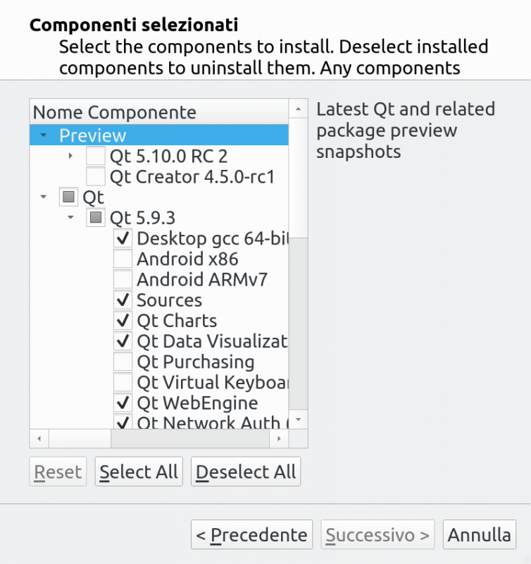
Building QGIS from sources is not hard at all on a recent linux box, but what about if you wanted to be able to step-debug into Qt core or if you wanted to build QGIS agains the latest Qt release? Here things become tricky. This short post is about my experiments to build Qt and and other Qt-based dependencies for QGIS in order to get a complete debugger-friendly build of QGIS.   Start with downloading the latest Qt installer from Qt official website: https://www.qt.io/download-qt-for-application-development choose the Open Source version.   Now install the Qt version you want to build, make sure you check the Sources and the components you might need. Whe you are done with that, you’ll have your sources in a location like /home/user/Qt/5.9.3/Src/ To build the sources, you can change into that directory and issue the following command – I assume that you have already installed all the dependencies normally needed to build C++ Qt programs – I’m using clang here but feel free to choose gcc, we are going to install the new Qt build into /opt/qt593.

./configure -prefix /opt/qt593 -debug -opensource -confirm-license -ccache -platform linux-clang
When done, you can build it with
make -j9
sudo make install
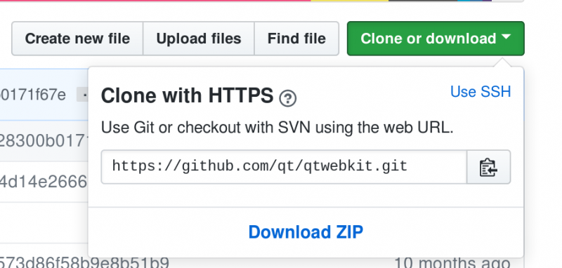
  To build QGIS you also need three additional Qt packages   QtWebKit from https://github.com/qt/qtwebkit (you can just download the zip): Extract it somewhere and build it with
/opt/qt593/bin/qmake WebKit.pro
make -j9
sudo make install
  Same with QScintila2 from https://www.riverbankcomputing.com/software/qscintilla
/opt/qt593/bin/qmake qscintilla.pro
make -j9
sudo make install
  QWT is also needed and it can be downloaded from https://sourceforge.net/projects/qwt/files/qwt/6.1.3/ but it requires a small edit in qwtconfig.pri before you can build it: set QWT_INSTALL_PREFIX = /opt/qt593_libs/qwt-6.1.3 to install it in a different folder than the default one (that would possibly overwrite a system install of QWT). The build it with:
/opt/qt593/bin/qmake qwt.pro
make -j9
sudo make install
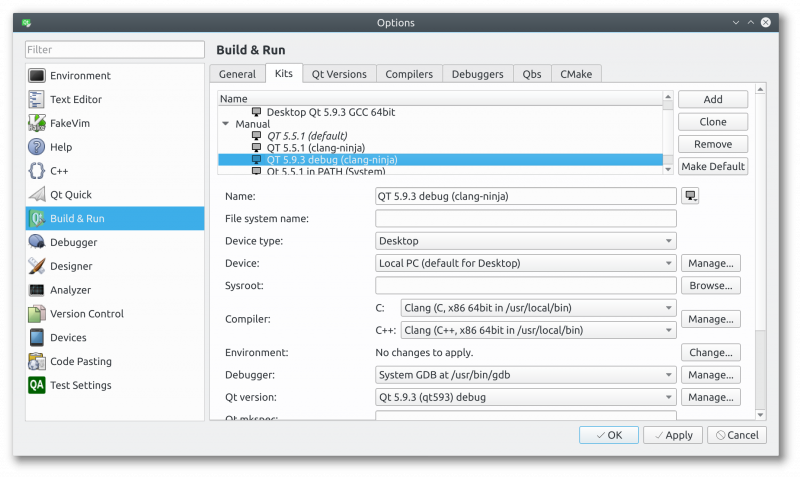
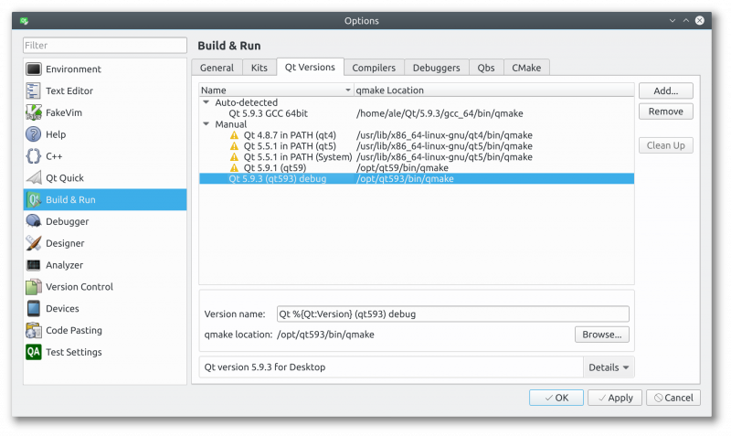
  If everything went fine, you can now configure Qt Creator to use this new debug build of Qt: start with creating a new kit (you can probably clone a working Qt5 kit if you have one). What you need to change is the Qt version (the path to cmake) to point to your brand new Qt build,: Pick up a name and choose the Qt version, but before doing that you need to click on Manage… to create a new one: Now you should be able to build QGIS using your new Qt build, just make sure you disable the bindings in the CMake configuration: unfortunately you’d also need to build PyQt in order to create the bindings.   Whe QGIS is built using this debug-enabled Qt, you will be able to step-debug into Qt core libraries! Happy debugging!  

The post Building QGIS master with Qt 5.9.3 debug build first appeared on Open Web Solutions, GIS & Python Development.

Intro to QGIS3 3D view with Viennese building data

In this post, I want to show how to visualize building block data published by the city of Vienna in 3D using QGIS. This data is interesting due to its level of detail. For example, here you can see the Albertina landmark in the center of Vienna:

an this is the corresponding 3D visualization, including flying roof:

To enable 3D view in QGIS 2.99 (soon to be released as QGIS 3), go to View | New 3D Map View.

Viennese building data (https://www.data.gv.at/katalog/dataset/76c2e577-268f-4a93-bccd-7d5b43b14efd) is provided as Shapefiles. (Saber Razmjooei recently published a similar post using data from New York City in ESRI Multipatch format.) You can download a copy of the Shapefile and a DEM for the same area from my dropbox.  The Shapefile contains the following relevant attributes for 3D visualization

  • O_KOTE: absolute building height measured to the roof gutter(?) (“absolute Gebäudehöhe der Dachtraufe”)
  • U_KOTE: absolute height of the lower edge of the building block if floating above ground (“absolute Überbauungshöhe unten”)
  • HOEHE_DGM: absolute height of the terrain (“absolute Geländehöhe”)
  • T_KOTE: lowest point of the terrain for the given building block (“tiefster Punkt des Geländes auf den Kanten der Gebäudeteilfläche”)

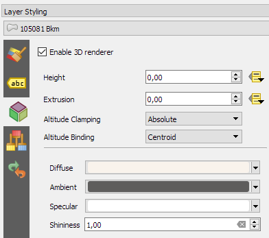
To style the 3D view in QGIS 3, I set height to “U_KOTE” and extrusion to

O_KOTE-coalesce(U_KOTE,0)

both with a default value of 0 which is used if the field or expression is NULL:

The altitude clamping setting defines how height values are interpreted. Absolute clamping is perfect for the Viennese data since all height values are provided as absolute measures from 0. Other options are “relative” and “terrain” which add given elevation values to the underlying terrain elevation. According to the source of qgs3dutils:

  AltClampAbsolute,   //!< Z_final = z_geometry
  AltClampRelative,   //!< Z_final = z_terrain + z_geometry
  AltClampTerrain,    //!< Z_final = z_terrain

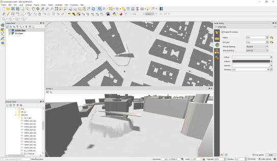
The gray colored polygon style shown in the map view on the top creates the illusion of shadows in the 3D view:


Beyond that, this example also features elevation model data which can be configured in the 3D View panel. I found it helpful to increase the terrain tile resolution (for example to 256 px) in order to get more detailed terrain renderings:

Overall, the results look pretty good. There are just a few small glitches in the rendering, as well as in the data. For example, the kiosik in front of Albertina which you can also see in the StreetView image, is lacking height information and therefore we can only see it’s “shadow” in the 3D rendering.

So far, I found 3D rendering performance very good. It works great on my PC with Nvidia graphics card. On my notebook with Intel Iris graphics, I’m unfortunately still experiencing crashes which I hope will be resolved in the future.

New version of dutch PDOK services plugin

A short post in Dutch, to let us dutchies know of a new version of the ‘PDOK services plugin’ which eases the use of our national OWS services. If you want you can install it, and for example view the different soli types of The Netherlands: Another nice service is the 25cm Aerial Map of … Continue reading New version of dutch PDOK services plugin

Movement data in GIS #11: FOSS4G2017 talk recordings

Many of the topics I’ve covered in recent “Movement data in GIS” posts, have also been discussed at this year’s FOSS4G. Here’s a list of videos for you to learn more about the OGC Moving Features standard, modelling AIS data with FOSS, and more:

1. Introduction to the OGC Moving Features standard presented by Kyoung-Sook Kim from the Artificial Intelligence Research Center, Japan:

Another Perspective View of Cesium for OGC Moving Features from FOSS4G Boston 2017 on Vimeo.

2. Modeling AIS data using GDAL & PostGIS presented by Morten Aronsen from the Norwegian Defence Research Establishment:

Density mapping of ship traffic using FOSS4G in C# .NET from FOSS4G Boston 2017 on Vimeo.

3. 3D visualization of movement data from videos presented by Anna Petrasova from the Center for Geospatial Analysis, North Carolina State University:

Visualization and analysis of active transportation patterns derived from public webcams from FOSS4G Boston 2017 on Vimeo.

There are also a ton of Docker presentations on the FOSS4G2017 Vimeo channel, if you liked “Docker basics with Geodocker GeoServer”.


Read more:

Live stream link

Here is the link to the live stream of the QGIS UK user group meeting in Edinburgh on Thursday.

Videos of the individual talks will be available after the event.

Supported and sponsored by thinkWhere, Ordnance Survey, Cawdor Forestry, EDINA (venue), WRLD3D, Angus Council, Registers of Scotland, Product Forge (streaming), OSGeo:UK (finance)

GRASS GIS 7.2.2 released

GRASS GIS 7.2.2 in action

What’s new in a nutshell

After three months of development the new update release GRASS GIS 7.2.2 is available. It provides more than 120 stability fixes and manual improvements compared to release version 7.2.1. An overview of new features in the 7.2 release series is available at New Features in GRASS GIS 7.2.

About GRASS GIS 7: Its graphical user interface supports the user to make complex GIS operations as simple as possible. The updated Python interface to the C library permits users to create new GRASS GIS-Python modules in a simple way while yet obtaining powerful and fast modules. Furthermore, the libraries were again significantly improved for speed and efficiency, along with support for huge files. A lot of effort has been invested to standardize parameter and flag names. Finally, GRASS GIS 7 comes with a series of new modules to analyse raster and vector data, along with a full temporal framework. For a detailed overview, see the list of new features. As a stable release series, 7.2.x enjoys long-term support.

Binaries/Installer download:

Source code download:

More details:

See also our detailed announcement:

First time users may explore the first steps tutorial after installation.

About GRASS GIS

The Geographic Resources Analysis Support System (https://grass.osgeo.org/), commonly referred to as GRASS GIS, is an Open Source Geographic Information System providing powerful raster, vector and geospatial processing capabilities in a single integrated software suite. GRASS GIS includes tools for spatial modeling, visualization of raster and vector data, management and analysis of geospatial data, and the processing of satellite and aerial imagery. It also provides the capability to produce sophisticated presentation graphics and hardcopy maps. GRASS GIS has been translated into about twenty languages and supports a huge array of data formats. It can be used either as a stand-alone application or as backend for other software packages such as QGIS and R geostatistics. It is distributed freely under the terms of the GNU General Public License (GPL). GRASS GIS is a founding member of the Open Source Geospatial Foundation (OSGeo).

The GRASS Development Team, Sep 2017

The post GRASS GIS 7.2.2 released appeared first on GFOSS Blog | GRASS GIS Courses.

PDAL 1.6.0 packaged for Fedora including vertical datums and grids

Cologne city shown as colorized 3D point cloud (data source: openNRW Germany)In order to simplify the installation of the latest PDAL release (Point Data Abstraction Library, http://www.pdal.io/, version 1.6.0) on Fedora, I have created an updated set of RPM packages now including vertical datums and grids (.gtx files from here).

The installation is as simple as this (the repository is located at Fedora’s COPR):

# enable extra repos to satisfy dependencies
sudo dnf copr enable neteler/pdal-hexer
sudo dnf copr enable neteler/points2grid

# install dependencies
sudo dnf install hexer
sudo dnf install points2grid

# enable and install PDAL
sudo dnf copr enable neteler/pdal
sudo dnf install PDAL PDAL-devel PDAL-vdatums

# run PDAL:
pdal-config --version
pdal --help

Enjoy!

The post PDAL 1.6.0 packaged for Fedora including vertical datums and grids appeared first on GFOSS Blog | GRASS GIS Courses.

Working with climate data in QGIS

In this tutorial, we are going to explore methods of visualising climate data within QGIS using Crayfish plugin. We are going to use September 2017 datasets from NASA which will include Hurricane Irma.

Downloading data

Note: You can download the processed data here. and skip to Viewing data in QGIS.

There are several resources available to obtain climate data. Due to the large volume of data and number of variables, the providers usually offer APIs to interact with dataset repository. But, you can download some datasets directly from their websites.

ECMWF and NASA data portals offering such services.

In this tutorial, we are using NASA portal to download NLDAS Secondary Forcing data for September 2017. Follow the instructions to batch download all the GRIB files using the script provided on their website.

Manipulating data

Each grb file downloaded in the previous step is only for one time step containing multiple variables. You can extract certain variable and also merge the files using Climate Data Operators:

cdo mergetime *.grb september.grb

cdo select,name=var61,var33,var34,var11 september.grb september_prec_wind_temp.grb

The first command will merge all the times and generates a single GRIB file containing all the time step. The second command, extracts temperature, precipitation and wind data.

Viewing data in QGIS

To view the data, you will need Crayfish plugin. Download and install the plugin from the QGIS plugin repository.

Add the GRIB file as a Crayfish layer (under Plugins > Crayfish > Add Crayfish Layer). You should be able to see precipitation, temperature and wind data from the Crayfish panel. Note that the wind data contains vector in addition to grid.

You can use the slider to move the time. Read more on how to use Crayfish plugin.

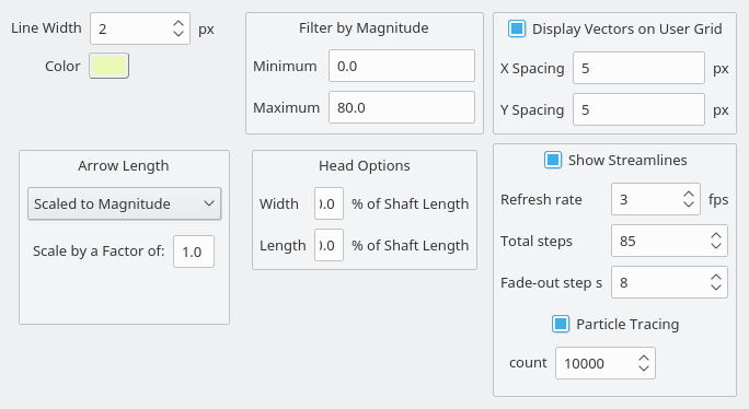
To view wind data as trace animation, move the slider time to 12.09.2017 07:00 (or 319:00:16.04 if your time is set to relative) and select Vector Options. Set the parameters according to the dialog window below:

Vector Options

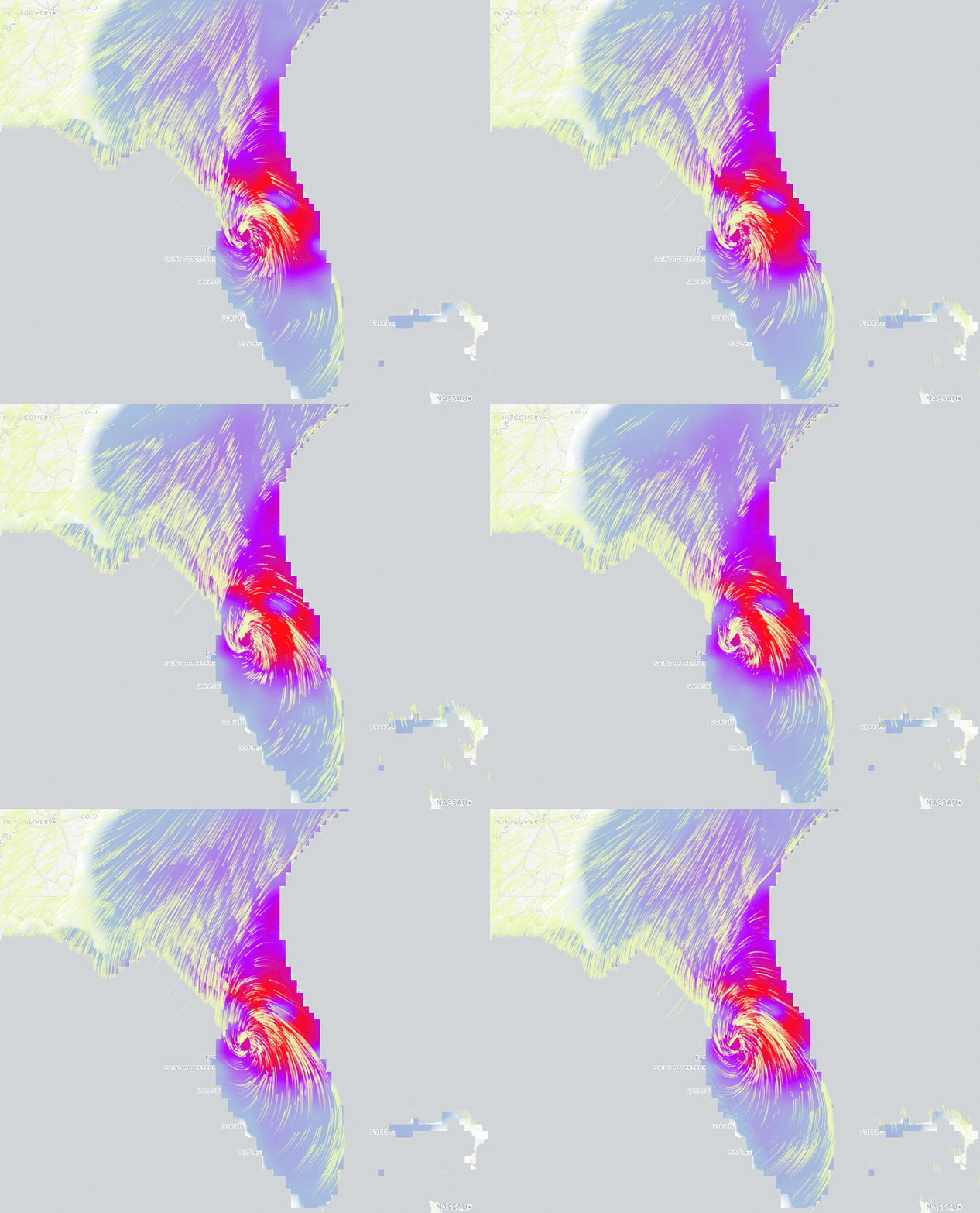
You should now be able to see live traces of the wind from your QGIS canvas:

GIF animation of Irma

You can plot the time series by clicking on the plot tool from Crayfish panel:

To generate an animation of precipitation and wind, you need to first click on from Crayfish panel and then enable wind vectors and precipitation grid. From Plugins > Crayfish > Export to animation you can generate animation of your time series.
Support funding Crayfish port to QGIS 3

If you are interested in using Crayfish in QGIS 3, help with this crowd-funding.

You may also like...

Mergin Maps, a field data collection app based on QGIS. Mergin Maps makes field work easy with its simple interface and cloud-based sync. Available on Android, iOS and Windows. Screenshots of the Mergin Maps mobile app for Field Data Collection
Get it on Google Play Get it on Apple store

7th QGIS UK Scottish user group

The next event on the QGIS UK user group roadshow is the 7th Scottish meeting at the Informatics Forum in Edinburgh on 16th November.

Free tickets are available through http://qgis.uk/ but you better hurry – there are only 20 left!

The “I can probably say final agenda” agenda

QGIS Server refactoring is done!

As you may know, QGIS is jumping to a new major version. (Yes!) Doing so was made necessary because of the need to switch to Python 3, Qt5, but also because we needed to break the QGIS API in several places.

A year ago there was an appeal on the QGIS developer mailing list about the strong need for love that the QGIS server code base required. Indeed, the API was locked by some old methods of QGIS server. In short, QGIS server was reparsing the .qgs project file in its own way, and created dependencies to parts of QGIS we needed to drop.

As outsourcing the server code base was not an option, so we had to refactor it. The involved parties decided to get engaged in a code sprint in the city of Lyon , France dedicated to sharing their vision, planning the work and finally making all the following happen:

Higher level refactoring

All services (WMS GetMap, WFS GetFeature, GetLegendGraphics, WCS, GetPrint etc..) have been rewritten. Some like WMS were entirely rewritten. Kudos to the devs!

New features

Deep, complex and unrewarding tasks

  • Remove all singleton calls
  • Cut all the dependencies to the old QGIS project file parser
  • Minimize dependencies to GUI library. Since fonts are necessary to render maps, totally removing them was not feasible.

Infrastructure tasks

Additionally, some of these new developments have already been presented at FOSS4G-EU in July.

Congratulations to the developers who worked hard on this!

Now this deserves to be well tested, please report back any issues!

Movement data in GIS #10: open tools for AIS tracks from MarineCadastre.gov

MarineCadastre.gov is a great source for AIS data along the US coast. Their data formats and tools though are less open. Luckily, GDAL – and therefore QGIS – can read ESRI File Geodatabases (.gdb).

MarineCadastre.gov also offer a Track Builder script that creates lines out of the broadcast points. (It can also join additional information from the vessel and voyage layers.) We could reproduce the line creation step using tools such as Processing’s Point to path but this post will show how to create PostGIS trajectories instead.

First, we have to import the points into PostGIS using either DB Manager or Processing’s Import into PostGIS tool:

Then we can create the trajectories. I’ve opted to create a materialized view:

The first part of the query creates a temporary table called ptm (short for PointM). This step adds time stamp information to each point. The second part of the query then aggregates these PointMs into trajectories of type LineStringM.

CREATE MATERIALIZED VIEW ais.trajectory AS
 WITH ptm AS (
   SELECT b.mmsi,
     st_makepointm(
       st_x(b.geom), 
       st_y(b.geom), 
       date_part('epoch', b.basedatetime)
     ) AS pt,
     b.basedatetime t
   FROM ais.broadcast b
   ORDER BY mmsi, basedatetime
 )
 SELECT row_number() OVER () AS id,
   st_makeline(ptm.pt) AS st_makeline,
   ptm.mmsi,
   min(ptm.t) AS min_t,
   max(ptm.t) AS max_t
 FROM ptm
 GROUP BY ptm.mmsi
WITH DATA;

The trajectory start and end times (min_t and max_t) are optional but they can help speed up future queries.
One of the advantages of creating trajectory lines is that they render many times faster than the original points.

Of course, we end up with some artifacts at the border of the dataset extent. (Files are split by UTM zone.) Trajectories connect the last known position before the vessel left the observed area with the position of reentry. This results, for example, in vertical lines which you can see in the bottom left corner of the above screenshot.

With the trajectories ready, we can go ahead and start exploring the dataset. For example, we can visualize trajectory speed and/or create animations:

Purple trajectory segments are slow while green segments are faster

We can also perform trajectory analysis, such as trajectory generalization:

This is a first proof of concept. It would be great to have a script that automatically fetches the datasets for a specified time frame and list of UTM zones and loads them into PostGIS for further processing. In addition, it would be great to also make use of the information in the vessel and voyage tables, thus splitting up trajectories into individual voyages.


Read more:

Crayfish new release and future plan

Crayfish 2.7 is out with grid calculator, new formats and several enhancements. This will likely to be the last version of Crayfish for QGIS 2.x. We have started a crowd-funding campaign to port Crayfish to QGIS 3.
Crayfish for QGIS 3.2

Crayfish has grown over the past few years and now handles several file formats. There are various functions within the plugin to analyse and process the data too. Instead of porting the plugin directly to QGIS 3, we decided to refactor the code with the possibility of incorporating the renderer directly in QGIS core. We have started a crowd-funding campaign and hoping the software vendors and organisations who are benefiting from the plugin will fund the effort:

https://www.lutraconsulting.co.uk/crowdfunding/qgis-crayfish-3/

Grid calculator

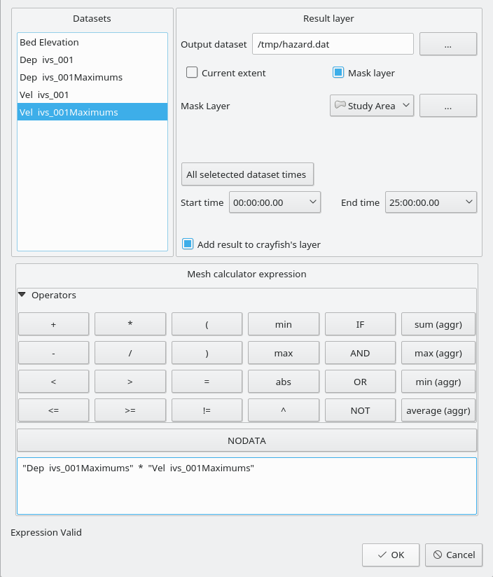
We have implemented a new grid calculator for Crayfish layer. Users can now perform various operations on one or multiple layers. The output can be filtered by time or spatially. In addition, we have added logical and aggregating operators. The result is currently saved as a binary XMS file. Read Crayfish wiki page for more details.

Grid calculator

Enhancements

Here is a list of enhancements for this release:

  • Better handling netcdf time
  • Resolving rendering issues with some file formats
  • Better support for Hydro_AS-2D files
  • Smoother area contour export

Sponsors

This release was funded by Austrian Ministry of Agriculture, Forestry, Environment and Water Management

Feedback and bug report

If you have any problem with Crayfish, please do not email us directly and consider filing a bug here: https://github.com/lutraconsulting/qgis-crayfish-plugin/issues

You may also like...

Mergin Maps, a field data collection app based on QGIS. Mergin Maps makes field work easy with its simple interface and cloud-based sync. Available on Android, iOS and Windows. Screenshots of the Mergin Maps mobile app for Field Data Collection
Get it on Google Play Get it on Apple store

Auxiliary Storage support in QGIS 3

For those who know how powerful QGIS can be using data defined widgets and expressions almost anywhere in styling and labeling settings, it remains today quite complex to store custom data.

For instance, moving a simple label using the label toolbar is not straightforward, that wonderful toolbar remains desperately greyed-out for manual labeling tweaks

…unless you do the following:

  • Set your vector layer editable (yes, it’s not possible with readonly data)
  • Add two columns in your data
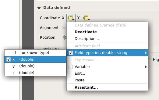
  • Link the X property position to a column and the Y position to another


the Move Label map tool becomes available and ready to be used (while your layer is editable). Then, if you move a label, the underlying data is modified to store the position. But what happened if you want to fully use the Change Label map tool (color, size, style, and so on)?


Well… You just have to add a new column for each property you want to manage. No need to tell you that it’s not very convenient to use or even impossible when your data administrator has set your data in readonly mode…

A plugin, made some years ago named EasyCustomLabeling was made to address that issue. But it kept being full of caveats, like a dependency to another plugin (Memory layer saver) for persistence, or a full copy of the layer to label inside a memory layer which indeed led to loose synchronisation with the source layer.

Two years ago, the French Agence de l’eau Adour Garonne (a water basin agency) and the Ministry in charge of Ecology asked Oslandia to think out QGIS Enhancement proposals to port that plugin into QGIS core, among a few other things like labeling connectors or curved labels enhancements.

Those QEPs were accepted and we could work on the real implementation, so here we are, Auxiliary storage has now landed in master!

How

The aim of auxiliary storage is to propose a more integrated solution to manage these data defined properties :

  • Easy to use (one click)
  • Transparent for the user (map tools always available by default when labeling is activated)
  • Do not update the underlying data (it should work even when the layer is not editable)
  • Keep in sync with the datasource (as much as possible)
  • Store this data along or inside the project file

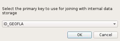
As said above, thanks to the Auxiliary Storage mechanism, map tools like Move Label, Rotate Label or Change Label are available by default. Then, when the user select the map tool to move a label and click for the first time on the map, a simple question is asked allowing to select a primary key :

Primary key choice dialog – (YES, you NEED a primary key for any data management)

From that moment on, a hidden table is transparently created to store all data defined values (positions, rotations, …) and joined to the original layer thanks to the primary key previously selected. When you move a label, the corresponding property is automatically created in the auxiliary layer. This way, the original data is not modified but only the joined auxiliary layer!

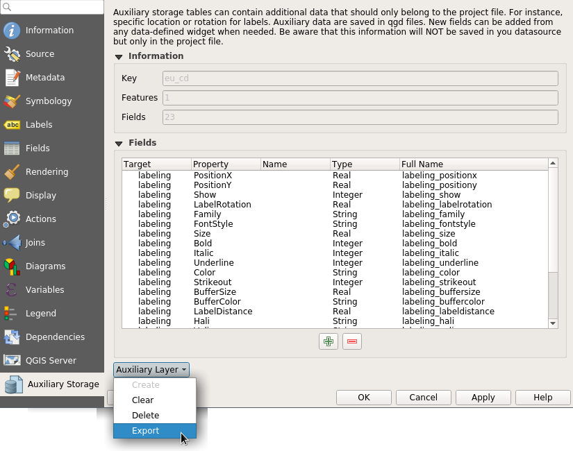
A new tab has been added in vector layer properties to manage the Auxiliary Storage mechanism. You can retrieve, clean up, export or create new properties from there :

Where the auxiliary data is really saved between projects?

We end up in using a light SQLite database which, by default, is just 8 Ko! When you save your project with the usual extension .qgs, the SQLite database is saved at the same location but with a different extension : .qgd.

Two thoughts with that choice: 

  • “Hey, I would like to store geometries, why no spatialite instead? “

Good point. We tried that at start in fact. But spatialite database initializing process using QGIS spatialite provider was found too long, really long. And a raw spatialite table weight about 4 Mo, because of the huge spatial reference system table, the numerous spatial functions and metadata tables. We chose to fall back onto using sqlite through OGR provider and it proved to be fast and stable enough. If some day, we achieve in merging spatialite provider and GDAL-OGR spatialite provider, with options to only create necessary SRS and functions, that would open news possibilities, like storing spatial auxiliary data.

  • “Does that mean that when you want to move/share a QGIS project, you have to manually manage these 2 files to keep them in the same location?!”

True, and dangerous isn’t it? Users often forgot auxiliary files with EasyCustomLabeling plugin.  Hence, we created a new format allowing to zip several files : .qgz.  Using that format, the SQLite database project.qgd and the regular project.qgs file will be embedded in a single project.zip file. WIN!!

Changing the project file format so that it can embed, data, fonts, svg was a long standing feature. So now we have a format available for self hosted QGIS project. Plugins like offline editing, Qconsolidate and other similar that aim at making it easy to export a portable GIS database could take profit of that new storage container.

Now, some work remains to add labeling connectors capabilities,  allow user to draw labeling paths by hand. If you’re interested in making this happen, please contact us!


More information

A full video showing auxiliary storage capabilities:


QEP: https://github.com/qgis/QGIS-Enhancement-Proposals/issues/27

PR New Zip format: https://github.com/qgis/QGIS/pull/4845

PR Editable Joined layers: https://github.com/qgis/QGIS/pull/4913

PR Auxiliary Storage: https://github.com/qgis/QGIS/pull/5086

How to view buildings in QGIS3D

With support for QGIS3D canvas, you can represent your vectors in a number of ways. In this post, we will walk you through how to render vectors as 3D objects.

Data

You can use CityGML or ESRI Multipatch, where the height of buildings are stored within the feature. For the purpose of this example, we are going to view New York buildings using ESRI Multipatch format. You can download the data from here:

http://maps.nyc.gov/download/3dmodel/DA_WISE_Multipatch.zip

After unziping the file, you will have several gdb files. You can use GDAL/OGR to convert gdb to Geopackage (or ESRI Shapefile). We should also convert the geometry type from multipatch to multipolygon. In Microsoft Windows gdal/ogr commands are available from the OSGEO4W command line.

ogr2ogr -f GPKG ny_buildings3d.gpkg DA1_3D_Buildings_Multipatch.gdb -nlt multipolygon

You can append the remaining gdb files to the existing Geopackage:

ogr2ogr -append -f GPKG ny_buildings3d.gpkg DA2_3D_Buildings_Multipatch.gdb -nlt multipolygon

Alternatively, you can write a simple batch script to loop through the files.

Note: we used gdal/ogr from trunk (2.3.0dev).

If you know of any other data sources, please send us an email so we can compile a full list of supported formats.

Viewing data

To be able to use QGIS3D, you need to install the latest version of QGIS using OSGEO4W or other installer for your platform.

Add the Geopackage containing the buildings to your QGIS. In QGIS, from the main menu, click on **View > New 3D Map View **

A new view, similar to your 2D canvas will be added to the bottom of your canvas. To be able to extrude the buildings, we need to enable 3D styling of the building layer.

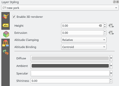
Ensure your Style panel is enabled (this is usually located on the right hand side of the canvas). Select 3D View tab and tick the box for Enable 3D renderer for building layer.

Vector 3D styling

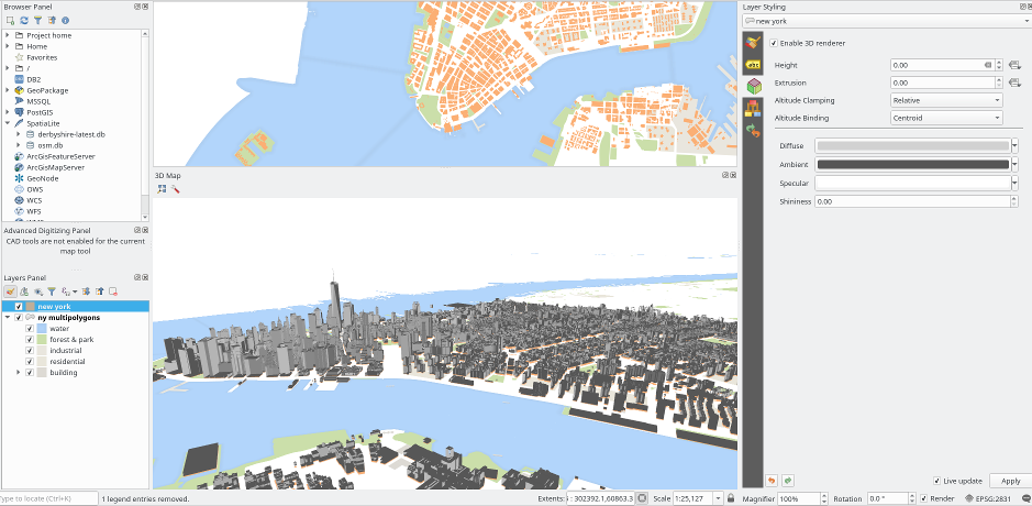
To navigate in 3D canvas, you can use Shift key + the wheel button on your mouse device.

3D view

You may also like...

Mergin Maps, a field data collection app based on QGIS. Mergin Maps makes field work easy with its simple interface and cloud-based sync. Available on Android, iOS and Windows. Screenshots of the Mergin Maps mobile app for Field Data Collection
Get it on Google Play Get it on Apple store

Movement data in GIS #9: trajectory data models

There are multiple ways to model trajectory data. This post takes a closer look at the OGC® Moving Features Encoding Extension: Simple Comma Separated Values (CSV). This standard has been published in 2015 but I haven’t been able to find any reviews of the standard (in a GIS context or anywhere else).

The following analysis is based on the official OGC trajcectory example at http://docs.opengeospatial.org/is/14-084r2/14-084r2.html#42. The header consists of two lines: the first line provides some meta information while the second defines the CSV columns. The data model is segment based. That is, each line describes a trajectory segment with at least two coordinate pairs (or triplets for 3D trajectories). For each segment, there is a start and an end time which can be specified as absolute or relative (offset) values:

@stboundedby,urn:x-ogc:def:crs:EPSG:6.6:4326,2D,50.23 9.23,50.31 9.27,2012-01-17T12:33:41Z,2012-01-17T12:37:00Z,sec
@columns,mfidref,trajectory,state,xsd:token,”type code”,xsd:integer
a, 10,150,11.0 2.0 12.0 3.0,walking,1
b, 10,190,10.0 2.0 11.0 3.0,walking,2
a,150,190,12.0 3.0 10.0 3.0,walking,2
c, 10,190,12.0 1.0 10.0 2.0 11.0 3.0,vehicle,1

Let’s look at the first data row in detail:

  • a … trajectory id
  • 10 … start time offset from 2012-01-17T12:33:41Z in seconds
  • 150 … end time offset from 2012-01-17T12:33:41Z in seconds
  • 11.0 2.0 12.0 3.0 … trajectory coordinates: x1, y1, x2, y2
  • walking …  state
  • 1… type code

My main issues with this approach are

  1. They missed the chance to use WKT notation to make the CSV easily readable by existing GIS tools.
  2. As far as I can see, the data model requires a regular sampling interval because there is no way to store time stamps for intermediate positions along trajectory segments. (Irregular intervals can be stored using segments for each pair of consecutive locations.)

In the common GIS simple feature data model (which is point-based), the same data would look something like this:

traj_id,x,y,t,state,type_code
a,11.0,2.0,2012-01-17T12:33:51Z,walking,1
a,12.0,3.0,2012-01-17T12:36:11Z,walking,1
a,10.0,3.0,2012-01-17T12:36:51Z,walking,2
b,10.0,2.0,2012-01-17T12:33:51Z,walking,2
b,11.0,3.0,2012-01-17T12:36:51Z,walking,2
c,12.0,1.0,2012-01-17T12:33:51Z,vehicle,1
c,10.0,2.0,2012-01-17T12:35:21Z,vehicle,1
c,11.0,3.0,2012-01-17T12:36:51Z,vehicle,1

The main issue here is that there has to be some application logic that knows how to translate from points to trajectory. For example, trajectory a changes from walking1 to walking2 at 2012-01-17T12:36:11Z but we have to decide whether to store the previous or the following state code for this individual point.

An alternative to the common simple feature model is the PostGIS trajectory data model (which is LineStringM-based). For this data model, we need to convert time stamps to numeric values, e.g. 2012-01-17T12:33:41Z is 1326803621 in Unix time. In this data model, the data looks like this:

traj_id,trajectory,state,type_code
a,LINESTRINGM(11.0 2.0 1326803631, 12.0 3.0 1326803771),walking,1
a,LINESTRINGM(12.0 3.0 1326803771, 10.0 3.0 1326803811),walking,2
b,LINESTRINGM(10.0 2.0 1326803631, 11.0 3.0 1326803811),walking,2
c,LINESTRINGM(12.0 1.0 1326803631, 10.0 2.0 1326803771, 11.0 3.0 1326803811),vehicle,1

This is very similar to the OGC data model, with the notable difference that every position is time-stamped (instead of just having segment start and end times). If one has movement data which is recorded at regular intervals, the OGC data model can be a bit more compact, but if the trajectories are sampled at irregular intervals, each point pair will have to be modeled as a separate segment.

Since the PostGIS data model is flexible, explicit, and comes with existing GIS tool support, it’s my clear favorite.


Read more:

Movement data in GIS extra: trajectory generalization code and sample data

Today’s post is a follow-up of Movement data in GIS #3: visualizing massive trajectory datasets. In that post, I summarized a concept for trajectory generalization. Now, I have published the scripts and sample data in my QGIS-Processing-tools repository on Github.

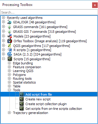
To add the trajectory generalization scripts to your Processing toolbox, you can use the Add scripts from files tool:

It is worth noting, that Add scripts from files fails to correctly import potential help files for the scripts but that’s not an issue this time around, since I haven’t gotten around to actually write help files yet.

The scripts are used in the following order:

  1. Extract characteristic trajectory points
  2. Group points in space
  3. Compute flows between cells from trajectories

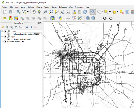
The sample project contains input data, as well as output layers of the individual tools. The only required input is a layer of trajectories, where trajectories have to be LINESTRINGM (note the M!) features:

Trajectory sample based on data provided by the GeoLife project

In Extract characteristic trajectory points, distance parameters are specified in meters, stop duration in seconds, and angles in degrees. The characteristic points contain start and end locations, as well as turns and stop locations:

The characteristic points are then clustered. In this tool, the distance has to be specified in layer units, which are degrees in case of the sample data.

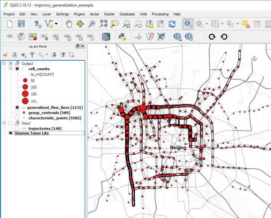
Finally, we can compute flows between cells defined by these clusters:

Flow lines scaled by flow strength and cell centers scaled by counts

If you use these tools on your own data, I’d be happy so see what you come up with!


Read more:

Newly-Committed QGIS 3.0 Algorithm: Raster Layer Unique Values Report

Getting a pixel count and area size of unique values for a given raster layer hasn’t been straightforward in QGIS. The user could either go through third-party solutions via processing with some limitations, or create a (slow) python script.

That is, until now. Say hello to the newly-committed processing algorithm, the “raster layer unique values report”.

The QGIS algorithm will take a raster layer as input and output an HTML formatted report listing the pixel count and area size – in the raster layer’s unit - for all unique values. Thanks to QGIS core developer Nyall Dawson’s fantastic work on the processing platform in upcoming QGIS 3.0, the algorithm is written in C++ and therefore much faster - over a tenfold improvement - to an equivalent python script.

Using QGIS’ processing modeler, users can come up with a simple model to provide unique values reports within areas of interests, defined through vector polygons: Simple processing model in QGIS 3.0

For example, using the newly-updated 2016 Global Forest Change dataset and the model above, we can quickly generate a deforestation per year chart. Simply reproject the dataset in the appropriate meter-based projection, clip it with a national boundaries polygon, et voila. Paste the resulting HTML table into your favorite spreadsheet program and enjoy the charts: Algorithm HTML output in spreadsheet view

Movement data in GIS #8: edge bundling for flow maps

If you follow this blog, you’ll probably remember that I published a QGIS style for flow maps a while ago. The example showed domestic migration between the nine Austrian states, a rather small dataset. Even so, it required some manual tweaking to make the flow map readable. Even with only 72 edges, the map quickly gets messy:

Raw migration flows between Austrian states, line width scaled by flow strength

One popular approach in the data viz community to deal with this problem is edge bundling. The idea is to reduce visual clutter by generate bundles of similar edges. 

Surprisingly, edge bundling is not available in desktop GIS. Existing implementations in the visual analytics field often run on GPUs because edge bundling is computationally expensive. Nonetheless, we have set out to implement force-directed edge bundling for the QGIS Processing toolbox [0]. The resulting scripts are available at https://github.com/dts-ait/qgis-edge-bundling.

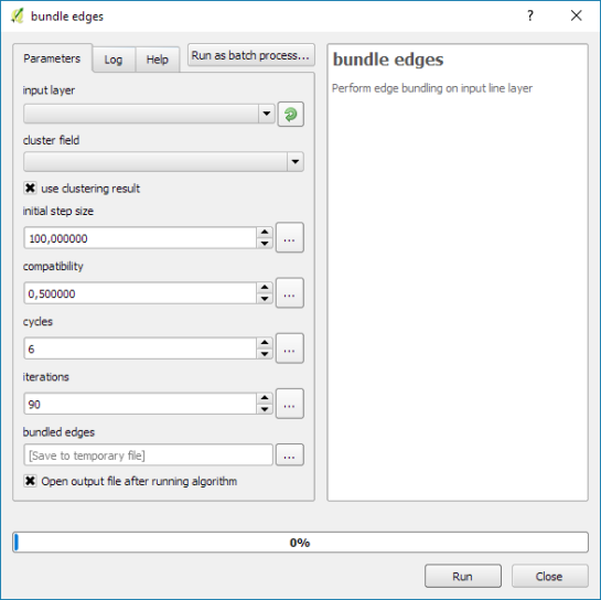
The main procedure consists of two tools: bundle edges and summarize. Bundle edges takes the raw straight lines, and incrementally adds intermediate nodes (called control points) and shifts them according to computed spring and electrostatic forces. If the input are 72 lines, the output again are 72 lines but each line geometry has been bent so that similar lines overlap and form a bundle.

After this edge bundling step, most common implementations compute a line heatmap, that is, for each map pixel, determine the number of lines passing through the pixel. But QGIS does not support line heatmaps and this approach also has issues distinguishing lines that run in opposite directions. We have therefore implemented a summarize tool that computes the local strength of the generated bundles.

Continuing our previous example, if the input are 72 lines, summarize breaks each line into its individual segments and determines the number of segments from other lines that are part of the same bundle. If a weight field is specified, each line is not just counted once but according to its weight value. The resulting bundle strength can be used to create a line layer style with data-defined line width:

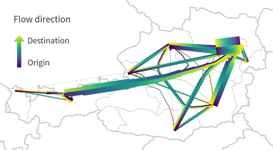
Bundled migration flows

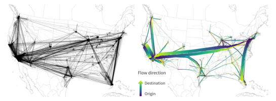
To avoid overlaps of flows in opposing directions, we define a line offset. Finally, summarize also adds a sequence number to the line segments. This sequence number is used to assign a line color on the gradient that indicates flow direction.

I already mentioned that edge bundling is computationally expensive. One reason is that we need to perform pairwise comparison of edges to determine if they are similar and should be bundled. This comparison results in a compatibility matrix and depending on the defined compatibility threshold, different bundles can be generated.

The following U.S. dataset contains around 4000 lines and bundling it takes a considerable amount of time.

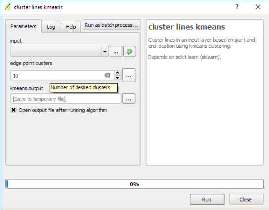
One approach to speed up computations is to first use a quick clustering algorithm and then perform edge bundling on each cluster individually. If done correctly, clustering significantly reduces the size of each compatibility matrix.

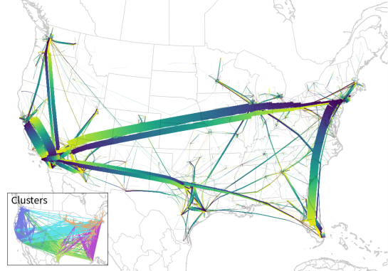
In this example, we divided the edges into six clusters before bundling them. If you compare this result to the visualization at the top of this post (which did not use clustering), you’ll see some differences here and there but, overall, the results are quite similar:

Looking at these examples, you’ll probably spot a couple of issues. There are many additional ideas for potential improvements from existing literature which we have not implemented yet. If you are interested in improving these tools, please go ahead! The code and more examples are available on Github.

For more details, leave your email in a comment below and I’ll gladly send you the pre-print of our paper.

[0] Graser, A., Schmidt, J., Roth, F., & Brändle, N. (2017 online) Untangling Origin-Destination Flows in Geographic Information Systems. Information Visualization – Special Issue on Visual Movement Analytics.


Read more:

  • <<
  • Page 51 of 141 ( 2819 posts )
  • >>

Back to Top

Sustaining Members