Related Plugins and Tags

QGIS Planet

(English) Proj: Select Datum Transformations for EPSG:28992

(FOR REFERENCE, TODO: TO BE UPDATED AND TRANSLATED) If you startup QGIS 3.8 / Zanzibar the first time to load a data in our national CRS (EPSG:28992) you are being presented with the following dialog: I thought it had something todo with the fact that this OSGeo4W install maybe used the newer PROJ (6.0.1), but […]

(English) QGISnetworklogger plugin or what are QGIS and my service talking about…

Just released a ‘new’ plugin: QGIS Network Logger, install via the plugin manager of QGIS version 3.6 or higher (https://plugins.qgis.org/plugins/qgisnetworklogger/). One of the things QGIS is pretty good in is talking to OGC services (WebMapService/WMS, WebFeatureService/WFS etc etc), QGIS even talks to Esri web services. Something what was hard in this, is that if you […]

QGIS 3 and performance analysis

Context

Since last year we (the QGIS communtity) have been using QGIS-Server-PerfSuite to run performance tests on a daily basis. This way, we’re able to monitor and avoid regressions according to some test scenarios for several QGIS Server releases (currently 2.18, 3.4, 3.6 and master branches). However, there are still many questions about performance from a general point of view:

  • What is the performance of QGIS Server compared to QGIS Desktop?
  • What are the implications of feature simplification for polygons and lines?
  • Does the symbology have a strong impact on performance and in which proportion?

Of course, it’s a broad and complex topic because of the numerous possibilities offered by the rendering engine of QGIS. In this article we’ll look at typical use cases with geometries coming from a PostgreSQL database.

Methodology

The first way to monitor performance is to measure the rendering time. To do so, the Map canvas refreshis activated in the Settings of QGIS Desktop. In this way we can get the rendering time from within the Rendering tab of log messages in QGIS Desktop, as well as from log messages written by QGIS Server.

The rendering time retrieved with this method allows to get the total amount of time spent in rendering for each layer (see the source code).

But in the case of QGIS Server another interesting measure is the total time spent for a specific request, which may be read from log messages too. There are indeed more operations achieved for a single WMS request than a simple rendering in QGIS Desktop:
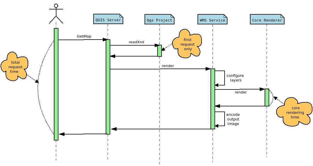
The rendering time extracted from QGIS Desktop corresponds to the core rendering time displayed in the sequence diagram above. Moreover, to be perfectly comparable, the rendering engine must be configured in the same way in both cases. In this way, and thanks to PyQGIS API, we can retrieve the necessary information from the Python console in QGIS Desktop, like the extent or the canvas size, in order to configure the GetMap WMS request with the appropriate WIDTH,, HEIGHT , and BBOX parameters.

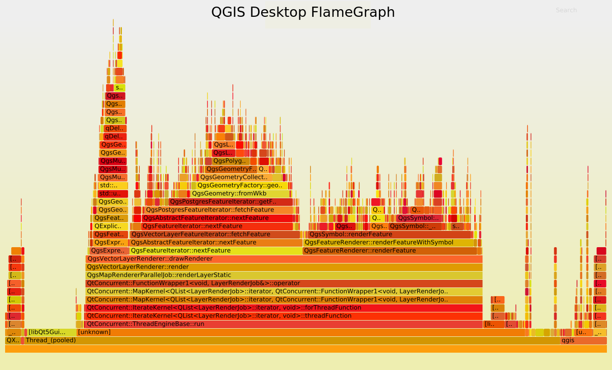
Another way to examine the performance is to use a profiler in order to inspect stack traces. These traces may be represented as a FlameGraph. In this case, debug symbols are necessary, meaning that the rendering time is not representative anymore. Indeed, QGIS has to be compiled in Debug mode.

Polygons

For these tests we use the same dataset as that for the daily performance tests, which is a layer of polygons with 282,776 features.

Feature simplification deactivated

Let’s first have a look at the rendering time and the FlameGraph when the simplification is deactivated. In QGIS Desktop, the mean rendering time is 2591 ms. Using to the PyQGIS API we are able to get the extent and the size of the map to render the map again but using a GetMap WMS request this time.

In this case, the rendering time is 2469 ms and the total request time is 2540 ms. For the record, the first GetMap request is ignored because in this case, the whole QGIS project is read and cached, meaning that the total request time is much higher. But according to those results, the rendering time for QGIS Desktop and QGIS Server are utterly similar, which makes sense considering that the same rendering engine is used, but it is still very reassuring :).

Now, let’s take a look to the FlameGraph to detect where most of the time is spent.
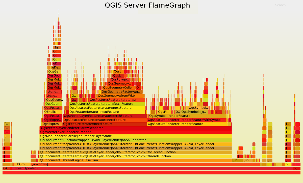
 

Undoubtedly the FlameGraph’s are similar in both cases, meaning that if we want to improve the performance of QGIS Server we need to improve the performance of the core rendering engine, also used in QGIS Desktop. In our case the main method is QgsMapRendererParallelJob::renderLayerStatic where most of the time is spent in:

Methods Desktop % Server %
QgsExpressionContext::setFeature 6.39 6.82
QgsFeatureIterator::nextFeature 28.77 28.41
QgsFeatureRenderer::renderFeature 29.01 27.05

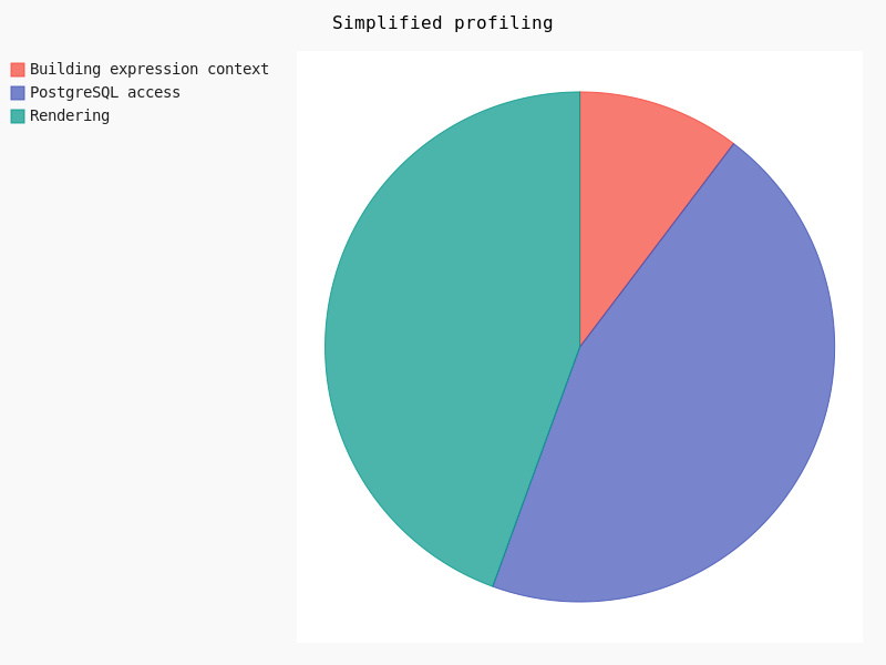
Basically, it may be simplified like:

Clearly, the rendering takes about 30% of the total amount of time. In this case geometry simplification could potentially help.

Feature simplification activated

Geometry simplification, available for both polygons and lines layers, may be activated and configured through layer’s Properties in the Rendering tab. Several parameters may be set:

  • Simplification may be deactivated
  • Threshold for a more drastic simplification
  • Algorithm
  • Provider simplification
  • Scale

Once the simplification activated, we varied the threshold as well as the algorithm in order to detect performance jumps:
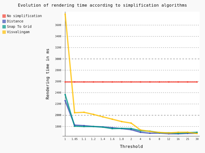
The following conclusions can be drawn:

  • The Visvalingam algorithm should be avoided because it begins to be efficient with a high threshold, meaning a significant lack of precision in geometries
  • The ideal threshold for Snap To Grid and Distance algorithms seems to be 1.05. Indeed, considering that it’s a very low threshold, the precision of geometries is still pretty good for a major improvement in rendering time though

For now, these tests have been run on the full extent of the layer. However, we still have a Maximum scale parameter to test, so we’ve decreased the scale of the layer:

And in this case, results are pretty interesting too:
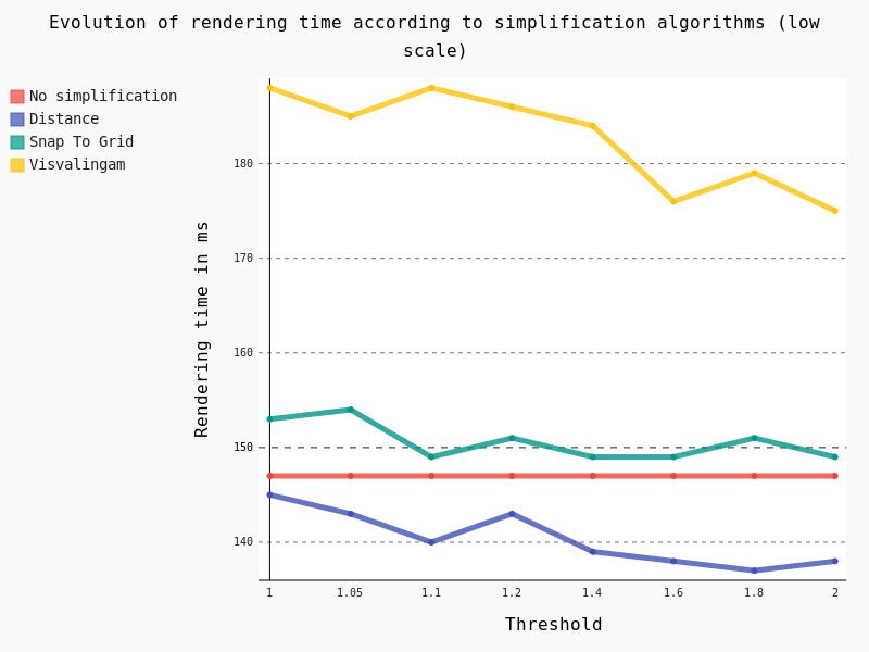
Several conclusions can be drawn:

  • Visvalingam algorithm should be avoided at low scale too
  • Snap To Grid seems counter-productive at low scale
  • Distance algorithm seems to be a good option

Lines

For these tests we also use the same dataset as that for daily performance tests, which is a layer of lines with 125,782 features.

Feature simplification activated

In the same way as for polygons we have tested the effect of the geometric simplification on the rendering time, as well as algorithms and thresholds:
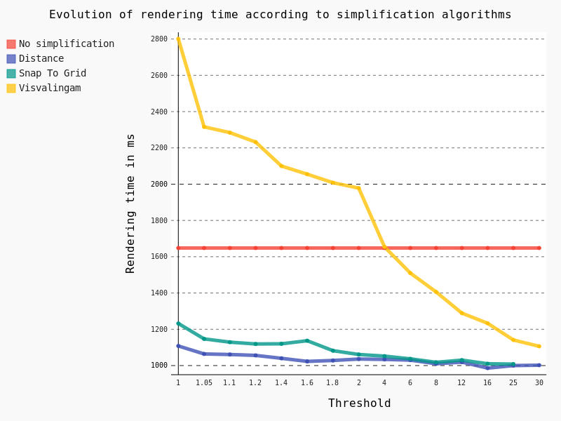
In this case we have exactly the same conclusion as for polygons: the Distance algorithm should be preferred with a threshold of 1.05.

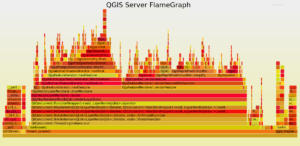
For QGIS Server the mean rendering time is about 1180 ms with geometry simplification compared to 1108 ms for QGIS Desktop, which is totally consistent. And looking at the FlameGraph we note that once again most of the time is spent in accessing the PostgreSQL database (about 30%) and rendering features (about 40%).


Symbology

Another parameter which has an obvious impact on performance is the symbology used to draw the layers. Some features are known to be time consuming, but we’ve felt that a a thorough study was necessary to verify it.


Firstly, we’ve studied the influence of the width as well as the Single Symbol type on the rendering time.
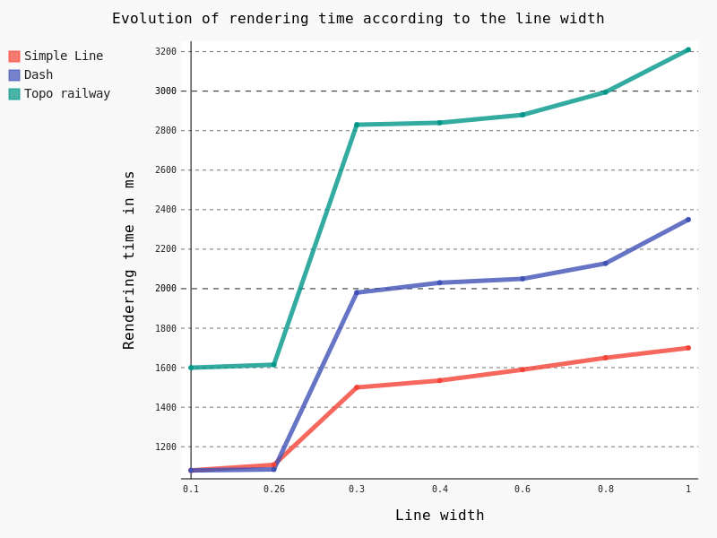
Some points are noteworthy:

Simple Line is clearly the less time consuming

– Beyond the default 0.26 line width, rendering time begins to raise consequently with a clear jump in performance


Another interesting feature is the Draw effects option, allowing to add some fancy effects (shadow, glow, …).
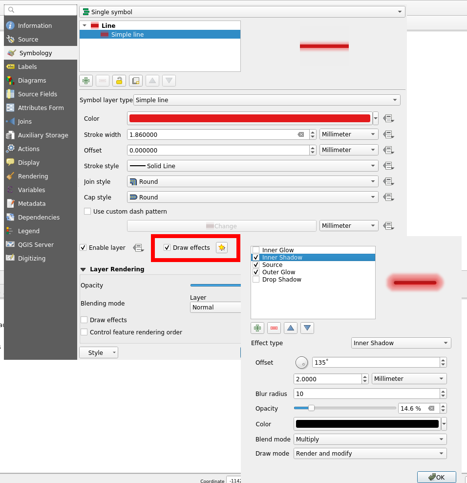
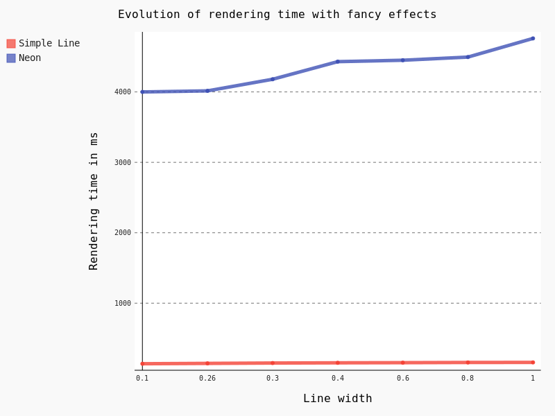
However, this feature is known to be particularly CPU consuming. Actually, rendering all the 125,782 lines took so long that we had to to change to a lower scale, with just some a few dozen lines. Results are unequivocal:
 

The last thing we wanted to test for symbology is the effect of the Categorized classification. Here are the results for some classifications with geometry simplification activated:

  • No classification: 1108 ms
  • A simple classification using the column “classification” (8 symbols): 1148 ms
  • A classification based on a stupid expression “classification x 3″ (8 symbols): 1261 ms
  • A classification based on string comparison “toponyme like ‘Ruisseau*'” (2 symbols): 1380 ms
  • A classification with a specific width line for each category (8 symbols): 1850 ms

Considering that a simple classification does not add an excessive extra-cost, it seems that the classification process itself is not very time consuming. However, as soon as an expression is used, we can observe a slight jump in performance.

Labeling

Another important part to study regarding performance is labeling and the underlying positioning. For this test we decreased the scale and varied the Placement parameter without tuning anything.
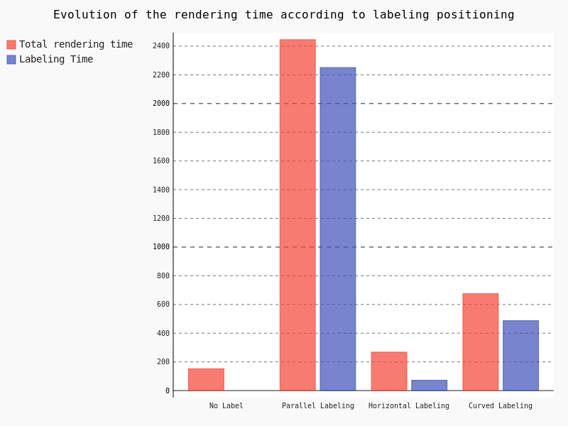
Clearly, the parallel labeling is much more time consuming than the other placements. However, as previously stated, we used the default parameters for each positioning, meaning that the number of labels really drawn on the map differs from a placement to another.

Points

The last kind of geometries we have to study is points. Similarly to polygons and lines, we used the same dataset as that of performance tests, that is a layer with 435588 points.

In the case of points geometries geometry simplification is of course not available. So we are going to focus on symbology and the impact of marker size.
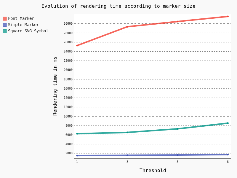
Obviously Font Marker must be used carefully because of the underlying jump in performance, as well as SVG Symbols. Moreover, contrary to Simple Marker, an increase of the size implies a drastic augmentation in time rendering.

General conclusion

Based on this factual study, several conclusions can be drawn.

Globally, FlameGraph for QGIS Desktop and QGIS Server are completely similar as well as rendering time.

It means that if we want to improve the performance of QGIS Server, we have to work on the desktop configuration and the rendering engine of the QGIS core library.

Extracting generic conclusions from our tests is very difficult, because it clearly depends on the underlying data. But let’s try to suggest some recommendations :).

Firstly, geometry simplification seems pretty efficient with lines and polygons as soon as the algorithm is chosen cautiously, and as long as your features include many vertices. It seems that the Distance algorithm with a 1.05 threshold is a good choice, with both high and low scale. However, it’s not a magic solution!

Secondly, a special care is needed with regards to symbology. Indeed, in some cases, a clear jump in performance is notable. For example, fancy effects and Font Marker SVG Symbol have to be used with caution if you’re picky on rendering time.

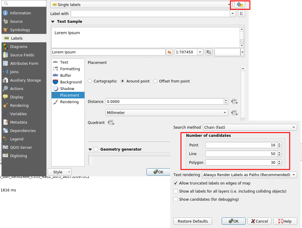
Thirdly, we have to be aware of the extra cost caused by labeling, especially the Parallel  placement for line geometries. On this subject, a not very well-known parameter allows to drastically reduce labeling time: the PAL candidates option. Actually, we may decrease the labeling time by reducing the number of candidates. For an explicit use case, you can take a look at the daily reports.
In any case, improving server performance in a substantial way means improving the QGIS core library directly.

Especially, we noticed thanks to FlameGraph that most of the time is spent in drawing features and managing the data from the PostgreSQL database. By the way, a legitimate question is: “How much time do we spend on waiting for the database?”. To be continued 😉

If you hit performance issues on your specific configuration or want to improve QGIS awesomeness, we provide a unique QGIS support offer at http://qgis.oslandia.com/ thanks to our team of specialists!

Funding for selective masking in QGIS is now complete!

Few months ago, Oslandia launched QGIS lab’s , a place to advertise our new ideas for QGIS, but also a place to help you find co funders to make dreams become reality.

The first initiative is about label selective masking, a feature that will allow us to achieve even more professional rendering for our maps.

Selective masking


Thanks to the commitment of the Swiss QGIS user group and local authorities, this work is now funded !

We now can start working hard to deliver you this great feature for QGIS 3.10

Thanks again to our funders

A last word, this is not a classical crowd funding initiative, but a classical contract for each funder.

No more reason not to contribute to free and open source software!

QGIS Print Layouts Graphs and Charts — target reached!

We’ve just passed the extended deadline for our recent QGIS Print Layouts Graphs and Charts campaign, and the great news is that thanks to a large number of generous backers we’ve successfully hit the target for this campaign! This has only been possible thanks to the tireless work of the QGIS community and user groups in promoting this campaign and spreading the word.

The Print Layouts Graphs and Charts campaign is a joint effort with our friends at Faunalia, so we’ll soon be starting work together on all the wonderful new functionality heading to the QGIS DataPlotly plugin as a result. The work will be commencing late June, just after the QGIS 3.8.0 final release. Keep an eye out for further updates on the development from this time! You can read more about what’s coming in detail at the campaign page.

We’d like to take this opportunity to extend our heartfelt thanks to all the backers who have pledged to support this project:

  • Federico Gianoli
  • Papercraft Mountains
  • Liam McCrae
  • Henry Walshaw
  • Raúl Sangonzalo
  • Ferdinando Urbano
  • pitsch-ing.ch
  • Carbon-X
  • Gabriel Diosan
  • Rene Giovanni Borella
  • Enrico Bertonati
  • Guido Ingwer
  • David Addy
  • Gerd Jünger
  • Andreas Neumann
  • Stefano Campus
  • Michael Jabot
  • Korto
  • Enrico Ferreguti
  • Carlo A. Nicolini
  • Salvatore Fiandaca
  • Alberto Grava
  • Hans van der Kwast
  • Ben Hur Pintor
  • Silvio Grosso
  • Nobusuke Iwasaki
  • Alasdair Rae
  • Manori Senanayake
  • Canton de Neuchâtel
  • Matthias Daues
  • Alteri Seculo
  • SunGIS Ltd.
  • Stu Smith
  • Keolis Rennes
  • Gabriel Diosan
  • Aiden Price
  • Giacomo Ponticelli
  • Diane Fritz
  • Gemio Bissolati
  • Claire Birnie
  • Nicolas Roelandt
  • Rocco Pispico
  • Gabriel Bengtsson
  • Birds Eye View
  • Barend Köbben
  • Roberto Marzocchi (GTER)
  • Yoichi Kayama
  • Alessandro Sarretta
  • Luca Angeli
  • Luca Bellani
  • giswelt
  • Stefan Giese
  • Ben Harding
  • Joao Gaspar
  • Romain Lacroix
  • Ryan Cooper
  • Daniele Bonaposta
  • QGIS Swedish User Group
  • Nino Formica
  • Michael Gieding
  • Amedeo Fadini
  • Andrew Hannell
  • Stefano
  • Phil Wyatt
  • Brett Edmond Carlock
  • Transitec


Using QGIS from Conda

QGIS recipes have been available on Conda for a while, but now, that they work for the three main operating systems, getting QGIS from Conda is s starting to become a reliable alternative to other QGIS distributions. Anyway, let’s rewind a bit…

What is Conda?

Conda is an open source package management system and environment management system that runs on Windows, macOS and Linux. Conda quickly installs, runs and updates packages and their dependencies. Conda easily creates, saves, loads and switches between environments on your local computer. It was created for Python programs, but it can package and distribute software for any language.

Why is that of any relevance?

Conda provides a similar way to build, package and install QGIS (or any other software) in Linux, Windows, and Mac.

As a user, it’s the installation part that I enjoy the most. I am a Linux user, and one of the significant limitations is not having an easy way to install more than one version of QGIS on my machine (for example the latest stable version and the Long Term Release). I was able to work around that limitation by compiling QGIS myself, but with Conda, I can install as many versions as I want in a very convenient way.

The following paragraphs explain how to install QGIS using Conda. The instructions and Conda commands should be quite similar for all the operating systems.

Anaconda or miniconda?

First thing you need to do is to install the Conda packaging system. Two distributions install Conda: Anaconda and Miniconda.

TL;DR Anaconda is big (3Gb?) and installs the packaging system and a lot of useful tools, python packages, libraries, etc… . Miniconda is much smaller and installs just the packaging system, which is the bare minimum that you need to work with Conda and will allow you to selectively install the tools and packages you need. I prefer the later.

For more information, check this stack exchange answer on anaconda vs miniconda.

Download anaconda or miniconda installers for your system and follow the instructions to install it.

Windows installer is an executable, you should run it as administrator. The OSX and Linux installers are bash scripts, which means that, once downloaded, you need to run something like this to install:

bash Miniconda3-latest-Linux-x86_64.sh

Installing QGIS

Notice that the Conda tools are used in a command line terminal. Besides, on Windows, you need to use the command prompt that is installed with miniconda.

Using environments

Conda works with environments, which are similar to Python virtual environments but not limited only to python. Basically, it allows isolating different installations or setups without interfering with the rest of the system. I recommend that you always use environments. If, like me, you want to have more that one version of QGIS installed, then the use of environments is mandatory.

Creating an environment is as easy as entering the following command on the terminal:

conda create --name <name_of_the_environment>

For example,

conda create --name qgis_stable

You can choose the version of python to use in your environment by adding the option python=<version>. Currently versions of QGIS run on python 3.6, 3.7, 3.8 and 3.9.

conda create –name qgis_stable python=3.7

To use an environment, you need to activate it.

conda activate qgis_stable

Your terminal prompt will show you the active environment.

(qgis_stable) aneto@oryx:~/miniconda3$

To deactivate the current environment, you run

conda deactivate

Installing packages

Installing packages using Conda is as simples as:

conda install <package_name>

Because conda packages can be stored in different channels, and because the default channels (from the anaconda service) do not contain QGIS, we need to specify the channel we want to get the package from. conda-forge is a community-driven repository of conda recipes and includes updated QGIS packages.

conda install qgis --channel conda-forge

Conda will download the latest available version of QGIS and all its dependencies installing it on the active environment.

Note: Because conda always try to install the latest version, if you want to use the QGIS LTR version, you must specify the QGIS version.

conda install qgis=3.10.12 --channel conda-forge

Uninstalling packages

Uninstalling QGIS is also easy. The quickest option is to delete the entire environment where QGIS was installed. Make sure you deactivate it first.

conda deactivate
conda env remove --name qgis_stable

Another option is to remove QGIS package manually. This is useful if you have other packages installed that you want to keep.

conda activate qgis_stable
conda remove qgis -c conda-forge

This only removes the QGIS package and will leave all other packages that were installed with it. Note that you need to specify the conda-forge channel. Otherwise, Conda will try to update some packages from the default channels during the removal process, and things may get messy.

Running QGIS

To run QGIS, in the terminal, activate the environment (if not activated already) and run the qgis command

conda activate qgis_stable
qgis

Updating QGIS

To update QGIS to the most recent version, you need to run the following command with the respective environment active

conda update qgis -c conda-forge

To update a patch release for the QGIS LTR version you run the install command again with the new version:

conda install qgis=3.10.13 -c conda-forge

Some notes and caveats

Please be aware that QGIS packages on Conda do not provide the same level of user experience as the official Linux, Windows, and Mac installer from the QGIS.org distribution. For example, there are no desktop icons or file association, it does not include GRASS and SAGA, etc …

On the other hand, QGIS installations on Conda it will share user configurations, installed plugins, with any other QGIS installations on your system.

QGIS op de FOSS4GNL 2019 (20 juni in Delft)

Sorry, this entry is only available in Dutch.

QGIS Print Layouts Graphs and Charts – campaign deadline extended!

If you’re a regular reader of this blog, it won’t surprise you to hear that we’re very excited about adding rich charting and graph functionality to QGIS’ Print Layout designer! Alongside our friends at Faunalia, we’re currently running a crowd funding campaign to make this a reality.

So, while the required funds weren’t raised within our original April 30 deadline, we’ve decided to extend this campaign by an additional 30 days in the hopes that the users and organisations from the wider QGIS community will jump onboard and pledge the remaining required funds.

This missing feature is a large gap in QGIS printing capabilities, so we’re counting on you to show your support and spread the word to your local user groups, QGIS users, and any organisations you know of who rely on QGIS and would love to see its inbuilt reporting capabilities levelled up!

QGIS (and SLYR!), now with Hash Lines support

Thanks to an anonymous corporate sponsor, we’ve recently had the opportunity to add a new Hashed Line symbol type for QGIS 3.8. This allows for a repeating line segment to be drawn over the length of a feature, with a line-sub symbol used to render each individual segment.

There’s tons of options available for customising the appearance and placement of line hashes. We based the feature heavily off QGIS’ existing “Marker Line” support, so you can create hashed lines placed at set intervals, on line vertices, or at the start/end/middle of lines. There’s options to offset the lines, and tweak the rotation angle of individual hashes too. Added to QGIS’ rich support for “data defined” symbol properties, this allows for a huge range of new symbol effects.

E.g. using a data defined hash length which increases over the length of a feature gives us this effect:

Or, when using a complex line sub-symbol for rendering each hash, we can get something like this:

Or even go completely “meta” and use a hashed line sub symbol for the hash line itself!

With the right combination of symbol settings and QGIS draw effects you can even emulate a calligraphic pen effect:

Or a chunky green highlighter!

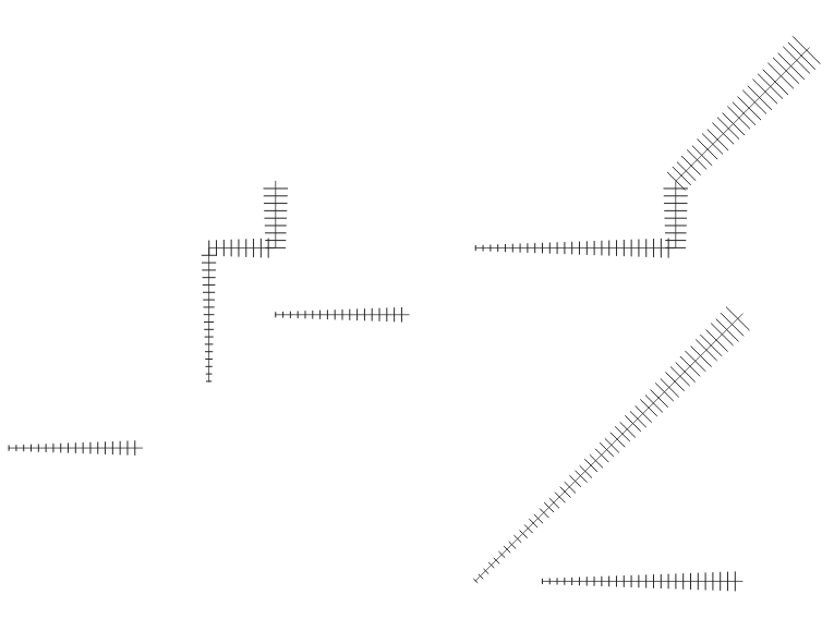
This same corporate sponsor also funded a change which results in a huge improvement to the appearance of both rotated hashed lines and marker lines. Previously, when marker or hash lines were rendered, the symbol angles were determined by taking the exact line orientation at the position of the symbol. This often leads to undesirable rendering effects, where little “bumps” or corners in lines which occur at the position of the symbol cause the marker or hash line to be oriented at a very different angle to what the eye expects to see.

With this improvement, the angle is instead calculated by averaging the line over a specified distance either side of the symbol. E.g. averaging the line angle over 4mm means we take the points along the line 2mm from either side of the symbol placement, and use these instead to calculate the line angle for that symbol. This has the effect of smoothing (or removing) any tiny local deviations from the overall line direction, resulting in much nicer visual orientation of marker or hash lines.

It’s easiest to show the difference visually. Here’s a before image, showing arrow markers following a line feature. Pay specific attention to the 3rd and last arrow, which seem completely random oriented due to the little shifts in line direction:

With new smoothing logic this is much improved:

The difference is even more noticeable for hashed lines. Here’s the before:

…and the after:

Suffice to say, cartographers will definitely appreciate the result!

Lastly, we’ve taken this new hash line feature as an opportunity to implement automatic conversion of ESRI hash line symbols within our SLYR ESRI to QGIS conversion tool. Read more about SLYR here, and how you can purchase this tool for .style, .lyr and .mxd document conversion.

QGIS Print Layouts Graphs and Charts – an Illustrated Showcase

If you’ve been following our latest updates, you’ll be well aware that North Road and Faunalia are running a crowd funding campaign to add rich charting and graph functionality to QGIS’ Print Layout designer. This missing feature is a large gap in QGIS printing capabilities, so we’re planning on filling that gap by exposing the powerful QGIS “Data Plotly” plugin to allow these charts to be embedded inside your layouts, and allow them to be created and modified in a simple, interactive style. And thanks to a large group of generous backers, the campaign is off to a fantastic start!

Accordingly, we’d like to take the opportunity to showcase some of the current plot styles available from the QGIS DataPlotly plugin, all of which will be possible to insert into your print layouts if the campaign is successful. Let’s start with the default chart option – a simple scatter plot:

In this screenshot we see a scatter plot of Educational Usage vs Distance from City for a network of railway stations. We’ve left most settings at their default in order to illustrate that even out-of-the-box, the charts look great! They’ll fit right alongside your map masterpieces in your print layouts and won’t look out of place. It’s also important to note that the above screenshot demonstrates the current interactive canvas mode for the DataPlotly plugin. If this campaign is successful, the chart designer shown above will be available directly inside the QGIS Print Layout designer window. Users will be able to drop new charts into their layouts, and then edit the properties of those charts in a interactive manner. Exciting stuff indeed!

So what other plot styles are currently available in DataPlotly? Here’s a quick showcase of what’s hopefully in the future for QGIS’ print layouts…

Box plots

Bar plot

Histograms

Pie Charts

2D Histogram

Polar Plots

Ternary Plots

Contour Plots

Violin Plots

These plots can already be created from your map canvas using the version of DataPlotly available from the standard QGIS plugin repository, so we encourage you to download the plugin and have a play, and start to get a feel for the flexibility and power having access to these charting options will bring to your print layouts!

You can help make this feature a reality by supporting the campaign or by sharing the page and increasing exposure to the campaign. Full details about the planned functionality and how to contribute are available at the campaign page.

QGIS Print Layouts Graphs and Charts crowdfund launched!

Ever wished QGIS had a way to insert dynamic, feature rich charts and graphs directly inside print layouts? If so, our latest crowdfunding campaign has you covered! This missing feature is a large gap in QGIS printing capabilities, so we’re planning on filling that gap by exposing the powerful QGIS “Data Plotly” plugin to allow these charts to be embedded inside your layouts, and allow them to be created and modified in a simple, interactive style.

If you’re not aware of the existing capabilities of the DataPlotly plugin, here’s a quick screencast which should get you excited about the possibilities here…

QGIS is already a reporting powerhouse, and we believe that linking DataPlotly with QGIS print layouts will boost the current functionality up an order of magnitude! To make it possible we need 8600€ pledged before 30 April 2019. North Road is collaborating on this campaign with our friends at Faunalia, and development work will be shared between the two consultancy firms.

You can help make this a reality by supporting the campaign or by sharing the page and increasing exposure to the campaign. Full details about the planned functionality and how to contribute are available at the campaign page.

Stand-alone PyQGIS scripts with OSGeo4W

PyQGIS scripts are great to automate spatial processing workflows. It’s easy to run these scripts inside QGIS but it can be even more convenient to run PyQGIS scripts without even having to launch QGIS. To create a so-called “stand-alone” PyQGIS script, there are a few things that need to be taken care of. The following steps show how to set up PyCharm for stand-alone PyQGIS development on Windows10 with OSGeo4W.

An essential first step is to ensure that all environment variables are set correctly. The most reliable approach is to go to C:\OSGeo4W64\bin (or wherever OSGeo4W is installed on your machine), make a copy of qgis-dev-g7.bat (or any other QGIS version that you have installed) and rename it to pycharm.bat:

Instead of launching QGIS, we want that pycharm.bat launches PyCharm. Therefore, we edit the final line in the .bat file to start pycharm64.exe:

In PyCharm itself, the main task to finish our setup is configuring the project interpreter:

First, we add a new “system interpreter” for Python 3.7 using the corresponding OSGeo4W Python installation.

To finish the interpreter config, we need to add two additional paths pointing to QGIS\python and QGIS\python\plugins:

That’s it! Now we can start developing our stand-alone PyQGIS script.

The following example shows the necessary steps, particularly:

  1. Initializing QGIS
  2. Initializing Processing
  3. Running a Processing algorithm
import sys

from qgis.core import QgsApplication, QgsProcessingFeedback
from qgis.analysis import QgsNativeAlgorithms

QgsApplication.setPrefixPath(r'C:\OSGeo4W64\apps\qgis-dev', True)
qgs = QgsApplication([], False)
qgs.initQgis()

# Add the path to processing so we can import it next
sys.path.append(r'C:\OSGeo4W64\apps\qgis-dev\python\plugins')
# Imports usually should be at the top of a script but this unconventional 
# order is necessary here because QGIS has to be initialized first
import processing
from processing.core.Processing import Processing

Processing.initialize()
QgsApplication.processingRegistry().addProvider(QgsNativeAlgorithms())
feedback = QgsProcessingFeedback()

rivers = r'D:\Documents\Geodata\NaturalEarthData\Natural_Earth_quick_start\10m_physical\ne_10m_rivers_lake_centerlines.shp'
output = r'D:\Documents\Geodata\temp\danube3.shp'
expression = "name LIKE '%Danube%'"

danube = processing.run(
    'native:extractbyexpression',
    {'INPUT': rivers, 'EXPRESSION': expression, 'OUTPUT': output},
    feedback=feedback
    )['OUTPUT']

print(danube)

Easy Processing scripts comeback in QGIS 3.6

When QGIS 3.0 was release, I published a Processing script template for QGIS3. While the script template is nicely pythonic, it’s also pretty long and daunting for non-programmers. This fact didn’t go unnoticed and Nathan Woodrow in particular started to work on a QGIS enhancement proposal to improve the situation and make writing Processing scripts easier, while – at the same time – keeping in line with common Python styles.

While the previous template had 57 lines of code, the new template only has 26 lines – 50% less code, same functionality! (Actually, this template provides more functionality since it also tracks progress and ensures that the algorithm can be cancelled.)

from qgis.processing import alg
from qgis.core import QgsFeature, QgsFeatureSink

@alg(name="ex_new", label=alg.tr("Example script (new style)"), group="examplescripts", group_label=alg.tr("Example Scripts"))
@alg.input(type=alg.SOURCE, name="INPUT", label="Input layer")
@alg.input(type=alg.SINK, name="OUTPUT", label="Output layer")
def testalg(instance, parameters, context, feedback, inputs):
    """
    Description goes here. (Don't delete this! Removing this comment will cause errors.)
    """
    source = instance.parameterAsSource(parameters, "INPUT", context)

    (sink, dest_id) = instance.parameterAsSink(
        parameters, "OUTPUT", context,
        source.fields(), source.wkbType(), source.sourceCrs())

    total = 100.0 / source.featureCount() if source.featureCount() else 0
    features = source.getFeatures()
    for current, feature in enumerate(features):
        if feedback.isCanceled():
            break
        out_feature = QgsFeature(feature)
        sink.addFeature(out_feature, QgsFeatureSink.FastInsert)
        feedback.setProgress(int(current * total))

    return {"OUTPUT": dest_id}

The key improvement are the new decorators that turn an ordinary function (such as testalg in the template) into a Processing algorithm. Decorators start with @ and are written above a function definition. The @alg decorator declares that the following function is a Processing algorithm, defines its name and assigns it to an algorithm group. The @alg.input decorator creates an input parameter for the algorithm. Similarly, there is a @alg.output decorator for output parameters.

For a longer example script, check out the original QGIS enhancement proposal thread!

For now, this new way of writing Processing scripts is only supported by QGIS 3.6 but there are plans to back-port this improvement to 3.4 once it is more mature. So give it a try and report back!

Ruimtelijke Plannen plugin vernieuwd

Sorry, this entry is only available in Dutch.

About Layer tree embedded widgets and have your WM(T)S always crispy sharp

Around 2014/2015 Martin updated the whole Legend / Layermanager code in QGIS. He wrote some nice blogs about this new “Layer Tree API”: Part 1, Part 2 and Part 3 so people would better understand how “to talk PyQGIS to the Legend”. In 2016 Martin merged some code on top of this, which would make … Continue reading About Layer tree embedded widgets and have your WM(T)S always crispy sharp

Nouvel outil d&#8217;édition des géométries dans QGIS : tronquer/prolonger

Sorry, this entry is only available in French.

Announcing our SLYR (MXD to QGIS) funding drive!

One product which North Road had the chance to develop last year, and which we are super-proud of, is our SLYR ESRI style to QGIS conversion tool. If you haven’t heard of it before, this tool allows automatic conversion of ESRI .style database files to their equivalent QGIS symbology equivalent. It works well for the most part, and now we’re keen to take this to the next stage.

The good news is that North Road have been conducting extensive research and development over the past 12 months, and we’re pleased to announce our plans for extending SLYR to support ESRI LYR and MXD documents. The LYR and MXD formats are proprietary ESRI-only formats, with no public specifications allowing their use. This is a huge issue for organisations who want to move from an ESRI environment to the open geospatial world, yet are held back by hundreds (or thousands!) of existing ESRI MXD map documents and layer styles which they currently cannot utilise outside of the ESRI software ecosystem. Furthermore, many providers of spatial data only include ESRI specific layer formatting files with their data supplies. This leaves users with no means of utilising these official, pre-defined styles in non-ESRI tools.

In order for us to continue development of the SLYR tool and unlock use of LYR and MXD formats outside of ESRI tools, we are conducting a funding campaign. Sponsors of the campaign will receive access to the tools as they are developed and gain access to official support channels covering their use. At the conclusion of this drive we’ll be releasing all the tools and specifications under a free, open-source license.

You can read the full details of the campaign here, including pricing to become a project sponsor and gain access to the tools as they develop. As a campaign launch promo, we’re offering the first 10 sponsors a super-special discounted rate (as a reward for jumping on the development early).

The mockup below shows what the end goal is: seamless, fully integrated, automatic conversion of MXD and LYR files directly within the QGIS desktop application!

Movement data in GIS #20: Trajectools v1 released!

In previous posts, I already wrote about Trajectools and some of the functionality it provides to QGIS Processing including:

There are also tools to compute heading and speed which I only talked about on Twitter.

Trajectools is now available from the QGIS plugin repository.

The plugin includes sample data from MarineCadastre downloads and the Geolife project.

Under the hood, Trajectools depends on GeoPandas!

If you are on Windows, here’s how to install GeoPandas for OSGeo4W:

  1. OSGeo4W installer: install python3-pip
  2. Environment variables: add GDAL_VERSION = 2.3.2 (or whichever version your OSGeo4W installation currently includes)
  3. OSGeo4W shell: call C:\OSGeo4W64\bin\py3_env.bat
  4. OSGeo4W shell: pip3 install geopandas (this will error at fiona)
  5. From https://www.lfd.uci.edu/~gohlke/pythonlibs/#fiona: download Fiona-1.7.13-cp37-cp37m-win_amd64.whl
  6. OSGeo4W shell: pip3 install path-to-download\Fiona-1.7.13-cp37-cp37m-win_amd64.whl
  7. OSGeo4W shell: pip3 install geopandas
  8. (optionally) From https://www.lfd.uci.edu/~gohlke/pythonlibs/#rtree: download Rtree-0.8.3-cp37-cp37m-win_amd64.whl and pip3 install it

If you want to use this functionality outside of QGIS, head over to my movingpandas project!

Movement data in GIS #19: splitting trajectories by date

Many current movement data sources provide more or less continuous streams of object locations. For example, the AIS system provides continuous locations of vessels (mostly ships). This continuous stream of locations – let’s call it track – starts when we first record the vessel and ends with the last record. This start and end does not necessarily coincide with the start or end of a vessel voyage from one port to another. The stream start and end do not have any particular meaning. Instead, if we want to see what’s going on, we need to split the track into meaningful segments. One such segmentation – albeit a simple one – is to split tracks by day. This segmentation assumes that day/night changes affect the movement of our observed object. For many types of objects – those who mostly stay still during the night – this will work reasonably well.

For example, the following screenshot shows raw data of one particular vessel in the Boston region. By default, QGIS provides a Points to Path to convert points to lines. This tool takes one “group by” and one “order by” field. Therefore, if we want one trajectory per ship per day, we’d first have to create a new field that combines ship ID and day so that we can use this combination as a “group by” field. Additionally, the resulting lines loose all temporal information.

To simplify this workflow, Trajectools now provides a new algorithm that creates day trajectories and outputs LinestringM features. Using the Day trajectories from point layer tool, we can immediately see that our vessel of interest has been active for three consecutive days: entering our observation area on Nov 5th, moving to Boston where it stayed over night, then moving south to Weymouth on the next day, and leaving on the 7th.

Since the resulting trajectories are LinestringM features with time information stored in the M value, we can also visualize the speed of movement (as discussed in part #2 of this series):

Flow maps in QGIS – no plugins needed!

If you’ve been following my posts, you’ll no doubt have seen quite a few flow maps on this blog. This tutorial brings together many different elements to show you exactly how to create a flow map from scratch. It’s the result of a collaboration with Hans-Jörg Stark from Switzerland who collected the data.

The flow data

The data presented in this post stems from a survey conducted among public transport users, especially commuters (available online at: https://de.surveymonkey.com/r/57D33V6). Among other questions, the questionnair asks where the commuters start their journey and where they are heading.

The answers had to be cleaned up to correct for different spellings, spelling errors, and multiple locations in one field. This cleaning and the following geocoding step were implemented in Python. Afterwards, the flow information was aggregated to count the number of nominations of each connection between different places. Finally, these connections (edges that contain start id, destination id and number of nominations) were stored in a text file. In addition, the locations were stored in a second text file containing id, location name, and co-ordinates.

Why was this data collected?

Besides travel demand, Hans-Jörg’s survey also asks participants about their coffee consumption during train rides. Here’s how he tells the story behind the data:

As a nearly daily commuter I like to enjoy a hot coffee on my train rides. But what has bugged me for a long time is the fact the coffee or hot beverages in general are almost always served in a non-reusable, “one-use-only-and-then-throw-away” cup. So I ended up buying one of these mostly ugly and space-consuming reusable cups. Neither system seem to satisfy me as customer: the paper-cup produces a lot of waste, though it is convenient because I carry it only when I need it. With the re-usable cup I carry it all day even though most of the time it is empty and it is clumsy and consumes the limited space in bag.

So I have been looking for a system that gets rid of the disadvantages or rather provides the advantages of both approaches and I came up with the following idea: Installing a system that provides a re-usable cup that I only have with me when I need it.

In order to evaluate the potential for such a system – which would not only imply a material change of the cups in terms of hardware but also introduce some software solution with the convenience of getting back the necessary deposit that I pay as a customer and some software-solution in the back-end that handles all the cleaning, distribution to the different coffee-shops and managing a balanced stocking in the stations – I conducted a survey

The next step was the geographic visualization of the flow data and this is where QGIS comes into play.

The flow map

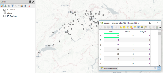
Survey data like the one described above is a common input for flow maps. There’s usually a point layer (here: “nodes”) that provides geographic information and a non-spatial layer (here: “edges”) that contains the information about the strength or weight of a flow between two specific nodes:

The first step therefore is to create the flow line features from the nodes and edges layers. To achieve our goal, we need to join both layers. Sounds like a job for SQL!

More specifically, this is a job for Virtual Layers: Layer | Add Layer | Add/Edit Virtual Layer

SELECT StartID, DestID, Weight, 
       make_line(a.geometry, b.geometry)
FROM edges
JOIN nodes a ON edges.StartID = a.ID
JOIN nodes b ON edges.DestID = b.ID
WHERE a.ID != b.ID 

This SQL query joins the geographic information from the nodes table to the flow weights in the edges table based on the node IDs. In the last line, there is a check that start and end node ID should be different in order to avoid zero-length lines.

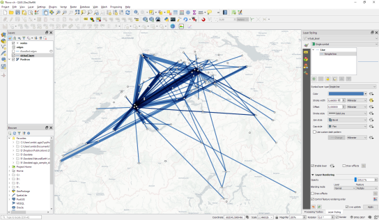
By styling the resulting flow lines using data-driven line width and adding in some feature blending, it’s possible to create some half decent maps:

However, we can definitely do better. Let’s throw in some curved arrows!

The arrow symbol layer type automatically creates curved arrows if the underlying line feature has three nodes that are not aligned on a straight line.

Therefore, to turn our straight lines into curved arrows, we need to add a third point to the line feature and it has to have an offset. This can be achieved using a geometry generator and the offset_curve() function:

make_line(
   start_point($geometry),
   centroid(
      offset_curve(
         $geometry, 
         length($geometry)/-5.0
      )
   ),
   end_point($geometry)
)

Additionally, to achieve the effect described in New style: flow map arrows, we extend the geometry generator to crop the lines at the beginning and end:

difference(
   difference(
      make_line(
         start_point($geometry),
         centroid(
            offset_curve(
               $geometry, 
               length($geometry)/-5.0
            )
         ),
	 end_point($geometry)
      ),
      buffer(start_point($geometry), 0.01)
   ),
   buffer(end_point( $geometry), 0.01)
)

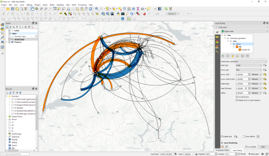
By applying data-driven arrow and arrow head sizes, we can transform the plain flow map above into a much more appealing map:

The two different arrow colors are another way to emphasize flow direction. In this case, orange arrows mark flows to the west, while blue flows point east.

CASE WHEN
 x(start_point($geometry)) - x(end_point($geometry)) < 0
THEN
 '#1f78b4'
ELSE
 '#ff7f00'
END

Conclusion

As you can see, virtual layers and geometry generators are a powerful combination. If you encounter performance problems with the virtual layer, it’s always possible to make it permanent by exporting it to a file. This will speed up any further visualization or analysis steps.

  • <<
  • Page 7 of 44 ( 874 posts )
  • >>
  • qgis

Back to Top

Sustaining Members