Related Plugins and Tags

QGIS Planet

Strategic partnership agreement between Oslandia and OpenGIS.ch on QField

Who are we?

🤔 For those unfamiliar with Oslandia, OpenGIS.ch, or even QGIS, let’s refresh your memory:

👉 Oslandia is a French company specializing in open-source Geographic Information Systems (GIS). Since our establishment in 2009, we have been providing consulting, development, and training services in GIS, with reknown expertise. Oslandia is a dedicated open-source player and the largest contributor to the QGIS solution in France.

👉 As for OPENGIS.ch, they are a Swiss company specializing in the development of open-source GIS software. Founded in 2011, OPENGIS.ch is the largest Swiss contributor to QGIS. OPENGIS.ch is the creator of QField, the most widely used open-source mobile GIS solution for geomatics professionals.

OPENGIS.ch also offers QFieldCloud as a SaaS or on-premise solution for collaborative field project management.

😲 Some may still be unfamiliar with #QGIS ?

It is a free and open-source Geographic Information System that allows creating, editing, visualizing, analyzing, and publicating geospatial data. QGIS is a cross-platform software that can be used on desktops, servers, as a web application, or as a development library.

QGIS is open-source software developed by multiple contributors worldwide. It is an official project of the OpenSource Geospatial Foundation (OSGeo) and is supported by the QGIS.org association. See https://qgis.org

A Partnership?

🎉 Today, we are delighted to announce our strategic partnership aimed at strengthening and promoting QField, the mobile application companion of QGIS Desktop.

🌟 This partnership between Oslandia and OPENGIS.ch is a significant step for QField and open-source mobile GIS solutions. It will consolidate the platform, providing users worldwide with simplified access to effective tools for collecting, managing, and analyzing geospatial data in the field.

📱 QField, developed by OPENGIS.ch, is an advanced open-source mobile application that enables GIS professionals to work efficiently in the field, using interactive maps, collecting real-time data, and managing complex geospatial projects on Android, iOS, or Windows mobile devices.

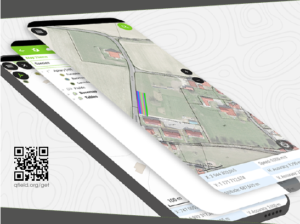
↔ QField is cross-platform, based on the QGIS engine, facilitating seamless project sharing between desktop, mobile, and web applications.

🕸 QFieldCloud (https://qfield.cloud), the collaborative web platform for QField project management, will also benefit from this partnership and will be enhanced to complement the range of tools within the QGIS platform.

Reactions

❤ At Oslandia, we are thrilled to collaborate with OPENGIS.ch on QGIS technologies. Oslandia shares with OPENGIS.ch a common vision of open-source software development: a strong involvement in development communities, work in respect with the ecosystem, an highly skilled expertise, and a commitment to industrial-quality, robust, and sustainable software development.

👩‍💻 With this partnership, we aim to offer our clients the highest expertise across all software components of the QGIS platform, from data capture to dissemination.

🤝 On the OpenGIS.ch side, Marco Bernasocchi adds:

The partnership with Oslandia represents a crucial step in our mission to provide leading mobile GIS tools with a genuine OpenSource credo. The complementarity of our skills will accelerate the development of QField and QFieldCloud and meet the growing needs of our users.

Commitment to open source

🙏 Both companies are committed to continue supporting and improving QField and QFieldCloud as open-source projects, ensuring universal access to this high-quality mobile GIS solution without vendor dependencies.

Ready for field mapping ?

🌏 And now, are you ready for the field?

So, download QField (https://qfield.org/get), create projects in QGIS, and share them on QFieldCloud!

✉ If you need training, support, maintenance, deployment, or specific feature development on these platforms, don’t hesitate to contact us. You will have access to the best experts available: [email protected].


Analyzing and visualizing large-scale fire events using QGIS processing with ST-DBSCAN

A while back, one of our ninjas added a new algorithm in QGIS’ processing toolbox named ST-DBSCAN Clustering, short for spatio temporal density-based spatial clustering of applications with noise. The algorithm regroups features falling within a user-defined maximum distance and time duration values.

This post will walk you through one practical use for the algorithm: large-scale fire event analysis and visualization through remote-sensed fire detection. More specifically, we will be looking into one of the larger fire events which occurred in Canada’s Quebec province in June 2023.

Fetching and preparing FIRMS data

NASA’s Fire Information for Resource Management System (FIRMS) offers a fantastic worldwide archive of all fire detected through three spaceborne sources: MODIS C6.1 with a resolution of roughly 1 kilometer as well as VIIRS S-NPP and VIIRS NOAA-20 with a resolution of 375 meters. Each detected fire is represented by a point that sits at the center of the source’s resolution grid.

Each source will cover the whole world several times per day. Since detection is impacted by atmospheric conditions, a given pass by one source might not be able to register an ongoing fire event. It’s therefore advisable to rely on more than one source.

To look into our fire event, we have chosen the two fire detection sources with higher resolution – VIIRS S-NPP and VIIRS NOAA-20 – covering the whole month of June 2023. The datasets were downloaded from FIRMS’ archive download page.

After downloading the two separate datasets, we combined them into one merged geopackage dataset using QGIS processing toolbox’s Merge Vector Layers algorithm. The merged dataset will be used to conduct the clustering analysis.

In addition, we will use QGIS’s field calculator to create a new Date & Time field named ACQ_DATE_TIME using the following expression:

to_datetime("ACQ_DATE" || "ACQ_TIME", 'yyyy-MM-ddhhmm')

This will allow us to calculate precise time differences between two dates.

Modeling and running the analysis

The large-scale fire event analysis requires running two distinct algorithms:

  • a spatiotemporal clustering of points to regroup fires into a series of events confined in space and time; and
  • an aggregation of the points within the identified clusters to provide additional information such as the beginning and end date of regrouped events.

This can be achieved through QGIS’ modeler to sequentially execute the ST-DBSCAN Clustering algorithm as well as the Aggregate algorithm against the output of the first algorithm.

The above-pictured model outputs two datasets. The first dataset contains single-part points of detected fires with attributes from the original VIIRS products as well as a pair of new attributes: the CLUSTER_ID provides a unique cluster identifier for each point, and the CLUSTER_SIZE represents the sum of points forming each unique cluster. The second dataset contains multi-part points clusters representing fire events with four attributes: CLUSTER_ID and CLUSTER_SIZE which were discussed above as well as DATE_START and DATE_END to identify the beginning and end time of a fire event.

In our specific example, we will run the model using the merged dataset we created above as the “fire points layer” and select ACQ_DATE_TIME as the “date field”. The outputs will be saved as separate layers within a geopackage file.

Note that the maximum distance (0.025 degrees) and duration (72 hours) settings to form clusters have been set in the model itself. This can be tweaked by editing the model.

Visualizing a specific fire event progression on a map

Once the model has provided its outputs, we are ready to start visualizing a fire event on a map. In this practical example, we will focus on detected fires around latitude 53.0960 and longitude -75.3395.

Using the multi-part points dataset, we can identify two clustered events (CLUSTER_ID 109 and 1285) within the month of June 2023. To help map canvas refresh responsiveness, we can filter both of our output layers to only show features with those two cluster identifiers using the following SQL syntax: CLUSTER_ID IN (109, 1285).

To show the progression of the fire event over time, we can use a data-defined property to graduate the marker fill of the single-part points dataset along a color ramp. To do so, open the layer’s styling panel, select the simple marker symbol layer, click on the data-defined property button next to the fill color and pick the Assistant menu item.

In the assistant panel, set the source expression to the following: day(age(to_date('2023-07-01'),”ACQ_DATE_TIME”)). This will give us the number of days between a given point and an arbitrary reference date (2023-07-01 here). Set the values range from 0 to 30 and pick a color ramp of your choice.

When applying this style, the resulting map will provide a visual representation of the spread of the fire event over time.

Having identified a fire event via clustering easily allows for identification of the “starting point” of a fire by searching for the earliest fire detected amongst the thousands of points. This crucial bit of analysis can help better understand the cause of the fire, and alongside the color grading of neighboring points, its directionality as it expanded over time.

Analyzing a fire event through histogram

Through QGIS’ DataPlotly plugin, it is possible to create an histogram of fire events. After installing the plugin, we can open the DataPlotly panel and configure our histogram.

Set the plot type to histogram and pick the model’s single-part points dataset as the layer to gather data from. Make sure that the layer has been filtered to only show a single fire event. Then, set the X field to the following layer attribute: “ACQ_DATE”.

You can then hit the Create Plot button, go grab a coffee, and enjoy the resulting histogram which will appear after a minute or so.

While not perfect, an histogram can quickly provide a good sense of a fire event’s “peak” over a period of time.

Comparing geographic data analysis in R and Python

Today, I want to point out a blog post over at

https://geocompx.org/post/2023/ogh23/

written together with my fellow “Geocomputation with Python” co-authors Robin Lovelace, Michael Dorman, and Jakub Nowosad.

In this blog post, we talk about our experience teaching R and Python for geocomputation. The context of this blog post is the OpenGeoHub Summer School 2023 which has courses on R, Python and Julia. The focus of the blog post is on geographic vector data, meaning points, lines, polygons (and their ‘multi’ variants) and the attributes associated with them. We plan to cover raster data in a future post.

I’ve archived my Tweets: Goodbye Twitter, Hello Mastodon

Today, Jeff Sikes @[email protected], alerted me to the fact that “Twitter has removed all media attachments from 2014 and prior” (source: https://firefish.social/notes/9imgvtckzqffboxt). So far, it seems unclear whether this was intentional or a system failure (source: https://mas.to/@carnage4life/110922114407553901).

Since I’ve been on Twitter since 2011, this means that some media files are now lost. While the loss of a few low-res images is probably not a major loss for humanity, I would prefer to have some control over when and how content I created vanishes. So, to avoid losing more content, I have followed Jeff’s recommendation to create a proper archival page:

https://anitagraser.github.io/twitter-archive/

It is based on an export I pulled in October 2022 when I started to use Mastodon as my primary social media account. Unfortunately, this export did not include media files.

To follow me in the future, find me on:

https://fosstodon.org/@underdarkGIS

Btw, a recent study published on Nature News shows that Mastodon is the top-ranking Twitter replacement for scientists.

To find other interesting people on Mastodon, there are many useful tools and lists, including, for example:


Update 2023-11-04: I’ve completely deleted my X / Twitter account. If you find any account pretending they are me on that platform, it’s an impostor.

QField 2.8: Boosting field work through external sensors

The latest version of QField is out, featuring as its main new feature sensor handling alongside the usual round of user experience and stability improvements. We simply can’t wait to see the sensor uses you will come up with!

The main highlight: sensors

QField 2.8 ships with out-of-the-box handling of external sensor streams over TCP, UDP, and serial port. The functionality allows for data captured through instruments – such as geiger counter, decibel sensor, CO detector, etc. – to be visualized and manipulated within QField itself.

Things get really interesting when sensor data is utilized as default values alongside positioning during the digitizing of features. You are always one tap away from adding a point locked onto your current position with spatially paired sensor readings saved as point attribute(s).

Not wowed yet? Try pairing sensor readings with QField’s tracking capability! 😉 Head over QField’s documentation on this as well as QGIS’ section on sensor management to know more.

The development of this feature involved the addition of a sensor framework in upstream QGIS which will be available by the end of this coming June as part of the 3.32 release. This is a great example of the synergy between QField and its big brother QGIS, whereas development of new functionality often benefits the broader QGIS community. Big thanks to Sevenson Environmental Services for sponsoring this exciting capability.

Notable improvements

A couple of refinements during this development cycle are worth mentioning. If you ever wished for QField to directly open a selected project or reloading the last session on app launch, you’ll be happy to know this is now possible.

For heavy users of value relations in their feature forms, QField is now a tiny bit more clever when displaying string searches against long lists, placing hits that begin with the matched string first as well as visually highlighting matches within the result list itself.

Finally, feature lists throughout QField are now sorted. By default, it will sort by the display field or expression defined for each vector layer, unless an advanced sorting has been defined in a given vector layer’s attribute table. It makes browsing through lists feel that much more natural.

How to use Kaggle’s Taxi Trajectory Data in MovingPandas

Kaggle’s “Taxi Trajectory Data from ECML/PKDD 15: Taxi Trip Time Prediction (II) Competition” is one of the most used mobility / vehicle trajectory datasets in computer science. However, in contrast to other similar datasets, Kaggle’s taxi trajectories are provided in a format that is not readily usable in MovingPandas since the spatiotemporal information is provided as:

  • TIMESTAMP: (integer) Unix Timestamp (in seconds). It identifies the trip’s start;
  • POLYLINE: (String): It contains a list of GPS coordinates (i.e. WGS84 format) mapped as a string. The beginning and the end of the string are identified with brackets (i.e. [ and ], respectively). Each pair of coordinates is also identified by the same brackets as [LONGITUDE, LATITUDE]. This list contains one pair of coordinates for each 15 seconds of trip. The last list item corresponds to the trip’s destination while the first one represents its start;

Therefore, we need to create a DataFrame with one point + timestamp per row before we can use MovingPandas to create Trajectories and analyze them.

But first things first. Let’s download the dataset:

import datetime
import pandas as pd
import geopandas as gpd
import movingpandas as mpd
import opendatasets as od
from os.path import exists
from shapely.geometry import Point

input_file_path = 'taxi-trajectory/train.csv'

def get_porto_taxi_from_kaggle():
    if not exists(input_file_path):
        od.download("https://www.kaggle.com/datasets/crailtap/taxi-trajectory")

get_porto_taxi_from_kaggle()
df = pd.read_csv(input_file_path, nrows=10, usecols=['TRIP_ID', 'TAXI_ID', 'TIMESTAMP', 'MISSING_DATA', 'POLYLINE'])
df.POLYLINE = df.POLYLINE.apply(eval)  # string to list
df

And now for the remodelling:

def unixtime_to_datetime(unix_time):
    return datetime.datetime.fromtimestamp(unix_time)

def compute_datetime(row):
    unix_time = row['TIMESTAMP']
    offset = row['running_number'] * datetime.timedelta(seconds=15)
    return unixtime_to_datetime(unix_time) + offset

def create_point(xy):
    try: 
        return Point(xy)
    except TypeError:  # when there are nan values in the input data
        return None
 
new_df = df.explode('POLYLINE')
new_df['geometry'] = new_df['POLYLINE'].apply(create_point)
new_df['running_number'] = new_df.groupby('TRIP_ID').cumcount()
new_df['datetime'] = new_df.apply(compute_datetime, axis=1)
new_df.drop(columns=['POLYLINE', 'TIMESTAMP', 'running_number'], inplace=True)
new_df

And that’s it. Now we can create the trajectories:

trajs = mpd.TrajectoryCollection(
    gpd.GeoDataFrame(new_df, crs=4326), 
    traj_id_col='TRIP_ID', obj_id_col='TAXI_ID', t='datetime')
trajs.hvplot(title='Kaggle Taxi Trajectory Data', tiles='CartoLight')

That’s it. Now our MovingPandas.TrajectoryCollection is ready for further analysis.

By the way, the plot above illustrates a new feature in the recent MovingPandas 0.16 release which, among other features, introduced plots with arrow markers that show the movement direction. Other new features include a completely new custom distance, speed, and acceleration unit support. This means that, for example, instead of always getting speed in meters per second, you can now specify your desired output units, including km/h, mph, or nm/h (knots).


This post is part of a series. Read more about movement data in GIS.

Capturing more while in the field with the new QField 2.7

A brand new version of QField has been released, packed with features that will make you fall in love with this essential open source tool all over again with a focus on capturing more while you are in the field. QField 2.7 nicknamed “Heroic Hedgehog” also includes a number of worthy fixes making it a crucial update to get.

New recording capabilities

The highlight of QField 2.7 is the new audio and video recording capability straight from the feature form. In addition to preexisting still photo capture, this functionality allows for video motion and audio clips to be added as attachments to feature attributes.

The audio recording capability can come in handy in the field when typing on a keyboard-less device can be challenging. Simply record an audio note of observations to process later.

The experience wouldn’t be complete without audio and video playback support, which we took care of in this version too. Playback of such media content within the feature form gives an immediate feedback and saves time. For those interested in full screen immersion, simply click on the video frame to open the attached in your favorite media player. We also took the opportunity to implement audio and video playback on QGIS so people can easily consume the fruits of their labor in the field at their workstation.

We would be remiss if we didn’t mention map canvas rotation functionality added in this version. This is a long-requested functionality which we are happy to have packed into QField now. Pro-tip: when positioning is enabled, double tapping on the lower-left positioning button will have the map canvas follow both the device’s current location as well as the compass orientation.

Finally – some would argue “most importantly” 😉 – QField is now equipped with a beautiful dark theme which users can activate in the settings panel. By default on Android and iOS, QField will follow the system’s dark theme setting. In addition to the new color scheme, users can also adjust the user interface font size.

Big thanks to Deutsches Archäologisches Institut who funded the majority of the new features in this release cycle. Their investment in making QField the perfect tool for them has benefited the community as a whole.

A ton of bug fixing across all platforms

Important stability improvements and fixes to serious issues are also part of this release. Noteworthy fixes include WFS layer support on iOS, much better Bluetooth connectivity on Android, and vertical grid improvement on Windows.

For users facing reliability issues with the native camera on Android, we have spent time supersizing the camera we ship within QField itself. During this development cycle, it has gained zoom and flash controls, as well as a ton of usability improvements, including geo-tagging.

To know more about this release, read the full change log on QField’s github release page.

Deep learning from trajectory data

I’ve previously written about Movement data in GIS and the AI hype and today’s post is a follow-up in which I want to share with you a new review of the state of the art in deep learning from trajectory data.

Our review covers 8 use cases:

  1. Location classification
  2. Arrival time prediction
  3. Traffic flow / activity prediction
  4. Trajectory prediction
  5. Trajectory classification
  6. Next location prediction
  7. Anomaly detection
  8. Synthetic data generation

We particularly looked into the trajectory data preprocessing steps and the specific movement data representation used as input to train the neutral networks:

On a completely subjective note: the price for most surprising approach goes to natural language processing (NLP) Transfomers for traffic volume prediction.

The paper was presented at BMDA2023 and you can watch the full talk recording here:

References

Graser, A., Jalali, A., Lampert, J., Weißenfeld, A., & Janowicz, K. (2023). Deep Learning From Trajectory Data: a Review of Neural Networks and the Trajectory Data Representations to Train Them. Workshop on Big Mobility Data Analysis BMDA2023 in conjunction with EDBT/ICDT 2023.


This post is part of a series. Read more about movement data in GIS.

Tracking geoprocessing workflows with QGIS & DVC

Today’s post is a geeky deep dive into how to leverage DVC (not just) data version control to track QGIS geoprocessing workflows.

“Why is this great?” you may ask.

DVC tracks data, parameters, and code. If anything changes, we simply rerun the process and DVC will figure out which stages need to be recomputed and which can be skipped by re-using cached results.

This can lead to huge time savings compared to re-running the whole model

You can find the source code used in this post on my repo https://github.com/anitagraser/QGIS-resources/tree/dvc

I’m using DVC with the DVC plugin for VSCode but DVC can be used completely from the command line, if you prefer this appraoch.

Basically, what follows is a proof of concept: converting a QGIS Processing model to a DVC workflow. In the following screenshot, you can see the main stages

  1. The QGIS model in the upper left corner
  2. The Python script exported from the QGIS model builder in the lower left corner
  3. The DVC stages in my dvc.yaml file in the upper right corner (And please ignore the hello world stage. It’s a left over from my first experiment)
  4. The DVC DAG visualizing the sequence of stages. Looks similar to the QGIS model, doesn’t it ;-)

Besides the stage definitions in dvc.yaml, there’s a parameters file:

random-points:
  n: 10
buffer-points:
  size: 0.5

And, of course, the two stages, each as it’s own Python script.

First, random-points.py which reads the random-points.n parameter to create the desired number of points within the polygon defined in qgis3/data/test.geojson:

import dvc.api

from qgis.core import QgsVectorLayer
from processing.core.Processing import Processing
import processing

Processing.initialize()

params = dvc.api.params_show()
pts_n = params['random-points']['n']

input_vector = QgsVectorLayer("qgis3/data/test.geojson")
output_filename = "qgis3/output/random-points.geojson"

alg_params = {
    'INCLUDE_POLYGON_ATTRIBUTES': True,
    'INPUT': input_vector,
    'MAX_TRIES_PER_POINT': 10,
    'MIN_DISTANCE': 0,
    'MIN_DISTANCE_GLOBAL': 0,
    'POINTS_NUMBER': pts_n,
    'SEED': None,
    'OUTPUT': output_filename
}
processing.run('native:randompointsinpolygons', alg_params)

And second, buffer-points.py which reads the buffer-points.size parameter to buffer the previously generated points:

import dvc.api
import geopandas as gpd
import matplotlib.pyplot as plt

from qgis.core import QgsVectorLayer
from processing.core.Processing import Processing
import processing

Processing.initialize()

params = dvc.api.params_show()
buffer_size = params['buffer-points']['size']

input_vector = QgsVectorLayer("qgis3/output/random-points.geojson")
output_filename = "qgis3/output/buffered-points.geojson"

alg_params = {
    'DISSOLVE': False,
    'DISTANCE': buffer_size,
    'END_CAP_STYLE': 0,  # Round
    'INPUT': input_vector,
    'JOIN_STYLE': 0,  # Round
    'MITER_LIMIT': 2,
    'SEGMENTS': 5,
    'OUTPUT': output_filename
}
processing.run('native:buffer', alg_params)

gdf = gpd.read_file(output_filename)
gdf.plot()

plt.savefig('qgis3/output/buffered-points.png')

With these things in place, we can use dvc to run the workflow, either from within VSCode or from the command line. Here, you can see the workflow (and how dvc skips stages and fetches results from cache) in action:

If you try it out yourself, let me know what you think.

Visualizing trajectories with QGIS & MobilityDB

In the previous post, we — creatively ;-) — used MobilityDB to visualize stationary IOT sensor measurements.

This post covers the more obvious use case of visualizing trajectories. Thus bringing together the MobilityDB trajectories created in Detecting close encounters using MobilityDB 1.0 and visualization using Temporal Controller.

Like in the previous post, the valueAtTimestamp function does the heavy lifting. This time, we also apply it to the geometry time series column called trip:

SELECT mmsi,
    valueAtTimestamp(trip, '2017-05-07 08:55:40') geom,
    valueAtTimestamp(SOG, '2017-05-07 08:55:40') SOG
FROM "public"."ships"

Using this SQL query, we again set up a — not yet Temporal Controller-controlled — QueryLayer.

To configure Temporal Controller to update the timestamp in our SQL query, we again need to run the Python script from the previous post.

With this done, we are all set up to animate and explore the movement patterns in our dataset:


This post is part of a series. Read more about movement data in GIS.

Visualizing IOT time series with QGIS & MobilityDB

Today’s post presents an experiment in modelling a common scenario in many IOT setups: time series of measurements at stationary sensors. The key idea I want to explore is to use MobilityDB’s temporal data types, in particular the tfloat_inst and tfloat_seq for instances and sequences of temporal float values, respectively.

For info on how to set up MobilityDB, please check my previous post.

Setting up our DB tables

As a toy example, let’s create two IOT devices (in table iot_devices) with three measurements each (in table iot_measurements) and join them to create the tfloat_seq (in table iot_joined):

CREATE TABLE iot_devices (
    id integer,
    geom geometry(Point, 4326)
);

INSERT INTO iot_devices (id, geom) VALUES
(1, ST_SetSRID(ST_MakePoint(1,1), 4326)),
(2, ST_SetSRID(ST_MakePoint(2,3), 4326));

CREATE TABLE iot_measurements (
    device_id integer,
    t timestamp,
    measurement float
);

INSERT INTO iot_measurements (device_id, t, measurement) VALUES
(1, '2022-10-01 12:00:00', 5.0),
(1, '2022-10-01 12:01:00', 6.0),
(1, '2022-10-01 12:02:00', 10.0),
(2, '2022-10-01 12:00:00', 9.0),
(2, '2022-10-01 12:01:00', 6.0),
(2, '2022-10-01 12:02:00', 1.5);

CREATE TABLE iot_joined AS
SELECT 
    dev.id, 
    dev.geom, 
    tfloat_seq(array_agg(
        tfloat_inst(m.measurement, m.t) ORDER BY t
    )) measurements
FROM iot_devices dev 
JOIN iot_measurements m
  ON dev.id = m.device_id
GROUP BY dev.id, dev.geom;

We can load the resulting layer in QGIS but QGIS won’t be happy about the measurements column because it does not recognize its data type:

Query layer with valueAtTimestamp

Instead, what we can do is create a query layer that fetches the measurement value at a specific timestamp:

SELECT id, geom, 
    valueAtTimestamp(measurements, '2022-10-01 12:02:00') 
FROM iot_joined

Which gives us a layer that QGIS is happy with:

Time for TemporalController

Now the tricky question is: how can we wire our query layer to the Temporal Controller so that we can control the timestamp and animate the layer?

I don’t have a GUI solution yet but here’s a way to do it with PyQGIS: whenever the Temporal Controller signal updateTemporalRange is emitted, our update_query_layer function gets the current time frame start time and replaces the datetime in the query layer’s data source with the current time:

l = iface.activeLayer()
tc = iface.mapCanvas().temporalController()

def update_query_layer():
    tct = tc.dateTimeRangeForFrameNumber(tc.currentFrameNumber()).begin().toPyDateTime()
    s = l.source()
    new = re.sub(r"(\d{4})-(\d{2})-(\d{2}) (\d{2}):(\d{2}):(\d{2})", str(tct), s)
    l.setDataSource(new, l.sourceName(), l.dataProvider().name())

tc.updateTemporalRange.connect(update_query_layer)

Future experiments will have to show how this approach performs on lager datasets but it’s exciting to see how MobilityDB’s temporal types may be visualized in QGIS without having to create tables/views that join a geometry to each and every individual measurement.

Detecting close encounters using MobilityDB 1.0

It’s been a while since we last talked about MobilityDB in 2019 and 2020. Since then, the project has come a long way. It joined OSGeo as a community project and formed a first PSC, including the project founders Mahmoud Sakr and Esteban Zimányi as well as Vicky Vergara (of pgRouting fame) and yours truly.

This post is a quick teaser tutorial from zero to computing closest points of approach (CPAs) between trajectories using MobilityDB.

Setting up MobilityDB with Docker

The easiest way to get started with MobilityDB is to use the ready-made Docker container provided by the project. I’m using Docker and WSL (Windows Subsystem Linux on Windows 10) here. Installing WLS/Docker is out of scope of this post. Please refer to the official documentation for your operating system.

Once Docker is ready, we can pull the official container and fire it up:

docker pull mobilitydb/mobilitydb
docker volume create mobilitydb_data
docker run --name "mobilitydb" -d -p 25432:5432 -v mobilitydb_data:/var/lib/postgresql mobilitydb/mobilitydb
psql -h localhost -p 25432 -d mobilitydb -U docker

Currently, the container provides PostGIS 3.2 and MobilityDB 1.0:

Loading movement data into MobilityDB

Once the container is running, we can already connect to it from QGIS. This is my preferred way to load data into MobilityDB because we can simply drag-and-drop any timestamped point layer into the database:

For this post, I’m using an AIS data sample in the region of Gothenburg, Sweden.

After loading this data into a new table called ais, it is necessary to remove duplicate and convert timestamps:

CREATE TABLE AISInputFiltered AS
SELECT DISTINCT ON("MMSI","Timestamp") *
FROM ais;

ALTER TABLE AISInputFiltered ADD COLUMN t timestamp;
UPDATE AISInputFiltered SET t = "Timestamp"::timestamp;

Afterwards, we can create the MobilityDB trajectories:

CREATE TABLE Ships AS
SELECT "MMSI" mmsi,
tgeompoint_seq(array_agg(tgeompoint_inst(Geom, t) ORDER BY t)) AS Trip,
tfloat_seq(array_agg(tfloat_inst("SOG", t) ORDER BY t) FILTER (WHERE "SOG" IS NOT NULL) ) AS SOG,
tfloat_seq(array_agg(tfloat_inst("COG", t) ORDER BY t) FILTER (WHERE "COG" IS NOT NULL) ) AS COG
FROM AISInputFiltered
GROUP BY "MMSI";

ALTER TABLE Ships ADD COLUMN Traj geometry;
UPDATE Ships SET Traj = trajectory(Trip);

Once this is done, we can load the resulting Ships layer and the trajectories will be loaded as lines:

Computing closest points of approach

To compute the closest point of approach between two moving objects, MobilityDB provides a shortestLine function. To be correct, this function computes the line connecting the nearest approach point between the two tgeompoint_seq. In addition, we can use the time-weighted average function twavg to compute representative average movement speeds and eliminate stationary or very slowly moving objects:

SELECT S1.MMSI mmsi1, S2.MMSI mmsi2, 
       shortestLine(S1.trip, S2.trip) Approach,
       ST_Length(shortestLine(S1.trip, S2.trip)) distance
FROM Ships S1, Ships S2
WHERE S1.MMSI > S2.MMSI AND
twavg(S1.SOG) > 1 AND twavg(S2.SOG) > 1 AND
dwithin(S1.trip, S2.trip, 0.003)

In the QGIS Browser panel, we can right-click the MobilityDB connection to bring up an SQL input using Execute SQL:

The resulting query layer shows where moving objects get close to each other:

To better see what’s going on, we’ll look at individual CPAs:

Having a closer look with the Temporal Controller

Since our filtered AIS layer has proper timestamps, we can animate it using the Temporal Controller. This enables us to replay the movement and see what was going on in a certain time frame.

I let the animation run and stopped it once I spotted a close encounter. Looking at the AIS points and the shortest line, we can see that MobilityDB computed the CPAs along the trajectories:

A more targeted way to investigate a specific CPA is to use the Temporal Controllers’ fixed temporal range mode to jump to a specific time frame. This is helpful if we already know the time frame we are interested in. For the CPA use case, this means that we can look up the timestamp of a nearby AIS position and set up the Temporal Controller accordingly:

More

I hope you enjoyed this quick dive into MobilityDB. For more details, including talks by the project founders, check out the project website.


This post is part of a series. Read more about movement data in GIS.

Forget label buffers! Better maps with selective label masks in QGIS

Cartographers use all kind of tricks to make their maps look deceptively simple. Yet, anyone who has ever tried to reproduce a cartographer’s design using only automatic GIS styling and labeling knows that the devil is in the details.

This post was motivated by Mika Hall’s retro map style.

There are a lot of things going on in this design but I want to draw your attention to the labels – and particularly their background:

Detail of Mike’s map (c) Mike Hall. You can see that the rail lines stop right before they would touch the A in Valencia (or any other letters in the surrounding labels).

This kind of effect cannot be achieved by good old label buffers because no matter which color we choose for the buffer, there will always be cases when the chosen color is not ideal, for example, when some labels are on land and some over water:

Ordinary label buffers are not always ideal.

Label masks to the rescue!

Selective label masks enable more advanced designs.

Here’s how it’s done:

Selective masking has actually been around since QGIS 3.12. There are two things we need to take care of when setting up label masks:

1. First we need to enable masks in the label settings for all labels we want to mask (for example the city labels). The mask tab is conveniently located right next to the label buffer tab:

2. Then we can go to the layers we want to apply the masks to (for example the railroads layer). Here we can configure which symbol layers should be affected by which mask:

Note: The order of steps is important here since the “Mask sources” list will be empty as long as we don’t have any label masks enabled and there is currently no help text explaining this fact.

I’m also using label masks to keep the inside of the large city markers (the ones with a star inside a circle) clear of visual clutter. In short, I’m putting a circle-shaped character, such as ◍, over the city location:

In the text tab, we can specify our one-character label and – later on – set the label opacity to zero.
To ensure that the label stays in place, pick the center placement in “Offset from Point” mode.

Once we are happy with the size and placement of this label, we can then reduce the label’s opacity to 0, enable masks, and configure the railroads layer to use this mask.

As a general rule of thumb, it makes sense to apply the masks to dark background features such as the railways, rivers, and lake outlines in our map design:

Resulting map with label masks applied to multiple labels including city and marine area labels masking out railway lines and ferry connections as well as rivers and lake outlines.

If you have never used label masks before, I strongly encourage you to give them a try next time you work on a map for public consumption because they provide this little extra touch that is often missing from GIS maps.

Happy QGISing! Make maps not war.

Official Austrian basemap and cadastre vector tiles

The BEV (Austrian Bundesamt für Eich- und Vermessungswesen) has recently published the Austrian cadastre as open data:

The URLs for vector tiles and styles can be found on https://kataster.bev.gv.at under Guide – External

The vector tile URL is:

https://kataster.bev.gv.at/tiles/{kataster | symbole}/{z}/{x}/{y}.pbf

There are 4 different style variations:

https://kataster.bev.gv.at/styles/{kataster | symbole}/style_{vermv | ortho | basic | gis}.json

When configuring the vector tiles in QGIS, we specify the desired tile and style URLs, for example:

For example, this is the “gis” style:

And this is the “basic” style:

The second vector tile source I want to mention is basemap.at. It has been around for a while, however, early versions suffered from a couple of issues that have now been resolved.

The basemap.at project provides extensive documentation on how to use the dataset in QGIS and other GIS, including manuals and sample projects:

Here’s the basic configuration: make sure to set the max zoom level to 16, otherwise, the map will not be rendered when you zoom in too far.

The level of detail is pretty impressive, even if it cannot quite keep up with the basemap raster tiles:

Vector tile details at Resselpark, Vienna
Raster basemap details at Resselpark, Vienna

Building an interactive app with geocoding in Jupyter Lab

This post aims to show you how to create quick interactive apps for prototyping and data exploration using Panel.

Specifically, the following example demos how to add geocoding functionality based on Geopy and Nominatim. As such, this example brings together tools we’ve previously touched on in Super-quick interactive data & parameter exploration and Geocoding with Geopy.

Here’s a quick preview of the resulting app in action:

To create this app, I defined a single function called my_plot which takes the address and desired buffer size as input parameters. Using Panel’s interact and servable methods, I’m then turning this function into the interactive app you’ve seen above:

import panel as pn
from geopy.geocoders import Nominatim
from utils.converting import location_to_gdf
from utils.plotting import hvplot_with_buffer

locator = Nominatim(user_agent="OGD.AT-Lab")

def my_plot(user_input="Giefinggasse 2, 1210 Wien", buffer_meters=1000):
    location = locator.geocode(user_input)
    geocoded_gdf = location_to_gdf(location, user_input)
    map_plot = hvplot_with_buffer(geocoded_gdf, buffer_meters, 
                                  title=f'Geocoded address with {buffer_meters}m buffer')
    return map_plot.opts(active_tools=['wheel_zoom']) 

kw = dict(user_input="Giefinggasse 2, 1210 Wien", buffer_meters=(0,10000))

pn.template.FastListTemplate(
    site="Panel", title="Geocoding Demo", 
    main=[pn.interact(my_plot, **kw)]
).servable();

You can find the full notebook in the OGD.AT Lab repository or run this notebook directly on MyBinder:

To open the Panel preview, press the green Panel button in the Jupyter Lab toolbar:

I really enjoy building spatial data exploration apps this way, because I can start off with a Jupyter notebook and – once I’m happy with the functionality – turn it into a pretty app that provides a user-friendly exterior and hides the underlying complexity that might scare away stakeholders.

Give it a try and share your own adventures. I’d love to see what you come up with.

GRASS GIS 8.2.0 released

The 8.2.0 release of GRASS GIS is now available with results from the GSoC 2021 and many other additions. A new grass.jupyter package is now included for interacting with Jupyter notebooks. Single window graphical user interface is available in GUI settings. r.series and three other modules are newly parallelized. Additionally, the release includes a series […]

The post GRASS GIS 8.2.0 released appeared first on Markus Neteler Consulting.

Dynamic Infographic Map Tutorial

This is a guest post by Mickael HOARAU @Oneil974

As an update of the tutorial from previous years, I created a tutorial showing how to make a simple and dynamic color map with charts in QGIS.

In this tutorial you can see some of interesting features of QGIS and its community plugins. Here you’ll see variables, expressions, filters, QuickOSM and DataPlotly plugins and much more. You just need to use QGIS 3.24 Tisler version.

Here is the tutorial.

New OGC Moving Features JSON support in MovingPandas

First time, we talked about the OGC Moving Features standard in a post from 2017. Back then, we looked at the proposed standard way to encode trajectories in CSV and discussed its issues. Since then, the Moving Features working group at OGC has not been idle. Besides the CSV and XML encodings, they have designed a new JSON encoding that addresses many of the downsides of the previous two. You can read more about this in our 2020 preprint “From Simple Features to Moving Features and Beyond”.

Basically Moving Features JSON (MF-JSON) is heavily inspired by GeoJSON and it comes with a bunch of mandatory and optional key/value pairs. There is support for static properties as well as dynamic temporal properties and, of course, temporal geometries (yes geometries, not just points).

I think this format may have an actual chance of gaining more widespread adoption.

Image source: http://www.opengis.net/doc/BP/mf-json/1.0

Inspired by Pandas.read_csv() and GeoPandas.read_file(), I’ve started implementing a read_mf_json() function in MovingPandas. So far, it supports basic MovingFeature JSONs with MovingPoint geometry:

You’ll need to use the current development version to test this feature.

Next steps will be MovingFeatureCollection JSONs and support for static as well as temporal properties. We’ll have to see if MovingPandas can be extended to go beyond moving point geometries. Storing moving linestrings and polygons in the GeoDataFrame will be the simple part but analytics and visualization will certainly be more tricky.


This post is part of a series. Read more about movement data in GIS.

GRASS GIS 8.0.0 released! Finally…

Overview of changes After more than 3 year of development the first stable release GRASS GIS 8.0.0 is available. Efforts have concentrated on making the user experience even better, providing many new useful additional functionalities to modules and further improving the graphical user interface. Breaking news: new graphical user interface with entirely rewritten startup sequence! […]

The post GRASS GIS 8.0.0 released! Finally… appeared first on Markus Neteler Consulting.

GRASS GIS 8.0.0RC2 released

Overview of changes

After more than 3 year of development the first stable release GRASS GIS 8.0.0 is available. Efforts have concentrated on making the user experience even better, providing many new useful additional functionalities to modules and further improving the graphical user interface.

Breaking news: new graphical user interface with entirely rewritten startup sequence!

This re-establishes user experience compatibility with QGIS and other connected software packages.

The GRASS GIS 8.0.0 release provides more than 1,300 fixes and improvements with respect to the release 7.8.6.

With the introduction of the semantic label raster metadata class, the temporal database was modified to version 3. Hence, to be able to read and process GRASS 7.x space-time datasets, users will be prompted to run t.upgrade. If users want to read newly created space-time datasets back in GRASS 7.x, they can run t.downgrade.

Launching the software

The user experience of the graphical user interface has been completely rewritten: no more clumsy selection screens – just enter the menu system directly!

And on command line, GRASS GIS now starts versionless, i.e. as grass.

Download and detailed list of changes

See https://github.com/OSGeo/grass/releases/tag/8.0.0RC2

Thanks to all contributors!

GRASS GIS 8.0.0RC2 contributors

The post GRASS GIS 8.0.0RC2 released appeared first on Markus Neteler Consulting.

  • <<
  • Page 2 of 14 ( 278 posts )
  • >>
  • gis

Back to Top

Sustaining Members