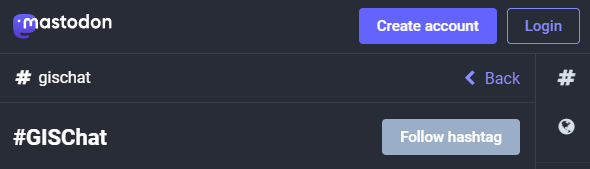
Besides following hashtags, such as #GISChat, #QGIS, #OpenStreetMap, #FOSS4G, and #OSGeo, curating good lists is probably the best way to stay up to date with geospatial developments.
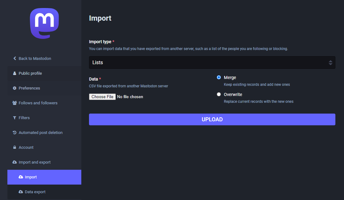
To get you started (or to potentially enrich your existing lists), I thought I’d share my Geospatial and SpatialDataScience lists with you. And the best thing: you don’t need to go through all the >150 entries manually! Instead, go to your Mastodon account settings and under “Import and export” you’ll find a tool to import and merge my list.csv with your lists:
And if you are not following the geospatial hashtags yet, you can search or click on the hashtags you’re interested in and start following to get all tagged posts into your timeline:
The launch of QField 3.0 was a big deal, but now we’re back to focusing on smaller, more frequent updates. Don’t let the shorter change log for 3.1 trick you – there are lots of cool new features in this update!
Main highlights
One of the main improvements in this release is the brand-new functionality to enable snapping to common angles while digitizing. When enabled, the coordinate cursor will snap to configured angles alongside a visual guideline. This comes in handy when adding new geometries while surveying features with regular angles (e.g. buildings, parking lots, etc.). As QField gets more digitizing functionalities, we’ve taken the time to implement a nifty UI that collapses digitizing toggle buttons into a drawer, leaving extra space for the map canvas to shine through.
In addition, the vertex editor – one of QField’s most advanced geometry tools – received tons of love during this development cycle, focusing on improving its usability. Changes worth mentioning include:
A new undo button allows users to revert individual vertex manipulations in case of mistaken adjustment, which can save you from having to cancel a large set of ongoing manipulations;
The possibility to select vertices using finger tapping on the screen, dramatically improving the user experience;
Clearer on-screen markers to represent vertices and
Tons of bug fixes to the vertex editor itself, as well as the broader set of geometry tools.
It is now possible to lock the geometry of individual features within a single vector layer. While QField has long supported the concept of a locked geometry state for vector layers, that was until now a layer-wide toggle. With the new version of QField, a data-defined property can dictate whether a given feature geometry can be edited. Interested in geofenced geometry editing? We’ve got you covered This functionality requires the latest version of QFieldSync, which is available through QGIS’ plugin manager.
Noticeably improvements
Permission handling has been improved across all platforms. On Android, QField now delays the permission request for camera, microphone, location, and Bluetooth access until needed. This makes for a much friendlier user experience.
QField 3.0 was one of the largest releases, with major changes in its underlying libraries, including a migration to Qt 6. With the community’s help, we have spent countless hours testing before release. However, it is never a bulletproof process, and that version came with a few noticeable regressions. In particular, camera handling on Android suffered from upstream issues with Qt. We’ve tracked as many of those as possible, making this new version much more stable. One lingering camera issue remains and will be fixed upstream in the next three weeks; we’ll update as soon as it is available.
Finally, long-time users of QField will notice improvements in how geometry highlights and digitizing rubber bands are drawn. We’ve doubled down on efforts to ensure that the digitized geometries and the coordinate cursor itself are always clearly visible, whether overlaid against the canvas’s light or dark parts.
We want to extend a heartfelt thank you to our sponsors for their generous support. If you’re inspired by the developments in QField and want to contribute, please consider donating. Your support will help us continue to innovate and improve this tool for everyone’s benefit.
The GRASS GIS Annual Report for 2023 highlights a year of significant achievements and developments in the GRASS GIS project, which celebrated its 40th anniversary. Here’s a summary of the report: Community Meeting: The GRASS GIS Community Meeting was held in June at the Czech Technical University in Prague, bringing together a diverse group of […]
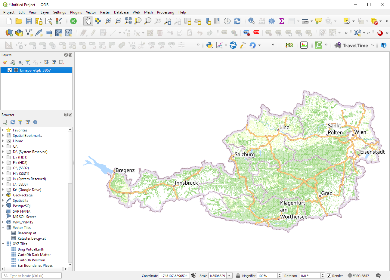
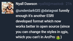
ESRI vector tile packages (VTPK files) can now be opened directly as vector tile layers via drag and drop, including support for style translation.
This is great news, particularly for users from Austria, since this makes it possible to use the open government basemap.at vector tiles directly, without any fuss:
In this post, Jakub Nowosad introduces our book “Geocomputation with Python”, also known as geocompy. It is an open-source book on geographic data analysis with Python, written by Michael Dorman, Jakub Nowosad, Robin Lovelace, and me with contributions from others. You can find it online at https://py.geocompx.org/
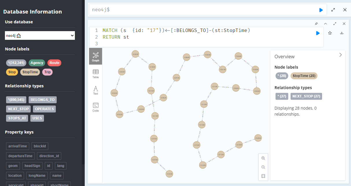
A prime example, are the relationships between GTFS StopTime and Trip nodes. For example, this is the Cypher query to get all StopTime nodes of Trip 17:
MATCH
    (t:Trip  {id: "17"})
    <-[:BELONGS_TO]-
    (st:StopTime)
RETURN st
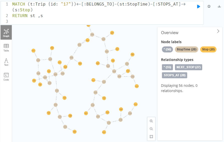
To get the stop locations, we also need to get the stop nodes:
MATCH
    (t:Trip {id: "17"})
    <-[:BELONGS_TO]-
    (st:StopTime)
    -[:STOPS_AT]->
    (s:Stop)
RETURN st ,s
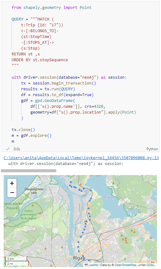
Adapting our code from the previous post, we can plot the stops:
from shapely.geometry import Point

QUERY = """MATCH (
    t:Trip {id: "17"})
    <-[:BELONGS_TO]-
    (st:StopTime)
    -[:STOPS_AT]->
    (s:Stop)
RETURN st ,s
ORDER BY st.stopSequence
"""

with driver.session(database="neo4j") as session:
    tx = session.begin_transaction()
    results = tx.run(QUERY)
    df = results.to_df(expand=True)
    gdf = gpd.GeoDataFrame(
        df[['s().prop.name']], crs=4326,
        geometry=df["s().prop.location"].apply(Point)
    )

tx.close()
m = gdf.explore()
m
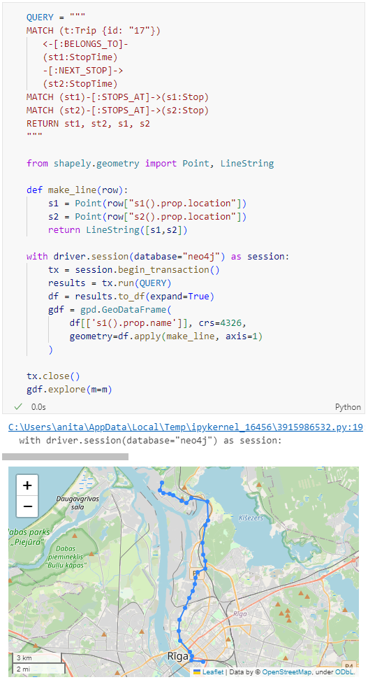
Ordering by stop sequence is actually completely optional. Technically, we could use the sorted GeoDataFrame, and aggregate all the points into a linestring to plot the route. But I want to try something different: we’ll use the NEXT_STOP relationships to get a DataFrame of the start and end stops for each segment:
QUERY = """
MATCH (t:Trip {id: "17"})
   <-[:BELONGS_TO]-
   (st1:StopTime)
   -[:NEXT_STOP]->
   (st2:StopTime)
MATCH (st1)-[:STOPS_AT]->(s1:Stop)
MATCH (st2)-[:STOPS_AT]->(s2:Stop)
RETURN st1, st2, s1, s2
"""

from shapely.geometry import Point, LineString

def make_line(row):
    s1 = Point(row["s1().prop.location"])
    s2 = Point(row["s2().prop.location"])
    return LineString([s1,s2])

with driver.session(database="neo4j") as session:
    tx = session.begin_transaction()
    results = tx.run(QUERY)
    df = results.to_df(expand=True)
    gdf = gpd.GeoDataFrame(
        df[['s1().prop.name']], crs=4326,
        geometry=df.apply(make_line, axis=1)
    )

tx.close()
gdf.explore(m=m)
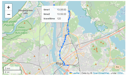
Finally, we can also use Cypher to calculate the travel time between two stops:
MATCH (t:Trip {id: "17"})
   <-[:BELONGS_TO]-
   (st1:StopTime)
   -[:NEXT_STOP]->
   (st2:StopTime)
MATCH (st1)-[:STOPS_AT]->(s1:Stop)
MATCH (st2)-[:STOPS_AT]->(s2:Stop)
RETURN st1.departureTime AS time1,
   st2.arrivalTime AS time2,
   s1.location AS geom1,
   s2.location AS geom2,
   duration.inSeconds(
      time(st1.departureTime),
      time(st2.arrivalTime)
   ).seconds AS traveltime
Then we can connect to our database. The default user name is neo4j and you get to pick the password when creating the database:
from neo4j import GraphDatabase

URI = "neo4j://localhost"
AUTH = ("neo4j", "password")

with GraphDatabase.driver(URI, auth=AUTH) as driver:
    driver.verify_connectivity()
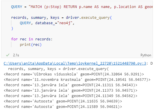
Once we have confirmed that the connection works as expected, we can run a query:
QUERY = "MATCH (p:Stop) RETURN p.name AS name, p.location AS geom"

records, summary, keys = driver.execute_query(
    QUERY, database_="neo4j",
)

for rec in records:
    print(rec)
Nice. There we have our GTFS stops, their names and their locations. But how to put them on a map?
import geopandas as gpd
import numpy as np

with driver.session(database="neo4j") as session:
    tx = session.begin_transaction()
    results = tx.run(QUERY)
    df = results.to_df(expand=True)
    df = df[df["geom[].0"]>0]
    gdf = gpd.GeoDataFrame(
        df['name'], crs=4326,
        geometry=gpd.points_from_xy(df['geom[].0'], df['geom[].1']))
    print(gdf)

tx.close()
Since some of the nodes lack geometries, I added a quick and dirty hack to get rid of these nodes because — otherwise — gdf.explore() will complain about None geometries.
In a recent post, we looked into a graph-based model for maritime mobility data and how it may be represented in Neo4J. Today, I want to look into another type of mobility data: public transport schedules in GTFS format.
Since a GTFS export is basically a ZIP archive full of CSVs, we will be making good use of Neo4Js CSV loading capabilities. The basic script for importing the stops file and creating point geometries from lat and lon values would be:
LOAD CSV with headers
FROM "file:///stops.txt"
AS row
CREATE (:Stop {
   stop_id: row["stop_id"],
   name: row["stop_name"],
   location: point({
    longitude: toFloat(row["stop_lon"]),
    latitude: toFloat(row["stop_lat"])
    })
})
This requires that the stops.txt is located in the import directory of your Neo4J database. When we run the above script and the file is missing, Neo4J will tell us where it tried to look for it. In my case, the directory ended up being:
So, let’s put all GTFS CSVs into that directory and we should be good to go.
Let’s start with the agency file:
load csv with headers from
'file:///agency.txt' as row
create (a:Agency {
   id: row.agency_id,
   name: row.agency_name,
   url: row.agency_url,
   timezone: row.agency_timezone,
   lang: row.agency_lang
});
… Added 1 label, created 1 node, set 5 properties, completed after 31 ms.
The routes file does not include agency info but, luckily, there is only one agency, so we can hard-code it:
load csv with headers from
'file:///routes.txt' as row
match (a:Agency {id: "rigassatiksme"})
create (a)-[:OPERATES]->(r:Route {
   id: row.route_id,
   shortName: row.route_short_name,
   longName: row.route_long_name,
   type: toInteger(row.route_type)
});
… Added 81 labels, created 81 nodes, set 324 properties, created 81 relationships, completed after 28 ms.
From stops, I’m removing non-existent or empty columns:
load csv with headers from
'file:///stops.txt' as row
create (s:Stop {
   id: row.stop_id,
   name: row.stop_name,
   location: point({
      latitude: toFloat(row.stop_lat),
      longitude: toFloat(row.stop_lon)
   }),
   code: row.stop_code
});
… Added 1671 labels, created 1671 nodes, set 5013 properties, completed after 71 ms.
From trips, I’m also removing non-existent or empty columns:
load csv with headers from
'file:///trips.txt' as row
match (r:Route {id: row.route_id})
create (r)<-[:USES]-(t:Trip {
   id: row.trip_id,
   serviceId: row.service_id,
   headSign: row.trip_headsign,
   direction_id: toInteger(row.direction_id),
   blockId: row.block_id,
   shapeId: row.shape_id
});
… Added 14427 labels, created 14427 nodes, set 86562 properties, created 14427 relationships, completed after 875 ms.
Slowly getting there. We now have around 16k nodes in our graph:
Finally, it’s stop times time. This is where the serious information is. This file is much larger than all previous ones with over 300k lines (i.e. times when an PT vehicle stops).
:auto
load csv with headers from
'file:///stop_times.txt' as row
CALL { with row
match (t:Trip {id: row.trip_id}), (s:Stop {id: row.stop_id})
create (t)<-[:BELONGS_TO]-(st:StopTime {
   arrivalTime: row.arrival_time,
   departureTime: row.departure_time,
   stopSequence: toInteger(row.stop_sequence)})-[:STOPS_AT]->(s)
} IN TRANSACTIONS OF 10 ROWS;
… Added 351388 labels, created 351388 nodes, set 1054164 properties, created 702776 relationships, completed after 1364220 ms.
As you can see, this took a while. But now we have all nodes in place:
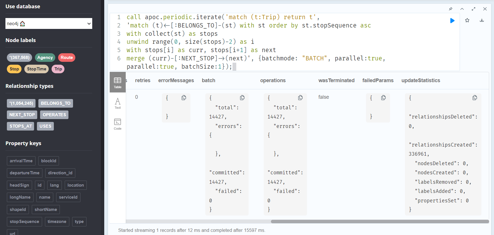
The final statement adds additional relationships between consecutive stop times:
call apoc.periodic.iterate('match (t:Trip) return t',
'match (t)<-[:BELONGS_TO]-(st) with st order by st.stopSequence asc
with collect(st) as stops
unwind range(0, size(stops)-2) as i
with stops[i] as curr, stops[i+1] as next
merge (curr)-[:NEXT_STOP]->(next)', {batchmode: "BATCH", parallel:true, parallel:true, batchSize:1});
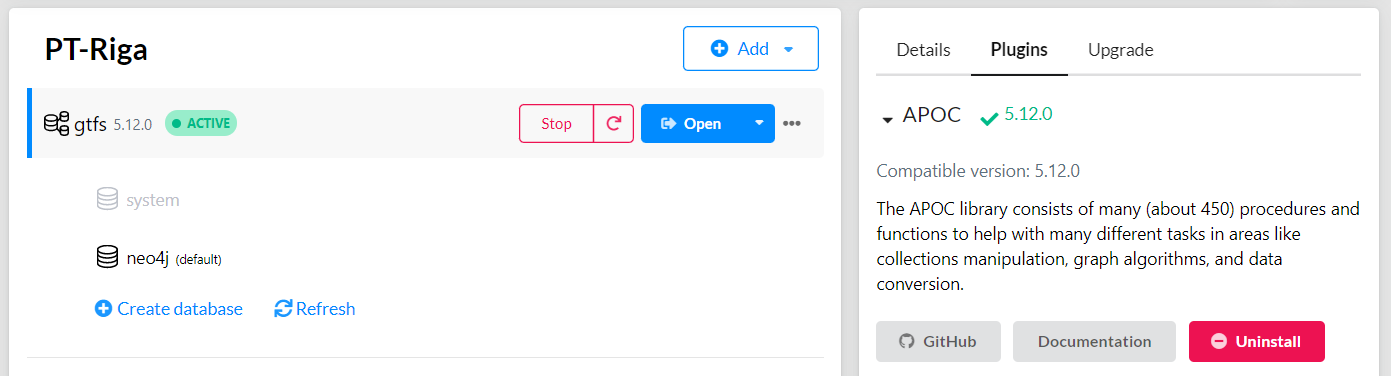
This fails with: There is no procedure with the name apoc.periodic.iterate registered for this database instance. Please ensure you've spelled the procedure name correctly and that the procedure is properly deployed.
So, let’s install APOC. That’s a plugin which we can install into our database from within Neo4J Desktop:
After restarting the db, we can run the query:
No errors. Sounds good.
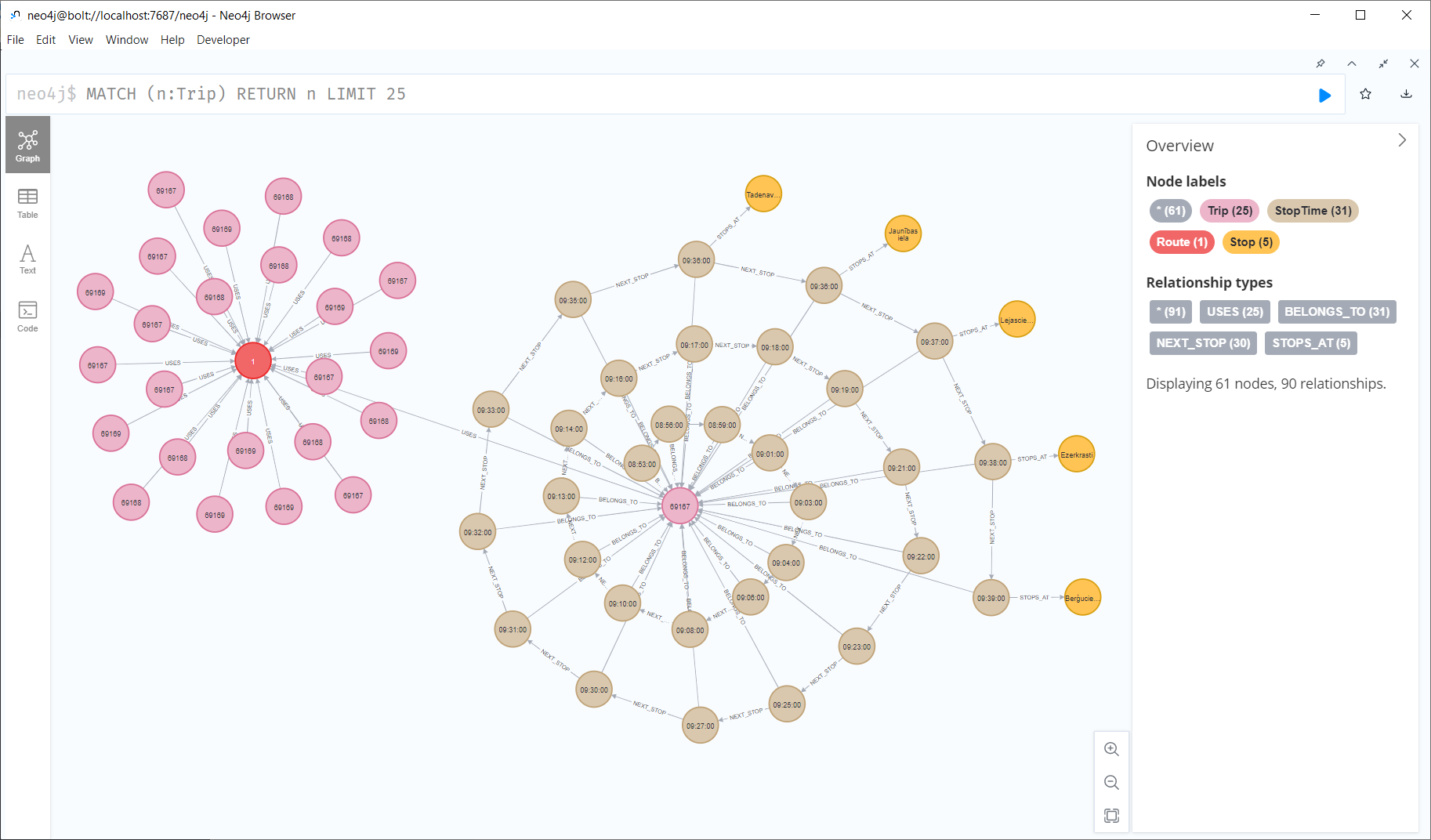
Let’s have a look at what we ended up with. Here are 25 random Trips. I expanded one of them to show its associated StopTimes. We can see the relations between consecutive StopTimes and I’ve expanded the final five StopTimes to show their linked Stops:
I also wanted to visualize the stops on a map. And there used to be a neat app called Neomap which can be installed easily:
Open source software projects thrive on the contributions of the community, not only for the code, but also for making the software accessible to a global audience. One of the critical aspects of this accessibility is the localization or translation of the software’s messages and interfaces. In this context, Weblate (https://weblate.org/) has proven to be […]
Earlier this year, we explored how to use PyQGIS in Juypter notebooks to run QGIS Processing tools from a notebook and visualize the Processing results using GeoPandas plots.
Today, we’ll go a step further and replace the GeoPandas plots with maps rendered by QGIS.
The following script presents a minimum solution to this challenge: initializing a QGIS application, canvas, and project; then loading a GeoJSON and displaying it:
from IPython.display import Image

from PyQt5.QtGui import QColor
from PyQt5.QtWidgets import QApplication

from qgis.core import QgsApplication, QgsVectorLayer, QgsProject, QgsSymbol, \
    QgsRendererRange, QgsGraduatedSymbolRenderer, \
    QgsArrowSymbolLayer, QgsLineSymbol, QgsSingleSymbolRenderer, \
    QgsSymbolLayer, QgsProperty
from qgis.gui import QgsMapCanvas

app = QApplication([])
qgs = QgsApplication([], False)
canvas = QgsMapCanvas()
project = QgsProject.instance()

vlayer = QgsVectorLayer("./data/traj.geojson", "My trajectory")
if not vlayer.isValid():
    print("Layer failed to load!")

def saveImage(path, show=True):
    canvas.saveAsImage(path)
    if show: return Image(path)

project.addMapLayer(vlayer)
canvas.setExtent(vlayer.extent())
canvas.setLayers([vlayer])
canvas.show()
app.exec_()

saveImage("my-traj.png")
When this code is executed, it opens a separate window that displays the map canvas. And in this window, we can even pan and zoom to adjust the map. The line color, however, is assigned randomly (like when we open a new layer in QGIS):
Today’s post is a first quick dive into Neo4J (really just getting my toes wet). It’s based on a publicly available Neo4J dump containing mobility data, ship trajectories to be specific. You can find this data and the setup instructions at:
I was made aware of this work since they cited MovingPandas in their paper in Data & Knowledge Engineering: “The implementation combines several open source tools such as Python, MovingPandas library, Uber H3 index, Neo4j graph database management system”
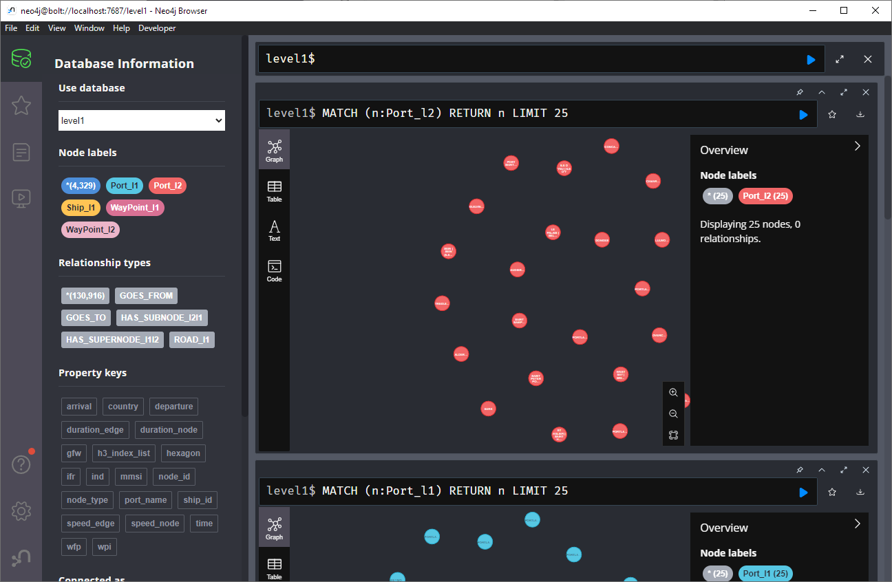
Once set up, this gives us a database with three hierarchical levels:
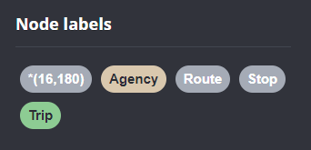
Neo4j comes with a nice graphical browser that lets us explore the data. We can switch between levels and click on individual node labels to get a quick preview:
Level 2 is a generalization / aggregation of level 1. Expanding the graph of one of the level 2 nodes shows its connection to level 1. For example, the level 2 port node “Audierne” actually refers to two level 1 nodes:
Every “road” level 1 relationship between ports provide information about the ship, its arrival, departure, travel time, and speed. We can see that this two level 1 ports must be pretty close since travel times are only 5 minutes:
Further expanding one of the port level 1 nodes shows its connection to waypoints of level1:
Switching to level 2, we gain access to nodes of type Traj(ectory). Additionally, the road level 2 relationships represent aggregations of the trajectories, for example, here’s a relationship with only one associated trajectory:
There are also some odd relationships, for example, trajectory 43 has two ends and begins relationships and there are also two road relationships referencing this trajectory (with identical information, only differing in their automatic <id>). I’m not yet sure if that is a feature or a bug:
On level 1, we also have access to ship nodes. They are connected to ports and waypoints. However, exploring them visually is challenging. Things look fine at first:
But after a while, once all relationships have loaded, we have it: the MIGHTY BALL OF YARN ™:
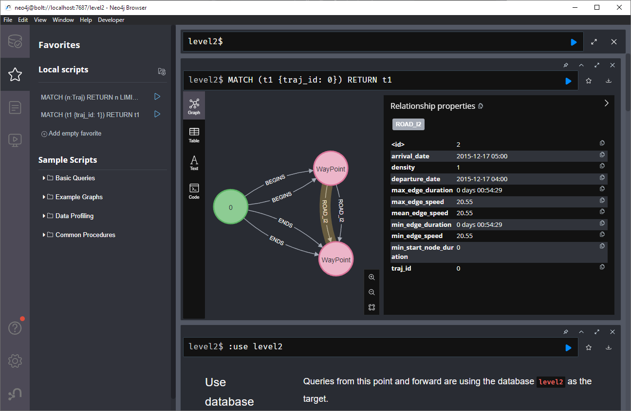
I guess this is the point where it becomes necessary to get accustomed to the query language. And no, it’s not SQL, it is Cypher. For example, selecting a specific trajectory with id 0, looks like this:
What’s new in a nutshell The GRASS GIS 8.3.1 maintenance release provides more than 60 changes compared to 8.3.0. This new patch release brings in important fixes and improvements in GRASS GIS modules and the graphical user interface (GUI) which stabilizes the new single window layout active by default. Some of the most relevant changes […]
We are very happy and enthusiasts at Oslandia to forward the QField 3.0 release announcement, the new major update of this mobile GIS application based on QGIS.
Oslandia is a strategic partner of OPENGIS.ch, the company at the heart of QField development, as well as the QFieldCloud associated SaaS offering. We join OPENGIS.ch to announce all the new features of QField 3.0.
Shipped with many new features and built with the latest generation of Qt’s cross-platform framework, this new chapter marks an important milestone for the most powerful open-source field GIS solution.
Main highlights
Upon launching this new version of QField, users will be greeted by a revamped recent projects list featuring shiny map canvas thumbnails. While this is one of the most obvious UI improvements, countless interface tweaks and harmonization have occurred. From the refreshed dark theme to the further polishing of countless widgets, QField has never looked and felt better.
The top search bar has a new functionality that allows users to look for features within the currently active vector layer by matching any of its attributes against a given search term. Users can also refine their searches by specifying a specific attribute. The new functionality can be triggered by typing the ‘f’ prefix in the search bar followed by a string or number to retrieve a list of matching features. When expanding it, a new list of functionalities appears to help users discover all of the tools available within the search bar.
QField’s tracking has also received some love. A new erroneous distance safeguard setting has been added, which, when enabled, will dictate the tracker not to add a new vertex if the distance between it and the previously added vertex is greater than a user-specified value. This aims at preventing “spikes” of poor position readings during a tracking session. QField is now also capable of resuming a tracking session after being stopped. When resuming, tracking will reuse the last feature used when first starting, allowing sessions interrupted by battery loss or momentary pause to be continued on a single line or polygon geometry.
On the feature form front, QField has gained support for feature form text widgets, a new read-only type introduced in QGIS 3.30, which allows users to create expression-based text labels within complex feature form configurations. In addition, relationship-related form widgets now allow for zooming to children/parent features within the form itself.
To enhance digitizing work in the field, QField now makes it possible to turn snapping on and off through a new snapping button on top of the map canvas when in digitizing mode. When a project has enabled advanced snapping, the dashboard’s legend item now showcases snapping badges, allowing users to toggle snapping for individual vector layers.
In addition, digitizing lines and polygons by using the volume up/down hardware keys on devices such as smartphones is now possible. This can come in handy when digitizing data in harsh conditions where gloves can make it harder to use a touch screen.
While we had to play favorites in describing some of the new functionalities in QField, we’ve barely touched the surface of this feature-packed release. Other major additions include support for Near-Field Communication (NFC) text tag reading and a new geometry editor’s eraser tool to delete part of lines and polygons as you would with a pencil sketch using an eraser.
Thanks to Deutsches Archäologisches Institut, Groupements forestiers Québec, Amsa, and Kanton Luzern for sponsoring these enhancements.
Quality of life improvements
Starting with this new version, the scale bar overlay will now respect projects’ distance measurement units, allowing for scale bars in imperial and nautical units.
QField now offers a rendering quality setting which, at the cost of a slightly reduced visual quality, results in faster rendering speeds and lower memory usage. This can be a lifesaver for older devices having difficulty handling large projects and helps save battery life.
Vector tile layer support has been improved with the automated download of missing fonts and the possibility of toggling label visibility. This pair of changes makes this resolution-independent layer type much more appealing.
On iOS, layouts are now printed by QField as PDF documents instead of images. While this was the case for other platforms, it only became possible on iOS recently after work done by one of our ninjas in QGIS itself.
Many thanks to DB Fahrwgdienste for sponsoring stabilization efforts and fixes during this development cycle.
Qt 6, the latest generation of the cross-platform framework powering QField
Last but not least, QField 3.0 is now built against Qt 6. This is a significant technological milestone for the project as this means we can fully leverage the latest technological innovations into this cross-platform framework that has been powering QField since day one.
On top of the new possibilities, QField benefited from years of fixes and improvements, including better integration with Android and iOS platforms. In addition, the positioning framework in Qt 6 has been improved with awareness of the newer GNSS constellations that have emerged over the last decade.
Forest-themed release names
Forests are critical in climate regulation, biodiversity preservation, and economic sustainability. Beginning with QField 3.0 “Amazonia” and throughout the 3.X’s life cycle, we will choose forest names to underscore the importance of and advocate for global forest conservation.
Software with service
OPENGIS.ch and Oslandia provides the full range of services around QField and QGIS : training, consulting, adaptation, specific development and core development, maintenance and assistance. Do not hesitate to contact us and detail your needs, we will be happy to collaborate : [email protected]
As always, we hope you enjoy this new release. Happy field mapping!
What’s new in a nutshell The GRASS GIS 8.3.0 release provides more than 360 changes compared to the 8.2 branch. This new minor release brings in many fixes and improvements in GRASS GIS modules and the graphical user interface (GUI) which now has the single window layout by default. Some of the most relevant changes […]
For those unfamiliar with Oslandia, OpenGIS.ch, or even QGIS, let’s refresh your memory:
Oslandia is a French company specializing in open-source Geographic Information Systems (GIS). Since our establishment in 2009, we have been providing consulting, development, and training services in GIS, with reknown expertise. Oslandia is a dedicated open-source player and the largest contributor to the QGIS solution in France.
As for OPENGIS.ch, they are a Swiss company specializing in the development of open-source GIS software. Founded in 2011, OPENGIS.ch is the largest Swiss contributor to QGIS. OPENGIS.ch is the creator of QField, the most widely used open-source mobile GIS solution for geomatics professionals.
OPENGIS.ch also offers QFieldCloud as a SaaS or on-premise solution for collaborative field project management.
Some may still be unfamiliar with #QGIS ?
It is a free and open-source Geographic Information System that allows creating, editing, visualizing, analyzing, and publicating geospatial data. QGIS is a cross-platform software that can be used on desktops, servers, as a web application, or as a development library.
QGIS is open-source software developed by multiple contributors worldwide. It is an official project of the OpenSource Geospatial Foundation (OSGeo) and is supported by the QGIS.org association. See https://qgis.org
A Partnership?
Today, we are delighted to announce our strategic partnership aimed at strengthening and promoting QField, the mobile application companion of QGIS Desktop.
This partnership between Oslandia and OPENGIS.ch is a significant step for QField and open-source mobile GIS solutions. It will consolidate the platform, providing users worldwide with simplified access to effective tools for collecting, managing, and analyzing geospatial data in the field.
QField, developed by OPENGIS.ch, is an advanced open-source mobile application that enables GIS professionals to work efficiently in the field, using interactive maps, collecting real-time data, and managing complex geospatial projects on Android, iOS, or Windows mobile devices.
QField is cross-platform, based on the QGIS engine, facilitating seamless project sharing between desktop, mobile, and web applications.
QFieldCloud (https://qfield.cloud), the collaborative web platform for QField project management, will also benefit from this partnership and will be enhanced to complement the range of tools within the QGIS platform.
Reactions
At Oslandia, we are thrilled to collaborate with OPENGIS.ch on QGIS technologies. Oslandia shares with OPENGIS.ch a common vision of open-source software development: a strong involvement in development communities, work in respect with the ecosystem, an highly skilled expertise, and a commitment to industrial-quality, robust, and sustainable software development.
With this partnership, we aim to offer our clients the highest expertise across all software components of the QGIS platform, from data capture to dissemination.
On the OpenGIS.ch side, Marco Bernasocchi adds:
The partnership with Oslandia represents a crucial step in our mission to provide leading mobile GIS tools with a genuine OpenSource credo. The complementarity of our skills will accelerate the development of QField and QFieldCloud and meet the growing needs of our users.
Commitment to open source
Both companies are committed to continue supporting and improving QField and QFieldCloud as open-source projects, ensuring universal access to this high-quality mobile GIS solution without vendor dependencies.
Ready for field mapping ?
And now, are you ready for the field?
So, download QField (https://qfield.org/get), create projects in QGIS, and share them on QFieldCloud!
If you need training, support, maintenance, deployment, or specific feature development on these platforms, don’t hesitate to contact us. You will have access to the best experts available: [email protected].
A while back, one of our ninjas added a new algorithm in QGIS’ processing toolbox named ST-DBSCAN Clustering, short for spatio temporal density-based spatial clustering of applications with noise. The algorithm regroups features falling within a user-defined maximum distance and time duration values.
This post will walk you through one practical use for the algorithm: large-scale fire event analysis and visualization through remote-sensed fire detection. More specifically, we will be looking into one of the larger fire events which occurred in Canada’s Quebec province in June 2023.
Fetching and preparing FIRMS data
NASA’s Fire Information for Resource Management System (FIRMS) offers a fantastic worldwide archive of all fire detected through three spaceborne sources: MODIS C6.1 with a resolution of roughly 1 kilometer as well as VIIRS S-NPP and VIIRS NOAA-20 with a resolution of 375 meters. Each detected fire is represented by a point that sits at the center of the source’s resolution grid.
Each source will cover the whole world several times per day. Since detection is impacted by atmospheric conditions, a given pass by one source might not be able to register an ongoing fire event. It’s therefore advisable to rely on more than one source.
To look into our fire event, we have chosen the two fire detection sources with higher resolution – VIIRS S-NPP and VIIRS NOAA-20 – covering the whole month of June 2023. The datasets were downloaded from FIRMS’ archive download page.
After downloading the two separate datasets, we combined them into one merged geopackage dataset using QGIS processing toolbox’s Merge Vector Layers algorithm. The merged dataset will be used to conduct the clustering analysis.
In addition, we will use QGIS’s field calculator to create a new Date & Time field named ACQ_DATE_TIME using the following expression:
The above-pictured model outputs two datasets. The first dataset contains single-part points of detected fires with attributes from the original VIIRS products as well as a pair of new attributes: the CLUSTER_ID provides a unique cluster identifier for each point, and the CLUSTER_SIZE represents the sum of points forming each unique cluster. The second dataset contains multi-part points clusters representing fire events with four attributes: CLUSTER_ID and CLUSTER_SIZE which were discussed above as well as DATE_START and DATE_END to identify the beginning and end time of a fire event.
In our specific example, we will run the model using the merged dataset we created above as the “fire points layer” and select ACQ_DATE_TIME as the “date field”. The outputs will be saved as separate layers within a geopackage file.
Note that the maximum distance (0.025 degrees) and duration (72 hours) settings to form clusters have been set in the model itself. This can be tweaked by editing the model.
Visualizing a specific fire event progression on a map
Once the model has provided its outputs, we are ready to start visualizing a fire event on a map. In this practical example, we will focus on detected fires around latitude 53.0960 and longitude -75.3395.
Using the multi-part points dataset, we can identify two clustered events (CLUSTER_ID 109 and 1285) within the month of June 2023. To help map canvas refresh responsiveness, we can filter both of our output layers to only show features with those two cluster identifiers using the following SQL syntax: CLUSTER_ID IN (109, 1285).
To show the progression of the fire event over time, we can use a data-defined property to graduate the marker fill of the single-part points dataset along a color ramp. To do so, open the layer’s styling panel, select the simple marker symbol layer, click on the data-defined property button next to the fill color and pick the Assistant menu item.
In the assistant panel, set the source expression to the following: day(age(to_date('2023-07-01'),”ACQ_DATE_TIME”)). This will give us the number of days between a given point and an arbitrary reference date (2023-07-01 here). Set the values range from 0 to 30 and pick a color ramp of your choice.
When applying this style, the resulting map will provide a visual representation of the spread of the fire event over time.
Having identified a fire event via clustering easily allows for identification of the “starting point” of a fire by searching for the earliest fire detected amongst the thousands of points. This crucial bit of analysis can help better understand the cause of the fire, and alongside the color grading of neighboring points, its directionality as it expanded over time.
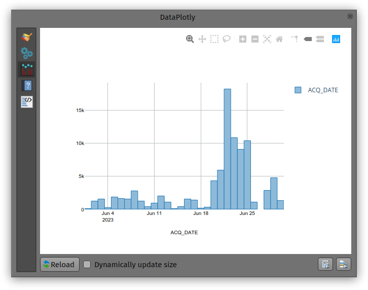
Analyzing a fire event through histogram
Through QGIS’ DataPlotly plugin, it is possible to create an histogram of fire events. After installing the plugin, we can open the DataPlotly panel and configure our histogram.
Set the plot type to histogram and pick the model’s single-part points dataset as the layer to gather data from. Make sure that the layer has been filtered to only show a single fire event. Then, set the X field to the following layer attribute: “ACQ_DATE”.
You can then hit the Create Plot button, go grab a coffee, and enjoy the resulting histogram which will appear after a minute or so.
While not perfect, an histogram can quickly provide a good sense of a fire event’s “peak” over a period of time.
written together with my fellow “Geocomputation with Python” co-authors Robin Lovelace, Michael Dorman, and Jakub Nowosad.
In this blog post, we talk about our experience teaching R and Python for geocomputation. The context of this blog post is the OpenGeoHub Summer School 2023 which has courses on R, Python and Julia. The focus of the blog post is on geographic vector data, meaning points, lines, polygons (and their ‘multi’ variants) and the attributes associated with them. We plan to cover raster data in a future post.
Since I’ve been on Twitter since 2011, this means that some media files are now lost. While the loss of a few low-res images is probably not a major loss for humanity, I would prefer to have some control over when and how content I created vanishes. So, to avoid losing more content, I have followed Jeff’s recommendation to create a proper archival page:
It is based on an export I pulled in October 2022 when I started to use Mastodon as my primary social media account. Unfortunately, this export did not include media files.
The latest version of QField is out, featuring as its main new feature sensor handling alongside the usual round of user experience and stability improvements. We simply can’t wait to see the sensor uses you will come up with!
The main highlight: sensors
QField 2.8 ships with out-of-the-box handling of external sensor streams over TCP, UDP, and serial port. The functionality allows for data captured through instruments – such as geiger counter, decibel sensor, CO detector, etc. – to be visualized and manipulated within QField itself.
Things get really interesting when sensor data is utilized as default values alongside positioning during the digitizing of features. You are always one tap away from adding a point locked onto your current position with spatially paired sensor readings saved as point attribute(s).
The development of this feature involved the addition of a sensor framework in upstream QGIS which will be available by the end of this coming June as part of the 3.32 release. This is a great example of the synergy between QField and its big brother QGIS, whereas development of new functionality often benefits the broader QGIS community. Big thanks to Sevenson Environmental Services for sponsoring this exciting capability.
Notable improvements
A couple of refinements during this development cycle are worth mentioning. If you ever wished for QField to directly open a selected project or reloading the last session on app launch, you’ll be happy to know this is now possible.
For heavy users of value relations in their feature forms, QField is now a tiny bit more clever when displaying string searches against long lists, placing hits that begin with the matched string first as well as visually highlighting matches within the result list itself.
Finally, feature lists throughout QField are now sorted. By default, it will sort by the display field or expression defined for each vector layer, unless an advanced sorting has been defined in a given vector layer’s attribute table. It makes browsing through lists feel that much more natural.
Kaggle’s “Taxi Trajectory Data from ECML/PKDD 15: Taxi Trip Time Prediction (II) Competition” is one of the most used mobility / vehicle trajectory datasets in computer science. However, in contrast to other similar datasets, Kaggle’s taxi trajectories are provided in a format that is not readily usable in MovingPandas since the spatiotemporal information is provided as:
TIMESTAMP: (integer) Unix Timestamp (in seconds). It identifies the trip’s start;
POLYLINE: (String): It contains a list of GPS coordinates (i.e. WGS84 format) mapped as a string. The beginning and the end of the string are identified with brackets (i.e. [ and ], respectively). Each pair of coordinates is also identified by the same brackets as [LONGITUDE, LATITUDE]. This list contains one pair of coordinates for each 15 seconds of trip. The last list item corresponds to the trip’s destination while the first one represents its start;
Therefore, we need to create a DataFrame with one point + timestamp per row before we can use MovingPandas to create Trajectories and analyze them.
But first things first. Let’s download the dataset:
import datetime
import pandas as pd
import geopandas as gpd
import movingpandas as mpd
import opendatasets as od
from os.path import exists
from shapely.geometry import Point

input_file_path = 'taxi-trajectory/train.csv'

def get_porto_taxi_from_kaggle():
    if not exists(input_file_path):
        od.download("https://www.kaggle.com/datasets/crailtap/taxi-trajectory")

get_porto_taxi_from_kaggle()
df = pd.read_csv(input_file_path, nrows=10, usecols=['TRIP_ID', 'TAXI_ID', 'TIMESTAMP', 'MISSING_DATA', 'POLYLINE'])
df.POLYLINE = df.POLYLINE.apply(eval)  # string to list
df
And now for the remodelling:
def unixtime_to_datetime(unix_time):
    return datetime.datetime.fromtimestamp(unix_time)

def compute_datetime(row):
    unix_time = row['TIMESTAMP']
    offset = row['running_number'] * datetime.timedelta(seconds=15)
    return unixtime_to_datetime(unix_time) + offset

def create_point(xy):
    try:
        return Point(xy)
    except TypeError:  # when there are nan values in the input data
        return None

new_df = df.explode('POLYLINE')
new_df['geometry'] = new_df['POLYLINE'].apply(create_point)
new_df['running_number'] = new_df.groupby('TRIP_ID').cumcount()
new_df['datetime'] = new_df.apply(compute_datetime, axis=1)
new_df.drop(columns=['POLYLINE', 'TIMESTAMP', 'running_number'], inplace=True)
new_df
And that’s it. Now we can create the trajectories:
That’s it. Now our MovingPandas.TrajectoryCollection is ready for further analysis.
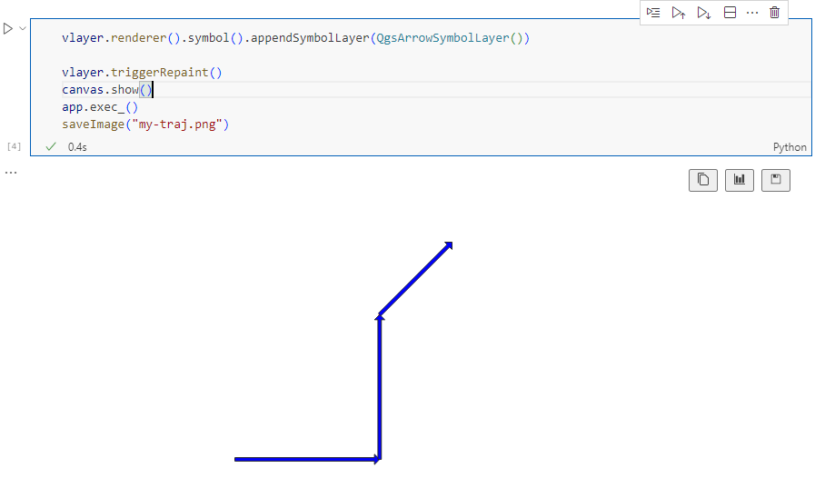
By the way, the plot above illustrates a new feature in the recent MovingPandas 0.16 release which, among other features, introduced plots with arrow markers that show the movement direction. Other new features include a completely new custom distance, speed, and acceleration unit support. This means that, for example, instead of always getting speed in meters per second, you can now specify your desired output units, including km/h, mph, or nm/h (knots).


 This functionality requires the latest version of QFieldSync, which is available through QGIS’ plugin manager.
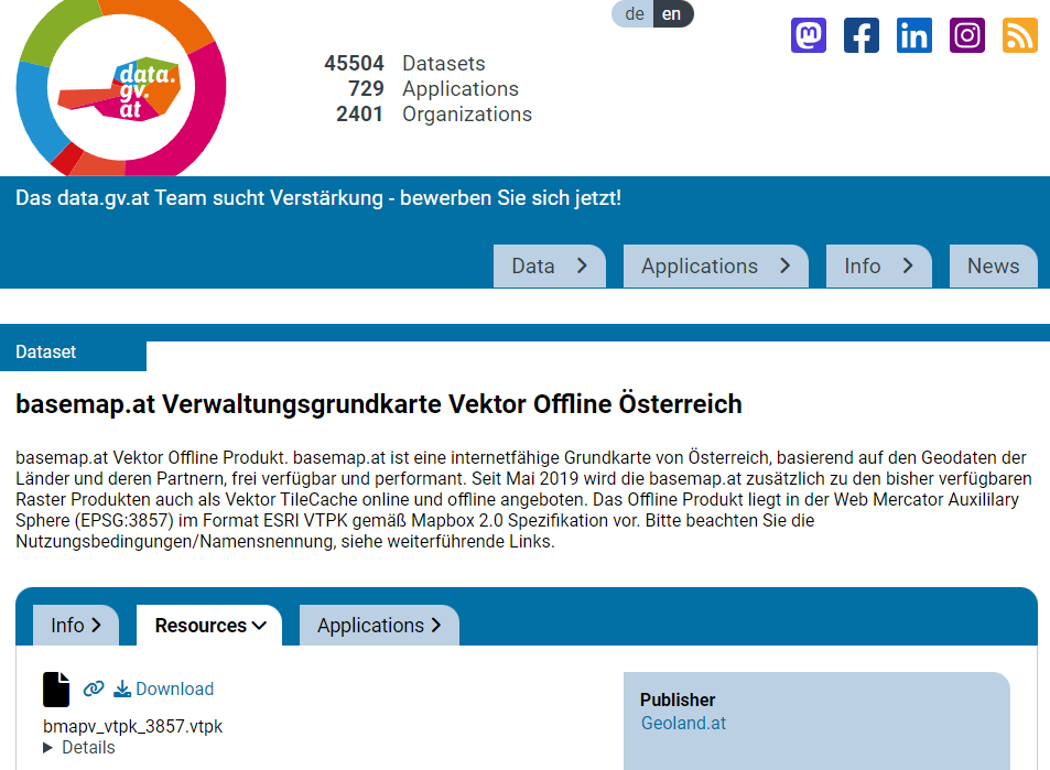


 For those unfamiliar with Oslandia,
  Oslandia is a French company specializing in open-source Geographic Information Systems (GIS). Since our establishment in 2009, we have been providing consulting, development, and training services in GIS, with reknown expertise. Oslandia is a dedicated open-source player and the largest contributor to the QGIS solution in France.
 Some may still be unfamiliar with #QGIS ?
 Today, we are delighted to announce our strategic partnership aimed at strengthening and promoting QField, the mobile application companion of QGIS Desktop.
 This partnership between Oslandia and OPENGIS.ch is a significant step for QField and open-source mobile GIS solutions. It will consolidate the platform, providing users worldwide with simplified access to effective tools for collecting, managing, and analyzing geospatial data in the field.
 QField, developed by OPENGIS.ch, is an advanced open-source mobile application that enables GIS professionals to work efficiently in the field, using interactive maps, collecting real-time data, and managing complex geospatial projects on Android, iOS, or Windows mobile devices.
 QField is cross-platform, based on the QGIS engine, facilitating seamless project sharing between desktop, mobile, and web applications.
 QFieldCloud (
 At Oslandia, we are thrilled to collaborate with OPENGIS.ch on QGIS technologies. Oslandia shares with OPENGIS.ch a common vision of open-source software development: a strong involvement in development communities, work in respect with the ecosystem, an highly skilled expertise, and a commitment to industrial-quality, robust, and sustainable software development.
 With this partnership, we aim to offer our clients the highest expertise across all software components of the QGIS platform, from data capture to dissemination.
 On the OpenGIS.ch side, Marco Bernasocchi adds:
 Both companies are committed to continue supporting and improving QField and QFieldCloud as open-source projects, ensuring universal access to this high-quality mobile GIS solution without vendor dependencies.
 And now, are you ready for the field?
 If you need training, support, maintenance, deployment, or specific feature development on these platforms, don’t hesitate to contact us. You will have access to the best experts available: