Related Plugins and Tags

QGIS Planet

Case Study: FLO-2D QGIS Plugin

The case study presents the implementation of the QGIS FLO-2D Plugin project (5 minute read)

Introduction

FLO-2D is one of the most widely used commercially available flood models. FLO-2D is capable of simulating urban flooding in high resolution including storm drain systems.

FLO-2D

In 2016 the FLO-2D team invited us to develop a set of tools for optimising the flood model build process in QGIS. The resulting plugin allows hydraulic models to be built quickly by leveraging the wide range of tools available in the QGIS ecosystem.

The plugin can be downloaded by following the guidance in the plugin documentation

As the use of open source GIS grows within the water engineering sector, Lutra Consulting develops and maintains MDAL which makes the visualisation and post-processing of time-varying numerical model results possible in QGIS.

Contact us at [email protected] if you’d like to discuss the benefits of integrating your flood modelling software more tightly with QGIS.
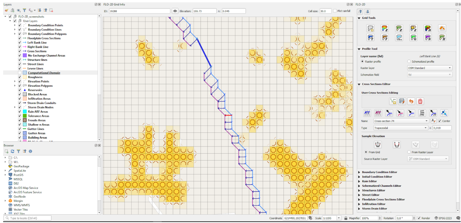
QGIS FLO-2D Plugin

Overview of Previous GUI tools: FLO-2D GDS

FLO-2D’s focus on urban modeling requires large datasets that may include several million grid cells. Each cell has between 4 and 10 attributes so datasets can often be in the range of several gigabytes.

Previously, Grid Developer System (GDS) was used to pre-process the spatial data used by FLO-2D. Being a 32-bit application, the GDS was only able to load up to 4 gigabytes of data and its programming framework was also no longer maintained by Microsoft. Modellers could only be built on Windows PCs.

All development and maintenance of the GDS was carried out by the FLO-2D team.

Behind the Implementation

Guiding principles behind the new QGIS Flo-2D plugin

We assessed the tools used at the time and in close collaboration with the FLO-2D team, optimised the workflow from the users’ point of view with emphasis on speed and simplicity.

To keep things simple for the users, we aimed to provide a level of abstraction so users would no longer need to be involved with the internal structure of FLO-2D solver input files. They could instead focus on real-world aspects affecting their models.

Together with the FLO-2D team we designed a solution that was based on 3 core ideas:

  • Modellers will use native QGIS tools and point/line/polygon layers to define real-world objects (e.g. domain, boundary conditions, levees, …)
  • These real-world objects will be converted automatically into the data structures required by the FLO-2D solver (although expert users can still modify these data structures if they so wish).
  • Additional productivity tools will be provided to allow users to speed-up time consuming tasks

Features of the plugin

Some of the key features of the solution are listed here:

  • Easy creation and handling of new models (all model data sits in a single GeoPackage file)
  • User friendly and intuitive digitizing and manipulation of model components (through simple GIS layers and dedicated tools) including:
    • 1D domain
    • Boundary and initial conditions
    • 1D channels and cross-sections
    • Levees
    • Rainfall
    • Infiltration areas
    • Storm drains
  • Various options for obtaining grid data such as elevation, roughness, reduction factors etc. from different sources (raster layers, external vector layers etc.)
  • Plotting profiles and editing time series data
  • Automated tools for schematizing input layers into the GDS format
  • Importing basic data from HEC-RAS models
  • Import / export functionality between GeoPackage and GDS format (*.DAT files)
  • Running external FLO-2D tools (FLO-2D Pro engine etc.) directly from QGIS
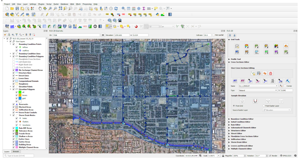
QGIS FLO-2D Plugin

Benefits for the FLO-2D developers:

Benefits for the developers of FLO-2D include:

  • Reduced development and maintenance costs, since much of the heavy lifting of the FLO-2D plugin is done by QGIS itself
  • By being part of the QGIS ecosystem, gaining opportunities to approach QGIS users in the flood risk industry to use FLO-2D software
  • The FLO-2D plugin is developed on GitHub, allowing the latest development technologies such as continuous integration, automatic testing and issue tracking to be used
  • Ability to solve upstream bugs in QGIS or MDAL due to the open-source nature of the projects
QGIS3

Benefits for FLO-2D users:

Some of the benefits realised by FLO-2D customers include:

  • Being able to work with their FLO-2D models using open source GIS on all major operating systems
  • A full GIS application to support their data pre-processing
  • Logical and intuitive workflows
  • FLO-2D results can now be visualised and post-processed natively in QGIS via mesh layer
  • Ability to use all native QGIS support and development channels in addition to FLO-2D support
  • Integration of internal workflows with powerful native QGIS features including projection support, GDAL/OGR integrations, background maps support (e.g. vector tiles), printed flood maps, etc.
  • Ability analyze results via QGIS’ Crayfish plugin and produce graphs and outputs

The plugin in action!

Further Reading

Do you have any questions or would like to see demo of QGIS Mesh Layer? Contact us at [email protected] or schedule a demo call calendly.com/saber-razmjooei/15min

Key words

QGIS, plugin, python, migration, optimised, speed up, fast, hydraulic modelling, water, 2D, open-source, cost reduction, software development

You may also like...

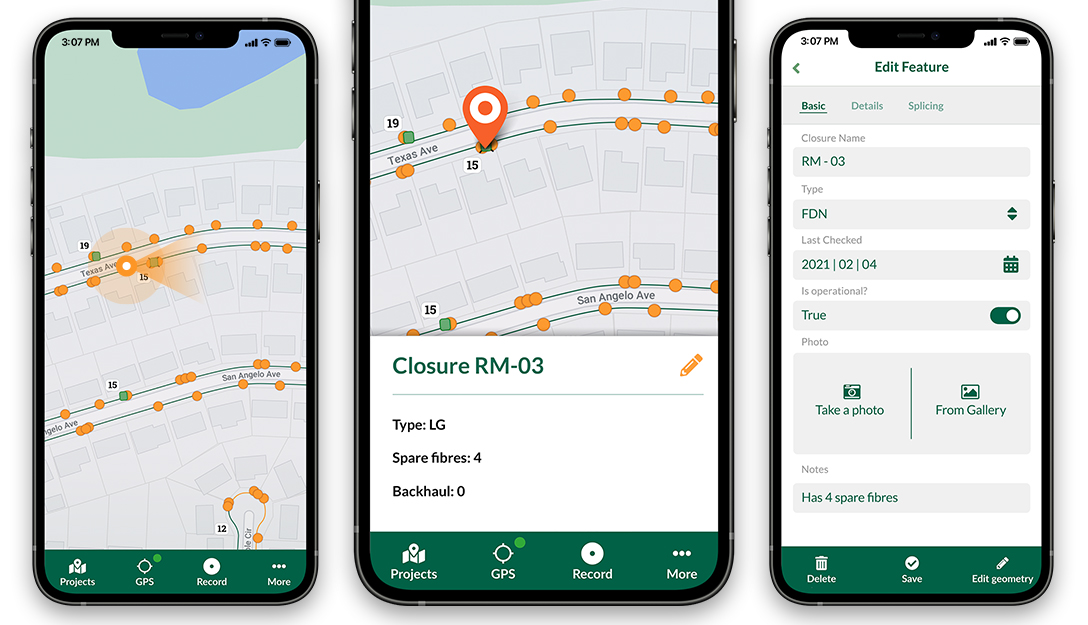
Mergin Maps, a field data collection app based on QGIS. Mergin Maps makes field work easy with its simple interface and cloud-based sync. Available on Android, iOS and Windows. Screenshots of the Mergin Maps mobile app for Field Data Collection
Get it on Google Play Get it on Apple store

Movement data in GIS #32: “Exploring movement data” webinar

Last October, I had the pleasure to speak at the Uni Liverpool’s Geographic Data Science Lab Brown Bag Seminar. The talk starts with examples from different movement datasets that illustrate why we need data exploration to better understand our datasets. Then we dive into different options for exploring movement data before ending on ongoing challenges for future development of the field.

Here’s the full recording of my talk and follow-up discussion:


This post is part of a series. Read more about movement data in GIS.

Introducing the open data analysis OGD.AT Lab

Data sourcing and preparation is one of the most time consuming tasks in many spatial analyses. Even though the Austrian data.gv.at platform already provides a central catalog, the individual datasets still vary considerably in their accessibility or readiness for use.

OGD.AT Lab is a new repository collecting Jupyter notebooks for working with Austrian Open Government Data and other auxiliary open data sources. The notebooks illustrate different use cases, including so far:

  1. Accessing geodata from the city of Vienna WFS
  2. Downloading environmental data (heat vulnerability and air quality)
  3. Geocoding addresses and getting elevation information
  4. Exploring urban movement data

Data processing and visualization are performed using Pandas, GeoPandas, and Holoviews. GeoPandas makes it straighforward to use data from WFS. Therefore, OGD.AT Lab can provide one universal gdf_from_wfs() function which takes the desired WFS layer as an argument and returns a GeoPandas.GeoDataFrame that is ready for analysis:

Many other datasets are provided as CSV files which need to be joined with spatial datasets to use them in spatial analysis. For example, the “Urban heat vulnerability index” dataset which needs to be joined to statistical areas.


Another issue with many CSV files is that they use German number formatting, where commas are used as a decimal separater instead of dots:

Besides file access, there are also open services provided by other developers, for example, Manfred Egger developed an elevation service that provides elevation information for any point in Austria. In combination with geocoding services, such as Nominatim, this makes is possible to, for example, find the elevation for any address in Austria:

Last but not least, the first version of the mobility notebook showcases open travel time data provided by Uber Movement:

The utility functions for data access included in this repository will continue to grow as new data sources are included. Eventually, it may make sense to extract the data access function into a dedicated library, similar to geofi (Finland) or geobr (Brazil).

If you’re aware of any interesting open datasets or services that should be included in OGD.AT, feel free to reach out here or on Github through the issue tracker or by providing a pull request.

Quickly Get Site Photos Into Word

Preparing reports with lots of survey photos takes time - this plugin automates the process.

Nowadays, it’s really easy to take georeferenced photos on site visits. Tools like Input can capture photos, descriptions and location information and bringing it all into GIS is straight-forward. However.. I recently discovered that people still spend significant amounts of time organising their photos into reports outside of GIS. This small plugin automates the process of getting the photos and their descriptions into Microsoft Word.

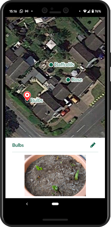
Using Input to Survey My Garden

For this blog post I knocked-up a simple survey project based on the Field notes Mergin template. Points can have a photo, title and description amongst other fields. No comments on my gardening skills please!

When I sync the data back to QGIS, the attribute table looks something like this:

The Input Survey Layer's Table of Attributes

We’ll now use the HTML Table Exporter plugin to export the layer as an HTML table (this will let us get it into Word).

First install the plugin.

It’s an experimental plugin so you’ll first need to check the Show also experimental plugins option under Plugins > Manage and Install Plugins… > Settings.

When you have installed the plugin, open it using this button HTML Table Exporter Icon or via Plugins > HTML Table Exporter > Export table as HTML.

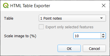
You should now see this:

HTML Table Exporter Dialog

Set Table to the layer you want to export. The image scaling option is described later, leave it at a small setting for the time being. Click OK to export and tell the plugin where to save the HTML file.

Now the data should be out of QGIS.. the next steps are in.. MS Word :o

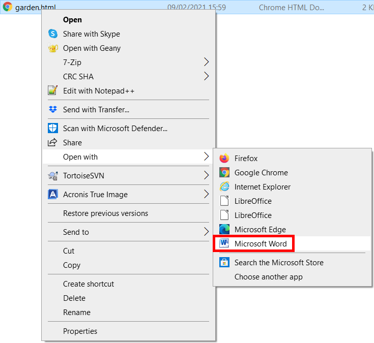
Right click on the exported html file and open it with Microsoft Word:

Open Exported HTML With Word

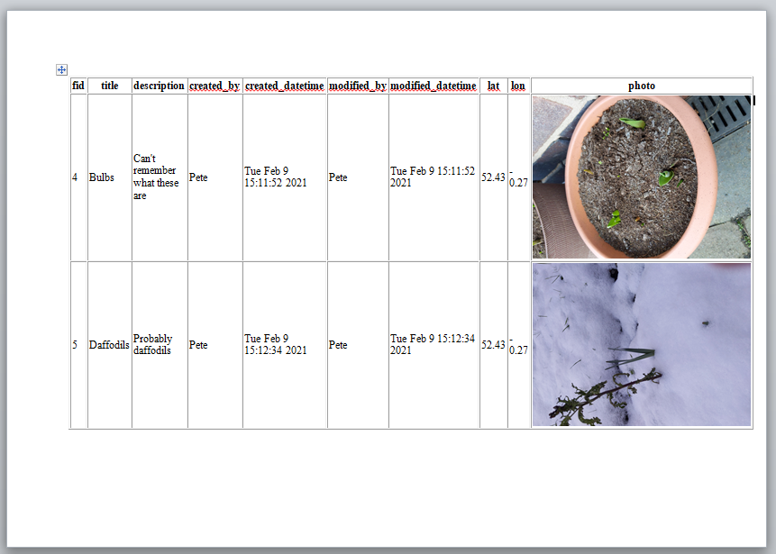
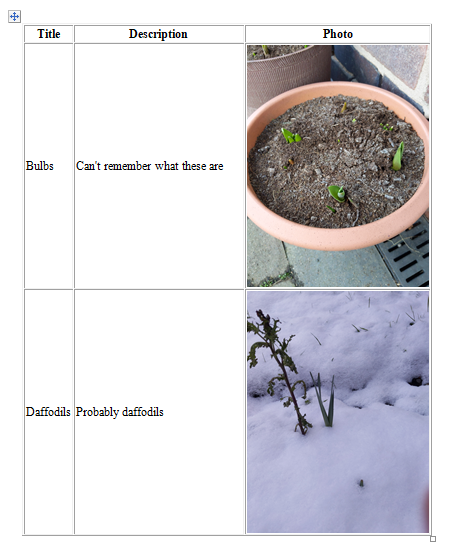
Let’s see what it looks like:

First Export in Word

OK.. we’re getting somewhere! At this point you’ll want to:

  • Enable Print Layout mode in Word so you can see what the printed page will look like
  • Set the page orientation as desired (I chose landscape in the image above)
  • Experiment with image rotation if required (Right click photo > Size and position > Rotation)

If playing with rotation, just focus on rotating a single image, we’ll batch rotate later as required. For now you want to get a feel of whether you want to adjust the scale factor in QGIS (to make the images smaller or larger) to save you having to resize them individually in Word.

I’ve decided to increase the scale factor from 10% to 15% so will now re-export.

Beware that Word has an exclusive lock on the html file when it’s open so you need to close it in Word before you can export it again from QGIS.

I settled for 10% in the end so I could get multiple images on each page in portrait mode. After removing the columns I didn’t want, the table in Word now looks like this:

A Better Export to Word

To rapidly rotate images by 90 degrees, rotate the first one using Right click on photo > Size and position > Rotation then select subsequent photos and press the F4 key. This method is described in more detail here as well as other Word batch image rotation methods.

My document is almost finished. There are just a few small issues to iron out. Currently, the images are referenced by the Word document, not embedded. This means if I email the document to someone, the images will be missing. Let’s fix that by embedding the images in the word document.

First save the document as a Word document in Word’s native format (e.g. *.docx).

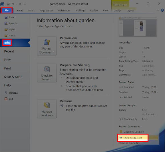
Next, locate the Edit Links to Files option:

Edit Links to Documents

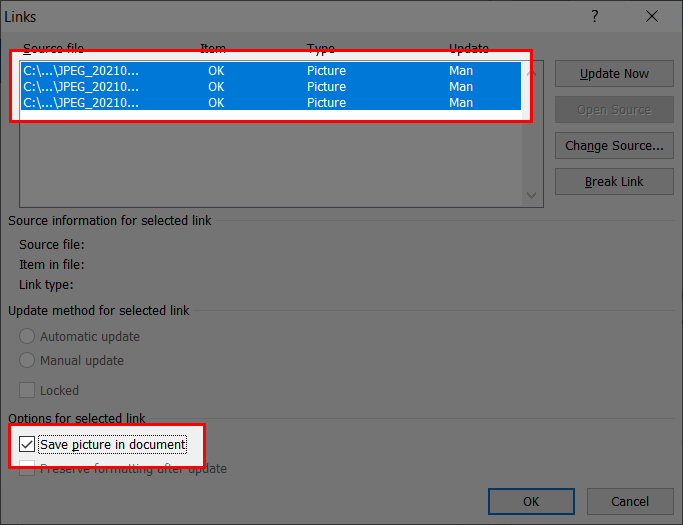
Select all the linked images (the shift and arrow keys help here) and check the Save picture in document option and click OK:

Save Picture In Document

Save the document, your photos should now be embedded within the document.

If you find your word document gets huge, you can use the method here to quickly batch compress all images in the document.

Input is a free and open source field data collection and mobile GIS app based on QGIS.

Get it on Google PlayGet it on Apple store

If this guide saved you some time and you feel like doing something awesome for us, a review of Input on the Apple App Store or Google Play Store would be really well appreciated.

Ask Me Anything about QGIS release management

Friday 29 January, Richard and Raymond will do an Ask Me Anything (in Dutch) on release management, and how to advise clients on which releases they should deploy. And the meaning of FF, difference between LR and LTR, etc. It’s in Dutch, but if you want to join in anyway: https://meet.jit.si/qgisnl-release-amaQGIS

Scheduled maintenance for plugins repository


We are running out of space on our server running https://plugins.qgis.org – a sign of success, given the large number of plugins and plugin versions hosted on the platform. On Thursday 28 January at 9am West European Time, we will bring the server offline for a scheduled upgrade to the storage space on the server. We anticipate that the work will be completed within an hour. We thank you for your patience whilst we undertake this critical maintenance.


The maintenance of QGIS infrastructure is undertaken largely by volunteers and the cost of servers and hosting related costs are funded by your donations and sustaining memberships. If you would like to help support this (and the many other excellent initiatives carried out by QGIS.org), please consider heading over to https://qgis.org/en/site/getinvolved/governance/sustaining_members/sustaining_members.html#how-can-you-support-the-qgis-development to find out how you can help!

Overview of QGIS 3.16 LTR and QGIS 3.18 Mesh Features

QGIS Mesh Layer now support DHI dfsu and HECRAS 6.0 format.

The releases of QGIS 3.16 LTR/QGIS 3.18, MDAL 0.8.0 and Crayfish 3.5.0 are planned for 19 February 2021. We are delighted to present the following improvements for the upcoming releases:

  • In-memory mesh datasets with persistence
  • Multi identify tool for mesh
  • Virtual dataset groups for mesh layer
  • 3D Mesh Layer Bug Fixes and speed optimizations
  • DHI’s dfsu format support (QGIS 3.18 only)
  • HECRAS 6.0 format support

If you’d like try the latest features, you can always install QGIS nightlies/master, which comes with all the latest features described in this blog post.

If you want to learn more about Mesh Layer in QGIS, read more here…

Mesh Calculator and Layer Improvements

The Virtual dataset groups for mesh layer and In-memory mesh datasets with persistence improvements greatly improves the workflows when using the Mesh Calculator in QGIS. Users can store the intermediate results into virtual layers that are recalculated on the fly (similarly to QGIS expressions for vector layers). The layers can be later persisted to any supported MDAL formats with write capabilities.

Multi identify tool for mesh feature allows to browse the temporal mesh data in more intuitive way and includes the extra information about the Mesh datasets loaded.

These features were sponsored by Artelia Group.

DHI’s dfsu format support

MDAL 0.8.0 supports loading of the external drivers. A first driver, available on Windows QGIS 3.18 only, is popular DFSU format by DHI, which is used to store MIKE 21 output results.

You can see how to configure and use QGIS to work with DFSU format on the DHI’s YouTube channel

Special thanks to the sponsor DHI this feature.

QGIS

We have added the following new features to QGIS to convert between mesh and vector/raster:

  • TIN Mesh creation
  • Ported most of the processing algorithms from Crayfish to QGIS core
  • 3D rendering improvements
  • Many Mesh Layer bugfixes

MDAL

  • Support for external drivers.
  • Fixed HECRAS vector datasets support
  • Packaging in conda

Crayfish

  • Fixed SAGA flow direction support
  • Fixed FFMPEG download link
  • Ported most of the processing algorithms from Crayfish to QGIS core

You may also like...

Mergin Maps, a field data collection app based on QGIS. Mergin Maps makes field work easy with its simple interface and cloud-based sync. Available on Android, iOS and Windows. Screenshots of the Mergin Maps mobile app for Field Data Collection
Get it on Google Play Get it on Apple store

Mergin and PostGIS in action

One of the challenges of data collection projects is consolidating all the data a central database, such as Postgres/PostGIS. Using PostGIS as a live survey layer is not usually recommended:

  • Security: exposing your database to the wider internet
  • Access and connectivity: internet connection is not always guaranteed for field survey projects

A more cumbersome way around this, is to convert your tables from PostGIS to a file based GIS layer (e.g. GeoPackage) and take the files with you to the field. This will create a new problem: keeping all the tables (from multiple surveyors) and the PostGIS table up-to-date.

During a survey to assess water access for villages in Limpopo province, South Africa, our friends at Kartoza have commissioned us to extend the Mergin service to support PostGIS. The Mergin service already supports file-based data synchronisation. The aim was to bridge the gap between the Mergin service and PostGIS so that the changes from Mergin immediately appear on PostGIS and vice versa.

To facilitate that, we further developed the Geodiff library to support Postgres driver. In addition, we developed mergin-db-sync tool to sync the tables from Postgres database with the Mergin service. The mergin-db-sync tool runs as a service (daemon) that keeps an eye on a particular Mergin project, and if there is a new version of the project, it will fetch the most recent changes and apply them to database tables in PostgreSQL. It works also the other way around at the same time: it looks for changes in the configured PostgreSQL schema and upload them in a new version of the Mergin project if any changes were detected. This service can be easily started on the local Intranet (where the PostgreSQL database is run) and therefore it does not need any adjustments to the firewall to allow access to the local database from public Internet.

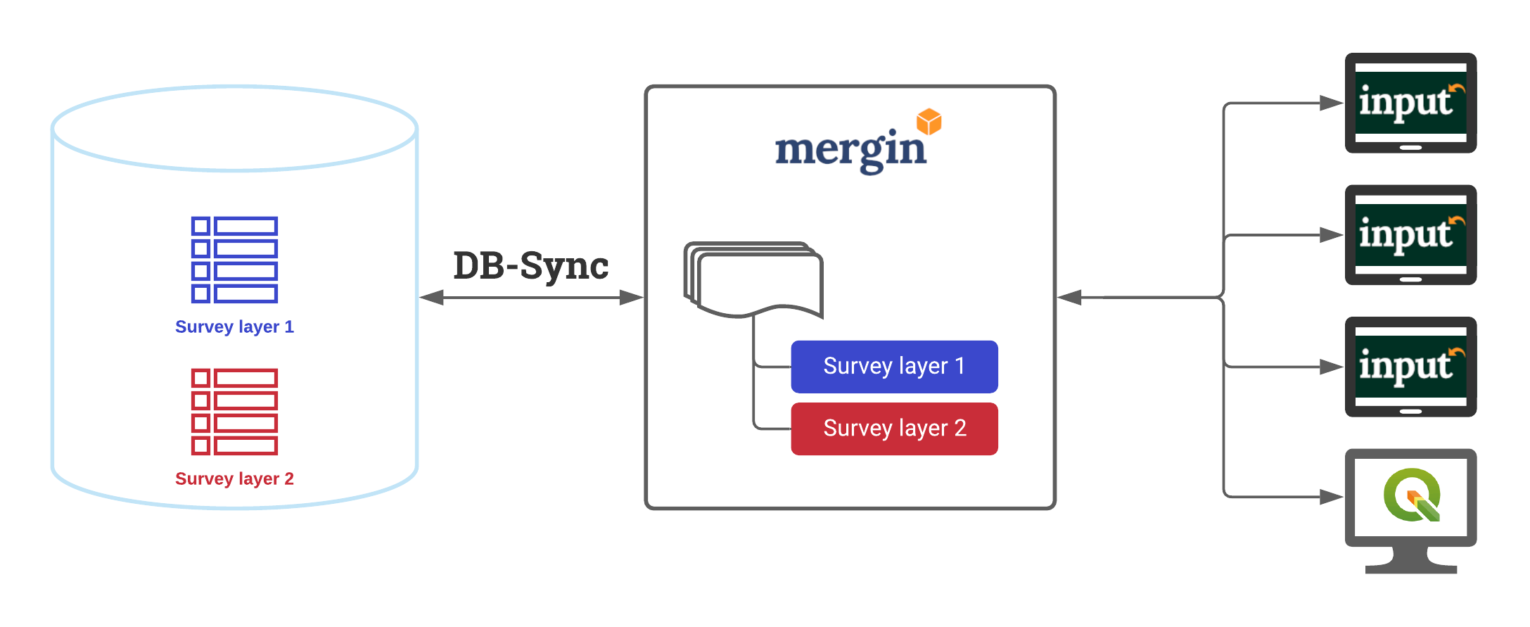
DB-Sync schema

The above diagram details how Postgres/PostGIS synchronisation works with the Mergin service via the DB-Sync tool.

  • Tables 1 and 2 from the Postgres/PostGIS server are set up to work with the Mergin service
  • DB-Sync tool runs on a server on a regular interval to sync with the Mergin service
  • An offline version of Tables 1 and 2 are provided within the QGIS survey project on Mergin
  • Several surveyors download the project and add their data mostly while offline. The data are then synced with the Mergin.

From the surveyors’ point of view, the extra set up to sync with the Postgres/PostGIS does not affect their workflow. In fact, mergin-db-sync tool acts as another client syncing data to the Mergin project, therefore it is possible to see all the changes in the project log originated from mergin-db-sync tool.

The tool is available on GitHub with a permissive open source license (MIT). At this point it supports PostgreSQL, but the mechanism is fairly generic and support for other database engines may be added in the future without great effort. All the heavy lifting is done by the Geodiff library which has been significantly enhanced during the development of mergin-db-sync tool.

To try the tool, please follow the instructions on the project’s readme on GitHub. The easiest way is to use it in a Docker container.

If you have any issues or feedback to enhance the tool, you can file a ticket on the project repo.

If you’d like to set up DB-Sync tool with your Mergin survey projects, you can contact us on [email protected]

(Nederlands) PDOKservices-plugin update

Sorry, this entry is only available in Dutch.

GRASS GIS 7.8.5 released

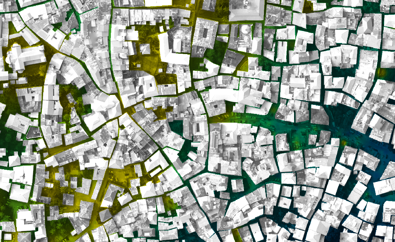
What’s new in a nutshell Zanzibar Mapping Initiative data processed in OpenDroneMap and interpolated respecting building footprints using v.surf.icw

As a follow-up to the previous GRASS GIS 7.8.4 we have published the new release GRASS GIS 7.8.5 with more than 80 improvements. This minor release offers new wxGUI fixes across the tree. Also the addon extension manager received various stability fixes. VRT raster map with tiled raster maps can now be properly exported and imported in the native GRASS GIS raster format.

The overview of new features in the 7.8 release series is available at new features in GRASS GIS 7.8. See also our detailed announcement with the full list of changes and bugs fixed at https://trac.osgeo.org/grass/wiki/Release/7.8.5-News.

Binaries/Installer download:

Source code download:

First time users may explore the first steps tutorial after installation.

About GRASS GIS

The Geographic Resources Analysis Support System (https://grass.osgeo.org/), commonly referred to as GRASS GIS, is an Open Source Geographic Information System providing powerful raster, vector and geospatial processing capabilities. It can be used either as a stand-alone application or as backend for other software packages such as QGIS and R geostatistics or in the cloud. It is distributed freely under the terms of the GNU General Public License (GPL). GRASS GIS is a founding member of the Open Source Geospatial Foundation (OSGeo).

The GRASS Development Team, Dec 2020

The post GRASS GIS 7.8.5 released appeared first on Markus Neteler Consulting.

OSGeo at FOSDEM 2021 (Online) – Call for Participation for the geospatial devroom

Call for Participation for FOSDEM 2021 geospatial devroom

Submission Deadline: 26.12.2020

FOSDEM is the largest free and open source developers meeting in Europe, with 8000+ participants. It normally takes place in Brussels (Belgium).

FOSDEM 2021 will be an online event. We will have a geospatial devroom again. The geospatial devroom will be on Saturday, 6 February 2021. In 2021 it will be our opportunity to bring our global community to FOSDEM.

The geospatial devroom is the place to talk about the state of the art of open, geo-related data, free and open source geospatial software and its ecosystem. This includes standards and tools, e.g. spatial databases, online mapping tools, geospatial services, used for collecting, storing, delivering, analysing, and visualizing geodata.

We are looking for you to be part of the geospatial devroom. The geospatial devroom aims to host talks about geospatial topics, GIS, and geodata projects, standards and open data.

Please submit your talk till 26. December 2020.

You find detailed information about the CfP at:
https://www.osgeo.org/foundation-news/osgeo-at-fosdem-2021-online-call-for-participation/

We hope you will submit a talk or come around at FOSDEM 2021.

See you at FOSDEM 2021

The post OSGeo at FOSDEM 2021 (Online) – Call for Participation for the geospatial devroom appeared first on Markus Neteler Consulting.

New version of Serval QGIS plugin

Raster selection tools and editing with QGIS expressions.

What’s new?

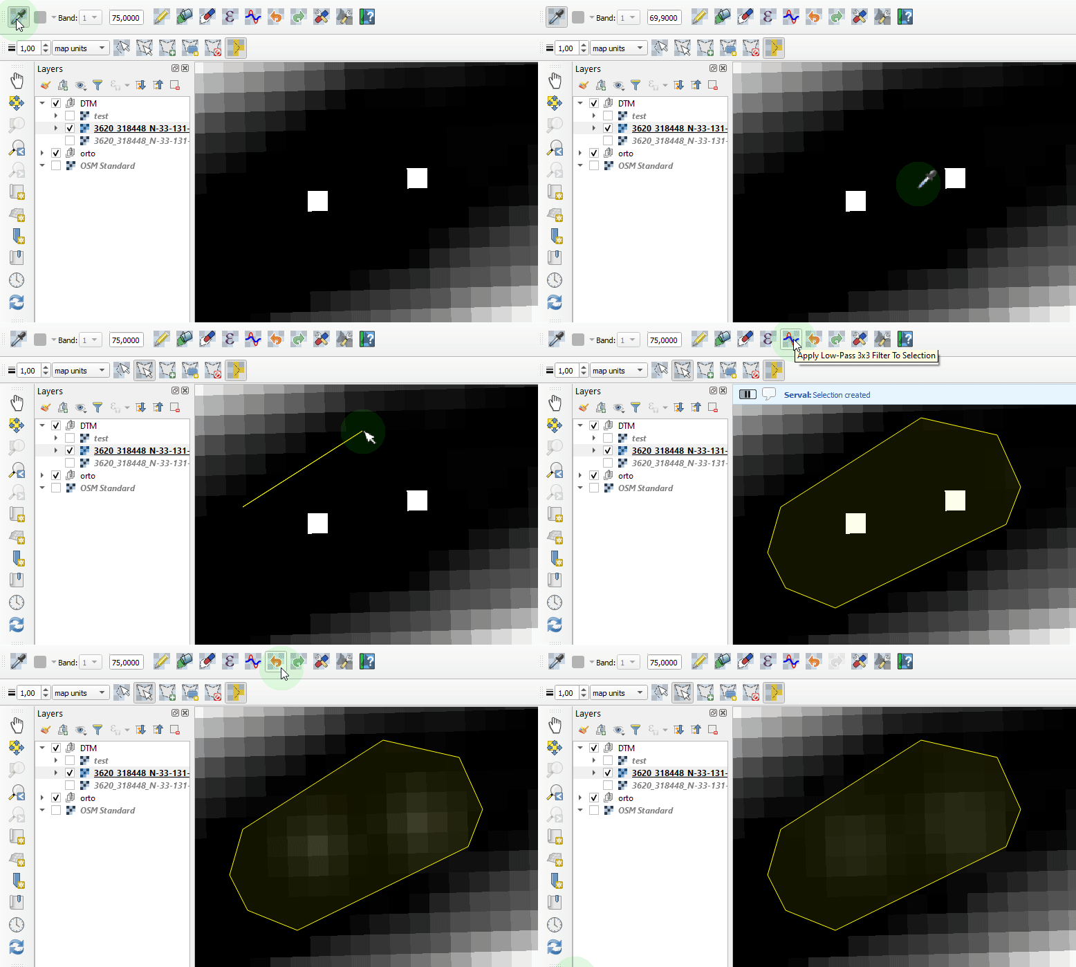
In the previous version Serval allowed for setting a constant value to a single raster cell at a time. The latest version brings in new raster cells selection tools and new ways of manipulating cells value:

  • QGIS expressions and
  • 3x3 low-pass filter.

Multi-bands rasters are fully supported - each band can be edited separately. Serval is meant to provide a convenient way to modify selected parts of a raster layer. It is not optimized to process entire images - use Raster Calculator for that.

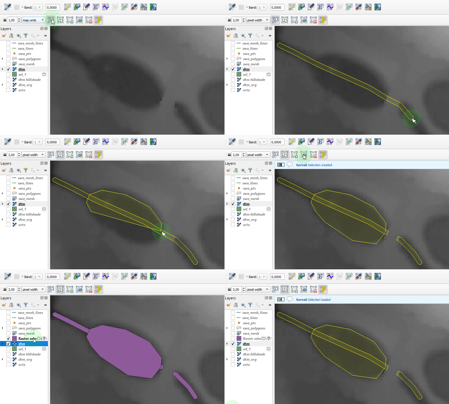
Raster selection tools

In order to modify raster cells values users need to select them first with a line or polygon selection tool. The line selection tool has a configurable width and unit. Selections can also be easily imported/exported from/to a vector map layer.

Multiple selections are allowed and users can add or remove from existing selection using CTRL and SHIFT keys modifiers, respectively.

Selecting raster cells

Modifying rasters with QGIS expressions

In addition to setting a constant value, new cells value might be evaluated using QGIS expressions. Users can build their expressions using cells’ row and column variables, or x and y of cell center point.

In the Serval group of the builder users will find several expression functions for:

  • interpolating raster value from a mesh layer,
  • averaging attribute values from vector layer features intersecting the cell,
  • getting the nearest vector layer feature attribute,
  • interpolating z-value from the nearest 3D linestring feature.

Interpolation on a mesh layer

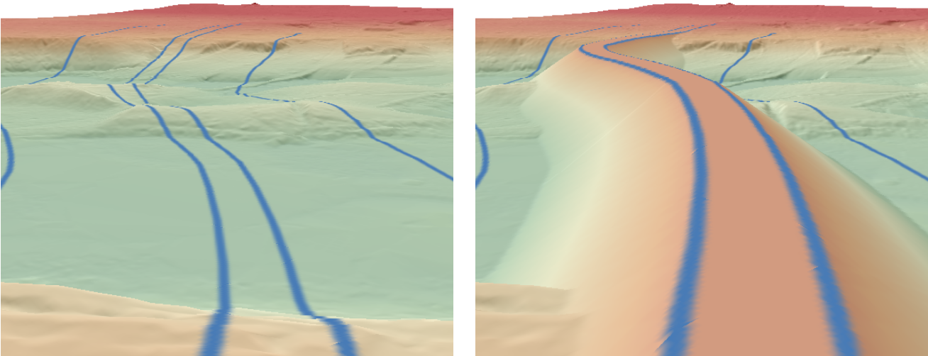
With the recent QGIS additions it is very easy to create mesh layers. Users can use a mesh layer for raster cell value interpolation. For example, interpolate_from_mesh() function will identify mesh dataset value and return it as a new raster value, optionally only when the value is higher than existing cell value. It is a convenient way for finding an embankment shape on a raster DTM - see pictures below.

Serval QGIS expression builder

Raster values interpolated on a mesh layer

Interpolation on 3D linestrings

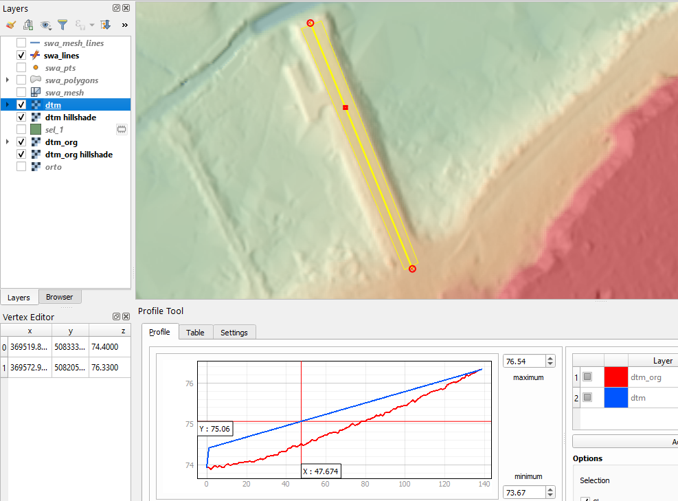
Another useful function finds the nearest point on a 3D line feature and interpolate its z-value. It could be used for fine-tuning terrain elevation from a 3D profile line.

For example, if the existing embankment crown needs to be raised by an amount at one of its ends, a user could create a profile line, adjust the vertex elevation in the Vertex Editor and use it for the interpolation.

Raising embankment elevation based on 3D profile line

Creating custom expression functions

In the Expression builder users can define their own functions using other types of vector and raster layers.

Applying 3x3 low-pass filter

For eliminating peak values or local cell values averaging, users can use 3x3 low-pass filter.

Applying low-pass filter

For more details and examples, refer to the plugin’s Manual.

You may also like...

Mergin Maps, a field data collection app based on QGIS. Mergin Maps makes field work easy with its simple interface and cloud-based sync. Available on Android, iOS and Windows. Screenshots of the Mergin Maps mobile app for Field Data Collection
Get it on Google Play Get it on Apple store

MapScaping podcast: GRASS GIS probably doesn’t get the attention it deserves

THE MAPSCAPING PODCAST, GRASS GIS episode

In episode 86 of MapScaping podcast, Markus Neteler talks about the functionality offered (the topological vector engine, 2D and 3D raster analysis, image processing and available programming interfaces), and whom GRASS GIS is for.

Markus is the cofounder of mundialis, a Bonn based business. He is also the Chairman of the GRASS GIS Project Steering Committee.

Enjoy the podcast and the transcript!

The post MapScaping podcast: GRASS GIS probably doesn’t get the attention it deserves appeared first on Markus Neteler | Geospatial Analysis | Remote sensing | GRASS GIS.

Spatial data exploration with linked plots

In the previous post, we explored how hvPlot and Datashader can help us to visualize large CSVs with point data in interactive map plots. Of course, the spatial distribution of points usually only shows us one part of the whole picture. Today, we’ll therefore look into how to explore other data attributes by linking other (non-spatial) plots to the map.

This functionality, referred to as “linked brushing” or “crossfiltering” is under active development and the following experiment was prompted by a recent thread on Twitter launched by @plotlygraphs announcement of HoloViews 1.14:

Turns out these features are not limited to plotly but can also be used with Bokeh and hvPlot:

Like in the previous post, this demo uses a Pandas DataFrame with 12 million rows (and HoloViews 1.13.4).

In addition to the map plot, we also create a histogram from the same DataFrame:

map_plot = df.hvplot.scatter(x='x', y='y', datashade=True, height=300, width=400)
hist_plot = df.where((df.SOG>0) & (df.SOG<50)).hvplot.hist("SOG",  bins=20, width=400, height=200) 

To link the two plots, we use HoloViews’ link_selections function:

from holoviews.selection import link_selections
linked_plots = link_selections(map_plot + hist_plot)

That’s all! We can now perform spatial filters in the map and attribute value filters in the histogram and the filters are automatically applied to the linked plots:

Linked brushing demo using ship movement data (AIS): filtering records by speed (SOG) reveals spatial patterns of fast and slow movement.

You’ve probably noticed that there is no background map in the above plot. I had to remove the background map tiles to get rid of an error in Holoviews 1.13.4. This error has been fixed in 1.14.0 but I ran into other issues with the datashaded Scatterplot.

It’s worth noting that not all plot types support linked brushing. For the complete list, please refer to http://holoviews.org/user_guide/Linked_Brushing.html

(Nederlands) Communicatieplatform Gebruikersvereniging

Sorry, this entry is only available in Dutch.

Plotting large point CSV files quickly & interactively

Even with all their downsides, CSV files are still a common data exchange format – particularly between disciplines with different tech stacks. Indeed, “How to Specify Data Types of CSV Columns for Use in QGIS” (originally written in 2011) is still one of the most popular posts on this blog. QGIS continues to be quite handy for visualizing CSV file contents. However, there are times when it’s just not enough, particularly when the number of rows in the CSV is in the range of multiple million. The following example uses a 12 million point CSV:

To give you an idea of the waiting times in QGIS, I’ve run the following script which loads and renders the CSV:

from datetime import datetime

def get_time():
    t2 = datetime.now()
    print(t2)
    print(t2-t1)
    print('Done :)')

canvas = iface.mapCanvas()
canvas.mapCanvasRefreshed.connect(get_time)

print('Starting ...')

t0 = datetime.now()
print(t0)

print('Loading CSV ...')

uri = "file:///E:/Geodata/AISDK/raw_ais/aisdk_20170701.csv?type=csv&amp;xField=Longitude&amp;yField=Latitude&amp;crs=EPSG:4326&amp;"
vlayer = QgsVectorLayer(uri, "layer name you like", "delimitedtext")

t1 = datetime.now()
print(t1)
print(t1 - t0)

print('Rendering ...')

QgsProject.instance().addMapLayer(vlayer)

The script output shows that creating the vector layer takes 02:39 minutes and rendering it takes over 05:10 minutes:

Starting ...
2020-12-06 12:35:56.266002
Loading CSV ...
2020-12-06 12:38:35.565332
0:02:39.299330
Rendering ...
2020-12-06 12:43:45.637504
0:05:10.072172
Done :)

Rendered CSV file in QGIS

Panning and zooming around are no fun either since rendering takes so long. Changing from a single symbol renderer to, for example, a heatmap renderer does not improve the rendering times. So we need a different solutions when we want to efficiently explore large point CSV files.

The Pandas data analysis library is well-know for being a convenient tool for handling CSVs. However, it’s less clear how to use it as a replacement for desktop GIS for exploring large CSVs with point coordinates. My favorite solution so far uses hvPlot + HoloViews + Datashader to provide interactive Bokeh plots in Jupyter notebooks.

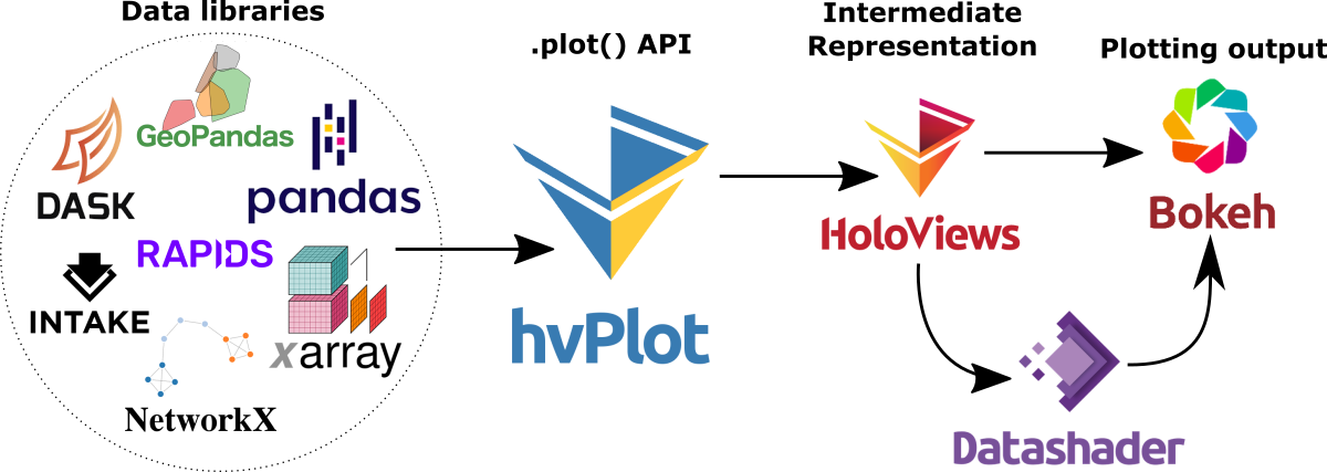
hvPlot provides a high-level plotting API built on HoloViews that provides a general and consistent API for plotting data in (Geo)Pandas, xarray, NetworkX, dask, and others. (Image source: https://hvplot.holoviz.org)

But first things first! Loading the CSV as a Pandas Dataframe takes 10.7 seconds. Pandas’ default plotting function (based on Matplotlib), however, takes around 13 seconds and only produces a static scatter plot.

Loading and plotting the CSV with Pandas

hvPlot to the rescue!

We only need two more steps to get faster and interactive map plots (plus background maps!): First, we need to reproject the lat/lon values. (There’s a warning here, most likely since some of the input lat/lon values are invalid.) Then, we replace plot() with hvplot() and voilà:

Plotting the CSV with Datashader

As you can see from the above GIF, the whole process barely takes 2 seconds and the resulting map plot is interactive and very responsive.

12 million points are far from the limit. As long as the Pandas DataFrame fits into memory, we are good and when the datasets get bigger than that, there are Dask DataFrames. But that’s a story for another day.

Dashboards in QGIS

If you are following QGIS topics on social media, you may have already seen this but if you don’t, I recommend having a look at Tim Sutton’s most recent adventures in building dashboards with QGIS:

The dashboard is built using labeling and geometry generator functionality. This means that they work in the QGIS application map window as well as in layouts. As hinted at in the screenshot above, the dashboard can show information about whole layers as well as interactive selections.

Here’s a full walk-through Tim published yesterday:

You can follow the further development via Tim’s tweets or the dedicated Github issue (where you can even find an example QGIS dashboard project in a GeoPacakge for download).

(Fr) Oslandia recrute : ingénieur(e) développement C++ / Python &#8211; OSL2011B

Sorry, this entry is only available in French.

Donatie OGT en ander QGIS Gebruikersvereniging nieuws

Sorry, this entry is only available in Dutch.

Google Summer of Code 2020 : QGIS 3D Improvements

In this year Google Summer of Code (GSoC), multiple new features were added to QGIS 3D. Belgacem Nedjima as the student with Martin Dobias and Peter Petrik as the mentors have implemented the following features into the 3D viewer of QGIS:

Feature 1 : Textures support

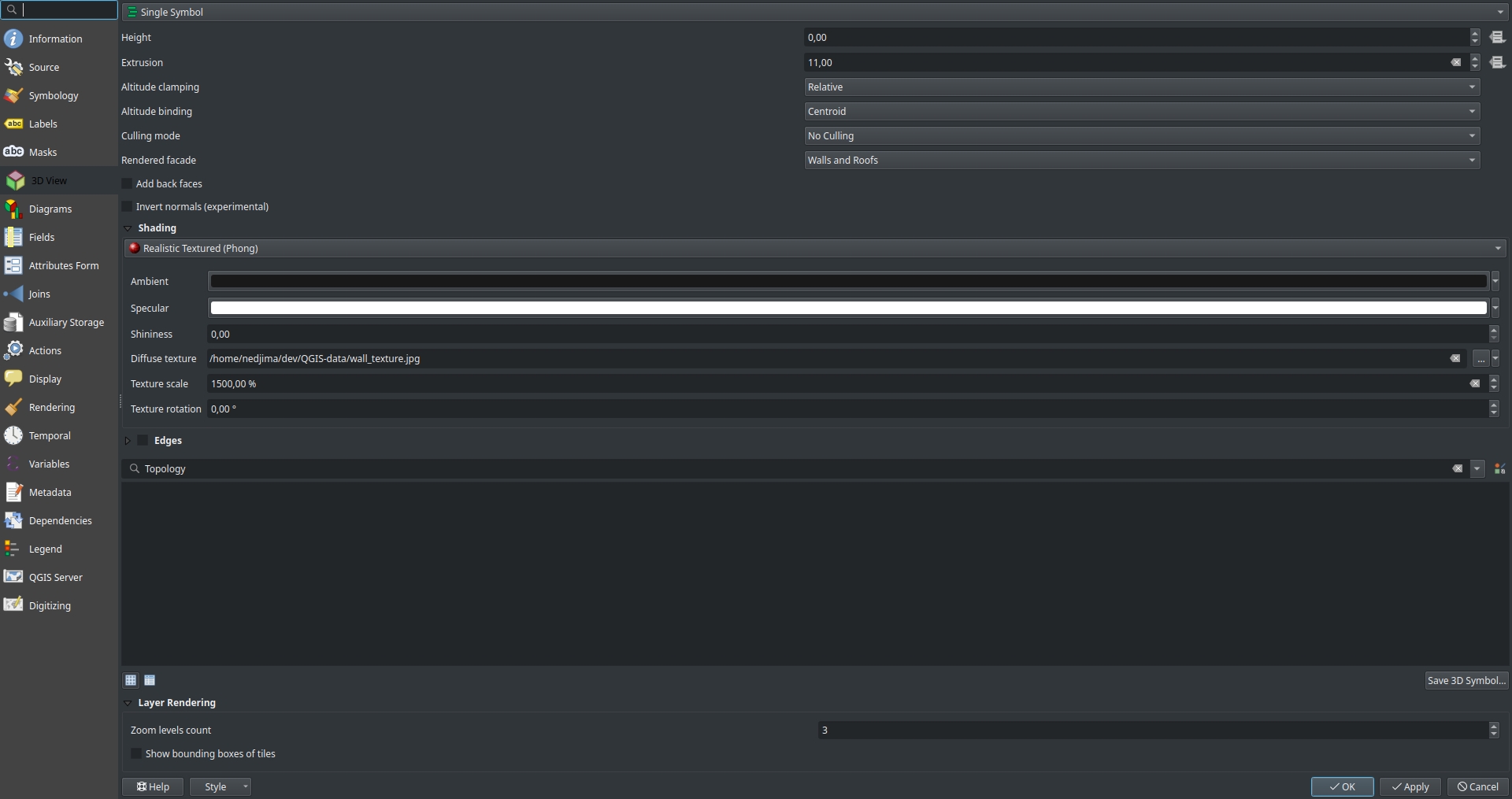
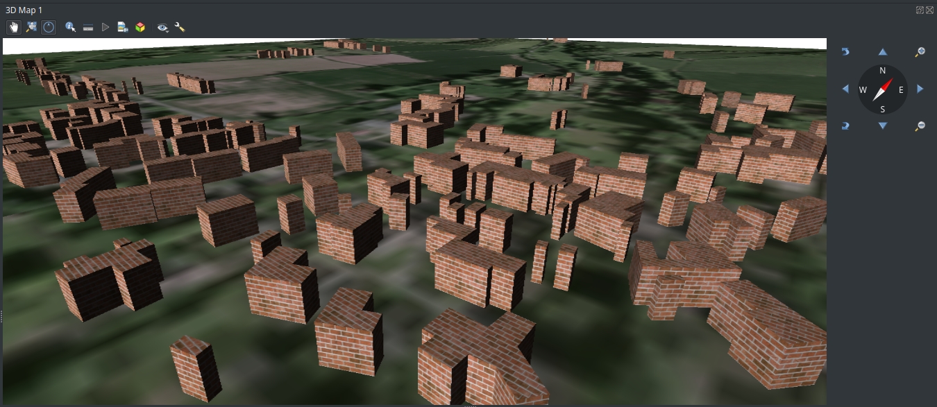
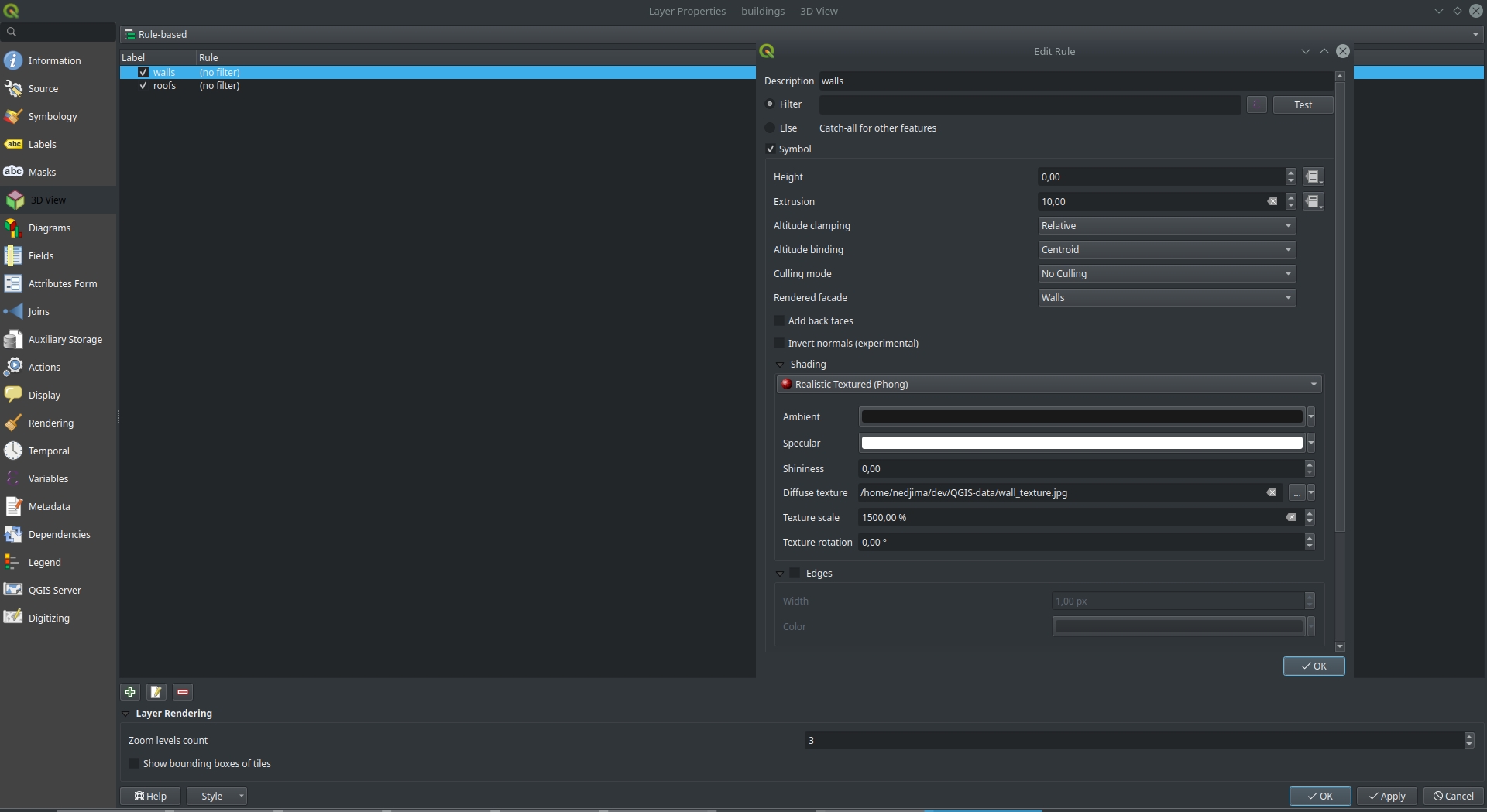
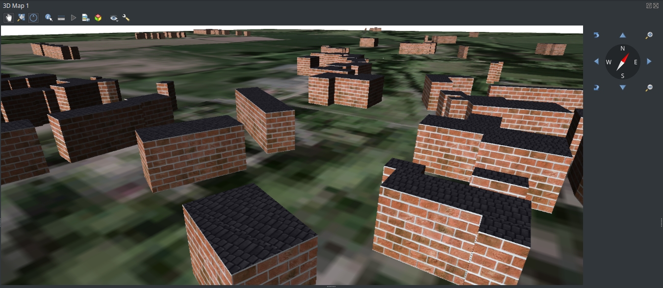
Now it is possible to add textures to vector layer data (buildings) in the 3D viewer: To do that you need to go the vector layer properties and select Realistic Textured (Phong) shading mode and select the image to be displayed on the surfaces by providing an image file to the diffuse texture field. texture-support-UI You can adjust the scale of the image and its rotation from the texture scale and texture fields respectively. texture-support-preview There is a workaround to seperate roofs from walls using rule based rendering by adding 2 seperate rules and selecting which facet (roof or a wall) to display and select which rendered facade to be used and the shading setting for each rule. texture-support-walls-roofs-UI Results for seperating roofs and walls texture-support-walls-roofs-preview

Feature 2 : Directional lights

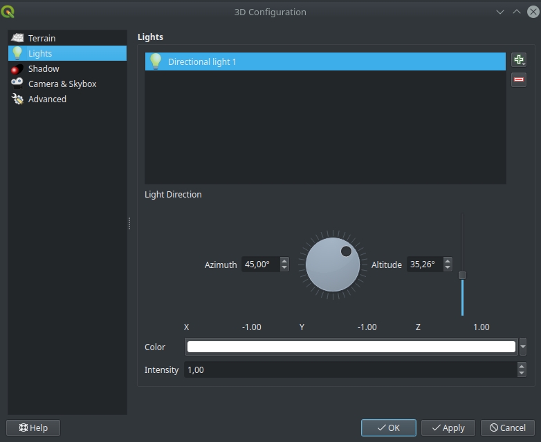
QGIS 3.16 adds support for directional lights that you can think of as the sun. The default light in QGIS 3.16 is now directional which makes the lighting of the whole scene better. To use directional lights, open the 3D configuration dialog and from the lights tab you can configure how many lights you use. If you select a directional light, you will see the new improved way to provide the direction of the light (Thanks to Vincent Cloarec for the UI improvements). directional-lights-UI

Feature 3 : Scene export as .obj file

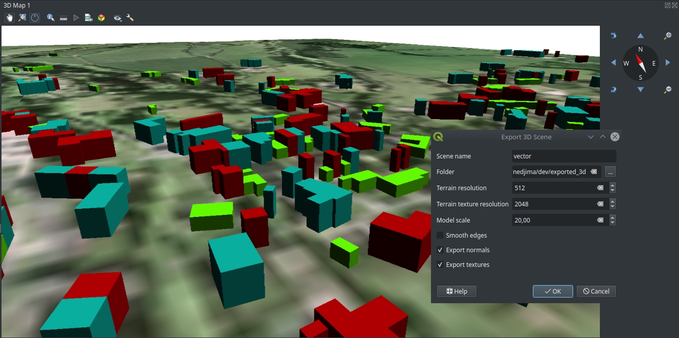
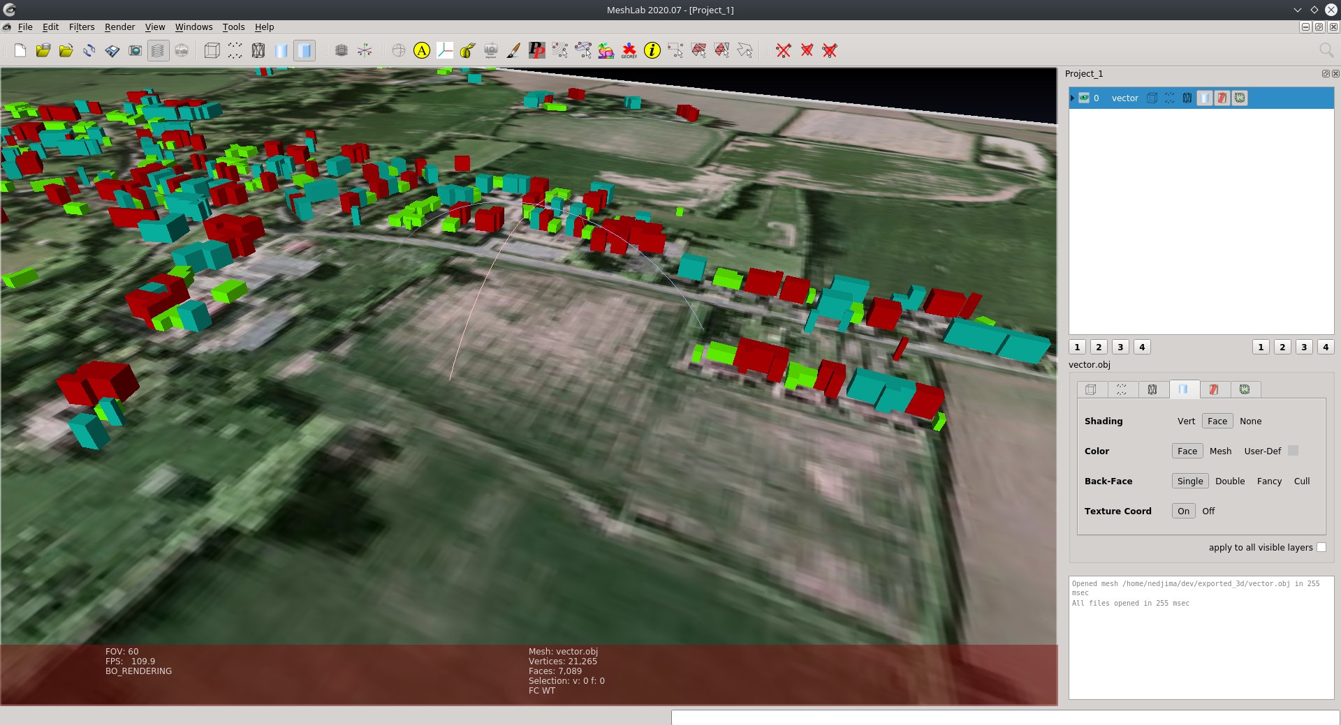
In the 3D viewer there is a new tool to export the scene as a .obj file and visualize or edit it in other software like Blender or MeshLab. To export the scene, from the 3D viewer select the 3D object icon and you will see the following dialog: export-UI You can select the name of the .obj file and where to save it (you need to select a folder because you will have multiple files if you export textures or color informations). You can specify the resolution of the terrain in case you’re using a DEM as well as the resolution of the exported textures. Here is a view of what an exported scene that has multiple rendering rules looks like in MeshLab: export-meshlab-preview

Feature 4 : Skybox rendering

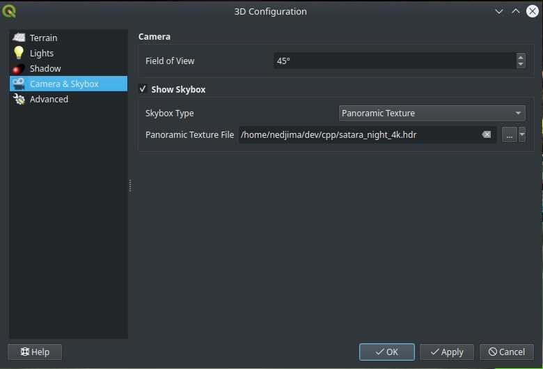
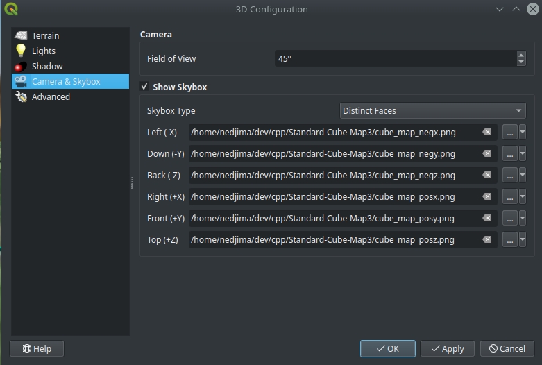
You can add a skybox to your scene from the 3D configuration dialog and selecting from the 2 skybox formats provided:

  • Panoramic Texture: One 360 image is used to generate the skybox
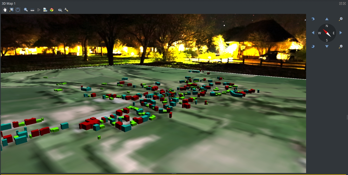
  • Distinct Faces: 6 different faces describing the cube map of the skybox skybox-panoramic skybox-distinct-faces The result of applying a skybox to the scene: skybox-preview

Feature 5 : Shadow rendering (beta)

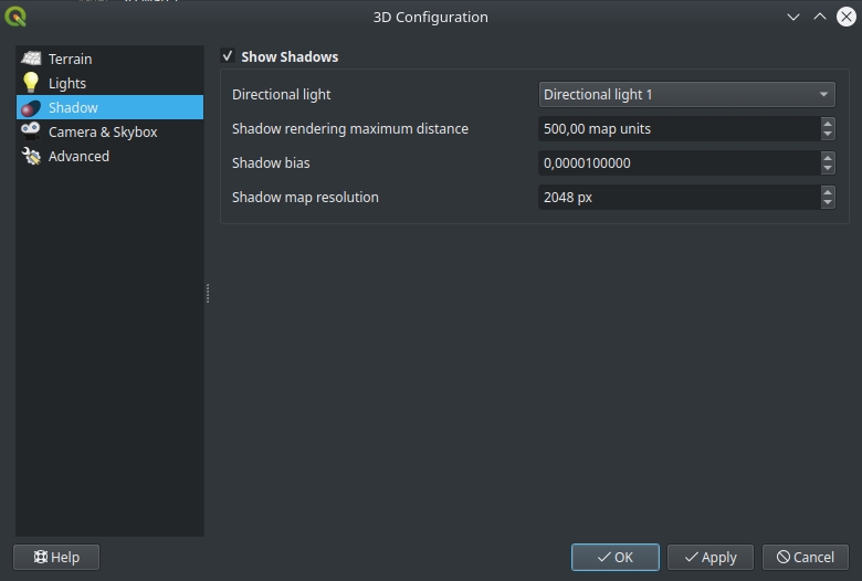
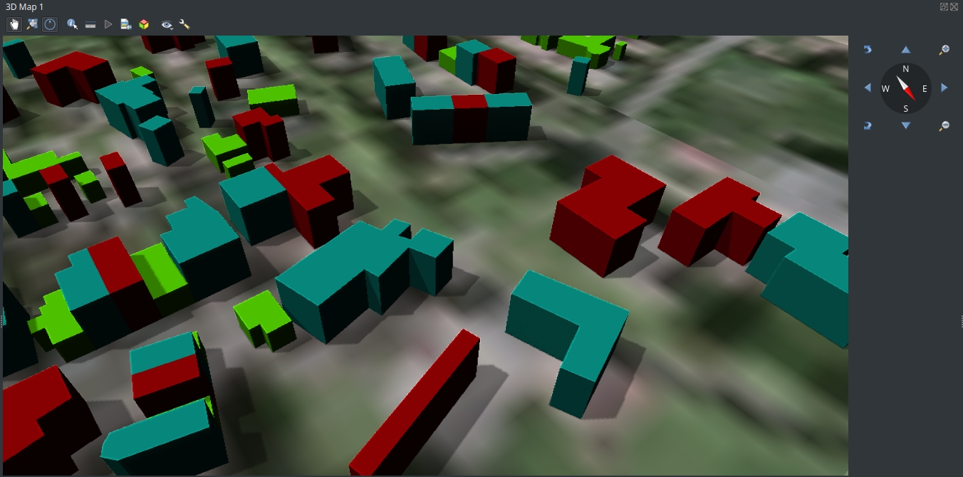
Althought it might not work for everyone, shadow rendering was added as a technical preview in QGIS 3.16. To try shadows, you need to open the 3D configuration dialog and enable shadows from the Shadows tab. shadows-settings-menu You can experiment with the shadow rendering parameters if you want to decrease the visual artifacts and make the shadows look better in the scene. Here is how the shadows look like in our scene: shadows-preview

You may also like...

Mergin Maps, a field data collection app based on QGIS. Mergin Maps makes field work easy with its simple interface and cloud-based sync. Available on Android, iOS and Windows. Screenshots of the Mergin Maps mobile app for Field Data Collection
Get it on Google Play Get it on Apple store

  • <<
  • Page 23 of 141 ( 2808 posts )
  • >>

Back to Top

Sustaining Members