Related Plugins and Tags

QGIS Planet

QField Users Sit Down, We Need to Talk About Storage Access on Android

TLDR: Since November 2021, Google has enforced new storage access limitations for apps published on its Play store which prohibits direct storage access on Android 11 and above forcing QField to adapt and rely on importing projects and datasets to access those.

If you are a QField beta user on Android 11 and above, you might have noticed a significant change in the way the app is handling storage in the latest set of betas released in early February of 2022. This blog post will go over the changes, explain why those had to be made (looking at you, Google), how to work in this new paradigm, and showcase some new benefits from the hard work done by OPENGIS.ch’s geoninjas.

It’s all gone! How can I access my projects and datasets?!

Starting with Android 11, apps are denied full access to main and external storage content. For QField, this means direct access to projects and datasets transferred and/or downloaded into storage folders is not possible anymore.

To work within this new confine, QField now has to import project folders or individual datasets into an app-dedicated storage location where Android allows for unrestricted read/write access.

Practically, this means that instead of being shown and having access to the full storage tree when clicking on the “Open local files” button, users are now shown a set of new folders named ‘QField files directory’, ‘Imported datasets’, and ‘Imported projects’ as well as a drop-down menu accessible via a top-right three-dot button.

The drop-down menu lists the means to import projects and datasets: import project from folder, import project from ZIP [archive], and import [individual] dataset(s).

Import project from folder

When importing a project from a folder, users will be asked to grant permission for QField to read the content of a given folder on the device’s storage via a system folder picker. When the folder is selected, QField copies the folder content (including its sub-folders) into the app’s ‘Imported projects’ location. Users can then open the project from there.

Re-importing a given folder through the drop-down menu action will overwrite preexisting projects given an identical folder name. That allows users to be able to update projects.

Note that feature editing, addition, and deletion will be saved into the imported project’s datasets, not in the original folder selected during the import process. More on how to find and handle those project datasets will come later in this post.

Import project from ZIP archive

Having to adapt to Google’s new set of rules did not come without its benefits. Users can now easily transfer projects into a given device by compressing the project content into a ZIP archive and having QField import that compressed project automatically. This can greatly ease remote deployment of projects by being able to send a single file to users.

Import dataset(s)

QField can also import individual dataset(s). Users will be asked to select one or more files via a system file picker, which will be copied into the ‘Imported datasets’ folder. Users will have to ensure that all sidecar files are selected when importing (e.g. a shapefile dataset would require users to select the .shp, .shx, .dbf, .prj, and .cpg files).

Just like imported projects, editing of datasets will be saved into the imported datasets, and not reflected in the original files.

Alright, but how can I retrieve modified projects and datasets?

Imported projects and datasets can be accessed directly using a USB cable. The location on storage is displayed in the top navigation bar when opening a local file.

On most devices plugged into a computer via USB cable connection, the path will be <drive>:/Android/data/ch.opengis.qfield/files/ where you will find both the Imported Datasets and Imported Projects folders within which your edited content will be located.

However, we’ve also added a nice new ‘Send to…’ functionality that allows for users to share and send datasets straight from QField using Android APIs. This allows for the sending of edited datasets directly to third party apps (Gmail, Drive, Dropbox, Nextcloud, your favourite messenger app, etc.).

Is direct copying via USB cable gone altogether?

Users can still avoid going through the import process by copying files via a USB cable connection directly into the QField app’s files directory. As mentioned above, the location on most devices will be <drive>:/Android/data/ch.opengis.qfield/files/.

What are the benefits from these changes?

Working out a functional solution to meet Google’s newly-enforced restrictions did not come without its benefits.

On top of what was already covered above – importing of compressed project ZIP files and sharing functionalities – QField is now fully integrated with Android’s cross-application document sharing APIs. This means that users can now directly open projects and files sent to them via their favourite browser/email/cloud/messenger app without the need to first download those files onto the device.

Altogether, the newly-coded importing mechanisms and integration with Android document APIs don’t only improve the ease of use for the average person, it also makes viewing and editing spatial datasets on QField far more secure. The imported projects and datasets reside in a location with access limited to QField only, meaning that its content is inherently far more protected from malicious access from third-party apps.

Why were these drastic changes needed?

As mentioned in the introduction, the changes were needed to comply with a set of new Google Play policies that came into force in November 2021. Users can read more on Google’s rationale on this page https://developer.android.com/google/play/requirements/target-sdk.

As part of the enforcement of these new policies, Google came up with an arbitrary mechanism to whitelist some apps which allows those to retain full storage access given the user explicitly allowed for it. We here at OPENGIS.ch believes QField had ample justifications to be whitelisted, however, Google’s appeal process judged otherwise after a series of email exchanges detailing our reasoning. While we have so far lost this argument with Google, we will continue fighting for our users and for their freedom to choose. If by any chance you have a good contact at Google that might be willing to listen to our reasoning, we would be grateful if you’d get in touch with us.

We hope this clarifies the recent changes and helps QField users adapt to those.

GRASS GIS 8.0.1 released

This is an update release of the GRASS GIS 8.0 series. Download source code tarball at https://grass.osgeo.org/grass80/source/grass-8.0.1.tar.gz https://grass.osgeo.org/grass80/source/grass-8.0.1.md5sum For further release details (bug fixes and enhancements), see https://trac.osgeo.org/grass/wiki/Grass8/NewFeatures80 The GRASS GIS 8.0.1 release provides more than 20 fixes and improvements with respect to the release 8.0.0. What’s Changed Important fixes utils/mkhtml: fix print warning/fatal message […]

The post GRASS GIS 8.0.1 released appeared first on Markus Neteler Consulting.

Qgis Then and Now

QGIS turns twenty this year. I wrote the first lines of code in mid-February of 2002.

As many of you may know, the first time the code compiled and ran, it could do one thing:

  • Connect to a PostGIS database and draw a vector layer.

This was the humble beginning of one of the most popular open source GIS applications. GRASS GIS is of course the grandaddy of open source GIS, but the 20th birthday of QGIS is a testament to its longevity and commitment of all those who have made it what it is today.

I did an analysis of the code using cloc, which counts the lines of code and displays a summary.

GRASS GIS 8.0.0 released! Finally…

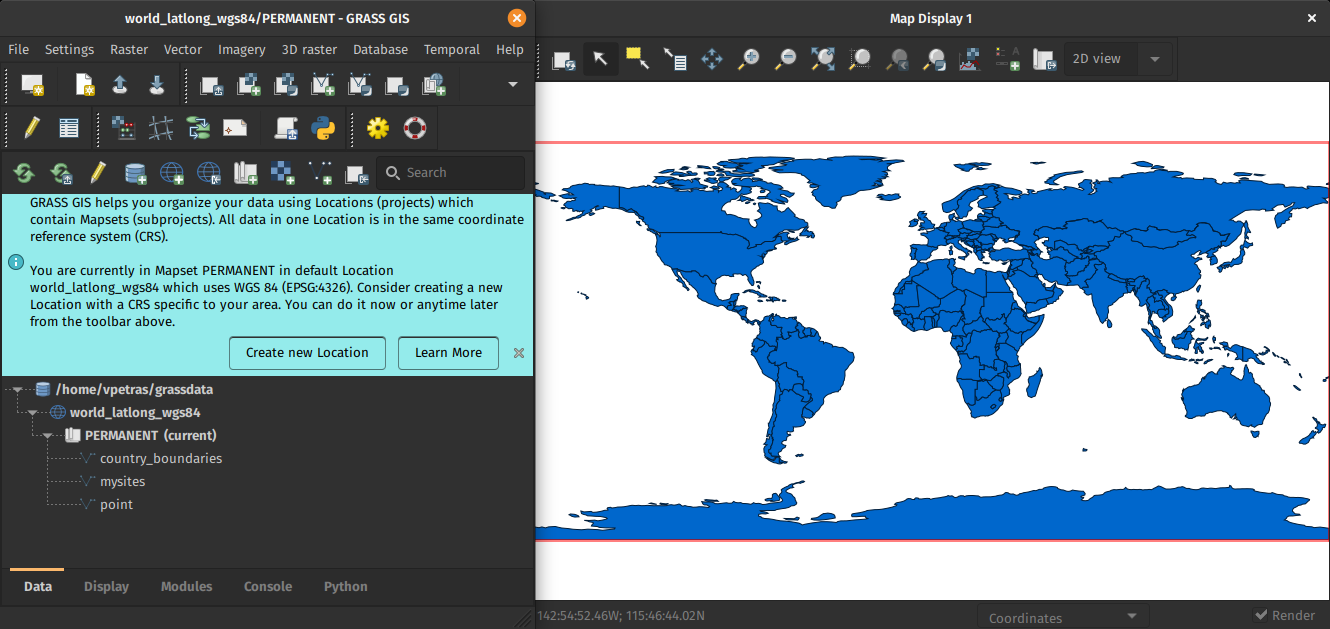
Overview of changes After more than 3 year of development the first stable release GRASS GIS 8.0.0 is available. Efforts have concentrated on making the user experience even better, providing many new useful additional functionalities to modules and further improving the graphical user interface. Breaking news: new graphical user interface with entirely rewritten startup sequence! […]

The post GRASS GIS 8.0.0 released! Finally… appeared first on Markus Neteler Consulting.

Reports from the winning grant proposals 2021

With the QGIS Grant Programme 2021, we were able to support eight proposals that are aimed to improve the QGIS project, including software, infrastructure, and documentation. The following reports summarize the work performed in the proposals. 

  1.  QGIS Server and services documentation (#213) – Report
    The Services chapter of the QGIS Server documentation needed some love to
    be effectively representative of the underlying implementation. Numerous
    services, requests or parameters were not documented at all. Some others
    also had very sketchy descriptions. Thanks to this QEP, the Services
    chapter is now in a much better shape!
  2. Rework handling of multi-layer, mixed-format datasets (#216) – Report
    While the work was partly motivated as an opportunity to clean up some
    older parts of the QGIS codebase which were fragile and had low test
    coverage, it has also resulted in many improvements and polish in the
    QGIS user interface.
  3. Port DB Manager Table Management Functionalities to Browser: SQL execution (part 3) (#205) – Report
    Besides SQL execution functionalities, an additional PR adds to QGIS core the query layer management tool that was provided by DB Manager plugin. The new API is fully covered by unit tests.
  4. Locale support for numeric input and display: revision and enhancements (#210) – Report
    The work has been completed with multiple pull requests that fixed all localization issues that have been reported plus countless unreported issues that have been identified along the way.
  5. Integrate GPS Tools plugin functionality into core QGIS (#217) – Report
    This grant sees the removal of the old, unmaintained “GPS Tools” core plugin, with all functionality from the plugin moved to reusable Processing algorithms or the unified Data Source Manager dialog. Since the functionality now uses the Processing framework, users gain the ability to run these tools in batch modes, as part of graphical models, and from 3rd party scripts and plugins. As a bonus the new tools are all fully covered by unit tests.
  6. QGIS Server, OGC tests and Continuous Integration: OGC API Features (part 2 (#212) – Report
    Thanks to the QEP funding, the OGC API Features standard for QGIS Server is
    now checked in QGIS continuous integration since end-November 2021.
  7. Fixing terrain and camera issues in 3D (#215) – Report
    These improvements should make the 3D map view easier to use. Especially the camera control issues (unintuitivie camera rotation and wrong center point) were quite tricky to fix.
  8. Review process on plugins.qgis.org and improvements (#219) – This proposal has been withdrawn.

Thank you to everyone who participated and made this round of grants a great success and thank you to all our sponsor and donors who make this initiative possible!

QGIS Annual General Meeting – 2021

Dear QGIS Community

We recently held our 2021 QGIS Annual General Meeting. The agenda included approval of the annual report and financial report 2020, as well as the new budget for 2022.

The minutes of this meeting are available for all to view.

Regards

Marco Bernasocchi (QGIS.ORG Chair)

QField collected data crucial in disaster relief after Tonga’s volcanic eruption

For once, it’s not an app from the Silicon Valley, but from Laax in the Swiss Alps that made the news. By publishing QField as an open-source app, OPENGIS.ch allows companies, organisations and even countries without the necessary financial means to have the opportunity to benefit from this important data collection app. And it is being used: Over half a million downloads have already been achieved. Now, since the volcanic eruption in Tonga on 15 January 2022, the app of the small Laax-based company is playing a not-unimportant role in disaster response planning. 

We’ve only been around for seven years. We could almost pass for a start-up. But OPENGIS.ch is already a household name when it comes to field data collection. OPENGIS.ch makes its field mapping tool QField available without restrictions (i.e. open-source) so that companies or even nations can collect their geographical data. In this way, data is brought from the field to the office and provides important insights for future decisions.
This was also the case for Tonga’s volcanic eruption. There, in December 2021, many relevant agricultural datasets were captured with “QField” and “QFieldCloud”. This currently helps the Ministry of Agriculture, Food, Forests, and Fisheries to analyse the damage after the volcanic eruption and the subsequent tsunami and plan the response.

Swiss software in use for Tonga

It is a technical and ethical decision for me. I want not only the privileged nations to benefit from our work.

Marco Bernasocchi, CEO

Co-founder Marco Bernasocchi’s credo is to focus on further developing the product (QField). OPENGIS.ch makes it freely available, so that nations like Tonga, with little financial means, can use professional software and invest their financial resources in reconstruction. “It is a technical and ethical decision for me. I want not only the privileged nations to benefit from our work. We are always developing the product and generate income mainly from support, paid developments and custom solutions. Our product, however, is publicly accessible”. This strategy is successful: the company is 90% financed by Swiss customers but the app is used all over the world. “Open source is a technological advantage for me. This way we get the input of many developers worldwide who are motivated to work out the best possible software. This leads to a superior product and is particularly valuable to me.,” adds Matthias Kuhn, co-founder of OPENGIS.ch.

This way we get the input of many developers worldwide who are motivated to work out the best possible software.

Matthias Kuhn, CTO

John Duncan, project manager at the University of Western Australia, who is working on the project in support of Tonga, explains the work done in December like this: “the workflow uses QField to map the extent of landscape features including agricultural fields and cropped holdings, recording detailed attributes about each feature’s farming system. QFieldCloud was used to support large teams of data collectors tasked with surveying every tax allotment across Tonga. The initiative has resulted in the detailed mapping of cropping and livestock systems for over 11,000 farms across Tonga’s three main island groups. These datasets provide actionable information for short-term decision making around food security, agricultural planning, and disaster response, and are a valuable resource for longer-term monitoring of agricultural and environmental changes in these climate-vulnerable locations.

The data was originally intended for food security and agricultural planning. But now they suddenly have acquired enormous value and can be used for disaster response planning. 

John Duncan, University of Western Australia

Further information on QField in connection with Tonga: 

Media articles

About OPENGIS.ch

OPENGIS.ch GmbH is a Swiss software development company based in Laax. OPENGIS.ch employs 19 people and works mainly in the field of spatial software development, geodata infrastructure deployments and professional support. Personalised open source GIS solutions are often planned and developed as desktop or mobile applications. OPENGIS.ch finances itself through tailor-made customer solutions, professional support and adaptations. Link: https://opengis.ch

OPENGIS.ch team in Summer 2021 company retreat

About the OPENGIS.ch product “QField” application

“QField” is an open-source app developed for efficient fieldwork in real-time in urban areas, with 5G connection or with offline data. The mobile GIS app combines a minimal design with sophisticated technology to conveniently bring data from the field to the office. Seamless QGIS integration, GPS centred, offline functionality, synchronisation capabilities, desktop configurable: “QField” is designed for fieldwork – simple but uncompromising. Link: https://qfield.org

About the OPENGIS.ch service “QFieldCloud

“QFieldCloud” is a spatial cloud service integrated into “QField” that allows remote provisioning and synchronisation of geodata and projects. Although “QFieldCloud” is still in an advanced beta stage, it is already being used by many groups to significantly improve their workflows. Link: https://qfield.cloud

Mapping Invasive Weeds in Swan Bay, Australia

Mergin and the Input App used for efficient mapping and recording of weed clearance in environmentally important wetland of Swan Bay.


“Input can in theory handle everything you’d ever want for a mapping tool!”

Dr Greg Parry BSc (Hons), PhD - 8 December 2021


Greg Parry is President of the Swan Bay Environment Association in the Borough of Queenscliff, Victoria, Australia. This semi-retired marine ecologist runs a one-man ecological consulting business, Marine Ecological Solutions.

Edward’s Point, courtesy of SBEA

Bare sand and seagrass meadows off the beach at Edward’s Point.

Importance of Swan Bay

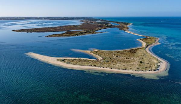
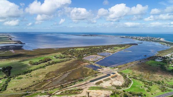
Swan Bay is a significant marine wetland with an area of 30 km2, situated near the entrance to Port Phillip Bay on the south-central coast of the Province of Victoria. This is an important bird habitat, supporting the life of about 200 different bird species. It has been recognised as an area of international importance under the Ramsar Convention. Every October, Swan Bay is visited by thousands of migratory shorebirds. More than 3 000 Black Swans can be seen in the bay in Summer and Autumn. The seagrass in Swan Bay is also an important habitat for a variety of fish and other marine life.

Drone image of Swan Bay, courtesy of SBEA

Drone image of Swan Bay, Australia

Aims of the Swan Bay Environment Association

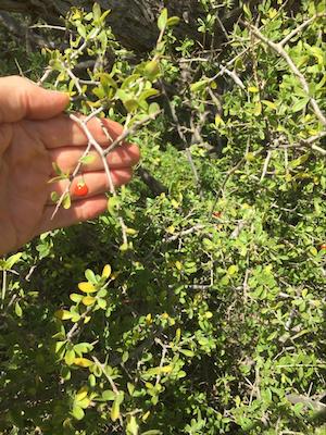
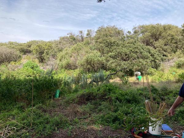
The natural flora and fauna in the area are under threat by environmental weeds. Among the 300 different plant species, about 50 % are alien. Invasive environmental weeds harm native plants and animals, the natural landscape and threaten the biodiversity of indigenous species. The three main invasive weeds in Swan Bay are Italian Buckthorn, African Boxthorn and Polygala myrtifolia (myrtle-leaf milkwort from South Africa).

African Boxthorn, courtesy of SBEA

African Boxthorn

A team of volunteers from among the 120 members of the Environment Association will assist with the removal of invasive weeds. Some of these are so large or spiny they need to be cleared by contractors. Others require spraying, while many will be cleared manually by a team of volunteers.

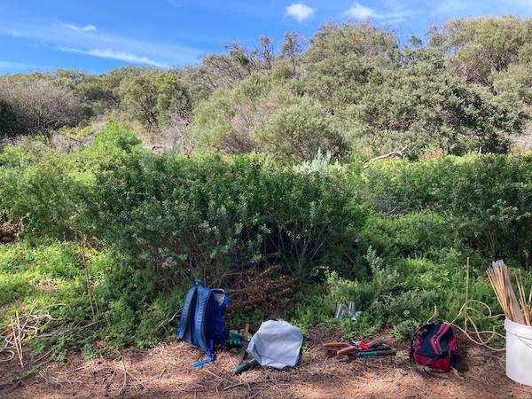
pre-weeding, courtesy of SBEA post-weeding, courtesy of SBEA

Pre- and post-weeding of the same area

Need for Effective Mapping

This is where Dr Parry’s expertise comes in – together with Mergin and the Input App. He realises the urgent need for effective mapping and planning, to co-ordinate the work of volunteers. If this is not done, there is “inadequate follow-up, so it is a waste of their time and energy”. He emphasises, “We need better records of when places are weeded and how they are weeded.”

The role of accurate mapping is two-fold: firstly to create a historical record of past weeding and to assess weed density, and, secondly, to identify the areas for future weeding.

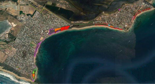
Dr Parry has classified the following categories for weeding as:

  1. areas suitable only for contractors requiring heavy equipment, (RED on map)
  2. areas suitable for contractors or volunteers – more open areas, usually where the worst weeds have already been removed by contractors, (ORANGE on map)
  3. areas suitable for volunteers – few weeds requiring diligent searching, and many man-hours but limited manual labour, (GREEN on map)
  4. areas where drainage has increased weed infestations so that drainage should be tackled before weed removal makes sense. (BLUE on map)
Classification of 4 different weeding categories, courtesy of SBEA

Classification of 4 different weeding categories

Dr Parry realises the need to store the information accurately (how much work has been done, the man-hours and number of people, etc.) and then to analyse it, so as to achieve a more effective job by volunteers in future.

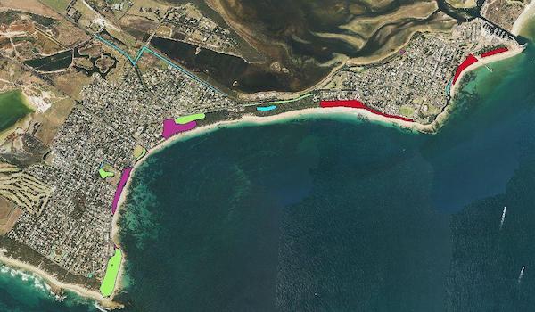
Weeds removed between 2015 and mid-2021, courtesy of SBEA

Map showing all areas where weeds have been removed between 2015 and mid-2021. Underlying these ‘weed density’ polygons are polygons showing areas that were weeded in different years between 2015-2021.

Conclusion

Dr Parry finds that Input has all the features required for this project. It will be very useful for volunteers in the field, especially as it is usable by both iOS and Android. He thinks it is “remarkably cheap”, compared to the software he had previously been using.

He has some experience with GIS and, after watching a YouTube instructional video, has managed to incorporate QGIS and set it up without many problems. Once he has fine-tuned the set-up, he is sure that he will be able to enlist many more willing volunteers for this important undertaking.

Back in 2005, Dr Parry had used a Magellan Mobile Mapper hand-held device for mapping, which was bulky and cost about $7 500. “Now all of the capacity of that system is available on your phone!” He is motivated to incorporate the user-friendly features of the Input App in order to achieve his main long-term objective:

“This information, I think, will be very helpful in improving co-ordination of weeding efforts within the borough and ensuring that resources are used efficiently. Over a few years, we will get a much better concept of the resources required to do the job in total. I’d summarise it to say we should be a bit more strategic about it, so as to be more effective.”

Download Mergin Maps Today

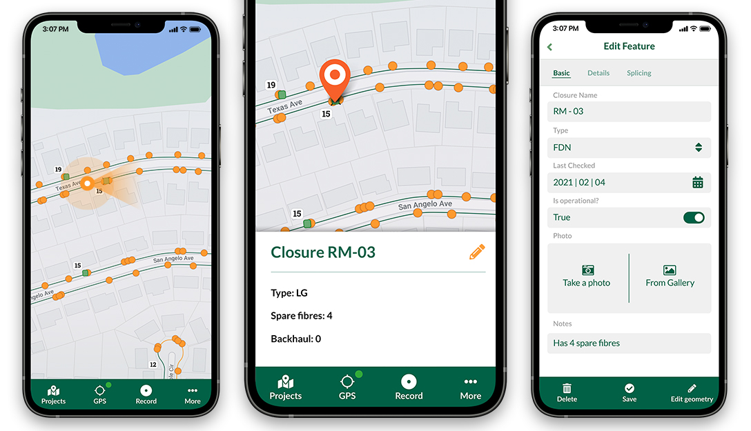
Screenshots of the Input App for Field Data Collection

Get it on Google PlayGet it on Apple store

GRASS GIS 8.0.0RC2 released

Overview of changes

After more than 3 year of development the first stable release GRASS GIS 8.0.0 is available. Efforts have concentrated on making the user experience even better, providing many new useful additional functionalities to modules and further improving the graphical user interface.

Breaking news: new graphical user interface with entirely rewritten startup sequence!

This re-establishes user experience compatibility with QGIS and other connected software packages.

The GRASS GIS 8.0.0 release provides more than 1,300 fixes and improvements with respect to the release 7.8.6.

With the introduction of the semantic label raster metadata class, the temporal database was modified to version 3. Hence, to be able to read and process GRASS 7.x space-time datasets, users will be prompted to run t.upgrade. If users want to read newly created space-time datasets back in GRASS 7.x, they can run t.downgrade.

Launching the software

The user experience of the graphical user interface has been completely rewritten: no more clumsy selection screens – just enter the menu system directly!

And on command line, GRASS GIS now starts versionless, i.e. as grass.

Download and detailed list of changes

See https://github.com/OSGeo/grass/releases/tag/8.0.0RC2

Thanks to all contributors!

GRASS GIS 8.0.0RC2 contributors

The post GRASS GIS 8.0.0RC2 released appeared first on Markus Neteler Consulting.

QGIS Grants #7: Call for Grant Proposals 2022

Dear QGIS Community,

We are very pleased to announce that this year’s round of grants is now available. The call is open to anybody who wants to make a funded contribution to QGIS, subject to the call conditions outlined in the application form.

The deadline for this round is in four weeks, on 13th February 2022.

As of 2022, we are changing the procedure in the following ways:

  • The project budgets should account for PR reviewing expenses to ensure timely handling of the project-related PRs and avoid delays caused by relying on reviewer volunteer time. 
  • In the week after the QEP discussion period, the proposal authors are expected to write a short summary of the discussion that is suitable for use as a basis on which voting members make their decisions. 

Also, note the following guidelines established in previous years: 

  • The proposal must be submitted as a ‘QEP’ (QGIS Enhancement Proposal) issue in the repo: https://github.com/qgis/QGIS-Enhancement-Proposals (tagged as Grant-YEAR). Following this approach will allow people to ask questions and provide public feedback on individual proposals.
  • Proposals must clearly define the expected final result, so that we can properly assess if the goal of the proposal has been reached.

For more details, please read the introduction provided in the application form.

We look forward to seeing all your great ideas for improving QGIS!

MovingPandas v0.9 released!

The latest v0.9 release is now available from conda-forge.

This release contains some really cool new algorithms:

The Kalman filter in action on the Geolife sample: smoother, less jiggly trajectories.
Top-Down Time Ratio generalization aka trajectory compression in action: reduces the number of positions along the trajectory without altering the spatiotemporal properties, such as speed, too much.

These new algorithms were contributed by Lyudmil Vladimirov and George S. Theodoropoulos.

Behind the scenes, Ray Bell took care of moving testing from Travis to Github Actions, and together we worked through the steps to ensure that the source code is now properly linted using flake8 and black.

Being able to work with so many awesome contributors has made this release really special for me. It’s great to see the project attracting more developer interest.

As always, all tutorials are available from the movingpandas-examples repository and on MyBinder:

Working collaboratively, not sequentially

Nick shares problems faced by his distributed GIS team and how Mergin solved them.

Nick was searching for a way for his remote team to safely edit the GIS layers of their fibre network designs at the same time. Solutions he’d tried were either unsafe for concurrent editing, not feature-rich enough or had prohibitive licence costs. Nick now uses Mergin to collaborate with his colleagues around the world in near real time.

Highbeech logo

Nick Whittaker is Director of Highbeech Consultancy, a company providing specialised fibre optic network design services. Highbeach is based in England and operates in markets around the world.

Around 9 years ago, Highbeech started helping their clients develop city-wide fibre-to-the-home network design strategies. Nick’s team developed network simulation models which they used to understand the performance and likely construction costs of different designs fed by both public and municipality GIS data. The models proved a success as several clients commissioned construction of the resulting designs.

Nick’s team were now tasked with acting as technical liaison to the engineering companies carrying out the build in the US.

Nick Whittaker

Nick Whittaker

The Challenge

Nick now needed a way for the different project partners to safely view and edit the design at the same time: “This was working sequentially, not collaboratively - we needed to be able to work in parallel!”

“One of the engineering companies we were advising had requirements to have staff in different parts of the US and at present, everything we were doing with the designs ran on-premises. People could use VPNs but working on designs was a nightmare” Nick explained.

Nick found working on designs via VPN was too slow to be workable and instead looked for a solution which would bring designs closer to the staff needing to work on them.

Cloud storage solutions such as OneDrive, Google Drive or Dropbox are unsuitable for collaboration on GIS data as they allow files that would normally be locked and accessed one at a time to be modified simultaneously by multiple users. This situation commonly results in data loss.

“We were having to limit ourselves to one person working on the design at a time and having to notify each other when it was safe for the next person to take over - file locking by email. This was working sequentially, not collaboratively - we needed to be able to work in parallel!” he added.

Nick searched for better solutions for allowing the various teams to work together quickly and safely at the same time.

“In the past we’d used ArcGIS Server which worked well as a collaboration platform when everyone was in the same office but wouldn’t be suitable in this case. We’d also tried ArcGIS Online but found it frustrating as it was too cut-down compared with ArcGIS Server.” Nick said.

Licencing was also an important factor for Nick: “Some solutions we looked at were plugins to other suites, for example, AutoCAD. If I tell my client that we’ll do a project in AutoCAD, they may tell me they can’t afford an AutoCAD licence.”

“While searching for collaborative GIS platforms I came across the Mergin plugin for QGIS.”

QGIS is open source GIS software with a large number of extensions called plugins.

“GIS is widely used in fibre network design and I used ArcGIS primarily. I first heard about QGIS when using FiberPlanIT as it’s implemented as a QGIS plugin. Within about 12 months I was doing the majority of my GIS tasks in QGIS and now consider myself a QGIS convert, purely because I see the power, potential and capability of its community.”

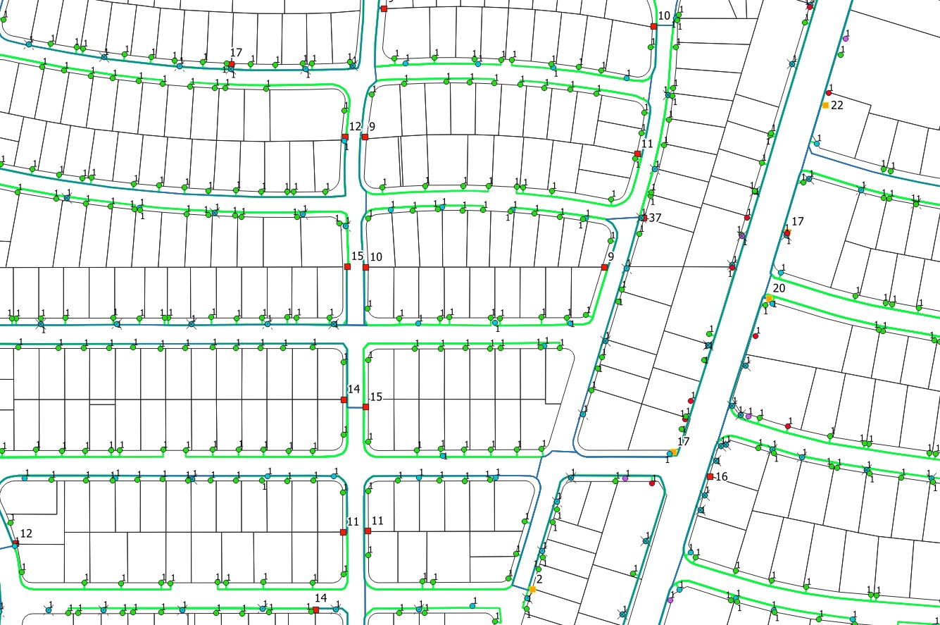
Example Fibre Network Design

A fibre network design shown in QGIS

Implementation and Outcomes

After taking time to evaluate Mergin within Highbeech, Nick proposed it as a collaboration platform to the US-based engineering company.

“Initially they were unsure how to set it up so I offered to do that and to administer it for them. Within 2-3 weeks they had 20 guys using it and within 3 months I’d migrated control of it over to them.” Nick said.

“The value is all about collaborating in near real time rather than the days it used to take to do things”

Nick’s team can now see the changes their US-based client makes to the design as they make them and jump in/out as required to perform validations and make corrections and changes as required.

“The time zone difference with the US now works to our advantage - we even tell our clients we can turn their 8 hour working day into a 16 hour working day.”

“Once our client’s fielding team has finished for the day, we work through their data, performing checks and validations and everything’s done by the time they’re back in the office the next day. This forms much of what Highbeech does on the project nowadays and this wouldn’t be possible without Mergin.”

When asked what worked particularly well about Mergin, Nick said: “the seamless way you can be working with someone on a call, make a change to a design and have it appear in front of them within seconds. This is incredible and something that happens on a regular basis.”

“The value is all about collaborating in near real time rather than the days it used to take to do things. That’s the greatest strength of both Mergin and Input.”

Input is a mobile app that allows GIS projects to be viewed and edited in the field.

When asked about how collaborative working might change in the future, Nick said: “We live in a world where an ever increasing number of people choose to work from home. For those working in fibre network design, that’s only possible with collaborative platforms such as Mergin.”

Nick has since introduced other clients in the US and UK to Mergin which supports their collaborative GIS efforts together.

Download Mergin Maps Today

Screenshots of the Input App for Field Data Collection

Get it on Google PlayGet it on Apple store

2021 wrap-up: baba und foi net!

What a ride.

This year has been both extremely rewarding and incredibly frustrating, sometimes both in very short succession.

I’ve finally finished my PhD dissertation and – between movement data analysis and open source and open data science talks in general – I’ve been counting over ten invited talks and conference presentations, including keynotes at FOSS4G and GI_Forum. Unfortunately, all of these were limited to virtual experiences and therefore often lacked much of the social interaction off stage that usually makes giving talks rewarding. But FOSS4G2021 was a refreshing exception to this rule:

One of the rare in-person events I attended this year was the Futurezone 2020 Award ceremony which – of course – had been postponed to 2021. The award took me completely by surprise:

This year’s focus on talks meant that there haven’t been many blog posts with original content this year, an unfortunate situation I hope to improve in 2022.

Without wanting to promise to much, there are quite a few interesting MovingPandas collaborations in the works that will hopefully result in exciting new features, demos, and tutorials:

On the plus side, with so many virtual events – from conferences to community events such as QGIS Open Days – much of the content formerly exclusively available to participants on-site have been recorded. Some worthwhile accounts and playlists include:

Happy streaming, happy new year, and – if you can – get vaccinated!

I’ll be having a nerd party.

Snowy day map style now available on the QGIS hub

Today’s post is a follow-up and summary of my mapping efforts this December. It all started with a proof of concept that it is possible to create a nice looking snowfall effect using only labeling:

After a few more iterations, I even included the snowflake style in the first ever QGIS Map Design DLC: a free extra map recipe that shows how to create a map series of Antarctic expeditions. For more details (including project download links), check out my guest post on the Locate Press blog:

If you want to just use the snowflake style in your own projects, the easiest way is to grab the “Snowy Day” project from the QGIS hub (while the GeoPackage is waiting for approval on the official site, you can get it from my Dropbox):

The project is self-contained within the downloaded GeoPackage. One of the most convenient ways to open projects from GeoPackages is through the browser panel:

From here, you can copy-paste the layer style to any other polygon layer.

To change the snowflake color, go to the project properties and edit the “flake_color” variable.

Happy new year!

QGIS and Log4j

The Log4J vulnerability has been dominating recent tech news. Consequently, we’ve received many request asking whether QGIS is affected. Therefore, we’d like to clarify:

QGIS is not a Java application. QGIS is built using C++ and Python. QGIS therefore does not use any Java component, including Log4j(ava).

It is technically possible that a plugin interfaces with Java applications. If you are aware of any potential vulnerabilities, please contact the plugin developers through the contact information provided in the plugin metadata.

Successful crowdfunding: Thank you!

We are pleased to announce the success of our crowdfunding campaign to improve point cloud and elevation tools in QGIS. Thanks to the generous pledges from QGIS community, we have exceeded the target (including the stretch goal).

We are very excited and looking forward to developing those features in the upcoming QGIS releases in collaboration with North Road and Hobu.

Thanks again to all those who have contributed to the campaign. Without your support, these major developments would have not been possible. We will publish a blog post with the list of contributors in due course.

To stay tuned with the latest development, you can visit QGIS code repository or visit our blog for news and updates.

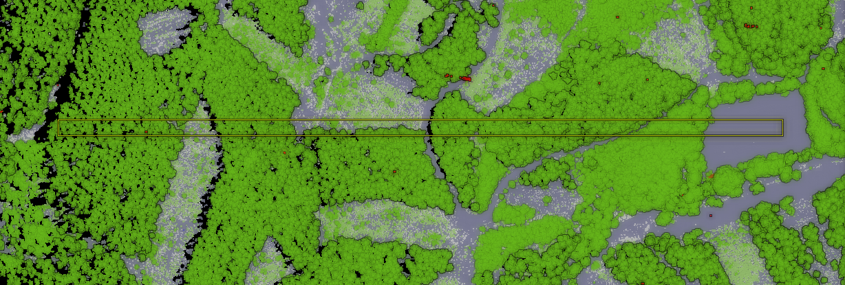
An example of a cross-section: view from the top including the profile line with a buffer, and the profile with two different ways of styling (classification / elevation-based).

An example of a cross-section: view from the top including the profile line with a buffer, and the profile with two different ways of styling (classification / elevation-based).

An example of a cross-section: view from the top including the profile line with a buffer, and the profile with two different ways of styling (classification / elevation-based).

You may also like...

Mergin Maps, a field data collection app based on QGIS. Mergin Maps makes field work easy with its simple interface and cloud-based sync. Available on Android, iOS and Windows. Screenshots of the Mergin Maps mobile app for Field Data Collection
Get it on Google Play Get it on Apple store

Qgis Landmark Events

QGIS has had a lot of landmark events in it’s development. Here are just a few, not necessarily in chronological order: It compiled and ran on Linux, displaying data from a PostGIS database Successfully ported the code to Windows Successfully ported the code to Mac GRASS integration Added on the fly projection and coordinate system support Python support, allowing plugins Print composer (now layout) Installers everywhere! msi, dmg, osgeo4w, linux packages Migration of the code from CVS -> SVN - Git Processing toolbox The API-breaking migration from Python 2.

Archaeological Discoveries in the Hands of Citizens

Input App helps to identify burial grounds in a citizen science project in the Netherlands.

“QGIS is my Number One tool for all my work. Through a podcast, I heard about Mergin and the Input App - I immediately installed it and have been playing around with it ever since. It has worked wonderfully and flawlessly. We haven’t had any problem with it so far. It was the perfect solution for this specific project!”

Konan Pruiksma - 24 November 2021


21st-century tools reveal 2000 years of our past history

Konan Pruiksma, born in the Netherlands, is an archaeologist and GIS (Geographic Information System) Specialist experienced in Data Analysis, Relational Databases and Geostatistics, who is making a career in exploring our cultural heritage – in particular the vast wealth buried in the fields of the Netherlands. As an employee of Tijdlab, he was approached by Heritage Quest (Erfgoed Gezocht) and Leiden University/Erfgoed Gelderland to assist in their citizen science project, in which volunteers participate in archaeological research on the Veluwe and Utrechtse Heuvelrug.

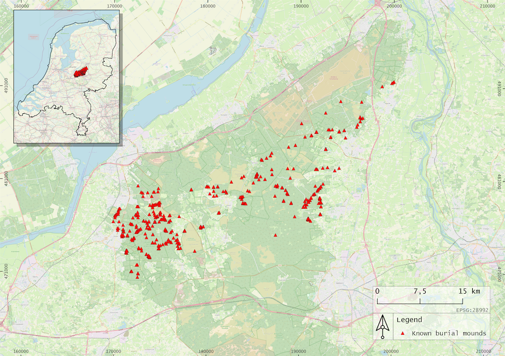
Burial Mounds in QGIS, image courtesy of Tijdlab.nl

Area of already well-known burial mounds created in QGIS

Secrets of Burial Mounds

The Dutch landscape is dotted with ancient burial mounds, Celtic fields and cart tracks, some dating back to the 3rd and 2nd millennium BC. Bodies were first cremated and then the ashes were buried in these mounds. In the Middle Ages, mounds were also used for navigational purposes and even for gallows. The ashes of important people were probably honoured with a solitary mound, whereas other mounds contained the ashes of whole families or of many individuals.

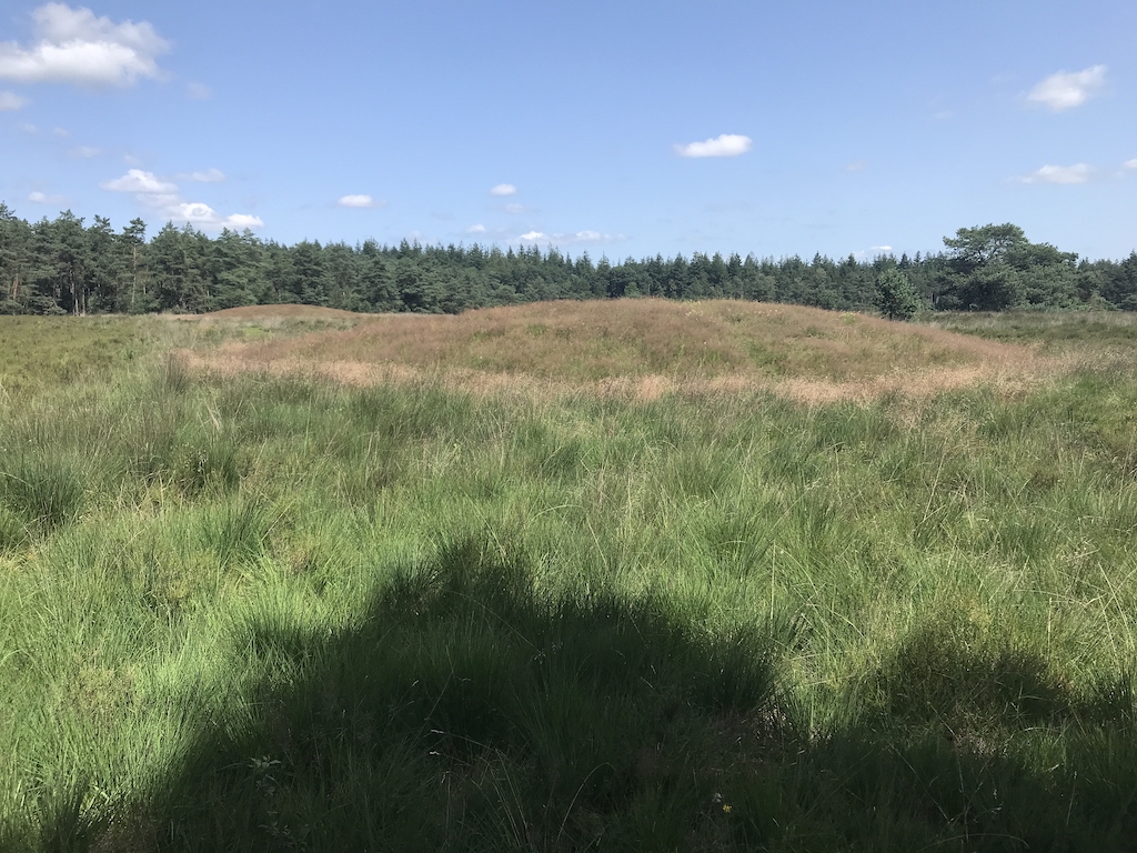
Two burial mounds, image courtesy of Tijdlab.nl

Two burial mounds

Aims of the Heritage Quest Project

The aims of the Heritage Quest project are two-fold, focusing on two views of the concept of citizen science:

  1. The public viewpoint - to introduce as many citizens as possible to an awareness of the unique archaeological heritage in the Netherlands literally under their feet. This encourages better protection and conservation of this ancient and fragile heritage. Citizen science lessons are even planned for the classroom, to make children aware of their archaeological heritage and how to conduct scientific research.

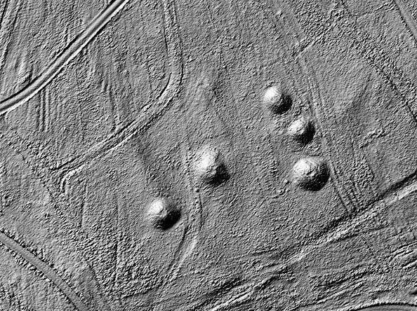
  2. The scientific viewpoint - to collect as much information as possible about the as yet unknown archaeological treasure trove. With the aid of LiDAR map data, huge areas become visible, which were previously hidden by vegetation and thus undiscovered. Later, with the participation of citizen volunteers, a large amount of field data can be collected, which archaeologists simply do not have the manpower to gather.

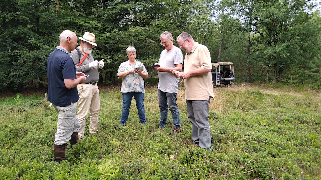
Volunteers using Input App in the field, image courtesy of Tijdlab.nl

Volunteers using Input App in the field

LiDAR Assists in New Discoveries

LiDAR maps – high-resolution models of ground elevation created by a laser scanner, GPS and INS systems mounted on a small aircraft – are made accessible to the project by the Dutch government. Over the past 2 years, these LiDAR maps of areas of suspected burial mounds were analysed by over 6 500 volunteers, even by children, who searched over 600 000 maps and identified many thousands of possible new discoveries. In addition to burial mounds, Celtic fields (agricultural fields about 2 500 years old) and deep linear depressions left by the wheels of carts or wagons are clearly visible in the sandy soil of the Utrechtse Heuvelrug and Veluwe on LiDAR maps.

This manual work of many volunteers has another great benefit. The identified objects from LiDAR maps were used as a teaching dataset for a neural network that could potentially do a similar task automatically in the near future for different sites.

LiDAR image showing burial mounds and tracks, image courtesy of Tijdlab.nl

LiDAR image showing burial mounds and tracks

As every map was inspected by at least 15 different participants, the difference in the probability of potential barrows become clear immediately; some hills are identified by all participants, while others only by a few. It is probable that hills recognised by more people have a higher chance of being burial mounds and not natural hillocks. Following this reasoning, there are about 6 000 hills that have a high potential of being ancient burial mounds. However, this needs to be checked in the field.

Volunteers Gather Data in the Field

In summer 2021, the field work began and this is where Mergin and Input App came into play.

“For this project, I immediately thought of Mergin and Input App and it worked from the get-go,”

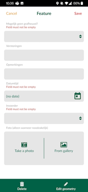
says Konan Pruiksma regarding the ideal tools he chose for data collection in the field. Volunteers install the Input App to their phones and see the potential burial mounds or Celtic fields on the map. They navigate to a point of interest, digitise the point and fill in the required information, such as photos and notes, in a form. Such field work will continue to be carried out over the next year or more.

Burial mounds to be verified, image courtesy of Tijdlab.nl Form to fill in by volunteers, image courtesy of Tijdlab.nl

Burial mounds to be verified and form to fill in by volunteers

Once they have all the information about the location in Input App, they synchronise the data back to the Mergin Cloud. Konan, as a field manager, sees that data are synchronised on Mergin Cloud Dashboard, as well as who made the changes and when. If he needs to update anything, he can do it even from his office and let volunteers refresh the map. The collected data are stored in the PostGIS database via a docker container for further analysis. Konan uses QGIS Plugin for Mergin to download the field data gathered and to analyse them. When the point has been confirmed as a possible burial mound in the field a certain number of times, it is removed from the volunteers’ maps on Input App and reported to the professional team of archaeologists.

“Input App is user-friendly and can be used on any smartphone. This makes it possible to be used by volunteers with only minimal instruction. Which is great, because with over 6 000 locations to be inspected, we need all the help we can get!” explains Konan. “The App furthermore enables volunteers and archaeologists alike to locate the barrows which are usually hidden beneath vegetation. In the field, these low rises are often poorly visible, which is the reason they have not been identified until now. Before we used Input App, it often took us a very long time just to be able to locate the hill highlighted on the LiDAR map.”

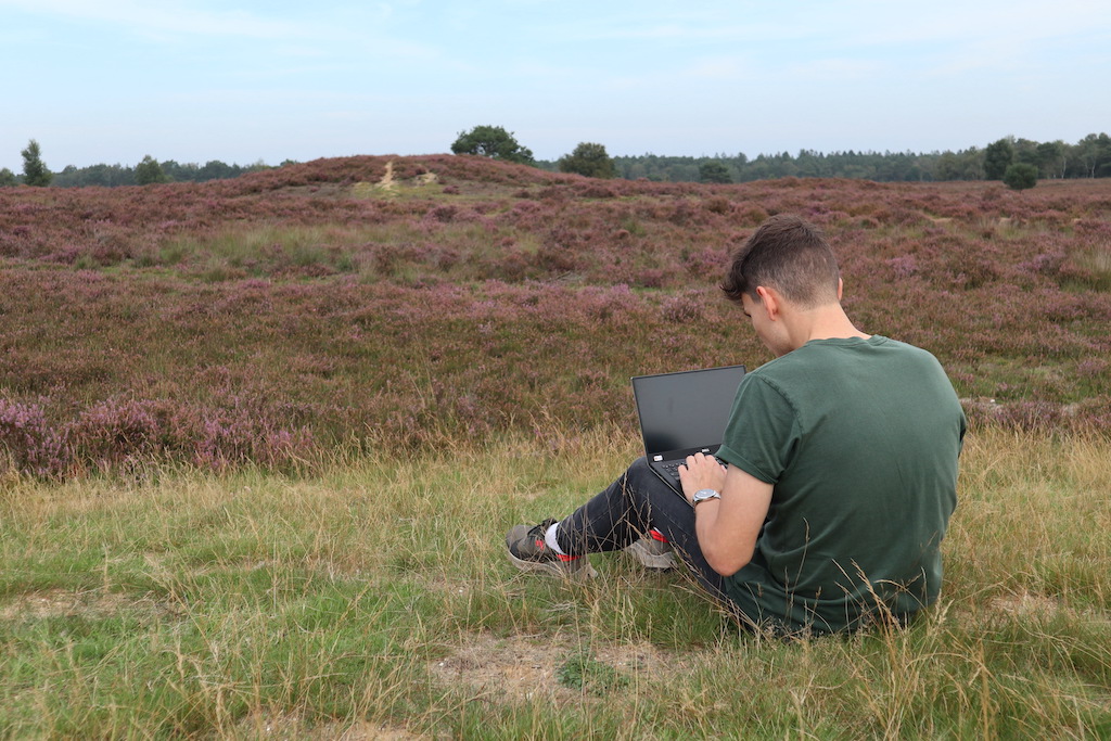
Konan doing analysis of collected field data on his laptop, image courtesy of Tijdlab.nl

Konan doing analysis of collected field data on his laptop

Information Gleaned from Soil of Burial Mounds

This team further investigates the mound by borehole surveying and the removal of soil samples. The mounds are generally not excavated, only if there is a danger of them being destroyed. Archaeologists prefer to keep these archaeological remains intact.

By coring with a 7 cm auger, a thin soil profile can be extracted from the barrow. In this way, archaeologists can get a small glimpse of the different layers that are present beneath the soil without destroying them by excavation. This provides invaluable information about our prehistoric ancestors. Radiocarbon (or Carbon-14) dating can provide accurate dating of the contents of these prehistoric mounds.

Konan says, “We previously did not know that there were so many burial mounds in the Netherlands!” He explains how information is obtained from the soil, without the need for excavation: “If we find charcoal, it is almost 100 % sure that it is a burial mound. We can learn what the burial rituals were of our ancestors, how they lived and what they ate.”

Conclusion

There are inestimable benefits of collecting and interpreting data accurately. The vast number of burial mounds in the Netherlands would not be able to be detected were it not for the assistance of volunteers, combined with LiDAR maps and tools such as QGIS or Input App. At present, there is a team of 20 volunteers at work on the Veluwe project, but this number should increase in the future, as more citizens become interested in doing citizen science in their environment. As Input App is user-friendly and very intuitive, a minimum amount of training is needed for volunteers, many of whom are students or senior citizens not au fait with digital technology.

Download Mergin Maps Today

Screenshots of the Input App for Field Data Collection

Get it on Google PlayGet it on Apple store

Visualization of Early QGIS Development

Years ago (2011), Nathan Woodrow did a visualization of code commits between QGIS 1.6 and 1.7 using Gource. I wanted to contrast the slow beginning of QGIS in 2002 with the flurry of activity in recent years. Gource can analyze a git repository and display the activity. The video below begins with the very slow start of QGIS development in 2002. Since displaying all of QGIS activity using Gource would result in a long video no one would want to watch, I took a look at the time period from 2002 to mid-2004, then jumped to June of 2021.

New MovingPandas website

The last couple of days, I have been hacking away to improve the online presence of MovingPandas.

The new home page aims to be the central landing page that provides direct links to all important resources: from source code on Github, to documentation on ReadTheDocs, and – most importantly – all the tutorial and analysis example notebooks:

Additionally, all tutorial and analysis example notebooks now contain direct links to live versions on MyBinder, sources on Github and already executed pre-rendered HTML versions of the notebooks for quick browsing:

If you are using MovingPandas, I’d love to hear about it, particularly if you want to share one of your analysis examples with the community.

  • <<
  • Page 19 of 141 ( 2808 posts )
  • >>

Back to Top

Sustaining Members