Related Plugins and Tags

QGIS Planet

QGIS LTR 3.16.13 reverted to 3.16.11

Dear community,

Due to some rather severe issues in the 3.16.13 and .12 Windows MSI installers, we decided to temporarily revert back the available download to the latest release without those issues, 3.16.11. The website rebuild has been performed and you’ll see everywhere that 3.16.11 is the latest LTR. This is true for Windows only as other OS will keep delivering the latest 3.16.13.

Next Friday 19th November is the planned release date for 3.16.14 which should bring fixes to both the above mentioned issues and restore the normal release flow.

Quoting our release manager Jürgen Fischer:”Only the 3.16.13 MSI is broken (not sure if 3.16.12-2 is affected). OSGeo4W
v2 was meanwhile fixed. All other platforms are not affected at all. The next release is on Friday and will also produce a fresh MSI.”

We apologize for the inconvenience and would like to take the opportunity to remind you how much work goes into producing and maintaining the high quality product that you’ve grown to love and that this is only possible thanks to our sustaining members and volunteers. If you or your organisation is relying on QGIS, it might be a good time to consider joining QGIS’ funding effort at https://qgis.org/funding or https://github.com/sponsors/qgis/

Have a great week, cheers

Marco

Original post: https://lists.osgeo.org/pipermail/qgis-user/2021-November/050193.html


Megaphone icon made by BomSymbols from www.flaticon.com

Open source for open spatial data science

Thanks to the FOSS4G2021 video team, all talks including my keynote are now available online.

I had the honor to be invited to give the closing keynote, talking about how open source can help open science, particularly data science:

I’m convinced that efforts towards more open data science are a worthwhile investment even if current scientific incentive structures are stacked against it.

Until incentive policies catch up, we all can help encourage more people to go the extra mile(s) by properly valuing their efforts, e.g. by celebrating and citing reproducible publications, open research datasets, and open scientific software.

PSA: Update to 3.16.13

This is a public service announcement:

Our developers have discovered a critical issue in QGIS 3.16.12 which may cause plugins to hang on Windows. All users are encouraged to upgrade to 3.16.13


Megaphone icon made by BomSymbols from www.flaticon.com

QGIS on Windows: Oops … Could not load qgis_app.dll message

Sometimes after a Windows update, or after a QGIS update Windows users see the dreaded “Oops, looks like an error loading QGIS’… Could not load qgis_app.dll…” message In short it means that one of the main libraries of QGIS cannot be fully loaded, because it is actually depending on other libraries, which (apparently) are not […]

Crowdfunding: Enhancing elevation data and point cloud in QGIS

The next round of crowdfunding to improve point cloud and elevation data in QGIS is here! Similar to the previous crowdfunding campaign, we have teamed up with North Road and Hobu to improve elevation and point cloud data in QGIS.

Created by: Tibor Lieskovský

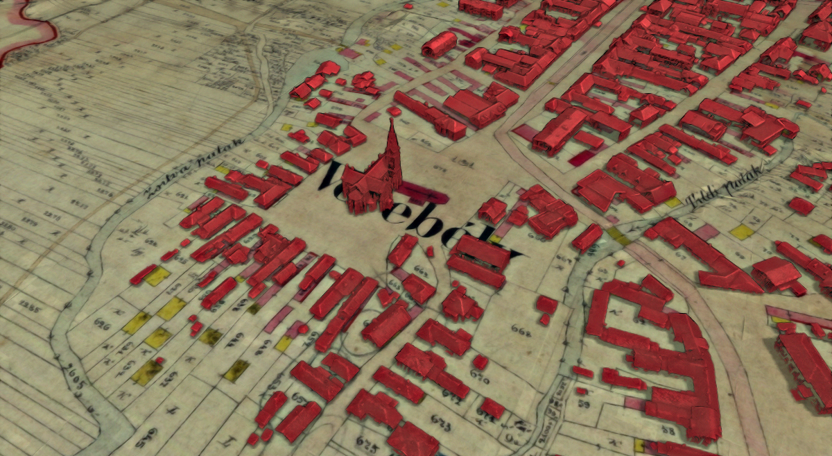
Buildings extracted from lidar, overlaid on top of a cadastral map from 1890. Made by Tibor Lieskovsky, data UGKK SR.

Last year, we added point cloud data to QGIS, thanks to the great support from the community. Based on numerous feedback and suggestions we had over the past year, we have decided to run another campaign to introduce some new tools and enhance user experience when dealing with elevation and point cloud data. Below is a list of those features we intend to introduce. For more details see the crowdfunding page.

Profile tool

A tool for drawing profiles of elevations is essential when working with 3D data, yet it has long been missing from QGIS. While there are several plugins for QGIS that add this missing functionality, unfortunately they all have limitations when it comes to ease of use, performance, integration with the rest of the user interface and wealth of functionality. The goal is to add a profile tool that would cover a wide variety of use cases, and be available immediately out-of-the-box for all QGIS users.

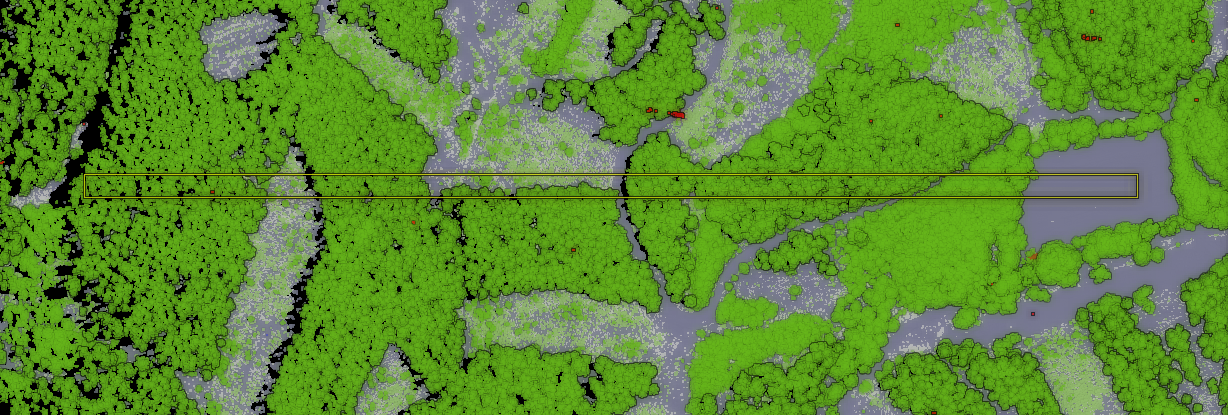
An example of a cross-section: view from the top including the profile line with a buffer, and the profile with two different ways of styling (classification / elevation-based).

An example of a cross-section: view from the top including the profile line with a buffer, and the profile with two different ways of styling (classification / elevation-based).

An example of a cross-section: view from the top including the profile line with a buffer, and the profile with two different ways of styling (classification / elevation-based).

An example of a cross-section: view from the top including the profile line with a buffer, and the profile with two different ways of styling (classification / elevation-based).

Enhanced 2D visualisation of point cloud

A technique that is extremely useful for visualization of point clouds in the 3D map view is the Eye Dome Lighting effect, which adds subtle shading and silhouettes (when there is a greater change of elevation) making it much easier to identify various features of interest that could be otherwise hard to see. To date this feature is only available in 3D QGIS map views, but we would like to introduce it to 2D map view as well! Many GIS workflows and products are still entirely based around 2D views of data (such as digitizing of vector data), so having the extra visual clues which Eye Dome adds is also highly desirable in 2D views.

Point cloud - without hillshade Point cloud - with hillshade

Top-down 2D view of a classified point cloud. Left: rendering without Eye Dome Lighting (EDL) effect. Right: rendering with EDL.

Filtering point clouds for visualisation

A common requirement of analysts when working with point clouds to work with just a subset of the dataset. This could be as simple as showing only one class of a classified dataset, using only a limited range of elevations, viewing just a particular flight line, or looking at just the first/last returns. Currently, QGIS only provides basic class-based filtering when using rendering based on classification.

Improve 3D map views

One of the limitations is the 3D map view’s window: when it gets closed the configuration of the 3D map view is discarded and any newly opened 3D map view needs to be re-configured again. This is frustrating for users and results in a lot of wasted time! We would like to fix this by keeping 3D views stored in QGIS projects, even when they are not currently being shown. Another issue related to 3D map views is the fact that they are currently only “dock widgets” that can be embedded within the main window. However, often it is preferable to be able to see the 3D view content in a big window, which is quite tricky to do in current QGIS versions (especially when the user does not have multiple displays).

Cloud-optimized point clouds

The new specification of cloud-optimized point clouds (COPC) is current being finalized (October 2021) and it is a very exciting innovation! Inspired by the hugely successful cloud-optimized GeoTIFF (COG) format, the idea is to reuse the existing LAZ format (widely used by the lidar community) and add the improvements which make the format more useful.

More point cloud data formats & more robust loading

While LAS and LAZ files (currently supported by QGIS) are the most common formats for point clouds nowadays, they are not the only ones. In order to support more formats in QGIS we do not need to worry about technical details of each format thanks to the PDAL library. It comes with a multitude of drivers for various formats and services - see https://pdal.io/stages/readers.html . In QGIS we need to provide a user interface to allow people to get other additional formats to work. Some drivers are always available in PDAL, others are optional and may need extra third-party libraries in order to work. We welcome feedback from the community regarding drivers they consider important.

About the crowdfunding campaign

Please visit the crowdfunding page for more details about the campaign!

You may also like...

Mergin Maps, a field data collection app based on QGIS. Mergin Maps makes field work easy with its simple interface and cloud-based sync. Available on Android, iOS and Windows. Screenshots of the Mergin Maps mobile app for Field Data Collection
Get it on Google Play Get it on Apple store

Exploring ZAMG’s new open weather data

The Central Institution for Meteorology and Geodynamics (ZAMG) is Austrian’s meteorological and geophysical service. And as such, they have a large database of historical weather data which they have now made publicly available, as announced on 28th Oct 2021:

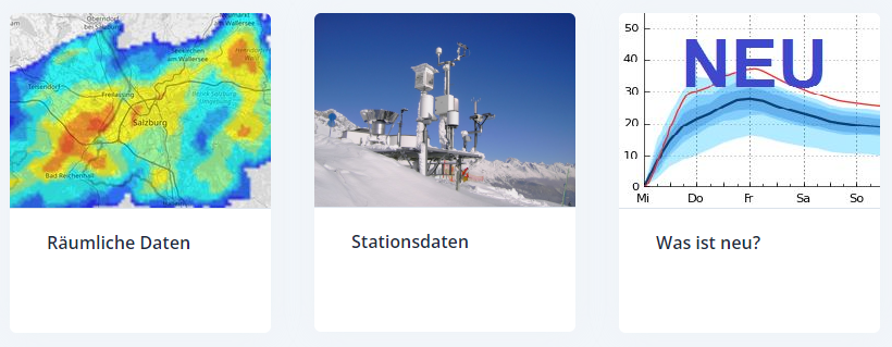
The new ZAMG Data Hub provides weather and station data, mainly in NetCDF and CSV formats:

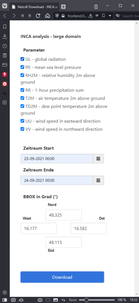
I decided to grab a NetCDF sample from their analysis and nowcasting system INCA. I went with all available parameters for a period of one day (the data has a temporal resolution of one hour) and a bounding box around Vienna:

https://frontend.hub.zamg.ac.at/grid/d512d5b5-4e9f-4954-98b9-806acbf754f6/historical/form?anonymous=true

The loading screen of QGIS 3.22 shows the different NetCDF layers:

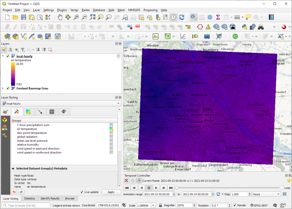
After adding the incal-hourly layer to QGIS, the layer styling panel provides access to the different weather parameters. We can switch between these parameters by clicking the gradient icon next to the parameter names. Here you can see the air temperature:

And because the NetCDF layer is time-aware, we can also use the QGIS Temporal Controller to step through the hourly measurements / create an animation:

Make sure to grab the latest version of QGIS to get access to all the functionality shown here.

MovingPandas v0.8 released!

The latest v0.8 release is now available from conda-forge.

New features include:

  • More convenient creation of TrajectoryCollection objects from (Geo)DataFrames (#137)
  • Support for different geometry column names (#112)

Last week, I also had the pleasure to speak about MovingPandas at Carto’s Spatial Data Science Conference SDSC21:

As always, all tutorials are available from the movingpandas-examples repository and on MyBinder:

QGIS 3.22 Białowieża is released!

We are pleased to announce the release of QGIS 3.22 ‘Białowieża’!

Installers for all supported operating systems are already out. QGIS 3.22 comes with tons of new features, as you can see in our visual changelog. QGIS 3.22 Białowieża is aimed at celebrating the 100-year anniversary of Białowieża National Park, Poland. You can learn more about the project and this release of QGIS at the dedicated project website, https://qgisbialowieza.pl.

We would like to thank the developers, documenters, testers and all the many folks out there who volunteer their time and effort (or fund people to do so). From the QGIS community we hope you enjoy this release! If you wish to donate time, money or otherwise get involved in making QGIS more awesome, please wander along to qgis.org and lend a hand!

QGIS is supported by donors and sustaining members. A current list of donors who have made financial contributions large and small to the project can be seen on our donors list. If you would like to become a sustaining member, please visit our page for sustaining members for details. Your support helps us fund our six monthly developer meetings, maintain project infrastructure and fund bug fixing efforts.

QGIS is Free software and you are under no obligation to pay anything to use it – in fact we want to encourage people far and wide to use it regardless of what your financial or social status is – we believe empowering people with spatial decision making tools will result in a better society for all of humanity.

(Nederlands) New PDOKServicesplugin (dutch public OWS services plugin)

Mostly interesting for dutchies: there is a new version of the PDOKServiceplugin, a plugin which makes it easier to set a WMS/WFS/WCS layer into QGIS from our national OWS services: PDOK. Best addition for now: free High Resolution images of almost the whole of The Netherlands. To show of the old and the new version: […]

QField 1.10 Uluru: Faster, Better, Stronger

While OPENGIS.ch’s GeoNinjas are busy getting QFieldCloud ready for primetime, it has not kept them away from concocting a brand new feature-packed QField 1.10 “Uluru”. Most users will find something to fall in love with in this release. From an improved feature form to new digitizing functionalities and quality of live updates.

Major feature form improvements

QField’s feature form has received lots of attention during this development cycle. Its user interface and stability have greatly improved, and there are simply too many individual changes to list here.

On the new functionality front, the feature form has gained:

  • An ordered relation editor widget allowing users to re-order the children features of a relationship
  • A complete-as-you-type mode for value relation editor widget
  • A new UUID generator editor widget
  • Support for “live” default expression value to be on feature update

Speed up workflow with new duplicate and move feature(s) actions

QField 1.10 brings in a pair of new useful actions: the duplicate feature(s) and move feature(s). This can speed up work in the field for many surveyors by avoiding potentially lengthy digitizing and attribute filling processes in favour of quickly duplicating what’s already done whenever possible.

Vertex digitizing logger

Conducting quality assurance (QA) reviews from work done in the field with QField has just gotten a lot better thanks to the brand new vertex digitizing logger. When enabled, each vertex entered while digitizing new features or editing preexisting geometries are logged as point features onto a ‘digitizing logs’ layer. Each point feature added has access to snapping result context, position context including horizontal and vertical accuracy, and more. This allows for data reviewers to get a fuller picture of how geometries were built.

Quality of life improvements

Quite a few improvements have landed in QField 1.10 which should improve users’ experience. To list a few:

  • To save battery, QField will now automatically dim the screen backlight after a period of inactivity, allowing users to conduct longer tracking sessions before running out of power
  • Tracking settings are now remembered and sub-meter minimum distance constraint allowed
  • The map scale bar now avoids degrees and instead automatically converts units into meters
  • Opening an individual point dataset will automatically setup and show feature labels; for other geometry types, users can show labels via a new checkbox in the layer item properties panel

QField speaks many languages

Thanks to community efforts, QField has been translated into a growing number of languages. However, the user interface language adopted by QField was until now hard-coded to match that of the device onto which QField was running.

Starting with QField 1.10, users are able to customize the language used by going to the settings panel.

Updates to foundational libraries

Time was spent during this development cycle to update a large number of libraries powering up QField, which is now running against QGIS 3.22, gdal 3.3.2, PROJ 8.1.1. This has resulted in increased stability as well as speed gains in a number of scenarios.

The Future is almost here

We are working hard to get QFieldClour open to the public, we currently have more than 2/3 of our waiting list actively using it. In the next 2-3 weeks we will invite all waiting users and then open up Beta registrations to the public.Meanwhile, we have also been working on fully supporting iOS, Windows and Linux. Simply go to https://qfield.org/get and start using QField immediately on your favourite device.

(Fr) Oslandia recrute : Ingénieur(e) développement d’applications SIG ( Python / SQL / QGIS ) – OSL2110A

Sorry, this entry is only available in French.

Scoped storage in Input for Android

Android has forced app to use Scoped Storage for all app related data. If you are using Input app on Android please read carefully for the upcoming update (1.1) of the app in the Google Play Store.

What is Scoped Storage?

In summary, apps need to use a specific part of folders on Android devices to store app related data.

Currently, Input stores your QGIS project and some other settings (e.g. grid shift projection) on /Internal storage/INPUT. With the new Android requirements, the app related data should be stored on /Internal storage/Android/data/uk.co.lutraconsulting.

Update process

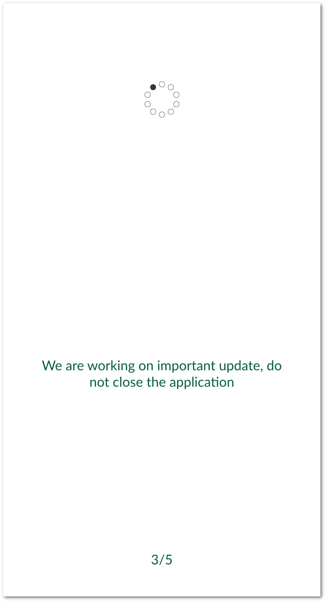
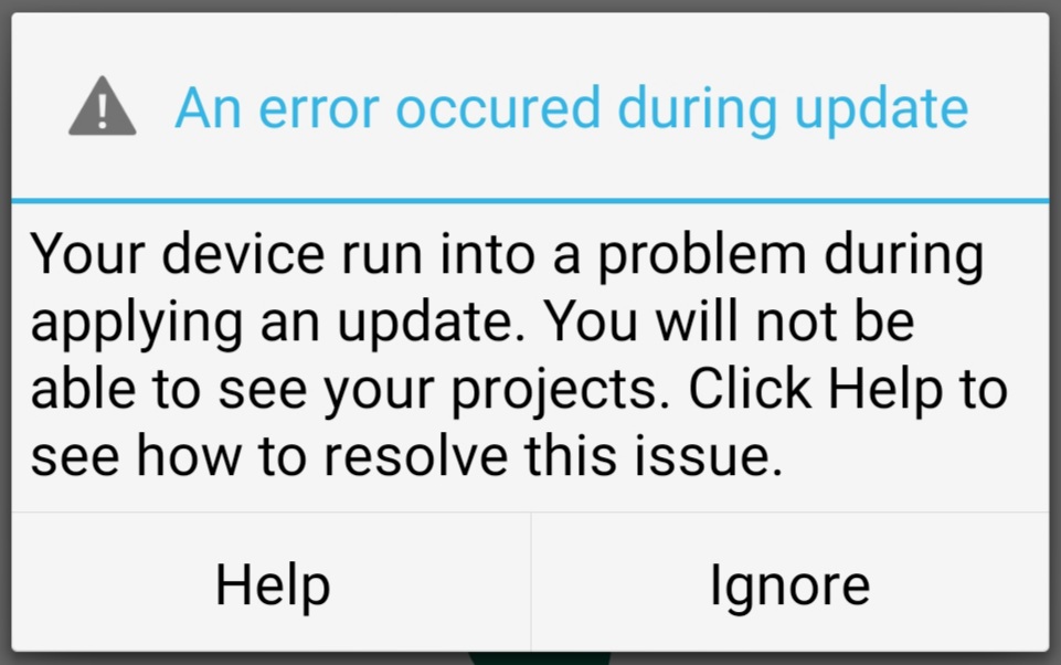
For the 1.1 release of Input on Android, there will be an extra process. This process will be a on-off action. When you launch the app after the upgrade, it will copy the data from /Internal storage/INPUT to /Internal storage/Android/data/uk.co.lutraconsulting. Depending on the size of your projects, this can take a couple of minutes. During the process you will see a screen similar to this one:

Input project migration

Best practices

The upgrade and copy process should work smoothly. But we suggest to take the following actions to ensure you will not lose any data during the process:

  • Sync all you changes: before upgrading the app, open Input and sync all your local changes to Mergin.

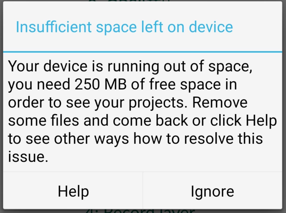
  • Storage space: if you work with several projects and large volume of data, make sure you have enough storage. The process will make a copy of your existing /Internal storage/INPUT without deleting it. So, you need at least the size of /Internal storage/INPUT storage available.

Troubleshooting

In case you have encountered any issues, you can take the following steps to fix the problem manually:

  • Lack of storage space:
    • Transfer the data through USB cable to your PC.
    • Make a back up of data on your PC.
    • Delete /Internal storage/INPUT on your Android phone/tablet
    • Transfer the data from PC through USB to /Internal storage/Android/data/uk.co.lutraconsulting
    Input project migration - storage warning
  • Missing data: the migration process does not delete /Internal storage/INPUT folder. It will rename it /Internal storage/INPUT_migrated. Similar to step above, you can copy the data to the PC and move them to /Internal storage/Android/data/uk.co.lutraconsulting. Alternatively, you can use a file browser app on your device to copy files around.

  • If you use Input app on a shared device, the migration process will transfer all the project data from /Internal storage/INPUT and marks the folder as /Internal storage/INPUT_migrated. Therefore, when the next user starts up the app, no data will be present. To fix the issue, you need to manually move the data from /Internal storage/INPUT_migrated to /Internal storage/Android/data/uk.co.lutraconsulting (as described above) for the other users on the device.
Input project migration problem

Need help

If you need further help, please join us on the community chatroom and we will be able to help you with the upgrade issue (or other Input/Mergin related problems.)

Introducing Annotation Layers in QGIS 3.22!

The QGIS 3.22 release is just around the corner, and we’d love to introduce you to one of the exciting changes included in this version. Just like all QGIS major releases, 3.22 brings a whole swag of improvements designed to enhance and simplify your mapping needs. In this post we’ll be highlighting one of these improvements — “Annotation Layers”. Before we dive further in, we need to extend our heartfelt thanks to the Swiss QGIS User Group who provided the funding required for this work. The Swiss User Group has invested heavily in cartographic enhancements to QGIS over many years, and it’s great to see this tradition continue for the 3.22 release!

So… let’s dive into Annotation Layers in QGIS 3.22, and what this new functionality allows you to do! Before we can get started, we’ll need to enable the new “Annotations” toolbar (it’s hidden by default). You can do this through the “View” – “Toolbars” menu by checking the “Annotations Toolbar” option. This will show a new toolbar, full of useful actions for creating and working with annotation layers:

The new Annotations toolbar

Annotation layers can contain a whole mix of different annotation types. In QGIS 3.22 this includes markers, lines, polygons and text. (We anticipate this list will grow steadily in future QGIS releases!)

Annotation item types


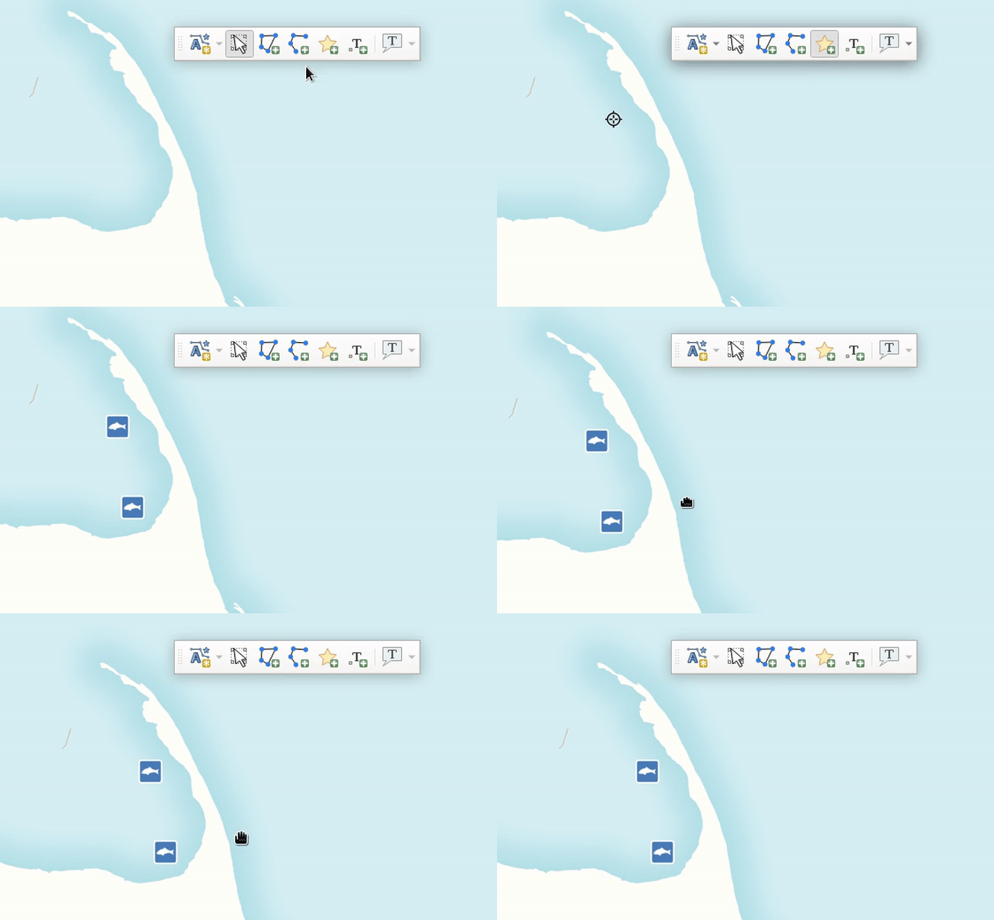
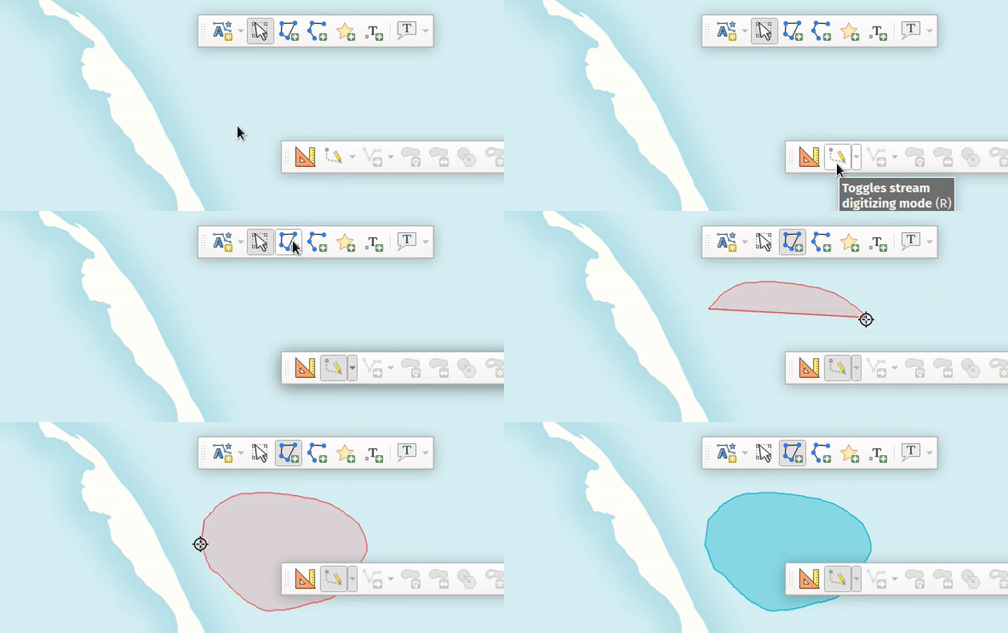
Creating an annotation is as easy is picking the desired item type (marker, line, polygon or text), and then drawing directly onto your map:

All the usual QGIS shortcuts for creating features apply when creating annotation items. A line or polygon annotation is drawn by left-clicking once for each vertex, with a final right mouse click to complete the shape. Snapping can be enabled while you draw, you can use the “Advanced Digitizing Tools” to precisely place vertices, and even switch the drawing tools to the streaming mode for completely free-form shapes!

Creating a polygon annotation using stream digitizing

While annotations are created in this free-form way, every annotation item is still completely geo-referenced and tied to a particular geographic location. Moving your map, changing the scale or changing projection won’t cause your annotations to jump around the map. Rather, they’ll be locked in place to the location you’ve drawn them:

Annotations are tied to a geographic location

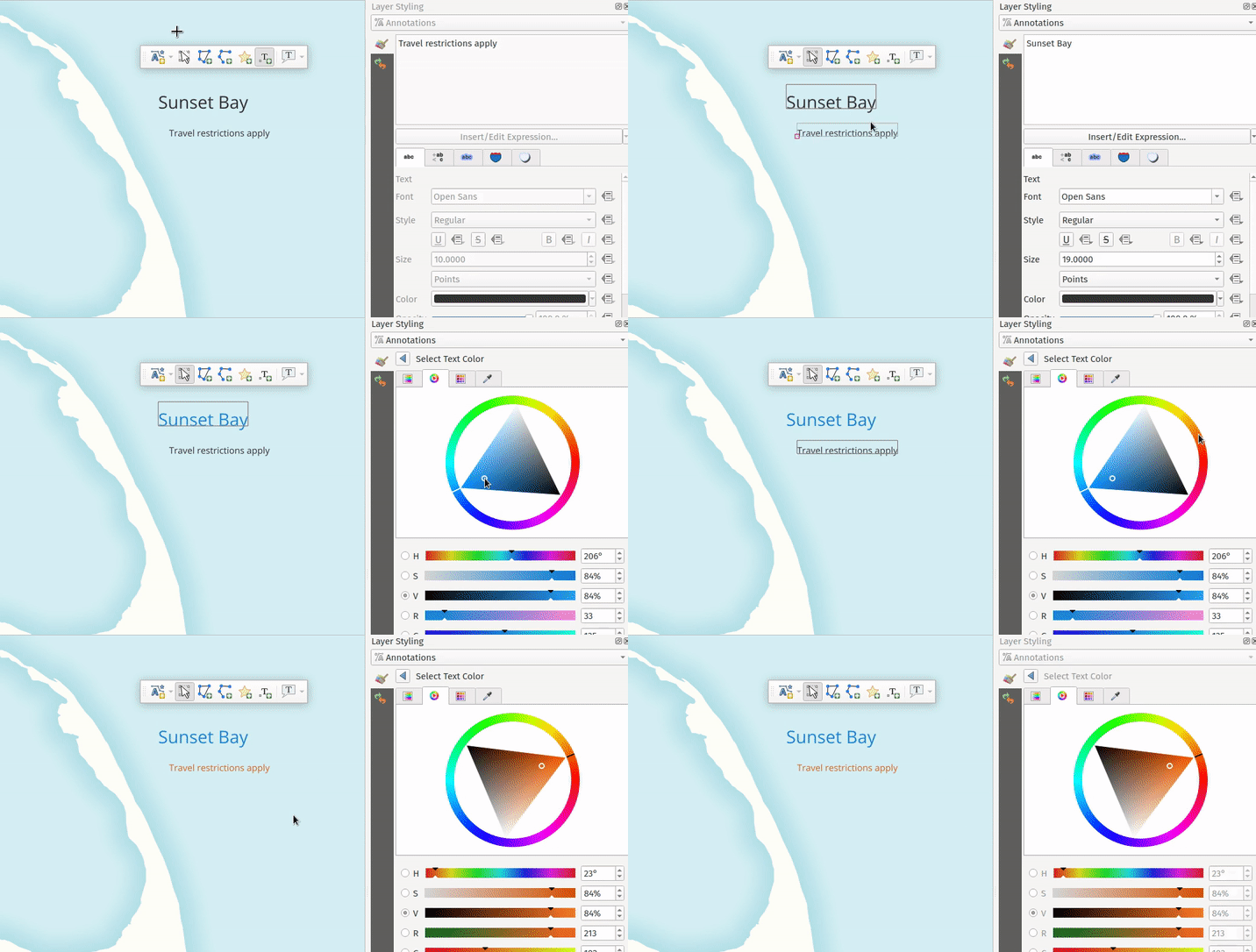
Unlike features in a traditional vector layer, it’s easy to interactively style annotation items on an item-by-item basis. (This is what makes them a great tool to help quickly create beautiful maps!). All the item appearance properties are set through the QGIS “Layer Styling” dock, which allows you to interactively tweak an item’s appearance without any annoying dialog windows getting in your way. Annotation items support all of QGIS’ rich symbology and labelling options, including layer effects (drop shadows, inner/outer glows), blending modes (multiply, overlay, etc), opacity, and even data-driven symbol property overrides!

Modifying items

Unlike traditional vector or raster (or mesh, or point cloud!) layers, an annotation layer isn’t linked to any external dataset. They exist within a single QGIS project only, so they are perfect for project-specific markups and cartographic notes. By default, any newly created annotation item will be placed on top of all your other map content. (Formally, they are added into a “main annotation layer” which is always drawn on the very top of the map.) This main annotation layer is a special beast, and you won’t see it listed alongside all the other layers in your project. If you need to interact with it, say to change a layer-level setting like the opacity or blend mode, just select the “Main Annotation Layer Properties” option from the annotations toolbar:

Setting the main annotation layer properties


In addition to this special main annotation layer, it’s also possible to create your own secondary annotation layers. From the annotations toolbar, select the “New Annotation Layer” option and a brand new annotation layer will be added to your project. Unlike the main annotation layer, you’ll see any secondary annotation layers appear in the list of your project’s layers. Just like any other map layer, you can toggle their visibility, rename them, and even reposition them to control whether the annotations show above or below particular layers in your map!

Creating a new annotation layer

(Note that whenever you have a secondary annotation layer selected as the current layer, any newly drawn annotation items will be placed into this layer instead of the main annotation layer.)

So there we go — that’s a quick dive into annotation layers in QGIS 3.22, and some of the new cartographic capabilities they unlock for your maps! We see this as the starting point of an exciting journey, and North Road developers have many plans for further enhancement of annotation layers in future QGIS releases. (And naturally, we’ve also added full support for ArcGIS drawings to QGIS annotation layer conversion to our SLYR ESRI conversion toolkit!) If you’ve something specific you’d love to see added to annotations layers, just contact us at [email protected] to discuss sponsorship options.


Pecan Precision Farming with Input App

Precision farming opens an opportunity to increase the gain for a farmer up to 20% with fewer trees.

Making a sustainable profit from farming can be something like tossing a coin. However, today the advancements in digital technology provide the incredible benefit of reducing the unpredictability of farming in general. In pecan farming in particular, the proper know-how of a combination of multiple factors such as soil composition, environmental impact, climate, irrigation and sunlight management are vital for success. Hard data is essential for innovating key decisions. Riaan Burger, a South African farmer, successfully uses open source GIS software to tackle the issues of collecting and utilising such vital data.
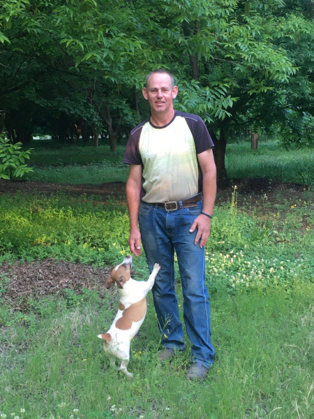
Riaan on Farm

Riaan Burger on his pecan farm.

Becoming a Farmer

Riaan Burger’s journey started back in 2017 when, after 20 years’ working as an electrical engineer, he decided to embark on his own business in pecan nut farming. He is a self-taught farmer and co-owner of one of the biggest pecan farms in the district of Weenen, South Africa. At first, Riaan had only a rough idea of how to improve his newly bought 24 hectares of planted orchard.

After reading books on soil structure, type, depth and chemical analyses, he had soil samples taken to create a soil sample map. In his orchard, the trees were planted in 10x10 metres geometric layouts. After 20 years, the trees were already creating shade. Riaan knew that sunlight penetration is important and that pecan trees are susceptible to fungus, so he decided to take a closer look.

“The previous owner of the farm had already started chopping out every second tree. I was in the position where I could compare the yield from areas where trees had been chopped down, to areas where they had not been felled,” explains Riaan.
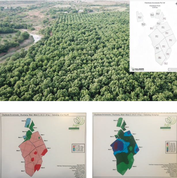
Initial stage

A photo of the farm taken by drone and initial stage of farming - soil maps.

Riaan realised that understanding the ambient conditions and mapping them to yield results was the right way to go. This was the beginning of his exciting journey in precision farming.

Collecting Data from the Field

It was no easy task for Riaan to get a complete picture. For two years, he only recorded the yield per day, and the relevant orchard block. Later, he used the services of a local consulting company which provided him with surveying applications to help him to set up a basic workflow.

“I record the weight of pecan nuts from each individual tree and I plot it on the map,” Riaan says. “And then afterwards I can see the different cultivars of trees, the weight of nuts they produced and the area in which they were produced. I previously had soil samples taken, so I’ve got soil sample maps. Now I can overlay a yield map over the soil sample map and correlate them”

Despite working well with the surveying app, Riaan was still in need of assistance to prepare data tables and then to export them to Excel sheets and to request map creation. After the consulting company moved from a third-party app to the in-house build solution, things got worse for Riaan: “It was a generic tool and a difficult app to work with. Displaying data was cumbersome. I wanted something that was quick and easy again. Ideally, I would like to capture data on the iPad and have it directly linked to my laptop – that is how I think it should work.”

So Riaan discovered the Input and Mergin suite, a surveying app based on QGIS and a cloud service for data synchronisation, respectively. Despite only a basic knowledge of QGIS and the necessity to learn and experiment, the effort immediately paid off!

“I’ve got Input, I’ve got a Mergin account and I’ve got QGIS. I now have full control of the process. I don’t need to fund a consultant and find that by 8 o’clock at night he has not yet responded to my query, and so I have to back it up with a WhatsApp call,” Riaan explains. “This is something I created entirely myself. I don’t need to ask someone to change this map, or add that icon, modify the legend or change the styling, I am in control of all of it! And I think there is a sense of satisfaction when one gets things going for oneself.”
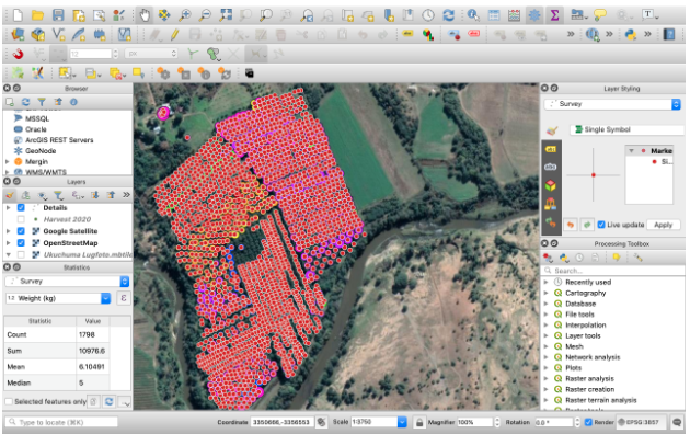
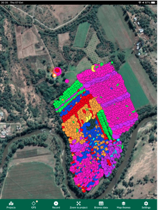
Project in QGIS Project in Input

A farming project in QGIS desktop and Input app UI.

With the Input app, Riaan has gained control of the workflow – something not before experienced. He has gained the freedom to set the project according to his own individual needs. Without much effort, not only the data but the styling, an important factor for him, are synchronised.

“In QGIS I created a style where each bubble represents the kilograms of the yield and the colour represents the variety,” says Riaan. “Then I saw in Input that there is suddenly an extra page on my iPad. So now I have the bubbles and bubble colours on the iPad instantly, which I did not have in previous apps. Previously, I had to create it the long way around, but now it is suddenly on the iPad automatically. I enjoy having that available! In the past, I only had that information by the end of the harvest.”

Cutting Down Trees

The energy invested in creating workflow, capturing and analysing data paid off handsomely for Riaan. All his initial doubts were suddenly eliminated. He has all the information essential for making any important decision right at his fingertips.

“The first time you fell trees, you have nightmares! How on earth you can be cutting your income and destroying 20 years of growth? Now, with the necessary proof at hand, it is easier in your mind to motivate that tree felling is actually your source of income, that it is the right thing to do,” says Riaan. “You can see that the yield from the remaining trees is more than double than before. The trees are healthier, because of allowing sunlight in. Moreover, you also get less pressure from fungus, because pecan trees are easily susceptible to fungus. Now that you have good ventilation, because you have a draught through your orchard, you can see on the map what your exposure to fungus is.”
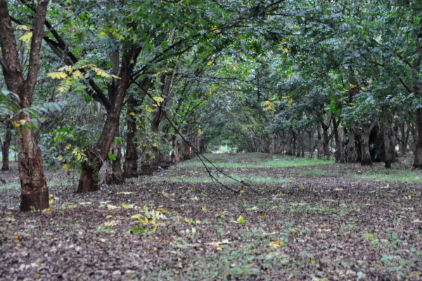
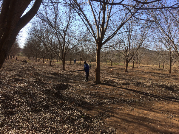
Higher density of trees Lower density of trees

Orchard with higher density of trees (top) and lower density (bottom).

Riaan continues: “I am not a sole owner, I have a partner. Now I have the data available, so that when we have a meeting I can explain to him this is what I did, this is what happened and this is the result. If you go to a bank manager for a loan, I mean, he really frowns at you when you tell him you are cutting down your trees which produce your income. Then you can explain to him why it is for the better.”
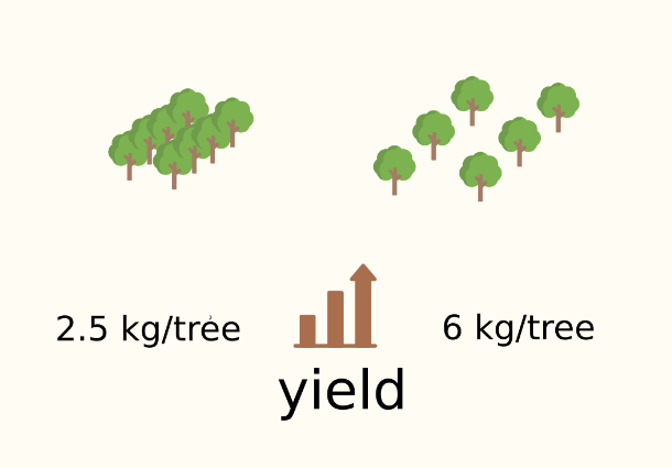
Yield increase

Increase in yield per tree after reduction of tree density.

Harvest Data Analysis and Beyond

The benefits of collecting and interpreting data carefully are limitless. Cutting down trees is just one example of the many advantages of careful data gathering and interpretation.

“Now I see that certain cultivars perform better than others this year,” adds Riaan. “So I can see if they consistently perform better or worse. I can decide, based on these results, what to do: if I need to add more nitrogen or improve soil pH, or whatever the case may be.”

User-friendly tools tailor-made to specific needs, such as the Input and Mergin suite, provided Riaan a way of collecting and analysing his specific type of farming data. His insights for necessary improvements also developed over the past few years.

“At first I did not have the distinction between individual trees and I even said to my partner” continues Riaan, “if only I’d started doing this in the very first season, I would have had 5 years of data to compare – but I didn’t. I will definitely continue to use this suite. It is valuable and I have been using it only for harvest. However, I see now that I can start recording where I have cut down a tree, so I have a record of when and where the tree was cut. I can also record my irrigation data.”

In spite of initial teething problems and the difficult decisions he had to take, Riaan’s success is proof that he has found the right way to go for his own specific pecan farming needs. He has even become an evangelist within the local farming community.

“I am not the only pecan farmer in our district. I am the biggest pecan farmer, but not the only one. I am trying to spread the word around. For example, my neighbour still does not want to cut down his trees. But I am getting there, showing him photos, proving that you have to be aggressive to open up the orchard to get sunlight in – and here is the proof that it has been working for me!”

Download Mergin Maps Today
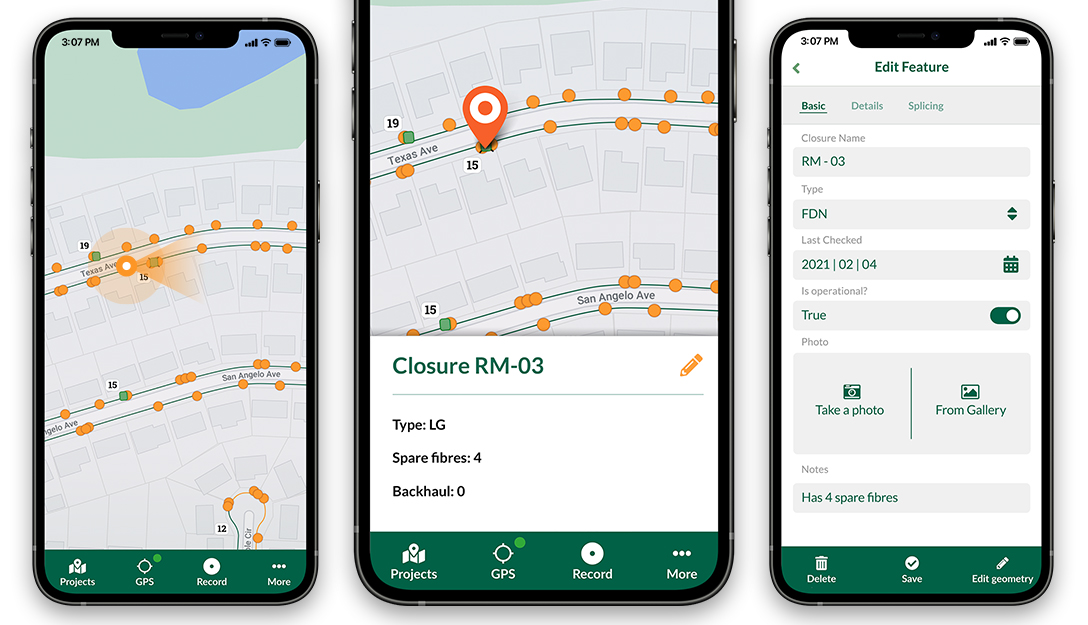
Screenshots of the Input App for Field Data Collection

Get it on Google PlayGet it on Apple store

Input version 1.0 release

Input app has reached a new milestone. Earlier in September, we have released version 1.0 of the app with many new features and enhancements.

Make syncs faster

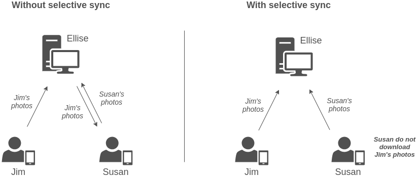
When you work in a team with several collaborators adding data and photos to the project, the size of the project can get really big. Every time you try to sync your changes, photos from all users will be transferred to your phone. This can take a long while when there are several hundreds of photos collected by other collaborators.

Image below illustrates the difference between having selective sync or the default behaviour (selective sync is disabled):

With and without sync

The configuration file for enabling the selective sync is stored in mergin-config.json which should be placed in the root of your folder. By opening the file in a text editor and adding the following option, the sync will be enabled for photos within your project root folder:

{ "input-selective-sync": true }

Currently, the editing of the file is manual and through the text editor, but we plan to incorporate it within the Mergin plugin for QGIS.

To learn more about how to set up selective sync for your project, you can see the example project. Read more on our help pages for extra configuration options.

One too many!

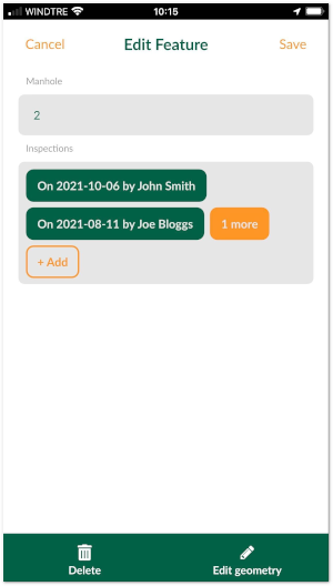
It is often the case that you have a set of spatial features and you want to record some parameters every now and then. For example, there is a GIS layer representing the manholes and the surveyors carry out regular inspections of the manholes. Instead of duplicating the manhole layer and recording each inspection, you can create a non-spatial table and store each inspection as a new line.

1-N relations in Input

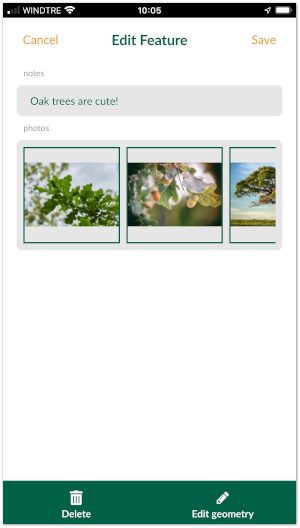
Another use-case for such a feature is that you’d like to attach multiple photos to a single feature.

Many photos to a single feature

To learn more about how to configure these types of projects in QGIS you can see the example projects (manhole example and multiple photos example). The documentation pages describes the logic and process in QGIS in more details.

Accuracy metadata

In addition to the display of the accuracy bubble in the app, we have recently added a whole set of new variables to capture the GPS accuracy, e.g. horizontal and vertical accuracy, ground speed and many more. See the help pages to find out how you can set up those variable within your form. Alternatively, you can clone the example project on Mergin website.

In addition to capturing GPS metadata, this feature can be used for geo-fencing: for example, you can only allow users to edit/capture data when they are physically (i.e. their GPS location) within a certain area:

Join our community

If you have any questions, would like to interact with the rest of community or want to give us your feedback, you can join the Slack community channel.

If you would like to add a new feature or have suggestions to improve the app, do not hesitate to contact us on [email protected]

Movement data in GIS #37: “Understanding Movement Data” webinar

Two weeks ago, I had the pleasure to speak at SystemX’s seminar series. The talk features a live demonstration of my protocol for exploring movement data, powered by Jupyter, Pandas, Holoviews, Datashader, GeoPandas, and MovingPandas. So if you haven’t read the paper yet, here’s the chance to watch the talk version:

Exploring Vienna’s street-level Lidar “Kappazunder” data sample

Kappazunder is the city of Vienna’s database created during their recent mobile mapping campaign. Using vehicle-mounted Lidar and cameras, they collected street-level Lidar and street view images.

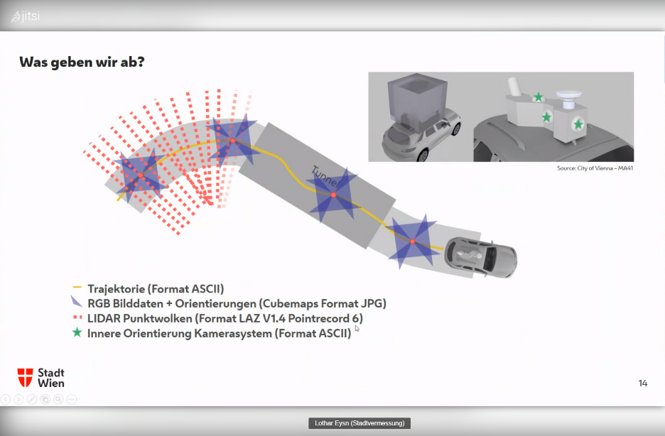
Slide from the official announcement on Thursday, 23rd Sept 2021. Full slide deck: https://www.slideshare.net/DigitalesWien/kappazunder-testdatensatz-2020-ogd-wien

Yesterday, they published a first sample dataset, containing one trajectory on data.gv.at. The download contains documentation, vector data (.shp), images (.jpg), and point clouds (.laz):

Trajectory

The shapefiles contain vehicle location updates, photo locations, and areas describing the extent of the point clouds. Since the shapefile lack .prj files, we need to manually specify the correct CRS (EPSG:31256 MGI / Austria GK East).

The vehicle location updates and photo locations contain timestamps as epoch. However, the format is a little special:

To display a human-readable timestamp, I therefore used the following label expression:

format_date( datetime_from_epoch( "epoch_s"*1000), 'HH:mm:ss')

Adding these labels also reveals that the whole trajectory is just 2 minutes long. This puts the download size of over 5GB into perspective. The whole dataset will be massive.

Lidar

The .laz files are between 100 and 200MB, each. There are four .laz files, even though the previously loaded point cloud extent areas only suggested three:

Loading the .laz files for the first time takes a while and there seem to be some issues – either on the user end (me) or in the files themselves. Trying to load content of the ept_ folders only results in very few points and multiple “invalid data source” errors:

For the few point that are loaded, it looks like the height information is available:

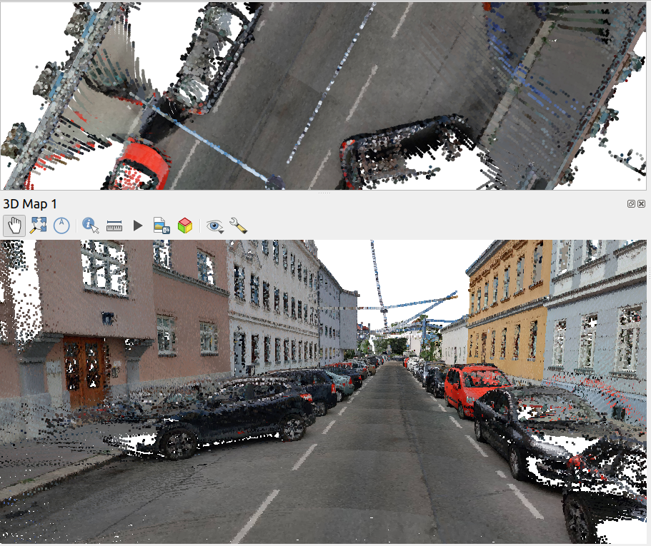
Update on 2021-10-01: I’ve reported the data loss issue and Martin Dobias has provided a first work-around that makes it possible to view the data in QGIS:

135284370-b07272bb-be8a-47ac-b050-d6024613c63b.png (911×765)

Images

The street view images are published as cubemaps. Here’s a sample of the side view:

Vector basemaps in QGIS

Thumb

QGIS Open Day – 24 Sept 2021

Dear QGIS Users

On Friday, 24 September 2021 we will be holding our monthly QGIS Open Day!

Programme

My QGIS. Each of us has a specialty in QGIS and our own workflows and tricks join this months QGIS Openday to learn from each other.

Where to watch

Please see the event wiki page at for all the details of times and links for participation.

Recordings

All of the YouTube live-streamed events will be recorded and made available on the QGIS Open Day Youtube channel.

If you missed the last event, have a look at the excellent contributions by Leonardo Nazareth (Brazil), Victoria Neema (Kenya), and Tim Sutton (Portugal):
(YouTube live streams sometimes take 24 hours to be available for catch-up viewing. Be sure to check back here for updates!)

Code of Conduct

Participants are kindly reminded to please read and observe our QGIS Code of Conduct and Diversity Statement to make these events a great experience for everyone!

Please contact Amy on Twitter @amzenviro or via the Telegram Channel if you have any queries or need help setting up events.

We look forward to seeing you there!

Regards

The QGIS Open Day Organising Team!

Movement data in GIS #36: trucks from space

Can we reliably measure truck traffic from space? Compared to private transport, spatiotemporal data on freight transport is even harder to come by. Detecting trucks using remote sensing has been a promising lead for many years but often required access to pretty specialized sensors, such as TerraSAR-X. That is why I was really excited to read about a new approach that detects trucks in commonly available Sentinel-2 imagery developed by Henrik Fisser (Julius-Maximilians-University Würzburg, Germany). So I reached out to him to learn more about the possibilities this new technology opens up. 

Vehicles are visible and detectable in Sentinel-2 data if they are large and moving fast enough (image source: ESA)

To verify his truck detection results. Henrik had already used data from truck counting stations along the German autobahn network. However, these counters are quite rare and thus cannot provide full spatial coverage. Therefore we started looking for more complete reference data. Fortunately, Nikolaus Kapser at the Austrian highway corporation ASFINAG offered his help. The Austrian autobahn toll system is gantry-based. It records when a truck passes a gantry. Using the timestamp of these truck passages and the current traffic speed, it is possible to estimate truck locations at arbitrary points in time, such as the time a Sentinel-2 image was taken. This makes it possible to assess the Sentinel-2-based truck detection along the autobahn network for complete Sentinel-2 images.

Overall, Sentinel-2-based detections tend to underestimate the number of trucks. Henrik found a strong correlation (with an average r value > 0.8) between German traffic counting stations and trucks detected by the Sentinel-2 method. These counting stations were selected for their ideal characteristics, including distance from volatile traffic situations such as a high number of highway intersections. This is very different from our comparison which covers autobahn sections in and near Vienna. We therefore expected larger detection errors. However, our new Austrian analysis reaches similar results (with r values of 0.79, 0.70, and 0.86 for three different days 2020-08-28, 2020-09-22, and 2020-11-06).

Thanks to the truck reference locations provided by ASFINAG, we were also able to analyze the spatial distribution of truck detections. We decided to compare ASFINAG data (truth) and Sentinel-2-based detections using a grid based approach with a cell size of 5×5 km. Confirming Henrik’s original results, grid cells with higher detection than ground truth values are clearly in the minority. Interestingly, many cells in Vienna (at the eastern border of the image extent) exhibit rather low relative errors compared to, for example, the cells along Westautobahn (the east-west running autobahn in the center of the image extent).

Some important remarks: The Sentinel-2-based detection method only works for large vehicles moving around 50km/h or faster. It is hence less suited to detect trucks in city traffic. Additionally, trucks in tunnel sections cannot be detected. To enable a fair comparison, we therefore flagged trucks in the ground truth dataset that were located in tunnels and excluded them from the analysis. Sentinel-2 captures the region around Vienna around 10:00 o’clock in the morning. As a result, it is not possible to assess other times of day. Finally, cloud cover will reduce the accuracy. Therefore we picked images with low reported cloud cover percentage (< 5%).

It is really exciting to finally see a truck detection method that works with readily available remote sensing data because this means that it is potentially transferable to other areas of the world where no official traffic counts are available. Furthermore, this method should be in line with data protection regulations (avoiding identification of individuals and potential reconstruction of movement trajectories) thus making it possible to use and publish the resulting data without further anonymization steps.


This post was written in collaboration with Henrik Fisser (Uni Würzburg / DLR) and Nikolaus Kasper (Asfinag MSG). Keep your eyes open for upcoming detailed publications on the Sentinel-2-based method by Henrik.


This post is part of a series. Read more about movement data in GIS.

  • <<
  • Page 20 of 141 ( 2808 posts )
  • >>

Back to Top

Sustaining Members