The gift economy of Open Source is community driven and filled by folks with ideas that just go for it!
We at North Road are blessed that we get to join these creatives on their journey in order to get their products to you. Recently, the first QGIS flagship sponsor, Felt, engaged us to further strengthen their support for the up to 600,000 daily QGIS users to integrate their workflows between QGIS and Felt.
The result is the “Add to Felt” QGIS Plugin, which makes it super-simple to publish your QGIS maps to the Felt platform.
To get started, install the Add to Felt Plugin from the QGIS Plugin manager.
If you don’t have a free Felt account, you’ll need to sign up for one online (or from the Add to Felt plugin itself once you have installed it).
Within QGIS, users can easily publish their maps and layers to Felt. You can either:
Publish a single layer by right-clicking the layer and selecting “Share Layer to Felt” from the Export sub-menu
Publish your whole QGIS project/map by selecting the Project Menu, Export, “Add to Felt” action
Whilst Felt is loading up your map, you can continue working and it will let you know once your map is ready to open on Felt and share with others.
We are happy to let you know that the collaboration does not stop there! As with our SLYR tool, there is ongoing development as the requirements of the community and technology grow. So install the Add to Felt Plugin via the QGIS Plugin manager, and let us know where you want it to go via the Add to Felt GitHub page.
Das QGIS swiss locator Plugin erleichtert in der Schweiz vielen Anwendern das Leben dadurch, dass es die umfangreichen Geodaten von swisstopo und opendata.swiss zugänglich macht. Darunter ein breites Angebot an GIS Layern, aber auch Objektinformationen und eine Ortsnamensuche.
Dank eines Förderprojektes der Anwendergruppe Schweiz durfte OPENGIS.ch ihr Plugin um eine zusätzliche Funktionalität erweitern. Dieses Mal mit der Integration von WMTS als Datenquelle, eine ziemlich coole Sache. Doch was ist eigentlich der Unterschied zwischen WMS und WMTS?
WMS vs. WMTS
Zuerst zu den Gemeinsamkeiten: Beide Protokolle – WMS und WMTS – sind dazu geeignet, Kartenbilder von einem Server zu einem Client zu übertragen. Dabei werden Rasterdaten, also Pixel, übertragen. Ausserdem werden dabei gerenderte Bilder übertragen, also keine Rohdaten. Diese sind dadurch für die Präsentation geeignet, im Browser, im Desktop GIS oder für einen PDF Export.
Der Unterschied liegt im T. Das T steht für “Tiled”, oder auf Deutsch “gekachelt”. Bei einem WMS (ohne Kachelung) können beliebige Bildausschnitte angefragt werden. Bei einem WMTS werden die Daten in einem genau vordefinierten Gitternetz — als Kacheln — ausgeliefert.
Der Hauptvorteil von WMTS liegt in dieser Standardisierung auf einem Gitternetz. Dadurch können diese Kacheln zwischengespeichert (also gecached) werden. Dies kann auf dem Server geschehen, der bereits alle Kacheln vorberechnen kann und bei einer Anfrage direkt eine Datei zurückschicken kann, ohne ein Bild neu berechnen zu müssen. Es erlaubt aber auch ein clientseitiges Caching, das heisst der Browser – oder im Fall von Swiss Locator QGIS – kann jede Kachel einfach wiederverwenden, ganz ohne den Server nochmals zu kontaktieren. Dadurch kann die Reaktionszeit enorm gesteigert werden und flott mit Applikationen gearbeitet werden.
Warum also noch WMS verwenden?
Auch das hat natürlich seine Vorteile. Der WMS kann optimierte Bilder ausliefern für genau eine Abfrage. Er kann Beispielsweise alle Beschriftungen optimal platzieren, so dass diese nicht am Kartenrand abgeschnitten sind, bei Kacheln mit den vielen Rändern ist das schwieriger. Ein WMS kann auch verschiedene abgefragte Layer mit Effekten kombinieren, Blending-Modi sind eine mächtige Möglichkeit, um visuell ansprechende Karten zu erzeugen. Weiter kann ein WMS auch in beliebigen Auflösungen arbeiten (DPI), was dazu führt, dass Schriften und Symbole auf jedem Display in einer angenehmen Grösse angezeigt werden, währenddem das Kartenbild selber scharf bleibt. Dasselbe gilt natürlich auch für einen PDF Export.
Ein WMS hat zudem auch die Eigenschaft, dass im Normalfall kein Caching geschieht. Bei einer dahinterliegenden Datenbank wird immer der aktuelle Datenstand ausgeliefert. Das kann auch gewünscht sein, zum Beispiel soll nicht zufälligerweise noch der AV-Datensatz von gestern ausgeliefert werden.
Dies bedingt jedoch immer, dass der Server das auch entsprechend umsetzt. Bei den von swisstopo via map.geo.admin.ch publizierten Karten ist die Schriftgrösse auch bei WMS fix ins Kartenbild integriert und kann nicht vom Server noch angepasst werden.
Im Falle von QGIS Swiss Locator geht es oft darum, Hintergrundkarten zu laden, z.B. Orthofotos oder Landeskarten zur Orientierung. Daneben natürlich oft auch auch weitere Daten, von eher statischer Natur. In diesem Szenario kommen die Vorteile von WMTS bestmöglich zum tragen. Und deshalb möchten wir der QGIS Anwendergruppe Schweiz im Namen von allen Schweizer QGIS Anwender dafür danken, diese Umsetzung ermöglicht zu haben!
Der QGIS Swiss Locator ist das schweizer Taschenmesser von QGIS. Fehlt dir ein Werkzeug, das du gerne integrieren würdest? Schreib uns einen Kommentar!
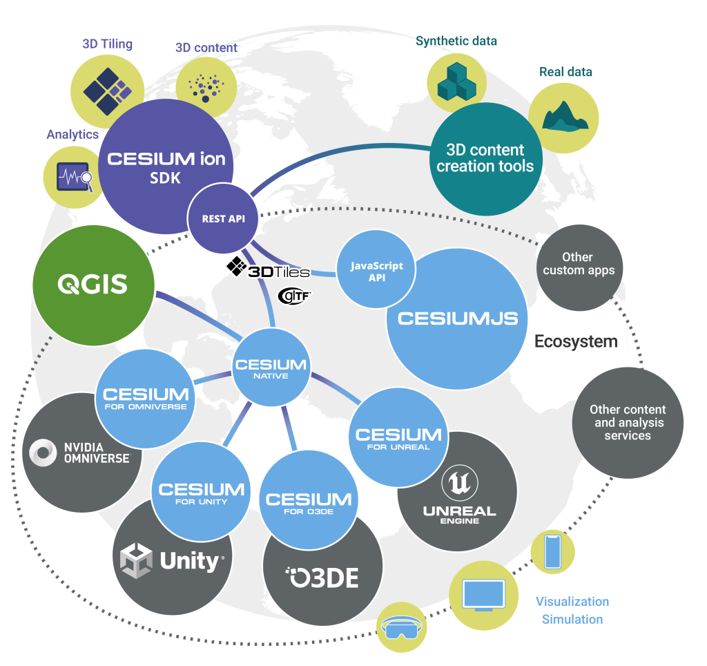
Success! Lutra and North Road have been rewarded a Cesium Ecosystem Grant to provide access to 3D tiles within QGIS. We will be creating the ability for users to visualise 3D Tiles in QGIS alongside other standard geospatial sources in both 3D and 2D map views.
3D Tiles Cesium integration ecosystem
We are very excited about it, but to be included in the first cohort of awardees is also an added honour! We share this distinction with 3 other recipients:
Ethan Berg, Agora World, Philadelphia, PA, USA, GeoForAll: Simplifying 3D Geospatial Metaverse Creation
The opportunity was brought to our attention by our friends over at Nearmap, which, along with the existence of this grant, shows how the geospatial community is working together by evolving the Open Source Economy. A movement close to our hearts and our core business. Working between commercial software and open-source, Cesium’s business model recognises the legitimacy of Open Source Software for use as a geospatial standard operating procedure by promoting openness and interoperability.
Our team of Nyall Dawson and Martin Dobias will create a new layer type, QgsTiledMeshLayer, allowing for direct access to Cesium 3D tile sources alongside the other supported geospatial layer types within QGIS. This will include visualisation of the tile data in both 3D and 2D map views (feature footprints). It will fulfill a critical need for QGIS users, permitting access to 3d data provided by their respective government agencies to work alongside all their other standard geospatial layers (vector, raster, point clouds). By making 3D Tiles a first class citizen in QGIS we help strengthen the case that those agencies should be providing their data in the Cesium format (as opposed to any proprietary alternatives).
Proposed Technical Architecture for Cesium 3D Tiles in QGIS
Here’s a breakdown of what we will be doing:
Develop a new QGIS layer type “QgsTiledMeshLayer”
Develop a parser for 3D Tiles format, supporting Batched 3D Model (with a reasonable set of glTF 2.0 features)
Develop a 3D renderer which dynamically loads and displays features from 3D Tiles based on appropriate 3D view level of detail. (A similar approach has already been implemented in QGIS for optimised viewing of point cloud data).
Develop a 2D renderer for 3D Tiles, which will display the footprints of 3D tile features in 2D QGIS map views. Just like the 3D renderer, the 2D renderer will utilise map scale information to dynamically load 3D tiles and display a suitable level of detail for the footprints.
Users will have full control over the appearance of the 2D footprints, with support for all of QGIS’ extensive polygon symbology options.
By permitting users to view the 2D footprints of features, we will promote use of Cesium 3D Tiles as a suitable source of cartographic data, eg display of authoritative building footprints supplied by government agencies in the Cesium 3D Tile format.
Through past partnerships, North Road and Lutra Consulting have developed and extended the 3D mapping functionality of QGIS. To date, all the framework for mature, performant 3D scenes including vector, mesh, raster and point cloud sources are in place. We are now ready to extend the existing functionality with Cesium 3D tiles support as QGIS 3D engine already implements most of the required concepts, such as out of core rendering and hierarchical level of detail (tested with point clouds with billions of points).
So there we go! Working together collaboratively with Lutra Consulting on another great addition to QGIS 3D Functionality thanks to Cesium Ecosystem Grants. Stay tuned on our social channels to find out when it will be released in QGIS.
Welcome back, SLYR enthusiasts! We’re thrilled to share the latest updates and enhancements for our SLYR ESRI to QGIS Compatibility Suite that will dramatically streamline the use of ESRI documents within QGIS (and vice versa!). Our team has been hard at work, expanding the capabilities of SLYR to ensure seamless compatibility between the latest QGIS and ArcGIS releases. We’ve also got some exciting news for users of the Community Edition of SLYR! Let’s dive right in and explore the exciting new features that have been added to SLYR since our previous update…
Converting Raster Layers in Geodatabases
We’re pleased to announce that SLYR now offers support for converting raster layers within Geodatabases. With this update, users can effortlessly migrate their raster data from ESRI’s Geodatabases to QGIS, enabling more efficient data management and analysis.
This enhancement is only possible thanks to work in the fantastic GDAL library which underpins QGIS’ raster data support. Please ensure that you have the latest version of QGIS (3.30.3 or 3.28.7 at a minimum) to make the most of this feature.
Annotation and Graphic Layer Improvements
Text Annotations along Curves
For those working with curved annotations, we’ve got you covered! SLYR now supports the conversion of text annotations along curves in QGIS. With this enhancement, you’ll get accurate conversion of any curved text and text-along-line annotations from MXD and APRX documents. This has been a long-requested feature which we can now introduce thanks to enhancements coming in QGIS 3.32.
ArcGIS Pro Graphics Layer Support
SLYR now supports the conversion of ArcGIS Pro graphics layers, converting all graphic elements to their QGIS “Annotation Layer” equivalents. If you’ve spent hours carefully designing cartographic markup on your maps, you can be sure that SLYR will allow you to re-use this work within QGIS!
Enhanced Page Layout Support
We’ve further improved the results of converting ArcGIS Pro page layouts to QGIS print layouts, with dozens of refinements to the conversion results. The highlights here include:
Support for converting measured grids and graticules to QGIS map grids
Enhanced dynamic text conversions: Now, when migrating your projects, you can expect a smoother transition for dynamic text ensuring your layouts correctly show generated metadata and text correctly
Support for north arrows, grouped elements, legends and table frames.
Rest assured that your carefully crafted map layouts will retain their visual appeal and functionality when transitioning to QGIS!
Improved QGIS to ArcGIS Pro Conversions
SVG Marker Exports and Symbology Size
SLYR has introduced initial support for exporting SVG markers from QGIS to ArcGIS Pro formats. SVG graphics are a component of QGIS’ cartography, and are frequently used to create custom marker symbols. Unfortunately, ArcGIS Pro doesn’t have any native support for SVG graphics for marker symbols, instead relying on a one-off conversion from SVG to multiple separate marker graphics whenever an SVG is imported into ArcGIS Pro. Accordingly, we’ve implemented a similar logic in SLYR in order to convert SVG graphics to ArcGIS Pro marker graphics transparently whenever QGIS symbology is exported to ArcGIS. This enhancement allows for a seamless transfer of symbology from QGIS, ensuring that your converted maps retain their visual integrity.
Furthermore, the update includes support for exporting QGIS symbology sizes based on “map unit” measurements to ArcGIS Pro, resulting in ArcGIS Pro symbology which more accurately matches the original QGIS versions.
Rule-Based Renderer Conversion
The “Rule Based Renderer” is QGIS’ ultimate powerhouse for advanced layer styling. It’s extremely flexible, thanks to its support for nested rules and filtering using QGIS expressions. However, this flexibility comes with a cost — there’s just no way to reproduce the same results within ArcGIS Pro’s symbology options! Newer SLYR releases will now attempt to work around this by implementing basic conversion of QGIS rule-based renderers to ArcGIS Pro layers with “display filters” attached. This allows us to convert some basic rule-based configuration to ArcGIS Pro formats.
There’s some limitations to be aware of:
Only “flat” rule structures can be converted. It’s not possible to convert a nested rule structure into something representable by ArcGIS Pro.
While the QGIS expression language is very rich and offers hundreds of functions for use in expressions, only basic QGIS filter expressions can be converted to ArcGIS Pro rules.
Improved Conversion of Raster and Mesh Layers
Based on user feedback, we’ve made significant improvements to the conversion of QGIS rasters and mesh layers to ArcGIS Pro formats. Expect enhanced accuracy when migrating these types of data, ensuring a closer match between your QGIS projects and their ArcGIS Pro equivalents.
New tools
The latest SLYR release introduces some brand new tools for automating your conversion workflows:
Convert LYR/LYRX Files Directly to SLD
To facilitate interoperability, SLYR has introduced algorithms that directly convert ESRI LYR or LYRX files to the “SLD” format (Styled Layer Descriptor). This feature simplifies the process of sharing and utilizing symbology between different GIS software, allowing for direct conversion of ESRI symbology for use in Geoserver or Mapserver.
Convert File Geodatabases to Geopackage
We’re thrilled to introduce a powerful new tool in SLYR that enables a comprehensive conversion of a File Geodatabase to the Geopackage format. With this feature, you can seamlessly migrate your data from ESRI’s File Geodatabase format to the versatile and widely supported GeoPackage format. As well as the raw data conversion, this tool also ensures the conversion of field domains and other advanced Geodatabase functionality to their GeoPackage equivalent, preserving valuable metadata and maintaining data integrity throughout the transition. (Please note that this tool requires QGIS version 3.28 or later.)
All these exciting additions to SLYR are available today to SLYR license holders. If you’re after one-click, accurate conversion of projects from ESRI to QGIS, contact us to discuss your licensing needs.
As described on our SLYR page, we also provide some of the conversion tools for free use via the SLYR “Community Edition”. We’re proud to announce that we’ve just hit the next milestone in the Community Edition funding, and will now be releasing all of SLYR’s support for raster LYR files to the community edition! This complements the existing support for vector LYR files and ESRI style files available in the community edition. For more details on the differences between the licensed and community editions, see our product comparison.
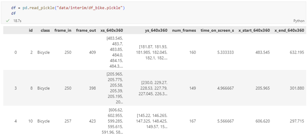
The bicycle trajectory coordinates are stored in two separate lists: xs_640x360 and ys640x360:
This format is kind of similar to the Kaggle Taxi dataset, we worked with in the previous post. However, to use the solution we implemented there, we need to combine the x and y coordinates into nice (x,y) tuples:
Afterwards, we can create the points and compute the proper timestamps from the frame numbers:
def compute_datetime(row):
    # some educated guessing going on here: the paper states that the video covers 2021-06-09 07:00-08:00
    d = datetime(2021,6,9,7,0,0) + (row['frame_in'] + row['running_number']) * timedelta(seconds=2)
    return d
def create_point(xy):
    try:
        return Point(xy)
    except TypeError:  # when there are nan values in the input data
        return None
new_df = df.head().explode('coordinates')
new_df['geometry'] = new_df['coordinates'].apply(create_point)
new_df['running_number'] = new_df.groupby('id').cumcount()
new_df['datetime'] = new_df.apply(compute_datetime, axis=1)
new_df.drop(columns=['coordinates', 'frame_in', 'running_number'], inplace=True)
new_df
Once the points and timestamps are ready, we can create the MovingPandas TrajectoryCollection. Note how we explicitly state that there is no CRS for this dataset (crs=None):
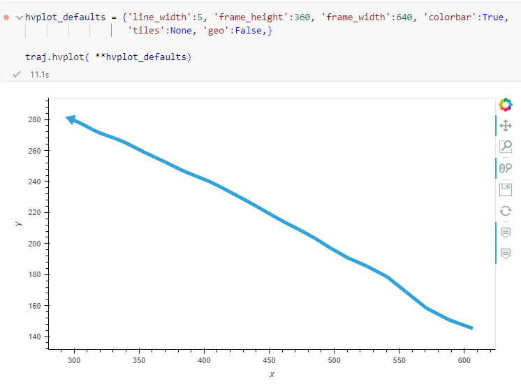
Similarly, to plot these trajectories, we should tell hvplot that it should not fetch any background map tiles (’tiles’:None) and that the coordinates are not geographic (‘geo’:False):
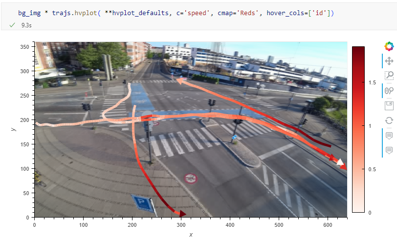
One important caveat is that speed will be calculated in pixels per second. So when we plot the bicycle speed, the segments closer to the camera will appear faster than the segments in the background:
To fix this issue, we would have to correct for the distortions of the camera lens and perspective. I’m sure that there is specialized software for this task but, for the purpose of this post, I’m going to grab the opportunity to finally test out the VectorBender plugin.
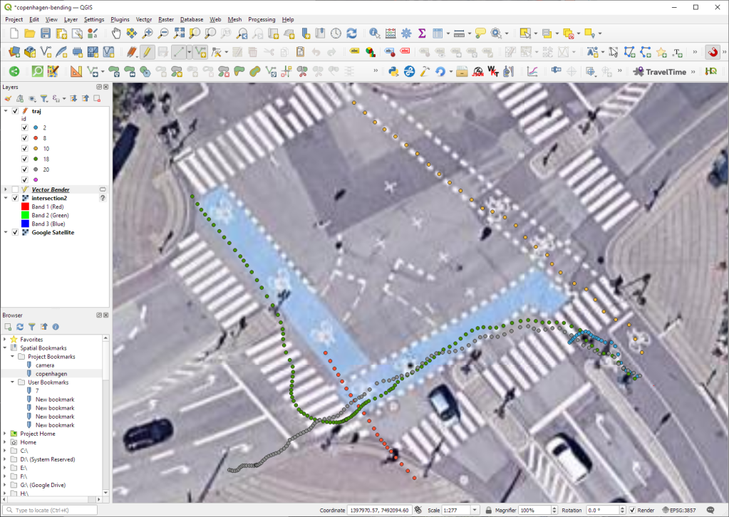
Georeferencing the trajectories using QGIS VectorBender plugin
Let’s load the five test trajectories and the camera image to QGIS. To make sure that they align properly, both are set to the same CRS and I’ve created the following basic world file for the camera image:
1
0
0
-1
0
360
Then we can use the VectorBender tools to georeference the trajectories by linking locations from the camera image to locations on aerial images. You can see the whole process in action here:
After around 15 minutes linking control points, VectorBender comes up with the following georeferenced trajectory result:
Not bad for a quick-and-dirty hack. Some points on the borders of the image could not be georeferenced since I wasn’t always able to identify suitable control points at the camera image borders. So it won’t be perfect but should improve speed estimates.
You may be wondering where Oslandia’s name is coming from ? Or maybe you already know ? In this article we focus on the “OS” part of Oslandia : OpenSource !
Oslandia positions itself as IT expert in the field of OpenSource geographical information systems. QGIS is namely one of the proheminent opensource softwares for the geospatial industry. This position is a key element of our business model.
But do you know how we work behind the scene ? This article will give you an opportunity to discover some of our contributions to the OpenSource ecosystem.
Principles
Our general business model is based on projects we carry out for our clients. They fund us to design and implement solutions adapted to their needs and requirements. Part of these developments consist in core development of Opensource software. This allows us to contribute actively to FOSS4G components.
But this funding method makes it complicated to fund maintenance, or new exploratory developments, as well as communication, community management or other tasks necessary for healthy opensource projects.
As a consequence, we introduced at Oslandia a mechanism of internal OpenSource project grants.
These grants constitute self-investment from the company into the OpenSource ecosystem, and can be applied to new projects, research and development or existing projects.
This mechanism has multiple interests :
For opensource projects : maintenance and new contributions
For Oslandia : image and potential new business opportunities
For the team : work on projects that matter to them
These OpenSource grants consist in a large range of possible tasks, as we often say : “Opensource projects are not only code”. Instead of developers, we prefer the term contributors. Development, code review, maintenance, documentation, community management, communication, each collaborator can choose the type of task to focus on.
We differentiate software maintenance grants and opensource project grants. We call the latter “OpenSource mini-projects”
Software maintenance consists in refactoring, bugfixing, packaging, release management… All these tasks need dedicated time which is difficult to fund directly on client’s project.
Opensource mini-projects grants are specific opensource proposal which can be submitted by any collaborator on any subject. We then vote on the best proposal and the team can start working on the subject within the allocated budget.
Some numbers
We allocate around 5% of the global production time to software maintenance grants. Our Opensource maintenance grant for 2022 is therefore approximately 190 days of work. It mainly focus on QGIS, PostGIS, QWC2, Giro3D and a few other components we actively maintain.
We also allocate 5% of the global production time to opensource mini-projects grants. It represents an additional 190 days of work for 2022.
Oslandia therefore invests almost 400 days of work into the OpenSource ecosystem, outside of direct contributions for client’s projects.
Opensource Mini-projects
OpenSource mini-projects grants are submitted by Oslandia’s collaborators and focus on various task and thematics : innovation, development, design, prototyping, communication or any other kind of Opensource contribution.
Proposals have to define goals, deliverables, planning, team and needed budget. Then we evaluate the proposals given the following criteria :
proposal coherency ( e.g. deliverables vs budget )
alignment with Oslandia’s strategy
innovation level
business opportunities
fun and motivation
impacts in terms of communication
links with other projects at Oslandia
possibility of extra R&D funding
We then vote on best proposal and manage these mini-projects just as a client project.
Examples
QGIS
The maintenance grant on QGIS allowed us to work on the following tasks :
Bugfixing
Code review for PRs submitted by other developers
Code refactoring
Documentation
Packaging pipeline
OSGeo4W improvement
OpenSource mini-projects grants
During the year of 2022, we worked on the following mini-projects :
This investment mechanism allows Oslandia to be an opensource “pure player” and contribute actively to these OpenSource projects and to the OpenSource ecosystem as a whole.
Should you be interested in our contribution model, or if you have any question regarding our internal OpenSource grant program, do not hesitate to contact us : [email protected] !
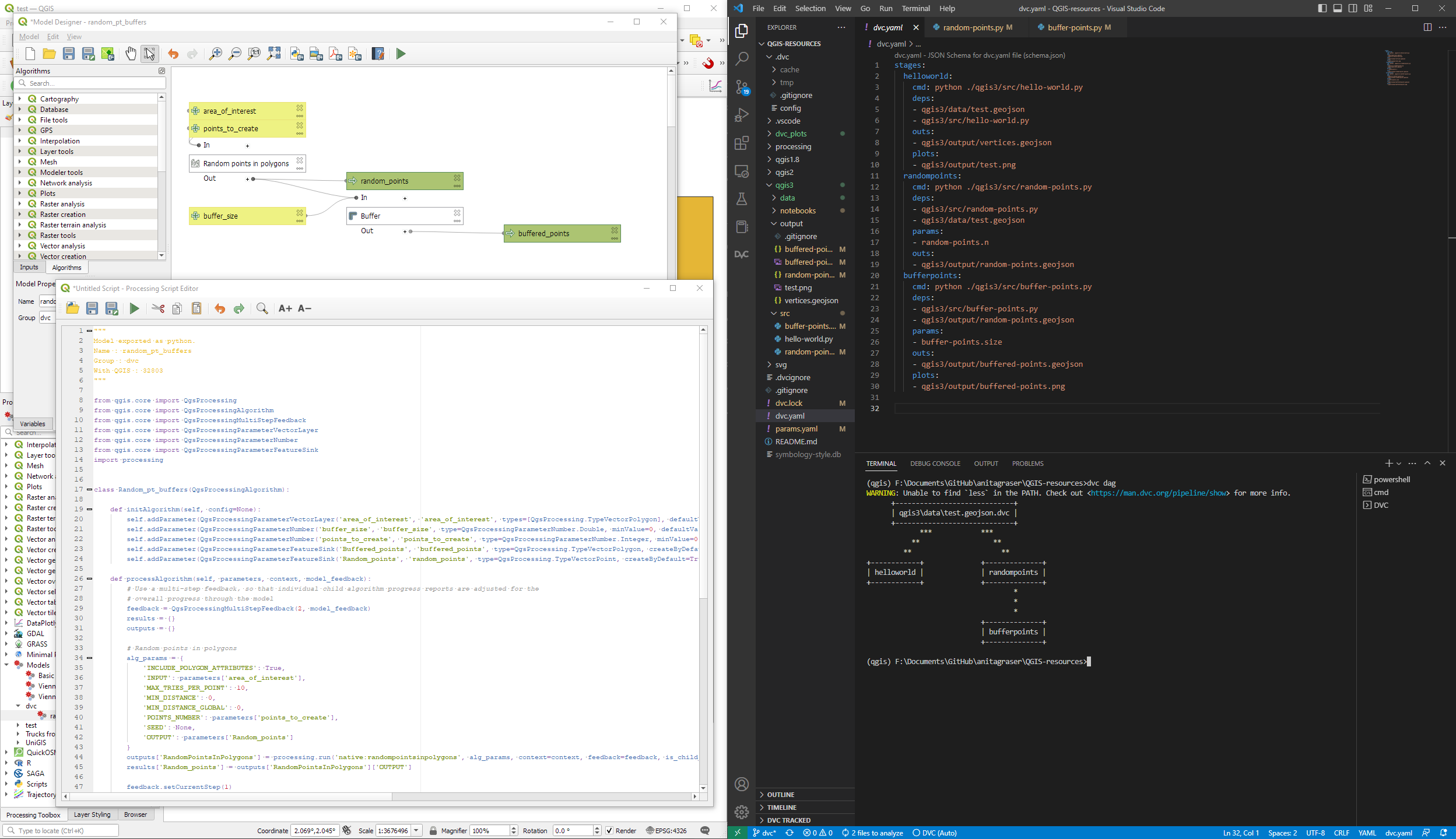
DVC tracks data, parameters, and code. If anything changes, we simply rerun the process and DVC will figure out which stages need to be recomputed and which can be skipped by re-using cached results.
This can lead to huge time savings compared to re-running the whole model
I’m using DVC with the DVC plugin for VSCode but DVC can be used completely from the command line, if you prefer this appraoch.
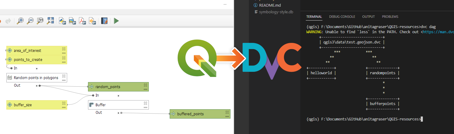
Basically, what follows is a proof of concept: converting a QGIS Processing model to a DVC workflow. In the following screenshot, you can see the main stages
The QGIS model in the upper left corner
The Python script exported from the QGIS model builder in the lower left corner
The DVC stages in my dvc.yaml file in the upper right corner (And please ignore the hello world stage. It’s a left over from my first experiment)
The DVC DAG visualizing the sequence of stages. Looks similar to the QGIS model, doesn’t it ;-)
Besides the stage definitions in dvc.yaml, there’s a parameters file:
random-points:
  n: 10
buffer-points:
  size: 0.5
And, of course, the two stages, each as it’s own Python script.
First, random-points.py which reads the random-points.n parameter to create the desired number of points within the polygon defined in qgis3/data/test.geojson:
With these things in place, we can use dvc to run the workflow, either from within VSCode or from the command line. Here, you can see the workflow (and how dvc skips stages and fetches results from cache) in action:
If you try it out yourself, let me know what you think.
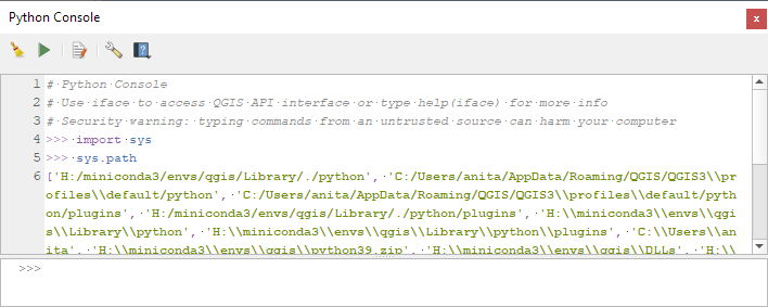
Similarly, we’ve seen posts on using PyQGIS in Jupyter notebooks. However, I find the setup with *.bat files rather tricky.
This post presents a way to set up a conda environment with QGIS that is ready to be used in Jupyter notebooks.
The first steps are to create a new environment and install QGIS. I use mamba for the installation step because it is faster than conda but you can use conda as well:
If we now try to import the qgis module in Python, we get an error:
(qgis) PS C:\Users\anita> python
Python 3.9.15 | packaged by conda-forge | (main, Nov 22 2022, 08:41:22) [MSC v.1929 64 bit (AMD64)] on win32
Type "help", "copyright", "credits" or "license" for more information.
>>> import qgis
Traceback (most recent call last):
  File "<stdin>", line 1, in <module>
ModuleNotFoundError: No module named 'qgis'
To fix this error, we need to get the paths from the Python console inside QGIS:
Thanks to the sponsoring of the Swiss QGIS User Group, starting from QGIS 3.26 is it possible to override field names in the layer export dialog. Previous to that, QGIS would always export with the technical names from the database, whereas now it’s possible to override with the alias defined in QGIS or any custom name. One use for this in Switzerland — a highly polyglot country — is an export with translated names.
This is done via an additional column “Export name”. For convenience we also added a tri-state checkbox to toggle export names to their alias defined in the layer configuration or back to the field name. If a name is changed by hand the checkbox shows a mixed state.
QField is a community-driven open-source project. It is free to share, use and modify and it will stay like that. The very essence of a community is to help and support each other. And that’s where YOU come into play. To make it work we need your support!
For those who don’t know much about the concept of open source projects, a bit of background. Investing in open-source projects is a technical and ethical decision for OPENGIS.ch. Open source is a technological advantage, as we receive input from many developers worldwide who are motivated to work out the best possible software. It prevents our customers from vendor lock-in and allows complete ownership and control of the developed software. And finally, not only financially independent businesses and people should benefit from professional software but also those who might not have the financial means to pay for features, and licences.
You are not a developer, but you still like to use QField and support it? Good news. You don’t have to be a developer to use, contribute or recommend the app. There are plenty of things that need to be done to help QField to remain the powerful software it is right now and become even better. Here are a few suggestions on how you can give something back.
Let the world know about it! It doesn’t matter if you’re on Twitter, LinkedIn, Instagram or any other social media platform. Show and tell about where QField helped you. We appreciate every post and we promise to like, share and comment.
Write about your experience and please let us know. Be it in your blog or as a new success story. Insights into field projects are extremely valuable. It helps us to make the app even more efficient for your work, and it helps others to understand the range of applications for QField.
Register for a paid QFieldCloud account. QFieldCloud allows to synchronize and merge the data collected in QField. QFieldCloud is hosted by the makers of QField and by getting an account you help QField too.
Do you want to do something that is more hands-on and directly linked to the app? No problem.
Help with the documentation. You can document features, or improve the documentation in English. Read the how-to guide to get started.
Become a beta tester and be the first to report a bug! When something doesn’t work properly it might be a bug. The quicker we know about it, the faster it can be resolved.
If you are a developer and you want to get involved in QField development, please refer to the individual documentation for QField, QFieldCloud and QFieldSync.
And now finally for those of you who have the financial means, you can either sponsor a feature or subscribe to one of the monthly sponsorships. By doing so you help get freshly baked QField versions straight to everyone’s devices.
Nothing in it for you? In that case, just drop by to say thank you or have a hot or cold beverage with us next time you meet OPENGIS.ch at a conference and you might make our day! Want to know more about the idea of community-driven open-source projects and the QGIS project in particular? Check out Nyall Dawson’s blog post about how to effectively get things done in open source!
This blog post is about QGIS relations and how they are edited in the attribute form with widgets in general, as well as some plugins that override the relations editor widget to improve usability and solve specific use cases. The start is quite basic. If you are already a relation hero, then jump directly to the plugins.
QGIS Relations in General
Let’s have a look at a simple example data model. We have four entities: Building, Apartment, Address and Owner. In UML it looks like this:
A building can have none or multiple apartments, but an apartment must to be related to a building. This black box on the left describes the relation strength as a composition. An apartment cannot exist without a building. When a building is demolished, all apartments of it are demolished as well.
An apartment needs to be owned by at least one owner. An owner can own none or more apartments. This is a many-to-many relation and this means, it will be normalized by adding a linking (join) table in between.
A building can have an address (only one – no multiple entrances in this example). An address can refer to one building. Why not making one single table on a one-to-one relation? To ensure their existence independently: When a building is demolished, the address should persist until the new building is constructed.
Creating Relations in QGIS
In QGIS we have now five layers. The four entities and the linking table called “Apartment_Owner”.
Open Project > Properties… > Relations
With Discover Relations the possible relations are detected from the existing layers according to their foreign keys in the database. In this example no CASCADE is defined in the database what means that the relations strength is always “Association”.
Where would “Composition” make sense?
Of course in the relation “Apartment” to “Building”, to ensure that when a feature of “Building” is deleted, the children (“Apartment”) are deleted as well, because they cannot exist without a building. Also a duplication of a feature of “Building” would duplicate the children (“Apartment”) as well.
But as well on the linking (join) table “Apartment_Owner” and its relation to “Apartment” and “Owner” a composition would make sense. Because when a feature of “Apartment” or “Owner” is deleted, the entry in the linking table should be deleted as well. Because this connection does not exist anymore and otherwise this would lead to orphan entries in the linking table.
Walk through the widgets
To demonstrate the relation widgets Relation Editor, Relation Reference and Value Relation we make a walk through the digitizing process.
Relation Editor
First we create a “Building” and call it “Garden Tower”. Then we add some “Apartments”.
The “Apartments” are created in the widget called Relation Editor. This shows us a list (similar to the QGIS Attribute Table) of all children (“Apartment”) referencing to this “Building”. We have here activated the possibilities to add, delete and duplicate child-features.
In the widget settings (Right-click on the layer > Properties… > Attribute Form) we see that there are other possibilities to link and unlink child-features as well as zoom to the current child-feature (what only would make sense when they have a geometry).
As well we can set here the cardinality. This will become interesting when we go to the “Owner” to “Apartment” relation. But let’s first have a look at the opposite of what we just did.
Relation Reference
When we open now a feature of “Apartment”, we see that we have a drop down to select the “Building” to reference to.
On the right of this drop down we can see some buttons. Those are for the following functionalities (from left to right):
Open the form of the current parent feature (in our case the “Building” feature called “Garden Tower”)
Add a new feature on the parent layer (in our case “Building”)
Highlight the parent layer (in our case “Building”) on the map
Select the parent feature (in our case “Building”) on the map to reference it
In the settings (Right-click on the layer > Properties… > Attribute Form) we see that we choose the configured relation to connect the child (“Apartment”) to the parent (“Building”). This won’t be needed with the widget Value Relation.
Value Relation
The Value Relation does not require a relation at all. We simply choose the “parent” layer (“Building”) its primary key as the key (“t_id”) and a descriptive field as the value (“Description”).
The result shows us a drop down as well to select the parent.
It is much easier to configure, but you can see the limitations. There are no such functionalities to control the parent feature like add, identify on map etc. As well you need to be careful to fulfill the foreign key constraint (you have to choose the correct field to link with). All this is given, when you build a Relation Reference on an existing relation.
Many-to-Many Relations
Now we link some “Owner” to our “Apartment”. We could create new ones like we did it for the “Apartment” in “Building” or we can link existing ones. For linking we choose the yellow link-button on the top of the Relation Editor.
This dialog looks similar to the Relation Editor widget. You have just to select the “Owner” you want to link to the “Apartment” by checking the yellow box. It’s a very powerful tool, but people are often confused about the load of functionality here and the selection that can be difficult to get used to (yellow boxes vs. blue index selection). For this case we extended the Relation Editor widget with a plugin.
Anyway after that we linked our features of the layer “Owner”.
Have you seen the linking table in between? Well, me neither. It’s completely invisible for the end user. This because of the cardinality setting I mentioned already. When we choose the linked table “Owner” instead of “Many to one relation”, then we can create and link the other parent (“Owner”) directly.
One-to-One Relation
A one-to-one relation like we have here between “Building” and “Address” is created in the database more or less like a normal one-to-many relation. This means one of the tables (in our case “Address”) has a foreign key pointing to the parent table (“Building”). There are tricks to fulfill the one-to-one maximum cardinality (like e.g. by setting a UNIQUE constraint on this foreign key column) but still in the QGIS user interface it looks like a one-to-many relation. It’s displayed in a normal Relation Editor widget.
Solutions could be so called “Joins”. Go to the settings (Right-click on the layer > Properties… > Joins)
Here you can join a layer of your choice and add the fields of this other layer (in our case “Address”) to your current feature form (of “Building”). So it appears to the user that it’s the same table containing fields of “Building” and “Address”.
Negative point about those joins are, that they are fault prone. You have to be careful with default values (e.g. on primary keys) of the joined layer. You cannot expect a fully reliable feature form like you have it in the Relation Editor. Here as well, we extended the Relation Editor widget with a plugin.
Plugins for Relation Editor Widgets
Since QGIS 3.18 the base class of the Relation Editor Widgets became abstract, what opened the possibility to use it in PyQGIS and derive it to super nice widgets handling specific use cases and improving the usability.
Linking Relation Editor Widget
As mentioned before, the QGIS stock dialog to link children is full of features but it can be overwhelming and difficult to use. Mostly because of the two selection possibilities in the list. A blue selection is for the currently displayed feature, and a yellow checkbox selection is for the features to be actually linked.
In collaboration with the Model Baker Group we wanted to improve the situation. But as we where unsure how the end solution should look like, so we decided to experiment in a plugin. The result is a link manger dialog, in which features can be linked and unlinked by moving them left and right. The effective link is created or destroyed when the dialog is accepted.
Sometimes the order of the children play a role on the project, and you want to have them displayed following that. For that there is the Ordered Relation Editor Widget. You can configure a field in the children to be used to order them. In the given example the field Floor was used to order Apartments. Reordering the fields by Drag&Drop would change the value of the configured field. Display name and optionally a path to an icon to be shown on the list can be configured by expression in the Attribute Form tab in the layer properties (Right-click on the layer > Properties… > Attribute Form).
Often in QGIS projects there is the need to deal with external documents. This could be for example pictures, documentations or reports about some features. To support that we added two new tables in the project:
Documents each document is represented by a row in this table. The table has following fields:
id
path is the filename of the document.
DocumentsFeatures this is a linking (join) table and permits to link a document with one or more features in more layers. The table has following fields:
id
document_id id of the document.
feature_id id of the feature.
feature_layer layer of the feature.
Thanks to a QGIS feature named Polymorphic Relations we can link a document with features of multiple layers. The polymorphic relation can evaluate an expression to decide in which table will be the feature to link. Here a screenshot of the relation configuration:
After this configuration in the layers “Apartment” and “Building” it will be possible to link children from the “Documents” table. The document management plugin provides two widgets to simplify the handling of the relation. In the feature side widget the documents are displayed as a grid or list. If possible a preview of the contend is shown and you can add new documents via Drag&Drop from the system file manager. Double-click on a document will open it in the default system viewer.
The second widget is meant to be used in the Feature Form of the “Documents” table, and it permits to handy see, for each document, with which feature from which layer it is linked.
Well then. We hope that all the beginners reading this article received some light on QGIS Relations and all the advanced user some inspiration on the immense possibilities you have with QGIS ?
The QGIS 3.28 release is an extremely exciting release for all users who work in mixed software workplaces, or who need to work alongside users of ESRI software. In this post we’ll be giving an overview of all the new tools and features introduced in 3.28 which together result in a dramatic improvement in the workflows and capabilities in working with ESRI based formats and services. Read on for the full details…!
Before we begin, we’d like to credit the following organisations for helping fund these developments in QGIS 3.28:
Naturstyrelsen, Denmark
Provincie Gelderland, Netherlands
Uppsala Universitet, Department of Archaeology and Ancient History
Gemeente Amsterdam
Provincie Zuid-Holland, Netherlands
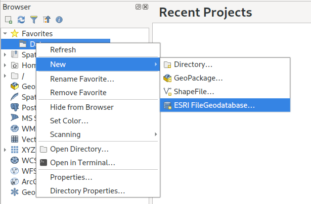
FileGeodatabase (GDB) related improvements
The headline item here is that QGIS 3.28 introduces support for editing, managing and creating ESRI FileGeodatabases out of the box! While older QGIS releases offered some limited support for editing FileGeodatabase layers, this required the manual installation of a closed source ESRI SDK driver… which unfortunately resulted in other regressions in working with FileGeodatabases (such as poor layer loading speed and random crashes). Now, thanks to an incredible reverse engineering effort by the GDAL team, the open-source driver for FileGeodatabases offers full support for editing these datasets! This means all QGIS users have out-of-the-box access to a fully functional, high-performance read AND write GDB driver, no further action or trade-offs required.
Operations supported by the GDAL open source driver include:
Editing existing features, with full support for editing attributes and curved, 3D and measure-value geometries
Creating new features
Deleting features
Creating, adding and modifying attributes in an existing layer
Full support for reading and updating spatial indexes
Creating new indexes on attributes
“Repacking” layers, to reduce their size and improve performance
Creating new layers in an existing FileGeodatabase
Removing layers from FileGeodatabases
Creating completely new, empty FileGeodatabases
Creating and managing field domains
On the QGIS side, the improvements to the GDAL driver meant that we could easily expose feature editing support for FileGeodatabase layers for all QGIS users. While this is a huge step forward, especially for users in mixed software workplaces, we weren’t happy to rest there when we had the opportunity to further improve GDB support within QGIS!
So in QGIS 3.28 we also introduced the following new functionality when working with FileGeodatabases:
FileGeodatabase management tools
QGIS 3.28 introduces a whole range of GUI based tools for managing FileGeodatabases. To create a brand new FileGeodatabase, you can now right click on a directory from the QGIS Browser panel and select New – ESRI FileGeodatabase:
After creating your new database, a right click on its entry will show a bunch of available options for managing the database. These include options for creating new tables, running arbitrary SQL commands, and database-level operations such as compacting the database:
You’re also able to directly import existing data into a FileGeodatabase by simply dragging and dropping layers onto the database!
Expanding out the GDB item will show a list of layers present in the database, and present options for managing the fields in those layers. Alongside field creation, you can also remove and rename existing fields.
Field domain handling
QGIS 3.28 also introduces a range of GUI tools for working with field domains inside FileGeodatabases. (GeoPackage users also share in the love here — these same tools are all available for working with field domains inside this standard format too!) Just right click on an existing FileGeodatabase (or GeoPackage) and select the “New Field Domain” option. Depending on the database format, you’ll be presented with a list of matching field domain types:
Once again, you’ll be guided through a user-friendly dialog allowing you to create your desired field domain!
After field domains have been created, they can be assigned to fields in the database by right-clicking on the field name and selecting “Set Field Domain”:
Field domains can also be viewed and managed by expanding out the “Field domains” option for each database.
Relationship discovery
Another exciting addition in QGIS 3.28 (and the underlying GDAL 3.6 release) is support for discovering database relationships in FileGeodatabases! (Once again, GeoPackage users also benefit from this, as we’ve implemented full support for GeoPackage relationships via the “Related Tables Extension“).
Expanding out a database containing any relationships will show a list of all discovered relationships:
(You can view the full description and details for any of these relationships by opening the QGIS Browser “Properties” panel).
Whenever QGIS 3.28 discovers relationships in the database, these related tables will automatically be added to your project whenever any of the layers which participate in the relationship are opened. This means that users get the full experience as designed for these databases without any manual configuration, and the relationships will “just work”!
Dataset Grouping
Lastly, we’ve improved the way layers from FileGeodatabases are shown in QGIS, so that layers are now grouped according to their original dataset groupings from the database structure:
Edit ArcGIS Online / Feature Service layers
While QGIS has had read-only support for viewing and working with the data in ArcGIS Online (AGOL) vector layers and ArcGIS Server “feature service” layers for many years, we’ve added support for editing these layers in QGIS 3.28. This allows you to take advantage of all of QGIS’ easy to use, powerful editing tools and directly edit the content in these layers from within your QGIS projects! You can freely create new features, delete features, and modify the shape and attributes of existing features (assuming that your user account on the ArcGIS service has these edit permissions granted, of course). This is an exciting addition for anyone who has to work often with content in ArcGIS services, and would prefer to directly manipulate these layers from within QGIS instead of the limited editing tools available on the AGOL/Portal platforms themselves.
This new functionality will be available immediately to users upon upgrading to QGIS 3.28 — any users who have been granted edit capabilities for the layers will see that the QGIS edit tools are all enabled and ready for use without any further configuration on the QGIS client side.
Filtering Feature Service layers
We’ve also had the opportunity to introduce filter/query support for Feature Service layers in QGIS 3.28. This is a huge performance improvement for users who need to work with a subset of a features from a large Feature Service layer. Unfortunately, due to the nature of the Feature Service protocol, these layers can often be slow to load and navigate on a client side. By setting a SQL filter to limit the features retrieved from the service the performance can be dramatically increased, as only matching features will ever be requested from the backend server. You can use any SQL query which conforms to the subset of SQL understood by ArcGIS servers (see the Feature Service documentation for examples of supported SQL queries).
What’s next?
While QGIS 3.28 is an extremely exciting release for any users who need to work alongside ESRI software, we aren’t content to rest here! The exciting news is that in QGIS 3.30 we’ll be introducing a GUI driven approach allowing users to create new relationships in their FileGeodatabase (and GeoPackage!) databases.
At North Road we’re always continuing to improve the cross-vendor experience for both ESRI and open-source users through our continued work on the QGIS desktop application and our SLYR conversion suite. If you’d like to chat to us about how we can help your workplace transition from a fully ESRI stack to a mixed or fully open-source stack, just contact us to discuss your needs.
In the previous post, we — creatively ;-) — used MobilityDB to visualize stationary IOT sensor measurements.
This post covers the more obvious use case of visualizing trajectories. Thus bringing together the MobilityDB trajectories created in Detecting close encounters using MobilityDB 1.0 and visualization using Temporal Controller.
Like in the previous post, the valueAtTimestamp function does the heavy lifting. This time, we also apply it to the geometry time series column called trip:
Our SLYR tool is the complete solution for full compatibility between ArcMap, ArcGIS Pro and QGIS. It offers a powerful suite of conversion tools for opening ESRI projects, styles and other documents directly within QGIS, and for exporting QGIS documents for use in ESRI software.
A lot has changed since our last SLYR product update post, and we’ve tons of very exciting improvements and news to share with you all! In this update we’ll explore some of the new tools we’ve added to SLYR, and discuss how these tools have drastically improved the capacity for users to migrate projects from the ESRI world to the open-source world (and vice versa).
ArcGIS Pro support
The headline item here is that SLYR now offers a powerful set of tools for working with the newer ArcGIS Pro document formats. Previously, SLYR offered support for the older ArcMap document types only (such as MXD, MXT, LYR, and PMF formats). Current SLYR versions now include tools for:
Directly opening ArcGIS Pro .lyrx files within QGIS
LYRX files can be dragged and dropped directly onto a QGIS window to add the layer to the current project. All the layer’s original styling and other properties will be automatically converted across, so the resultant layer will be an extremely close match to the original ArcGIS Pro layer! SLYR supports vector layers, raster layers, TIN layers, point cloud layers and vector tile layers. We take great pride in just how close the conversion results are to how these layers appear in ArcGIS Pro… in most cases you’ll find the results are nearly pixel perfect!
In addition to drag-and-drop import support, SLYR also adds support for showing .lyrx files directly in the integrated file browser, and also adds tools to the QGIS Processing Toolbox so that users can execute bulk conversion operations, or include document conversion in their models or custom scripts.
ArcGIS Pro map (mapx) and project (aprx) conversion
Alongside the LYRX support, we’ve also added support for the ArcGIS Pro .mapx and .aprx formats. Just like our existing .mxd conversion, you can now easily convert entire ArcGIS Pro maps for direct use within QGIS! SLYR supports both the older ArcGIS Pro 2.x project format and the newer 3.x formats.
Export from QGIS to ArcGIS Pro!
Yes, you read that correctly… SLYR now allows you to export QGIS documents into ArcGIS Pro formats! This is an extremely exciting development… for the first time ever QGIS users now have the capacity to export their work into formats which can be supplied directly to ESRI users. Current SLYR versions support conversion of map layers to .lyrx format, and exporting entire projects to the .mapx format. (We’ll be introducing support for direct QGIS to .aprx exports later this year.)
We’re so happy to finally provide an option for QGIS users to work alongside ArcGIS Pro users. This has long been a pain point for many organisations, and has even caused organisations to be ineligible to tender for jobs which they are otherwise fully qualified to do (when tenders require provision of data and maps in ArcGIS compatible formats).
ArcGIS Pro .stylx support
Alongside the other ArcGIS Pro documents, SLYR now has comprehensive support for reading and writing ArcGIS Pro .stylx databases. We’ve dedicated a ton of resources in ensuring that the conversion results (both from ArcGIS Pro to QGIS and from QGIS to ArcGIS Pro) are top-notch, and we even handle advanced ArcGIS Pro symbology options like symbol effects!
While we’ve been focusing heavily on the newer ArcGIS Pro formats, we’ve also improved our support for the older ArcMap documents. In particular, SLYR now offers more options for converting ArcMap annotation layers and annotation classes to QGIS supported formats. Users can now convert Annotation layers and classes directly over to QGIS annotation layer or alternatively annotation classes can be converted over to the OGC standard GeoPackage format. When exporting annotation classes to GeoPackage the output database is automatically setup with default styling rules, so that the result can be opened directly in QGIS and will be immediately visualised to match the original annotation class.
Coming soon…
While all the above improvements are already available for all SLYR license holders, we’ve got many further improvements heading your way soon! For example, before the end of 2022 we’ll be releasing another large SLYR update which will introduce support for exporting QGIS projects directly to ArcGIS Pro .aprx documents. We’ve also got many enhancements planned which will further improve the quality of the converted documents. Keep an eye on this blog and our socialmediachannels for more details as they are available…
You can read more about our SLYR tool at the product page, or contact us today to discuss licensing options for your organisation.
Thanks to the recent popularity of the “30 Day Map Challenge“, the month of November has become synonymous with beautiful maps and cartography. During this November we’ll be sharing a bunch of tips and tricks which utilise some advanced QGIS functionality to help create beautiful maps.
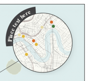
One technique which can dramatically improve the appearance of maps is to swap out rectangular inset maps for more organic shapes, such as circles or ovals.
Back in 2020, we had the opportunity to add support for directly creating circular insets in QGIS Print Layouts (thanks to sponsorship from the City of Canning, Australia!). While this functionality makes it easy to create non-rectangular inset maps the steps, many QGIS users may not be aware that this is possible, so we wanted to highlight this functionality for our first 30 Day Map Challenge post.
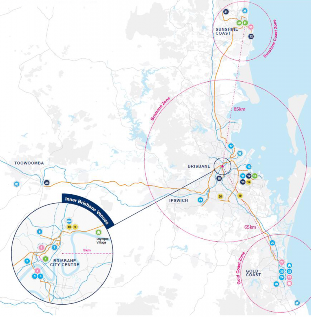
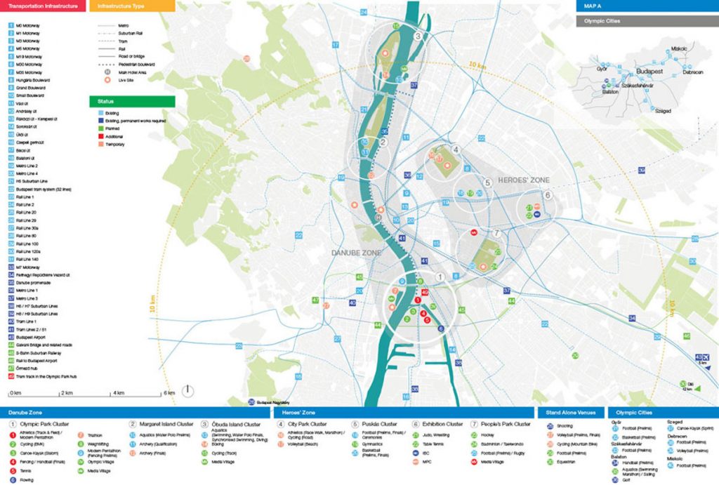
Let’s kick things off with an example map. We’ve shown below an extract from the 2032 Brisbane Olympic Bid that some of the North Road team helped create (on behalf of SMEC for EKS). This map is designed to highlight potential venues around South East Queensland and the travel options between these regions:
Venue Masterplan for 2032 Olympic Games, IOC Feasibility Assessment – Olympic Games, Brisbane February 2021
Circles featured heavily in previous Olympic bid maps (such as Budapest) where we took our inspiration from. This may, or may not, play a part in using the language of the target map audience – think Olympic rings!
Budapest Olympics 2024 Masterplan
Step by Step Guide to Creating a Circle Inset
Firstly, prepare a print layout with both a main map and an inset map. Make sure that your inset map is large enough to cover your circular shape:
From the Print Layout toolbar, click on the Add Shape button and then select Add Ellipse:
Draw the ellipse over the middle of your inset map (hint: holding down Shift while drawing the ellipse will force it to a circular shape!). If you didn’t manage to create an exact circle then you can manually specify the width and height in the shape item’s properties. For this one, we went with a 50mm x 50mm circle:
Next, select the Inset Map item and in its Item Properties click on the Clipping Settings button:
In the Clipping Settings, scroll down to the second section and tick the Clip to Item box and select your Ellipse item from the list. (If you have labels shown in your inset map you may also want to check the “force labels inside clipping shape” option to force these labels inside the circle. If you don’t check this option then labels will be allowed to overflow outside of the circle shape.)
Your inset map will now be bound to the ellipse!
Here’s a bit more magic you could add to this map – in the Main Map’s properties, click on Overviews and set create one for the Inset map – it will nicely show the visible circular area and not the rectangle!
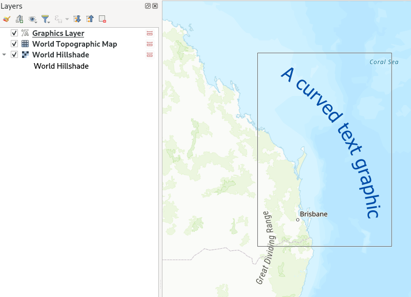
Bonus Points: Circular Title Text!
For advanced users, we’ve another fun tip…and when we say fun, we mean ‘let’s play with radians’! Here we’re going to create some title text and a wedged background which curves around the outside of our circular inset. This takes some fiddly playing around, but the end result can be visually striking! Here we’re going to push the QGIS print layout “HTML” item to create some advanced graphics, so some HTML and CSS coding experience is advantageous. (An alternative approach would be to use a vector illustration application like Inkscape, and add your title and circular background as an SVG item in the print layout).
We’ll start by creating some curved circular text:
First, add a “HTML frame” to your print layout:
HTML frames allow placement of dynamic content in your layouts, which can use HTML, CSS and JavaScript to create graphical components.
In the HTML item’s “source” box, add the following code:
Now, let’s add in a background to bring more focus onto the title!
To add in the background, create another HTML item. We’ll again create the arc shape using an SVG element, so add the following code into the item’s source box:
So there we go! These two techniques can help push your QGIS map creations further and make it easier to create beautiful cartography directly in QGIS itself. If you found these tips useful, keep an eye on this blog as we post more tips and tricks over the month of November. And don’t forget to follow the 30 day Map Challenge for a smorgasbord of absolutely stunning maps.
Starting with QField 2.2, users can fully rely on animation capabilities that have made their way into QGIS during its last development cycle. This can be a powerful mean to highlight key elements on a map that require special user attention.
The example below demonstrates a scenario where animated raster markers are used to highlight active fires within the visible map extent. Notice how the subtle fire animation helps draw viewers’ eyes to those important markers.
The second example below showcases more advanced animated symbology which relies on expressions to animate several symbol properties such as marker size, border width, and color opacity. While more complex than simply adding a GIF marker, the results achieved with data-defined properties animation can be very appealing and integrate perfectly with any type of project.
You’ll quickly notice how smooth the animation runs. That is thanks to OPENGIS.ch’s own ninjas having spent time improving the map canvas element’s handling of layers constantly refreshing. This includes automatic skipping of frames on older devices so the app remains responsive.
Amongst all the processing algorithms already available in QGIS, sometimes the one thing you need is missing.
This happened not a long time ago, when we were asked to find a way to continuously visualise traffic on the Swiss motorway network (polylines) using frequently measured traffic volumes from discrete measurement stations (points) alongside the motorways. In order to keep working with the existing polylines, and be able to attribute more than one value of traffic to each feature, we chose to work with the M-values. M-values are a per-vertex attribute like X, Y or Z coordinates. They contain a measure value, which typically represents time or distance. But they can hold any numeric value.
In our example, traffic measurement values are provided on a separate point layer and should be attributed to the M-value of the nearest vertex of the motorway polylines. Of course, the motorway features should be of type LineStringM in order to hold an M-value. We then should interpolate the M-values for each feature over all vertices in order to get continuous values along the line (i.e. a value on every vertex). This last part is not yet existing as a processing algorithm in QGIS.
This article describes how to write a feature-based processing algorithm based on the example of M-value interpolation along LineStrings.
Feature-based processing algorithm
The pyqgis class QgsProcessingFeatureBasedAlgorithmis described as follows: “An abstract QgsProcessingAlgorithm base class for processing algorithms which operates “feature-by-feature”.
Feature based algorithms are algorithms which operate on individual features in isolation. These are algorithms where one feature is output for each input feature, and the output feature result for each input feature is not dependent on any other features present in the source. […]
Using QgsProcessingFeatureBasedAlgorithm as the base class for feature based algorithms allows shortcutting much of the common algorithm code for handling iterating over sources and pushing features to output sinks. It also allows the algorithm execution to be optimised in future (for instance allowing automatic multi-thread processing of the algorithm, or use of the algorithm in “chains”, avoiding the need for temporary outputs in multi-step models).”
In other words, when connecting several processing algorithms one after the other – e.g. with the graphical modeller – these feature-based processing algorithms can easily be used to fill in the missing bits.
Compared to the standard QgsProcessingAlgorithm the feature-based class implicitly iterates over each feature when executing and avoids writing wordy loops explicitly fetching and applying the algorithm to each feature.
Just like for the QgsProcessingAlgorithm (a template can be found in the Processing Toolbar > Scripts > Create New Script from Template), there is quite some boilerplate code in the QgsProcessingFeatureBasedAlgorithm. The first part is identical to any QgsProcessingAlgorithm.
After the description of the algorithm (name, group, short help, etc.), the algorithm is initialised with def initAlgorithm, defining input and output.
While in a regular processing algorithm now follows def processAlgorithm(self, parameters, context, feedback), in a feature-based algorithm we use def processFeature(self, feature, context, feedback). This implies applying the code in this block to each feature of the input layer.
! Do not use def processAlgorithm in the same script, otherwise your feature-based processing algorithm will not work !
Interpolating M-values
This actual processing part can be copied and added almost 1:1 from any other independent python script, there is little specific syntax to make it a processing algorithm. Only the first line below really.
In our M-value example:
    def processFeature(self, feature, context, feedback):

        try:
            geom = feature.geometry()
            line = geom.constGet()
            vertex_iterator = QgsVertexIterator(line)
            vertex_m = []

            # Iterate over all vertices of the feature and extract M-value

            while vertex_iterator.hasNext():
                vertex = vertex_iterator.next()
                vertex_m.append(vertex.m())

            # Extract length of segments between vertices

            vertices_indices = range(len(vertex_m))
            length_segments = [sqrt(QgsPointXY(line[i]).sqrDist(QgsPointXY(line[j])))
                for i,j in itertools.combinations(vertices_indices, 2)
                if (j - i) == 1]

            # Get all non-zero M-value indices as an array, where interpolations
              have to start

            vertex_si = np.nonzero(vertex_m)[0]

            m_interpolated = np.copy(vertex_m)

            # Interpolate between all non-zero M-values - take segment lengths between
              vertices into account

            for i in range(len(vertex_si)-1):
                first_nonzero = vertex_m[vertex_si[i]]
                next_nonzero = vertex_m[vertex_si[i+1]]
                accum_dist = itertools.accumulate(length_segments[vertex_si[i]
                                                                  :vertex_si[i+1]])
                sum_seg = sum(length_segments[vertex_si[i]:vertex_si[i+1]])
                interp_m = [round(((dist/sum_seg)*(next_nonzero-first_nonzero)) +
                            first_nonzero,0) for dist in accum_dist]
                m_interpolated[vertex_si[i]:vertex_si[i+1]] = interp_m

            # Copy feature geometry and set interpolated M-values,
              attribute new geometry to feature

            geom_new = QgsLineString(geom.constGet())

            for j in range(len(m_interpolated)):
                geom_new.setMAt(j,m_interpolated[j])

            attrs = feature.attributes()

            feat_new = QgsFeature()
            feat_new.setAttributes(attrs)
            feat_new.setGeometry(geom_new)

        except Exception:
            s = traceback.format_exc()
            feedback.pushInfo(s)
            self.num_bad += 1
            return []

        return [feat_new]
In our example, we get the feature’s geometry, iterate over all its vertices (using the QgsVertexIterator) and extract the M-values as an array. This allows us to assign interpolated values where we don’t have M-values available. Such missing values are initially set to a value of 0 (zero).
We also extract the length of the segments between the vertices. By gathering the indices of the non-zero M-values of the array, we can then interpolate between all non-zero M-values, considering the length that separates the zero-value vertex from the first and the next non-zero vertex.
For the iterations over the vertices to extract the length of the segments between them as well as for the actual interpolation between all non-zero M-value vertices we use the library itertools. This library provides different iterator building blocks that come in quite handy for our use case.
Finally, we create a new geometry by copying the one which is being processed and setting the M-values to the newly interpolated ones.
And that’s all there is really!
Alternatively, the interpolation can be made using the interp function of the numpy library. Some parts where our manual method gave no values, interp.numpy seemed more capable of interpolating. It remains to be judged which version has the more realistic results.
Styling the result via M-values
The last step is styling our output layer in QGIS, based on the M-values (our traffic M-values are categorised from 1 [a lot of traffic -> dark red] to 6 [no traffic -> light green]). This can be achieved by using a Single Symbol symbology with a Marker Line type “on every vertex”. As a marker type, we use a simple round point. Stroke style is “no pen” and Stroke fill is based on an expression:
with_variable(

'm_value', m(point_n($geometry, @geometry_point_num)),

	CASE WHEN @m_value = 6
		THEN color_rgb(140, 255, 159)

		WHEN @m_value = 5
			THEN color_rgb(244, 252, 0)

		WHEN @m_value = 4
			THEN color_rgb(252, 176, 0)

		WHEN @m_value = 3
			THEN color_rgb(252, 134, 0)

		WHEN @m_value = 2
			THEN color_rgb(252, 29, 0)

		WHEN @m_value = 1
			THEN color_rgb(140, 255, 159)

		ELSE
			color_hsla(0,100,100,0)

	END
)
And voilà! Wherever we have enough measurements on one line feature, we get our motorway network continuously coloured according to the measured traffic volume.
Motorway network – the different lanes are regrouped for each direction. M-values of the vertices closest to measurement points are attributed the measured traffic volume. The vertices are coloured accordingly.Trafic on motorway network after “manual” M-value interpolation. Trafic on motorway network after M-value interpolation using numpy.
One disclaimer at the end: We get this seemingly continuous styling only because of the combination of our “complex” polylines (containing many vertices) and the zoomed-out view of the motorway network. Because really, we’re styling many points and not directly the line itself. But in our case, this is working very well.
If you’d like to make your custom processing algorithm available through the processing toolbox in your QGIS, just put your script in the folder containing the files related to your user profile:
profiles > default > processing > scripts
You can directly access this folder by clicking on Settings > User Profiles > Open Active Profile Folder in the QGIS menu.
That way, it’s also available for integration in the graphical modeller.
Extract of the GraphicalModeler sequence. “Interpolate M-values neg” refers to the custom feature-based processing algorithm described above.
You can download the above-mentioned processing scripts (with numpy and without numpy) here.
Together with our partners at Lutra Consulting and Hobu, we have once again have collated your feature requests for even MORE point cloud and QGIS elevation improvements and are ready to start working on them!
Point cloud data management, transformation and analysis via incorporation of PDAL within the QGIS “Processing” toolbox
Optimised handling of large datasets to speed up your 3D maps, including dynamic data loading for complex 3D scenes
Combine multiple LAS/LAZ point cloud files into a single “virtual” point cloud for easy data management and display
Elevation profile tool embedded into print layouts, totally customizable, more efficient and with the ability to export profile data to CSV and DXF
General improvements to QGIS 3D map views, including an enhanced 3D measuring tool, additional camera controls and improving the configuration dialog options and functionality.
To find out more, check out the ‘Detailed proposal and deliverables’ section on the main crowd funding page. You may want to get some popcorn ready, it really is exciting!
We need your help to make this work possible. If you’d like to see these enhancements, pledge to the crowdfunding campaign before October 24, 2022.


 To know more about


