


Exploring variables in QGIS pt 2: project management
Following on from part 1 in which I introduced how variables can be used in map composers, I’d like to now explore how using variables can make it easier to manage your QGIS projects. As a quick refresher, variables are a new feature in QGIS 2.12 which allow you to create preset values for use anywhere you can use an expression in QGIS.
Let’s imagine a typical map project. You load up QGIS, throw a bunch of layers on your map, and then get stuck into styling and labelling them ‘just right’. Over time the project gets more and more complex, with a stack of layers all styled using different rendering and labelling rules. You keep tweaking settings until you’re almost happy with the result, but eventually realise that you made the wrong choice of font for the labelling and now need to go through all your layers and labelling rules and update each in turn to the new typeface. Ouch.
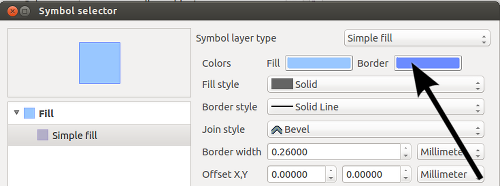
Variables to the rescue! As you may recall from part 1, you can reuse variables anywhere in QGIS where you can enter an expression. This includes using them for data defined overrides in symbology and labelling. So, lets imagine that way back at the beginning of our project we created a project level variable called @main_label_font:

Creating a variable for label font
Now, we can re-use that variable in a data defined override for the label font setting. In fact, QGIS makes this even easier for you by showing a “variables” sub-menu allowing easy access to all the currently defined variables accessible to the layer:
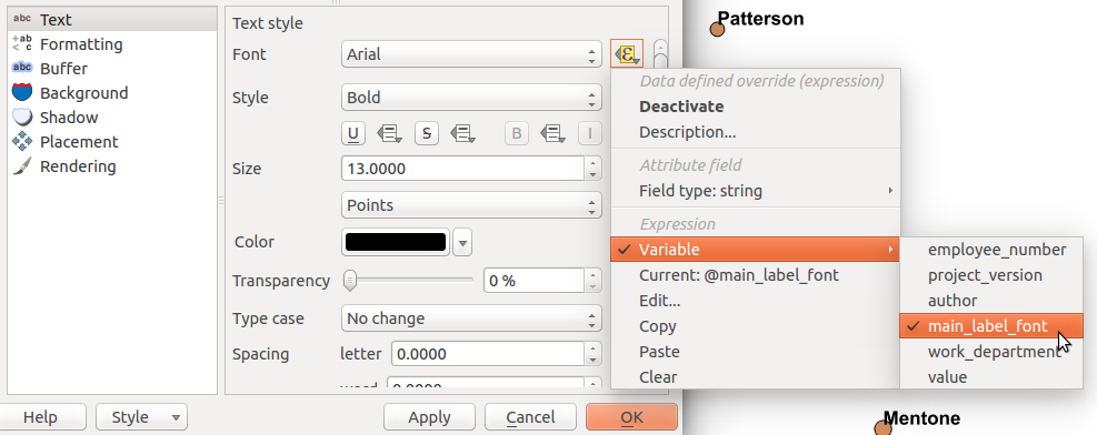
Binding the label font to the @main_label_font variable
When we hit Apply all our labels will be updated to use the font face defined by the @main_label_font variable, so in this case ‘Courier New’:

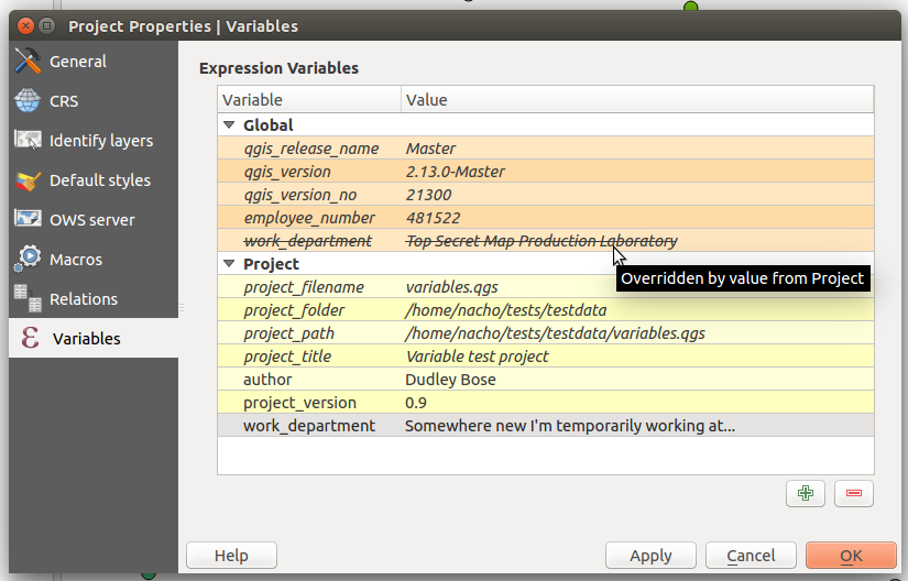
In a similar way we can bind all the other layer’s label fonts to the same variable, so @main_label_font will be reused by all the layers in the project. Then, when we later realise that Courier New was a horrible choice for labelling the map, it’s just a matter of opening up the Project Properties dialog and updating the value of the @main_label_font variable:

And now when we hit Apply the font for all our labelled layers will be updated all at once:

It’s not only a huge time saver, it also makes changes like this easier because you can try out different font faces by updating the variable and hitting apply and seeing the effect that the changes have all at once. Updating multiple layers manually tends to have the consequence that you forget what the map looked like before you started making the change, making direct comparisons harder.
Of course, you could have multiple variables for other fonts used by your project too, eg @secondary_label_font and @highlighted_feature_font. Plus, this approach isn’t limited to just setting the label font. You could utilise project level variables for consolidating font sizes, symbol line thickness, marker rotation, in fact, ANYTHING that has one of those handy little data defined override buttons next to it:
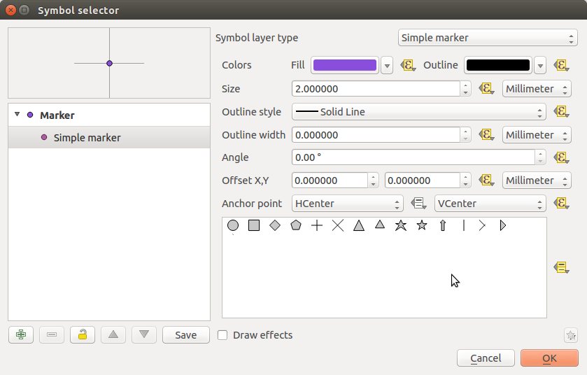
See all those nice little yellow buttons? All those controls can be bound to variables…
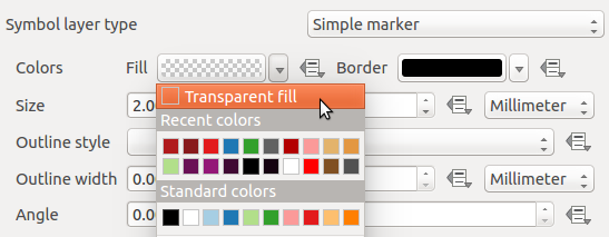
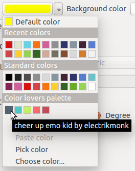
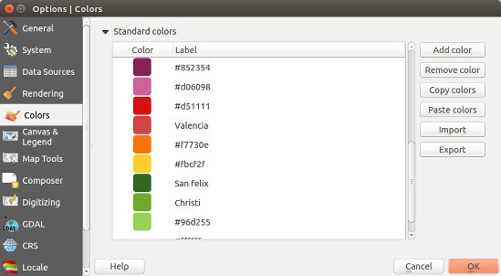
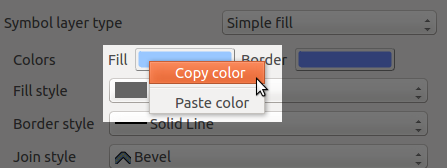
One last thing before I wrap up part 2 of this series. The same underlying changes which introduced variables to QGIS also allows us to begin introducing a whole stack of new, useful functions to the expression engine. One of these which also helps with project management is the new project_color function. Just like how we can use project level variables throughout a project, project_color lets you reuse a color throughout your project. First, you need to create a named colour in the Default Styles group under the Project Properties dialog:

Define a colour in the project’s colour scheme…
Then, you can set a data defined override for a symbol or label colour to the expression “project_color(‘red alert!’)“:

When you go back and change the corresponding colour in the Project Properties dialog, every symbol bound to this colour will also be updated!

So, there you have it. With a little bit of forward planning and by taking advantage of the power of expression variables in QGIS 2.12 you can help make your mapping projects much easier to manage and update!
That’s all for now, but we’re still only just getting started with variables. Part 3, coming soon!.. (Update: Part 3 is available now)


