Related Plugins and Tags

QGIS Planet

About label halos

A lot of cartographers have a love/hate relationship with label halos. On one hand they can be an essential technique for improving label readability, especially against complex background layers. On the other hand they tend to dominate maps and draw unwanted attention to the map labels.

In this post I’m going to share my preferred techniques for using label halos. I personally find this technique is a good approach which minimises the negative effects of halos, while still providing a good boost to label readability. (I’m also going to share some related QGIS 3.0 news at the end of this post!)

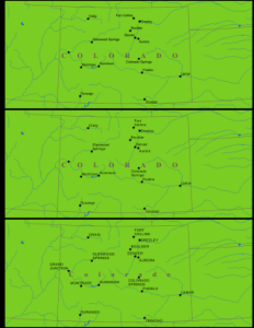
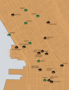
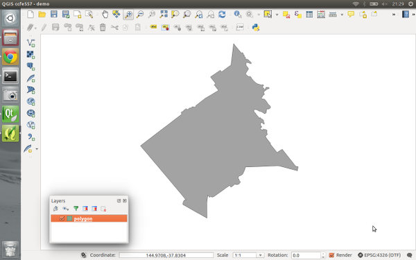
Let’s start with some simple white labels over an aerial image:

These labels aren’t very effective. The complex background makes them hard to read, especially the “Winton Shire” label at the bottom of the image. A quick and nasty way to improve readability is to add a black halo around the labels:

Sure, it’s easy to read the labels now, but they stand out way too much and it’s difficult to see anything here except the labels!

We can improve this somewhat through a better choice of halo colour:

This is much better. We’ve got readable labels which aren’t too domineering. Unfortunately the halo effect is still very prominent, especially where the background image varies a lot. In this case it works well for the labels toward the middle of the map, but not so well for the labels at the top and bottom.

A good way to improve this is to take advantage of blending (or “composition”) modes (which QGIS has native support for). The white labels will be most readable when there’s a good contrast with the background map, i.e. when the background map is dark. That’s why we choose a halo colour which is darker than the text colour (or vice versa if you’ve got dark coloured labels). Unfortunately, by choosing the mid-toned brown colour to make the halos blend in more, we are actually lightening up parts of this background layer and both reducing the contrast with the label and also making the halo more visible. By using the “darken” blend mode, the brown halo will only be drawn for pixels were the brown is darker then the existing background. It will darken light areas of the image, but avoid lightening pixels which are already dark and providing good contrast. Here’s what this looks like:

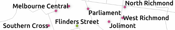
The most noticeable differences are the labels shown above darker areas – the “Winton Shire” label at the bottom and the “Etheridge Shire” at the top. For both these labels the halo is almost imperceptible whilst still subtly doing it’s part to make the label readable. (If you had dark label text with a lighter halo color, you can use the “lighten” blend mode for the same result).

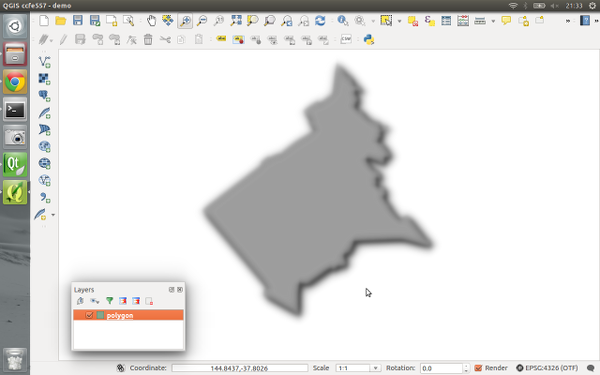
The only issue with this map is that the halo is still very obvious around “Shire” in “Richmond Shire” and “McKinlay” on the left of the map. This can be reduced by applying a light blur to the halo:

There’s almost no loss of readability by applying this blur, but it’s made those last prominent halos disappear into the map. At first glance you probably wouldn’t even notice that there’s any halos being used here. But if we compare back against the original map (which used no halos) we can see the huge difference in readability:

Compare especially the Winton Shire label at the bottom, and the Richmond Shire label in the middle. These are much clearer on our tweaked map versus the above image.

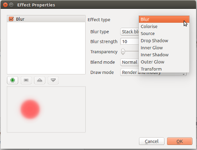
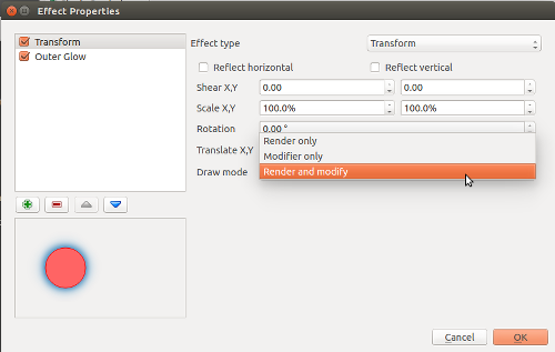
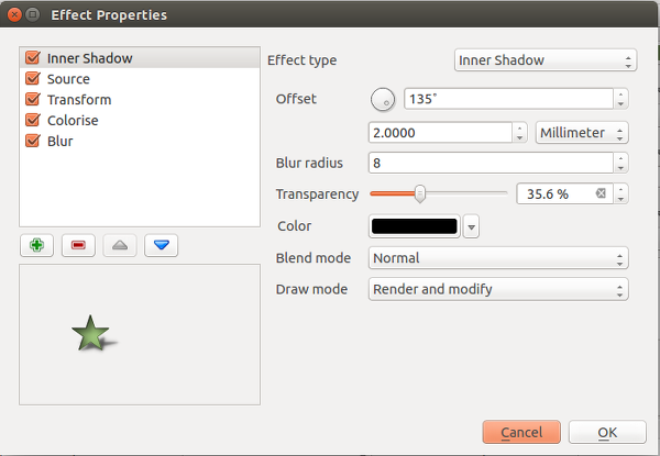
Now for the good news… when QGIS 3.0 is released you’ll no longer have to rely on an external illustration/editing application to get this effect with your maps. In fact, QGIS 3.0 is bringing native support for applying many types of live layer effects to label buffers and background shapes, including blur. This means it will be possible to reproduce this technique directly inside your GIS, no external editing or tweaking required!

Better river styles with tapered lines

In 2012 I published a post on mapping the then newly released Tirol river dataset.

In the comments, reader Michal Zimmermann asked:

Do you think it would be possible to create a river stream which gains width along its way? I mean rivers are usually much narrower on their beginnings, then their width increases and the estuary should be the widest part, right?

For a long time, this kind of river style, also known as “tapered lines” could only be created in vector graphics software, such as Inkscape and Illustrator.

With the help of geometry generators, we can now achieve this look directly in QGIS:

Data cc-by Land Tirol

In the river dataset published by the state of Tirol, all rivers are digitized in upstream direction. For this styling to work, it is necessary that the line direction is consistent throughout the whole dataset.

We use a geometry generator symbol layer to split the river geometry into its individual segments:


Then we can use the information about the total number of segments (accessible via the expression variable @geometry_part_count) and the individual segment’s number (@geometry_part_num) to calculate the segment’s line width.

The stroke width expression furthermore uses the river category (GEW_GRKL) to vary the line width depending on the category:

CASE 
WHEN "GEW_GRKL" = '< 10 km2 Fluss' THEN 0.2
WHEN "GEW_GRKL" = '10 km2 Fluss' THEN 0.4
WHEN "GEW_GRKL" = '100 km2 Fluss' THEN 0.6
WHEN "GEW_GRKL" = '1.000 km2 Fluss' THEN 0.8
ELSE 1.0
END 
* ( 1- ( @geometry_part_num /  @geometry_part_count ))

If the rivers are digitized in downstream direction, you can simply remove the 1- term.

Happy mapping!


New map coloring algorithms in QGIS 3.0

It’s been a long time since I last blogged here. Let’s just blame that on the amount of changes going into QGIS 3.0 and move on…

One new feature which landed in QGIS 3.0 today is a processing algorithm for automatic coloring of a map in such a way that adjoining polygons are all assigned different color indexes. Astute readers may be aware that this was possible in earlier versions of QGIS through the use of either the (QGIS 1.x only!) Topocolor plugin, or the Coloring a map plugin (2.x).

What’s interesting about this new processing algorithm is that it introduces several refinements for cartographically optimising the coloring. The earlier plugins both operated by pure “graph” coloring techniques. What this means is that first a graph consisting of each set of adjoining features is generated. Then, based purely on this abstract graph, the coloring algorithms are applied to optimise the solution so that connected graph nodes are assigned different colors, whilst keeping the total number of colors required minimised.

The new QGIS algorithm works in a different way. Whilst the first step is still calculating the graph of adjoining features (now super-fast due to use of spatial indexes and prepared geometry intersection tests!), the colors for the graph are assigned while considering the spatial arrangement of all features. It’s gone from a purely abstract mathematical solution to a context-sensitive cartographic solution.

The “Topological coloring” processing algorithm

Let’s explore the differences. First up, the algorithm has an option for the “minimum distance between features”. It’s often the case that features aren’t really touching, but are instead just very close to each other. Even though they aren’t touching, we still don’t want these features to be assigned the same color. This option allows you to control the minimum distance which two features can be to each other before they can be assigned the same color.

The biggest change comes in the “balancing” techniques available in the new algorithm. By default, the algorithm now tries to assign colors in such a way that the total number of features assigned each color is equalised. This avoids having a color which is only assigned to a couple of features in a large dataset, resulting in an odd looking map coloration.

Balancing color assignment by count – notice how each class has a (almost!) equal count

Another available balancing technique is to balance the color assignment by total area. This technique assigns colors so that the total area of the features assigned to each color is balanced. This mode can be useful to help avoid large features resulting in one of the colors appearing more dominant on a colored map.

Balancing assignment by area – note how only one large feature is assigned the red color

The final technique, and my personal preference, is to balance colors by distance between colors. This mode will assign colors in order to maximize the distance between features of the same color. Maximising the distance helps to create a more uniform distribution of colors across a map, and avoids certain colors clustering in a particular area of the map. It’s my preference as it creates a really nice balanced map – at a glance the colors look “randomly” assigned with no discernible pattern to the arrangement.

Balancing colors by distance

As these examples show, considering the geographic arrangement of features while coloring allows us to optimise the assigned colors for cartographic output.

The other nice thing about having this feature implemented as a processing algorithm is that unlike standalone plugins, processing algorithms can be incorporated as just one step of a larger model (and also reused by other plugins!).

QGIS 3.0 has tons of great new features, speed boosts and stability bumps. This is just a tiny taste of the handy new features which will be available when 3.0 is released!

Small multiples for OD flow maps using virtual layers

In my previous posts, I discussed classic flow maps that use arrows of different width to encode flows between regions. This post presents an alternative take on visualizing flows, without any arrows. This style is inspired by Go with the Flow by Robert Radburn and Visualisation of origins, destinations and flows with OD maps by J. Wood et al.

The starting point of this visualization is a classic OD matrix.

migration_raw_data

For my previous flow maps, I already converted this data into a more GIS-friendly format: a Geopackage with lines and information about the origin, destination and strength of the flow:

migration_attribute_table

In addition, I grabbed state polygons from Natural Earth Data.

At this point, we have 72 flow features and 9 state polygon features. An ordinary join in the layer properties won’t do the trick. We’d still be stuck with only 9 polygons.

Virtual layers to the rescue!

The QGIS virtual layers feature (Layer menu | Add Layer | Add/Edit Virtual Layer) provides database capabilities without us having to actually set up a database … *win!*

Using a classic SQL query, we can join state polygons and migration flows into a new virtual layer:

virtual_layer

The resulting virtual layer contains 72 polygon features. There are 8 copies of each state.

Now that the data is ready, we can start designing the visualization in the Print Composer.

This is probably the most manual step in this whole process: We need 9 map items, one for each mini map in the small multiples visualization. Create one and configure it to your liking, then copy and paste to create 8 more copies.

I’ve decided to arrange the map items in a way that resembles the actual geographic location of the state that is represented by the respective map, from the state of Vorarlberg (a proud QGIS sponsor by the way) in the south-west to Lower Austria in the north-east.

To configure which map item will represent the flows from which origin state, we set the map item ID to the corresponding state ID. As you can see, the map items are numbered from 1 to 9:

small_multiples_print_composer_init

Once all map items are set up, we can use the map item IDs to filter the features in each map. This can be implemented using a rule based renderer:

small_multiples_style_rules

The first rule will ensure that the each map only shows flows originating from a specific state and the second rule will select the state itself.

We configure the symbol of the first rule to visualize the flow strength. The color represents the number number of people moving to the respective district. I’ve decided to use a smooth gradient instead of predefined classes for the polygon fill colors. The following expression maps the feature’s weight value to a shade on the Viridis color ramp:

ramp_color( 'Viridis',
  scale_linear("weight",0,2000,0,1)
)

You can use any color ramp you like. If you want to use the Viridis color ramp, save the following code into an .xml file and import it using the Style Manager. (This color ramp has been provided by Richard Styron on rocksandwater.net.)

<!DOCTYPE qgis_style>
<qgis_style version="0">
  <symbols/>
    <colorramp type="gradient" name="Viridis">
      <prop k="color1" v="68,1,84,255"/>
      <prop k="color2" v="253,231,36,255"/>
      <prop k="stops" v="0.04;71,15,98,255:0.08;72,29,111,255:0.12;71,42,121,255:0.16;69,54,129,255:0.20;65,66,134,255:0.23;60,77,138,255:0.27;55,88,140,255:0.31;50,98,141,255:0.35;46,108,142,255:0.39;42,118,142,255:0.43;38,127,142,255:0.47;35,137,141,255:0.51;31,146,140,255:0.55;30,155,137,255:0.59;32,165,133,255:0.62;40,174,127,255:0.66;53,183,120,255:0.70;69,191,111,255:0.74;89,199,100,255:0.78;112,206,86,255:0.82;136,213,71,255:0.86;162,218,55,255:0.90;189,222,38,255:0.94;215,226,25,255:0.98;241,229,28,255"/>
    </colorramp>
  </colorramps>
</qgis_style>

If we go back to the Print Composer and update the map item previews, we see it all come together:

small_multiples_print_composer

Finally, we set title, legend, explanatory texts, and background color:

migration

I think it is amazing that we are able to design a visualization like this without having to create any intermediate files or having to write custom code. Whenever a value is edited in the original migration dataset, the change is immediately reflected in the small multiples.


New style: flow map arrows

Last time, I wrote about the little details that make a good flow map. The data in that post was made up and simpler than your typical flow map. That’s why I wanted to redo it with real-world data. In this post, I’m using domestic migration data of Austria.

Raw migration data

Raw migration data, line width scaled to flow strength

With 9 states, that makes 72 potential flow arrows. Since that’s too much to map, I’ve decided in a first step to only show flows with more than 1,000 people.

Following the recommendations mentioned in the previous post, I first designed a basic flow map where each flow direction is rendered as a black arrow:

migration_basic

Basic flow map

Even with this very limited number of flows, the map gets pretty crowded, particularly around the north-eastern node, the Austrian capital Vienna.

To reduce the number of incoming and outgoing lines at each node, I therefore decided to change to colored one-sided arrows that share a common geometry:

migration_twocolor

Colored one-sided arrows

The arrow color is determined automatically based on the arrow direction using the following expression:

CASE WHEN
 "weight" < 1000 THEN color_rgba( 0,0,0,0)
WHEN
 x(start_point( $geometry)) - x(end_point($geometry)) < 0
THEN
 '#1f78b4'
ELSE
 '#ff7f00'
END

The same approach is used to control the side of the one-sided arrow head. The arrow symbol layer has two “arrow type” options for rendering the arrow head: on the inside of the curve or on the outside. This means that, if we wouldn’t use a data-defined approach, the arrow head would be on the same side – independent of the line geometry direction.

CASE WHEN
 x(start_point( $geometry)) - x(end_point($geometry)) < 0
THEN
 1
ELSE
 2
END

Obviously, this ignores the corner case of start and end points at the same x coordinate but, if necessary, this case can be added easily.

Of course the results are far from perfect and this approach still requires manual tweaking of the arrow geometries. Nonetheless, I think it’s very interesting to see how far we can push the limits of data-driven styling for flow maps.

Give it a try! You’ll find the symbol and accompanying sample data on the QGIS resource sharing plugin platform:

resourcesharing_flowmap


Details of good flow maps

In my previous post, I shared a flow map style that was inspired by a hand drawn map. Today’s post is inspired by a recent academic paper recommended to me by Radoslaw Panczak  and Thomas Gratier :

Jenny, B., Stephen, D. M., Muehlenhaus, I., Marston, B. E., Sharma, R., Zhang, E., & Jenny, H. (2016). Design principles for origin-destination flow maps. Cartography and Geographic Information Science, 1-15.

Jenny et al. (2016)  performed a study on how to best design flow maps. The resulting design principles are:

  • number of flow overlaps should be minimized;
  • sharp bends and excessively asymmetric flows should be avoided;
  • acute intersection angles should be avoided;
  • flows must not pass under unconnected nodes;
  • flows should be radially arranged around nodes;
  • quantity is best represented by scaled flow width;
  • flow direction is best indicated with arrowheads;
  • arrowheads should be scaled with flow width, but arrowheads for thin flows should be enlarged; and
  • overlaps between arrowheads and flows should be avoided.

Many of these points concern the arrangement of flow lines but I want to talk about those design principles that can be implemented in a QGIS line style. I’ve summarized the three core ideas:

  1. use arrow heads and scale arrow width according to flow,
  2. enlarge arrow heads for thin flows, and
  3. use nodes to arrange flows and avoid overlaps of arrow heads and flows
Click to view slideshow.

To get started, we can use a standard QGIS arrow symbol layer. To represent the flow value (“weight”) according to the first design principle, all arrow parameters are data-defined:

scale_linear("weight",0,10,0.1,3)

To enlarge the arrow heads for thin flow lines, as required by the second design principle, we can add a fixed value to the data-defined head length and thickness:

scale_linear("weight",0,10,0.1,1.5)+1.5

arrow_head_thickness

The main issue with this flow map is that it gets messy as soon as multiple arrows end at the same location. The arrow heads are plotted on top of each other and at some point it is almost impossible to see which arrow starts where. This is where the third design principle comes into play!

To fix the overlap issue, we can add big round nodes at the flow start and end points. These node buffers are both used to render circles on the map, as well as to shorten the arrows by cutting off a short section at the beginning and end of the lines:

difference(
  difference(
    $geometry,
    buffer( start_point($geometry), 10000 )
  ),
  buffer( end_point( $geometry), 10000 )
)

Note that the buffer values in this expression only produce appropriate results for line datasets which use a CRS in meters and will have to be adjusted for other units.

arrow_nodes

It’s great to have some tried and evaluated design guidelines for our flow maps. As always: Know your cartography rules before you start breaking them!

PS: To draw a curved arrow, the line needs to have one intermediate point between start and end – so three points in total. Depending on the intermediate point’s position, the line is more or less curved.


New style: conveyor belt flows

The QGIS map style I want to share with you today was inspired by a hand-drawn map by Philippe Rekacewicz that I saw on Twitter:

The look reminds me of conveyor belts, thus the name choice.

You can download the symbol and a small sample dataset by adding my repo to the QGIS Resource Sharing plugin.

resourcesharing_conveyor

The conveyor belt is a line symbol that makes extensive use of Geometry generators. One generator for the circle at the flow line start and end point, respectively, another generator for the belt, and a final one for the small arrows around the colored circles. The color and size of the circle are data defined:

conveyor_details

The collection also contains a sample Geopackage dataset which you can use to test the symbol immediately. It is worth noting that the circle size has to be specified in layer CRS units.

It’s great fun playing with the power of Geometry generator symbol layers and QGIS geometry expressions. For example, this is the expression for the final geometry that is used to draw the small arrows around colored circles:

line_merge( 
  intersection(
    exterior_ring( 
      convex_hull( 
        union( 
          buffer( start_point($geometry), "start_size" ),
          buffer( end_point($geometry), 500000 )
        )
      )
    ),
    exterior_ring( 
      buffer( start_point( $geometry), "start_size" )
    )
  )
)

The expression constructs buffer circles, the belt geometry (convex_hull around buffers), and finally extracts the intersecting part from the start circle and the belt geometry.

Hope you enjoy it!

It’s holiday season, why not share one of your own symbols with the QGIS community?


Movement data in GIS #2: visualization

In the first part of the Movement Data in GIS series, I discussed some of the common issues of modeling movement data in GIS, followed by a recommendation to model trajectories as LinestringM features in PostGIS to simplify analyses and improve query performance.

Of course, we don’t only want to analyse movement data within the database. We also want to visualize it to gain a better understanding of the data or communicate analysis results. For example, take one trajectory:

(data credits: GeoLife project)

Visualizing movement direction is easy: just slap an arrow head on the end of the line and done. What about movement speed? Sure! Mean speed, max speed, which should it  be?

Speed along the trajectory, a value for each segment between consecutive positions.

With the usual GIS data model, we are back to square one. A line usually has one color and width. Of course we can create doted and dashed lines but that’s not getting us anywhere here. To visualize speed variations along the trajectory, we therefore split the original trajectory into its segments, 1429 in this case. Then we can calculate speed for each segment and use a graduated or data defined renderer to show the results:

trajectory_segment_features

Speed along trajectory: red = slow to blue = fast

Very unsatisfactory! We had to increase the number of features 1429 times just to show speed variations along the trajectory, even though the original single trajectory feature already contained all the necessary information and QGIS does support geometries with measurement values.

Starting from QGIS 2.14, we have an alternative way to deal with this issue. We can stick to the original single trajectory feature and render it using the new geometry generator symbol layer. (This functionality is also used under the hood of the 2.5D renderer.) Using the segments_to_lines() function, the geometry generator basically creates individual segment lines on the fly:

geomgenerator

Segments_to_lines( $geometry) returns a multi line geometry consisting of a line for every segment in the input geometry

Once this is set up, we can style the segments with a data-defined expression that determines the speed on the segment and returns the respective color along a color ramp:

segment_speed_color

Speed is calculated using the length of the segment and the time between segment start and end point. Then speed values from 0 to 50 km/h are mapped to the red-yellow-blue color ramp:

ramp_color(
  'RdYlBu',
  scale_linear(
    length( 
      transform(
	    geometry_n($geometry,@geometry_part_num),
		'EPSG:4326','EPSG:54027'
		)
    ) / (
      m(end_point(  geometry_n($geometry,@geometry_part_num))) -
      m(start_point(geometry_n($geometry,@geometry_part_num)))
    ) * 3.6,
    0,50,
    0,1
  )
)

Thanks a lot to @nyalldawson for all the help figuring out the details!

While the following map might look just like the previous one in the end, note that we now only deal with the original single line feature:

trajectory_geomgenerator

Similar approaches can be used to label segments or positions along the trajectory without having to break the original feature. Thanks to the geometry generator functionality, we can make direct use of the LinestringM data model for trajectory visualization.


Material design map tutorial for QGIS Composer

This is a guest post by Mickael HOARAU @Oneil974

For those wishing to get a stylized map on QGIS composer, I’ve been working on a tutorial to share with you a project I’m working on. Fan of web design and GIS user since few years, I wanted to merge Material Design Style with Map composer. Here is a tutorial to show you how to make simply a Material Design Map style on QGIS.

Click to view slideshow.

You can download tutorial here:

Tutorial Material Design Map

And sources here:

Sources Material Design Map

An Atlas Powered version is coming soon!


Point cluster renderer crowdfunding – the final countdown!

At North Road we are currently running a crowdfunding campaign to sponsor work on a new “Point Cluster Renderer” for QGIS. This is a really exciting new feature which would help make possible some neat styling effects which just aren’t possible in QGIS at the moment. The campaign is now in its final hours and we’ve still got some way to go to reach the campaign goals. If you’re interested in seeing this feature happen, now’s the time to jump onboard and contribute to the campaign!

Before time runs out we’d like to share some more details on how the cluster renderer can be enhanced through the use of data defined symbol overrides. Data defined overrides are where a huge part of QGIS’ symbology power resides. If you’re not familiar with them, we’d suggest grabbing a copy of Anita Graser and Gretchen Peterson’s reference “QGIS Map Design” (seriously – buy this book. You won’t regret it!). Basically, data defined properties allow you to set rules in place which control exactly how each individual feature in a layer is rendered. So, for instance, you can create an override which makes just a single feature render in a different color, or with a larger label, or so that all features with a value over 100 render with a bold label.

We’ve designed the point cluster renderer to take full advantage of QGIS data defined symbology. What this means is that the cluster symbol (ie, the marker which is rendered when 2 or more points are sufficiently close together) will respect any data defined overrides you set for this symbol, and each individual cluster symbol can have a different appearance as a result.

To make this even more flexible, the clusterer will also provide two additional new variables which can be used in data defined overrides for the symbol. The first of these, @cluster_size, will be preset to equal the number of features which have been clustered together at that point. Eg, if the cluster consists of 4 individual neighbouring features, then @cluster_size will be 4 when the cluster symbol is rendered. This can be used to alter the appearance of the cluster symbol based on the number of associated points. The mockup below shows how this could be used to scale the cluster symbol size so that clusters with more points are rendered larger than clusters with less points:

symbol_sizeIn this mockup we’ve also used a font marker symbol layer to render the actual cluster size inside the symbol too. Of course, because almost every property of symbols in QGIS can be data defined there’s almost no limit how @cluster_size could be used – you could use it to change the symbol color by pairing it with QGIS’ ramp_color function, or alter the symbol opacity, or the outline width… basically anything!

The second new expression variable which would be introduced with the cluster renderer is @cluster_color. This variable allows you to access the color of the points contained within each cluster. Since the cluster renderer is built “on top” of an existing renderer, any point which is NOT contained within a cluster is rendered using the specified renderer. For example, if you use a categorized symbol renderer then all points which aren’t in clusters will be drawn using these categorized classes. In this case isolated points will be drawn using different colors to match the predefined classes.

When multiple points are clustered together, @cluster_color will be set to match the color of any contained points. The points must all have the same color, if they differ then @cluster_color will be null. It’s easiest to illustrate this concept! In the below mockup, we’ve used a categorized render to shade points by an attribute (in this case rail line segment name), and used an uninspiring dark grey circle for the cluster markers:

clusters_categorized

Using @cluster_color together with a data defined color override, we can force these cluster markers to retain the colors from the points within each cluster:

clusters_categorized2

Much nicer! You’ll note that a single dark grey point remains, which is where the cluster consists of stations from multiple different line segments. In this case @cluster_color is null, so the data defined override is not applied and the marker falls back to the dark grey color.

Of course, both @cluster_size and @cluster_color can be combined to create some very nice results:

BOTH

So there we have it – using data defined overrides with the cluster marker renderer allows for extremely flexible, powerful cartography!

Now’s the time to get involved… if you’re wanting to see this feature in QGIS, head over to the crowd funding page to find out how YOU can contribute!


Special FOSS4G offer: 25% off QGIS Map Design

FOSS4G2016 is drawing closer quickly. To get in the mood for a week full of of geogeekery, Locate Press is offering a special FOSS4G discount for QGIS Map Design.

Use the code foss4gbonn to get 25% off your copy.

QGIS Map Design is the reference book to get if you want to bring your mapping skills up to speed. The book comes with a download for all our example map projects:

qmd114 qmd132 qmd140 qmd128 qmd174 qmd58 qmd152 qmd158 qmd64 qmd46 qmd146 qmd188 qmd164 qmd20 qmd90 qmd78 qmd84 qmd108 qmd184 qmd34 qmd180 qmd120 qmd26 qmd104 qmd168 qmd100 qmd52

Looking forward to meeting you in Bonn!


Introducing QGIS live layer effects!

I’m pleased to announce that the crowdfunded work on layer effects for QGIS is now complete and available in the current development snapshots! Let’s dive in and explore how these effects work, and check out some of the results possible using them.

I’ll start with a simple polygon layer, with some nice plain styling:

Nice and boring polygon layer
A nice and boring polygon layer

If I open the properties for this layer and switch to the Style tab, there’s a new checkbox for “Draw effects“. Let’s enable that, and then click the little customise effects button to its right:

Enabling effects for the layer

A new “Effects Properties” dialog opens:

Effects Properties dialog

You can see that currently the only effect listed is a “Source” effect. Source effects aren’t particularly exciting – all they do is draw the original layer unchanged. I’m going to change this to a “Blur” effect by clicking the “Effect type” combo box and selecting “Blur“:

Changing to a blur effect

If I apply the settings now, you’ll see that the polygon layer is now blurry. Now we’re getting somewhere!

Blurry polygons!
Blurry polygons!

Ok, so back to the Effects Properties dialog. Let’s try something a bit more advanced. Instead of just a single effect, it’s possible to chain multiple effects together to create different results. Let’s make a traditional drop shadow by adding a “Drop shadow” effect under the “Source” effect:

Setting up a drop shadow

Effects are drawn top-down, so the drop shadow will appear below the source polygons:

Live drop shadows!
Live drop shadows!

Of course, if you really wanted, you could rearrange the effects so that the drop shadow effect is drawn above the source!..

Hmmmm
Hmmmm…

You can stack as many effects as you like. Here’s a purple inner glow over a source effect, with a drop shadow below everything:

Inner glow, source, drop shadow...
Inner glow, source, drop shadow…

Now it’s time to get a bit more creative… Let’s explore the “transform” effect. This effect allows you to apply all kinds of transformations to your layer, including scaling, shearing, rotation and translation:

The transform effect

Here’s what the layer looks like if I add a horizontally shearing transform effect above an outer glow effect:

Getting freaky...
Getting tricky…

Transforms can get really freaky. Here’s what happens if we apply a 180° rotation to a continents layer (with a subtle nod to xkcd):

Change your perspective on the world!

Remember that all these effects are applied when the layers are rendered, so no modifications are made to the underlying data.

Now, there’s one last concept regarding effects which really blasts open what’s possible with them, and that’s “Draw modes“. You’ll notice that this combo box contains a number of choices, including “Render“, “Modify” and “Render and Modify“:

"Draw mode" options
“Draw mode” options

These draw modes control how effects are chained together. It’s easiest to demonstrate how draw modes work with an example, so this time I’ll start with a Transform effect over a Colorise effect. The transform effect is set to a 45° rotation, and the colorise effect set to convert to grayscale. To begin, I’ll set the transform effect to a draw mode of Render only:

The "Render only" draw mode
The “Render only” draw mode

In this mode, the results of the effect will be drawn but won’t be used to modify the underlying effects:

Rotation effect over the grayscale effect

So what we have here is that the polygon is drawn rotated by 45° by the transform effect, and then underneath that there’s a grayscale copy of the original polygon drawn by the colorise effect. The results of the transform effect have been rendered, but they haven’t affected the underlying colorise effect.

If I instead set the Transform effect’s draw mode to “Modifier only” the results are quite different:

Rotation modifier for grayscale effect

Now, the transform effect is rotating the polygon by 45° but the result is not rendered. Instead, it is passed on to the subsequent colorise effect, so that now the colorise effect draws a grayscale copy of the rotated polygon. Make sense? We could potentially chain a whole stack of modifier effects together to get some great results. Here’s a transform, blur, colorise, and drop shadow effect all chained together using modifier only draw modes:

A stack of modifier effects

The final draw mode, “Render and modify” both renders the effect and applies its result to underlying effects. It’s a combination of the two other modes. Using draw modes to customise the way effects chain is really powerful. Here’s a combination of effects which turn an otherwise flat star marker into something quite different:

Lots of effects!
Lots of effects!

The last thing I’d like to point out is that effects can be either applied to an entire layer, or to the individual symbol layers for features within a layer. Basically, the possibilities are almost endless! Python plugins can also extend this further by implementing additional effects.

All this work was funded through the 71 generous contributors who donated to the crowdfunding campaign. A big thank you goes out to you all whole made this work possible! I honestly believe that this feature takes QGIS’ cartographic possibilities to whole new levels, and I’m really excited to see the maps which come from it.

Lastly, there’s two other crowdfunding campaigns which are currently in progress. Lutra consulting is crowdfunding for a built in auto trace feature, and Radim’s campaign to extend the functionality of the QGIS GRASS plugin. Please check these out and contribute if you’re interested in their work and would like to see these changes land in QGIS.

Recent labelling improvements in QGIS master

If you’re not like me and don’t keep a constant eye over at QGIS development change log (be careful – it’s addictive!), then you’re probably not aware of a bunch of labelling improvements which recently landed in QGIS master version. I’ve been working recently on a large project which involves a lot (>300) of atlas map outputs, and due to the size of this project it’s not feasible to manually tweak placements of labels. So, I’ve been totally at the mercy of QGIS’ labelling engine for automatic label placements. Generally it’s quite good but there were a few things missing which would help this project. Fortunately, due to the open-source nature of QGIS, I’ve been able to dig in and enhance the label engine to handle these requirements (insert rhetoric about beauty of open source here!). Let’s take a look at them one-by-one:

Data defined quadrant in “Around Point” placement mode

First up, it’s now possible to specify a data defined quadrant when a point label is set to the Around Point placement mode. In the past, you had a choice of either Around Point mode, in which QGIS automatically places labels around point features in order to maximise the number of labels shown, or the Offset from Point mode, in which all labels are placed at a specified position relative to the points (eg top-left). In Offset from Point mode you could use data defined properties to force labels for a feature to be placed at a specific relative position by binding the quadrant to a field in your data. This allowed you to manually tweak the placement for individual labels, but at the cost of every other label being forced to the same relative position. Now, you’ve also got the option to data define the relative position when in Around Point mode, so that the rest of the labels will fall back to being automatically placed. Here’s a quick example – I’ll start with a layer with labels in Around Point mode:

Around Point placement mode

You can see that some labels are sitting to the top right of the points, others to the bottom right, and some in the top middle, in order to fit all the labels for these points. With this new option, I can setup a data defined quadrant for the labels, and then force the ‘Tottenham’ label (top left of the map) to display below and to the left of the point:

Setting a data-defined quadrant

Here’s what the result looks like:

Manually setting the quadrant for the Tottenham label

The majority of the labels are still auto-placed, but Tottenham is now force to the lower left corner.

Data defined label priority

Another often-requested feature which landed recently is the ability to set the priority for individual labels. QGIS has long had the ability to set the priority for an entire labelling layer, but you couldn’t control the priority of features within a layer. That would lead to situations like that shown below, where the most important central station (the green point) hasn’t been labelled:

What... no label for the largest station in Melbourne?
What… no label for the largest station in Melbourne?

By setting a data defined priority for labels, I can set the priority either via values manually entered in a field or by taking advantage of an existing “number of passengers” field present in my data. End result is that this central station is now prioritised over any others:

Much better! (in case you're wondering... I've manually forced some other non-optimal placement settings for illustrative purposes!)
Much better! (in case you’re wondering… I’ve manually forced some other non-optimal placement settings for illustrative purposes!)

Obstacle only layers

The third new labelling feature is the option for “Obstacle only” layers. What this option does is allow a non-labelled layer to act as an obstacle for the labels in other layers, so they will be discouraged from drawing labels over the features in the obstacle layer. Again, it’s best demonstrated with an example. Here’s my stations layer with labels placed automatically – you can see that some labels are placed right over the features in the rail lines layer:

Labels over rail lines...
Labels over rail lines…

Now, let’s set the rail lines layer to act as an obstacle for other labels:

... setting the layer as an obstacle...
… setting the layer as an obstacle…

The result is that labels will be placed so that they don’t cover the rail lines anymore! (Unless there’s no other choice). Much nicer.

No more clashing labels!

Control over how polygons act as obstacles for labels

This change is something I’m really pleased about. It’s only applicable for certain situations, but when it works the improvements are dramatic.

Let’s start with my labelled stations map, this time with an administrative boundary layer in the background:

Stations with administrative boundaries

Notice anything wrong with this map? If you’re like me, you won’t be able to look past those labels which cross over the admin borders. Yuck. What’s happening here is that although my administrative regions layer is set to discourage labels being placed over features, there’s actually nowhere that labels can possibly be placed which will avoid this. The admin layer covers the entire map, so regardless of where the labels are placed they will always cover an administrative polygon feature. This is where the new option to control how polygon layers act as obstacles comes to the rescue:

...change a quick setting...
…change a quick setting…

Now, I can set the administrative layer to only avoid placing labels over feature’s boundaries! I don’t care that they’ll still be placed inside the features (since we have no choice!), but I don’t want them sitting on top of these boundaries. The result is a big improvement:

Much better!
Much better!

Now, QGIS has avoided placing labels over the boundaries between regions. Better auto-placement of labels like this means much less time required manually tweaking their positioning, and that’s always a good thing!

Draw only labels which fit inside a polygon

The last change is fairly self explanatory, so no nice screenshots here. QGIS now has the ability to prevent drawing labels which are too large to fit inside their corresponding polygon features. Again, in certain circumstances this can make a huge cartographic improvement to your map.

So there you go. Lots of new labelling goodies to look forward to when QGIS 2.12 rolls around.


How to create round maps in Print Composer

If you follow me on Twitter, you’ve probably seen previews of my experiments with round maps. These experiments were motivated by a recent question on GIS.stackexchange whether this type of map can be created in QGIS and while it’s not very convenient right now, it is definitely possible:

http://www.quantarctica.org

All maps in this post are created using data from the Quantarctica project.

I’ve been planing to try the Quantarctica datasets for a long time and this use case is just perfect. When you download and open their project, you’ll see that they have already clipped all datasets to a circle around Antarctica:

Quantarctica project with some custom styling

Quantarctica project with some custom styling

Since the map of the full extent of the dataset is already clipped to a circle, the overview map is easy to deal with. The detail map on the other hand is rectangular by default:

circle_maps_start

Since we cannot change the shape of the map item, we have to use a mask instead. To create a circular mask, we can add an ellipse shape:

circle_maps_addellipse

The main challenge when creating the mask is that there is no inverted polygon renderer for shapes in print composer. I’ve evaluated to workarounds: First, I created a style with a wide white outline that would cover all map parts outside the circle shape. But this solution slowed the print composer down a lot. An alternative, which doesn’t suffer from this slowdown is using draw effects:

circle_maps_mask_style

In particular, I created a big outer glow effect:

circle_maps_mask_style_effect

Note that the effect only works if the symbol itself is not transparent. That’s why I set the symbol fill to black and used the Lighten blending mode:

circle_maps_mask

Voilà! Both maps appear are nicely circular.

It is worth noting though that this workaround has a downside: it is not possible to create automatic grids/graticules for these maps. The graticule in the overview map only works because it is a layer in the main project that was already clipped to the circular shape.

Finally, you can add more depth to your map by adding shadows. To create the shadow effect, I added additional ellipse items which are styled with a drop shadow draw effect. If you only enable the drop shadow effect, you will notice that the shadow is cut off at the ellipse bounding box. To avoid this undesired effect, you can add a transform effect, which reduces the size of the drawn shape and it’s shadow so that the shadow fits into the bounding box:

circle_maps_mask_shadow_effect

It requires some manual adjustments to place the shadow at the optimal location on top of the mask:

circle_maps_mask_shadow

Add another ellipse to create the shadow for the overview map.

For more cartography tips and tricks check my new book QGIS Map Design or join my QGIS training courses.


New demos: live labels & gradient editor

Following up on last week’s post, Nyall has continued his work on the QGIS gradient editor:

Latest version of the new QGIS interactive gradient edit. This now includes an interactive plot of the color hue/saturation/lightness/alpha, allowing a visual overview of these color components and easy editing.

Another equally awesome demo has been posted by Nathan, who is currently working on usability improvements for labeling and styling without blocking dialogs:

This is going to be great for map design work because it makes many complex styles much easier to create since you can interact with the map and attribute table at the same time.

These are definitely two developments to follow closely!


Towards better gradients

Interesting developments going on if you like creating your own gradients. After all, that’s not as easy as it might initially seem, as Gregor Aisch describes in his post “Mastering Multi-hued Color Scales with Chroma.js”:

The issues with simple color interpolations, which include nonuniform changes in lightness between classes, also haunt us in cartography. Just have a look at the map and legend on the left-hand side, which has been created using a normal custom QGIS gradient with colors ranging from black to red, yellow and finally white. We end up with three classes in yellow which are nearly impossible to tell apart:

comparing_ramps

For comparison, on the right side, I’ve used Gregor’s corrected color ramp, which ensures that lightness changes evenly from one class to the next.

Wouldn’t it be great if the built-in gradient tool in QGIS could correct for lightness? Too bad the current dialog is not that great:

My first reaction therefore was to write a short script to import gradients from Gregor’s Chroma.js Color Scale Helper into QGIS:

But we’ll probably have a much better solution in QGIS soon since Nyall Dawson has picked up the idea and is already working on a completely new version of the gradient tool. You can see a demo of the current work in progress here:

I’m really looking forward to trying this out once it hits master!


Creating dynamic icon series

Today’s post was motivated by a question on GIS.StackExchange, which is looking for an automated way to symbolize the amenities available at a location using a series of icons, like this:

Screenshot 2016-03-19 23.02.30

Assuming the information is available in  a format similar to this example attribute table

Screenshot 2016-03-19 23.02.00

we can create a symbol, which adapts to the values in the icon columns using data-defined overrides:

Screenshot 2016-03-19 23.04.17

The five potential symbol locations are aligned next to each other using offsets. We use the following expression to determine the correct SVG symbol:

CASE
WHEN "icon4" = 'dinner'
 THEN 'C:/OSGeo4W64/apps/qgis-dev/svg/entertainment/amenity=restaurant.svg'
WHEN "icon4" = 'sleep'
 THEN 'C:/OSGeo4W64/apps/qgis-dev/svg/accommodation/accommodation_hotel2.svg'
WHEN "icon4" = 'ship'
 THEN 'C:/OSGeo4W64/apps/qgis-dev/svg/transport/amenity=ferry_terminal.svg'
WHEN "icon4" = 'house'
 THEN 'C:/OSGeo4W64/apps/qgis-dev/svg/accommodation/accommodation_house.svg'
 ELSE  ''
END

To hide icons if the icon value is NULL, the marker size is set to 0 using, for example:

CASE
WHEN "icon4" is not NULL
 THEN 4
 ELSE 0
END

Finally, to ensure that the labels don’t cover the icons, we can use the cartographic label placement with the position priority set to ‘TR,TL,BL’, which restricts labels to the top right, top left, and bottom left position.

Screenshot 2016-03-19 23.04.43

With these settings in place, we can zoom out and the labeling algorithm picks the most suitable position from the list of allowed positions:

Screenshot 2016-03-19 23.02.11

For more cartography tips and tricks check my new book QGIS Map Design or join my QGIS training courses.


How to create a graduated renderer for polygon borders instead of fills

Today’s post was motivated by a recent question on the #gistribe Twitter chat:

So what’s the issue?

Default polygon symbols come with a fill and a border color:

Screenshot 2016-03-12 15.40.37

When they are used in a graduated renderer, the fill color is altered for each class:

Screenshot 2016-03-12 15.40.26

What if you want to change the border color instead?

The simplest solution is to add an outline symbol layer to your polygon symbol:

Screenshot 2016-03-12 15.40.46

The outline layer has only one color property and it will be altered by the graduated renderer.

If you now hit ok, the graduated renderer will alter both the simple fill’s fill color and the outline’s color. To stop the fill color from changing, select the simple fill and lock it using the small lock icon below the list of symbol layers:

Screenshot 2016-03-12 15.40.50

Voilà:

Screenshot 2016-03-12 15.40.58

For more cartography tips and tricks check my new book QGIS Map Design or join my QGIS training courses.


QGIS Map Design is out now!

My latest book “QGIS Map Design”, co-authored with well-known cartography expert Gretchen Peterson and with a foreword by the founder of QGIS, Gary Sherman himself, is now available as e-book.

In three parts, the book covers layer styling, labeling, and designing print maps. All recipes come with data and project files so you can reproduce the maps yourself.

Check the book website for the table of contents and a sample chapter.

Just in time for the big QGIS 2.14 LTR release, the paperback will be available March 1st.

On a related note, I am also currently reviewing the latest proofs of the 3rd edition of “Learning QGIS”, which will be updated to QGIS 2.14 as well.

Happy QGISing!


How to create connectivity-based line caps

It’s been a while since my last blog post mostly because I’ve been busy with some more long form writing. Most notably, I’ve been writing a paper on the QGIS Projcessing framework in the open access ISPRS International Journal of Geo-Information together with Victor Olaya and I’m still in the process of writing a new book titled “QGIS Map Design” together with Gretchen Peterson which is scheduled for early 2016.

Today’s post has been on my todo list for a while now. It’s inspired by a talk at a recent cartography conference I attended:

(For a summary of the whole event, check the storify I compiled.)

The idea of this slide and several more was to show all the attention to detail which goes into designing a good road map. One aspect seemed particularly interesting to me since I had never considered it before: what do we communicate by our choice of line caps? The speaker argued that we need different caps for different situations, such as closed square caps at the end of a road and open flat caps when a road turns into a narrower path.

I’ve been playing with this idea to see how to reproduce the effect in QGIS …

So first of all, I created a small test dataset with different types of road classes. The dataset is pretty simple but the key to recreating the style is in the attributes for the road’s end node degree values (degree_fro and degree_to), the link’s road class as well as the class of the adjacent roads (class_to and class_from). The degree value simply states how many lines connect to a certain network node. So a dead end as a degree of 1, a t-shaped intersection has a degree of 3, and so on. The adjacent class columns are only filled if the a neighbor is of class minor since I don’t have a use for any other values in this example. Filling the degree and adjacent class columns is something that certainly could be automated but I haven’t looked into that yet.

roadattributes


The layer is then styled using rules. There is one rule for each road class value. Rendering order is used to ensure that bridges are drawn on top of all other lines.

roadrules

Now for the juicy part: the caps are defined using a data-defined expression. The goal of the expression is to detect where a road turns into a narrow path and use a flat cap there. In all other cases, square cap should be used.

roadrule

Like some of you noted on Twitter after I posted the first preview, there is one issue and that is that we can only set one cap style per line and it will affect both ends of the line in the same way. In practice though, I’m not sure this will actually cause any issues in the majority of cases.

I wonder if it would be possible to automate this style in a way such that it doesn’t require any precomputed attributes but instead uses some custom functions in the data-defined expressions which determine the correct style on the fly. Let me know if you try it!


  • <<
  • Page 2 of 5 ( 81 posts )
  • >>
  • cartography

Back to Top

Sustaining Members