Related Plugins and Tags

QGIS Planet

A New Trick up QField’s Sleeve: Animated Maps

Starting with QField 2.2, users can fully rely on animation capabilities that have made their way into QGIS during its last development cycle. This can be a powerful mean to highlight key elements on a map that require special user attention.

The example below demonstrates a scenario where animated raster markers are used to highlight active fires within the visible map extent. Notice how the subtle fire animation helps draw viewers’ eyes to those important markers.

Animated raster markers is a new symbol layer type in QGIS 3.26 that was developed by Nyall Dawson. Supported image formats include GIF, WEBP, and APNG.

The second example below showcases more advanced animated symbology which relies on expressions to animate several symbol properties such as marker size, border width, and color opacity. While more complex than simply adding a GIF marker, the results achieved with data-defined properties animation can be very appealing and integrate perfectly with any type of project.

You’ll quickly notice how smooth the animation runs. That is thanks to OPENGIS.ch’s own ninjas having spent time improving the map canvas element’s handling of layers constantly refreshing. This includes automatic skipping of frames on older devices so the app remains responsive.

Oh, we couldn’t help ourselves but take the opportunity to demonstrate how nice the QField feature form layout is these days in the video above 😄 To know more about other new features in QField 2.2, go and read the release page.

Happy field mapping to all!

The lovely animal markers used in the zoo example above were made by Serbian artist Arsenije Vujovic.

Writing a feature-based processing algorithm at the example of M-value interpolation

Amongst all the processing algorithms already available in QGIS, sometimes the one thing you need is missing. 

This happened not a long time ago, when we were asked to find a way to continuously visualise traffic on the Swiss motorway network (polylines) using frequently measured traffic volumes from discrete measurement stations (points) alongside the motorways. In order to keep working with the existing polylines, and be able to attribute more than one value of traffic to each feature, we chose to work with the M-values. M-values are a per-vertex attribute like X, Y or Z coordinates. They contain a measure value, which typically represents time or distance. But they can hold any numeric value.

In our example, traffic measurement values are provided on a separate point layer and should be attributed to the M-value of the nearest vertex of the motorway polylines. Of course, the motorway features should be of type LineStringM in order to hold an M-value. We then should interpolate the M-values for each feature over all vertices in order to get continuous values along the line (i.e. a value on every vertex). This last part is not yet existing as a processing algorithm in QGIS.

This article describes how to write a feature-based processing algorithm based on the example of M-value interpolation along LineStrings.

Feature-based processing algorithm

The pyqgis class QgsProcessingFeatureBasedAlgorithm is described as follows: “An abstract QgsProcessingAlgorithm base class for processing algorithms which operates “feature-by-feature”.  

Feature based algorithms are algorithms which operate on individual features in isolation. These are algorithms where one feature is output for each input feature, and the output feature result for each input feature is not dependent on any other features present in the source. […]

Using QgsProcessingFeatureBasedAlgorithm as the base class for feature based algorithms allows shortcutting much of the common algorithm code for handling iterating over sources and pushing features to output sinks. It also allows the algorithm execution to be optimised in future (for instance allowing automatic multi-thread processing of the algorithm, or use of the algorithm in “chains”, avoiding the need for temporary outputs in multi-step models).

In other words, when connecting several processing algorithms one after the other – e.g. with the graphical modeller – these feature-based processing algorithms can easily be used to fill in the missing bits. 

Compared to the standard QgsProcessingAlgorithm the feature-based class implicitly iterates over each feature when executing and avoids writing wordy loops explicitly fetching and applying the algorithm to each feature. 

Just like for the QgsProcessingAlgorithm (a template can be found in the Processing Toolbar > Scripts > Create New Script from Template), there is quite some boilerplate code in the QgsProcessingFeatureBasedAlgorithm. The first part is identical to any QgsProcessingAlgorithm.

After the description of the algorithm (name, group, short help, etc.), the algorithm is initialised with def initAlgorithm, defining input and output. 

In our M-value example:

    def initAlgorithm(self, config=None):
        self.addParameter(
            QgsProcessingParameterFeatureSource(
                self.INPUT,
                self.tr('Input layer'),
                [QgsProcessing.TypeVectorAnyGeometry]
            )
        )
        self.addParameter(
            QgsProcessingParameterFeatureSink(
                self.OUTPUT,
                self.tr('Output layer')
            )
        )

While in a regular processing algorithm now follows def processAlgorithm(self, parameters, context, feedback), in a feature-based algorithm we use def processFeature(self, feature, context, feedback). This implies applying the code in this block to each feature of the input layer. 

! Do not use def processAlgorithm in the same script, otherwise your feature-based processing algorithm will not work !

Interpolating M-values

This actual processing part can be copied and added almost 1:1 from any other independent python script, there is little specific syntax to make it a processing algorithm. Only the first line below really.

In our M-value example:

    def processFeature(self, feature, context, feedback):
        
        try:
            geom = feature.geometry()
            line = geom.constGet()
            vertex_iterator = QgsVertexIterator(line)
            vertex_m = []

            # Iterate over all vertices of the feature and extract M-value

            while vertex_iterator.hasNext():
                vertex = vertex_iterator.next()
                vertex_m.append(vertex.m())

            # Extract length of segments between vertices

            vertices_indices = range(len(vertex_m))
            length_segments = [sqrt(QgsPointXY(line[i]).sqrDist(QgsPointXY(line[j]))) 
                for i,j in itertools.combinations(vertices_indices, 2) 
                if (j - i) == 1]

            # Get all non-zero M-value indices as an array, where interpolations 
              have to start

            vertex_si = np.nonzero(vertex_m)[0]
            
            m_interpolated = np.copy(vertex_m)

            # Interpolate between all non-zero M-values - take segment lengths between 
              vertices into account

            for i in range(len(vertex_si)-1):
                first_nonzero = vertex_m[vertex_si[i]]
                next_nonzero = vertex_m[vertex_si[i+1]]
                accum_dist = itertools.accumulate(length_segments[vertex_si[i]
                                                                  :vertex_si[i+1]])
                sum_seg = sum(length_segments[vertex_si[i]:vertex_si[i+1]])
                interp_m = [round(((dist/sum_seg)*(next_nonzero-first_nonzero)) + 
                            first_nonzero,0) for dist in accum_dist]
                m_interpolated[vertex_si[i]:vertex_si[i+1]] = interp_m

            # Copy feature geometry and set interpolated M-values, 
              attribute new geometry to feature

            geom_new = QgsLineString(geom.constGet())
            
            for j in range(len(m_interpolated)):
                geom_new.setMAt(j,m_interpolated[j])
                
            attrs = feature.attributes()
            
            feat_new = QgsFeature()
            feat_new.setAttributes(attrs)
            feat_new.setGeometry(geom_new)

        except Exception:
            s = traceback.format_exc()
            feedback.pushInfo(s)
            self.num_bad += 1
            return []
        
        return [feat_new]

In our example, we get the feature’s geometry, iterate over all its vertices (using the QgsVertexIterator) and extract the M-values as an array. This allows us to assign interpolated values where we don’t have M-values available. Such missing values are initially set to a value of 0 (zero).

We also extract the length of the segments between the vertices. By gathering the indices of the non-zero M-values of the array, we can then interpolate between all non-zero M-values, considering the length that separates the zero-value vertex from the first and the next non-zero vertex.

For the iterations over the vertices to extract the length of the segments between them as well as for the actual interpolation between all non-zero M-value vertices we use the library itertools. This library provides different iterator building blocks that come in quite handy for our use case. 

Finally, we create a new geometry by copying the one which is being processed and setting the M-values to the newly interpolated ones.

And that’s all there is really!

Alternatively, the interpolation can be made using the interp function of the numpy library. Some parts where our manual method gave no values, interp.numpy seemed more capable of interpolating. It remains to be judged which version has the more realistic results.

Styling the result via M-values

The last step is styling our output layer in QGIS, based on the M-values (our traffic M-values are categorised from 1 [a lot of traffic -> dark red] to 6 [no traffic -> light green]). This can be achieved by using a Single Symbol symbology with a Marker Line type “on every vertex”. As a marker type, we use a simple round point. Stroke style is “no pen” and Stroke fill is based on an expression:

with_variable(

'm_value', m(point_n($geometry, @geometry_point_num)),

	CASE WHEN @m_value = 6
		THEN color_rgb(140, 255, 159)

		WHEN @m_value = 5
			THEN color_rgb(244, 252, 0)

		WHEN @m_value = 4
			THEN color_rgb(252, 176, 0)

		WHEN @m_value = 3
			THEN color_rgb(252, 134, 0)

		WHEN @m_value = 2
			THEN color_rgb(252, 29, 0)

		WHEN @m_value = 1
			THEN color_rgb(140, 255, 159)

		ELSE
			color_hsla(0,100,100,0)

	END
)

And voilà! Wherever we have enough measurements on one line feature, we get our motorway network continuously coloured according to the measured traffic volume.

One disclaimer at the end: We get this seemingly continuous styling only because of the combination of our “complex” polylines (containing many vertices) and the zoomed-out view of the motorway network. Because really, we’re styling many points and not directly the line itself. But in our case, this is working very well.

If you’d like to make your custom processing algorithm available through the processing toolbox in your QGIS, just put your script in the folder containing the files related to your user profile:

profiles > default > processing > scripts 

You can directly access this folder by clicking on Settings > User Profiles > Open Active Profile Folder in the QGIS menu.

That way, it’s also available for integration in the graphical modeller.

Extract of the Graphical Modeler sequence. “Interpolate M-values neg” refers to the custom feature-based processing algorithm described above.


You can download the above-mentioned processing scripts (with numpy and without numpy) here.

Happy processing!

Crowd funding alert: Point Clouds, Elevation Profiles and 3D Map view improvements!

Together with our partners at Lutra Consulting and Hobu, we have once again have collated your feature requests for even MORE point cloud and QGIS elevation improvements and are ready to start working on them!

Here’s a taster of what to expect if our latest crowd funding campaign is successful:

  • Point cloud data management, transformation and analysis via incorporation of PDAL within the QGIS “Processing” toolbox
  • Optimised handling of large datasets to speed up your 3D maps, including dynamic data loading for complex 3D scenes
  • Combine multiple LAS/LAZ point cloud files into a single “virtual” point cloud for easy data management and display
  • Elevation profile tool embedded into print layouts, totally customizable, more efficient and with the ability to export profile data to CSV and DXF
  • General improvements to QGIS 3D map views, including an enhanced 3D measuring tool, additional camera controls and improving the configuration dialog options and functionality.

To find out more, check out the ‘Detailed proposal and deliverables’ section on the main crowd funding page. You may want to get some popcorn ready, it really is exciting!

We need your help to make this work possible. If you’d like to see these enhancements, pledge to the crowdfunding campaign before October 24, 2022.

Visualizing IOT time series with QGIS & MobilityDB

Today’s post presents an experiment in modelling a common scenario in many IOT setups: time series of measurements at stationary sensors. The key idea I want to explore is to use MobilityDB’s temporal data types, in particular the tfloat_inst and tfloat_seq for instances and sequences of temporal float values, respectively.

For info on how to set up MobilityDB, please check my previous post.

Setting up our DB tables

As a toy example, let’s create two IOT devices (in table iot_devices) with three measurements each (in table iot_measurements) and join them to create the tfloat_seq (in table iot_joined):

CREATE TABLE iot_devices (
    id integer,
    geom geometry(Point, 4326)
);

INSERT INTO iot_devices (id, geom) VALUES
(1, ST_SetSRID(ST_MakePoint(1,1), 4326)),
(2, ST_SetSRID(ST_MakePoint(2,3), 4326));

CREATE TABLE iot_measurements (
    device_id integer,
    t timestamp,
    measurement float
);

INSERT INTO iot_measurements (device_id, t, measurement) VALUES
(1, '2022-10-01 12:00:00', 5.0),
(1, '2022-10-01 12:01:00', 6.0),
(1, '2022-10-01 12:02:00', 10.0),
(2, '2022-10-01 12:00:00', 9.0),
(2, '2022-10-01 12:01:00', 6.0),
(2, '2022-10-01 12:02:00', 1.5);

CREATE TABLE iot_joined AS
SELECT 
    dev.id, 
    dev.geom, 
    tfloat_seq(array_agg(
        tfloat_inst(m.measurement, m.t) ORDER BY t
    )) measurements
FROM iot_devices dev 
JOIN iot_measurements m
  ON dev.id = m.device_id
GROUP BY dev.id, dev.geom;

We can load the resulting layer in QGIS but QGIS won’t be happy about the measurements column because it does not recognize its data type:

Query layer with valueAtTimestamp

Instead, what we can do is create a query layer that fetches the measurement value at a specific timestamp:

SELECT id, geom, 
    valueAtTimestamp(measurements, '2022-10-01 12:02:00') 
FROM iot_joined

Which gives us a layer that QGIS is happy with:

Time for TemporalController

Now the tricky question is: how can we wire our query layer to the Temporal Controller so that we can control the timestamp and animate the layer?

I don’t have a GUI solution yet but here’s a way to do it with PyQGIS: whenever the Temporal Controller signal updateTemporalRange is emitted, our update_query_layer function gets the current time frame start time and replaces the datetime in the query layer’s data source with the current time:

l = iface.activeLayer()
tc = iface.mapCanvas().temporalController()

def update_query_layer():
    tct = tc.dateTimeRangeForFrameNumber(tc.currentFrameNumber()).begin().toPyDateTime()
    s = l.source()
    new = re.sub(r"(\d{4})-(\d{2})-(\d{2}) (\d{2}):(\d{2}):(\d{2})", str(tct), s)
    l.setDataSource(new, l.sourceName(), l.dataProvider().name())

tc.updateTemporalRange.connect(update_query_layer)

Future experiments will have to show how this approach performs on lager datasets but it’s exciting to see how MobilityDB’s temporal types may be visualized in QGIS without having to create tables/views that join a geometry to each and every individual measurement.

Detecting close encounters using MobilityDB 1.0

It’s been a while since we last talked about MobilityDB in 2019 and 2020. Since then, the project has come a long way. It joined OSGeo as a community project and formed a first PSC, including the project founders Mahmoud Sakr and Esteban Zimányi as well as Vicky Vergara (of pgRouting fame) and yours truly.

This post is a quick teaser tutorial from zero to computing closest points of approach (CPAs) between trajectories using MobilityDB.

Setting up MobilityDB with Docker

The easiest way to get started with MobilityDB is to use the ready-made Docker container provided by the project. I’m using Docker and WSL (Windows Subsystem Linux on Windows 10) here. Installing WLS/Docker is out of scope of this post. Please refer to the official documentation for your operating system.

Once Docker is ready, we can pull the official container and fire it up:

docker pull mobilitydb/mobilitydb
docker volume create mobilitydb_data
docker run --name "mobilitydb" -d -p 25432:5432 -v mobilitydb_data:/var/lib/postgresql mobilitydb/mobilitydb
psql -h localhost -p 25432 -d mobilitydb -U docker

Currently, the container provides PostGIS 3.2 and MobilityDB 1.0:

Loading movement data into MobilityDB

Once the container is running, we can already connect to it from QGIS. This is my preferred way to load data into MobilityDB because we can simply drag-and-drop any timestamped point layer into the database:

For this post, I’m using an AIS data sample in the region of Gothenburg, Sweden.

After loading this data into a new table called ais, it is necessary to remove duplicate and convert timestamps:

CREATE TABLE AISInputFiltered AS
SELECT DISTINCT ON("MMSI","Timestamp") *
FROM ais;

ALTER TABLE AISInputFiltered ADD COLUMN t timestamp;
UPDATE AISInputFiltered SET t = "Timestamp"::timestamp;

Afterwards, we can create the MobilityDB trajectories:

CREATE TABLE Ships AS
SELECT "MMSI" mmsi,
tgeompoint_seq(array_agg(tgeompoint_inst(Geom, t) ORDER BY t)) AS Trip,
tfloat_seq(array_agg(tfloat_inst("SOG", t) ORDER BY t) FILTER (WHERE "SOG" IS NOT NULL) ) AS SOG,
tfloat_seq(array_agg(tfloat_inst("COG", t) ORDER BY t) FILTER (WHERE "COG" IS NOT NULL) ) AS COG
FROM AISInputFiltered
GROUP BY "MMSI";

ALTER TABLE Ships ADD COLUMN Traj geometry;
UPDATE Ships SET Traj = trajectory(Trip);

Once this is done, we can load the resulting Ships layer and the trajectories will be loaded as lines:

Computing closest points of approach

To compute the closest point of approach between two moving objects, MobilityDB provides a shortestLine function. To be correct, this function computes the line connecting the nearest approach point between the two tgeompoint_seq. In addition, we can use the time-weighted average function twavg to compute representative average movement speeds and eliminate stationary or very slowly moving objects:

SELECT S1.MMSI mmsi1, S2.MMSI mmsi2, 
       shortestLine(S1.trip, S2.trip) Approach,
       ST_Length(shortestLine(S1.trip, S2.trip)) distance
FROM Ships S1, Ships S2
WHERE S1.MMSI > S2.MMSI AND
twavg(S1.SOG) > 1 AND twavg(S2.SOG) > 1 AND
dwithin(S1.trip, S2.trip, 0.003)

In the QGIS Browser panel, we can right-click the MobilityDB connection to bring up an SQL input using Execute SQL:

The resulting query layer shows where moving objects get close to each other:

To better see what’s going on, we’ll look at individual CPAs:

Having a closer look with the Temporal Controller

Since our filtered AIS layer has proper timestamps, we can animate it using the Temporal Controller. This enables us to replay the movement and see what was going on in a certain time frame.

I let the animation run and stopped it once I spotted a close encounter. Looking at the AIS points and the shortest line, we can see that MobilityDB computed the CPAs along the trajectories:

A more targeted way to investigate a specific CPA is to use the Temporal Controllers’ fixed temporal range mode to jump to a specific time frame. This is helpful if we already know the time frame we are interested in. For the CPA use case, this means that we can look up the timestamp of a nearby AIS position and set up the Temporal Controller accordingly:

More

I hope you enjoyed this quick dive into MobilityDB. For more details, including talks by the project founders, check out the project website.


This post is part of a series. Read more about movement data in GIS.

Securely accessing ArcGIS Online (AGOL) and enterprise ArcGIS Portal sites through QGIS (2022 update!)

We’re often contacted for advice regarding our recommendations for securely accessing content on ArcGIS Online (AGOL) or enterprise ArcGIS Portal deployments from within QGIS. While we ran through our recommended setup in an older post, we thought it was time for a 2022 update for our recommendations. In this version we’ve updated some of the descriptions and screenshots for newer QGIS releases, and have added explicit instructions on accessing ArcGIS Online content too.

This post details step-by-step instructions in setting up both AGOL/ArcGIS Portal and QGIS to enable this integration. First, we’ll need to create an application on the server in order to enable QGIS users to securely authenticate with the server. The process for this varies between AGOL and ArcGIS Portal, so we’ve separated the guidelines into two sections below:

ArcGIS Portal

Creating an application

Logon to the Portal, and from the “Content” tab, click the “Add Item” option. Select “An application” from the drop down list of options:

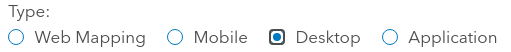
Set the type of the application as “Desktop

You can fill out the rest of this dialog as you see fit. Suggested values are:

  • Purpose: Ready to Use
  • Platform: Qt
  • URL: https://qgis.org
  • Tags: QGIS, Desktop, etc

Now – here comes a trick. Portal will force you to attach a file for the application. It doesn’t matter what you attach here, so long as it’s a zip file. While you could attach a zipped copy of the QGIS installer, that’s rather wasteful of server space! We’d generally just opt for a zip file containing a text file with a download link in it.

Click Add Item when you’re all done filling out the form, and the new application should be created on the Portal.

Registering the Application

The next step is to register the application on Portal, so that you can obtain the keys required for the OAuth2 logon using it. From the newly created item’s page, click on the “Settings” tab:

Scroll right to the bottom of this page, and you should see a “Register” button. Press this. Set the “App type” to “Native“.

Add two redirect URIs to the list (don’t forget to click “Add” after entering each!):

  1. The Portal’s public address, e.g. https://mydomain.com/portal
  2. http://127.0.0.1:7070

Finally, press the “Register” button in the dialog. If all goes well then the App Registration section in the item settings should now be populated with details. From here, copy the “App ID” and “Secret” strings, we’ll need these later:

Determine Request URLs

One last configuration setting we’ll need to determine before we fire up QGIS is the Portal’s OAuth Request and Token URLs. These are usually found by appending /sharing/rest/oauth2/authorize and /sharing/rest/oauth2/token to the end of your Portal’s URL.

For instance, if your public Portal URL is http://mydomain.com/portal, then the URLs will be:

Request URL: http://mydomain.com/portal/sharing/rest/oauth2/authorize
Token URL: http://mydomain.com/portal/sharing/rest/oauth2/token

You should be able to open both URLs directly in a browser. The Request URL will likely give a “redirect URL not specified” error, and the Token URL will give a “client_id not specified” error. That’s ok — it’s enough to verify that the URLs are correct.

When this is all done we can skip ahead to the client-side configuration below.

ArcGIS Online (AGOL)

Registering an application on AGOL must be done by an account administrator. So first, we’ll logon to AGOL using an appropriate account, and then head over to the “Content” tab. We’ll then hit the “New Item” button to start creating our application:

From the available item types select the “Application” option:

We’ll then select the “Mobile” application type, and enter “https://qgis.org” as the application URL (it actually doesn’t matter what we enter here!):

Lastly, we can enter a title for the application and complete all the metadata options as desired, then hit the “Save” button to create the application. AGOL should then take us over to the applications content page (if not, just open that page manually). From the application summary page, click across to the “Settings” tab:

Scroll right down to the “Credentials” section at the bottom of this page and click the “Register application” button:

Enter the following “Redirect URLs”, by copying each value and then hitting “Add”

  • localhost
  • http://127.0.0.1:7070
  • https://127.0.0.1:7070

Set the “Application environment” to Browser and then click “Register” button to continue:

You’ll be taken back to the application Settings page, but should now see an Client ID value and option to show the Client Secret. Copy the “Client ID” and “Client Secret” (there’s a “copy to clipboard” button for this) as we’ll need these later:

We’re all done on the AGOL side now, so it’s time to fire up QGIS!

Creating an QGIS OAuth2 Authentication Configuration

From your QGIS application, select Options from the Settings menu. Select the Authentication tab. We need to create a new authentication configuration, so press the green + button on the right hand side of the dialog. You’ll get a new dialog prompting you for Authentication details.

You may be asked to create a “Master Password” when you first create an authentication setup. If so, create a secure password there before continuing.

There’s a few tricks to this setup. Firstly, it’s important to ensure that you use the exact same settings on all your client machines. This includes the authentication ID field, which defaults to an auto-generated random string. (While it’s possible to automatically deploy the configuration as part of a startup or QGIS setup script, we won’t be covering that here!).

So, from the top of the dialog, we’ll fill in the “Name” field with a descriptive name of the Portal site. You then need to “unlock” the “Id” field by clicking the little padlock icon, and then you’ll be able to enter a standard ID to identify the Portal. The Id field is very strict, and will only accept a 7 letter string! Since you’ll need to create a different authentication setup for each individual ArcGIS Portal site you access, make sure you choose your ID string accordingly. (If you’re an AGOL user, then you’ll only need to create one authentication setup which will work for any AGOL account you want to access).

Drop down the Authentication Type combo box, and select “OAuth2 Authentication” from the list of options. There’s lots of settings we need to fill in here, but here’s what you’ll need:

  • Grant flow: set to “Authorization Code”
  • Request URL: 
    • For ArcGIS Portal services: enter the Request URL we determined in the previous step, e.g. http://mydomain.com/portal/sharing/rest/oauth2/authorize
    • For AGOL services: enter https://www.arcgis.com/sharing/rest/oauth2/authorize
  • Token URL:
    • For ArcGIS Portal services: enter the Token URL from the previous step, e.g. http://mydomain.com/portal/sharing/rest/oauth2/token
    • For AGOL services: enter https://www.arcgis.com/sharing/rest/oauth2/token
  • Refresh Token URL: leave empty
  • Redirect URL: leave as the default http://127.0.0.1:7070 value
  • Client ID: enter the App ID (or Client ID) from the App Registration information (see earlier steps)
  • Client Secret: enter the App Secret (or Client Secret) from the App Registration information (see earlier steps)
  • Scope: leave empty
  • API Key: leave empty
  • For AGOL services only: you’ll also need to set the “Token header” option under the “Advanced” heading. This needs to be “X-Esri-Authorization” (without the quotes!)

That’s it — leave all the rest of the settings at their default values, and click Save.

You can close down the Options dialog now.

Adding the Connection Details

Lastly, we’ll need to setup the server connection as an “ArcGIS Rest Server Connection” in QGIS. This is done through the QGIS “Data Source Manager” dialog, accessed through the Layer menu. Click the “ArcGIS REST Server” tab to start with, and then press “New” in the Server Connections group at the top of this dialog.

Enter a descriptive name for the connection, and then enter the connection URLs. These will vary depending on whether you’re connecting to AGOL or an ArcGIS Portal server:

ArcGIS Online Connection

  • URL: This will be something similar to “https://services###.arcgis.com/########/arcgis/rest/services/”, but will vary organisation by organisation. You can determine your organisation’s URL by visiting the overview page for any dataset published on your AGOL account, and looking under the “Details” sidebar. Copy the address from the “Source: Feature Service” link and it will contain the correct URL parameters for your organisation. (Just make sure you truncate the link to end after the “arcgis/rest/services” part, you don’t require the full service endpoint URL)
  • Community endpoint URL: https://www.arcgis.com/sharing/rest/community
  • Content endpoint URL: https://www.arcgis.com/sharing/rest/content

ArcGIS Portal Connection

  • URL:  the REST endpoint associated with your Portal, e.g. “https://mydomain.com/arcgis/rest/services”
  • Community endpoint URL (optional): This will vary depending on the server setup, but will generally take the form “https://mydomain.com/portal/sharing/rest/community”
  • Content endpoint URL (optional): This will vary depending on the server setup, but will generally take the form “https://mydomain.com/portal/sharing/rest/content”

Lastly, select the new OAuth2 configuration you just created under the “Authentication” group:

Click OK, and you’re done! When you try to connect to the newly added connection, you’ll automatically be taken to the AGOL or ArcGIS Portal’s logon screen in order to authenticate with the service. After entering your details, you’ll then be connected securely to the server and will have access to all items which are shared with your user account!

We’ve regularly use this setup for our enterprise clients, and have found it to work flawlessly in recent QGIS versions. If you’ve found this useful and are interested in other “best-practice” recommendations for mixed Open-Source and ESRI workplaces, don’t hesitate to contact us to discuss your requirements… at North Road we specialise in ensuring flawless integration between ESRI based systems and the Open Source geospatial software stack.

Mixed Format Labels in QGIS — coming soon!

For the QGIS 3.28 release North Road had the exciting opportunity to add some much desired new functionality to QGIS: the ability to mix font formatting and styles within a single map label! This enhancement was funded by the Swiss QGIS User Group, and offers a whole range of new cartographic possibilities for all QGIS users. Read on for more details on how this can impact your mapping…

QGIS has long supported the ability to combine different values inside a label for a feature, via the use of custom QGIS expressions. For example, the map below labels features from a rail station layer with the expression

"NAME" || '\n' || "PATRONAGE"

This expression concatenates the field values inside the “NAME” field with their “PATRONAGE” values, using a new line character to separate the two values. The end result looks something like this:

While custom expressions are extremely flexible and offer an almost unlimited range of possibilities to tweak label content, the limitation has been that all of this label text will always be displayed using a single font, font size, and font style. For example, there was no capacity to show the station names in a larger, bold font, and the patronage values in a smaller size.

That’s all changing thanks to the funding from the QGIS Swiss User Group! Now, in QGIS 3.28, users can combine label text with HTML formatting tags in order to customise exactly how each individual word or character in the label is drawn. Let’s revisit the map shown above and flex these new cartographic muscles…

The first thing we need to do is enable the HTML formatting tags for our labels by checking the “Allow HTML formatting” option in the text properties:

With this option enabled, we can now use a range of HTML and CSS tags to format individual parts of our label. For instance, “<b>bold text</b>” will show the text between the <b> and </b> tags in a bold font. By revising our previous labelling expression we can now get the station names to render in a bold font. Here’s the revised expression:

'<b>' || "NAME" || '</b><p>' || "PATRONAGE"

There’s one other important change we’ve made in the above expression. When using HTML formatting for labels, we need to replace the ‘\n’ newline character with the HTML new paragraph tag “<p>”. Otherwise, our expression is very similar to the previous one, with the exception that we’re wrapping the “NAME” field in <b>…</b> tags.

Here’s how it looks:

That’s already a dramatic improvement in the readability of the map! Let’s try refining it further by dropping down the font size of the patronage values. We can do that by inserting some CSS into the label string, specifically the “font-size” property. Here’s our new expression:

'<b>' || "NAME" || '</b><p><span style="font-size: 10pt">' || "PATRONAGE" || '</span>'

It’s so beautiful now! (Go on, scroll back up to our original map, we dare you to compare!).

So which HTML/CSS formatting options are supported? For QGIS 3.28, these options are:

  • Font family, via the CSS font-family tag. E.g. <span style=”font-family: Comic Sans MS”>…</span>
  • Font size, via the CSS font-size tag. E.g. <span style=”font-size: 30pt”>…</span>
  • Font weights, via the HTML <b> tag or CSS font-weight tag
  • Italic, via the HTML <i> tag or CSS “font-style: italic”
  • Font color, via the CSS “color: #rrggbb” tag
  • Underline, via the HTML <u> tag or CSS “text-decoration: underline” tag
  • Strikethrough, via the HTML <s> tag or CSS “text-decoration: line-through” tag
  • Overline, via the CSS “text-decoration: overline” tag

Oh, one last thing we nearly forgot to mention: all these wonderful styling options also apply perfectly to curved label text!

Our thanks go out to the members of the Swiss QGIS User Group for funding this feature! It’s an exciting addition to QGIS and can offer new ways to dramatically improve your mapping creations.

Got any QGIS needs you’d like to discuss? Or want to see additional formatting options added in a future QGIS release? Just contact our friendly team to discuss your needs — we’d love to assist!

24th Contributors QGIS Meeting in Firenze 2022

The international community of QGIS contributors got together in person from 18 to 22 August in parallel to OpenStreetMap State of The Map event and right before the FOSS4G. So there was a lot of open source geo power concentrated in the beautiful city of Florence in those days. It was my first participation and all I knew was that it’s supposed to be an unconference. This means, there is no strict schedule but space and opportunity for everyone to present their work or team up to discuss and hack on specific tasks to bring the QGIS project to the next level.

Introduction and first discussions

We were a group of six OPENGIS.ch members arriving mostly on Thursday, spending the day shopping and moving into our city apartment. In the evening we went to a Bisteccheria to eat the famous Fiorentina steak. It was big and delicious as was the food in general. Though, I am eating vegetarian since to compensate. On Friday we went to the Campus to meet the other contributors. After a warm welcome by the organizer, Rossella and our CEO and QGIS chair Marco Bernasocchi we did an introduction round where everyone mentioned their first QGIS version ever used. At this point, I became aware of the knowledge and experience I was sharing the room with. Besides this, I noticed that there was another company attending with several members, namely Tim Sutton’s Kartoza, which is also contributing a lot to QGIS. The first discussion was about QGIS funding model, vision, communication and on the new website in planning. This discussion then moved into some smaller groups including most of the long term contributors. I was looking around, physically and virtually, and tried to process all the new inputs and to better understand the whole QGIS world. Besides, I noticed my colleague Ivan having problems with compiling QGIS after upgrading to Ubuntu 22.04 which then motivated my other colleague Clemens to implement a docker container to do the compilation. Nevertheless, I postponed my Ubuntu upgrade. That evening we went out all together to have a beer or two and play some pool sessions and table football. Finally, the OPENGIS.ch crew navigated back home pairing a high-precision GNSS sensor with a mobile device running OpenStreetMap in QField. We arrived back home safely and super precise.

First tasks and coffee breaks

There was catering in the main hall covering breakfast, lunch and coffee breaks. It never took long after grabbing a cup of coffee to find yourself in a conversation with either fellow contributors or OpenStreetMap folks. I chatted with a mapper from Japan about mobile apps, an engineer from Colombia about travelling and a freelancer from the Netherlands about GDAL, to name 3 coffees out of many.

QGIS plugins website

After some coffee, Matthias Kuhn, our CTO and high-ranking QGIS contributor, asked me whether I could improve some ugly parts of QGIS plugins website. So I had my first task which I started working on immediately. The task was to make the site more useful on mobile devices which would be achieved by collapsing some unimportant information and even removing other parts. I noticed some quirks in the development workflow, so I also added some pre-commit hooks to the dev setup. Dimas Ciputra from Kartoza helped me finalize the improvements and merge them into master branch on github.

QGIS website downloads section

Regis Haubourg asked to help simplify the QGIS Downloads for Windows section on the main QGIS website. We played around in the browser dev tools until we thought the section looked about right. I then checked out the github repo and started implementing the changes. I need to say the tech stack is not quite easy to develop with currently, but there is a complete rework in planning. Anyway, following the pull request on github a lively discussion started which is ongoing by the time of writing. And this is a good thing and shows how much thought goes into this project.

Presentations

There were many interesting and sometimes spontaneous presentations which always involved lively discussions. Amy Burness from Kartoza presented new styling capabilities for QGIS, Tobias Schmetzer from the Bavarian Center for Applied Energy Research presented the geo data processing and pointed out issues he encountered using QGIS on this and Etienne Trimaille from 3liz talked about qgis-plugins-ci, just to name a few.

Amazing community

On Saturday evening a bus showed up at the campus and took us on a trip up to the hills. After quite a long ride we arrived at a restaurant high up with mind-blowing view of the city. I forgot how many rounds of Tuscan food were served, but it was delicious throughout. An amazing evening with fruitful conversations and many laughs.

The weather was nice and hot, the beers cold, the Tuscan food delicious and the contributors were not only popular Github avatars but really nice people. Thank you QGIS.

Forget label buffers! Better maps with selective label masks in QGIS

Cartographers use all kind of tricks to make their maps look deceptively simple. Yet, anyone who has ever tried to reproduce a cartographer’s design using only automatic GIS styling and labeling knows that the devil is in the details.

This post was motivated by Mika Hall’s retro map style.

There are a lot of things going on in this design but I want to draw your attention to the labels – and particularly their background:

Detail of Mike’s map (c) Mike Hall. You can see that the rail lines stop right before they would touch the A in Valencia (or any other letters in the surrounding labels).

This kind of effect cannot be achieved by good old label buffers because no matter which color we choose for the buffer, there will always be cases when the chosen color is not ideal, for example, when some labels are on land and some over water:

Ordinary label buffers are not always ideal.

Label masks to the rescue!

Selective label masks enable more advanced designs.

Here’s how it’s done:

Selective masking has actually been around since QGIS 3.12. There are two things we need to take care of when setting up label masks:

1. First we need to enable masks in the label settings for all labels we want to mask (for example the city labels). The mask tab is conveniently located right next to the label buffer tab:

2. Then we can go to the layers we want to apply the masks to (for example the railroads layer). Here we can configure which symbol layers should be affected by which mask:

Note: The order of steps is important here since the “Mask sources” list will be empty as long as we don’t have any label masks enabled and there is currently no help text explaining this fact.

I’m also using label masks to keep the inside of the large city markers (the ones with a star inside a circle) clear of visual clutter. In short, I’m putting a circle-shaped character, such as ◍, over the city location:

In the text tab, we can specify our one-character label and – later on – set the label opacity to zero.
To ensure that the label stays in place, pick the center placement in “Offset from Point” mode.

Once we are happy with the size and placement of this label, we can then reduce the label’s opacity to 0, enable masks, and configure the railroads layer to use this mask.

As a general rule of thumb, it makes sense to apply the masks to dark background features such as the railways, rivers, and lake outlines in our map design:

Resulting map with label masks applied to multiple labels including city and marine area labels masking out railway lines and ferry connections as well as rivers and lake outlines.

If you have never used label masks before, I strongly encourage you to give them a try next time you work on a map for public consumption because they provide this little extra touch that is often missing from GIS maps.

Happy QGISing! Make maps not war.

Official Austrian basemap and cadastre vector tiles

The BEV (Austrian Bundesamt für Eich- und Vermessungswesen) has recently published the Austrian cadastre as open data:

The URLs for vector tiles and styles can be found on https://kataster.bev.gv.at under Guide – External

The vector tile URL is:

https://kataster.bev.gv.at/tiles/{kataster | symbole}/{z}/{x}/{y}.pbf

There are 4 different style variations:

https://kataster.bev.gv.at/styles/{kataster | symbole}/style_{vermv | ortho | basic | gis}.json

When configuring the vector tiles in QGIS, we specify the desired tile and style URLs, for example:

For example, this is the “gis” style:

And this is the “basic” style:

The second vector tile source I want to mention is basemap.at. It has been around for a while, however, early versions suffered from a couple of issues that have now been resolved.

The basemap.at project provides extensive documentation on how to use the dataset in QGIS and other GIS, including manuals and sample projects:

Here’s the basic configuration: make sure to set the max zoom level to 16, otherwise, the map will not be rendered when you zoom in too far.

The level of detail is pretty impressive, even if it cannot quite keep up with the basemap raster tiles:

Vector tile details at Resselpark, Vienna
Raster basemap details at Resselpark, Vienna

Dynamic Infographic Map Tutorial

This is a guest post by Mickael HOARAU @Oneil974

As an update of the tutorial from previous years, I created a tutorial showing how to make a simple and dynamic color map with charts in QGIS.

In this tutorial you can see some of interesting features of QGIS and its community plugins. Here you’ll see variables, expressions, filters, QuickOSM and DataPlotly plugins and much more. You just need to use QGIS 3.24 Tisler version.

Here is the tutorial.

Snowy day map style now available on the QGIS hub

Today’s post is a follow-up and summary of my mapping efforts this December. It all started with a proof of concept that it is possible to create a nice looking snowfall effect using only labeling:

After a few more iterations, I even included the snowflake style in the first ever QGIS Map Design DLC: a free extra map recipe that shows how to create a map series of Antarctic expeditions. For more details (including project download links), check out my guest post on the Locate Press blog:

If you want to just use the snowflake style in your own projects, the easiest way is to grab the “Snowy Day” project from the QGIS hub (while the GeoPackage is waiting for approval on the official site, you can get it from my Dropbox):

The project is self-contained within the downloaded GeoPackage. One of the most convenient ways to open projects from GeoPackages is through the browser panel:

From here, you can copy-paste the layer style to any other polygon layer.

To change the snowflake color, go to the project properties and edit the “flake_color” variable.

Happy new year!

Exploring ZAMG’s new open weather data

The Central Institution for Meteorology and Geodynamics (ZAMG) is Austrian’s meteorological and geophysical service. And as such, they have a large database of historical weather data which they have now made publicly available, as announced on 28th Oct 2021:

The new ZAMG Data Hub provides weather and station data, mainly in NetCDF and CSV formats:

I decided to grab a NetCDF sample from their analysis and nowcasting system INCA. I went with all available parameters for a period of one day (the data has a temporal resolution of one hour) and a bounding box around Vienna:

https://frontend.hub.zamg.ac.at/grid/d512d5b5-4e9f-4954-98b9-806acbf754f6/historical/form?anonymous=true

The loading screen of QGIS 3.22 shows the different NetCDF layers:

After adding the incal-hourly layer to QGIS, the layer styling panel provides access to the different weather parameters. We can switch between these parameters by clicking the gradient icon next to the parameter names. Here you can see the air temperature:

And because the NetCDF layer is time-aware, we can also use the QGIS Temporal Controller to step through the hourly measurements / create an animation:

Make sure to grab the latest version of QGIS to get access to all the functionality shown here.

(Fr) Oslandia recrute : Ingénieur(e) développement d&#8217;applications SIG ( Python / SQL / QGIS ) &#8211; OSL2110A

Sorry, this entry is only available in French.

Introducing Annotation Layers in QGIS 3.22!

The QGIS 3.22 release is just around the corner, and we’d love to introduce you to one of the exciting changes included in this version. Just like all QGIS major releases, 3.22 brings a whole swag of improvements designed to enhance and simplify your mapping needs. In this post we’ll be highlighting one of these improvements — “Annotation Layers”. Before we dive further in, we need to extend our heartfelt thanks to the Swiss QGIS User Group who provided the funding required for this work. The Swiss User Group has invested heavily in cartographic enhancements to QGIS over many years, and it’s great to see this tradition continue for the 3.22 release!

So… let’s dive into Annotation Layers in QGIS 3.22, and what this new functionality allows you to do! Before we can get started, we’ll need to enable the new “Annotations” toolbar (it’s hidden by default). You can do this through the “View” – “Toolbars” menu by checking the “Annotations Toolbar” option. This will show a new toolbar, full of useful actions for creating and working with annotation layers:

The new Annotations toolbar

Annotation layers can contain a whole mix of different annotation types. In QGIS 3.22 this includes markers, lines, polygons and text. (We anticipate this list will grow steadily in future QGIS releases!)

Annotation item types


Creating an annotation is as easy is picking the desired item type (marker, line, polygon or text), and then drawing directly onto your map:

All the usual QGIS shortcuts for creating features apply when creating annotation items. A line or polygon annotation is drawn by left-clicking once for each vertex, with a final right mouse click to complete the shape. Snapping can be enabled while you draw, you can use the “Advanced Digitizing Tools” to precisely place vertices, and even switch the drawing tools to the streaming mode for completely free-form shapes!

Creating a polygon annotation using stream digitizing

While annotations are created in this free-form way, every annotation item is still completely geo-referenced and tied to a particular geographic location. Moving your map, changing the scale or changing projection won’t cause your annotations to jump around the map. Rather, they’ll be locked in place to the location you’ve drawn them:

Annotations are tied to a geographic location

Unlike features in a traditional vector layer, it’s easy to interactively style annotation items on an item-by-item basis. (This is what makes them a great tool to help quickly create beautiful maps!). All the item appearance properties are set through the QGIS “Layer Styling” dock, which allows you to interactively tweak an item’s appearance without any annoying dialog windows getting in your way. Annotation items support all of QGIS’ rich symbology and labelling options, including layer effects (drop shadows, inner/outer glows), blending modes (multiply, overlay, etc), opacity, and even data-driven symbol property overrides!

Modifying items

Unlike traditional vector or raster (or mesh, or point cloud!) layers, an annotation layer isn’t linked to any external dataset. They exist within a single QGIS project only, so they are perfect for project-specific markups and cartographic notes. By default, any newly created annotation item will be placed on top of all your other map content. (Formally, they are added into a “main annotation layer” which is always drawn on the very top of the map.) This main annotation layer is a special beast, and you won’t see it listed alongside all the other layers in your project. If you need to interact with it, say to change a layer-level setting like the opacity or blend mode, just select the “Main Annotation Layer Properties” option from the annotations toolbar:

Setting the main annotation layer properties


In addition to this special main annotation layer, it’s also possible to create your own secondary annotation layers. From the annotations toolbar, select the “New Annotation Layer” option and a brand new annotation layer will be added to your project. Unlike the main annotation layer, you’ll see any secondary annotation layers appear in the list of your project’s layers. Just like any other map layer, you can toggle their visibility, rename them, and even reposition them to control whether the annotations show above or below particular layers in your map!

Creating a new annotation layer

(Note that whenever you have a secondary annotation layer selected as the current layer, any newly drawn annotation items will be placed into this layer instead of the main annotation layer.)

So there we go — that’s a quick dive into annotation layers in QGIS 3.22, and some of the new cartographic capabilities they unlock for your maps! We see this as the starting point of an exciting journey, and North Road developers have many plans for further enhancement of annotation layers in future QGIS releases. (And naturally, we’ve also added full support for ArcGIS drawings to QGIS annotation layer conversion to our SLYR ESRI conversion toolkit!) If you’ve something specific you’d love to see added to annotations layers, just contact us at [email protected] to discuss sponsorship options.


Exploring Vienna’s street-level Lidar “Kappazunder” data sample

Kappazunder is the city of Vienna’s database created during their recent mobile mapping campaign. Using vehicle-mounted Lidar and cameras, they collected street-level Lidar and street view images.

Slide from the official announcement on Thursday, 23rd Sept 2021. Full slide deck: https://www.slideshare.net/DigitalesWien/kappazunder-testdatensatz-2020-ogd-wien

Yesterday, they published a first sample dataset, containing one trajectory on data.gv.at. The download contains documentation, vector data (.shp), images (.jpg), and point clouds (.laz):

Trajectory

The shapefiles contain vehicle location updates, photo locations, and areas describing the extent of the point clouds. Since the shapefile lack .prj files, we need to manually specify the correct CRS (EPSG:31256 MGI / Austria GK East).

The vehicle location updates and photo locations contain timestamps as epoch. However, the format is a little special:

To display a human-readable timestamp, I therefore used the following label expression:

format_date( datetime_from_epoch( "epoch_s"*1000), 'HH:mm:ss')

Adding these labels also reveals that the whole trajectory is just 2 minutes long. This puts the download size of over 5GB into perspective. The whole dataset will be massive.

Lidar

The .laz files are between 100 and 200MB, each. There are four .laz files, even though the previously loaded point cloud extent areas only suggested three:

Loading the .laz files for the first time takes a while and there seem to be some issues – either on the user end (me) or in the files themselves. Trying to load content of the ept_ folders only results in very few points and multiple “invalid data source” errors:

For the few point that are loaded, it looks like the height information is available:

Update on 2021-10-01: I’ve reported the data loss issue and Martin Dobias has provided a first work-around that makes it possible to view the data in QGIS:

135284370-b07272bb-be8a-47ac-b050-d6024613c63b.png (911×765)

Images

The street view images are published as cubemaps. Here’s a sample of the side view:

(Nederlands) Sprekers gezocht voor QGIS track FOSS4GNL

Sorry, this entry is only available in Dutch.

Great label callout lines

One of the new features in QGIS 3.20 is the option to trim the start and end of simple line symbols. This allows for the line rendering to trim off the first and last sections of a line at a user configured distance, as shown in the visual changelog entry

This new feature makes it much easier to create decorative label callout (or leader) lines. If you know QGIS Map Design 2, the following map may look familiar – however – the following leader lines are even more intricate, making use of the new trimming capabilities:

To demonstrate some of the possibilities, I’ve created a set of four black and four white leader line styles:

You can download these symbols from the QGIS style sharing platform: https://plugins.qgis.org/styles/101/ to use them in your projects. Have fun mapping!

QGIS Atlas on steroids

Today’s post is a video recommendation. In the following video, Alexandre Neto demonstrates an exciting array of tips, tricks, and hacks to create an automated Atlas map series of the Azores islands.

Highlights include:

1. A legend that includes automatically updating statistics

2. A way to support different page sizes

3. A solution for small areas overshooting the map border

You’ll find the video on the QGIS Youtube channel:

This video was recorded as part of the QGIS Open Day June edition. QGIS Open Days are organized monthly on the last Friday of the month. Anyone can take part and present their work for and with QGIS. For more details, see https://github.com/qgis/QGIS/wiki#qgis-open-day

(Fr) QSoccer : QGIS, football, what else ?

Sorry, this entry is only available in French.

  • <<
  • Page 3 of 43 ( 857 posts )
  • >>
  • qgis

Back to Top

Sustaining Members