Related Plugins and Tags

QGIS Planet

MovingPandas v0.5 released!

The latest v0.5 release is now available from conda-forge.

New features include:

As always, all tutorials are available on MyBinder:


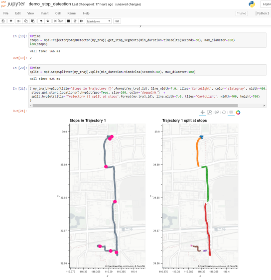
Detected stops (left) and trajectory split at stops (right)

Super-quick interactive data & parameter exploration

This post introduces Holoviz Panel, a library that makes it possible to create really quick dashboards in notebook environments as well as more sophisticated custom interactive web apps and dashboards.

The following example shows how to use Panel to explore a dataset (a trajectory collection in this case) and different parameter settings (relating to trajectory generalization). All the Panel code we need is a dict that defines the parameters that we want to explore. Then we can use Panel’s interact function to automatically generate a dashboard for our custom plotting function:

import panel as pn

kw = dict(traj_id=(1, len(traj_collection)), 
          tolerance=(10, 100, 10), 
          generalizer=['douglas-peucker', 'min-distance'])
pn.interact(plot_generalized, **kw)

Click to view the resulting dashboard in full resolution:

The plotting function uses the parameters to generate a Holoviews plot. First it fetches a specific trajectory from the trajectory collection. Then it generalizes the trajectory using the specified parameter settings. As you can see, we can easily combine maps and other plots to visualize different aspects of the data:

def plot_generalized(traj_id=1, tolerance=10, generalizer='douglas-peucker'):
  my_traj = traj_collection.get_trajectory(traj_id).to_crs(CRS(4088))
  if generalizer=='douglas-peucker':
    generalized = mpd.DouglasPeuckerGeneralizer(my_traj).generalize(tolerance)
  else:
    generalized = mpd.MinDistanceGeneralizer(my_traj).generalize(tolerance)
  generalized.add_speed(overwrite=True)
  return ( 
    generalized.hvplot(
      title='Trajectory {} (tolerance={})'.format(my_traj.id, tolerance), 
      c='speed', cmap='Viridis', colorbar=True, clim=(0,20), 
      line_width=10, width=500, height=500) + 
    generalized.df['speed'].hvplot.hist(
      title='Speed histogram', width=300, height=500) 
    )

Trajectory collections and generalization functions used in this example are part of the MovingPandas library. If you are interested in movement data analysis, you should check it out! You can find this example notebook in the MovingPandas tutorial section.

MovingPandas v0.3 released!

MovingPandas has come a long way since 2018 when I started to experiment with GeoPandas for trajectory data handling.

This week, MovingPandas passed peer review and was approved for pyOpenSci. This technical review process was extremely helpful in ensuring code, project, and documentation quality. I would strongly recommend it to everyone working on new data science libraries!

The lastest v0.3 release is now available from conda-forge.

All tutorials are available on MyBinder

New features include:

  • Support for GeoPandas 0.7
  • Trajectory collection aggregation functions to generate flow maps


Movement data in GIS #29: power your web apps with movement data using mobilitydb-sqlalchemy

This is a guest post by Bommakanti Krishna Chaitanya @chaitan94

Introduction

This post introduces mobilitydb-sqlalchemy, a tool I’m developing to make it easier for developers to use movement data in web applications. Many web developers use Object Relational Mappers such as SQLAlchemy to read/write Python objects from/to a database.

Mobilitydb-sqlalchemy integrates the moving objects database MobilityDB into SQLAlchemy and Flask. This is an important step towards dealing with trajectory data using appropriate spatiotemporal data structures rather than plain spatial points or polylines.

To make it even better, mobilitydb-sqlalchemy also supports MovingPandas. This makes it possible to write MovingPandas trajectory objects directly to MobilityDB.

For this post, I have made a demo application which you can find live at https://mobilitydb-sqlalchemy-demo.adonmo.com/. The code for this demo app is open source and available on GitHub. Feel free to explore both the demo app and code!

In the following sections, I will explain the most important parts of this demo app, to show how to use mobilitydb-sqlalchemy in your own webapp. If you want to reproduce this demo, you can clone the demo repository and do a “docker-compose up –build” as it automatically sets up this docker image for you along with running the backend and frontend. Just follow the instructions in README.md for more details.

Declaring your models

For the demo, we used a very simple table – with just two columns – an id and a tgeompoint column for the trip data. Using mobilitydb-sqlalchemy this is as simple as defining any regular table:

from flask_sqlalchemy import SQLAlchemy
from mobilitydb_sqlalchemy import TGeomPoint

db = SQLAlchemy()

class Trips(db.Model):
   __tablename__ = "trips"
   trip_id = db.Column(db.Integer, primary_key=True)
   trip = db.Column(TGeomPoint)

Note: The library also allows you to use the Trajectory class from MovingPandas as well. More about this is explained later in this tutorial.

Populating data

When adding data to the table, mobilitydb-sqlalchemy expects data in the tgeompoint column to be a time indexed pandas dataframe, with two columns – one for the spatial data  called “geometry” with Shapely Point objects and one for the temporal data “t” as regular python datetime objects.

from datetime import datetime
from shapely.geometry import Point

# Prepare and insert the data
# Typically it won’t be hardcoded like this, but it might be coming from 
# other data sources like a different database or maybe csv files
df = pd.DataFrame(
   [
       {"geometry": Point(0, 0), "t": datetime(2012, 1, 1, 8, 0, 0),},
       {"geometry": Point(2, 0), "t": datetime(2012, 1, 1, 8, 10, 0),},
       {"geometry": Point(2, -1.9), "t": datetime(2012, 1, 1, 8, 15, 0),},
   ]
).set_index("t")

trip = Trips(trip_id=1, trip=df)
db.session.add(trip)
db.session.commit()

Writing queries

In the demo, you see two modes. Both modes were designed specifically to explain how functions defined within MobilityDB can be leveraged by our webapp.

1. All trips mode – In this mode, we extract all trip data, along with distance travelled within each trip, and the average speed in that trip, both computed by MobilityDB itself using the ‘length’, ‘speed’ and ‘twAvg’ functions. This example also shows that MobilityDB functions can be chained to form more complicated queries.

mobilitydb-sqlalchemy-demo-1

trips = db.session.query(
   Trips.trip_id,
   Trips.trip,
   func.length(Trips.trip),
   func.twAvg(func.speed(Trips.trip))
).all()

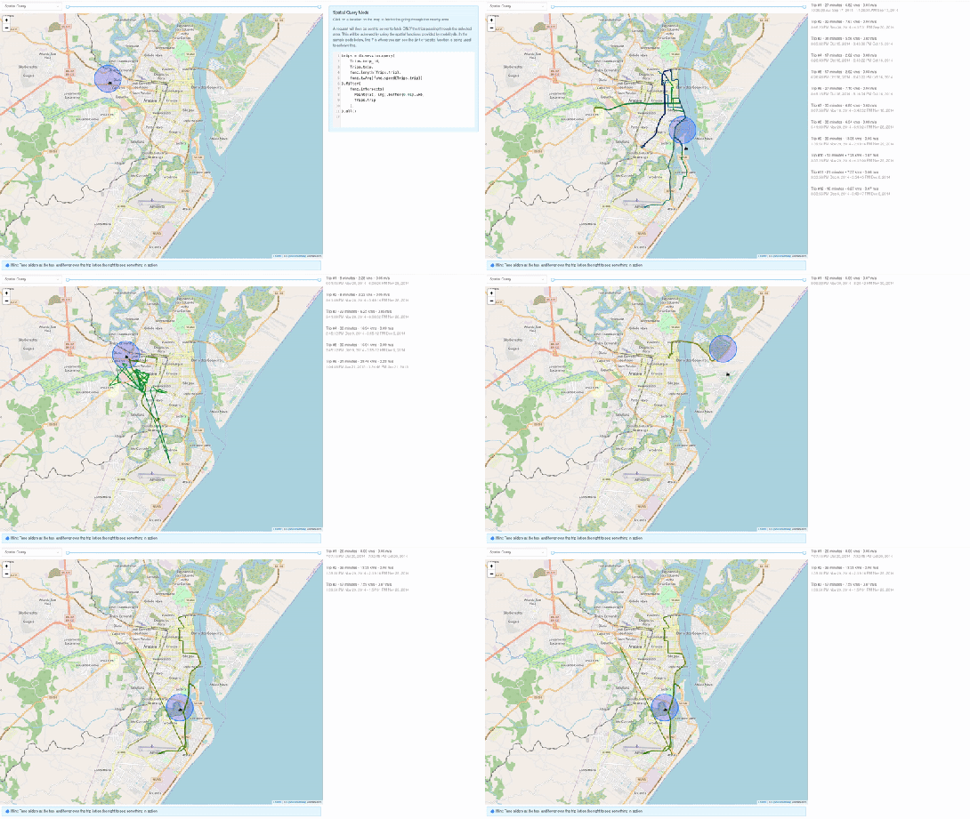
2. Spatial query mode – In this mode, we extract only selective trip data, filtered by a user-selected region of interest. We then make a query to MobilityDB to extract only the trips which pass through the specified region. We use MobilityDB’s ‘intersects’ function to achieve this filtering at the database level itself.
mobilitydb-sqlalchemy-demo-2

trips = db.session.query(
   Trips.trip_id,
   Trips.trip,
   func.length(Trips.trip),
   func.twAvg(func.speed(Trips.trip))
).filter(
   func.intersects(Point(lat, lng).buffer(0.01).wkb, Trips.trip),
).all()

Using MovingPandas Trajectory objects

Mobilitydb-sqlalchemy also provides first-class support for MovingPandas Trajectory objects, which can be installed as an optional dependency of this library. Using this Trajectory class instead of plain DataFrames allows us to make use of much richer functionality over trajectory data like analysis speed, interpolation, splitting and simplification of trajectory points, calculating bounding boxes, etc. To make use of this feature, you have set the use_movingpandas flag to True while declaring your model, as shown in the below code snippet.

class TripsWithMovingPandas(db.Model):
   __tablename__ = "trips"
   trip_id = db.Column(db.Integer, primary_key=True)
   trip = db.Column(TGeomPoint(use_movingpandas=True))

Now when you query over this table, you automatically get the data parsed into Trajectory objects without having to do anything else. This also works during insertion of data – you can directly assign your movingpandas Trajectory objects to the trip column. In the below code snippet we show how inserting and querying works with movingpandas mode.

from datetime import datetime
from shapely.geometry import Point

# Prepare and insert the data
# Typically it won’t be hardcoded like this, but it might be coming from 
# other data sources like a different database or maybe csv files
df = pd.DataFrame(
   [
       {"geometry": Point(0, 0), "t": datetime(2012, 1, 1, 8, 0, 0),},
       {"geometry": Point(2, 0), "t": datetime(2012, 1, 1, 8, 10, 0),},
       {"geometry": Point(2, -1.9), "t": datetime(2012, 1, 1, 8, 15, 0),},
   ]
).set_index("t")

geo_df = GeoDataFrame(df)
traj = mpd.Trajectory(geo_df, 1)

trip = Trips(trip_id=1, trip=traj)
db.session.add(trip)
db.session.commit()

# Querying over this table would automatically map the resulting tgeompoint 
# column to movingpandas’ Trajectory class
result = db.session.query(TripsWithMovingPandas).filter(
   TripsWithMovingPandas.trip_id == 1
).first()

print(result.trip.__class__)
# <class 'movingpandas.trajectory.Trajectory'>

Bonus: trajectory data serialization

Along with mobilitydb-sqlalchemy, recently I have also released trajectory data serialization/compression libraries based on Google’s Encoded Polyline Format Algorithm, for python and javascript called trajectory and trajectory.js respectively. These libraries let you send trajectory data in a compressed format, resulting in smaller payloads if sending your data through human-readable serialization formats like JSON. In some of the internal APIs we use at Adonmo, we have seen this reduce our response sizes by more than half (>50%) sometimes upto 90%.

Want to learn more about mobilitydb-sqlalchemy? Check out the quick start & documentation.


This post is part of a series. Read more about movement data in GIS.

First working MovingPandas setup on Databricks

In December, I wrote about GeoPandas on Databricks. Back then, I also tried to get MovingPandas working but without luck. (While GeoPandas can be installed using Databricks’ dbutils.library.installPyPI("geopandas") this PyPI install just didn’t want to work for MovingPandas.)

Now that MovingPandas is available from conda-forge, I gave it another try and … *spoiler alert* … it works!

First of all, conda support on Databricks is in beta. It’s not included in the default runtimes. At the time of writing this post, “6.0 Conda Beta” is the latest runtime with conda:

Once the cluster is up and connected to the notebook, a quick conda list shows the installed packages:

Time to install MovingPandas! I went with a 100% conda-forge installation. This takes a looong time (almost half an hour)!

When the installs are finally done, it get’s serious: time to test the imports!

Success!

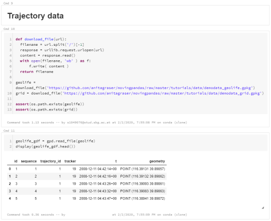
Now we can put the MovingPandas data structures to good use. But first we need to load some movement data:

Or course, the points in this GeoDataFrame can be plotted. However, the plot isn’t automatically displayed once plot() is called on the GeoDataFrame. Instead, Databricks provides a display() function to display Matplotlib figures:

MovingPandas also uses Matplotlib. Therefore we can use the same approach to plot the TrajectoryCollection that can be created from the GeoDataFrame:

These Matplotlib plots are nice and quick but they lack interactivity and therefore are of limited use for data exploration.

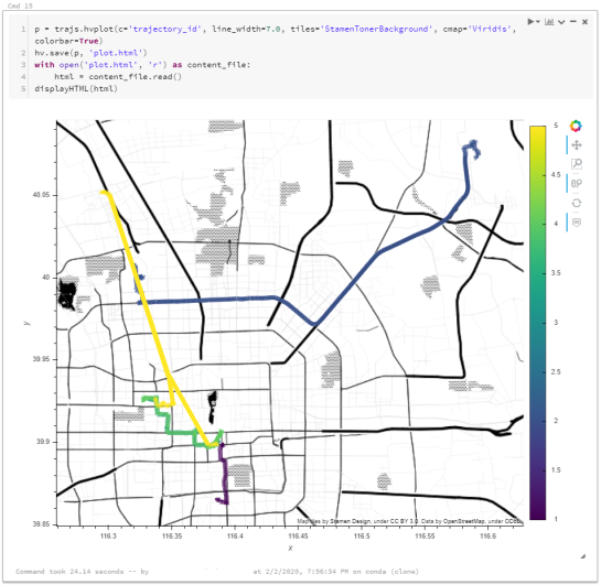
MovingPandas provides interactive plotting (including base maps) using hvplot. hvplot is based on Bokeh and, luckily, the Databricks documentation tells us that bokeh plots can be exported to html and then displayed using  displayHTML():

Of course, we could achieve all this on MyBinder as well (and much more quickly). However, Databricks gets interesting once we can add (Py)Spark and distributed processing to the mix. For example, “Getting started with PySpark & GeoPandas on Databricks” shows a spatial join function that adds polygon information to a point GeoDataFrame.

A potential use case for MovingPandas would be to speed up flow map computations. The recently added aggregator functionality (currently in master only) first computes clusters of significant trajectory points and then aggregates the trajectories into flows between these clusters. Matching trajectory points to the closest cluster could be a potential use case for distributed computing. Each trajectory (or each point) can be handled independently, only the cluster locations have to be broadcast to all workers.

Flow map (screenshot from MovingPandas tutorial 4_generalization_and_aggregation.ipynb)


Movement data in GIS #27: extracting trip origin clusters from MovingPandas trajectories

This post is a follow-up to the draft template for exploring movement data I wrote about in my previous post. Specifically, I want to address step 4: Exploring patterns in trajectory and event data.

The patterns I want to explore in this post are clusters of trip origins. The case study presented here is an extension of the MovingPandas ship data analysis notebook.

The analysis consists of 4 steps:

  1. Splitting continuous GPS tracks into individual trips
  2. Extracting trip origins (start locations)
  3. Clustering trip origins
  4. Exploring clusters

Since I have already removed AIS records with a speed over ground (SOG) value of zero from the dataset, we can use the split_by_observation_gap() function to split the continuous observations into individual trips. Trips that are shorter than 100 meters are automatically discarded as irrelevant clutter:

traj_collection.min_length = 100
trips = traj_collection.split_by_observation_gap(timedelta(minutes=5))

The split operation results in 302 individual trips:

Passenger vessel trajectories are blue, high-speed craft green, tankers red, and cargo vessels orange. Other vessel trajectories are gray.

To extract trip origins, we can use the get_start_locations() function. The list of column names defines which columns are carried over from the trajectory’s GeoDataFrame to the origins GeoDataFrame:

 
origins = trips.get_start_locations(['SOG', 'ShipType']) 

The following density-based clustering step is based on a blog post by Geoff Boeing and uses scikit-learn’s DBSCAN implementation:

from sklearn.cluster import DBSCAN
from geopy.distance import great_circle
from shapely.geometry import MultiPoint

origins['lat'] = origins.geometry.y
origins['lon'] = origins.geometry.x
matrix = origins.as_matrix(columns=['lat', 'lon'])

kms_per_radian = 6371.0088
epsilon = 0.1 / kms_per_radian

db = DBSCAN(eps=epsilon, min_samples=1, algorithm='ball_tree', metric='haversine').fit(np.radians(matrix))
cluster_labels = db.labels_
num_clusters = len(set(cluster_labels))
clusters = pd.Series([matrix[cluster_labels == n] for n in range(num_clusters)])
print('Number of clusters: {}'.format(num_clusters))

Resulting in 69 clusters.

Finally, we can add the cluster labels to the origins GeoDataFrame and plot the result:

origins['cluster'] = cluster_labels

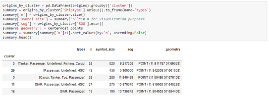
To analyze the clusters, we can compute summary statistics of the trip origins assigned to each cluster. For example, we compute a representative (center-most) point, count the number of trips, and compute the mean speed (SOG) value:

 
def get_centermost_point(cluster):
    centroid = (MultiPoint(cluster).centroid.x, MultiPoint(cluster).centroid.y)
    centermost_point = min(cluster, key=lambda point: great_circle(point, centroid).m)
    return Point(tuple(centermost_point)[1], tuple(centermost_point)[0])
centermost_points = clusters.map(get_centermost_point) 

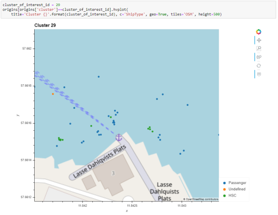
The largest cluster with a low mean speed (indicating a docking or anchoring location) is cluster 29 which contains 43 trips from passenger vessels, high-speed craft, an an undefined vessel:

To explore the overall cluster pattern, we can plot the clusters colored by speed and scaled by the number of trips:

Besides cluster 29, this visualization reveals multiple smaller origin clusters with low speeds that indicate different docking locations in the analysis area.

Cluster locations with high speeds on the other hand indicate locations where vessels enter the analysis area. In a next step, it might be interesting to compute flows between clusters to gain insights about connections and travel times.

It’s worth noting that AIS data contains additional information, such as vessel status, that could be used to extract docking or anchoring locations. However, the workflow presented here is more generally applicable to any movement data tracks that can be split into meaningful trips.

For the full interactive ship data analysis tutorial visit https://mybinder.org/v2/gh/anitagraser/movingpandas/binder-tag


This post is part of a series. Read more about movement data in GIS.

Movement data in GIS #26: towards a template for exploring movement data

Exploring new datasets can be challenging. Addressing this challenge, there is a whole field called exploratory data analysis that focuses on exploring datasets, often with visual methods.

Concerning movement data in particular, there’s a comprehensive book on the visual analysis of movement by Andrienko et al. (2013) and a host of papers, such as the recent state of the art summary by Andrienko et al. (2017).

However, while the literature does provide concepts, methods, and example applications, these have not yet translated into readily available tools for analysts to use in their daily work. To fill this gap, I’m working on a template for movement data exploration implemented in Python using MovingPandas. The proposed workflow consists of five main steps:

  1. Establishing an overview by visualizing raw input data records
  2. Putting records in context by exploring information from consecutive movement data records (such as: time between records, speed, and direction)
  3. Extracting trajectories & events by dividing the raw continuous tracks into individual trajectories and/or events
  4. Exploring patterns in trajectory and event data by looking at groups of the trajectories or events
  5. Analyzing outliers by looking at potential outliers and how they may challenge preconceived assumptions about the dataset characteristics

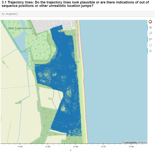
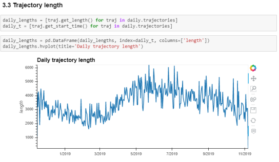
To ensure a reproducible workflow, I’m designing the template as a a Jupyter notebook. It combines spatial and non-spatial plots using the awesome hvPlot library:

This notebook is a work-in-progress and you can follow its development at http://exploration.movingpandas.org. Your feedback is most welcome!


References

  • Andrienko G, Andrienko N, Bak P, Keim D, Wrobel S (2013) Visual analytics of movement. Springer Science & Business Media.
  • Andrienko G, Andrienko N, Chen W, Maciejewski R, Zhao Y (2017) Visual Analytics of Mobility and Transportation: State of the Art and Further Research Directions. IEEE Transactions on Intelligent Transportation Systems 18(8):2232–2249, DOI 10.1109/TITS.2017.2683539

  • <<
  • Page 2 of 2 ( 27 posts )
  • movingpandas

Back to Top

Sustaining Members